Android学习之Material Components
以下是 Material Design 提供的核心控件列表(基于最新 Material Components for Android 库),按功能分类整理:
1. 基础按钮类
| 控件名称 | 类名 | 说明 |
|---|---|---|
| MaterialButton | com.google.android.material.button.MaterialButton | 遵循 Material 规范的按钮,支持圆角、阴影等 |
| FloatingActionButton | com.google.android.material.floatingactionbutton.FloatingActionButton | 悬浮操作按钮,用于主要操作 |
| TextButton | com.google.android.material.button.TextButton | 无边界的纯文本按钮 |
| OutlinedButton | com.google.android.material.button.OutlinedButton | 带边框的轮廓按钮 |
2. 表单与输入控件
| 控件名称 | 类名 | 说明 |
|---|---|---|
| TextInputLayout | com.google.android.material.textfield.TextInputLayout | 包裹 TextInputEditText 的容器,支持标签动画 |
| TextInputEditText | com.google.android.material.textfield.TextInputEditText | 带输入验证和错误提示的 EditText |
| Switch | com.google.android.material.materialswitch.MaterialSwitch | 开关控件(Material 风格) |
| Checkbox | com.google.android.material.checkbox.MaterialCheckBox | 复选框 |
| RadioButton | com.google.android.material.radiobutton.MaterialRadioButton | 单选按钮 |
| AutoCompleteTextView | com.google.android.material.textfield.MaterialAutoCompleteTextView | 带自动补全功能的输入框 |
3. 导航与布局
| 控件名称 | 类名 | 说明 |
|---|---|---|
| BottomNavigationView | com.google.android.material.bottomnavigation.BottomNavigationView | 底部导航栏,支持标签切换 |
| NavigationView | com.google.android.material.navigation.NavigationView | 侧边栏导航菜单(搭配 DrawerLayout 使用) |
| TabLayout | com.google.android.material.tabs.TabLayout | 标签页布局,常与 ViewPager 结合使用 |
| BottomAppBar | com.google.android.material.bottomappbar.BottomAppBar | 底部应用栏,常与 FloatingActionButton 结合 |
4. 信息展示
| 控件名称 | 类名 | 说明 |
|---|---|---|
| CardView | com.google.android.material.card.MaterialCardView | 带圆角和阴影的卡片容器 |
| Snackbar | com.google.android.material.snackbar.Snackbar | 短暂提示栏,显示操作反馈 |
| Divider | com.google.android.material.divider.MaterialDivider | 分割线控件 |
| ProgressBar | com.google.android.material.progressindicator.LinearProgressIndicator | 线性进度条(替代旧版 ProgressBar) |
5. 对话框与弹窗
| 控件名称 | 类名 | 说明 |
|---|---|---|
| MaterialAlertDialog | MaterialAlertDialogBuilder (通过 Builder 创建) | 响应式对话框 |
| BottomSheetDialog | com.google.android.material.bottomsheet.BottomSheetDialog | 底部弹出式对话框 |
6. 其他组件
| 控件名称 | 类名 | 说明 |
|---|---|---|
| Chip | com.google.android.material.chip.Chip | 标签组件,用于分类或选择 |
| Menu | MaterialMenuItem (通过 XML 定义) | 菜单项(需配合 MenuInflater 使用) |
| DatePicker | com.google.android.material.datepicker.MaterialDatePicker | 日期选择器 |
| TimePicker | com.google.android.material.timepicker.MaterialTimePicker | 时间选择器 |
使用说明
-
依赖版本:
implementation 'com.google.android.material:material:1.9.0' // 使用最新稳定版本 -
核心特性:
- 所有控件均遵循 Material Design 3 (MD3) 规范(如
MaterialButton的形状、阴影、颜色主题等)。 - 支持动态主题(通过
Theme.MaterialComponents系列主题)。 - 提供丰富的属性配置(如
app:shapeAppearance、app:rippleColor等)。
- 所有控件均遵循 Material Design 3 (MD3) 规范(如
-
注意事项:
- 部分旧版控件(如
FloatingActionButton)在 Material Components 中重新设计,需注意迁移。 - 需要 API 14+ 以上支持,但可通过
AppCompat兼容更早版本。
- 部分旧版控件(如
实践与对比
按钮
<?xml version="1.0" encoding="utf-8"?>
<androidx.constraintlayout.widget.ConstraintLayout xmlns:android="http://schemas.android.com/apk/res/android"xmlns:app="http://schemas.android.com/apk/res-auto"android:layout_width="match_parent"android:layout_height="match_parent"><!-- 普通 Button 示例 --><Buttonandroid:id="@+id/button"android:layout_width="wrap_content"android:layout_height="wrap_content"android:layout_marginTop="16dp"android:text="Standard Button"app:layout_constraintEnd_toEndOf="parent"app:layout_constraintStart_toStartOf="parent"app:layout_constraintTop_toTopOf="parent" /><!-- MaterialButton 示例 --><com.google.android.material.button.MaterialButtonandroid:id="@+id/material_button"style="@style/Widget.MaterialComponents.Button.OutlinedButton"android:layout_width="wrap_content"android:layout_height="wrap_content"android:layout_marginTop="24dp"android:text="Material Button"android:textColor="@color/white"app:backgroundTint="?attr/colorPrimary"app:cornerRadius="8dp"app:layout_constraintEnd_toEndOf="parent"app:layout_constraintStart_toStartOf="parent"app:layout_constraintTop_toBottomOf="@id/button"app:rippleColor="?attr/colorOnPrimary"app:strokeColor="?attr/colorPrimary"app:strokeWidth="2dp"app:textColor="@android:color/white" /><!--  FloatingActionButton  --><com.google.android.material.floatingactionbutton.FloatingActionButtonandroid:id="@+id/floating_action_button"android:layout_width="wrap_content"android:layout_height="wrap_content"android:layout_margin="16dp"app:backgroundTint="?attr/colorPrimary"app:elevation="6dp"app:layout_constraintBottom_toBottomOf="parent"app:layout_constraintEnd_toEndOf="parent"app:pressedTranslationZ="12dp"app:srcCompat="@android:drawable/ic_menu_add" />
</androidx.constraintlayout.widget.ConstraintLayout>
特点对比
| 控件 | 特点 |
|---|---|
| 普通 Button | 原生基础控件,样式简单(矩形无圆角),无 Material 特性(如涟漪效果),依赖系统主题。 |
| MaterialButton | 支持 Material Design 风格(圆角、边框、填充/轮廓/文字样式),动态主题适配,涟漪反馈。 |
| FloatingActionButton | 圆形图标按钮,用于核心操作,悬浮定位(如右下角),自带阴影和 Z 轴交互反馈。 |
使用场景对比
| 控件 | 适用场景 |
|---|---|
| 普通 Button | 简单交互(如表单提交)、无需 Material 风格、低版本兼容场景。 |
| MaterialButton | 需要 Material 设计语言(圆角/边框/主题适配)、复杂视觉反馈(如电商按钮、设置项)。 |
| FloatingActionButton | 突出核心操作(如“添加”“新建”),需固定在屏幕边缘,配合 Material 主题使用。 |
核心对比表格
| 维度 | 普通 Button | MaterialButton | FloatingActionButton |
|---|---|---|---|
| 核心用途 | 简单交互 | Material 风格按钮 | 突出核心操作的悬浮按钮 |
| 样式复杂度 | 简单(矩形无装饰) | 高(圆角/边框/填充/轮廓) | 高(圆形图标+阴影) |
| 图标支持 | 仅文字(需自定义图标) | 支持文字+图标(需配置) | 强制图标(无文字) |
| 主题适配 | 系统主题 | 动态主题(如深色模式) | 动态主题(颜色/阴影跟随主题) |
| 定位方式 | 需手动布局 | 需手动布局 | 通常固定屏幕边缘(如右下角) |
| 依赖库 | 无 | com.google.android.material | 同 MaterialButton |
| 交互反馈 | 无涟漪效果 | 支持涟漪效果 | 支持 Z 轴按下偏移 |
选择总结
- 选普通 Button:简单需求、无需 Material 风格。
- 选 MaterialButton:需要 Material 视觉(圆角/边框/主题适配)。
- 选 FloatingActionButton:需突出核心操作(如“+”按钮)。
输入控件
<?xml version="1.0" encoding="utf-8"?>
<androidx.constraintlayout.widget.ConstraintLayoutxmlns:android="http://schemas.android.com/apk/res/android"xmlns:app="http://schemas.android.com/apk/res-auto"android:layout_width="match_parent"android:layout_height="match_parent"android:padding="16dp"><!-- 普通 EditText 示例 --><EditTextandroid:id="@+id/et_input"android:layout_width="0dp"android:layout_height="wrap_content"android:layout_marginTop="16dp"android:background="@android:drawable/editbox_background"android:hint="普通输入框"android:textColorHint="#666"app:layout_constraintEnd_toEndOf="parent"app:layout_constraintStart_toStartOf="parent"app:layout_constraintTop_toTopOf="parent" /><!-- Material Design 输入框 --><com.google.android.material.textfield.TextInputLayoutandroid:id="@+id/username_layout"android:layout_width="0dp"android:layout_height="wrap_content"android:layout_marginTop="32dp"app:boxBackgroundColor="#FFF"app:boxStrokeColor="?attr/colorPrimary"app:boxBackgroundMode="outline"app:errorEnabled="true"app:helperText="Material Design 输入框"app:helperTextTextColor="?attr/colorPrimary"app:startIconDrawable="@drawable/ic_launcher_foreground"app:endIconMode="clear_text"app:layout_constraintEnd_toEndOf="parent"app:layout_constraintStart_toStartOf="parent"app:layout_constraintTop_toBottomOf="@+id/et_input"app:layout_constraintBottom_toBottomOf="parent"><com.google.android.material.textfield.TextInputEditTextandroid:id="@+id/username_input"android:layout_width="match_parent"android:layout_height="wrap_content"android:hint="用户名"android:inputType="text"android:textColor="?attr/colorOnSurface" /></com.google.android.material.textfield.TextInputLayout></androidx.constraintlayout.widget.ConstraintLayout>
特点对比
| 控件 | 特点 |
|---|---|
| 普通 EditText | 原生基础输入框,样式简单(下划线/矩形边框),无 Material 特性(如浮动标签/图标支持),依赖系统主题。 |
| TextInputLayout + EditText | 仅实现容器包裹样式,缺少 Material Design 规范特性(如动态颜色适配/图标交互反馈)。 |
| TextInputLayout + TextInputEditText | 完整 Material Design 输入组件,支持浮动标签、错误提示、图标系统、动态主题适配,提供交互反馈。 |
使用场景对比
| 控件 | 适用场景 |
|---|---|
| 普通 EditText | 简单输入场景(如快速原型开发)、无需 Material 风格、低版本兼容需求。 |
| TextInputLayout + EditText | 过渡方案(已有 EditText 改造),需要部分 Material 容器样式但无需完整特性。 |
| TextInputLayout + TextInputEditText | 规范 Material 设计场景(如登录表单)、需要错误提示/图标交互/主题适配等高级功能。 |
核心对比表格
| 维度 | 普通 EditText | TextInputLayout+EditText | TextInputLayout+TextInputEditText |
|---|---|---|---|
| 浮动标签动画 | ❌ 不支持 | ❌ 需手动实现 | ✅ 自动浮动/收缩动画 |
| 图标系统 | ❌ 仅自定义实现 | ⚠️ 部分支持(需手动适配) | ✅ 完整支持(start/end icon 体系) |
| 错误提示机制 | ❌ 需自定义 | ⚠️ 基础提示(无动画) | ✅ 带动画的错误提示+辅助计数器 |
| 主题适配 | 系统主题 | 颜色需硬编码 | ✅ 动态适配(?attr/colorPrimary 等) |
| 辅助功能 | 基础 Accessibility | 需手动添加 ContentDescription | ✅ 自动适配 TalkBack |
| 依赖库 | 无 | com.google.android.material | 同左 |
选择总结
- 选普通 EditText:快速验证功能原型、非 Material 设计场景
- 选 TextInputLayout+TextInputEditText:
- 需要完整的 Material Design 输入体验
- 要求自动主题适配(深色模式切换)
- 需要标准化错误提示/图标交互
开关
<?xml version="1.0" encoding="utf-8"?>
<androidx.constraintlayout.widget.ConstraintLayoutxmlns:android="http://schemas.android.com/apk/res/android"xmlns:app="http://schemas.android.com/apk/res-auto"xmlns:tools="http://schemas.android.com/tools"android:layout_width="match_parent"android:layout_height="match_parent"android:background="#FAFAFA"android:padding="24dp"><!-- 标题 --><TextViewandroid:id="@+id/title"android:layout_width="wrap_content"android:layout_height="wrap_content"android:text="Switch 控件对比"android:textSize="20sp"android:textColor="#333333"android:textStyle="bold"app:layout_constraintTop_toTopOf="parent"app:layout_constraintStart_toStartOf="parent"app:layout_constraintEnd_toEndOf="parent"android:layout_marginBottom="24dp"/><!-- 普通Switch控件区域 --><TextViewandroid:id="@+id/default_switch_label"android:layout_width="wrap_content"android:layout_height="wrap_content"android:text="默认 Switch 控件"android:textSize="16sp"android:textColor="#555555"app:layout_constraintTop_toBottomOf="@id/title"app:layout_constraintStart_toStartOf="parent"android:layout_marginBottom="16dp"/><LinearLayoutandroid:id="@+id/default_switches"android:layout_width="match_parent"android:layout_height="wrap_content"android:orientation="horizontal"android:gravity="center"android:layout_marginBottom="32dp"app:layout_constraintTop_toBottomOf="@id/default_switch_label"><Switchandroid:id="@+id/switch1"android:layout_width="wrap_content"android:layout_height="wrap_content"android:text="开关1"android:textColor="#333333"android:layout_marginEnd="32dp"/><Switchandroid:id="@+id/switch2"android:layout_width="wrap_content"android:layout_height="wrap_content"android:text="开关2"android:checked="true"android:textColor="#333333"/></LinearLayout><!-- Material风格Switch控件区域 --><TextViewandroid:id="@+id/material_switch_label"android:layout_width="wrap_content"android:layout_height="wrap_content"android:text="Material Switch 控件"android:textSize="16sp"android:textColor="#555555"app:layout_constraintTop_toBottomOf="@id/default_switches"app:layout_constraintStart_toStartOf="parent"android:layout_marginBottom="16dp"/><LinearLayoutandroid:id="@+id/material_switches"android:layout_width="match_parent"android:layout_height="wrap_content"android:orientation="horizontal"android:gravity="center"app:layout_constraintTop_toBottomOf="@id/material_switch_label"><com.google.android.material.switchmaterial.SwitchMaterialandroid:id="@+id/material_switch1"android:layout_width="wrap_content"android:layout_height="wrap_content"android:text="Material开关1"android:textColor="#333333"android:layout_marginEnd="32dp"app:useMaterialThemeColors="true"/><com.google.android.material.switchmaterial.SwitchMaterialandroid:id="@+id/material_switch2"android:layout_width="wrap_content"android:layout_height="wrap_content"android:text="Material开关2"android:textColor="#333333"android:checked="true"app:useMaterialThemeColors="true"/></LinearLayout></androidx.constraintlayout.widget.ConstraintLayout>
特点对比
| 控件 | 特点 |
|---|---|
| 普通 Switch | 原生基础控件,样式简单(直角滑块/无主题适配),无 Material 特性(如动态颜色/涟漪效果)。 |
| SwitchMaterial | 支持 Material Design 规范(圆角滑块/动态主题),提供图标支持、触摸涟漪反馈、无障碍优化。 |
使用场景对比
| 控件 | 适用场景 |
|---|---|
| 普通 Switch | 简单开关功能、无需 Material 风格、兼容低版本 Android 系统(API < 21)。 |
| SwitchMaterial | 需要 Material 设计语言(如深色模式适配)、更流畅的交互反馈、图标自定义需求。 |
核心对比表格
| 维度 | 普通 Switch | SwitchMaterial |
|---|---|---|
| 样式 | 直角滑块+灰色轨道 | 圆角滑块+主题色轨道 |
| 主题适配 | 依赖系统主题 | 动态适配 ?attr/colorPrimary 等属性 |
| 图标支持 | ❌ 仅文字 | ✅ 支持 app:thumbIcon 和 app:trackIcon |
| 交互反馈 | 基础按压效果 | 涟漪动画 + 按压 Z 轴抬升效果 |
| 无障碍支持 | 基础 TalkBack | 自动适配内容描述(ContentDescription) |
| 依赖库 | 无 | com.google.android.material |
| 自定义属性 | 有限(仅基础颜色/文本) | 支持滑块尺寸、图标资源、轨道颜色等 |
XML 属性对比示例
<!-- 普通 Switch 的典型实现 -->
<Switchandroid:thumbTint="#FF4081"      <!-- 固定颜色 -->android:trackTint="#BDBDBD" />   <!-- 无主题适配 --><!-- Material Switch 的规范实现 -->
<com.google.android.material.switchmaterial.SwitchMaterialapp:thumbTint="?attr/colorPrimary"           <!-- 动态主题色 -->app:trackColor="?attr/colorSurfaceVariant"   <!-- 轨道主题色 -->app:thumbIcon="@drawable/ic_custom_thumb"    <!-- 自定义滑块图标 -->app:rippleColor="?attr/colorOnPrimary" />    <!-- 涟漪效果颜色 -->
选择总结
-
选普通 Switch:
- 项目需兼容 Android 4.x 及以下版本
- 快速原型开发,无需复杂样式
-
选 SwitchMaterial:
- 遵循 Material Design 规范(如深色模式适配)
- 需要动态主题色或自定义图标
- 要求更好的交互反馈(如涟漪效果)
选择器
<?xml version="1.0" encoding="utf-8"?>
<ScrollView xmlns:android="http://schemas.android.com/apk/res/android"xmlns:app="http://schemas.android.com/apk/res-auto"android:layout_width="match_parent"android:layout_height="match_parent"android:background="#FAFAFA"android:padding="16dp"><LinearLayoutandroid:layout_width="match_parent"android:layout_height="wrap_content"android:orientation="vertical"><!-- 复选框对比部分 --><TextViewandroid:layout_width="wrap_content"android:layout_height="wrap_content"android:text="CheckBox 对比"android:textSize="18sp"android:textColor="#333333"android:textStyle="bold"android:layout_marginBottom="16dp"/><!-- 普通CheckBox --><TextViewandroid:layout_width="wrap_content"android:layout_height="wrap_content"android:text="普通CheckBox"android:textSize="14sp"android:textColor="#555555"android:layout_marginBottom="8dp"/><LinearLayoutandroid:layout_width="match_parent"android:layout_height="wrap_content"android:orientation="horizontal"android:layout_marginBottom="24dp"><CheckBoxandroid:id="@+id/normal_checkbox1"android:layout_width="wrap_content"android:layout_height="wrap_content"android:text="选项1"android:layout_marginEnd="24dp"/><CheckBoxandroid:id="@+id/normal_checkbox2"android:layout_width="wrap_content"android:layout_height="wrap_content"android:checked="true"android:text="选项2"/></LinearLayout><!-- MaterialCheckBox --><TextViewandroid:layout_width="wrap_content"android:layout_height="wrap_content"android:text="MaterialCheckBox"android:textSize="14sp"android:textColor="#555555"android:layout_marginBottom="8dp"/><LinearLayoutandroid:layout_width="match_parent"android:layout_height="wrap_content"android:orientation="horizontal"android:layout_marginBottom="32dp"><com.google.android.material.checkbox.MaterialCheckBoxandroid:id="@+id/material_checkbox1"android:layout_width="wrap_content"android:layout_height="wrap_content"android:text="选项1"app:useMaterialThemeColors="true"android:layout_marginEnd="24dp"/><com.google.android.material.checkbox.MaterialCheckBoxandroid:id="@+id/material_checkbox2"android:layout_width="wrap_content"android:layout_height="wrap_content"android:text="选项2"android:checked="true"app:useMaterialThemeColors="true"/></LinearLayout><!-- 分割线 --><Viewandroid:layout_width="match_parent"android:layout_height="1dp"android:background="#E0E0E0"android:layout_marginVertical="8dp"/><!-- 单选按钮对比部分 --><TextViewandroid:layout_width="wrap_content"android:layout_height="wrap_content"android:text="RadioButton 对比"android:textSize="18sp"android:textColor="#333333"android:textStyle="bold"android:layout_marginBottom="16dp"/><!-- 普通RadioButton --><TextViewandroid:layout_width="wrap_content"android:layout_height="wrap_content"android:text="普通RadioButton"android:textSize="14sp"android:textColor="#555555"android:layout_marginBottom="8dp"/><RadioGroupandroid:layout_width="match_parent"android:layout_height="wrap_content"android:orientation="horizontal"android:layout_marginBottom="24dp"><RadioButtonandroid:id="@+id/normal_radio1"android:layout_width="wrap_content"android:layout_height="wrap_content"android:text="选项A"android:layout_marginEnd="24dp"/><RadioButtonandroid:id="@+id/normal_radio2"android:layout_width="wrap_content"android:layout_height="wrap_content"android:checked="true"android:text="选项B"/></RadioGroup><!-- MaterialRadioButton --><TextViewandroid:layout_width="wrap_content"android:layout_height="wrap_content"android:text="MaterialRadioButton"android:textSize="14sp"android:textColor="#555555"android:layout_marginBottom="8dp"/><RadioGroupandroid:layout_width="match_parent"android:layout_height="wrap_content"android:orientation="horizontal"android:layout_marginBottom="24dp"><com.google.android.material.radiobutton.MaterialRadioButtonandroid:id="@+id/material_radio1"android:layout_width="wrap_content"android:layout_height="wrap_content"android:text="选项A"app:useMaterialThemeColors="true"android:layout_marginEnd="24dp"/><com.google.android.material.radiobutton.MaterialRadioButtonandroid:id="@+id/material_radio2"android:layout_width="wrap_content"android:layout_height="wrap_content"android:text="选项B"android:checked="true"app:useMaterialThemeColors="true"/></RadioGroup></LinearLayout>
</ScrollView>
CheckBox 对比分析
特点对比
| 控件 | 特点 |
|---|---|
| 普通 CheckBox | 原生基础控件,样式简单(方框勾选),无 Material 特性(如动态颜色/涟漪效果),依赖系统主题 |
| MaterialCheckBox | 支持 Material Design 规范(动态颜色/动画过渡),提供触摸涟漪反馈、主题自动适配能力 |
使用场景对比
| 控件 | 适用场景 |
|---|---|
| 普通 CheckBox | 简单选择场景、低版本兼容需求(API < 21)、无需主题适配 |
| MaterialCheckBox | 需要 Material 设计语言、深色模式支持、动态主题色适配场景 |
核心对比表格
| 维度 | 普通 CheckBox | MaterialCheckBox |
|---|---|---|
| 选中动画 | ❌ 无过渡动画 | ✅ 缩放+颜色渐变动画 |
| 主题适配 | 固定颜色需硬编码 | 自动适配 ?attr/colorPrimary |
| 错误状态显示 | ❌ 需自定义实现 | ✅ 内置错误状态样式 |
| 无障碍支持 | 基础 TalkBack | ✅ 自动生成内容描述 |
| 触摸反馈 | 基础按压效果 | ✅ 涟漪动画反馈 |
| 自定义属性 | 仅基础颜色/尺寸 | 支持图标/波纹颜色/状态指示器等 |
RadioButton 对比分析
特点对比
| 控件 | 特点 |
|---|---|
| 普通 RadioButton | 原生单选控件,样式传统(圆形外框),无动态主题适配能力 |
| MaterialRadioButton | 符合 Material 规范(动态波浪效果),支持主题色自动适配和触摸反馈优化 |
使用场景对比
| 控件 | 适用场景 |
|---|---|
| 普通 RadioButton | 基础单选需求、兼容旧版本系统(API < 21) |
| MaterialRadioButton | 需要 Material 交互动画、主题色动态切换的场景 |
核心对比表格
| 维度 | 普通 RadioButton | MaterialRadioButton |
|---|---|---|
| 选择动画 | ❌ 瞬间切换 | ✅ 波浪扩散动画 |
| 主题颜色适配 | 需手动设置颜色 | 自动继承 colorSecondary |
| 禁用状态显示 | ❌ 灰显效果单一 | ✅ 带透明度变化的禁用状态 |
| 触摸区域 | 仅图标区域可点击 | ✅ 文本标签联动点击 |
| 自定义能力 | 仅支持基础属性 | 支持按钮尺寸/波纹颜色/图标等 |
综合对比说明
<!-- Material 组件正确使用示例 -->
<com.google.android.material.checkbox.MaterialCheckBoxandroid:text="选项1"app:buttonTint="?attr/colorSecondary"app:useMaterialThemeColors="true"app:rippleColor="@color/ripple_color"/><com.google.android.material.radiobutton.MaterialRadioButtonandroid:text="选项A"app:buttonTint="?attr/colorPrimary"app:useMaterialThemeColors="true"/>
选择建议
-
选用普通组件的情况:
- 需要支持 Android 4.x 及以下系统
- 项目时间紧张只需实现基础功能
- 示例:
<CheckBox android:text="基础选项"/>
-
必须使用 Material 组件的情况:
- 要求符合 Material Design 规范
- 需要深色模式自动适配
- 需要交互动画提升用户体验
- 示例:
<MaterialCheckBox app:useMaterialThemeColors="true"/>
主题配置提醒
使用 Material 组件时,请确保应用主题继承自 MaterialComponents:
<!-- res/values/themes.xml -->
<style name="Theme.MyApp" parent="Theme.MaterialComponents.DayNight"><item name="colorPrimary">@color/purple_500</item><item name="colorSecondary">@color/pink_200</item><item name="colorSurface">@color/white</item>
</style>
导航与布局实现详解
这部分图就不放了,建议复制代码实际上手体验一下各个布局
1. BottomNavigationView(底部导航栏)
功能特点:
- 固定3-5个导航标签
- 支持图标和文字组合
- 内置平滑过渡动画
实现步骤:
- 布局文件 (
activity_main.xml)
<androidx.constraintlayout.widget.ConstraintLayoutxmlns:android="http://schemas.android.com/apk/res/android"xmlns:app="http://schemas.android.com/apk/res-auto"android:layout_width="match_parent"android:layout_height="match_parent"><!-- 主内容区 --><FrameLayoutandroid:id="@+id/container"android:layout_width="match_parent"android:layout_height="0dp"app:layout_constraintBottom_toTopOf="@id/bottom_nav"app:layout_constraintTop_toTopOf="parent"/><!-- 底部导航栏 --><com.google.android.material.bottomnavigation.BottomNavigationViewandroid:id="@+id/bottom_nav"android:layout_width="0dp"android:layout_height="wrap_content"app:labelVisibilityMode="labeled"app:layout_constraintBottom_toBottomOf="parent"app:layout_constraintEnd_toEndOf="parent"app:layout_constraintStart_toStartOf="parent"app:menu="@menu/bottom_nav_menu"/></androidx.constraintlayout.widget.ConstraintLayout>
- 菜单配置 (
res/menu/bottom_nav_menu.xml)
<menu xmlns:android="http://schemas.android.com/apk/res/android"><item android:id="@+id/nav_home"android:icon="@drawable/ic_home"android:title="首页"/><item android:id="@+id/nav_search"android:icon="@drawable/ic_search"android:title="搜索"/><item android:id="@+id/nav_profile"android:icon="@drawable/ic_person"android:title="我的"/>
</menu>
- 交互处理 (Activity/Fragment中)
bottom_nav.setOnItemSelectedListener { item ->when(item.itemId) {R.id.nav_home -> showFragment(HomeFragment())R.id.nav_search -> showFragment(SearchFragment())R.id.nav_profile -> showFragment(ProfileFragment())}true
}
2. NavigationView(侧边导航抽屉)
功能特点:
- 必须配合DrawerLayout使用
- 支持自定义头部布局
- 可分组显示菜单项
实现步骤:
- 主布局结构 (
activity_main.xml)
<androidx.drawerlayout.widget.DrawerLayoutandroid:id="@+id/drawer_layout"android:layout_width="match_parent"android:layout_height="match_parent"android:fitsSystemWindows="true"><!-- 主内容 --><include layout="@layout/content_main"/><!-- 导航抽屉 --><com.google.android.material.navigation.NavigationViewandroid:id="@+id/nav_view"android:layout_width="280dp"android:layout_height="match_parent"android:layout_gravity="start"app:headerLayout="@layout/nav_header"app:menu="@menu/nav_menu"/>
</androidx.drawerlayout.widget.DrawerLayout>
- 头部布局 (
res/layout/nav_header.xml)
<LinearLayout xmlns:android="http://schemas.android.com/apk/res/android"android:layout_width="match_parent"android:layout_height="180dp"android:background="@color/colorPrimary"android:orientation="vertical"android:padding="16dp"><ImageViewandroid:layout_width="72dp"android:layout_height="72dp"android:src="@drawable/ic_logo"/><TextViewandroid:layout_width="wrap_content"android:layout_height="wrap_content"android:text="应用名称"android:textColor="@android:color/white"android:textSize="18sp"/>
</LinearLayout>
- 菜单配置 (
res/menu/nav_menu.xml)
<menu xmlns:android="http://schemas.android.com/apk/res/android"><group android:checkableBehavior="single"><item android:id="@+id/nav_home"android:icon="@drawable/ic_home"android:title="首页"/><item android:id="@+id/nav_gallery"android:icon="@drawable/ic_photo"android:title="相册"/></group><item android:title="设置"><menu><item android:id="@+id/nav_settings"android:icon="@drawable/ic_settings"android:title="系统设置"/></menu></item>
</menu>
3. TabLayout(标签页导航)
功能特点:
- 支持固定/滚动模式
- 与ViewPager2完美配合
- 自定义指示器样式
实现步骤:
- 布局文件 (
activity_tabs.xml)
<LinearLayoutandroid:layout_width="match_parent"android:layout_height="match_parent"android:orientation="vertical"><com.google.android.material.appbar.AppBarLayoutandroid:layout_width="match_parent"android:layout_height="wrap_content"><com.google.android.material.tabs.TabLayoutandroid:id="@+id/tabs"android:layout_width="match_parent"android:layout_height="?attr/actionBarSize"app:tabIndicatorAnimationMode="elastic"app:tabMode="fixed"/></com.google.android.material.appbar.AppBarLayout><androidx.viewpager2.widget.ViewPager2android:id="@+id/view_pager"android:layout_width="match_parent"android:layout_height="0dp"android:layout_weight="1"/></LinearLayout>
- 适配器实现
class TabPagerAdapter(fa: FragmentActivity) : FragmentStateAdapter(fa) {override fun getItemCount() = 3override fun createFragment(position: Int) = when(position) {0 -> NewsFragment()1 -> SportsFragment()else -> TechFragment()}
}
- 关联Tab与ViewPager
val tabLayout = findViewById<TabLayout>(R.id.tabs)
val viewPager = findViewById<ViewPager2>(R.id.view_pager)viewPager.adapter = TabPagerAdapter(this)TabLayoutMediator(tabLayout, viewPager) { tab, position ->tab.text = when(position) {0 -> "新闻"1 -> "体育"else -> "科技"}
}.attach()
4. BottomAppBar(底部应用栏)
功能特点:
- 支持嵌入FAB按钮
- 可定制导航菜单
- 多种裁剪形状可选
实现步骤:
- 布局文件 (
activity_appbar.xml)
<androidx.coordinatorlayout.widget.CoordinatorLayoutandroid:layout_width="match_parent"android:layout_height="match_parent"><!-- 主内容 --><FrameLayoutandroid:id="@+id/container"android:layout_width="match_parent"android:layout_height="match_parent"/><!-- 底部应用栏 --><com.google.android.material.bottomappbar.BottomAppBarandroid:id="@+id/bottom_appbar"android:layout_width="match_parent"android:layout_height="?attr/actionBarSize"android:layout_gravity="bottom"app:fabCradleMargin="8dp"app:fabCradleRoundedCornerRadius="8dp"app:navigationIcon="@drawable/ic_menu"><com.google.android.material.bottomnavigation.BottomNavigationViewandroid:layout_width="match_parent"android:layout_height="match_parent"app:menu="@menu/bottom_appbar_menu"/></com.google.android.material.bottomappbar.BottomAppBar><!-- 悬浮按钮 --><com.google.android.material.floatingactionbutton.FloatingActionButtonandroid:id="@+id/fab"android:layout_width="wrap_content"android:layout_height="wrap_content"android:src="@drawable/ic_add"app:layout_anchor="@id/bottom_appbar"/></androidx.coordinatorlayout.widget.CoordinatorLayout>
- 交互处理
bottom_appbar.setNavigationOnClickListener {// 处理导航点击
}fab.setOnClickListener {// 处理FAB点击
}
信息展示控件对比实现
1. CardView 对比
MaterialCardView vs 普通CardView
<?xml version="1.0" encoding="utf-8"?>
<androidx.constraintlayout.widget.ConstraintLayoutxmlns:android="http://schemas.android.com/apk/res/android"xmlns:app="http://schemas.android.com/apk/res-auto"xmlns:tools="http://schemas.android.com/tools"android:layout_width="match_parent"android:layout_height="match_parent"android:padding="16dp"><!-- MaterialCardView实现 --><com.google.android.material.card.MaterialCardViewandroid:id="@+id/materialCardView"android:layout_width="match_parent"android:layout_height="120dp"android:layout_margin="16dp"app:cardCornerRadius="8dp"app:cardElevation="4dp"app:strokeColor="@color/purple_500"app:strokeWidth="1dp"app:layout_constraintTop_toTopOf="parent"tools:layout_editor_absoluteX="32dp"tools:layout_editor_absoluteY="16dp"><!-- 卡片内容 --><TextViewandroid:layout_width="wrap_content"android:layout_height="wrap_content"android:text="MaterialCardView"android:textSize="18sp" /></com.google.android.material.card.MaterialCardView><!-- 普通CardView实现 --><androidx.cardview.widget.CardViewandroid:layout_width="match_parent"android:layout_height="120dp"android:layout_margin="16dp"app:cardCornerRadius="8dp"app:cardElevation="4dp"app:layout_constraintBottom_toBottomOf="parent"tools:layout_editor_absoluteX="32dp"><TextViewandroid:layout_width="wrap_content"android:layout_height="wrap_content"android:text="普通CardView"android:textSize="18sp" /></androidx.cardview.widget.CardView></androidx.constraintlayout.widget.ConstraintLayout>
对比特性:
| 特性 | MaterialCardView | 普通CardView |
|---|---|---|
| 边框描边 | ✅ 支持 | ❌ 不支持 |
| 动态主题适配 | ✅ 自动适配深色模式 | ❌ 需手动配置 |
| 波纹点击效果 | ✅ 默认启用 | ❌ 需自定义 |
| 检查器模式 | ✅ 支持(app:checked) | ❌ 不支持 |
2. Snackbar 对比
Material Snackbar vs 原生Toast
// Material Snackbar实现
Snackbar.make(view, "操作已保存", Snackbar.LENGTH_LONG).setAction("撤销") { /* 撤销操作 */ }.setBackgroundTint(ContextCompat.getColor(this, R.color.purple_500)).show()// 原生Toast实现
Toast.makeText(this, "操作已保存", Toast.LENGTH_LONG).show()
对比特性:
| 特性 | Material Snackbar | 原生Toast |
|---|---|---|
| 交互动作按钮 | ✅ 支持 | ❌ 不支持 |
| 位置控制 | ✅ 可锚定到指定视图下方 | ❌ 固定屏幕位置 |
| 主题适配 | ✅ 自动适配 | ❌ 系统默认样式 |
| 显示时长 | ✅ LENGTH_SHORT/LONG | ✅ 同左 |
| 队列管理 | ✅ 自动排队显示 | ❌ 会立即覆盖前一条 |
3. Divider 对比
MaterialDivider vs View分割线
<?xml version="1.0" encoding="utf-8"?>
<androidx.constraintlayout.widget.ConstraintLayoutxmlns:android="http://schemas.android.com/apk/res/android"xmlns:app="http://schemas.android.com/apk/res-auto"xmlns:tools="http://schemas.android.com/tools"android:layout_width="match_parent"android:layout_height="match_parent"android:padding="16dp"><!-- MaterialDivider实现 --><com.google.android.material.divider.MaterialDividerandroid:id="@+id/divider"android:layout_width="match_parent"android:layout_height="1dp"android:layout_marginVertical="8dp"app:dividerColor="@color/purple_500"app:layout_constraintTop_toTopOf="parent"app:layout_constraintBottom_toTopOf="@+id/view2"app:dividerThickness="2dp"/><!-- 普通View实现 --><Viewandroid:id="@+id/view2"android:layout_width="match_parent"android:layout_height="1dp"android:layout_marginVertical="8dp"app:layout_constraintBottom_toBottomOf="parent"app:layout_constraintTop_toBottomOf="@+id/divider"android:background="#CCC"/></androidx.constraintlayout.widget.ConstraintLayout>

对比特性:
| 特性 | MaterialDivider | 普通View |
|---|---|---|
| 粗细控制 | ✅ app:dividerThickness | ❌ 需手动设置高度 |
| 颜色透明度 | ✅ 自动处理 | ❌ 需手动配置 |
| 方向控制 | ✅ 水平/垂直 | ❌ 需旋转布局 |
| 主题适配 | ✅ 自动适配 | ❌ 固定颜色 |
4. ProgressBar 对比
这个最好也自己写个demo体验一下,主要就优化了动画
LinearProgressIndicator vs 普通ProgressBar
<!-- Material进度条 -->
<com.google.android.material.progressindicator.LinearProgressIndicatorandroid:id="@+id/material_progress"android:layout_width="match_parent"android:layout_height="4dp"app:indicatorColor="@color/purple_500"app:trackColor="@color/gray_light"app:indeterminateAnimationType="contiguous"/><!-- 普通进度条 -->
<ProgressBarandroid:id="@+id/default_progress"style="?android:attr/progressBarStyleHorizontal"android:layout_width="match_parent"android:layout_height="4dp"android:progressDrawable="@drawable/custom_progress"/>
对比特性:
| 特性 | LinearProgressIndicator | 普通ProgressBar |
|---|---|---|
| 动画类型 | ✅ 4种预设动画模式 | ❌ 需自定义 |
| 轨道颜色 | ✅ 单独控制 | ❌ 需自定义drawable |
| 主题适配 | ✅ 自动适配 | ❌ 固定样式 |
| 不确定模式 | ✅ 平滑动画 | ❌ 卡顿明显 |
相关文章:
Android学习之Material Components
以下是 Material Design 提供的核心控件列表(基于最新 Material Components for Android 库),按功能分类整理: 1. 基础按钮类 控件名称类名说明MaterialButtoncom.google.android.material.button.MaterialButton遵循 Material 规…...
sentinel新手入门安装和限流,热点的使用
1 sentinel入门 1.1下载sentinel控制台 🔗sentinel管理后台官方下载地址 下载完毕以后就会得到一个jar包 1.2启动sentinel 将jar包放到任意非中文目录,执行命令: java -jar 名字.jar如果要修改Sentinel的默认端口、账户、密码ÿ…...
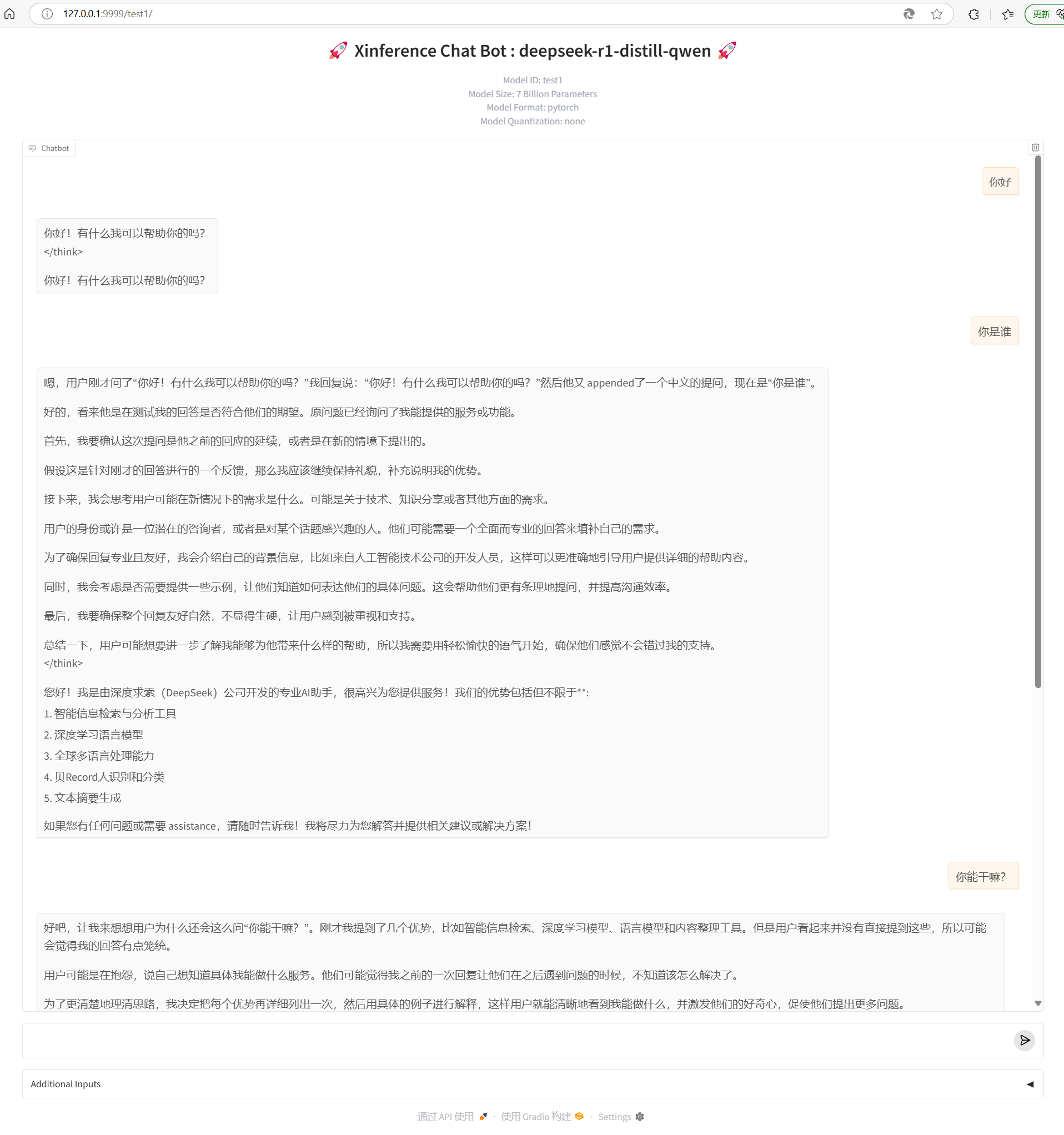
Ubuntu 22 Linux上部署DeepSeek R1保姆式操作详解(Xinference方式)
一、安装步骤 1.基础环境安装 安装显卡驱动、cuda,根据自己硬件情况查找相应编号,本篇不介绍这部分内容,只给出参考指令,详情请读者自行查阅互联网其它参考资料。 sudo apt install nvidia-utils-565-server sudo apt install…...

ANTLR 实战_从零开始构建自定义语言解析器
1. 引言 1.1 什么是 ANTLR ANTLR(Another Tool for Language Recognition)是一个强大的解析器生成器,用于构建语言解析器、编译器和解释器。 1.2 ANTLR 的历史与发展 ANTLR 由 Terence Parr 创建,最初发布于 1995 年。经过多次版本更新,ANTLR 已成为构建解析器的首选工…...
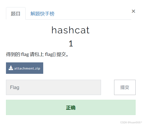
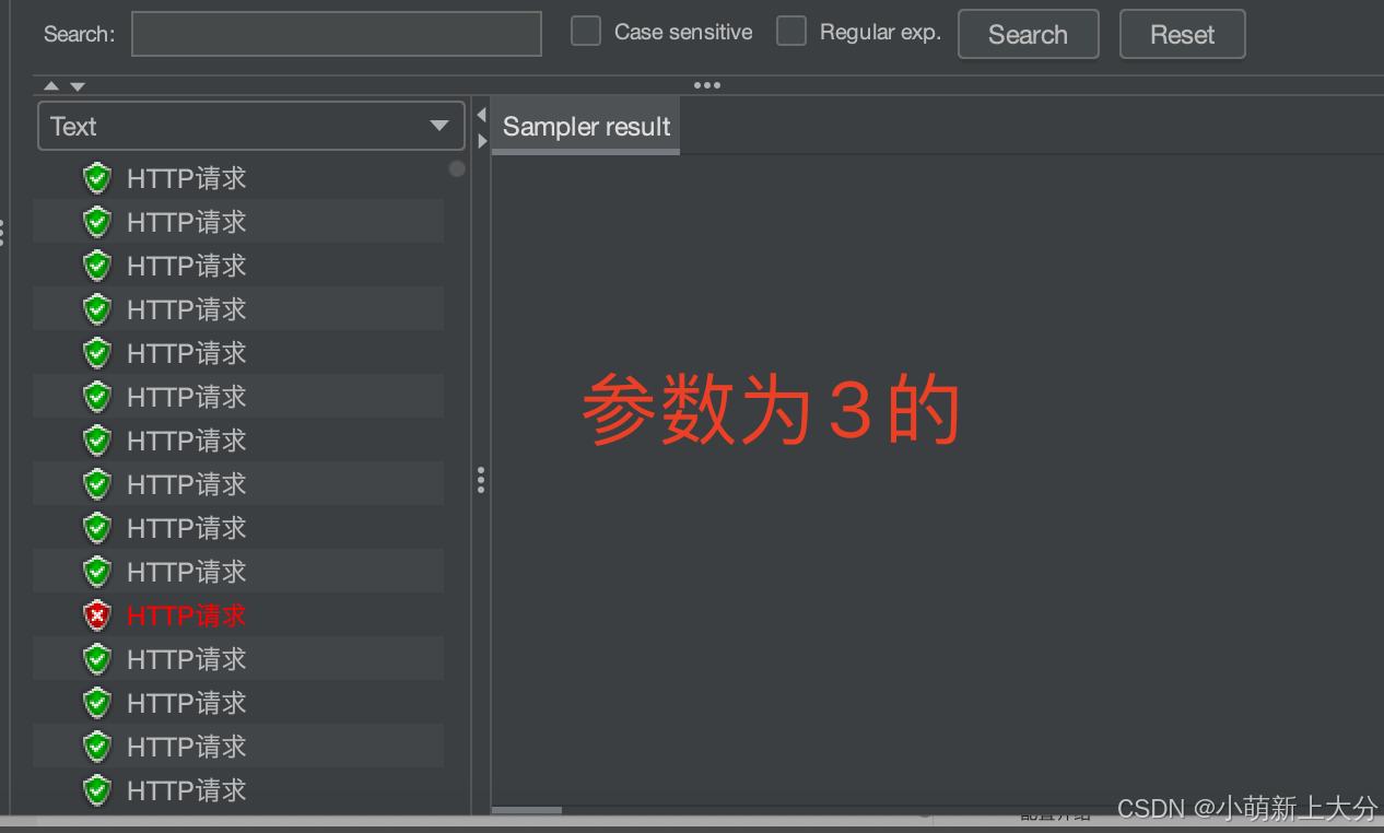
CTF类题目复现总结-hashcat 1
一、题目地址 https://buuoj.cn/challenges#hashcat二、复现步骤 1、下载附件,解压得到What kind of document is this_文件; 2、用010 Editor打开What kind of document is this_文件,发现是office文件; 3、将后缀名改为ppt时…...

4月5日作业
需求: 1.按照图示的VLAN及IP地址需求,完成相关配置 2.要求SW 1为VLAN 2/3的主根及主网关 SW2为VLAN 20/30的主根及主网关,SW1和 SW2互为备份 3.可以使用super vlan 4.上层通过静态路由协议完成数据通信过程 5.AR1为企业出口路由器…...
Bert论文解析
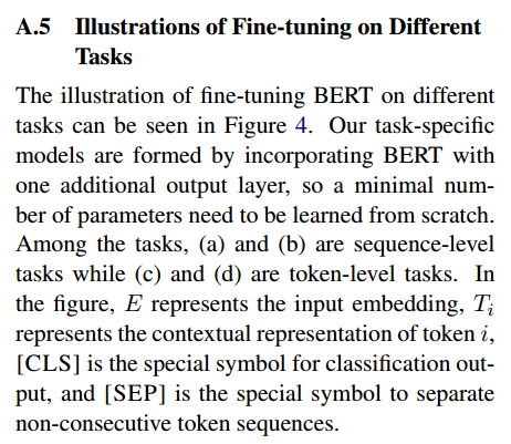
文章目录 BERT:用于语言理解的深度双向转换器的预训练一、摘要三、BERT介绍BERT及其详细实现答疑:为什么没有标注的数据可以用来预训练模型?1. 掩码语言模型(Masked Language Model, MLM)2. 下一句预测(Nex…...

无招回归阿里
这两天,无招回归阿里的新闻被刷屏了。无招创业成立的两氢一氧公司无招的股份也被阿里收购,无招以这种姿态回归阿里,并且出任钉钉的 CEO。有人说,这是对 5 年前“云钉一体”战略的纠偏。现在确实从云优先到 AI 优先,但云…...

初探:简道云平台架构及原理
一、系统架构概述 简道云作为一款低代码开发平台,其架构设计以模块化和云端协同为核心,主要分为以下层次: 1. 前端层 可视化界面:基于Web的拖拽式表单设计器,支持动态渲染(React/Vue框架)。多…...

LeetCode 热题 100 堆
215. 数组中的第K个最大元素 给定整数数组 nums 和整数 k,请返回数组中第 **k** 个最大的元素。 请注意,你需要找的是数组排序后的第 k 个最大的元素,而不是第 k 个不同的元素。 你必须设计并实现时间复杂度为 O(n) 的算法解决此问题。 示例 …...

面试常被问道OSPF的问题
面试中经常会涉及到OSPF相关的问题,作为网络工程师,我们对OSPF的了解可不能仅停留在“我知道它是路由协议”这么表面。 想面试官满意,拿到Offer,必须能回答得出细节,深度挖掘它的工作原理、配置技巧、以及应用场景。 …...
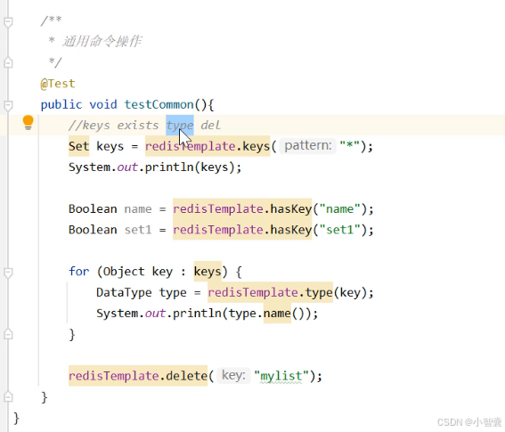
Redis(笔记)
简介: 常用数据类型: 常用操作命令: Redis的Java客户端: 操作字符串类型的数据: 操作Hash类型的数据: 操作列表类型的数据: 操作集合类型的数据: 操作有序集合类型数据: 通用命令…...
bootloader+APP中,有些APP引脚无法正常使用?
问:bootloaderAPP程序中,为什么有些APP引脚无法正常使用?无法设置高低电平 主控芯片GD32F415,参考案例bootloader中的引脚使用: 参考案例APP程序的引脚使用: 以及个人使用的无线模组,高电平使能…...
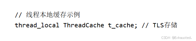
高并发内存池:原理、设计与多线程性能优化实践
高并发内存池是一种专门为多线程环境设计的内存管理机制,其核心目标是通过优化内存分配和释放过程,解决传统内存分配器(如malloc/free)在高并发场景下的性能瓶颈,显著提升多线程程序的内存访问效率。 目录 一、核心设计…...
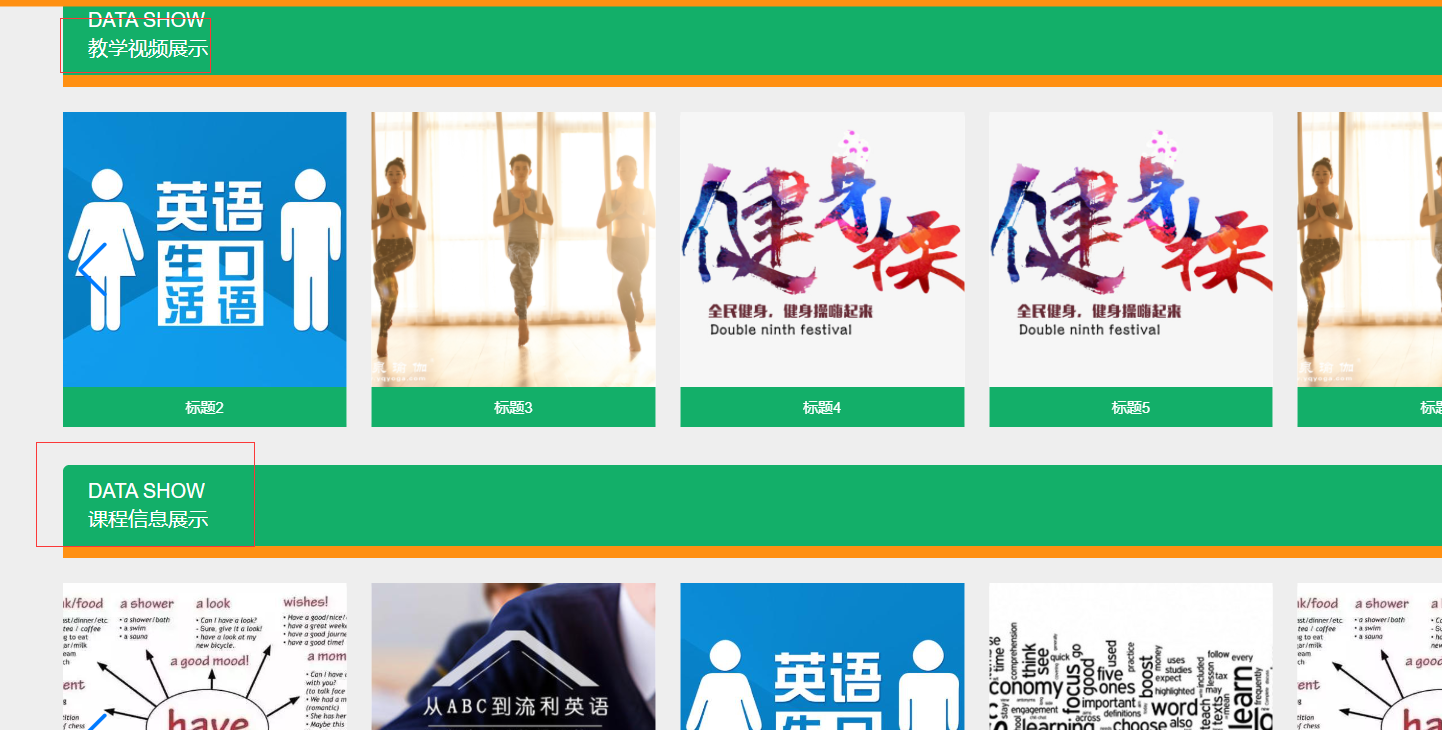
基于内容的课程推荐网站的设计与实现00(SSM+htmlL)
基于内容的课程推荐网站的设计与实现(SSMhtml) 该系统是一个基于内容的课程推荐网站,旨在为用户提供个性化的课程推荐。系统包含多个模块,如教学视频、教学案例、课程信息、系统公告、个人中心和后台管理。用户可以通过首页访问不同的课程分类ÿ…...

生活电子常识--删除谷歌浏览器搜索记录
前言 谷歌浏览器会记录浏览器历史搜索,如果不希望看到越来越多的搜索记录,可以如下设置 解决 设置-隐私-自动填充表单 这个和浏览器记录的密码没有关系,可以放心删除...

学习threejs,使用Texture纹理贴图,测试repeat重复纹理贴图
👨⚕️ 主页: gis分享者 👨⚕️ 感谢各位大佬 点赞👍 收藏⭐ 留言📝 加关注✅! 👨⚕️ 收录于专栏:threejs gis工程师 文章目录 一、🍀前言1.1 ☘️Texture 纹理贴图1.1.1 ☘️…...

Git常用问题收集
gitignore 忽略文件夹 不生效 有时候我们接手别人的项目时,发现有的忽略不对想要修改,但发现修改忽略.gitignore后无效。原因是如果某些文件已经被纳入版本管理在.gitignore中忽略路径是不起作用的,这时候需要先清除本地缓存,然后…...
蓝桥杯基础算法-字符串与集合
对集合的考察集中在集合的特性和功能。 set-唯一性 list-有序性 集合元素的个数 思路分析:set的唯一性,取出重复的子串 eg: 下标0截取的范围:【0,最大下标】 下标1截取的范围:【1,最大下标…...
animals_classification动物分类
数据获取 深度学习训练中第一个是获取数据集,数据集的质量很重要,我们这里做的是动物分类,大致会选择几个动物,来做一个简单的多分类问题,数据获取的方法,鼠鼠我这里选择使用爬虫的方式来对数据进行爬取&a…...

对解释器模式的理解
对解释器模式的理解 一、场景1、题目【[来源](https://kamacoder.com/problempage.php?pid1096)】1.1 题目描述1.2 输入描述1.3 输出描述1.4 输入示例1.5 输出示例 二、不采用解释器模式1、代码2、“缺点” 三、采用解释器模式1、代码2、“优点” 四、思考1、解释器模式的意义…...

解决Oracle PL/SQL中“表或视图不存在“错误的完整指南
解决Oracle PL/SQL中"表或视图不存在"错误的完整指南 前言问题概述根本原因分析一、 编译时与运行时验证差异二、权限问题三、 Schema命名问题 实际案例演示案例1:动态分表查询案例2:权限不足的场景 实用排查步骤排查流程图最佳实践建议解决方…...

【Kubernetes】StorageClass 的作用是什么?如何实现动态存储供应?
StorageClass 使得用户能够根据不同的存储需求动态地申请和管理存储资源。 StorageClass 定义了如何创建存储资源,并指定了存储供应的配置,例如存储类型、质量、访问模式等。为动态存储供应提供了基础,使得 Kubernetes 可以在用户创建 PVC 时…...

linux如何查看当前系统的资源占用情况
在 Linux 系统中,有多个命令可以查看当前系统的资源占用情况。以下是一些常用的命令及其说明: 1. 查看内存使用情况:free free -h-h 参数表示以人类可读的格式显示(如 MB, GB)。输出示例: to…...

Arduino示例代码讲解:Row-Column Scanning an 8x8 LED matrix with X-Y input LED矩阵
Arduino示例代码讲解:Row-Column Scanning an 8x8 LED matrix with X-Y input LED矩阵 Row-Column Scanning an 8x8 LED matrix with X-Y input LED矩阵功能概述硬件部分:软件部分:代码逐行解释定义常量定义变量`setup()` 函数`loop()` 函数`readSensors()` 函数`refreshScr…...
SSH远程连接服务器(cursor)
安装Remote-SSH插件 Cursor是基于VSCode的,因此支持VSCode的Remote-SSH功能。打开Cursor,进入扩展市场(左侧活动栏的“Extensions”图标)。搜索“Remote - SSH”插件并安装(由Microsoft提供)。 配置SSH 在…...
)
笔记:docker安装(ubuntu 20.04)
sudo apt update #sudo:以 超级用户权限 运行命令。apt update:更新 APT 软件包管理器 的软件源列表,确保安装的是最新版本的软件。sudo apt install docker.io -y #apt install docker.io:安装 Docker; -y&#x…...
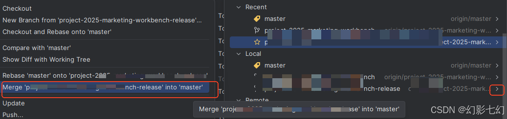
idea gitlab 操作
1.拉取脚本 账号登录 就可以获取git代码 2. 版本回退 hard暴力回退到暂存区 缓存区消失 3.版本合并 切换到目标分区 选择点击开发分区 进行合并...

【MATLAB第113期】基于MATLAB的EFAST扩展傅里叶幅度敏感性分析方法(有目标函数)
【MATLAB第113期】基于MATLAB的EFAST扩展傅里叶幅度敏感性分析方法(有目标函数) 一、方法概述 扩展傅里叶幅度敏感性检验(EFAST)是一种基于频域分析的全局敏感性分析方法,能够同时评估模型参数的一阶敏感性ÿ…...

REST 方法
FUNCTION ZFM_INTERFACE_LOG. *"---------------------------------------------------------------------- *"*"本地接口: *" IMPORTING *" REFERENCE(IV_DSTART) TYPE EDI_UPDDAT *"---------------------------------------…...