Android 自定义View之圆形进度条
很多场景下都用到这种进度条,有的还带动画效果,

今天我也来写一个。
写之前先拆解下它的组成:
- 底层圆形
- 上层弧形
- 中间文字
那我们要做的就是:
- 绘制底层圆形;
- 在同位置绘制上层弧形,但颜色不同;
- 在中心点绘制文本,显示进度。
按照这个目标,学习下自定义View的流程。
1.基础
新建一个类,继承 View ,重写构造函数,如,
package com.test.luodemo.customerview;import android.content.Context;
import android.util.AttributeSet;
import android.view.View;import androidx.annotation.Nullable;public class CircleProgressBar extends View {public CircleProgressBar(Context context) {super(context);}public CircleProgressBar(Context context, @Nullable AttributeSet attrs) {super(context, attrs);}public CircleProgressBar(Context context, @Nullable AttributeSet attrs, int defStyleAttr) {super(context, attrs, defStyleAttr);}
}
在 xml 中使用,LinearLayout 加了背景颜色,方便看出所在位置。
<LinearLayoutandroid:layout_width="wrap_content"android:layout_height="wrap_content"android:background="@color/purple_200"><com.test.luodemo.customerview.CircleProgressBarandroid:layout_width="300dp"android:layout_height="300dp"/></LinearLayout>
此时运行,是没效果的,因为这个View还没有绘制,啥也没有。
2.绘制底层圆形
初始化3个图形的画笔 ,底层圆形和上层弧形的画笔宽度一致、颜色不一致,方便区分
重写 onDraw(Canvas canvas) 方法,用 canvas.drawCircle 绘制底层圆形,
package com.test.luodemo.customerview;import android.content.Context;
import android.graphics.Canvas;
import android.graphics.Color;
import android.graphics.Paint;
import android.util.AttributeSet;
import android.view.View;import androidx.annotation.Nullable;public class CircleProgressBar extends View {private Paint paintCircleBottom = new Paint();private Paint paintArcTop = new Paint();private Paint paintText = new Paint();public CircleProgressBar(Context context) {super(context);init();}public CircleProgressBar(Context context, @Nullable AttributeSet attrs) {super(context, attrs);init();}public CircleProgressBar(Context context, @Nullable AttributeSet attrs, int defStyleAttr) {super(context, attrs, defStyleAttr);init();}private void init(){//初始化文本的画笔paintText.setFlags(Paint.ANTI_ALIAS_FLAG);paintText.setColor(Color.BLACK);paintText.setTextAlign(Paint.Align.CENTER);paintText.setTextSize(80f);//初始化底层圆形的画笔paintCircleBottom.setFlags(Paint.ANTI_ALIAS_FLAG);paintCircleBottom.setColor(Color.LTGRAY);paintCircleBottom.setStrokeWidth(10f);paintCircleBottom.setStrokeCap(Paint.Cap.ROUND);paintCircleBottom.setStyle(Paint.Style.STROKE);//初始化弧形的画笔paintArcTop.setFlags(Paint.ANTI_ALIAS_FLAG);paintArcTop.setColor(Color.MAGENTA);paintArcTop.setStrokeWidth(10f);paintArcTop.setStrokeCap(Paint.Cap.ROUND);paintArcTop.setStyle(Paint.Style.STROKE);}@Overrideprotected void onDraw(Canvas canvas) {super.onDraw(canvas);//绘制底层圆形canvas.drawCircle(300, 300, 200, paintCircleBottom);}
}
效果,

3.绘制上层弧形
在之前的基础上绘制上层弧形,弧形的中心和圆心一致。
用 canvas.drawArc 绘制弧形。这里直接指定绘制的角度是 90° ,后续会动态指定。
@Overrideprotected void onDraw(Canvas canvas) {super.onDraw(canvas);//绘制底层圆形canvas.drawCircle( 300, 300, 200, paintCircleBottom);//绘制上层弧形,从顶部开始,顺时针走90°_angle = 90;canvas.drawArc(100,100,500,500,270, _angle,false, paintArcTop);}
效果,

4.绘制文本
用 canvas.drawText 绘制文本,
使用 DecimalFormat 格式化输入,保留小数点后两位,如果小数点后两位都是0则不显示小数点后两位。
@Overrideprotected void onDraw(Canvas canvas) {super.onDraw(canvas);//绘制底层圆形canvas.drawCircle(300, 300, 200, paintCircleBottom);//绘制上层弧形,从顶部开始,顺时针走90°_angle = 90;canvas.drawArc(100,100,500,500,270, _angle,false, paintArcTop);//绘制文本DecimalFormat dt = new DecimalFormat("0.##");canvas.drawText(dt.format(100 * _angle/360)+"%", 300 , 300, paintText);}
效果,

可以看到,文本虽然居中,但是文本是显示在中心线上,

期望结果是文本的水平中心线和圆心重合,改为,
//绘制文本,文字中心和圆心保持一致Paint.FontMetrics fontMetrics = paintText.getFontMetrics();float distance =(fontMetrics.bottom - fontMetrics.top)/2 - fontMetrics.bottom;float baseline= 300 + distance;canvas.drawText(dt.format(100 * _angle/360)+"%", 300, baseline, paintText);//文字中心和圆心一致
效果,复合预期。

5.添加动画
创建一个设置进度的接口,供外部调用。
使用 ValueAnimator ,监听动画过程,然后逐渐刷新角度值。使用 AccelerateInterpolator 插值器,动画速度开始慢、逐渐加速。
@Overrideprotected void onDraw(Canvas canvas) {super.onDraw(canvas);//绘制底层圆形canvas.drawCircle(300, 300, 200, paintCircleBottom);//绘制上层弧形,从顶部开始,顺时针走90°canvas.drawArc(100,100,500,500,270, _angle,false, paintArcTop);//绘制文本,文字中心和圆心保持一致DecimalFormat dt = new DecimalFormat("0.##");Paint.FontMetrics fontMetrics = paintText.getFontMetrics();float distance =(fontMetrics.bottom - fontMetrics.top)/2 - fontMetrics.bottom;float baseline= 300 + distance;canvas.drawText(dt.format(100 * _angle/360)+"%", 300, baseline, paintText);//文字中心和圆心一致}/*** 设置进度,展现动画* */public void setProgress(int progress){ValueAnimator animator = ValueAnimator.ofFloat(0,100f);animator.addUpdateListener(new ValueAnimator.AnimatorUpdateListener() {@Overridepublic void onAnimationUpdate(ValueAnimator animation) {float cur = (float) animation.getAnimatedValue();_angle = cur/100 * 360 * progress/100;invalidate(); //刷新 View}});animator.setDuration(3000);animator.setInterpolator(new AccelerateInterpolator());animator.start();}
注意要去掉 3.绘制上层弧形 中固定90°的逻辑。
外部调用,
CircleProgressBar mCircleProgressBar1 = (CircleProgressBar) findViewById(R.id.circle_progress_bar1);
mCircleProgressBar1.setProgress((int) (100 * Math.random()));
随机生成一个 0.0 - 0.1 的数值,乘以 100 设置为进度。
效果,

可以看到动画效果, 虽然 git 丢帧了 ~ 。
6.调整位置、宽高
前文我是设定了 View 宽高都是 300dp ,并且绘制图形是随意指定的坐标。
实际开发时,不可能用这些值,所以要优化下绘制的逻辑。
实际使用时,可能宽度高度一样,宽度大于高度 ,宽度小于高度,
采用这个逻辑:
- 取宽度、高度的最小值,作为圆的直径,除以 2 得到半径。
- 对角线交汇点作为圆心。
简言之,以对角线为圆心画最大内切圆。
重写 onMeasure 方法,重绘 View 的宽高,这部分参考《Android 开发艺术探索》,
private int DEFAULT_WIDTH = 100;//默认宽度private int DEFAULT_HEIGHT = 100;//默认宽度private int DEFAULT_RADIUS = 50;//默认半径@Overrideprotected void onMeasure(int widthMeasureSpec, int heightMeasureSpec) {super.onMeasure(widthMeasureSpec, heightMeasureSpec);int widthMode = MeasureSpec.getMode(widthMeasureSpec);int heightMode = MeasureSpec.getMode(heightMeasureSpec);if (widthMode == MeasureSpec.AT_MOST && heightMode == MeasureSpec.AT_MOST) {setMeasuredDimension(DEFAULT_WIDTH, DEFAULT_HEIGHT);} else if (widthMode == MeasureSpec.AT_MOST) {setMeasuredDimension(DEFAULT_WIDTH, heightMeasureSpec);} else if (heightMode == MeasureSpec.AT_MOST) {setMeasuredDimension(widthMeasureSpec, DEFAULT_HEIGHT);}}
修改 onDraw 绘制逻辑 ,
@Overrideprotected void onDraw(Canvas canvas) {super.onDraw(canvas);// 圆心坐标是(centerX,centerY)int centerX = getWidth()/2;int centerY = getHeight()/2;//确定半径float radius = Math.min(centerX, centerY) - paintCircleBottom.getStrokeWidth();//绘制底层圆形canvas.drawCircle(centerX, centerY, radius, paintCircleBottom);//绘制上层弧形,从顶部开始,顺时针走 _anglecanvas.drawArc(centerX - radius,centerY-radius,centerX + radius,centerY + radius,270, _angle,false, paintArcTop);//绘制文本,文字中心和圆心保持一致Paint.FontMetrics fontMetrics = paintText.getFontMetrics();float distance =(fontMetrics.bottom - fontMetrics.top)/2 - fontMetrics.bottom;float baseline= centerY + distance;canvas.drawText(dt.format(100 * _angle/360)+"%", centerX, baseline, paintText);//文字中心和圆心一致}
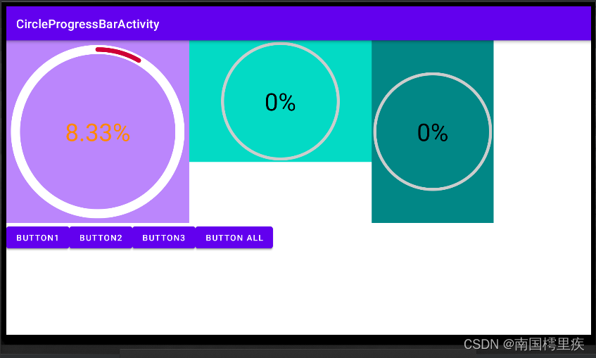
分别写了 3 个布局,布局依次是 宽度等于高度 、宽度大宇高度、宽度小于高度,效果,

至此,基本是一个还可以的版本了。
附代码
贴下当前代码,
CircleProgressBar.java
package com.test.luodemo.customerview;import android.animation.ValueAnimator;
import android.content.Context;
import android.graphics.Canvas;
import android.graphics.Color;
import android.graphics.Paint;
import android.util.AttributeSet;
import android.util.Log;
import android.view.View;
import android.view.animation.AccelerateInterpolator;import androidx.annotation.Nullable;import java.text.DecimalFormat;public class CircleProgressBar extends View {private Paint paintCircleBottom = new Paint();private Paint paintArcTop = new Paint();private Paint paintText = new Paint();private int DEFAULT_WIDTH = 100;//默认宽度private int DEFAULT_HEIGHT = 100;//默认宽度private int DEFAULT_RADIUS = 50;//默认半径private float _angle;//弧形的角度public CircleProgressBar(Context context) {super(context);init();}public CircleProgressBar(Context context, @Nullable AttributeSet attrs) {super(context, attrs);init();}public CircleProgressBar(Context context, @Nullable AttributeSet attrs, int defStyleAttr) {super(context, attrs, defStyleAttr);init();}private void init(){//初始化文本的画笔paintText.setFlags(Paint.ANTI_ALIAS_FLAG);paintText.setColor(Color.BLACK);paintText.setTextAlign(Paint.Align.CENTER);paintText.setTextSize(80f);//初始化底层圆形的画笔paintCircleBottom.setFlags(Paint.ANTI_ALIAS_FLAG);paintCircleBottom.setColor(Color.LTGRAY);paintCircleBottom.setStrokeWidth(10f);paintCircleBottom.setStrokeCap(Paint.Cap.ROUND);paintCircleBottom.setStyle(Paint.Style.STROKE);//初始化弧形的画笔paintArcTop.setFlags(Paint.ANTI_ALIAS_FLAG);paintArcTop.setColor(Color.MAGENTA);paintArcTop.setStrokeWidth(10f);paintArcTop.setStrokeCap(Paint.Cap.ROUND);paintArcTop.setStyle(Paint.Style.STROKE);}@Overrideprotected void onMeasure(int widthMeasureSpec, int heightMeasureSpec) {super.onMeasure(widthMeasureSpec, heightMeasureSpec);int widthMode = MeasureSpec.getMode(widthMeasureSpec);int heightMode = MeasureSpec.getMode(heightMeasureSpec);if (widthMode == MeasureSpec.AT_MOST && heightMode == MeasureSpec.AT_MOST) {setMeasuredDimension(DEFAULT_WIDTH, DEFAULT_HEIGHT);} else if (widthMode == MeasureSpec.AT_MOST) {setMeasuredDimension(DEFAULT_WIDTH, heightMeasureSpec);} else if (heightMode == MeasureSpec.AT_MOST) {setMeasuredDimension(widthMeasureSpec, DEFAULT_HEIGHT);}}@Overrideprotected void onDraw(Canvas canvas) {super.onDraw(canvas);// 圆心坐标是(centerX,centerY)int centerX = getWidth()/2;int centerY = getHeight()/2;//确定半径float radius = Math.min(centerX, centerY) - paintCircleBottom.getStrokeWidth();//绘制底层圆形canvas.drawCircle(centerX, centerY, radius, paintCircleBottom);//绘制上层弧形,从顶部开始,顺时针走90°canvas.drawArc(centerX - radius,centerY-radius,centerX + radius,centerY + radius,270, _angle,false, paintArcTop);//绘制文本,文字中心和圆心保持一致DecimalFormat dt = new DecimalFormat("0.##");Paint.FontMetrics fontMetrics = paintText.getFontMetrics();float distance =(fontMetrics.bottom - fontMetrics.top)/2 - fontMetrics.bottom;float baseline= centerY + distance;canvas.drawText(dt.format(100 * _angle/360)+"%", centerX, baseline, paintText);//文字中心和圆心一致}/*** 设置进度,展现动画* */public void setProgress(int progress){ValueAnimator animator = ValueAnimator.ofFloat(0,100f);animator.addUpdateListener(new ValueAnimator.AnimatorUpdateListener() {@Overridepublic void onAnimationUpdate(ValueAnimator animation) {float cur = (float) animation.getAnimatedValue();_angle = cur/100 * 360 * progress/100;invalidate();}});animator.setDuration(3000);animator.setInterpolator(new AccelerateInterpolator());animator.start();}
}
布局文件
<?xml version="1.0" encoding="utf-8"?>
<LinearLayout xmlns:android="http://schemas.android.com/apk/res/android"xmlns:app="http://schemas.android.com/apk/res-auto"xmlns:tools="http://schemas.android.com/tools"android:layout_width="match_parent"android:layout_height="match_parent"android:orientation="vertical"tools:context=".customerview.CircleProgressBarActivity"><LinearLayoutandroid:layout_width="match_parent"android:layout_height="wrap_content"android:orientation="horizontal"><LinearLayoutandroid:layout_width="wrap_content"android:layout_height="wrap_content"android:background="@color/purple_200"><com.test.luodemo.customerview.CircleProgressBarandroid:id="@+id/circle_progress_bar1"android:layout_width="300dp"android:layout_height="300dp" /></LinearLayout><LinearLayoutandroid:layout_width="wrap_content"android:layout_height="wrap_content"android:background="@color/teal_200"><com.test.luodemo.customerview.CircleProgressBarandroid:id="@+id/circle_progress_bar2"android:layout_width="300dp"android:layout_height="200dp" /></LinearLayout><LinearLayoutandroid:layout_width="wrap_content"android:layout_height="wrap_content"android:background="@color/teal_700"><com.test.luodemo.customerview.CircleProgressBarandroid:id="@+id/circle_progress_bar3"android:layout_width="200dp"android:layout_height="300dp" /></LinearLayout><!--<LinearLayoutandroid:layout_width="50dp"android:layout_height="70dp"android:background="@color/purple_200"><com.test.luodemo.customerview.CircleProgressBarandroid:layout_width="match_parent"android:layout_height="match_parent"/></LinearLayout><LinearLayoutandroid:layout_width="wrap_content"android:layout_height="wrap_content"android:background="@color/purple_200"><com.test.luodemo.customerview.CircleProgressBarandroid:layout_width="wrap_content"android:layout_height="wrap_content"/></LinearLayout>--></LinearLayout><LinearLayoutandroid:layout_width="match_parent"android:layout_height="wrap_content"android:visibility="visible"><Buttonandroid:id="@+id/button_cpb1"android:layout_width="wrap_content"android:layout_height="wrap_content"android:onClick="onCPBButtonClick"android:text="Button1" /><Buttonandroid:id="@+id/button_cpb2"android:layout_width="wrap_content"android:layout_height="wrap_content"android:onClick="onCPBButtonClick"android:text="Button2" /><Buttonandroid:id="@+id/button_cpb3"android:layout_width="wrap_content"android:layout_height="wrap_content"android:onClick="onCPBButtonClick"android:text="Button3" /><Buttonandroid:id="@+id/button_cpb_all"android:layout_width="wrap_content"android:layout_height="wrap_content"android:onClick="onCPBButtonClick"android:text="Button All" /></LinearLayout></LinearLayout>
Activity 调用
public class CircleProgressBarActivity extends AppCompatActivity {private CircleProgressBar mCircleProgressBar1 , mCircleProgressBar2 , mCircleProgressBar3;@Overrideprotected void onCreate(Bundle savedInstanceState) {super.onCreate(savedInstanceState);setContentView(R.layout.activity_circle_progress_bar);Objects.requireNonNull(getSupportActionBar()).setTitle("CircleProgressBarActivity");mCircleProgressBar1 = (CircleProgressBar) findViewById(R.id.circle_progress_bar1);mCircleProgressBar2 = (CircleProgressBar) findViewById(R.id.circle_progress_bar2);mCircleProgressBar3 = (CircleProgressBar) findViewById(R.id.circle_progress_bar3);}public void onCPBButtonClick(View view) {switch (view.getId()) {case R.id.button_cpb1:mCircleProgressBar1.setProgress((int) (100 * Math.random()));break;case R.id.button_cpb2:mCircleProgressBar2.setProgress((int) (100 * Math.random()));break;case R.id.button_cpb3:mCircleProgressBar3.setProgress((int) (100 * Math.random()));break;case R.id.button_cpb_all:mCircleProgressBar1.setProgress((int) (100 * Math.random()));mCircleProgressBar2.setProgress((int) (100 * Math.random()));mCircleProgressBar3.setProgress((int) (100 * Math.random()));break;default:break;}}
}
7.自定义属性 attr
需求是不停的,会有这些需求:可指定画笔(宽度、颜色等)、可指定动画时长等。
这些可以通过在自定义的View中创建 Java 接口来设置,但我要学自定义View,就要用 attr 。
7.1 创建 res/values/attrs.xml
如果已有就不用创建,直接用就行了。
写入如下内容,
<?xml version="1.0" encoding="utf-8"?>
<resources><!-- 圆形进度条 --><declare-styleable name="CircleProgressBar"><attr name="circleWidth" format="float" /> <!--底层圆形宽度--><attr name="circleColor" format="color" /> <!--底层圆形颜色--><attr name="arcWidth" format="float" /> <!--上层弧形宽度--><attr name="arcColor" format="color" /><!--上层弧形颜色--><attr name="textColor" format="color" /><!--文本颜色--><attr name="textSize" format="float" /><!--文本字体大小--><attr name="initProgress" format="integer" /><!--进度--></declare-styleable>
</resources>
<declare-styleable name="CircleProgressBar"> 中 CircleProgressBar 就是自定义 View 的名字,要保持一致。
不一致AS会报黄,
By convention, the custom view (CircleProgressBar) and the declare-styleable (CircleProgressBar111) should have the same name (various editor features rely on this convention)
<attr name="circleWidth" format="float" /> 是 CircleProgressBar 的属性,可指定类型
| 类型 | 说明 |
|---|---|
| boolean | 布尔类型,true 或 false |
| color | 颜色值,如 @android:color/white |
| dimension | dp 值,如 20dp |
| enum | 枚举 |
| flags | 位或运算,如 app:cus_view_gravity=“top|right” |
| fraction | 百分比,如 30% |
| float | float 型 |
| integer | int 型 |
| reference | 引用资源,如 @drawable/pic |
| string | 字符串 |
7.2 使用 TypedArray 获取 attrs
在构造函数中,通过 TypedArray 获取自定义的属性。基本逻辑就是有设置 attr 就用设置的值,没有就用默认值。
使用后一定要调用 TypedArray.recycle();
public CircleProgressBar(Context context, @Nullable AttributeSet attrs) {super(context, attrs);TypedArray typedArray = context.obtainStyledAttributes(attrs, R.styleable.CircleProgressBar);textColor = typedArray.getColor(R.styleable.CircleProgressBar_textColor, Color.BLACK);textSize = typedArray.getFloat(R.styleable.CircleProgressBar_textSize, 80f);circleColor = typedArray.getColor(R.styleable.CircleProgressBar_circleColor, Color.LTGRAY);circleWidth = typedArray.getFloat(R.styleable.CircleProgressBar_circleWidth, 10f);arcColor = typedArray.getColor(R.styleable.CircleProgressBar_arcColor, Color.MAGENTA);arcWidth = typedArray.getFloat(R.styleable.CircleProgressBar_arcWidth, 10f);progress = typedArray.getInt(R.styleable.CircleProgressBar_initProgress, 0);typedArray.recycle();init();}
有两个带 AttributeSet 参数的构造函数,
- public CircleProgressBar(Context context, @Nullable AttributeSet attrs) {}
- public CircleProgressBar(Context context, @Nullable AttributeSet attrs, int defStyleAttr) {}
为什么用后面这个? 因为我们是在 xml 中定义的 CircleProgressBar 。参考源码说明,
/*** Constructor that is called when inflating a view from XML. This is called* when a view is being constructed from an XML file, supplying attributes* that were specified in the XML file. This version uses a default style of* 0, so the only attribute values applied are those in the Context's Theme* and the given AttributeSet.** <p>* The method onFinishInflate() will be called after all children have been* added.** @param context The Context the view is running in, through which it can* access the current theme, resources, etc.* @param attrs The attributes of the XML tag that is inflating the view.* @see #View(Context, AttributeSet, int)*/public View(Context context, @Nullable AttributeSet attrs) {this(context, attrs, 0);}/*** Perform inflation from XML and apply a class-specific base style from a* theme attribute. This constructor of View allows subclasses to use their* own base style when they are inflating. For example, a Button class's* constructor would call this version of the super class constructor and* supply <code>R.attr.buttonStyle</code> for <var>defStyleAttr</var>; this* allows the theme's button style to modify all of the base view attributes* (in particular its background) as well as the Button class's attributes.** @param context The Context the view is running in, through which it can* access the current theme, resources, etc.* @param attrs The attributes of the XML tag that is inflating the view.* @param defStyleAttr An attribute in the current theme that contains a* reference to a style resource that supplies default values for* the view. Can be 0 to not look for defaults.* @see #View(Context, AttributeSet)*/public View(Context context, @Nullable AttributeSet attrs, int defStyleAttr) {this(context, attrs, defStyleAttr, 0);}
7.3 在 xml 中初始化 attr
xml 关键代码如下,
<LinearLayout xmlns:android="http://schemas.android.com/apk/res/android"xmlns:app="http://schemas.android.com/apk/res-auto" <!-- 注释1-->	xmlns:tools="http://schemas.android.com/tools"android:layout_width="match_parent"android:layout_height="match_parent"android:orientation="vertical"tools:context=".customerview.CircleProgressBarActivity"><!-- ... -->	<LinearLayoutandroid:layout_width="wrap_content"android:layout_height="wrap_content"android:background="@color/purple_200"><com.test.luodemo.customerview.CircleProgressBarandroid:id="@+id/circle_progress_bar1"android:layout_width="300dp"android:layout_height="300dp"<!-- 注释2-->	app:circleColor="@android:color/white"app:circleWidth="30"app:arcColor="@color/my_red"app:arcWidth="15"app:textColor="@android:color/holo_orange_dark"app:initProgress="30"<!-- 注释2-->/></LinearLayout><!-- ... -->
</LinearLayout>
注释2处就是初始化 attr ,以为 app: 开头是对应注释1处。
7.4 效果
左一是自定义 attr 的效果,左二、左三是没有自定义 attr 的效果。
差异有:底层圆形的颜色、画笔大小;上层弧形的颜色、画笔大小、开始的角度;中间文字的颜色。
说明自定义 attr 起效了。
附代码V2
CircleProgressBar.java
package com.test.luodemo.customerview;import android.animation.ValueAnimator;
import android.content.Context;
import android.content.res.TypedArray;
import android.graphics.Canvas;
import android.graphics.Color;
import android.graphics.Paint;
import android.util.AttributeSet;
import android.util.Log;
import android.view.View;
import android.view.animation.AccelerateInterpolator;import androidx.annotation.Nullable;import com.test.luodemo.R;import java.text.DecimalFormat;public class CircleProgressBar extends View {private Paint paintCircleBottom = new Paint();private Paint paintArcTop = new Paint();private Paint paintText = new Paint();private int DEFAULT_WIDTH = 100;//默认宽度private int DEFAULT_HEIGHT = 100;//默认宽度private int DEFAULT_RADIUS = 50;//默认半径private float _angle;//弧形的角度/***************************** attr *******************************/int textColor;float textSize;int circleColor ;int arcColor;float circleWidth;float arcWidth;int progress;/***************************** attr *******************************/public CircleProgressBar(Context context) {super(context);init();}public CircleProgressBar(Context context, @Nullable AttributeSet attrs) {super(context, attrs);TypedArray typedArray = context.obtainStyledAttributes(attrs, R.styleable.CircleProgressBar);textColor = typedArray.getColor(R.styleable.CircleProgressBar_textColor, Color.BLACK);textSize = typedArray.getFloat(R.styleable.CircleProgressBar_textSize, 80f);circleColor = typedArray.getColor(R.styleable.CircleProgressBar_circleColor, Color.LTGRAY);circleWidth = typedArray.getFloat(R.styleable.CircleProgressBar_circleWidth, 10f);arcColor = typedArray.getColor(R.styleable.CircleProgressBar_arcColor, Color.MAGENTA);arcWidth = typedArray.getFloat(R.styleable.CircleProgressBar_arcWidth, 10f);progress = typedArray.getInt(R.styleable.CircleProgressBar_initProgress, 0);typedArray.recycle();init();}public CircleProgressBar(Context context, @Nullable AttributeSet attrs, int defStyleAttr) {super(context, attrs, defStyleAttr);init();}private void init(){//初始化文本的画笔paintText.setFlags(Paint.ANTI_ALIAS_FLAG);paintText.setStyle(Paint.Style.FILL);paintText.setColor(textColor);//设置自定义属性值paintText.setTextAlign(Paint.Align.CENTER);paintText.setTextSize(textSize);//初始化底层圆形的画笔paintCircleBottom.setFlags(Paint.ANTI_ALIAS_FLAG);paintCircleBottom.setStrokeCap(Paint.Cap.ROUND);paintCircleBottom.setStyle(Paint.Style.STROKE);paintCircleBottom.setColor(circleColor);//设置自定义属性值paintCircleBottom.setStrokeWidth(circleWidth);//设置自定义属性值//初始化弧形的画笔paintArcTop.setFlags(Paint.ANTI_ALIAS_FLAG);paintArcTop.setStrokeCap(Paint.Cap.ROUND);paintArcTop.setStyle(Paint.Style.STROKE);paintArcTop.setColor(arcColor);//设置自定义属性值paintArcTop.setStrokeWidth(arcWidth);//设置自定义属性值_angle = progress;}@Overrideprotected void onMeasure(int widthMeasureSpec, int heightMeasureSpec) {super.onMeasure(widthMeasureSpec, heightMeasureSpec);int widthMode = MeasureSpec.getMode(widthMeasureSpec);int heightMode = MeasureSpec.getMode(heightMeasureSpec);if (widthMode == MeasureSpec.AT_MOST && heightMode == MeasureSpec.AT_MOST) {setMeasuredDimension(DEFAULT_WIDTH, DEFAULT_HEIGHT);} else if (widthMode == MeasureSpec.AT_MOST) {setMeasuredDimension(DEFAULT_WIDTH, heightMeasureSpec);} else if (heightMode == MeasureSpec.AT_MOST) {setMeasuredDimension(widthMeasureSpec, DEFAULT_HEIGHT);}}@Overrideprotected void onDraw(Canvas canvas) {super.onDraw(canvas);// 圆心坐标是(centerX,centerY)int centerX = getWidth()/2;int centerY = getHeight()/2;//确定半径float radius = Math.min(centerX, centerY) - paintCircleBottom.getStrokeWidth();//绘制底层圆形canvas.drawCircle(centerX, centerY, radius, paintCircleBottom);//绘制上层弧形,从顶部开始,顺时针走90°canvas.drawArc(centerX - radius,centerY-radius,centerX + radius,centerY + radius,270, _angle,false, paintArcTop);//绘制文本,文字中心和圆心保持一致DecimalFormat dt = new DecimalFormat("0.##");Paint.FontMetrics fontMetrics = paintText.getFontMetrics();float distance =(fontMetrics.bottom - fontMetrics.top)/2 - fontMetrics.bottom;float baseline= centerY + distance;canvas.drawText(dt.format(100 * _angle/360)+"%", centerX, baseline, paintText);//文字中心和圆心一致}/*** 设置进度,展现动画* */public void setProgress(int progress){ValueAnimator animator = ValueAnimator.ofFloat(0,100f);animator.addUpdateListener(new ValueAnimator.AnimatorUpdateListener() {@Overridepublic void onAnimationUpdate(ValueAnimator animation) {float cur = (float) animation.getAnimatedValue();_angle = cur/100 * 360 * progress/100;invalidate();}});animator.setDuration(3000);animator.setInterpolator(new AccelerateInterpolator());animator.start();}
}
布局文件
<?xml version="1.0" encoding="utf-8"?>
<LinearLayout xmlns:android="http://schemas.android.com/apk/res/android"xmlns:app="http://schemas.android.com/apk/res-auto"xmlns:tools="http://schemas.android.com/tools"android:layout_width="match_parent"android:layout_height="match_parent"android:orientation="vertical"tools:context=".customerview.CircleProgressBarActivity"><LinearLayoutandroid:layout_width="match_parent"android:layout_height="wrap_content"android:orientation="horizontal"><LinearLayoutandroid:layout_width="wrap_content"android:layout_height="wrap_content"android:background="@color/purple_200"><com.test.luodemo.customerview.CircleProgressBarandroid:id="@+id/circle_progress_bar1"android:layout_width="300dp"android:layout_height="300dp"app:circleColor="@android:color/white"app:circleWidth="30"app:arcColor="@color/my_red"app:arcWidth="15"app:textColor="@android:color/holo_orange_dark"app:initProgress="30"/></LinearLayout><LinearLayoutandroid:layout_width="wrap_content"android:layout_height="wrap_content"android:background="@color/teal_200"><com.test.luodemo.customerview.CircleProgressBarandroid:id="@+id/circle_progress_bar2"android:layout_width="300dp"android:layout_height="200dp" /></LinearLayout><LinearLayoutandroid:layout_width="wrap_content"android:layout_height="wrap_content"android:background="@color/teal_700"><com.test.luodemo.customerview.CircleProgressBarandroid:id="@+id/circle_progress_bar3"android:layout_width="200dp"android:layout_height="300dp" /></LinearLayout></LinearLayout><LinearLayoutandroid:layout_width="match_parent"android:layout_height="wrap_content"android:visibility="visible"><Buttonandroid:id="@+id/button_cpb1"android:layout_width="wrap_content"android:layout_height="wrap_content"android:onClick="onCPBButtonClick"android:text="Button1" /><Buttonandroid:id="@+id/button_cpb2"android:layout_width="wrap_content"android:layout_height="wrap_content"android:onClick="onCPBButtonClick"android:text="Button2" /><Buttonandroid:id="@+id/button_cpb3"android:layout_width="wrap_content"android:layout_height="wrap_content"android:onClick="onCPBButtonClick"android:text="Button3" /><Buttonandroid:id="@+id/button_cpb_all"android:layout_width="wrap_content"android:layout_height="wrap_content"android:onClick="onCPBButtonClick"android:text="Button All" /></LinearLayout></LinearLayout>
Activity 调用
和之前一样。
attrs
<?xml version="1.0" encoding="utf-8"?>
<resources><!-- 圆形进度条 --><declare-styleable name="CircleProgressBar"><attr name="circleWidth" format="float" /> <!--底层圆形宽度--><attr name="circleColor" format="color" /> <!--底层圆形颜色--><attr name="arcWidth" format="float" /> <!--上层弧形宽度--><attr name="arcColor" format="color" /><!--上层弧形颜色--><attr name="textColor" format="color" /><!--文本颜色--><attr name="textSize" format="float" /><!--文本字体大小--><attr name="initProgress" format="integer" /><!--进度--></declare-styleable>
</resources>
参考资料:
Android属性动画深入分析:让你成为动画牛人_singwhatiwanna的博客-CSDN博客
Android Canvas的使用_南国樗里疾的博客-CSDN博客
Android Canvas的drawText()和文字居中方案 - 简书
相关文章:
Android 自定义View之圆形进度条
很多场景下都用到这种进度条,有的还带动画效果, 今天我也来写一个。 写之前先拆解下它的组成: 底层圆形上层弧形中间文字 那我们要做的就是: 绘制底层圆形;在同位置绘制上层弧形,但颜色不同ÿ…...
算法_C++——字母异位词分组)
力扣(LeetCode)算法_C++——字母异位词分组
给你一个字符串数组,请你将 字母异位词 组合在一起。可以按任意顺序返回结果列表。 字母异位词 是由重新排列源单词的所有字母得到的一个新单词。 示例 1: 输入: strs [“eat”, “tea”, “tan”, “ate”, “nat”, “bat”] 输出: [[“bat”],[“nat”,“tan”…...
【LeetCode-中等题】59. 螺旋矩阵 II
文章目录 题目方法一:二维数组缩圈填数字方法二: 题目 方法一:二维数组缩圈填数字 定义四个边界条件,每转一圈,把数值填进去,然后缩小一圈,直到不满足条件位置 结束循环条件可以是: …...
错误: 找不到或无法加载主类 Main
在用git回退到上个版本后发现,无法运行项目并提示 错误: 找不到或无法加载主类 Main 可以看到Main前面的图标也是号。 查了半天没有解决,问了个大佬,大佬一下就解决掉了,本文记录下解决过程。 错误原因是编辑器无法找到代码位置&…...

【云原生】Kubeadmin安装k8s集群
目录 前言: 一 环境部署 1.1 服务器部署功能 1.2 环境准备(所有节点) 二 安装docker(所有节点) 三 所有节点安装kubeadm,kubelet和kubectl 3.1 定义kubernetes源 3.2 开机自启kubelet 四 部署K8S集…...
Java:Springboot和React中枚举值(数据字典)的使用
目录 1、开发中的需求2、实现效果3、后端代码4、前端代码5、接口数据6、完整代码7、参考文章 1、开发中的需求 开发和使用过程中,通常会涉及四个角色:数据库管理员、后端开发人员、前端开发人员、浏览者 数据库使用int类型的数值进行存储(e…...
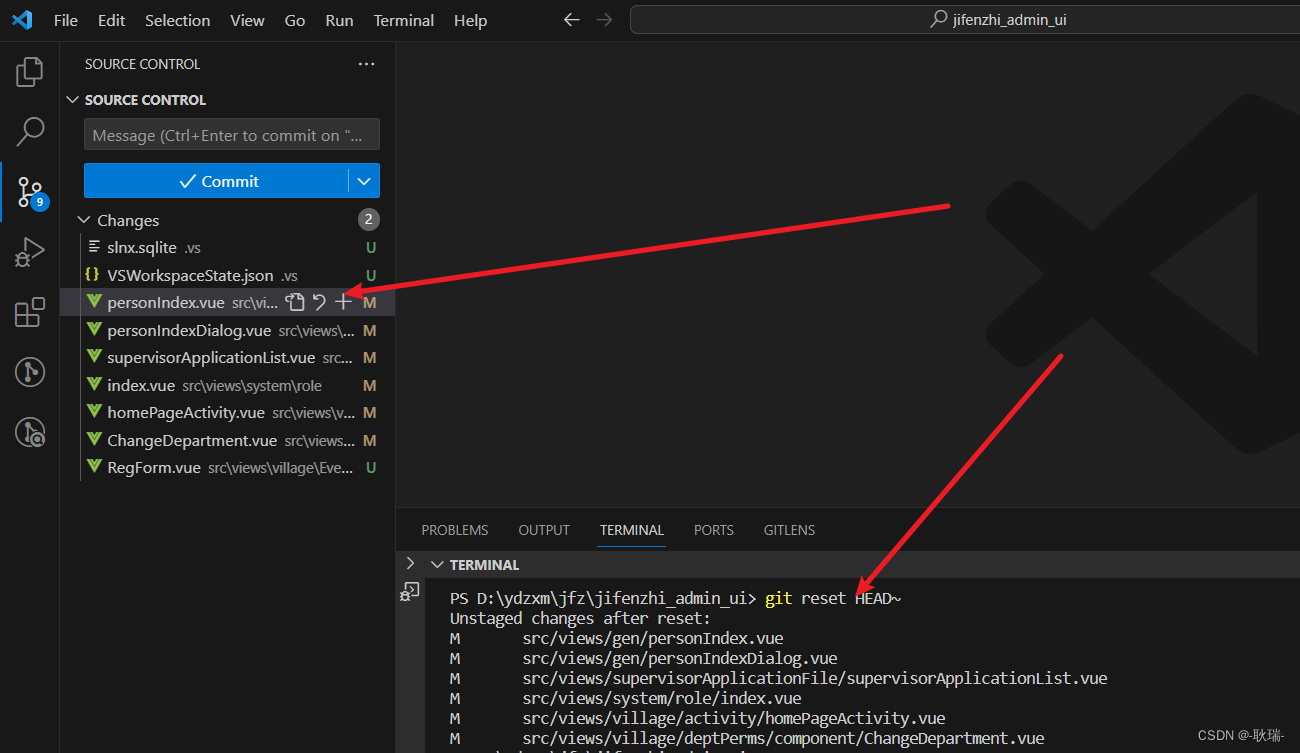
git撤回 不小心 commit 进去的文件
我时候 我们可能讲一下不想提交的文件 不小心commit了进去 我们可以通过 git reset HEAD~来撤回刚才的添加记录...

qt之movetothread理解
基础概念 qt的下线程qthread,每个线程都有自己的事件循环exec。对象的线程上下文,每个对象都有自己的线程上下文,怎么理解呢,就是该对象在哪个线程创建,其线程上下文就是谁。每个qobject对象在创建时都有包含线程成员…...
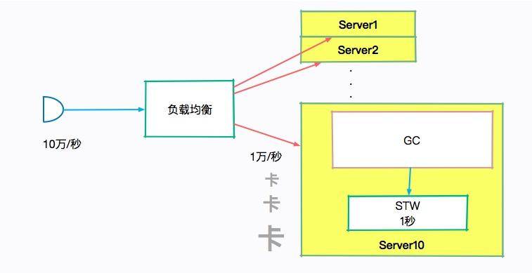
深入剖析:垃圾回收你真的了解吗?
小熊学Java:https://www.javaxiaobear.cn/ 本文我们重点剖析 JVM 的垃圾回收机制。关于 JVM 垃圾回收机制面试中主要涉及这三个考题: JVM 中有哪些垃圾回收算法?它们各自有什么优劣? CMS 垃圾回收器是怎么工作的?有哪…...
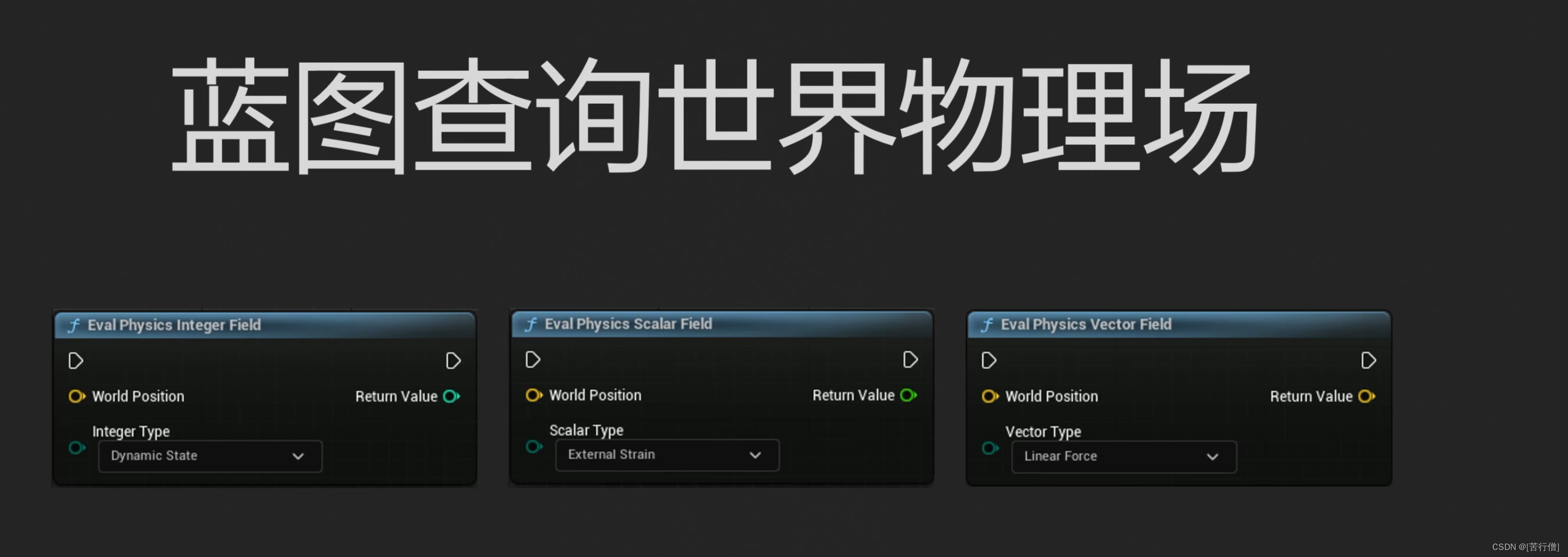
ue5 物理场的应用
cable mat wpo particle 流体粒子 choas 破损 刚体 布料 cloud abp blueprint riggedbody 体积雾 毛发 全局的 局部的 非均匀的 连续变化的 也可以多个叠加 从全局 到 范围 除了vector还有scalar的值也就是0--1的黑白灰的值 但是最终输出的值的类型还是取决于这个 一…...
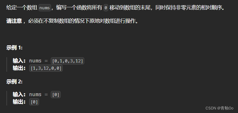
移动零00
题目链接 移动零 题目描述 注意点 将所有 0 移动到数组的末尾,同时保持非零元素的相对顺序必须在不复制数组的情况下原地对数组进行操作 解答思路 采用双指针的思路,左指针指向已移动零的数组的尾部,右指针指向为移动零的数组的头部&…...
 -框架设置操作)
go初识iris框架(四) -框架设置操作
前言 iris(1) iris(2) iris(3) 框架设置操作 当我们的一个路径是xxx/user/info,xxx/user/login,xxx/user/register的时候,我们发现前面都有一个user,我们如果用/{data:string}这样的话这样导致我们的路径是灵活的,所以我们得用其他方法 这里我们的路径是以anime为…...
)
python基础语法(二)
目录 注释注释的语法注释行文档字符串 注释的规范 输入输出和用户的交互通过控制台输出通过控制台的输入 注释 注释的语法 注释行 python的注释:使用#开通的行都是注释 # 这是一行注释C语言的注释:使用//的都是注释 // 这是一行注释文档字符串 使用三引号引起来的称为文档…...
从本地到Gitee:一步步学习文件上传及解决常见报错问题
🙂博主:小猫娃来啦 🙂文章核心:一步步学习文件上传及解决常见报错问题 文章目录 安装git进入gitee官网,登录账号新建仓库先打开git命令行上传本地资源到仓库第一步:git init第二步:git add .第三…...
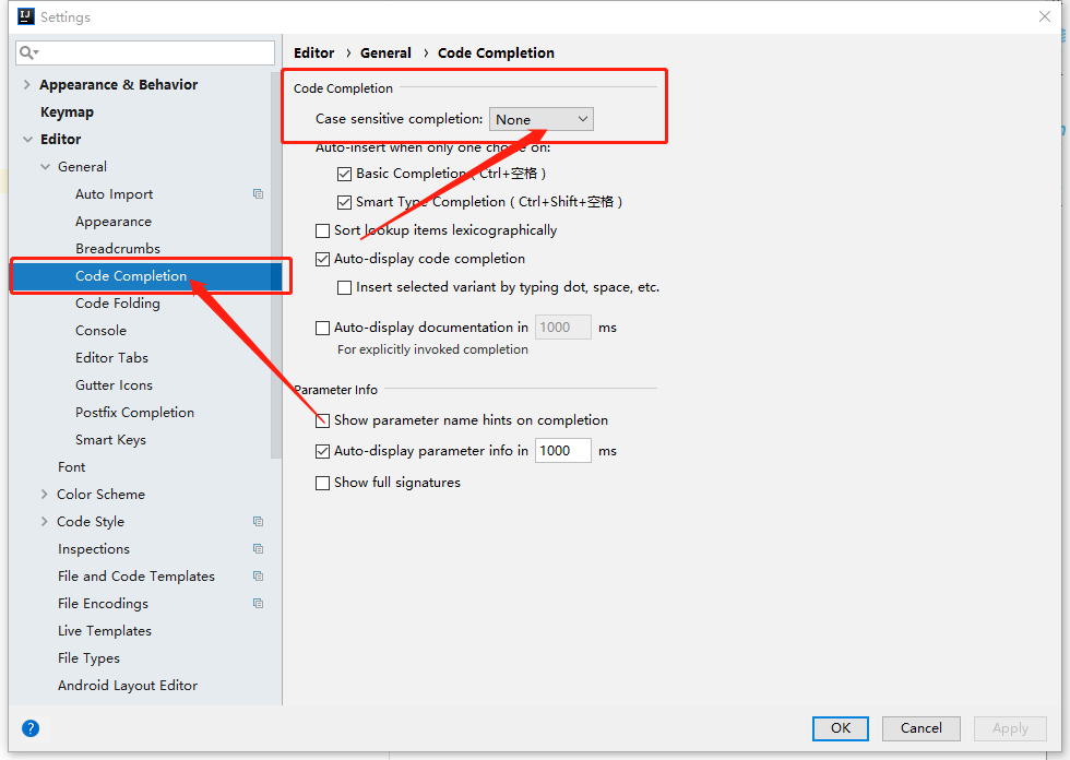
idea2018修改大小写提示(敏感)信息
操作步骤如下: File > Settings > Editor > Code Completion > Code Completion(默认是首字母,选为none将不区分大小写)...

Quartz.Net调度框架简介
Quartz.Net是一个功能强大的开源任务调度框架,它可以在C#应用程序中实现灵活、可靠的任务调度和定时作业。它的主要作用是允许开发人员按照预定的时间表执行各种任务,例如定期生成报表、发送电子邮件、备份数据等。 在C#中使用Quartz.Net进行配置、开发…...
HarmonyOS/OpenHarmony(Stage模型)应用开发组合手势(一)连续识别
组合手势由多种单一手势组合而成,通过在GestureGroup中使用不同的GestureMode来声明该组合手势的类型,支持连续识别、并行识别和互斥识别三种类型。 .GestureGroup(mode:GestureMode, …gesture:GestureType[]) mode:必选参数,为G…...

Redis --- 位图
目录 背景 结构 存取方式 统计和查找 背景 开发过程中,会有布尔类型的存储,比如记录一个用户一年365天的签到情况,如果每天都要有一个布尔变量,多个用户,亦或者使用k-v形式,上亿用户的话这个存储量是惊…...
自然语言处理-词向量模型-Word2Vec
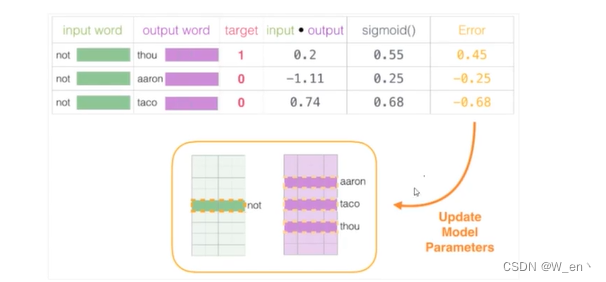
通常数据的维度越高,能提供的信息也就越多,从而计算结果的可靠性就更值得信赖 如何来描述语言的特征呢,通常都在词的层面上构建特征,Word2Vec就是要把词转换成向量 假设现在已经拿到一份训练好的词向量,其中每一个词都…...

List知识总结
ArrayList: 1 ArrayList扩容底层用到的是;System.arraycopy. 2 扩容的长度计算;int newCapacity oldCapacity (oldCapacity >> 1);,旧容量 旧容量右移1位,这相当于扩容为原 来容量的(int)3/2. 3 ArrayList<String…...

Vue绘图神器:vue-drawing-canvas让前端绘图开发变得简单快速
Vue绘图神器:vue-drawing-canvas让前端绘图开发变得简单快速 【免费下载链接】vue-drawing-canvas VueJS Component for drawing on canvas. 项目地址: https://gitcode.com/gh_mirrors/vu/vue-drawing-canvas 在当今Web开发中,绘图功能已成为许多…...

Wand-Enhancer终极指南:3步免费解锁WeMod完整功能
Wand-Enhancer终极指南:3步免费解锁WeMod完整功能 【免费下载链接】Wand-Enhancer Advanced UX and interoperability extension for Wand (WeMod) app 项目地址: https://gitcode.com/gh_mirrors/we/Wand-Enhancer 还在为WeMod高级功能付费而烦恼吗…...

快速安装ClaudeCode完整指南
在电脑上安装 Claude Code 先安装系统环境和必要的依赖。 1、检查 Node.js 和Git是否已安装 (1)Node.js 方法 1:官网下载 访问: https://nodejs.org/zh-cn 运行安装包一路 Next 即可 方法 2:用 winget 安装 wi…...

GitHub代码仓库安全防护:基于ClamAV的PR恶意文件自动化扫描实践
1. 项目概述:一个守护代码仓库的“安全哨兵”最近在梳理团队内部的代码安全流程,发现一个挺普遍但容易被忽视的问题:我们花了很多精力在CI/CD流水线上做安全扫描,比如用SonarQube检查代码质量,用Trivy扫描容器镜像漏洞…...
)
Trae IDE 实战:打造“创建完美智能体助手”(交互式+自动生成+模板删减,新手无脑上手)
Trae IDE 实战:打造“创建完美智能体助手”(交互式+自动生成+模板删减,新手无脑上手) 前言:在AI研发提效浪潮中,Trae IDE的自定义Agent已成为开发者的核心协作工具。本文聚焦「创建完美智能体助手」的打造,全程贴合Trae原生能力,主打“交互式引导、全自动文件生成、模…...

告别手动操作!GSE魔兽世界宏编辑器:让技能释放像呼吸一样自然
告别手动操作!GSE魔兽世界宏编辑器:让技能释放像呼吸一样自然 【免费下载链接】GSE-Advanced-Macro-Compiler GSE is an alternative advanced macro editor and engine for World of Warcraft. 项目地址: https://gitcode.com/gh_mirrors/gs/GSE-Adv…...

AI工作流框架:用DAG与异步编排简化大模型应用开发
1. 项目概述:一个面向AI应用开发的现代工作流工具如果你最近在折腾AI应用开发,无论是想快速搭建一个智能客服,还是想集成大语言模型到你的产品里,大概率会遇到一个共同的烦恼:“想法很美好,落地很琐碎”。从…...
:多队列 + RSS + 多 worker 的最小转发 / Echo)
DPDK 教程(三):多队列 + RSS + 多 worker 的最小转发 / Echo
DPDK 教程(三):多队列 RSS 多 worker 的最小转发 / Echo 本文对应学习路径第三步:在理解 ethdev/mbuf/mempool 后,做一个最小可运行的转发或 echo 原型,刻意使用 多 RX 队列 RSS 把流量分散到 多个 work…...

Digg 回归成 AI 新闻聚合器,追踪 1000 位 AI 领域人士关注内容
1. Digg 再次回归今年 1 月,Digg 以类似 Reddit 的社交新闻网站和应用程序的形式重新推出测试版,但仅仅两个月后,由于大量 AI 机器人涌入,Digg 被迫关闭,并进行了裁员。不过,截至周二,Digg 再次…...

通过Taotoken模型广场快速为项目选择合适的AI模型
🚀 告别海外账号与网络限制!稳定直连全球优质大模型,限时半价接入中。 👉 点击领取海量免费额度 通过Taotoken模型广场快速为项目选择合适的AI模型 当你开始一个新项目,或者需要为现有应用集成AI能力时,面…...