HarmonyOS 基础组件和基础布局的介绍
1. HarmonyOS 基础组件
1.1 Text 文本组件
Text(this.message)//文本内容.width(200).height(50).margin({ top: 20, left: 20 }).fontSize(30)//字体大小.maxLines(1)// 最大行数.textOverflow({ overflow: TextOverflow.Ellipsis })// 超出显示....fontColor(Color.Black).fontWeight(FontWeight.Bold)//字重:字体加粗.onClick(() => {this.clickCount++}).textAlign(TextAlign.Center)// 文本自身居中).lineHeight(30)//行高// .textCase(TextCase.UpperCase)// 全大写.textShadow({//设置阴影radius: 5,color: Color.Gray,offsetX: 2,offsetY: 2}).fontStyle(FontStyle.Normal)//字体样式// .fontFamily($r('app.font.myfont'))//自定义字体(需在resources中添加字体文件)// 富文本
Text(){Span('点击次数: ').fontWeight(FontWeight.Bold)Span(this.clickCount.toString()).fontColor('#FF0000')
}.margin({ top: 20, left: 20 })// 装饰文本
Text('删除线示例').margin({ top: 20, left: 20 }).decoration({type: TextDecorationType.LineThrough,// type: TextDecorationType.Underline, // 下划线color: Color.Grey})
1.2 Button 按钮组件
Button('属性介绍').width(120)// 宽度(单位vp).height(40)// 高度.margin({ top: 10 })// 外边距.padding(10) // 内边距.border({//设置边框width: 2,//边框宽度color: '#FF0000',//边框颜色radius: 8 // 圆角半径}).fontSize(16)//设置文本的大小.fontColor('#FFFFFF')//文本的颜色.fontWeight(FontWeight.Bold)//自重.fontFamily('Arial')//字体// .enabled(false)// .opacity(0.5) // 透明度降低表示禁用.backgroundColor(this.isPressed ? '#000000' : '#007DFF')// .onTouch((e) => {// this.isPressed = (e.type === TouchType.Down);// }).onClick(() => {promptAction.showToast({message: '文本带样式的按钮', duration: 1000 // 单位毫秒})})})
1.3 Image 图片组件
1.3.1 加载本地
Row() {Text('加载本地:').margin({ top: 20 })Image($r('app.media.ic_start_icon'))// resources目录下的图片.margin({ top: 20, left: 20 }).width(50).height(50)// 填充模式:// - Cover(默认): 保持宽高比填满// - Contain: 完整显示// - Fill: 拉伸填满// - ScaleDown: 自适应缩小.objectFit(ImageFit.Cover)}.alignItems(VerticalAlign.Top)1.3.2 加载网络
Row() {Text('加载网络:').margin({ top: 10 }) Image('https://www.baidu.com/img/PCtm_d9c8750bed0b3c7d089fa7d55720d6cf.png').margin({ top: 10, left: 20 }).width(50).height(50).alt('加载失败')// 加载失败时显示图片或文字.onComplete(() => {console.log('图片加载完成');}).onError(() => {console.log('图片加载失败');}).syncLoad(false) // 异步加载(默认)
}.alignItems(VerticalAlign.Top)
1.3.3 圆角和边框
Image($r('app.media.ic_start_icon'))// resources目录下的图片.margin({ top: 20, left: 20 }).width(40).height(40)// 填充模式:.borderRadius(40)// 圆形效果.border({width: 2,color: '#FF0000',radius: 40 // 需与宽高一致})
1.3.4 SVG加载使用的是Path
Row() {Text('SVG图片:').margin({ top: 20 })Path().margin({ top: 20, left: 20 }).width(100).height(100).commands('M10 10 L90 10 L90 90 Z')// SVG路径数据.fill('#FF0000')
}.alignItems(VerticalAlign.Top)
1.4 文本输入框
1.4.1 TextInput 单行文本输入框
@Entry
@Component
struct TextInputExample {@State text: string = '' // 存储输入内容build() {Column() {// 基础输入框TextInput({ placeholder: '请输入用户名' }).width('80%').height(50).margin(10).fontSize(16).onChange((value: string) => {console.log(`输入内容:${value}`)this.text = value // 更新状态变量})// 密码输入框TextInput({ placeholder: '请输入密码' }).type(InputType.Password) // 设置输入类型为密码.width('80%').margin(10)// 显示输入内容Text(`当前输入:${this.text}`).margin(10)}.width('100%').padding(20)}
}
1.4.2 TextArea 多行文本输入
适用于长文本场景。
@Entry
@Component
struct TextAreaExample {@State longText: string = ''build() {Column() {TextArea({ text: this.longText, placeholder: '请输入备注...' }).width('90%').height(150).margin(10).onChange((value: string) => {this.longText = value})Button('提交').onClick(() => {console.log(`提交内容:${this.longText}`)})}}
}
1.4.3 常用属性说明
1.4.3.1 **输入类型(type)**
- InputType.Normal:默认文本
- InputType.Number:数字键盘
- InputType.Number:数字键盘
- InputType.Number:数字键盘
1.4.3.2 事件监听
-
onChange(value: string):输入内容变化时触发 -
onSubmit():按下回车键时触发
1.4.3.3 代码示例
@Entry
@Component
struct LoginForm {@State username: string = ''@State password: string = ''build() {Column() {TextField({ placeholder: '用户名' }).width('80%').margin(10).onChange((value: string) => {this.username = value})TextField({ placeholder: '密码' }).type(InputType.Password).width('80%').margin(10).onChange((value: string) => {this.password = value})Button('登录', { type: ButtonType.Capsule }).width('50%').margin(20).onClick(() => {if (this.username && this.password) {// 执行登录逻辑console.log(`登录信息:${this.username} / ${this.password}`)}})}.alignItems(HorizontalAlign.Center)}
}
2. 常用的布局组件
2.1. 线性布局
Column(垂直布局) 和 Row(水平布局)
2.1.1 通用属性
Column和Row都支持以下通用属性:
| 属性 | 类型 | 说明 |
|---|---|---|
| width | Length | 设置组件宽度 |
| height | Length | 设置组件高度 |
| backgroundColor | Color | 设置背景颜色 |
| padding | Padding | 设置内边距 |
| margin | Margin | 设置外边距 |
| border | BorderOptions | 设置边框 |
| onClick | () => void | 点击事件 |
2.1.2 对齐方式枚举值
2.1.2.1 HorizontalAlign(水平对齐)
- Start:左对齐
- Center:居中对齐
- End:右对齐
2.1.2.2 VerticalAlign(垂直对齐)
- Top:顶部对齐
- Center:居中对齐
- Bottom:底部对齐
2.1.2.3 FlexAlign(主轴对齐)
- Start:起点对齐
- Center:居中对齐
- End:终点对齐
- SpaceBetween:两端对齐,项目间隔相等
- SpaceAround:每个项目两侧间隔相等
- SpaceEvenly:项目与项目、项目与边框间隔相等
2.1.3 代码示例
import { promptAction } from '@kit.ArkUI';@Entry
@Component
struct ColumnAndRowPage {@State message: string = 'Hello World';build() {Column({ space: 20 }) { // 子组件间距// 子组件this.columnLayout()this.rowLayout()this.columnLayoutBorder()this.columnLayoutShadow()this.columnLayoutComplexBorder()}.height('100%').width('100%').justifyContent(FlexAlign.Start) // 垂直居中.alignItems(HorizontalAlign.Start) // 水平居中.backgroundColor('#F1F3F5')}@BuildercolumnLayoutComplexBorder(){Column() {Text('花式边框').fontSize(20).margin(10)Text('可以设置不同样式的边框').fontSize(16)}.width(300).height(100).border({width: {top: 3,right: 1,bottom: 3,left: 1},color: {top: '#3366FF',right: '#3366FF',bottom: '#3366FF',left: '#3366FF'},radius: {topLeft: 20,topRight: 5,bottomLeft: 5,bottomRight: 20},style: BorderStyle.Dotted // 边框样式}).margin(10).padding(10).backgroundColor('#F5F5F5')}@BuildercolumnLayoutBorder() {Column({ space: 20 }) {//Text('带边框的布局').fontSize(20);}.height(100).width(300).justifyContent(FlexAlign.Start) // 垂直居中.alignItems(HorizontalAlign.Start) // 水平居中.backgroundColor('#F1F3F5').margin(10).padding(10).border({//设置边框width: 2,color:'#FF0000',radius: 10}).shadow({radius: 10,color: '#888888',offsetX: 2,offsetY: 2})}@BuildercolumnLayoutShadow() {Column({ space: 20 }) {Text('带阴影的布局').fontSize(20);}.height(100).width(300).justifyContent(FlexAlign.Start) // 垂直居中.alignItems(HorizontalAlign.Start) // 水平居中.backgroundColor('#F1F3F5').margin(10).padding(10).border({//设置边框width: 2,color:'#FF0000',radius: 10}).shadow({radius: 10,color: '#888888',offsetX: 2,offsetY: 2})}@BuildercolumnLayout() {Column({ space: 20 }) {//Text('基础的Column').fontSize(20);}.height(50).width('100%').justifyContent(FlexAlign.Start) // 垂直居中.alignItems(HorizontalAlign.Start) // 水平居中.backgroundColor('#FFFFFF').margin(10).padding(10).onClick(() => {promptAction.showToast({ message: '垂直布局点击' });})}@BuilderrowLayout() {Row({ space: 15 }) {Text('Apple').fontSize(18)Text('Banana').fontSize(18)Text('Orange').fontSize(18)}.width(300).height(100).justifyContent(FlexAlign.SpaceBetween) // 两端对齐.alignItems(VerticalAlign.Center) // 垂直居中.backgroundColor('#EFF4FF').margin(10).padding(10).onClick(() => {promptAction.showToast({ message: '水平布局点击' });})}
}
2.2 弹性布局 Flex
Flex 是 HarmonyOS 中强大的弹性布局组件,可以灵活地控制子元素的排列方式、对齐方式和空间分配。以下是 Flex 布局的完整使用示例。
特点:
- 通过
direction设置主轴方向(Row/Column) - 通过
wrap控制是否换行 - 适合需要自动调整的子元素布局
@Entry
@Component
struct FlexLayoutPage {@State message: string = 'Hello World';build() {Column() {this.flexGrowLayout()this.flexBasisLayout()this.responsiveNavBar()this.cardLayout()}.height('100%').width('100%').backgroundColor('#F1F3F5')}/*** 卡片是布局*/@BuildercardLayout() {Flex({ direction: FlexDirection.Row, wrap: FlexWrap.Wrap, justifyContent: FlexAlign.SpaceBetween }) {ForEach([1, 2, 3, 4, 5, 6], (item: number) => {Column() {Image($r('app.media.ic_start_icon')).width(120).height(120).objectFit(ImageFit.Cover);Text('产品' + item).margin({ top: 8 });}.width(150).height(150).padding(10).backgroundColor('#FFFFFF').margin({ bottom: 15 }).borderRadius(8).shadow({radius: 4,color: '#888888',offsetX: 2,offsetY: 2});});}.width('100%').padding(15).backgroundColor('#F5F5F5')}/*** 水平权重的布局*/@BuilderflexGrowLayout() {Flex({ direction: FlexDirection.Row }) {Text('1').flexGrow(1).height(80).backgroundColor('#FF6B81')Text('2').flexGrow(3).height(80).backgroundColor('#FF9770')Text('3').flexGrow(1).height(80).backgroundColor('#FFD670')}.margin(10).width('100%').padding(10).backgroundColor('#F5F5F5')}@BuilderflexBasisLayout() {Flex({ direction: FlexDirection.Row }) {Text('1').flexBasis('20%').height(80).backgroundColor('#FF6B81')Text('2').flexBasis('30%').height(80).backgroundColor('#FF9770')Text('3').flexBasis('50%').height(80).backgroundColor('#FFD670')}.margin(10).width('100%').padding(10).backgroundColor('#F5F5F5')}/*** 导航栏*/@BuilderresponsiveNavBar() {Flex({ direction: FlexDirection.Row }) {Text('Logo').fontSize(20).fontWeight(FontWeight.Bold).flexShrink(0)Blank() // 空白填充Flex({ direction: FlexDirection.Row }) {Text('首页').margin({ right: 15 })Text('产品').margin({ right: 15 })Text('关于').margin({ right: 15 })Text('联系')}.displayPriority(1) // 优先显示Button('登录').margin({ left: 15 }).flexShrink(0)}.width('100%').padding(10).margin(10).backgroundColor('#FFFFFF').border({ width: 1, color: '#E0E0E0' })}
}
2.3 层叠布局 Stack
@Entry
@Component
struct StackLayoutPage {build() {Stack() {Image($r('app.media.banner_pic1')) // 底层Text('标题').align(Alignment.Top) // 顶层}.width('100%').height(200)}
}
2.4 相对布局 RelativeContainer
@Entry
@Component
struct RelativeContainerPage {@State message: string = 'Hello World';build() {RelativeContainer() {Text('标题').alignRules({top: { anchor: '__container__', align: VerticalAlign.Top },left: { anchor: '__container__', align: HorizontalAlign.Start }}).id('title')Button('确定').alignRules({bottom: { anchor: '__container__', align: VerticalAlign.Bottom },right: { anchor: '__container__', align: HorizontalAlign.End }})}.height('100%').width('100%')}
}
2.5 网格布局 Grid
@Entry
@Component
struct GridLayoutPage {private items: string[] = ['苹果', '香蕉', '橙子', '西瓜', '葡萄', '芒果', '菠萝']build() {Grid() {ForEach(this.items, (item: string) => {GridItem() {Text(item)}})}.margin(20).columnsTemplate('1fr 1fr 1fr') // 3等分列.rowsTemplate('100px 100px') // 固定行高.columnsGap(10) // 列间距.rowsGap(15) // 行间}
}
2.6 列表布局 List
List 是 HarmonyOS 中用于展示长列表数据的高性能组件,支持垂直滚动、分隔线、滚动条等功能。以下是 List 组件的完整使用示例。
2.6.1 List 常用属性与方法
| 属性/方法 | 类型 | 说明 |
|---|---|---|
| divider | DividerStyle | 设置分隔线样式 |
| scrollBar | BarState | 滚动条状态(On/Off/Auto) |
| edgeEffect | EdgeEffect | 滚动边缘效果(Spring/None) |
| editMode | boolean | 是否开启编辑模式 |
| stickyHeader | boolean | 分组标题是否吸顶 |
| onScroll | (scrollOffset: number, scrollState: ScrollState) => void | 滚动事件回调 |
| onReachStart/onReachEnd | () => void | 到达列表开始/结束回调 |
| onItemDelete | (index: number) => boolean | 删除项目回调 |
| onItemMove | (from: number, to: number) => boolean | 项目移动回调 |
2.6.2 代码示例
import TestBean from '../bean/TestBean';@Entry
@Component
struct ListLayoutPage {// 正确写法@State bean: TestBean[] = [new TestBean(1, '会议通知', '今天下午3点项目评审会', '10:30'),new TestBean(2, '系统更新', '新版本v2.1.0已发布', '昨天'),new TestBean(3, '日程提醒', '明天是张经理的生日', '周一')];private data: string[] = ['苹果', '香蕉', '橙子', '西瓜', '葡萄', '芒果', '菠萝']private books: string[] = ['HarmonyOS应用开发指南','TypeScript入门与实践','深入浅出OpenHarmony','ArkUI框架解析','分布式应用开发']build() {List({ space: 5 }) {ForEach(this.bean, (item: TestBean) => {ListItem() {Column() {Row() {Text(item.title).fontSize(18).fontWeight(FontWeight.Bold)Blank() // 空白填充Text(item.time).fontSize(14).fontColor('#999999')}.width('100%')Text(item.content).fontSize(16).margin({ top: 8 }).width('100%')}.padding(15)}.borderRadius(8).margin({ top: 5, bottom: 5 }).backgroundColor('#FFFFFF')}, (item: TestBean) => item.id.toString())}.width('100%').height('100%').backgroundColor('#F7F8FA')}/*** 基础的*/@BuilderBasicListExample() {List({ space: 10 }) {ForEach(this.data, (item: string) => {ListItem() {Text(item).fontSize(18).width('100%').height(50).textAlign(TextAlign.Center).backgroundColor('#FFFFFF')}}, (item: string) => item)}.margin({ top: 40 }).width('100%').height('100%').backgroundColor('#F5F5F5')}/*** 带分割线的*/@BuilderListWithDividerExample() {List({ space: 5 }) {ForEach(this.books, (book: string) => {ListItem() {Text(book).fontSize(16).padding(15)}})}.divider({strokeWidth: 1,color: '#E0E0E0',startMargin: 15,endMargin: 15}).scrollBar(BarState.On) // 显示滚动条}/*** 复杂列表项示例*/@BuildercomplexListItemExample() {List({ space: 5 }) {ForEach(this.bean, (item: TestBean) => {ListItem() {Column() {Row() {Text(item.title).fontSize(18).fontWeight(FontWeight.Bold)Blank() // 空白填充Text(item.time).fontSize(14).fontColor('#999999')}.width('100%')Text(item.content).fontSize(16).margin({ top: 8 }).width('100%')}.padding(15)}.borderRadius(8).margin({ top: 5, bottom: 5 }).backgroundColor('#FFFFFF')}, (item: TestBean) => item.id.toString())}.width('100%').height('100%').backgroundColor('#F7F8FA')}
}
2.7 自适应布局 GridRow/GridCol
tItem() {
Column() {
Row() {
Text(item.title)
.fontSize(18)
.fontWeight(FontWeight.Bold)
          Blank() // 空白填充Text(item.time).fontSize(14).fontColor('#999999')}.width('100%')Text(item.content).fontSize(16).margin({ top: 8 }).width('100%')}.padding(15)}.borderRadius(8).margin({ top: 5, bottom: 5 }).backgroundColor('#FFFFFF')}, (item: TestBean) => item.id.toString())
}
.width('100%')
.height('100%')
.backgroundColor('#F7F8FA')
}
}
## 2.7 自适应布局 GridRow/GridCol
相关文章:

HarmonyOS 基础组件和基础布局的介绍
1. HarmonyOS 基础组件 1.1 Text 文本组件 Text(this.message)//文本内容.width(200).height(50).margin({ top: 20, left: 20 }).fontSize(30)//字体大小.maxLines(1)// 最大行数.textOverflow({ overflow: TextOverflow.Ellipsis })// 超出显示....fontColor(Color.Black).…...
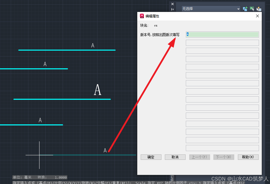
CAD插入属性块 弹窗提示输入属性值——CAD知识讲堂
插入属性块时,有时会遇到不弹窗输入属性值的情况,解决方案如下: 最好关闭块编辑器并保存,插入属性块即可弹窗。...

Redis 主要能够用来做什么
Redis(Remote Dictionary Server)是一种基于内存的键值存储数据库,它的性能极高,广泛应用于各种高并发场景。以下是 Redis 常见的用途: 1. 缓存(Cache) 作用:存储热点数据…...

MySQL GROUP BY 和 HAVING 子句中 ‘Unknown column‘ 错误的深入解析
在使用 MySQL 进行数据分析和报表生成时,GROUP BY 和 HAVING 子句是非常强大的工具。然而,很多开发者在使用它们时会遇到一个常见的错误:"Unknown column column_name in having clause"。本文将深入解析这个错误的原因,…...
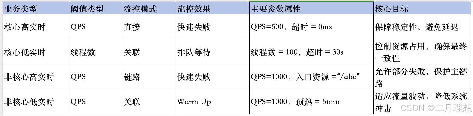
Sentinel实战(三)、流控规则之流控效果及流控小结
spring cloud Alibaba-Sentinel实战(三)、流控效果流控小结 一、流控规则:流控效果一)、流控效果:预热1、概念含义2、案例流控规则设置测试结果 二)、流控效果:排队等待1、概念含义2、案例流控规…...

JavaScrip——DOM编程
一、DOM元素创建与属性操作 1. 元素创建与插入 // 创建新元素 const newDiv document.createElement(div); newDiv.textContent "动态创建的内容";// 插入到容器末尾 document.body.appendChild(newDiv);// 在指定元素前插入 existingElement.before(newDiv);// …...

表单的前端数据流向
在CRM项目中,会涉及很多张表单。每张表单的前端代码都会放在一个单独的文件夹中。这个文件夹下包含三个文件,分别是: index.js(以下称为 index):负责组件的渲染和交互逻辑。model.js(以下称为 …...

PP-ChatOCRv3新升级:多页PDF信息抽取支持自定义提示词工程,拓展大语言模型功能边界
文本图像信息抽取技术在自动化办公、建筑工程、教育科研、金融风控、医疗健康等行业领域具有广泛应用场景。2024年9月,飞桨低代码开发工具PaddleX中新增文本图像智能产线PP-ChatOCRv3,充分结合PaddleOCR的文本图像版面解析能力和文心一言语言理解优势&am…...
《二叉树:二叉树的顺序结构->堆》
二叉树一般可以使用两种结构存储,一种是顺序结构,一种是链式结构。 顺序存储 顺序结构存储是使用数组来存储,一般使用数组只适合表示完全二叉树,因为不是完全二叉树会有空间的浪费。实际上使用中只有堆才会使用数组来存储。二叉…...
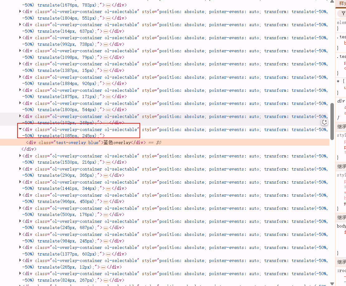
OpenLayers:封装Overlay的方法
平时在使用OpenLayers的Overlay时常感觉不便,于是最近我便封装了一些Overlay增删改查的方法,以提高可用性。这边文章中我会介绍我封装的方法,同时记录这个过程中踩的一些坑。 添加Overlay /*** abstract 添加overlay* param {*} map* param…...
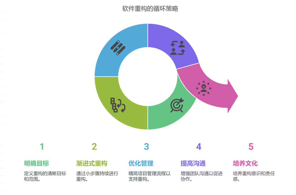
软件重构与项目进度的矛盾如何解决
软件重构与项目进度之间的矛盾可以通过明确重构目标与范围、采用渐进式重构策略、优化项目管理流程、提高团队沟通效率、建立重构意识文化等方式解决。其中,采用渐进式重构策略尤为关键。渐进式重构是指在日常开发过程中,以小步骤持续进行重构࿰…...

Mysql+Demo 获取当前日期时间的方式
记录一下使用Mysql获取当前日期时间的方式 获取当前完整的日期时间有常见的四种方式,获取得到的默认格式(mysql的格式标准)是 %Y-%m-%d %H:%i:%s其它格式 %Y-%m-%d %H:%i:%s.%f方式一:now()函数 select now();mysql> select now(); -------------…...

数智化时代下开源AI大模型驱动的新型商业生态构建——基于AI智能名片与S2B2C商城小程序的融合创新研究
摘要 数字技术的指数级发展推动物理世界向数智化网状结构加速转型,传统商业逻辑面临系统性重构。本文以"开源AI大模型AI智能名片S2B2C商城小程序"为研究主体,采用案例分析与技术验证相结合的方法,揭示技术融合对商业生态的重塑机制…...
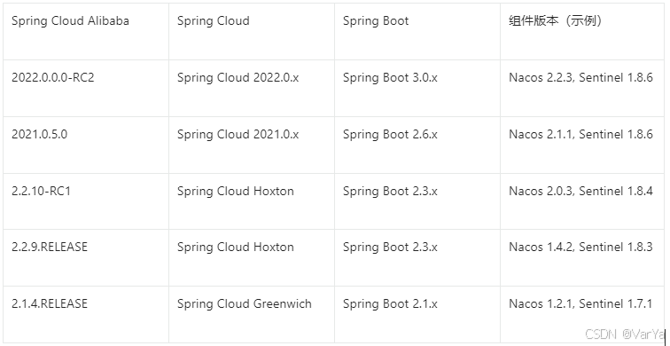
Spring Cloud Alibaba 技术全景与实战指南
简介: Spring Cloud Alibaba 是阿里巴巴开源的微服务解决方案,基于 Spring Cloud 标准构建,提供了一站式分布式系统开发能力。它深度整合阿里云生态组件,为企业级微服务架构提供高可用、高性能的技术支撑。 核心特性 全栈微服务能…...

回归预测 | Matlab实现NRBO-Transformer-BiLSTM多输入单输出回归预测
回归预测 | Matlab实现NRBO-Transformer-BiLSTM多输入单输出回归预测 目录 回归预测 | Matlab实现NRBO-Transformer-BiLSTM多输入单输出回归预测预测效果基本介绍程序设计参考资料 预测效果 基本介绍 1.【JCR一区级】Matlab实现NRBO-Transformer-BiLSTM多变量回归预测…...

了解 PoE 握手协议在网络配电中的重要性
在现代网络领域,以太网供电(PoE)已成为一项革命性的技术,通过在一根以太网电缆上集成电力和数据传输,简化了网络连接设备的部署和管理。这种无缝操作的核心是 PoE 握手 —— 一个促进支持PoE 的设备之间的通信、确保高效供电和保护网络基础设…...
将一个回调函数添加到后台任务队列中等待执行)
小智机器人相关函数解析,BackgroundTask::Schedule (***)将一个回调函数添加到后台任务队列中等待执行
以下是对 BackgroundTask::Schedule 函数代码的详细解释: void BackgroundTask::Schedule(std::function<void()> callback) {std::lock_guard<std::mutex> lock(mutex_);if (active_tasks_ > 30) {int free_sram heap_caps_get_free_size(MALLOC_…...

基于Python设计的TEQC数据质量可视化分析软件
标题:基于Python设计的TEQC数据质量可视化分析软件 内容:1.摘要 本文旨在设计一款基于Python的TEQC数据质量可视化分析软件。随着全球导航卫星系统(GNSS)的广泛应用,数据质量的评估变得至关重要。TEQC(TransEditQualityCheck&…...

人月神话:如何有效的避免Bug的产生
bug的来源有很多种,一般的小bug很好修复,最头疼的是哪些致命且难以察觉的Bug。这些bug从哪来的? 在人月神话书中说:假设的不匹配是大多数致命和难以察觉的bug的主要来源。 假设来源于各个组成部分的开发者对概念的理解不一致。 为…...
Git的基础使用方法
本文最终功能: 1.从终端直接传输代码给仓库 2.用终端从仓库克隆文件 基本概念 我们先来理解下 Git 工作区、暂存区和版本库概念: 工作区:就是你在电脑里能看到的目录。 暂存区:英文叫 stage 或 index。一般存放在 .git 目录下的…...

轮胎厂相关笔记
一、术语 图解:https://news.yiche.com/hao/wenzhang/38498703/ 1、胚胎 在轮胎制造行业中,“胎胚”(也称“生胎”或“未硫化轮胎”)是指轮胎在硫化(高温高压固化)之前的半成品形态。它是轮胎成型的中间…...
Java常用异步方式总结
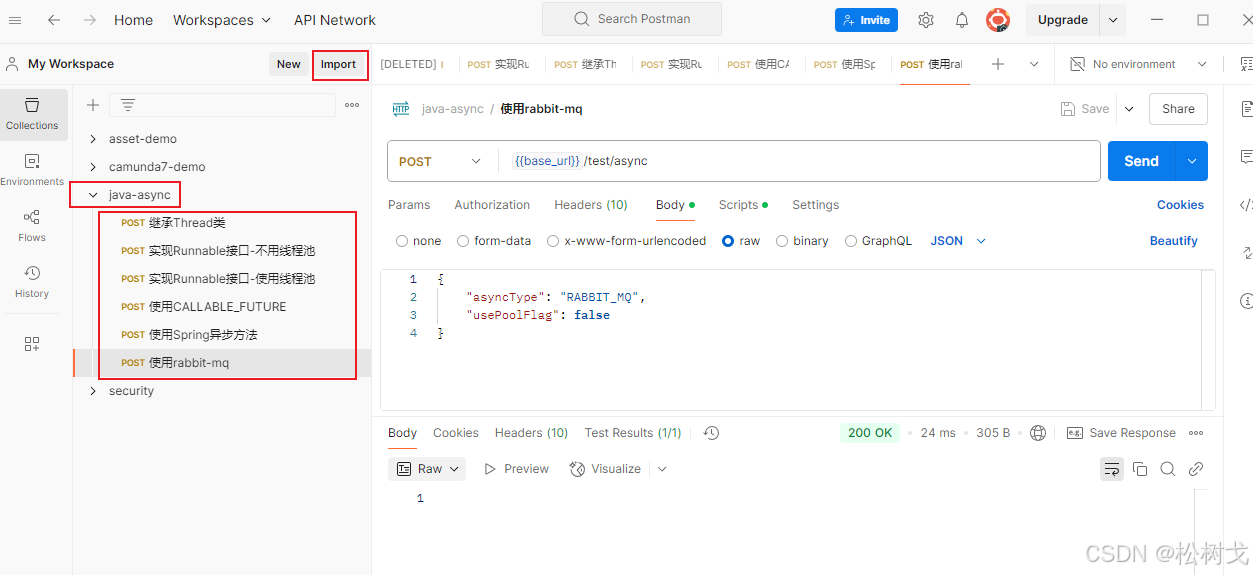
使用建议 完整代码见https://gitee.com/pinetree-cpu/parent-demon 提供了postMan调试json文件于security-demo/src/main/resources/test_file/java-async.postman_collection.json 可导入postMan中进行调试 Java异步方式以及使用场景 继承Thread类 新建三个类继承Thread&…...

【Easylive】视频在线人数统计系统实现详解 WebSocket 及其在在线人数统计中的应用
【Easylive】项目常见问题解答(自用&持续更新中…) 汇总版 视频在线人数统计系统实现详解 1. 系统架构概述 您实现的是一个基于Redis的视频在线人数统计系统,主要包含以下组件: 心跳上报接口:客户端定期调用以…...

tomcat 目录结构组成
文章目录 背景文件结构层级一些常用的路径 背景 现在非常多的 java web 服务部署在 linux 服务器中,我们服务器中的 tomcat 会有各种文件路径,看下它有哪些文件 文件结构层级 ├── bin/ # 核心脚本和启动文件 ├── conf/ # …...

苍穹外卖day12
课程内容 工作台 Apache POI 导出运营数据Excel报表 功能实现:工作台、数据导出 工作台效果图: 数据导出效果图: 在数据统计页面点击数据导出:生成Excel报表 1. 工作台 1.1 需求分析和设计 1.1.1 产品原型 工作台是系统运…...

Unity Final IK:下一代角色动画与物理交互的技术解析
引言:角色动画的范式转移 在传统游戏开发中,角色动画主要依赖于 前向动力学(Forward Kinematics, FK) 和预烘焙动画。然而,这种方法的局限性在开放世界、物理交互和VR等场景中愈发明显: 环境适应性差&…...

前端开发时的内存泄漏问题
目录 🔍 什么是内存泄漏(Memory Leak)?🚨 常见的内存泄漏场景1️⃣ 未清除的定时器(setInterval / setTimeout)2️⃣ 全局变量(变量未正确释放)3️⃣ 事件监听未清除4️⃣…...

【Feign】⭐️使用 openFeign 时传递 MultipartFile 类型的参数参考
💥💥✈️✈️欢迎阅读本文章❤️❤️💥💥 🏆本篇文章阅读大约耗时三分钟。 ⛳️motto:不积跬步、无以千里 📋📋📋本文目录如下:🎁🎁&a…...

Linux中动静态库的制作
1.什么是库 库是写好的现有的,成熟的,可以复⽤的代码。现实中每个程序都要依赖很多基础的底层库,不可能每个⼈的代码都从零开始,因此库的存在意义非同寻常。 本质上来说库是⼀种可执⾏代码的⼆进制形式,可以被操作系统…...

Docker部署sprintboot后端项目
创建Docker网络 docker network create icjs 部署Redis docker run -d \--network icjs \--name redis \-p 6379:6379 \redis:latest数据持久化 docker run --restartalways --network icjs -p 6379:6379 --name redis -v /opt/docker/redis/redis.conf:/etc/redis/redis.c…...