鸿蒙UI(ArkUI-方舟UI框架)- 使用弹框
返回主章节 → 鸿蒙UI(ArkUI-方舟UI框架)
文章目录
- 弹框概述
- 使用弹出框(Dialog)
- 弹出框概述
- 不依赖UI组件的全局自定义弹出框(openCustomDialog)(推荐)
- 生命周期
- 自定义弹出框的打开与关闭
- 更新自定义弹出框内容
- 更新自定义弹出框的属性
- 完整示例
- 基础自定义弹出框(CustomDialog)(不推荐)
- 固定样式弹出框
- 使用约束
- 操作菜单(showAMenu)
- 对话框(showDialog)
- 选择器弹框(PickerDialog)
- 生命周期
- 日历选择器弹窗 (CalendarPickerDialog)
- 日期滑动选择器弹窗 (DatePickerDialog)
- 时间滑动选择器弹窗 (TimePickerDialog)
- 文本滑动选择器弹窗 (TextPickerDialog)
- 列表选择弹窗 (ActionSheet)
- 警告弹窗 (AlertDialog)
- 菜单控制(Menu)
- 生命周期
- 创建默认样式的菜单
- 创建自定义样式的菜单
- @Builder开发菜单内的内容
- bindMenu属性绑定组件
- 创建支持右键或长按的菜单
- 气泡提示(Popup)
- 文字提示气泡
- 添加气泡状态变化的事件
- 带按钮的提示气泡
- 气泡的动画
- 自定义气泡
- 气泡样式
- 绑定模态页面
- 绑定模态页面概述
- 绑定半模态页面(bindSheet)
- 绑定全模态页面(bindContentCover)
- 即时反馈(Toast)
- 使用建议
- 即时反馈模式对比
- 创建即时反馈
- 设置浮层(OverlayManager)
- 规格约束
- 设置浮层
弹框概述
弹窗一般指打开应用时自动弹出或者用户行为操作时弹出的UI界面,用于短时间内展示用户需关注的信息或待处理的操作。
- 模态弹框
为强交互形式,会中断用户当前的操作流程,要求用户必须作出响应才能继续其他操作,通常用于向用户传达重要信息的场景 - 非模态弹框
为弱交互形式,不会影响用户当前的操作行为,用户可以不对其进行回答,通常都有时间限制,出现一段时间后会自动消失。一般用于告诉用户信息内容外还需要用户进行功能操作的场景
使用弹出框(Dialog)
弹出框概述
弹出框是一种模态窗口,通常用于在保持当前上下文环境的同时,临时展示用户需关注的信息或待处理的操作。
- 自定义弹出框
开发者需要根据使用场景,传入自定义组件填充在弹出框中实现自定义的弹出框内容。主要包括基础自定义弹出框 (CustomDialog)、不依赖UI组件的自定义弹出框 (openCustomDialog)。 - 固定样式弹出框
开发者可使用固定样式弹出框,指定需要显示的文本内容和按钮操作,完成简单的交互效果。主要包括警告弹窗 (AlertDialog)、列表选择弹窗 (ActionSheet)、选择器弹窗 (PickerDialog)、对话框 (showDialog)、操作菜单 (showActionMenu)。
不依赖UI组件的全局自定义弹出框(openCustomDialog)(推荐)
由于CustomDialogController在使用上存在诸多限制,不支持动态创建也不支持动态刷新,在相对较复杂的应用场景中推荐使用UIContext中获取到的PromptAction对象提供的openCustomDialog接口来实现自定义弹出框。
说明
弹出框(openCustomDialog)存在两种入参方式创建自定义弹出框:
- openCustomDialog(传参为ComponentContent形式):通过ComponentContent封装内容可以与UI界面解耦,调用更加灵活,可以满足开发者的封装诉求。拥有更强的灵活性,弹出框样式是完全自定义的,且在弹出框打开之后可以使用updateCustomDialog方法动态更新弹出框的一些参数。
- openCustomDialog(传builder的形式):相对于ComponentContent,builder必须要与上下文做绑定,与UI存在一定耦合。此方法有用默认的弹出框样式,适合于开发者想要实现与系统弹窗默认风格一致的效果。
弹出框(openCustomDialog)可以通过配置isModal来实现模态和非模态弹窗。isModal为true时,弹出框为模态弹窗。isModal为false时,弹出框为非模态弹窗。
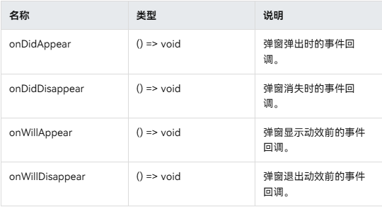
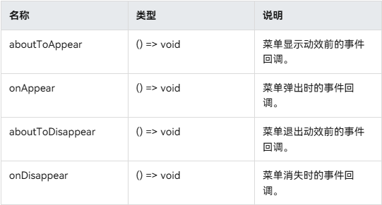
生命周期
弹出框提供了生命周期函数用于通知用户该弹出框的生命周期。生命周期的触发时序依次为:onWillAppear -> onDidAppear -> onWillDisappear -> onDidDisappear。
自定义弹出框的打开与关闭
-
1、 创建 CompenentContent
ComponentContent用于定义自定义弹出框的内容。其中,wrapBuilder(buildText)封装自定义组件,new Params(this.message)是自定义组件的入参,可以缺省,也可以传入基础数据类型。private contentNode: ComponentContent<Object> = new ComponentContent(this.ctx, wrapBuilder(buildText), new Params(this.message)); -
2、打开自定义弹出框
通过调用openCustomDialog接口打开的弹出框默认为customStyle为true的弹出框,即弹出框的内容样式完全按照contentNode自定义样式显示。PromptActionClass.ctx.getPromptAction().openCustomDialog(PromptActionClass.contentNode, PromptActionClass.options).then(() => {console.info('OpenCustomDialog complete.')}).catch((error: BusinessError) => {let message = (error as BusinessError).message;let code = (error as BusinessError).code;console.error(`OpenCustomDialog args error code is ${code}, message is ${message}`);}) -
3、关闭自定义弹出框
由于closeCustomDialog接口需要传入待关闭弹出框对应的ComponentContent。因此,如果需要在弹出框中设置关闭方法,则可参考完整示例封装静态方法来实现。关闭弹出框之后若需要释放对应的ComponentContent,则需要调用ComponentContent的dispose方法。
PromptActionClass.ctx.getPromptAction().closeCustomDialog(PromptActionClass.contentNode).then(() => {console.info('CloseCustomDialog complete.')if (this.contentNode !== null) {this.contentNode.dispose(); // 释放contentNode}}).catch((error: BusinessError) => {let message = (error as BusinessError).message;let code = (error as BusinessError).code;console.error(`CloseCustomDialog args error code is ${code}, message is ${message}`);})
更新自定义弹出框内容
ComponentContent与BuilderNode有相同的使用限制,不支持自定义组件使用@Reusable、@Link、@Provide、@Consume等装饰器,来同步弹出框弹出的页面与ComponentContent中自定义组件的状态。因此,若需要更新弹出框中自定义组件的内容可以通过ComponentContent提供的update方法来实现。
this.contentNode.update(new Params('update'))
更新自定义弹出框的属性
通过updateCustomDialog可以动态更新弹出框的属性。目前支持的属性包括alignment、offset、autoCancel、maskColor。
需要注意的是,更新属性时,未设置的属性会恢复为默认值。例如,初始设置{ alignment: DialogAlignment.Top, offset: { dx: 0, dy: 50 } },更新时设置{ alignment: DialogAlignment.Bottom },则初始设置的offset: { dx: 0, dy: 50 }不会保留,会恢复为默认值。
PromptActionClass.ctx.getPromptAction().updateCustomDialog(PromptActionClass.contentNode, options).then(() => {console.info('UpdateCustomDialog complete.')}).catch((error: BusinessError) => {let message = (error as BusinessError).message;let code = (error as BusinessError).code;console.error(`UpdateCustomDialog args error code is ${code}, message is ${message}`);})
完整示例
// PromptActionClass.ets
import { BusinessError } from '@kit.BasicServicesKit';
import { ComponentContent, promptAction } from '@kit.ArkUI';
import { UIContext } from '@ohos.arkui.UIContext';export class PromptActionClass {static ctx: UIContext;static contentNode: ComponentContent<Object>;static options: promptAction.BaseDialogOptions;static setContext(context: UIContext) {PromptActionClass.ctx = context;}static setContentNode(node: ComponentContent<Object>) {PromptActionClass.contentNode = node;}static setOptions(options: promptAction.BaseDialogOptions) {PromptActionClass.options = options;}static openDialog() {if (PromptActionClass.contentNode !== null) {PromptActionClass.ctx.getPromptAction().openCustomDialog(PromptActionClass.contentNode, PromptActionClass.options).then(() => {console.info('OpenCustomDialog complete.')}).catch((error: BusinessError) => {let message = (error as BusinessError).message;let code = (error as BusinessError).code;console.error(`OpenCustomDialog args error code is ${code}, message is ${message}`);})}}static closeDialog() {if (PromptActionClass.contentNode !== null) {PromptActionClass.ctx.getPromptAction().closeCustomDialog(PromptActionClass.contentNode).then(() => {console.info('CloseCustomDialog complete.')}).catch((error: BusinessError) => {let message = (error as BusinessError).message;let code = (error as BusinessError).code;console.error(`CloseCustomDialog args error code is ${code}, message is ${message}`);})}}static updateDialog(options: promptAction.BaseDialogOptions) {if (PromptActionClass.contentNode !== null) {PromptActionClass.ctx.getPromptAction().updateCustomDialog(PromptActionClass.contentNode, options).then(() => {console.info('UpdateCustomDialog complete.')}).catch((error: BusinessError) => {let message = (error as BusinessError).message;let code = (error as BusinessError).code;console.error(`UpdateCustomDialog args error code is ${code}, message is ${message}`);})}}
}
// Index.ets
import { ComponentContent } from '@kit.ArkUI';
import { PromptActionClass } from './PromptActionClass';class Params {text: string = ""constructor(text: string) {this.text = text;}
}@Builder
function buildText(params: Params) {Column() {Text(params.text).fontSize(50).fontWeight(FontWeight.Bold).margin({ bottom: 36 })Button('Close').onClick(() => {PromptActionClass.closeDialog()})}.backgroundColor('#FFF0F0F0')
}@Entry
@Component
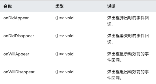
struct Index {@State message: string = "hello"private ctx: UIContext = this.getUIContext();private contentNode: ComponentContent<Object> =new ComponentContent(this.ctx, wrapBuilder(buildText), new Params(this.message));aboutToAppear(): void {PromptActionClass.setContext(this.ctx);PromptActionClass.setContentNode(this.contentNode);PromptActionClass.setOptions({ alignment: DialogAlignment.Top, offset: { dx: 0, dy: 50 } });}build() {Row() {Column() {Button("open dialog and update options").margin({ top: 50 }).onClick(() => {PromptActionClass.openDialog()setTimeout(() => {PromptActionClass.updateDialog({alignment: DialogAlignment.Bottom,offset: { dx: 0, dy: -50 }})}, 1500)})Button("open dialog and update content").margin({ top: 50 }).onClick(() => {PromptActionClass.openDialog()setTimeout(() => {this.contentNode.update(new Params('update'))}, 1500)})}.width('100%').height('100%')}.height('100%')}
}
基础自定义弹出框(CustomDialog)(不推荐)
固定样式弹出框
固定样式弹出框采用固定的布局格式,这使得开发者无需关心具体的显示布局细节,只需输入所需显示的文本内容,从而简化了使用流程,提升了便捷性。
使用约束
- 弹出框的弹出依赖UI的执行上下文,不可在UI上下文不明确的地方使用,具体约束参见UIContext说明。
- 可以通过调用UIContext或getUIContext,在非UI页面或某些异步回调中使用本文中的接口。CalendarPickerDialog当前不支持此操作。
- 操作菜单 (showActionMenu)、对话框 (showDialog)需先使用UIContext中的getPromptAction()方法获取到PromptAction对象,再通过该对象调用对应方法。
- 列表选择弹出框 (ActionSheet)、警告弹出框 (AlertDialog)、选择器弹出框 (PickerDialog)中除CalendarPickerDialog都需先使用ohos.window中的getUIContext()方法获取UIContext实例,再通过此实例调用对应方法。或者可以通过自定义组件内置方法getUIContext()获取。
操作菜单 (showActionMenu)、对话框 (showDialog)、列表选择弹出框 (ActionSheet)、警告弹出框 (AlertDialog)可以设置isModal为false变成非模态弹窗。
操作菜单(showAMenu)
操作菜单通过UIContext中的getPromptAction方法获取到PromptAction对象,再通过该对象调用showActionMenu接口实现,支持在回调或开发者自定义类中使用。
创建并显示操作菜单后,菜单的响应结果会异步返回选中按钮在buttons数组中的索引。
import { PromptAction } from '@kit.ArkUI';let uiContext = this.getUIContext();
let promptAction: PromptAction = uiContext.getPromptAction();
try {promptAction.showActionMenu({title: 'showActionMenu Title Info',buttons: [{text: 'item1',color: '#666666'},{text: 'item2',color: '#000000'},]}).then(data => {console.info('showActionMenu success, click button: ' + data.index);}).catch((err: Error) => {console.error('showActionMenu error: ' + err);})
} catch (error) {
}

对话框(showDialog)
对话框通过UIContext中的getPromptAction方法获取到PromptAction对象,再通过该对象调用showDialog接口实现,支持在回调或开发者自定义类中使用。
创建并显示对话框,对话框响应后异步返回选中按钮在buttons数组中的索引。
// xxx.ets
import { PromptAction } from '@kit.ArkUI';let uiContext = this.getUIContext();
let promptAction: PromptAction = uiContext.getPromptAction();
try {promptAction.showDialog({title: 'showDialog Title Info',message: 'Message Info',buttons: [{text: 'button1',color: '#000000'},{text: 'button2',color: '#000000'}]}, (err, data) => {if (err) {console.error('showDialog err: ' + err);return;}console.info('showDialog success callback, click button: ' + data.index);});
} catch (error) {
}
选择器弹框(PickerDialog)
选择器弹窗通常用于在用户进行某些操作(如点击按钮)时显示特定的信息或选项。
生命周期
弹窗提供了生命周期函数用于通知用户该弹窗的生命周期。
日历选择器弹窗 (CalendarPickerDialog)
日历选择器弹窗提供日历视图,包含年、月和星期信息,通过CalendarPickerDialog接口实现。开发者可调用show函数,定义并弹出日历选择器弹窗。
通过配置 acceptButtonStyle、cancelButtonStyle可以实现自定义按钮样式。
// xxx.ets
@Entry
@Component
struct CalendarPickerDialogExample {private selectedDate: Date = new Date('2024-04-23')build() {Column() {Button("Show CalendarPicker Dialog").margin(20).onClick(() => {console.info("CalendarDialog.show")CalendarPickerDialog.show({selected: this.selectedDate,acceptButtonStyle: {fontColor: '#2787d9',fontSize: '16fp',backgroundColor: '#f7f7f7',borderRadius: 10},cancelButtonStyle: {fontColor: Color.Red,fontSize: '16fp',backgroundColor: '#f7f7f7',borderRadius: 10},onAccept: (date: Date)=>{// 当弹出框再次弹出时显示选中的是上一次确定的日期this.selectedDate = date}})})}.width('100%')}
}
日期滑动选择器弹窗 (DatePickerDialog)
开发者可以利用指定的日期范围,创建日期滑动选择器弹窗,将日期信息清晰地展示在弹出的窗口上。
日期滑动选择器弹窗通过UIContext中的showDatePickerDialog接口实现。
弹窗中配置lunarSwitch、showTime为true时,展示切换农历的开关以及时间,当checkbox被选中时,显示农历。当按下确定按钮时,弹窗会通过onDateAccept返回目前所选中的日期。如需弹窗再次弹出时显示选中的是上一次确定的日期,就要在回调中重新给selectTime进行赋值。
@Entry
@Component
struct DatePickerDialogExample {@State selectTime: Date = new Date('2023-12-25T08:30:00');build() {Column() {Button('showDatePickerDialog').margin(30).onClick(() => {this.getUIContext().showDatePickerDialog({start: new Date("2000-1-1"),end: new Date("2100-12-31"),selected: this.selectTime,lunarSwitch: true,showTime: true,onDateAccept: (value: Date) => {this.selectTime = valueconsole.info("DatePickerDialog:onAccept()" + JSON.stringify(value))},})})}.width('100%').margin({ top: 5 })}
}

该示例通过配置disappearTextStyle、textStyle、selectedTextStyle、acceptButtonStyle、cancelButtonStyle实现了自定义文本以及按钮样式
@Entry
@Component
struct DatePickerDialogExample {@State selectTime: Date = new Date('2023-12-25T08:30:00');build() {Column() {Button('showDatePickerDialog').margin(30).onClick(() => {this.getUIContext().showDatePickerDialog({start: new Date("2000-1-1"),end: new Date("2100-12-31"),selected: this.selectTime,textStyle: { color: '#2787d9', font: { size: '14fp', weight: FontWeight.Normal } },selectedTextStyle: { color: '#004aaf', font: { size: '18fp', weight: FontWeight.Regular } },acceptButtonStyle: {fontColor: '#2787d9',fontSize: '16fp',backgroundColor: '#f7f7f7',borderRadius: 10},cancelButtonStyle: {fontColor: Color.Red,fontSize: '16fp',backgroundColor: '#f7f7f7',borderRadius: 10}})})}.width('100%').margin({ top: 5 })}
}
时间滑动选择器弹窗 (TimePickerDialog)
开发者可根据24小时的时间区间,创建时间滑动选择器弹窗,将时间信息清晰地展示在弹出的窗口上。
时间滑动选择器弹窗通过UIContext中的showTimePickerDialog接口实现。
该示例通过配置disappearTextStyle、textStyle、selectedTextStyle、acceptButtonStyle、cancelButtonStyle实现了自定义文本以及按钮样式。
// xxx.ets@Entry
@Component
struct TimePickerDialogExample {@State selectTime: Date = new Date('2023-12-25T08:30:00');build() {Column() {Button('showTimePickerDialog').margin(30).onClick(() => {this.getUIContext().showTimePickerDialog({selected: this.selectTime,textStyle: { color: '#2787d9', font: { size: '14fp', weight: FontWeight.Normal } },selectedTextStyle: { color: '#004aaf', font: { size: '18fp', weight: FontWeight.Regular } },acceptButtonStyle: {fontColor: '#2787d9',fontSize: '16fp',backgroundColor: '#f7f7f7',borderRadius: 10},cancelButtonStyle: {fontColor: Color.Red,fontSize: '16fp',backgroundColor: '#f7f7f7',borderRadius: 10}})})}.width('100%').margin({ top: 5 })}
}
文本滑动选择器弹窗 (TextPickerDialog)
开发者可根据指定的选择范围,创建文本滑动选择器弹窗,将文本信息清晰地展示在弹出的窗口上。
文本滑动选择器弹窗通过UIContext中的showTextPickerDialog接口实现。
该示例通过设置range的参数类型为TextCascadePickerRangeContent[]类型实现3列文本选择器弹窗。当按下确定按钮时,弹窗会通过onAccept返回目前所选中文本和索引值。如需弹窗再次弹出时显示选中的是上一次确定的文本,就要在回调中重新给select进行赋值。
@Entry
@Component
struct TextPickerDialogExample {private fruits: TextCascadePickerRangeContent[] = [{text: '辽宁省',children: [{ text: '沈阳市', children: [{ text: '沈河区' }, { text: '和平区' }, { text: '浑南区' }] },{ text: '大连市', children: [{ text: '中山区' }, { text: '金州区' }, { text: '长海县' }] }]},{text: '吉林省',children: [{ text: '长春市', children: [{ text: '南关区' }, { text: '宽城区' }, { text: '朝阳区' }] },{ text: '四平市', children: [{ text: '铁西区' }, { text: '铁东区' }, { text: '梨树县' }] }]},{text: '黑龙江省',children: [{ text: '哈尔滨市', children: [{ text: '道里区' }, { text: '道外区' }, { text: '南岗区' }] },{ text: '牡丹江市', children: [{ text: '东安区' }, { text: '西安区' }, { text: '爱民区' }] }]}]private select : number  = 0;build() {Column() {Button('showTextPickerDialog').margin(30).onClick(() => {this.getUIContext().showTextPickerDialog({range: this.fruits,selected: this.select,onAccept: (value: TextPickerResult) => {this.select = value.index as number}})})}.width('100%').margin({ top: 5 })}
}

列表选择弹窗 (ActionSheet)
列表选择器弹窗适用于呈现多个操作选项,尤其当界面中仅需展示操作列表而无其他内容时。
列表选择器弹窗通过UIContext中的showActionSheet接口实现。
该示例通过配置width、height、transition等接口定义了弹窗的样式以及弹出动效。
@Entry
@Component
struct showActionSheetExample {build() {Column() {Button('showActionSheet').margin(30).onClick(() => {this.getUIContext().showActionSheet({title: 'ActionSheet title',message: 'message',autoCancel: false,width: 300,height: 300,cornerRadius: 20,borderWidth: 1,borderStyle: BorderStyle.Solid,borderColor: Color.Blue,backgroundColor: Color.White,transition: TransitionEffect.asymmetric(TransitionEffect.OPACITY.animation({ duration: 3000, curve: Curve.Sharp }).combine(TransitionEffect.scale({ x: 1.5, y: 1.5 }).animation({ duration: 3000, curve: Curve.Sharp })),TransitionEffect.OPACITY.animation({ duration: 100, curve: Curve.Smooth }).combine(TransitionEffect.scale({ x: 0.5, y: 0.5 }).animation({ duration: 100, curve: Curve.Smooth }))),confirm: {value: 'Confirm button',action: () => {console.info('Get Alert Dialog handled')}},alignment: DialogAlignment.Center,sheets: [{title: 'apples',action: () => {}},{title: 'bananas',action: () => {}},{title: 'pears',action: () => {console.log('pears')}}]})})}.width('100%').margin({ top: 5 })}
}
警告弹窗 (AlertDialog)
需要向用户提问或得到用户的许可时,可使用警告弹窗。
- 警告弹窗用来提示重要信息,但会中断当前任务,尽量提供必要的信息和有用的操作。
- 避免仅使用警告弹窗提供信息,用户不喜欢被信息丰富但不可操作的警告打断。
警告弹窗通过UIContext中的showAlertDialog接口实现。
该示例通过配置width、height、transition等接口定义了多个按钮弹窗的样式以及弹出动效。
@Entry
@Component
struct showAlertDialogExample {build() {Column() {Button('showAlertDialog').margin(30).onClick(() => {this.getUIContext().showAlertDialog({title: 'title',message: 'text',autoCancel: true,alignment: DialogAlignment.Center,offset: { dx: 0, dy: -20 },gridCount: 3,transition: TransitionEffect.asymmetric(TransitionEffect.OPACITY.animation({ duration: 3000, curve: Curve.Sharp }).combine(TransitionEffect.scale({ x: 1.5, y: 1.5 }).animation({ duration: 3000, curve: Curve.Sharp })),TransitionEffect.OPACITY.animation({ duration: 100, curve: Curve.Smooth }).combine(TransitionEffect.scale({ x: 0.5, y: 0.5 }).animation({ duration: 100, curve: Curve.Smooth }))),buttons: [{value: 'cancel',action: () => {console.info('Callback when the first button is clicked')}},{enabled: true,defaultFocus: true,style: DialogButtonStyle.HIGHLIGHT,value: 'ok',action: () => {console.info('Callback when the second button is clicked')}}],})})}.width('100%').margin({ top: 5 })}
}
菜单控制(Menu)
Menu是菜单接口,一般用于鼠标右键弹窗、点击弹窗等。具体用法请参考菜单控制。
使用bindContextMenu并设置预览图,菜单弹出时有蒙层,此时为模态。
使用bindMenu或bindContextMenu未设置预览图时,菜单弹出无蒙层,此时为非模态。
生命周期
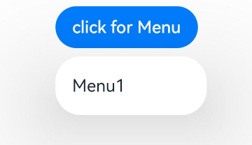
创建默认样式的菜单
菜单需要调用bindMenu接口来实现。bindMenu响应绑定组件的点击事件,绑定组件后手势点击对应组件后即可弹出。
Button('click for Menu').bindMenu([{value: 'Menu1',action: () => {console.info('handle Menu1 select')}}])
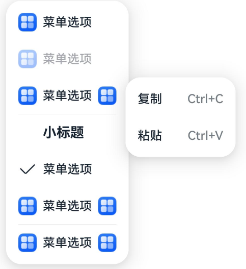
创建自定义样式的菜单
当默认样式不满足开发需求时,可使用**@Builder自定义菜单内容**,通过bindMenu接口进行菜单的自定义。
@Builder开发菜单内的内容
class Tmp {iconStr2: ResourceStr = $r("app.media.view_list_filled")set(val: Resource) {this.iconStr2 = val}
}@Entry
@Component
struct menuExample {@State select: boolean = trueprivate iconStr: ResourceStr = $r("app.media.view_list_filled")private iconStr2: ResourceStr = $r("app.media.view_list_filled")@BuilderSubMenu() {Menu() {MenuItem({ content: "复制", labelInfo: "Ctrl+C" })MenuItem({ content: "粘贴", labelInfo: "Ctrl+V" })}}@BuilderMyMenu() {Menu() {MenuItem({ startIcon: $r("app.media.icon"), content: "菜单选项" })MenuItem({ startIcon: $r("app.media.icon"), content: "菜单选项" }).enabled(false)MenuItem({startIcon: this.iconStr,content: "菜单选项",endIcon: $r("app.media.arrow_right_filled"),// 当builder参数进行配置时,表示与menuItem项绑定了子菜单。鼠标hover在该菜单项时,会显示子菜单。builder: this.SubMenu})MenuItemGroup({ header: '小标题' }) {MenuItem({ content: "菜单选项" }).selectIcon(true).selected(this.select).onChange((selected) => {console.info("menuItem select" + selected);let Str: Tmp = new Tmp()Str.set($r("app.media.icon"))})MenuItem({startIcon: $r("app.media.view_list_filled"),content: "菜单选项",endIcon: $r("app.media.arrow_right_filled"),builder: this.SubMenu})}MenuItem({startIcon: this.iconStr2,content: "菜单选项",endIcon: $r("app.media.arrow_right_filled")})}}build() {// ...}
}
bindMenu属性绑定组件
Button('click for Menu').bindMenu(this.MyMenu)
创建支持右键或长按的菜单
通过bindContextMenu接口自定义菜单,设置菜单弹出的触发方式,触发方式为右键或长按。使用bindContextMenu弹出的菜单项是在独立子窗口内的,可显示在应用窗口外部。
- @Builder开发菜单内的内容与上文写法相同。
- 确认菜单的弹出方式,使用bindContextMenu属性绑定组件。示例中为右键弹出菜单。
Button('click for Menu').bindContextMenu(this.MyMenu, ResponseType.RightClick)
气泡提示(Popup)
Popup属性可绑定在组件上显示气泡弹窗提示,设置弹窗内容、交互逻辑和显示状态。主要用于屏幕录制、信息弹出提醒等显示状态。
气泡分为两种类型,一种是系统提供的气泡PopupOptions,一种是开发者可以自定义的气泡CustomPopupOptions。其中,PopupOptions通过配置primaryButton和secondaryButton来设置带按钮的气泡,CustomPopupOptions通过配置builder来设置自定义的气泡。
气泡可以通过配置mask来实现模态和非模态窗口,mask为true或者颜色值的时候,气泡为模态窗口,mask为false时,气泡为非模态窗口。
文字提示气泡
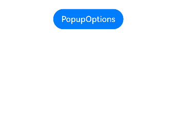
文本提示气泡常用于只展示带有文本的信息提示,不带有任何交互的场景。Popup属性需绑定组件,当bindPopup属性中参数show为true时会弹出气泡提示。
在Button组件上绑定Popup属性,每次点击Button按钮,handlePopup会切换布尔值,当值为true时,触发bindPopup弹出气泡。
@Entry
@Component
struct PopupExample {@State handlePopup: boolean = falsebuild() {Column() {Button('PopupOptions').onClick(() => {this.handlePopup = !this.handlePopup}).bindPopup(this.handlePopup, {message: 'This is a popup with PopupOptions',})}.width('100%').padding({ top: 5 })}
}
添加气泡状态变化的事件
通过onStateChange参数为气泡添加状态变化的事件回调,可以判断当前气泡的显示状态。
@Entry
@Component
struct PopupExample {@State handlePopup: boolean = falsebuild() {Column() {Button('PopupOptions').onClick(() => {this.handlePopup = !this.handlePopup}).bindPopup(this.handlePopup, {message: 'This is a popup with PopupOptions',onStateChange: (e)=> { // 返回当前的气泡状态if (!e.isVisible) {this.handlePopup = false}}})}.width('100%').padding({ top: 5 })}
}
带按钮的提示气泡
通过primaryButton、secondaryButton属性为气泡最多设置两个Button按钮,通过此按钮进行简单的交互,开发者可以通过配置action参数来设置想要触发的操作。
@Entry
@Component
struct PopupExample22 {@State handlePopup: boolean = falsebuild() {Column() {Button('PopupOptions').margin({ top: 200 }).onClick(() => {this.handlePopup = !this.handlePopup}).bindPopup(this.handlePopup, {message: 'This is a popup with PopupOptions',primaryButton: {value: 'Confirm',action: () => {this.handlePopup = !this.handlePopupconsole.info('confirm Button click')}},secondaryButton: {value: 'Cancel',action: () => {this.handlePopup = !this.handlePopup}},onStateChange: (e) => {if (!e.isVisible) {this.handlePopup = false}}})}.width('100%').padding({ top: 5 })}
}
气泡的动画
气泡通过定义transition控制气泡的进场和出场动画效果。
// xxx.ets
@Entry
@Component
struct PopupExample {@State handlePopup: boolean = false@State customPopup: boolean = false// popup构造器定义弹框内容@Builder popupBuilder() {Row() {Text('Custom Popup with transitionEffect').fontSize(10)}.height(50).padding(5)}build() {Flex({ direction: FlexDirection.Column }) {// PopupOptions 类型设置弹框内容Button('PopupOptions').onClick(() => {this.handlePopup = !this.handlePopup}).bindPopup(this.handlePopup, {message: 'This is a popup with transitionEffect',placementOnTop: true,showInSubWindow: false,onStateChange: (e) => {if (!e.isVisible) {this.handlePopup = false}},// 设置弹窗显示动效为透明度动效与平移动效的组合效果,无退出动效transition:TransitionEffect.asymmetric(TransitionEffect.OPACITY.animation({ duration: 1000, curve: Curve.Ease }).combine(TransitionEffect.translate({ x: 50, y: 50 })),TransitionEffect.IDENTITY)}).position({ x: 100, y: 150 })// CustomPopupOptions 类型设置弹框内容Button('CustomPopupOptions').onClick(() => {this.customPopup = !this.customPopup}).bindPopup(this.customPopup, {builder: this.popupBuilder,placement: Placement.Top,showInSubWindow: false,onStateChange: (e) => {if (!e.isVisible) {this.customPopup = false}},// 设置弹窗显示动效与退出动效为缩放动效transition:TransitionEffect.scale({ x: 1, y: 0 }).animation({ duration: 500, curve: Curve.Ease })}).position({ x: 80, y: 300 })}.width('100%').padding({ top: 5 })}
}
自定义气泡
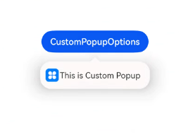
开发者可以使用CustomPopupOptions的builder创建自定义气泡,@Builder中可以放自定义的内容。除此之外,还可以通过popupColor等参数控制气泡样式。
@Entry
@Component
struct Index {@State customPopup: boolean = false// popup构造器定义弹框内容@Builder popupBuilder() {Row({ space: 2 }) {Image($r("app.media.icon")).width(24).height(24).margin({ left: 5 })Text('This is Custom Popup').fontSize(15)}.width(200).height(50).padding(5)}build() {Column() {Button('CustomPopupOptions').position({x:100,y:200}).onClick(() => {this.customPopup = !this.customPopup}).bindPopup(this.customPopup, {builder: this.popupBuilder, // 气泡的内容placement:Placement.Bottom, // 气泡的弹出位置popupColor:Color.Pink, // 气泡的背景色onStateChange: (e) => {if (!e.isVisible) {this.customPopup = false}}})}.height('100%')}
}
使用者通过配置placement参数将弹出的气泡放到需要提示的位置。弹窗构造器会触发弹出提示信息,来引导使用者完成操作,也让使用者有更好的UI体验。
气泡样式
以下示例通过设置popupColor(背景颜色)、mask(蒙层样式)、width(气泡宽度)、placement(显示位置)实现气泡的样式。
// xxx.ets@Entry
@Component
struct PopupExample {@State handlePopup: boolean = falsebuild() {Column({ space: 100 }) {Button('PopupOptions').onClick(() => {this.handlePopup = !this.handlePopup}).bindPopup(this.handlePopup, {width: 200,message: 'This is a popup.',popupColor: Color.Red, // 设置气泡的背景色mask: {color: '#33d9d9d9'},placement: Placement.Top,backgroundBlurStyle: BlurStyle.NONE // 去除背景模糊效果需要关闭气泡的模糊背景})}.width('100%')}
}
绑定模态页面
绑定模态页面概述
模态页面是一种大面板大视图交互式的弹窗,和其他弹窗组件一样,通常用于在保持当前的上下文环境时,临时展示用户需关注的信息或待处理的操作。相比于其他弹窗组件,模态页面的内容都需要开发者通过自定义组件来填充实现,可展示的视图往往也很大。默认需要用户进行交互才能够退出模态页面。ArkUI当前提供了半模态和全模态两类模态页面组件。
- 半模态:开发者可以利用此模态页面实现多形态效果。支持不同宽度设备显示不同样式的半模态页面。允许用户通过侧滑,点击蒙层,点击关闭按钮,下拉关闭半模态页面。
- 全模态:开发者可以利用此模态页面实现全屏的模态弹窗效果。默认需要侧滑才能关闭。
绑定半模态页面(bindSheet)
绑定全模态页面(bindContentCover)
即时反馈(Toast)
即时反馈(Toast)是一种临时性的消息提示框,用于向用户显示简短的操作反馈或状态信息。它通常在屏幕的底部或顶部短暂弹出,随后在一段时间后自动消失。即时反馈的主要目的是提供简洁、不打扰的信息反馈,避免干扰用户当前的操作流程。
可以通过使用UIContext中的getPromptAction方法获取当前UI上下文关联的PromptAction对象,再通过该对象调用showToast创建并显示文本提示框。
使用建议
- 合理使用弹出场景,而不是频繁的提醒用户
- 注意文本的信息密度,即使反馈展示时间有限,应当避免长文本的出现
- 杜绝强制占位和密集弹出的提示
- 遵从系统默认弹出位置
即时反馈模式对比
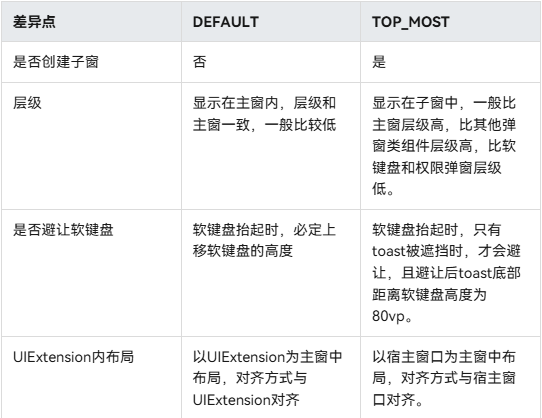
即时反馈提供了两种显示模式,分别为DEFAULT(显示在应用内)、TOP_MOST(显示在应用之上)。
在TOP_MOST类型的Toast显示前,会创建一个全屏大小的子窗(手机上子窗大小和主窗大小一致),然后在该子窗上计算Toast的布局位置,最后显示在该子窗上。具体和DEFAULT模式Toast的差异如下:
import {promptAction} from '@kit.ArkUI';
@Entry
@Component
struct Index {build() {Column({space: 10}) {TextInput()Button() {Text("DEFAULT类型Toast").fontSize(20).fontWeight(FontWeight.Bold)}.width('100%').onClick(()=>{promptAction.showToast({message:"ok,我是DEFAULT toast",duration:2000,showMode: promptAction.ToastShowMode.DEFAULT,bottom:80})})Button() {Text("TOPMOST类型Toast").fontSize(20).fontWeight(FontWeight.Bold)}.width('100%').onClick(()=>{promptAction.showToast({message:"ok,我是TOP_MOST toast",duration:2000,showMode: promptAction.ToastShowMode.TOP_MOST,bottom:85})})}}
}
创建即时反馈
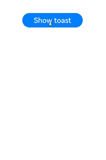
适用于短时间内提示自动消失的场景
import { LengthMetrics, PromptAction } from '@kit.ArkUI'
import { BusinessError } from '@kit.BasicServicesKit'@Entry
@Component
struct toastExample {private uiContext: UIContext = this.getUIContext()private promptAction: PromptAction = this.uiContext.getPromptAction()build() {Column() {Button('Show toast').fontSize(20).onClick(() => {try {this.promptAction.showToast({message: 'Hello World',duration: 2000});} catch (error) {let message = (error as BusinessError).messagelet code = (error as BusinessError).codeconsole.error(`showToast args error code is ${code}, message is ${message}`);};})}.height('100%').width('100%').justifyContent(FlexAlign.Center)}
}
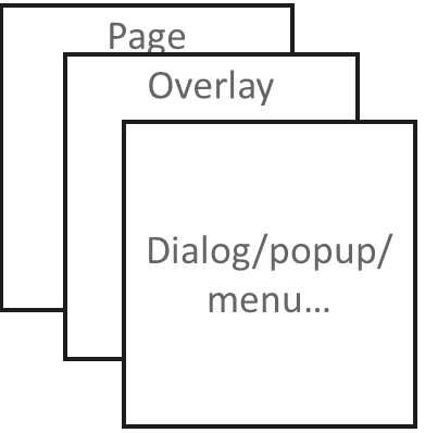
设置浮层(OverlayManager)
浮层(OverlayManager) 用于将自定义的UI内容展示在页面(Page)之上,在Dialog、Popup、Menu、BindSheet、BindContentCover和Toast等组件之下,展示的范围为当前窗口安全区内。可适用于常驻悬浮等场景。
可以通过使用UIContext中的getOverlayManager方法获取当前UI上下文关联的OverlayManager对象,再通过该对象调用对应方法。
规格约束
- OverlayManager上节点的层级在Page页面层级之上,在Dialog、Popup、Menu、BindSheet、BindContentCover和Toast等组件之下。
- OverlayManager添加的节点显示和消失时没有默认动画
- OverlayManager上节点安全区域内外的绘制方式与Page一致,键盘避让方式与Page一致。
- 与OverlayManager相关的属性推荐采用AppStorage来进行应用全局存储,以免切换页面后属性值发生变化从而导致业务错误。
设置浮层
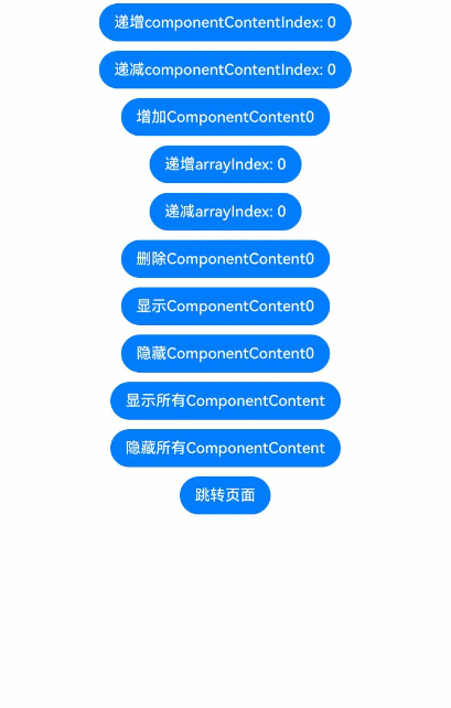
在OverlayManager上新增指定节点(addComponentContent)、删除指定节点(removeComponentContent)、显示所有节点(showAllComponentContents)和隐藏所有节点(hideAllComponentContents)。
import { ComponentContent, OverlayManager, router } from '@kit.ArkUI';class Params {text: string = ""offset: Positionconstructor(text: string, offset: Position) {this.text = textthis.offset = offset}
}
@Builder
function builderText(params: Params) {Column() {Text(params.text).fontSize(30).fontWeight(FontWeight.Bold)}.offset(params.offset)
}@Entry
@Component
struct OverlayExample {@State message: string = 'ComponentContent';private uiContext: UIContext = this.getUIContext()private overlayNode: OverlayManager = this.uiContext.getOverlayManager()@StorageLink('contentArray') contentArray: ComponentContent<Params>[] = []@StorageLink('componentContentIndex') componentContentIndex: number = 0@StorageLink('arrayIndex') arrayIndex: number = 0@StorageLink("componentOffset") componentOffset: Position = {x: 0, y: 80}build() {Column({space:10}) {Button("递增componentContentIndex: " + this.componentContentIndex).onClick(()=>{++this.componentContentIndex})Button("递减componentContentIndex: " + this.componentContentIndex).onClick(()=>{--this.componentContentIndex})Button("增加ComponentContent" + this.contentArray.length).onClick(()=>{let componentContent = new ComponentContent(this.uiContext, wrapBuilder<[Params]>(builderText),new Params(this.message + (this.contentArray.length), this.componentOffset))this.contentArray.push(componentContent)this.overlayNode.addComponentContent(componentContent, this.componentContentIndex)})Button("递增arrayIndex: " + this.arrayIndex).onClick(()=>{++this.arrayIndex})Button("递减arrayIndex: " + this.arrayIndex).onClick(()=>{--this.arrayIndex})Button("删除ComponentContent" + this.arrayIndex).onClick(()=>{if (this.arrayIndex >= 0 && this.arrayIndex < this.contentArray.length) {let componentContent = this.contentArray.splice(this.arrayIndex, 1)this.overlayNode.removeComponentContent(componentContent.pop())} else {console.info("arrayIndex有误")}})Button("显示ComponentContent" + this.arrayIndex).onClick(()=>{if (this.arrayIndex >= 0 && this.arrayIndex < this.contentArray.length) {let componentContent = this.contentArray[this.arrayIndex]this.overlayNode.showComponentContent(componentContent)} else {console.info("arrayIndex有误")}})Button("隐藏ComponentContent" + this.arrayIndex).onClick(()=>{if (this.arrayIndex >= 0 && this.arrayIndex < this.contentArray.length) {let componentContent = this.contentArray[this.arrayIndex]this.overlayNode.hideComponentContent(componentContent)} else {console.info("arrayIndex有误")}})Button("显示所有ComponentContent").onClick(()=>{this.overlayNode.showAllComponentContents()})Button("隐藏所有ComponentContent").onClick(()=>{this.overlayNode.hideAllComponentContents()})Button("跳转页面").onClick(()=>{router.pushUrl({url: 'pages/Second'})})}.width('100%').height('100%')}
}
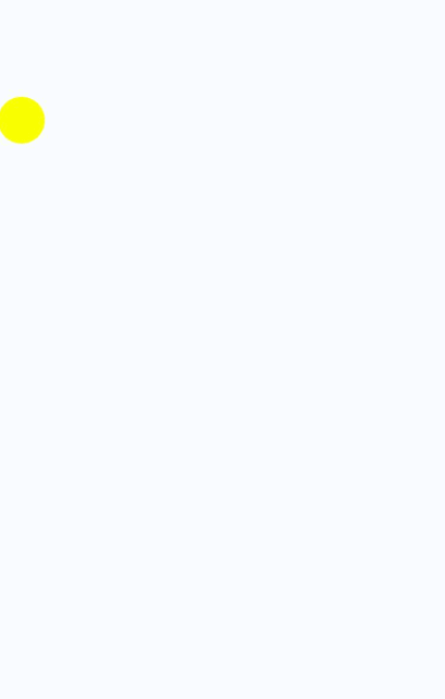
显示一个始终在屏幕左侧的悬浮球,点击可以弹出alertDialog弹窗。
import { ComponentContent, OverlayManager } from '@kit.ArkUI';class Params {context: UIContextoffset: Positionconstructor(context: UIContext, offset: Position) {this.context = contextthis.offset = offset}
}
@Builder
function builderOverlay(params: Params) {Column() {Stack(){}.width(50).height(50).backgroundColor(Color.Yellow).position(params.offset).borderRadius(50).onClick(() => {params.context.showAlertDialog({title: 'title',message: 'Text',autoCancel: true,alignment: DialogAlignment.Center,gridCount: 3,confirm: {value: 'Button',action: () => {}},cancel: () => {}})})}.focusable(false).width('100%').height('100%').hitTestBehavior(HitTestMode.Transparent)
}@Entry
@Component
struct OverlayExample {@State message: string = 'ComponentContent';private uiContext: UIContext = this.getUIContext()private overlayNode: OverlayManager = this.uiContext.getOverlayManager()private overlayContent:ComponentContent<Params>[] = []controller: TextInputController = new TextInputController()aboutToAppear(): void {let uiContext = this.getUIContext();let componentContent = new ComponentContent(this.uiContext, wrapBuilder<[Params]>(builderOverlay),new Params(uiContext, {x:0, y: 100}))this.overlayNode.addComponentContent(componentContent, 0)this.overlayContent.push(componentContent)}aboutToDisappear(): void {let componentContent = this.overlayContent.pop()this.overlayNode.removeComponentContent(componentContent)}build() {Column() {}.width('100%').height('100%')}
}
相关文章:
鸿蒙UI(ArkUI-方舟UI框架)- 使用弹框
返回主章节 → 鸿蒙UI(ArkUI-方舟UI框架) 文章目录 弹框概述使用弹出框(Dialog)弹出框概述不依赖UI组件的全局自定义弹出框(openCustomDialog)(推荐)生命周期自定义弹出框的打开与关闭更新自定义弹出框内容更新自定义弹出框的属性完整示例 基础自定义弹…...
学习笔记(24): 机器学习之数据预处理Pandas和转换成张量格式[2]
学习笔记(24): 机器学习之数据预处理Pandas和转换成张量格式[2] 学习机器学习,需要学习如何预处理原始数据,这里用到pandas,将原始数据转换为张量格式的数据。 学习笔记(23): 机器学习之数据预处理Pandas和转换成张量格式[1]-CSDN博客 下面…...

在不同型号的手机或平板上后台运行Aidlux
在不同型号的手机或平板上后台运行Aidlux 一、鸿蒙/HarmonyOS手机与平板 二、小米手机与平板 三、OPPO手机与平板 四、vivo手机与平板 一、鸿蒙/HarmonyOS手机与平板 (系统版本有差异,但操作原理相通) 第一步:点击设置——应用和…...
【SSM】SpringBoot学习笔记1:SpringBoot快速入门
前言: 文章是系列学习笔记第9篇。基于黑马程序员课程完成,是笔者的学习笔记与心得总结,供自己和他人参考。笔记大部分是对黑马视频的归纳,少部分自己的理解,微量ai解释的内容(ai部分会标出)。 …...
1.企业可观测性监控三大支柱及开源方案的横评对比
[ 知识是人生的灯塔,只有不断学习,才能照亮前行的道路 ] 📢 大家好,我是 WeiyiGeek,一名深耕安全运维开发(SecOpsDev)领域的技术从业者,致力于探索DevOps与安全的融合(De…...

Neo4j图数据库管理:原理、技术与最佳实践
Neo4j作为领先的图数据库,其高效管理是发挥图计算潜力的关键。本文基于官方技术文档,深入探讨其管理原理、核心操作及生产环境最佳实践。 一、 管理架构与核心原理 多数据库架构 系统数据库 (system):管理元数据(用户、角色、权限、其他数据库信息)。标准数据库:存储实际…...
数据类型介绍)
Elasticsearch中的地理空间(Geo)数据类型介绍
在Elasticsearch中,地理空间(Geo)数据类型用于存储和处理与地理位置相关的数据,支持基于地理坐标的查询、过滤和分析。这类数据类型允许用户在分布式环境中高效地处理地理空间相关的搜索、聚合和可视化需求,广泛应用于地图应用、物流追踪、位置服务(LBS)等场景。 一、核…...

[论文阅读] 软件工程 | 如何挖掘可解释性需求?三种方法的深度对比研究
如何挖掘可解释性需求?三种方法的深度对比研究 研究背景:当软件变复杂,我们需要“说明书” 想象你买了一台智能家电,却发现它的运行逻辑完全看不懂,按钮按下后毫无反应,故障时也不提示原因——这就是现代…...
双空间知识蒸馏用于大语言模型
Dual-Space Knowledge Distillation for Large Language Models 发表:EMNLP 2024 机构:Beijing Key Lab of Traffic Data Analysis and Mining 连接:https://aclanthology.org/2024.emnlp-main.1010.pdf 代码:GitHub - songmz…...
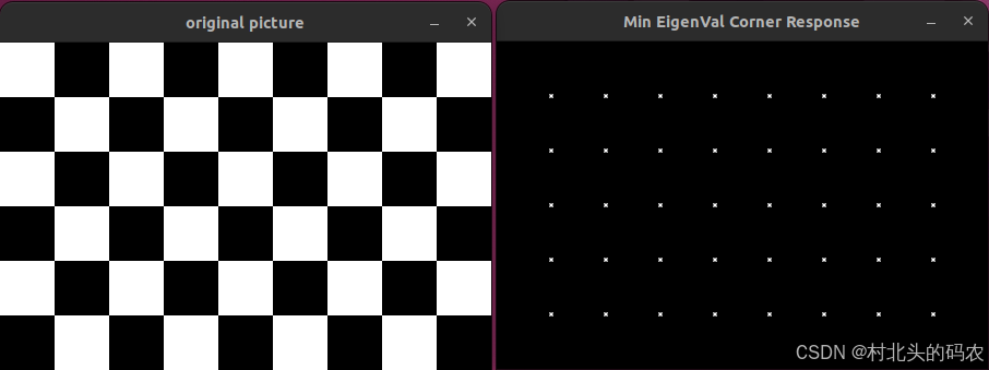
OpenCV CUDA模块特征检测------角点检测的接口createMinEigenValCorner()
操作系统:ubuntu22.04 OpenCV版本:OpenCV4.9 IDE:Visual Studio Code 编程语言:C11 算法描述 该函数创建一个 基于最小特征值(Minimum Eigenvalue)的角点响应计算对象,这是另一种经典的角点检测方法&…...

Git 提交备注应该如何规范
Git 提交备注应该如何规范 在软件开发过程中,Git 作为版本控制系统被广泛使用,而规范的提交备注对于代码的可维护性、团队协作以及项目的长期发展都有着至关重要的意义。良好的提交备注能够清晰地记录代码变更的原因、范围和影响,方便团队成…...

青少年编程与数学 02-020 C#程序设计基础 17课题、WEB与移动开发
青少年编程与数学 02-020 C#程序设计基础 17课题、WEB与移动开发 一、C#语言Web和移动项目开发1. Web项目开发2. 移动项目开发 二、ASP.NET Core1. ASP.NET Core 基础架构1.1 请求处理管道1.2 主机模型1.3 服务器选项 2. 核心新特性2.1 NativeAOT 支持2.2 增强的身份验证方案2.…...
)
Qt OpenGL 实现交互功能(如鼠标、键盘操作)
一、基本概念 1. Qt 事件系统与 OpenGL 渲染的协同 Qt 提供了完善的事件处理机制,而 OpenGL 负责图形渲染。交互的实现本质上是: 事件捕获:通过 Qt 的事件系统(如 mousePressEvent、keyPressEvent)捕获用户输入。 状态更新:根据输入事件更新场景状态(如相机位置、模型…...

【Go语言基础【3】】变量、常量、值类型与引用类型
文章目录 一、值(Value)与字面量(Literal)1. 值2. 字面量 二、变量(Variable)1. 声明方式2. 赋值方式3. 变量默认值4. 类型与值的匹配 三、常量(Constant)1. 声明方式2. 常量的特性3…...
8天Python从入门到精通【itheima】-69~70(字符串的常见定义和操作+案例练习)
目录 69节-字符串的定义和操作 1.学习目标 2.数据容器视角下的字符串 3.字符串的下标索引 4.字符串是一个无法修改的数据容器 5.字符串的常用操作 【1】index方法 【2】replace方法:进过替换,得到一个新的字符串 【3】split方法:将字…...

在 Linux 中查看文件并过滤空行
在 Linux 中查看文件并过滤空行 在 Linux 中查看文件内容时过滤掉空行有多种方法,以下是几种常用的方法: 方法 1:使用 grep grep -v ^$ filename-v:反转匹配,只显示不匹配的行^$:表示空行的正则表达式&a…...
GC1809:高性能音频接收与转换芯片
GC1809 是一款高性能音频接收与转换芯片,适用于多种音频设备,如 A/V 接收器、多媒体音响设备、机顶盒等。本文将简要介绍该芯片的主要特性、性能参数及应用。 主要特性 多协议兼容:兼容 IEC60958、S/PDIF、EIAJ CP1201 和 AES3 协议。 多种…...

项目实战——C语言扫雷游戏
这是一款9*9的扫雷游戏 扫雷游戏 1.需求分析2.程序框架设计3.分函数实现打印游戏菜单界面游戏主逻辑函数程序主入口初始化游戏棋盘随机布置地雷显示当前棋盘状态计算指定位置周围的地雷数量玩家排雷主逻辑 4.分文件实现(1)test.c(2࿰…...

【Java】CopyOnWriteArrayList
一,概述 CopyOnWriteArrayList作为List接口的实现之一,它区分于ArrayList在于它是线程安全的。如它名字一样,所有的写操作均复制了原数组的值,虽说代价较大,但读多写少的环境下,是可接受的。笔者在此简单看…...

【JS进阶】ES6 实现继承的方式
ES6 实现继承的方式 基本语法 class Parent {constructor(name) {this.name name;this.colors [red, blue];}sayName() {console.log(this.name);} }class Child extends Parent {constructor(name, age) {super(name); // 必须调用super(),且在使用this之前thi…...

mac 电脑Pycharm ImportError: No module named pip
这个错误表明 PyCharm 在尝试使用 pip 时找不到该模块,通常是由于 Python 环境中的 pip 未正确安装或损坏引起的。以下是针对 Mac 系统的完整解决方案: 解决方案步骤: 检查终端中的 pip 状态 打开终端(Terminal),执行以下命令: bash python3 -m ensurepip --upgrade pi…...
C#入门学习笔记 #8(委托)
欢迎进入这篇文章,文章内容为学习C#过程中做的笔记,可能有些内容的逻辑衔接不是很连贯,但还是决定分享出来,由衷的希望可以帮助到你。 笔记内容会持续更新~~ 本章介绍C#中的委托,本章难度较大... 委托 C#中的委托是C语言、C++中函数指针的升级版。接下来介绍一个概念—…...
CSS 3D 变换中z-index失效问题
CSS 3D 变换中 z-index 失效问题 1. z-index 失效了 在 CSS 中,z-index 通常用于控制元素的层叠顺序,数值越大,元素越靠前显示。在 3D 变换(如 rotateX、translateZ) 中使用 z-index 时,可能会发现z-inde…...

Vue3 中使用 i18n
Vue3 中使用i18n 在 Vue 3 中使用国际化(i18n)可以通过官方的 vue-i18n 库来实现。vue-i18n 是专门为 Vue 应用设计的国际化解决方案,支持多语言切换、动态内容插值等功能。 以下是如何在 Vue 3 中使用 vue-i18n 的详细步骤: 1.…...

vue:当前对象添加对应值
this.$set(this.dynamicValidateForm.domains[index], // 目标对象item.roundProperty, // 要添加的属性名row[item.roundProperty] ? row[item.roundProperty].split(",") : [] // 属性值 ); 说明: 第一个参数:th…...
Tailwind CSS 实战:基于 Kooboo 构建 AI 对话框页面(七):消息框交互功能添加
Tailwind CSS 实战,基于Kooboo构建AI对话框页面(一) Tailwind CSS 实战,基于Kooboo构建AI对话框页面(二):实现交互功能 Tailwind CSS 实战,基于 Kooboo 构建 AI 对话框页面&#x…...

JavaScript 核心原理深度解析-不停留于表面的VUE等的使用!
一、解释 JavaScript 作为当今最流行的编程语言之一,广泛应用于 Web 开发、移动端开发、后端开发等多个领域。然而,许多开发者在使用 JavaScript 时,往往只关注其表面的语法和 API,而对其底层原理和核心机制了解甚少。深入理解 J…...
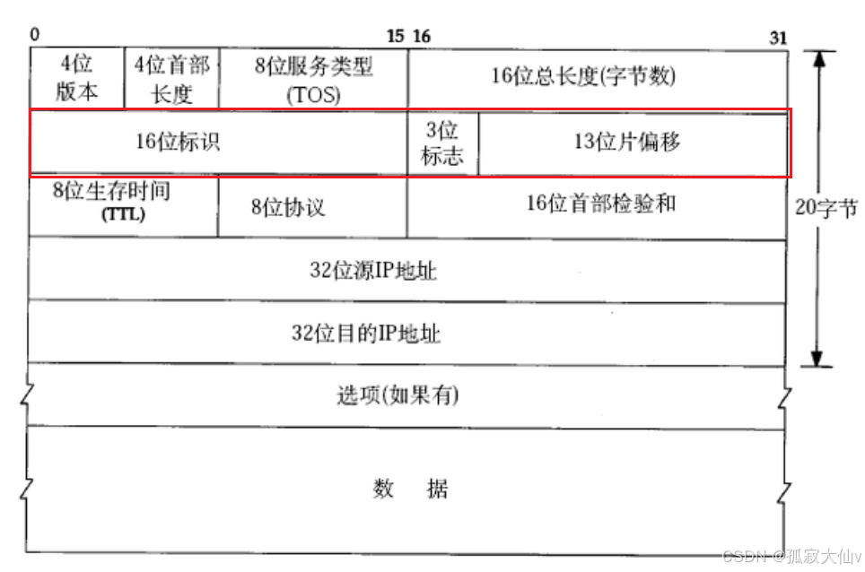
【计算机网络】网络层IP协议与子网划分详解:从主机通信到网络设计的底层逻辑
🔥个人主页🔥:孤寂大仙V 🌈收录专栏🌈:计算机网络 🌹往期回顾🌹: 【计算机网络】传输层TCP协议——协议段格式、三次握手四次挥手、超时重传、滑动窗口、流量控制、 &…...
基于WSL搭建Ubnutu 20.04.6 LTS(二)-部署Docker环境
Docker是一组平台即服务(PaaS)的产品。它基于操作系统层级的虚拟化技术,将软件与其依赖项打包为容器。托管容器的软件称为Docker引擎。Docker能够帮助开发者在轻量级容器中自动部署应用程序,并使得不同容器中的应用程序彼此隔离&a…...
【图像处理入门】6. 频域图像处理:傅里叶变换与滤波的奥秘
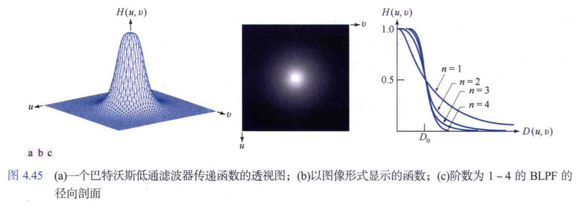
摘要 频域图像处理通过傅里叶变换将图像从空间域转换到频率域,为图像增强、去噪、压缩等任务提供全新视角。本文将深入解析傅里叶变换原理,介绍低通、高通滤波的实现方式,结合OpenCV和Python代码展示频域滤波在去除噪声、增强边缘中的应用,帮助读者掌握图像频域处理的核心…...