WHAT - 通过 shadcn 组件源码学习 React
目录
- 一、button
- 1. 导入部分
- 2. 定义按钮的样式变体
- 1. `variant`
- 2. `size`
- 总结
- 3. 定义按钮的属性类型
- 4. 定义按钮组件
- 5. 导出组件和样式变体
- 总结
- 二、multi-select
- 多选组件的核心上下文与状态
- 1. 上下文与钩子
- 2. MultiSelector 组件
- 组件子部分
- 1. MultiSelectorTrigger
- 2. MultiSelectorInput
- 3. MultiSelectorContent
- 4. MultiSelectorList
- 5. MultiSelectorItem
- 总结
一、button
组件来源:https://ui.shadcn.com/docs/components/button
import * as React from "react"
import { Slot } from "@radix-ui/react-slot"
import { cva, type VariantProps } from "class-variance-authority"import { cn } from "@/lib/utils"const buttonVariants = cva("inline-flex items-center justify-center whitespace-nowrap rounded-md text-sm font-medium ring-offset-background transition-colors focus-visible:outline-none focus-visible:ring-2 focus-visible:ring-ring focus-visible:ring-offset-2 disabled:pointer-events-none disabled:opacity-50",{variants: {variant: {default:"bg-primary text-primary-foreground hover:bg-primary/90",destructive:"bg-destructive text-destructive-foreground hover:bg-destructive/90",outline:"border border-input bg-background hover:bg-accent hover:text-accent-foreground",secondary:"bg-secondary text-secondary-foreground hover:bg-secondary/80",disabled:"disabled-foreground bg-disabled text-disabled-foreground",ghost: "hover:bg-accent focus-visible:ring-0 focus-visible:ring-offset-0",link: "hover:text-primary underline-offset-4",icon: "border border-input",},size: {default: "h-8 px-5 py-1.5",sm: "h-9 rounded-md px-3",lg: "h-11 rounded-md px-8",icon: "h-6 w-6",iconSm: "h-8 w-8",ssm: "h-6",},},defaultVariants: {variant: "default",size: "default",},},
)export interface ButtonPropsextends React.ButtonHTMLAttributes<HTMLButtonElement>,VariantProps<typeof buttonVariants> {asChild?: boolean
}const Button = React.forwardRef<HTMLButtonElement, ButtonProps>(({ className, variant, size, asChild = false, ...props }, ref) => {const Comp = asChild ? Slot : "button"return (<CompclassName={cn(buttonVariants({ variant, size, className }))}ref={ref}{...props}/>)},
)
Button.displayName = "Button"export { Button, buttonVariants }
这段代码定义了一个可变样式的按钮组件Button,使用了多个工具和库。我们将逐步解释各部分代码的作用。
1. 导入部分
import * as React from "react"
import { Slot } from "@radix-ui/react-slot"
import { cva, type VariantProps } from "class-variance-authority"
import { cn } from "@/lib/utils"
React: 导入React库。Slot: 从@radix-ui/react-slot库中导入Slot组件,用于支持“asChild”属性。cva和VariantProps: 从class-variance-authority库中导入,用于定义可变样式。cn: 从项目中的utils工具库导入cn函数,用于合并CSS类名。
2. 定义按钮的样式变体
const buttonVariants = cva("inline-flex items-center justify-center whitespace-nowrap rounded-md text-sm font-medium ring-offset-background transition-colors focus-visible:outline-none focus-visible:ring-2 focus-visible:ring-ring focus-visible:ring-offset-2 disabled:pointer-events-none disabled:opacity-50",{variants: {variant: {default: "bg-primary text-primary-foreground hover:bg-primary/90",destructive: "bg-destructive text-destructive-foreground hover:bg-destructive/90",outline: "border border-input bg-background hover:bg-accent hover:text-accent-foreground",secondary: "bg-secondary text-secondary-foreground hover:bg-secondary/80",disabled: "disabled-foreground bg-disabled text-disabled-foreground",ghost: "hover:bg-accent focus-visible:ring-0 focus-visible:ring-offset-0",link: "hover:text-primary underline-offset-4",icon: "border border-input",},size: {default: "h-8 px-5 py-1.5",sm: "h-9 rounded-md px-3",lg: "h-11 rounded-md px-8",icon: "h-6 w-6",iconSm: "h-8 w-8",ssm: "h-6",},},defaultVariants: {variant: "default",size: "default",},},
)
buttonVariants: 使用cva函数定义了按钮的样式变体。这个对象包含了两个主要部分:variants: 定义了不同的变体选项,如variant和size,每个选项又包含不同的具体样式。defaultVariants: 定义了默认的变体值。
当然,让我们逐一解释variants对象中的每个属性及其对应的CSS属性值。
1. variant
variant属性定义了按钮的多种视觉风格,每种风格都对应一组CSS类名。
-
defaultbg-primary {background-color: var(--primary-color); } text-primary-foreground {color: var(--primary-foreground-color); } hover:bg-primary/90 {background-color: var(--primary-color);opacity: 0.9; } -
destructivebg-destructive {background-color: var(--destructive-color); } text-destructive-foreground {color: var(--destructive-foreground-color); } hover:bg-destructive/90 {background-color: var(--destructive-color);opacity: 0.9; } -
outlineborder border-input {border: 1px solid var(--input-border-color); } bg-background {background-color: var(--background-color); } hover:bg-accent {background-color: var(--accent-color); } hover:text-accent-foreground {color: var(--accent-foreground-color); } -
secondarybg-secondary {background-color: var(--secondary-color); } text-secondary-foreground {color: var(--secondary-foreground-color); } hover:bg-secondary/80 {background-color: var(--secondary-color);opacity: 0.8; } -
disableddisabled-foreground {color: var(--disabled-foreground-color); } bg-disabled {background-color: var(--disabled-color); } text-disabled-foreground {color: var(--disabled-foreground-color); } -
ghosthover:bg-accent {background-color: var(--accent-color); } focus-visible:ring-0 {outline: none;box-shadow: none; } focus-visible:ring-offset-0 {box-shadow: none; } -
linkhover:text-primary {color: var(--primary-color); } underline-offset-4 {text-underline-offset: 4px; } -
iconborder border-input {border: 1px solid var(--input-border-color); }
2. size
size属性定义了按钮的不同尺寸,每个尺寸都对应一组CSS类名。
-
defaulth-8 {height: 2rem; /* 32px */ } px-5 {padding-left: 1.25rem; /* 20px */padding-right: 1.25rem; /* 20px */ } py-1.5 {padding-top: 0.375rem; /* 6px */padding-bottom: 0.375rem; /* 6px */ } -
smh-9 {height: 2.25rem; /* 36px */ } rounded-md {border-radius: 0.375rem; /* 6px */ } px-3 {padding-left: 0.75rem; /* 12px */padding-right: 0.75rem; /* 12px */ } -
lgh-11 {height: 2.75rem; /* 44px */ } rounded-md {border-radius: 0.375rem; /* 6px */ } px-8 {padding-left: 2rem; /* 32px */padding-right: 2rem; /* 32px */ } -
iconh-6 {height: 1.5rem; /* 24px */ } w-6 {width: 1.5rem; /* 24px */ } -
iconSmh-8 {height: 2rem; /* 32px */ } w-8 {width: 2rem; /* 32px */ } -
ssmh-6 {height: 1.5rem; /* 24px */ }
总结
这些variants属性提供了丰富的样式变体,使得按钮组件可以根据不同的需求应用不同的外观和尺寸,通过简单的属性传递实现了多样化的视觉效果。
3. 定义按钮的属性类型
export interface ButtonPropsextends React.ButtonHTMLAttributes<HTMLButtonElement>,VariantProps<typeof buttonVariants> {asChild?: boolean
}
ButtonProps: 定义了按钮组件的属性接口,扩展了React.ButtonHTMLAttributes和VariantProps。另外,还增加了asChild属性,用于指定是否将按钮作为子组件渲染。
4. 定义按钮组件
const Button = React.forwardRef<HTMLButtonElement, ButtonProps>(({ className, variant, size, asChild = false, ...props }, ref) => {const Comp = asChild ? Slot : "button"return (<CompclassName={cn(buttonVariants({ variant, size, className }))}ref={ref}{...props}/>)},
)
Button.displayName = "Button"
Button: 使用React.forwardRef定义一个带有转发引用(ref)的按钮组件。Comp: 根据asChild属性,动态决定使用Slot组件还是button元素。cn(buttonVariants({ variant, size, className })): 使用cn函数合并传入的className和通过buttonVariants生成的变体样式。
5. 导出组件和样式变体
export { Button, buttonVariants }
Button和buttonVariants均被导出,允许在其他模块中使用。
总结
这个组件使用了class-variance-authority库来管理按钮的样式变体,通过React的forwardRef和条件渲染实现了灵活的按钮组件。这样,开发者可以通过简单的属性传递来改变按钮的外观和行为。
二、multi-select
组件来源:https://shadcn-extension.vercel.app/docs/multi-select
如果希望有远程搜索能力,可以参考 https://shadcnui-expansions.typeart.cc/docs/multiple-selector
"use client";import { Badge } from "@/components/ui/badge";
import {Command,CommandItem,CommandEmpty,CommandList,
} from "@/components/ui/command";
import { cn } from "@/lib/utils";
import { Command as CommandPrimitive } from "cmdk";
import { X as RemoveIcon, Check } from "lucide-react";
import React, {KeyboardEvent,createContext,forwardRef,useCallback,useContext,useState,
} from "react";type MultiSelectorProps = {values: string[];onValuesChange: (value: string[]) => void;loop?: boolean;options: {label: string, value: string, color?: string}[];
} & React.ComponentPropsWithoutRef<typeof CommandPrimitive>;interface MultiSelectContextProps {value: string[];options: {label: string, value: string, color?: string}[];onValueChange: (value: any) => void;open: boolean;setOpen: (value: boolean) => void;inputValue: string;setInputValue: React.Dispatch<React.SetStateAction<string>>;activeIndex: number;setActiveIndex: React.Dispatch<React.SetStateAction<number>>;
}const MultiSelectContext = createContext<MultiSelectContextProps | null>(null);const useMultiSelect = () => {const context = useContext(MultiSelectContext);if (!context) {throw new Error("useMultiSelect must be used within MultiSelectProvider");}return context;
};const MultiSelector = ({values: value,onValuesChange: onValueChange,loop = false,className,children,dir,options,...props
}: MultiSelectorProps) => {const [inputValue, setInputValue] = useState("");const [open, setOpen] = useState<boolean>(false);const [activeIndex, setActiveIndex] = useState<number>(-1);const onValueChangeHandler = useCallback((val: string) => {if (value.includes(val)) {onValueChange(value.filter((item) => item !== val));} else {onValueChange([...value, val]);}},[value]);// TODO : change from else if use to switch case statementconst handleKeyDown = useCallback((e: KeyboardEvent<HTMLDivElement>) => {const moveNext = () => {const nextIndex = activeIndex + 1;setActiveIndex(nextIndex > value.length - 1 ? (loop ? 0 : -1) : nextIndex);};const movePrev = () => {const prevIndex = activeIndex - 1;setActiveIndex(prevIndex < 0 ? value.length - 1 : prevIndex);};if ((e.key === "Backspace" || e.key === "Delete") && value.length > 0) {if (inputValue.length === 0) {if (activeIndex !== -1 && activeIndex < value.length) {onValueChange(value.filter((item) => item !== value[activeIndex]));const newIndex = activeIndex - 1 < 0 ? 0 : activeIndex - 1;setActiveIndex(newIndex);} else {onValueChange(value.filter((item) => item !== value[value.length - 1]));}}} else if (e.key === "Enter") {setOpen(true);} else if (e.key === "Escape") {if (activeIndex !== -1) {setActiveIndex(-1);} else {setOpen(false);}} else if (dir === "rtl") {if (e.key === "ArrowRight") {movePrev();} else if (e.key === "ArrowLeft" && (activeIndex !== -1 || loop)) {moveNext();}} else {if (e.key === "ArrowLeft") {movePrev();} else if (e.key === "ArrowRight" && (activeIndex !== -1 || loop)) {moveNext();}}},[value, inputValue, activeIndex, loop]);return (<MultiSelectContext.Providervalue={{value,onValueChange: onValueChangeHandler,open,setOpen,inputValue,setInputValue,activeIndex,setActiveIndex,options,}}><CommandonKeyDown={handleKeyDown}className={cn("overflow-visible bg-transparent flex flex-col",className)}dir={dir}{...props}>{children}</Command></MultiSelectContext.Provider>);
};const MultiSelectorTrigger = forwardRef<HTMLDivElement,React.HTMLAttributes<HTMLDivElement>
>(({ className, children, ...props }, ref) => {const { value, onValueChange, activeIndex, open, options } = useMultiSelect();const mousePreventDefault = useCallback((e: React.MouseEvent) => {e.preventDefault();e.stopPropagation();}, []);const valueOptions = options.filter(option => value.includes(option.value))return (<divref={ref}className={cn("min-h-9 bg-accent text-sm flex items-center flex-wrap gap-1 px-3 rounded-lg mb-2",open ? "ring-ring ring-1 ring-offset-1 bg-background" : "",className)}{...props}>{valueOptions.map((item, index) => (<Badgekey={item.value}color={item.color}className={cn("flex flex-wrap gap-1",activeIndex === index && "ring-2 ring-muted-foreground")}><span>{item.label}</span><buttonaria-label={`Remove ${item.label} option`}aria-roledescription="button to remove option"type="button"onMouseDown={mousePreventDefault}onClick={() => onValueChange(item.value)}><span className="sr-only">Remove {item.label} option</span><RemoveIcon className="h-4 w-4 hover:stroke-destructive" /></button></Badge>))}{children}</div>);
});MultiSelectorTrigger.displayName = "MultiSelectorTrigger";const MultiSelectorInput = forwardRef<React.ElementRef<typeof CommandPrimitive.Input>,React.ComponentPropsWithoutRef<typeof CommandPrimitive.Input>
>(({ className, ...props }, ref) => {const { setOpen, inputValue, setInputValue, activeIndex, setActiveIndex } =useMultiSelect();return (<CommandPrimitive.Input{...props}ref={ref}value={inputValue}onValueChange={activeIndex === -1 ? setInputValue : undefined}onBlur={() => setOpen(false)}onFocus={() => setOpen(true)}onClick={() => setActiveIndex(-1)}className={cn("bg-transparent outline-none placeholder:text-muted-foreground flex-1",className,activeIndex !== -1 && "caret-transparent")}/>);
});MultiSelectorInput.displayName = "MultiSelectorInput";const MultiSelectorContent = forwardRef<HTMLDivElement,React.HTMLAttributes<HTMLDivElement>
>(({ children }, ref) => {const { open } = useMultiSelect();return (<div ref={ref} className="relative">{open && children}</div>);
});MultiSelectorContent.displayName = "MultiSelectorContent";const MultiSelectorList = forwardRef<React.ElementRef<typeof CommandPrimitive.List>,React.ComponentPropsWithoutRef<typeof CommandPrimitive.List>
>(({ className, children }, ref) => {return (<CommandListref={ref}className={cn("p-2 flex flex-col gap-2 rounded-md scrollbar-thin scrollbar-track-transparent transition-colors scrollbar-thumb-muted-foreground dark:scrollbar-thumb-muted scrollbar-thumb-rounded-lg w-full absolute bg-background shadow-md z-10 border border-muted top-0",className)}>{children}<CommandEmpty><span className="text-muted-foreground">No results found</span></CommandEmpty></CommandList>);
});MultiSelectorList.displayName = "MultiSelectorList";const MultiSelectorItem = forwardRef<React.ElementRef<typeof CommandPrimitive.Item>,{ value: string } & React.ComponentPropsWithoutRef<typeof CommandPrimitive.Item>
>(({ className, value, children, ...props }, ref) => {const { value: Options, onValueChange, setInputValue } = useMultiSelect();const mousePreventDefault = useCallback((e: React.MouseEvent) => {e.preventDefault();e.stopPropagation();}, []);const isIncluded = Options.includes(value);return (<CommandItemref={ref}{...props}onSelect={() => {onValueChange(value);setInputValue("");}}className={cn("rounded-md cursor-pointer px-4 py-1.5 transition-colors flex justify-between ",className,isIncluded && "opacity-50 cursor-default",props.disabled && "opacity-50 cursor-not-allowed")}onMouseDown={mousePreventDefault}>{children}{isIncluded && <Check className="h-4 w-4" />}</CommandItem>);
});MultiSelectorItem.displayName = "MultiSelectorItem";export {MultiSelector,MultiSelectorTrigger,MultiSelectorInput,MultiSelectorContent,MultiSelectorList,MultiSelectorItem,
};
这个组件库实现了一个多选下拉框,包含选择、显示和过滤选项等功能。组件利用了 React 的上下文、钩子和基于 Radix UI 和 CMDK 的组合控件。
以下是对每个主要部分的详细分析:
多选组件的核心上下文与状态
1. 上下文与钩子
const MultiSelectContext = createContext<MultiSelectContextProps | null>(null);const useMultiSelect = () => {const context = useContext(MultiSelectContext);if (!context) {throw new Error("useMultiSelect must be used within MultiSelectProvider");}return context;
};
MultiSelectContext 是一个 React 上下文,用于共享多选组件的状态。useMultiSelect 是一个自定义钩子,用于方便地访问这个上下文。
2. MultiSelector 组件
const MultiSelector = ({values: value,onValuesChange: onValueChange,loop = false,className,children,dir,options,...props
}: MultiSelectorProps) => {const [inputValue, setInputValue] = useState("");const [open, setOpen] = useState<boolean>(false);const [activeIndex, setActiveIndex] = useState<number>(-1);const onValueChangeHandler = useCallback((val: string) => {if (value.includes(val)) {onValueChange(value.filter((item) => item !== val));} else {onValueChange([...value, val]);}},[value]);const handleKeyDown = useCallback((e: KeyboardEvent<HTMLDivElement>) => {// handle keyboard navigation and actions},[value, inputValue, activeIndex, loop]);return (<MultiSelectContext.Providervalue={{value,onValueChange: onValueChangeHandler,open,setOpen,inputValue,setInputValue,activeIndex,setActiveIndex,options,}}><CommandonKeyDown={handleKeyDown}className={cn("overflow-visible bg-transparent flex flex-col",className)}dir={dir}{...props}>{children}</Command></MultiSelectContext.Provider>);
};
MultiSelector 是整个多选组件的核心,负责管理状态并提供上下文。它使用 useState 管理输入值、打开状态和活动索引。通过 useCallback 创建 onValueChangeHandler 和 handleKeyDown 函数,用于处理选项的选择和键盘事件。
组件子部分
1. MultiSelectorTrigger
const MultiSelectorTrigger = forwardRef<HTMLDivElement,React.HTMLAttributes<HTMLDivElement>
>(({ className, children, ...props }, ref) => {const { value, onValueChange, activeIndex, open, options } = useMultiSelect();const mousePreventDefault = useCallback((e: React.MouseEvent) => {e.preventDefault();e.stopPropagation();}, []);const valueOptions = options.filter(option => value.includes(option.value))return (<divref={ref}className={cn("min-h-9 bg-accent text-sm flex items-center flex-wrap gap-1 px-3 rounded-lg mb-2",open ? "ring-ring ring-1 ring-offset-1 bg-background" : "",className)}{...props}>{valueOptions.map((item, index) => (<Badgekey={item.value}color={item.color}className={cn("flex flex-wrap gap-1",activeIndex === index && "ring-2 ring-muted-foreground")}><span>{item.label}</span><buttonaria-label={`Remove ${item.label} option`}aria-roledescription="button to remove option"type="button"onMouseDown={mousePreventDefault}onClick={() => onValueChange(item.value)}><span className="sr-only">Remove {item.label} option</span><RemoveIcon className="h-4 w-4 hover:stroke-destructive" /></button></Badge>))}{children}</div>);
});MultiSelectorTrigger.displayName = "MultiSelectorTrigger";
MultiSelectorTrigger 是一个用于显示已选择选项的组件。它使用 useMultiSelect 钩子从上下文获取状态,并渲染已选项的 Badge 组件。每个 Badge 组件包含一个按钮,用于移除该选项。
2. MultiSelectorInput
const MultiSelectorInput = forwardRef<React.ElementRef<typeof CommandPrimitive.Input>,React.ComponentPropsWithoutRef<typeof CommandPrimitive.Input>
>(({ className, ...props }, ref) => {const { setOpen, inputValue, setInputValue, activeIndex, setActiveIndex } =useMultiSelect();return (<CommandPrimitive.Input{...props}ref={ref}value={inputValue}onValueChange={activeIndex === -1 ? setInputValue : undefined}onBlur={() => setOpen(false)}onFocus={() => setOpen(true)}onClick={() => setActiveIndex(-1)}className={cn("bg-transparent outline-none placeholder:text-muted-foreground flex-1",className,activeIndex !== -1 && "caret-transparent")}/>);
});MultiSelectorInput.displayName = "MultiSelectorInput";
MultiSelectorInput 是一个输入组件,用于处理用户输入。它使用 useMultiSelect 钩子从上下文获取状态,并根据输入值更新上下文中的 inputValue。它还处理输入框的焦点和点击事件。
3. MultiSelectorContent
const MultiSelectorContent = forwardRef<HTMLDivElement,React.HTMLAttributes<HTMLDivElement>
>(({ children }, ref) => {const { open } = useMultiSelect();return (<div ref={ref} className="relative">{open && children}</div>);
});MultiSelectorContent.displayName = "MultiSelectorContent";
MultiSelectorContent 是一个包装组件,用于渲染多选内容。当上下文中的 open 状态为 true 时,显示其子组件。
4. MultiSelectorList
const MultiSelectorList = forwardRef<React.ElementRef<typeof CommandPrimitive.List>,React.ComponentPropsWithoutRef<typeof CommandPrimitive.List>
>(({ className, children }, ref) => {return (<CommandListref={ref}className={cn("p-2 flex flex-col gap-2 rounded-md scrollbar-thin scrollbar-track-transparent transition-colors scrollbar-thumb-muted-foreground dark:scrollbar-thumb-muted scrollbar-thumb-rounded-lg w-full absolute bg-background shadow-md z-10 border border-muted top-0",className)}>{children}<CommandEmpty><span className="text-muted-foreground">No results found</span></CommandEmpty></CommandList>);
});MultiSelectorList.displayName = "MultiSelectorList";
MultiSelectorList 是一个列表组件,用于渲染所有可选项。它使用 CommandList 组件,并在子组件中包含一个 CommandEmpty 组件,当没有结果时显示提示。
5. MultiSelectorItem
const MultiSelectorItem = forwardRef<React.ElementRef<typeof CommandPrimitive.Item>,{ value: string } & React.ComponentPropsWithoutRef<typeof CommandPrimitive.Item>
>(({ className, value, children, ...props }, ref) => {const { value: Options, onValueChange, setInputValue } = useMultiSelect();const mousePreventDefault = useCallback((e: React.MouseEvent) => {e.preventDefault();e.stopPropagation();}, []);const isIncluded = Options.includes(value);return (<CommandItemref={ref}{...props}onSelect={() => {onValueChange(value);setInputValue("");}}className={cn("rounded-md cursor-pointer px-4 py-1.5 transition-colors flex justify-between ",className,isIncluded && "opacity-50 cursor-default",props.disabled && "opacity-50 cursor-not-allowed")}onMouseDown={mousePreventDefault}>{children}{isIncluded && <Check className="h-4 w-4" />}</CommandItem>);
});MultiSelectorItem.displayName = "MultiSelectorItem";
MultiSelectorItem 是一个可选项组件。它使用 useMultiSelect 钩子从上下文获取状态,并在选中时调用 onValueChange 更新上下文中的选项状态。它还会在已选项时显示一个 Check 图标。
总结
这个多选组件库通过上下文和钩子共享状态,并将组件划分为多个小组件,每个小组件负责处理不同的功能和渲染部分。
相关文章:

WHAT - 通过 shadcn 组件源码学习 React
目录 一、button1. 导入部分2. 定义按钮的样式变体1. variant2. size总结 3. 定义按钮的属性类型4. 定义按钮组件5. 导出组件和样式变体总结 二、multi-select多选组件的核心上下文与状态1. 上下文与钩子2. MultiSelector 组件 组件子部分1. MultiSelectorTrigger2. MultiSelec…...
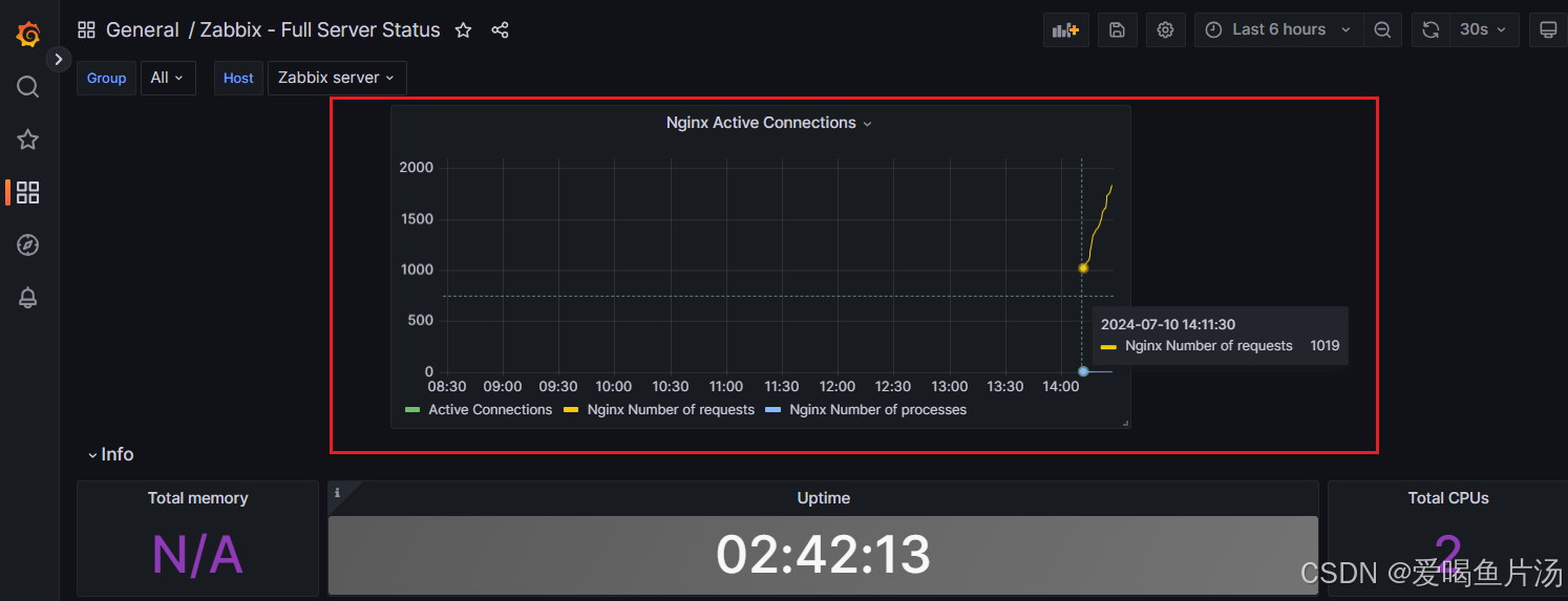
grafana对接zabbix数据展示
目录 1、初始化、安装grafana 2、浏览器访问 3、安装zabbix 4、zabbix数据对接grafana 5、如何导入模板? ① 设置键值 ② 在zabbix web端完成自定义监控项 ③ garafana里添加nginx上面的的三个监控项 6、如何自定义监控项? 以下实验沿用上一篇z…...

C++ 学习补充 1:短链算法
短链算法 短链算法: 将长链接 转化为 一个短key 之所以不是短url 是因为 ,url 短链不区分大小写,可用空间比较小。 短链算法通常用于将一个长网址转换成一个较短的字符串,以便于分享和存储。这种算法通常需要满足以下条件&#…...
硅纪元视角 | 语音克隆突破:微软VALL-E 2,Deepfake新纪元!
在数字化浪潮的推动下,人工智能(AI)正成为塑造未来的关键力量。硅纪元视角栏目紧跟AI科技的最新发展,捕捉行业动态;提供深入的新闻解读,助您洞悉技术背后的逻辑;汇聚行业专家的见解,…...
没有51基础,能不能学好STM32?
在开始前刚好我有一些资料,是我根据网友给的问题精心整理了一份「STM32的资料从专业入门到高级教程」, 点个关注在评论区回复“888”之后私信回复“888”,全部无偿共享给大家!!! 我们通常准备攻读一本大部…...

Web开发:VUE3小白开发入门基础笔记
一、基本语法 1.click 后端路由:api/GetDataList 返回值:Value 前端要做的事: ①拿到Value值,传到a标签 ②a标签有一个按钮,每点击一下,Value的值加一。 前端需要用click语法 【代码】 <template>…...
)
技术周总结 2024.07.15~07.21周日(Spark性能优化)
文章目录 一、07.19 周五1.1)问题01: spark性能优化1.2)问题02: spark是怎么应用在机器学习领域的1.3)问题03:spark自带工具有哪些?1.4)问题04: spark日志的知识点有哪些…...

提高性能的常见技术
1.数据库层面: 读写分离,对于大部分业务来说,读取操作要大于写入,同一个库,既读又写的话,负载会比较重,拆分为读库和写入库,可以降低数据库的负载,分时或延迟将写入的数…...

LeetCode206 反转链表
前言 题目: 206. 反转链表 文档: 代码随想录——反转链表 编程语言: C 解题状态: 有了思路以后没敢尝试 思路 需要注意的是创建指针不会申请额外的内存空间。 代码 方法一: 双指针法/迭代 我的理解是创建了三个指针…...

nginx通过nginx_upstream_check_module实现后端健康检查
1、简介说明 nginx是常用的反向代理和负载均衡服务,具有强大并发能力、稳定性、丰富的功能集、低资源的消耗。 nginx自身是没有针对后端节点健康检查的,但是可以通过默认自带的ngx_http_proxy_module 模块和ngx_http_upstream_module模块中的相关指令来完…...
)
FastGPT 知识库搜索测试功能解析(二)
目录 一、代码解析 1.1 searchTest.ts 1.2 controller.ts 本文接上一篇文章FastGPT 知识库搜索测试功能解析 对具体代码进行解析。 一、代码解析 FastGPT 知识库的搜索测试功能主要涉及两个文件,分别是 searchTest.ts 和 controller.ts 文件,下面分别进行介绍。 1.1 se…...

双向链表<数据结构 C版>
目录 关于链表的分类 双向链表结构体 初始化 尾插 头插 打印 判断是否为空 尾删 头删 查找 指定位置之后的插入 指定位置的删除 销毁 关于链表的分类 根据链表的三大特性,单向or双向、带头or不带头、循环or不循环,可将链表分为2*2*2…...

react18+
主要是围绕函数式组件讲,18主要用就是函数式组件,学习前先熟悉下原生js的基本使用,主要是事件 1、UI操作 1.1、书写jsx标签语言 基本写法和原生如同一则,只是放在一个方法里面返回而已,我们称这样的写法为函数式组件…...

rk3568 OpenHarmony4.1 Launcher定制开发—桌面壁纸替换
Launcher 作为系统人机交互的首要入口,提供应用图标的显示、点击启动、卸载应用,并提供桌面布局设置以及最近任务管理等功能。本文将介绍如何使用Deveco Studio进行单独launcher定制开发、然后编译并下载到开发板,以通过Launcher修改桌面背景…...
 与 int(10))
MySQL:送分or送命 varchar(30) 与 int(10)
摘要: VARCHAR(30) 和 INT(10) 在MySQL中代表两种不同类型的字段,它们之间的主要区别在于它们存储的数据类型、存储方式以及显示宽度的含义。 正文: INT(10) 在MySQL中,当你看到INT(10)这样的数据类型定义时,可能会…...

【odoo17】后端py方法触发右上角提示组件
概要 在前面文章中,有介绍过前端触发的通知服务。 【odoo】右上角的提示(通知服务) 此文章则介绍后端触发方法。 内容 直接上代码:但是前提一定是按钮触发!!!!! def bu…...

1775D - Friendly Spiders
题目链接:Friendly Spiders 首先我们可以考虑暴力做法,那就是每两个蜘蛛判断一下gcd,如果不等于1,那就连条边,这样的话时间复杂度是O(n^2),显然超时,因此我们可以采用类似…...

【python】OpenCV—Point Polygon Test
文章目录 1、完整代码2、涉及到的库cv2.pointPolygonTestcv2.minMaxLoc 1、完整代码 from __future__ import print_function from __future__ import division import cv2 as cv import numpy as np # Create an image r 100 src np.zeros((4*r, 4*r), dtypenp.uint8) # 创…...

6 Go语言的常量、枚举、作用域
本专栏将从基础开始,循序渐进,由浅入深讲解Go语言,希望大家都能够从中有所收获,也请大家多多支持。 查看相关资料与知识库 专栏地址:Go专栏 如果文章知识点有错误的地方,请指正!大家一起学习,…...

第十一章 数据结构
第十一章 数据结构 11.1 数组 数组是元素的顺序集合,通常这些元素具有相同的数据类型 索引表示元素在数组中的顺序号,顺序号从数组开始处计数 数组元素通过索引被独立给出了地址,数组整体上有一个名称,但每个元素利用数组的的…...

扩散模型与流匹配:生成式AI的核心原理与实践
1. 扩散模型与流匹配的核心原理1.1 扩散模型:从噪声到数据的渐进式转换扩散模型的核心思想是通过学习一个逐步去噪的过程来生成数据。这个过程模拟了物理学中的扩散现象——就像一滴墨水在水中逐渐扩散,最终均匀分布。在生成式AI中,我们把这个…...

从Selective Search到RPN:目标检测的“找茬”进化史,以及为什么Faster RCNN是里程碑
目标检测的范式革命:从手工特征到端到端学习的演进之路 在计算机视觉领域,目标检测一直是最具挑战性的任务之一——不仅要识别图像中的物体是什么,还要精确标出它们的位置。这个看似简单的需求背后,却经历了从手工特征到深度学习&…...

ARM GIC-600中断控制器错误检测与恢复机制详解
1. GIC-600中断控制器架构概述GIC-600作为ARMv8/v9架构中的通用中断控制器,在现代SoC设计中扮演着关键角色。不同于传统的中断控制器,GIC-600采用了分层式设计,将中断处理逻辑划分为分发器(Distributor)、CPU接口(CPU Interface)和重分发器(R…...

MCP:破解大模型困境的更优解,重构AI与世界的交互范式
目录 一、大模型的核心困境:Function Calling难以突破的“瓶颈” 1.1 困境一:工具适配繁琐,开发成本居高不下 1.2 困境二:实时数据获取低效,精度难以保障 1.3 困境三:跨平台协同缺失,复杂任务…...

黑马点评新手必看:2大实战坑避坑指南
以下是针对“黑马点评新手避坑|2个高频实战坑”内容的整理导入。我将以结构清晰的方式,逐步梳理两个常见问题,包括错误示例、问题分析、正确解决方案(附可直接复用的代码),以及避坑要点。内容基于真实编程实…...

Windows域渗透新思路:在暗月靶场中复现并绕过MS14-068与黄金票据
Windows域渗透实战:MS14-068与黄金票据的靶场复现与防御思考 靶场环境搭建与初始信息收集 在开始技术探索之前,我们需要一个可控的实验环境。暗月内网靶场提供了理想的低版本Windows域环境,特别适合复现经典漏洞。这个靶场模拟了企业内网中…...

5分钟本地化视频字幕提取:87种语言支持,完全免费的专业级解决方案
5分钟本地化视频字幕提取:87种语言支持,完全免费的专业级解决方案 【免费下载链接】video-subtitle-extractor 视频硬字幕提取,生成srt文件。无需申请第三方API,本地实现文本识别。基于深度学习的视频字幕提取框架,包含…...

新手开发者从注册到发出第一个AI请求的Taotoken快速上手指南
新手开发者从注册到发出第一个AI请求的Taotoken快速上手指南 1. 注册与获取API Key 访问Taotoken官网并完成注册流程。登录后进入控制台,在「API密钥管理」页面点击「创建新密钥」。系统将生成一个以sk-开头的API Key,请妥善保存此密钥。若密钥不慎泄露…...

如何使用edb-debugger:多架构调试的终极指南
如何使用edb-debugger:多架构调试的终极指南 【免费下载链接】edb-debugger edb is a cross-platform AArch32/x86/x86-64 debugger. 项目地址: https://gitcode.com/gh_mirrors/ed/edb-debugger edb-debugger是一款功能强大的跨平台调试工具,支持…...

从‘Building kernel modules’报错聊起:Linux内核模块与NVIDIA驱动的‘爱恨情仇’
从内核模块构建失败看NVIDIA驱动的技术困境与解决方案 当你在Linux系统上安装NVIDIA显卡驱动时,最令人头疼的莫过于看到"Building kernel modules"报错。这个看似简单的错误背后,隐藏着Linux内核与闭源驱动之间复杂的技术博弈。本文将带你深入…...