WPF+MVVM案例实战(十七)- 自定义字体图标按钮的封装与实现(ABC类)
提示:文章写完后,目录可以自动生成,如何生成可参考右边的帮助文档
文章目录
- 1、案例效果
- 1、按钮分类
- 2、ABC类按钮实现
- 1、文件创建
- 2、字体图标资源
- 3、自定义依赖属性
- 4、按钮特效样式实现
- 3、按钮案例演示
- 1、页面实现与文件创建
- 2、依赖注入
- 3 运行效果
- 4、源代码下载
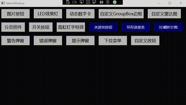
1、案例效果

1、按钮分类
在WPF开发中,最常见的就是按钮的使用,这里我们总结以下大概的按钮种类,然后分别实现对应的按钮。
- A【纯文字按钮】 只有文字,但是会根据根据操作改变颜色
- B【纯图片按钮 】只有图片,但是会有图片旋转或者变色特效
- C【文字图片按钮】图片在左,文字在右边,有部分特效
- D【文字图片按钮】图片在右,文字在左边,有部分特效
- E【文字图片按钮】图片在上,文字在下,有部分特效
- F【文字图片按钮】图片在下,文字在上,有部分特效
基本上所有按钮都是上面归纳的情况了,接下来,我们一步一步去实现上面的这些按钮并封装成对应的按钮控件,方便后续使用。
2、ABC类按钮实现
1、文件创建
打开 Wpf_Examples 项目,在自定义控类库中创建文件夹 Buttons ,在Buttons 文件夹下创建 IconFontButton.cs 文件,这里我们将 ABC 三类统称为 字体图标按钮。目录结构如下所示:

2、字体图标资源
想要做出好看的按钮,离不开一个能随时满足自己需求样式的好图标,这里推荐使用阿里巴巴矢量图标库,一款强大免费的图标库,可以搜索到你想要的图标,随时满足你想要的按钮图标,可以创建项目,把每个项目图标单独分类,简直不要太好。每个项目都可以下载 字体资源,也就是 .ttf 格式的子图文件,有了这个文件,我们使用图标就只需要 图标下面的字体代码即可。


3、自定义依赖属性
- PressedBackground - 鼠标按下背景样式类型: Brush默认值: Brushes.DarkBlue
- PressedForeground - 鼠标按下前景样式(图标、文字)类型: Brush默认值:Brushes.White
- MouseOverBackground - 鼠标进入背景样式类型: Brush默认值: Brushes.RoyalBlue
- MouseOverForeground - 鼠标进入前景样式类型: Brush默认值: Brushes.White
- FIcon - 按钮字体图标编码类型: string默认值: “\ue604”
- FIconSize - 按钮字体图标大小类型: int默认值: 20
- FIconMargin - 字体图标间距类型: Thickness默认值: new Thickness(0, 1, 3, 1)
- AllowsAnimation - 是否启用Ficon动画类型: bool 默认值: true
- CornerRadius - 按钮圆角大小, 左上,右上,右下,左下 默认值: 2
- ContentDecorations - 内容装饰集合 类型: TextDecorationCollection 默认值: null
每个依赖属性都有一个对应的属性用于获取和设置其值,并且通过DependencyProperty.Register 方法注册为依赖属性。这些属性允许 IconFontButton 控件根据用户交互或数据变化动态地改变其外观。
代码实现如下:
using System;
using System.Collections.Generic;
using System.Linq;
using System.Text;
using System.Threading.Tasks;
using System.Windows.Controls;
using System.Windows.Media;
using System.Windows;namespace CustomControlLib.Buttons
{public class IconFontButton : Button{public static readonly DependencyProperty PressedBackgroundProperty =DependencyProperty.Register("PressedBackground", typeof(Brush), typeof(IconFontButton), new PropertyMetadata(Brushes.DarkBlue));/// <summary>/// 鼠标按下背景样式/// </summary>public Brush PressedBackground{get { return (Brush)GetValue(PressedBackgroundProperty); }set { SetValue(PressedBackgroundProperty, value); }}public static readonly DependencyProperty PressedForegroundProperty =DependencyProperty.Register("PressedForeground", typeof(Brush), typeof(IconFontButton), new PropertyMetadata(Brushes.White));/// <summary>/// 鼠标按下前景样式(图标、文字)/// </summary>public Brush PressedForeground{get { return (Brush)GetValue(PressedForegroundProperty); }set { SetValue(PressedForegroundProperty, value); }}public static readonly DependencyProperty MouseOverBackgroundProperty =DependencyProperty.Register("MouseOverBackground", typeof(Brush), typeof(IconFontButton), new PropertyMetadata(Brushes.RoyalBlue));/// <summary>/// 鼠标进入背景样式/// </summary>public Brush MouseOverBackground{get { return (Brush)GetValue(MouseOverBackgroundProperty); }set { SetValue(MouseOverBackgroundProperty, value); }}public static readonly DependencyProperty MouseOverForegroundProperty =DependencyProperty.Register("MouseOverForeground", typeof(Brush), typeof(IconFontButton), new PropertyMetadata(Brushes.White));/// <summary>/// 鼠标进入前景样式/// </summary>public Brush MouseOverForeground{get { return (Brush)GetValue(MouseOverForegroundProperty); }set { SetValue(MouseOverForegroundProperty, value); }}public static readonly DependencyProperty FIconProperty =DependencyProperty.Register("FIcon", typeof(string), typeof(IconFontButton), new PropertyMetadata("\ue604"));/// <summary>/// 按钮字体图标编码/// </summary>public string FIcon{get { return (string)GetValue(FIconProperty); }set { SetValue(FIconProperty, value); }}public static readonly DependencyProperty FIconSizeProperty =DependencyProperty.Register("FIconSize", typeof(int), typeof(IconFontButton), new PropertyMetadata(20));/// <summary>/// 按钮字体图标大小/// </summary>public int FIconSize{get { return (int)GetValue(FIconSizeProperty); }set { SetValue(FIconSizeProperty, value); }}public static readonly DependencyProperty FIconMarginProperty = DependencyProperty.Register("FIconMargin", typeof(Thickness), typeof(IconFontButton), new PropertyMetadata(new Thickness(0, 1, 3, 1)));/// <summary>/// 字体图标间距/// </summary>public Thickness FIconMargin{get { return (Thickness)GetValue(FIconMarginProperty); }set { SetValue(FIconMarginProperty, value); }}public static readonly DependencyProperty AllowsAnimationProperty = DependencyProperty.Register("AllowsAnimation", typeof(bool), typeof(IconFontButton), new PropertyMetadata(true));/// <summary>/// 是否启用Ficon动画/// </summary>public bool AllowsAnimation{get { return (bool)GetValue(AllowsAnimationProperty); }set { SetValue(AllowsAnimationProperty, value); }}public static readonly DependencyProperty CornerRadiusProperty =DependencyProperty.Register("CornerRadius", typeof(CornerRadius), typeof(IconFontButton), new PropertyMetadata(new CornerRadius(2)));/// <summary>/// 按钮圆角大小,左上,右上,右下,左下/// </summary>public CornerRadius CornerRadius{get { return (CornerRadius)GetValue(CornerRadiusProperty); }set { SetValue(CornerRadiusProperty, value); }}public static readonly DependencyProperty ContentDecorationsProperty = DependencyProperty.Register("ContentDecorations", typeof(TextDecorationCollection), typeof(IconFontButton), new PropertyMetadata(null));public TextDecorationCollection ContentDecorations{get { return (TextDecorationCollection)GetValue(ContentDecorationsProperty); }set { SetValue(ContentDecorationsProperty, value); }}static IconFontButton(){DefaultStyleKeyProperty.OverrideMetadata(typeof(IconFontButton), new FrameworkPropertyMetadata(typeof(IconFontButton)));}}
}
4、按钮特效样式实现
在 自定义控件的 Themes 文件夹下创建 Buttons 文件夹,主要存放各种按钮的样式,新建资源样视文件 IconFontButton.xaml ,引用按钮控件如下所示:

然后实现按钮特效样式,这里我把样式分成2个部分实现。
- 1、按钮模板样式 FButton_Template
- 2、按钮属性样式 FButtonStyle
样式代码实现如下所示:
<ResourceDictionary xmlns="http://schemas.microsoft.com/winfx/2006/xaml/presentation"xmlns:x="http://schemas.microsoft.com/winfx/2006/xaml"xmlns:local="clr-namespace:CustomControlLib.Buttons"><SolidColorBrush x:Key="ButtonBackground" Color="DimGray"></SolidColorBrush><SolidColorBrush x:Key="ButtonForeground" Color="White"></SolidColorBrush><!--鼠标在按钮上时按钮背景颜色--><SolidColorBrush x:Key="ButtonMouseOverBackground" Color="#93545454"></SolidColorBrush><!--鼠标在按钮上时按钮字体颜色--><SolidColorBrush x:Key="ButtonMouseOverForeground" Color="#E6E6E6"></SolidColorBrush><SolidColorBrush x:Key="ButtonPressedBackground" Color="#2F2F2F"></SolidColorBrush><SolidColorBrush x:Key="ButtonPressedForeground" Color="White"></SolidColorBrush><Style x:Key="IconFontText" TargetType="TextBlock"><Setter Property="FontFamily" Value="pack://application:,,,/CustomControlLib;component/Fonts/#iconfont"></Setter><Setter Property="Foreground" Value="White"/><Setter Property="TextAlignment" Value="Center"/><Setter Property="HorizontalAlignment" Value="Center"/><Setter Property="VerticalAlignment" Value="Center"/><Setter Property="FontSize" Value="20"/></Style><ControlTemplate x:Key="FButton_Template" TargetType="{x:Type local:IconFontButton}"><Border x:Name="border" Background="{Binding RelativeSource={RelativeSource Mode=TemplatedParent}, Path= Background}" Height="{Binding RelativeSource={RelativeSource Mode=TemplatedParent}, Path=Height}" CornerRadius="{Binding RelativeSource={RelativeSource Mode=TemplatedParent}, Path=CornerRadius}" BorderBrush="{TemplateBinding BorderBrush}" BorderThickness="{TemplateBinding BorderThickness}"Width="{Binding RelativeSource={RelativeSource Mode=TemplatedParent}, Path=Width}"><StackPanel Orientation="Horizontal" VerticalAlignment="Center" Margin="{TemplateBinding Padding}"HorizontalAlignment="{TemplateBinding HorizontalContentAlignment}"><TextBlock x:Name="icon"  Margin="{Binding RelativeSource={RelativeSource Mode=TemplatedParent}, Path=FIconMargin}" RenderTransformOrigin="0.5,0.5" Style="{StaticResource IconFontText}"Text="{Binding RelativeSource={RelativeSource Mode=TemplatedParent}, Path= FIcon}"FontSize="{Binding RelativeSource={RelativeSource Mode=TemplatedParent}, Path= FIconSize}" Foreground="{Binding RelativeSource={RelativeSource Mode=TemplatedParent}, Path= Foreground}"><TextBlock.RenderTransform><RotateTransform x:Name="transIcon" Angle="0"/></TextBlock.RenderTransform></TextBlock><TextBlock VerticalAlignment="Center"  x:Name="txt" TextDecorations="{Binding RelativeSource={RelativeSource Mode=TemplatedParent}, Path=ContentDecorations}" Text="{Binding RelativeSource={RelativeSource Mode=TemplatedParent}, Path=Content}" FontSize="{Binding RelativeSource={RelativeSource Mode=TemplatedParent}, Path=FontSize}" Foreground="{Binding RelativeSource={RelativeSource Mode=TemplatedParent}, Path=Foreground}"/></StackPanel></Border><ControlTemplate.Triggers><Trigger Property="IsMouseOver" Value="True"><Setter Property="Background" Value="{Binding RelativeSource={RelativeSource Mode=TemplatedParent}, Path=MouseOverBackground}" TargetName="border" /><Setter Property="Foreground" Value="{Binding RelativeSource={RelativeSource Mode=TemplatedParent}, Path=MouseOverForeground}" TargetName="icon"/><Setter Property="Foreground" Value="{Binding RelativeSource={RelativeSource Mode=TemplatedParent}, Path=MouseOverForeground}" TargetName="txt"/></Trigger><MultiTrigger><MultiTrigger.Conditions><Condition Property="IsMouseOver" Value="true"></Condition><Condition Property="AllowsAnimation" Value="true"></Condition></MultiTrigger.Conditions><MultiTrigger.EnterActions><BeginStoryboard><Storyboard><DoubleAnimation Storyboard.TargetName="transIcon" Storyboard.TargetProperty="Angle" To="180" Duration="0:0:0.2" /></Storyboard></BeginStoryboard></MultiTrigger.EnterActions><MultiTrigger.ExitActions><BeginStoryboard><Storyboard><DoubleAnimation Storyboard.TargetName="transIcon" Storyboard.TargetProperty="Angle" To="0" Duration="0:0:0.2" /></Storyboard></BeginStoryboard></MultiTrigger.ExitActions></MultiTrigger><Trigger Property="IsPressed" Value="True"><Setter Property="Background" Value="{Binding RelativeSource={RelativeSource Mode=TemplatedParent}, Path=PressedBackground}" TargetName="border" /><Setter Property="Foreground" Value="{Binding RelativeSource={RelativeSource Mode=TemplatedParent}, Path=PressedForeground}" TargetName="icon"/><Setter Property="Foreground" Value="{Binding RelativeSource={RelativeSource Mode=TemplatedParent}, Path=PressedForeground}" TargetName="txt"/></Trigger><Trigger Property="IsEnabled" Value="false"><Setter Property="Opacity" Value="0.5" TargetName="border"/></Trigger></ControlTemplate.Triggers></ControlTemplate><Style x:Key="FButtonStyle" TargetType="{x:Type local:IconFontButton}"><Setter Property="Background" Value="{StaticResource ButtonBackground}" /><Setter Property="Foreground" Value="{StaticResource ButtonForeground}" /><Setter Property="MouseOverBackground" Value="{StaticResource ButtonMouseOverBackground}" /><Setter Property="MouseOverForeground" Value="{StaticResource ButtonMouseOverForeground}" /><Setter Property="PressedBackground" Value="{StaticResource ButtonPressedBackground}" /><Setter Property="PressedForeground" Value="{StaticResource ButtonPressedForeground}" /><Setter Property="HorizontalContentAlignment" Value="Center" /><Setter Property="Width" Value="100" /><Setter Property="Height" Value="30" /><Setter Property="FontSize" Value="13" /><Setter Property="CornerRadius" Value="0" /><Setter Property="FIconSize" Value="20" /><Setter Property="Template" Value="{StaticResource FButton_Template}"/><Setter Property="Padding" Value="3,1,3,1" /><Setter Property="Content" Value="{x:Null}" /><Setter Property="FIconMargin" Value="0,0,5,0" /><Setter Property="AllowsAnimation" Value="False" /></Style><Style TargetType="{x:Type local:IconFontButton}" BasedOn="{StaticResource FButtonStyle}"/>
</ResourceDictionary>
以上我们就实现了BC 类的按钮功能,接下来我们逐个使用写出案例。
3、按钮案例演示
1、页面实现与文件创建
打开 Wpf_Examples 项目,在 ViewModels 下创建 ButtonViewModel.cs 文件,Views 文件下创建 ButtonWindow.xaml 窗体。创建完成后如下所示:

ButtonWindow.xaml 代码实现如下:
<Window x:Class="Wpf_Examples.Views.ButtonWindow"xmlns="http://schemas.microsoft.com/winfx/2006/xaml/presentation"xmlns:x="http://schemas.microsoft.com/winfx/2006/xaml"xmlns:d="http://schemas.microsoft.com/expression/blend/2008"xmlns:mc="http://schemas.openxmlformats.org/markup-compatibility/2006"xmlns:local="clr-namespace:Wpf_Examples.Views"xmlns:cc="clr-namespace:CustomControlLib.Buttons;assembly=CustomControlLib"DataContext="{Binding Source={StaticResource Locator},Path=FButton}"mc:Ignorable="d"Title="ButtonWindow" Height="450" Width="800" Background="#2B2B2B"><Grid><Grid.RowDefinitions><RowDefinition/><RowDefinition/><RowDefinition/></Grid.RowDefinitions><StackPanel Orientation="Horizontal"><GroupBox Header="【纯图片按钮】根据操作改变颜色" Foreground="White"><StackPanel Orientation="Vertical"><cc:IconFontButton FIcon="" Margin="5" AllowsAnimation="False" Foreground="Red"/><cc:IconFontButton Content="文字按钮" FIcon="" Background="Transparent" AllowsAnimation="True" Foreground="#7ACDE9"/><StackPanel Orientation="Horizontal"><cc:IconFontButton ToolTip="结束" FIcon="" Foreground="Red" Margin="5,0,0,0" CornerRadius="16,0,0,16" AllowsAnimation="True"/><cc:IconFontButton ToolTip="播放" FIcon="" Margin="1,0,0,0" CornerRadius="0" AllowsAnimation="True" Command="{Binding ButtonClickCmd}" CommandParameter="{Binding RelativeSource={RelativeSource Mode=Self},Path=ToolTip}"/><cc:IconFontButton ToolTip="暂停" FIcon="" Foreground="Black" Margin="1,0,0,0" CornerRadius="0,16,16,0" AllowsAnimation="True"/></StackPanel></StackPanel></GroupBox><GroupBox Header="【文字图片按钮】图左字右 图片旋转或者字体变色" Foreground="White"><StackPanel Orientation="Vertical"><cc:IconFontButton FIcon="" Foreground="#16D166" AllowsAnimation="True" Content="有动画" /><cc:IconFontButton FIcon="" Foreground="#FE0000" Margin="0 8 0 0" Content="无动画" /><StackPanel Orientation="Horizontal" Margin="0 8 0 0"><cc:IconFontButton ToolTip="咨询" FIcon="" Content="Question" Margin="0 0 1 0"/><cc:IconFontButton ToolTip="警告" FIcon="" Foreground="Yellow" Content="Wariing" Margin="0 0 1 0"/><cc:IconFontButton ToolTip="错误" FIcon="" Foreground="red" AllowsAnimation="True" Content="Error" Command="{Binding ButtonClickCmd}" CommandParameter="{Binding RelativeSource={RelativeSource Mode=Self},Path=ToolTip}"/></StackPanel></StackPanel></GroupBox></StackPanel></Grid>
</Window>ButtonViewModel.cs 代码实现如下:
using CommunityToolkit.Mvvm.ComponentModel;
using CommunityToolkit.Mvvm.Input;
using System;
using System.Collections.Generic;
using System.Linq;
using System.Text;
using System.Threading.Tasks;
using System.Windows;
using Wpf_Examples.Views;namespace Wpf_Examples.ViewModels
{public class ButtonViewModel:ObservableObject{public RelayCommand<string> ButtonClickCmd { get; set; }public ButtonViewModel() {ButtonClickCmd = new RelayCommand<string>(BtnFun);}private void BtnFun(string obj){switch (obj){case "播放":MessageBox.Show("播放按钮是假的,不能播放,哈哈哈哈.....","提示",MessageBoxButton.OK);break;case "错误":MessageBox.Show("系统报错了,别怕,假的啦,哈哈哈哈.....", "提示", MessageBoxButton.OK);break;}}}
}
2、依赖注入
在 ViewModelLocator 文件中实现 按钮界面 与 ViewModel 前后端的绑定,代码如下
using Microsoft.Extensions.DependencyInjection;
using System;
using System.Collections.Generic;
using System.Linq;
using System.Text;
using System.Threading.Tasks;
using System.Windows.Controls;namespace Wpf_Examples.ViewModels
{public class ViewModelLocator{public IServiceProvider Services { get; }public ViewModelLocator(){Services = ConfigureServices();}private static IServiceProvider ConfigureServices(){var services = new ServiceCollection();//这里实现所有viewModel的容器注入services.AddSingleton<MainViewModel>();services.AddTransient<ButtonViewModel>();//添加其他 viewModelreturn services.BuildServiceProvider();}public MainViewModel Main => Services.GetService<MainViewModel>();public ButtonViewModel FButton => Services.GetService<ButtonViewModel>();}
}
3 运行效果
4、源代码下载
CSDN源代码下载链接 自定义字体图标按钮
相关文章:
WPF+MVVM案例实战(十七)- 自定义字体图标按钮的封装与实现(ABC类)
提示:文章写完后,目录可以自动生成,如何生成可参考右边的帮助文档 文章目录 1、案例效果1、按钮分类2、ABC类按钮实现1、文件创建2、字体图标资源3、自定义依赖属性4、按钮特效样式实现 3、按钮案例演示1、页面实现与文件创建2、依赖注入3 运…...

Redis数据结构:List类型全面解析
文章目录 一、List数据类型1.1 简介1.2 应用场景1.3 底层结构 二、数据结构2.1 压缩列表ZipList2.2 双向链表LinkedList(后续已废弃)2.3 快速链表QuickList 三、List常见命令 一、List数据类型 1.1 简介 详细介绍:Redis五种数据类型、Strin…...
人工智能证书合集
本文将对目前市面上主流官方机构颁发的人工智能证书进行整理和介绍,由于整理的证书较多,本文共一万八千多字,请根据自己的考证需求阅读对应部分的内容,希望本文对人工智能行业的从业人员和计划从事人工智能相关岗位工作的人员有所…...
:优化MySQL分页查询与数量统计,提升数据库性能)
php开发实战分析(8):优化MySQL分页查询与数量统计,提升数据库性能
在开发过程中,我们遇到了一段用于从数据库中查询部门信息的PHP代码。该代码负责根据不同的条件(如部门名称和来源)筛选数据,并返回分页结果及总记录数。然而,原始代码存在一些问题,包括重复的查询条件构建逻…...
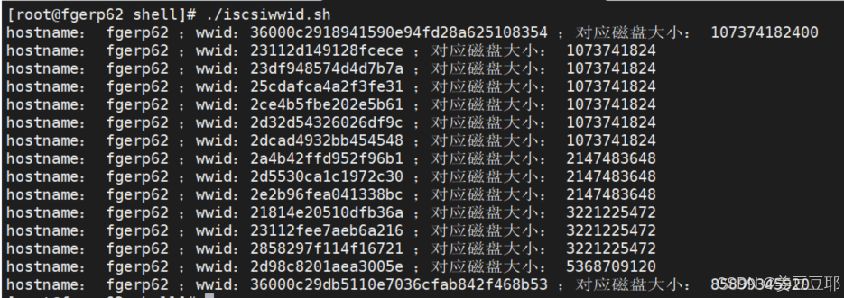
shell脚本案例:RAC配置多路径时获取磁盘设备WWID和磁盘大小
使用场景 在RAC配置多路径时,需要获取到磁盘设备的wwid。因为RAC的磁盘配置是提前规划好的,只知道wwid,不知道磁盘对应大小,是不知道应该如何配置多路径的mutipath.conf文件的;而凭借肉眼手工去对应磁盘设备的wwid和大…...
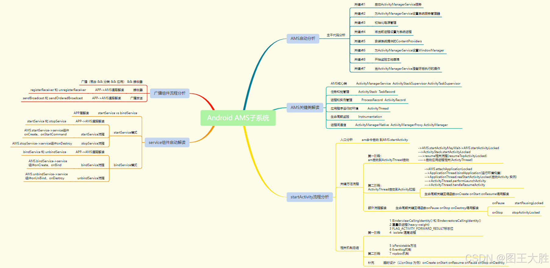
Android Framework AMS(10)广播组件分析-1
该系列文章总纲链接:专题总纲目录 Android Framework 总纲 本章关键点总结 & 说明: 说明:本章节主要解读应用层广播组件的发送广播和接收处理广播 2个过程,以及从APP层到AMS调用之间的打通。关注思维导图中左上部分即可。 有…...

在 Node.js 中使用 .env 文件
什么是 .env 文件? 文件.env是包含环境变量键值对的简单文本文件。此文件的内容不会被签入源代码管理,从而确保敏感数据的安全。 示例 PORT 4000 DATABASE_URL mongodb://localhost: 27017 /mydb API_KEY abcd1234 NODE_ENV development 在 Node.…...

CesiumJS 案例 P19:添加矩形、监听鼠标左击、监听鼠标右击、监听鼠标移动
CesiumJS CesiumJS API:https://cesium.com/learn/cesiumjs/ref-doc/index.html CesiumJS 是一个开源的 JavaScript 库,它用于在网页中创建和控制 3D 地球仪(地图) 一、添加矩形 <!DOCTYPE html> <html lang"en&…...
路测毫米波雷达标定和目标跟踪
1 2 3 4 5 6 查找匹配时,先对数据排序。逐帧对数据处理,运行速度快。单帧有噪点,多帧处理,准确率更高一些。 7 8 9 10 参考 路侧毫米波雷达标定与目标跟踪哔哔哩_bilibili路侧毫米波雷达标定与目标跟踪, 视频播放量 5855、弹幕量…...

【sqlmap使用手册-持续更新中】
SQLMap 简介 SQLMap 是一个开源的渗透测试工具,用于自动化检测和利用 SQL 注入漏洞。它支持多种数据库,包括 MySQL、PostgreSQL、Oracle、SQL Server 等。 可以通过以下命令安装sqlmap git clone https://github.com/sqlmapproject/sqlmap.git最常用的…...
面向对象三大特征之一:封 装
1、特点 封装是面向对象的核心思想,两层含义:一是一个整体(把对象的属性和行为看成一个整体,即封装在一个对象种),二是信息隐藏,对外隐藏,但可以通过某种方式进行调用。 2、访问权…...

qt QMenuBar详解
1、概述 QMenuBar是Qt框架中用于创建菜单栏的类,它继承自QWidget。QMenuBar通常位于QMainWindow对象的标题栏下方,用于组织和管理多个QMenu(菜单)和QAction(动作)。菜单栏提供了一个水平排列的容器&#x…...
ESP32的下的蓝牙应用笔记(1)——Beacon蓝牙信标
Beacon蓝牙信标简介 Beacon蓝牙信标是一种基于蓝牙低功耗(BLE)技术的设备,主要用于提供位置信息和数据传输服务。它通过周期性地广播信号,能够在一定范围内与其他蓝牙设备进行通信,从而提供精准的位置信息和相关服…...

控制台安全内部:创新如何塑造未来的硬件保护
在 Help Net Security 的采访中,安全研究人员 Specter 和 ChendoChap 讨论了游戏机独特的安全模型,并强调了它与其他消费设备的不同之处。 他们还分享了对游戏机安全性的进步将如何影响未来消费者和企业硬件设计的看法。 斯佩克特 (Specter) 是本周在阿…...
如何选择适合自己的 Python IDE
集成开发环境(IDE)是指提供广泛软件开发能力的软件应用程序。IDE 通常包括源代码编辑器、构建自动化工具和调试器。大多数现代 IDE 都配备了智能代码补全功能。在本文中,你将发现目前市场上最好的 Python IDE。 什么是 IDE? IDE…...
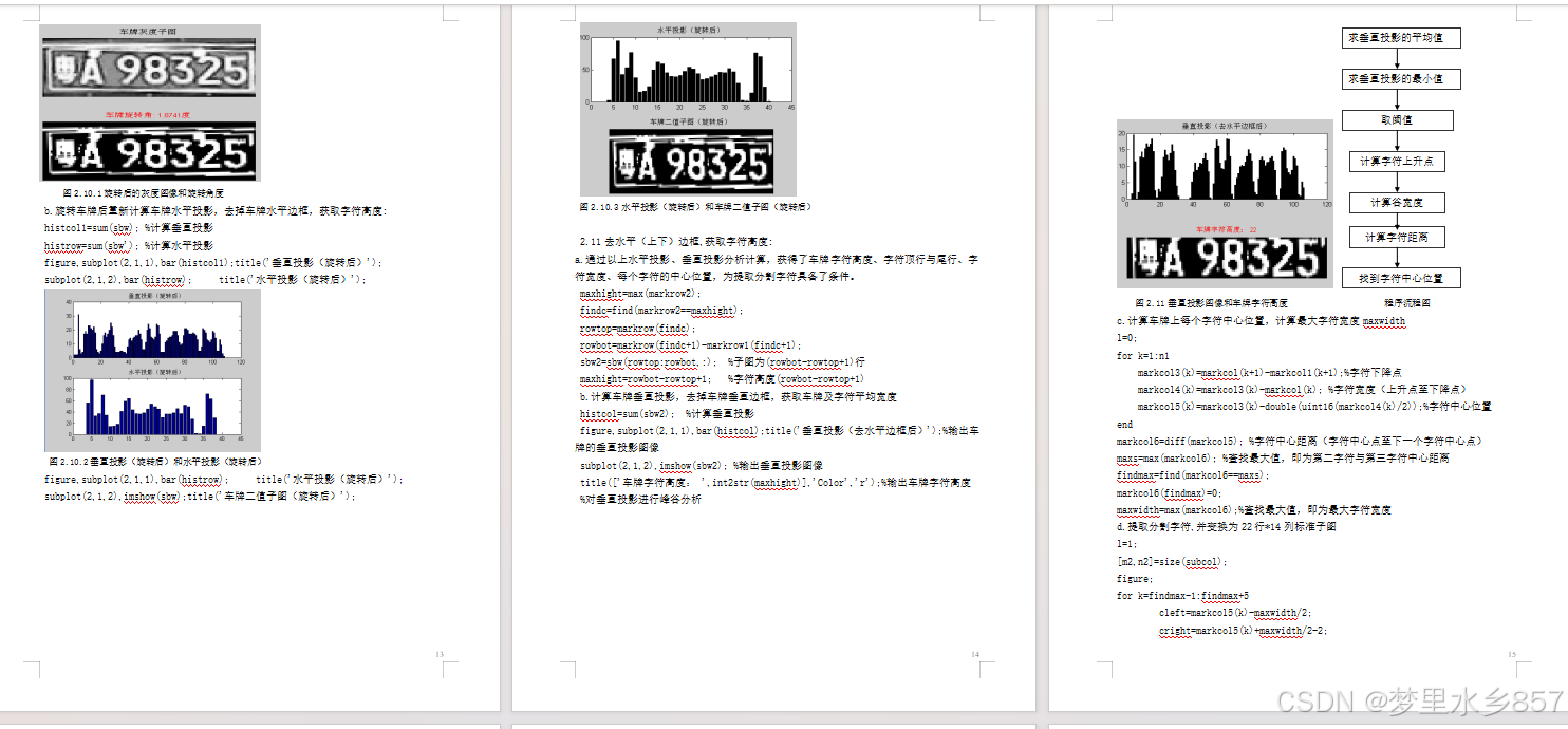
Matlab车牌识别课程设计报告模板(附源代码)
目 录 一.课程设计目的……………………………………………3 二.设计原理…………………………………………………3 三.详细设计步骤……………………………………………3 四. 设计结果及分析…………………………………………18 五. …...

kubesphere jenkins自动重定向 http://ks-apiserver:30880/oauth/authorize
问题:登陆kubesphere的jenkins Nodeport IP :Port 46.XXX.XXX.16:30180 自动跳转失败 http://ks-apiserver:30880/oauth/authorize?client_idjenkins&redirect_urihttp://46.XXX.XXX.16:30180/securityRealm/finishLogin&response_typecode&scopeopen…...

Vue3访问页面时自动获取数据
1. 使用生命周期钩子函数 # 后端代码--使用pywebview class Api:def greet(self):greet_text pywebview and vue3response {}response[text] greet_textreturn responseif __name__ __main__:# 前后端通信测试api Api()window webview.create_window(Vue app in pywebvie…...

go语言回调函数的使用
前言 在 Go 语言中,回调函数是一种将一个函数作为参数传递给另一个函数,在特定的事件发生时被调用的编程模式。 一、回调函数的定义 type OnTaskHandler func(r []byte)type remoteTaskClient struct {sync.RWMutexonTask OnTaskHandler } 以上定义了…...
)
区块链学习笔记(一)
区块链技术实现了去中心化的货币系统,与中心化记账方式不同,它消除了中间第三方,允许用户进行点对点交易,并确保了货币的真正所有权。此外,区块链的代码完全公开且不可篡改,保障了系统的透明度和安全性。 …...

如何在Windows上无缝运行安卓应用:APK Installer的技术解密与实践指南
如何在Windows上无缝运行安卓应用:APK Installer的技术解密与实践指南 【免费下载链接】APK-Installer An Android Application Installer for Windows 项目地址: https://gitcode.com/GitHub_Trending/ap/APK-Installer 你是否想过,在Windows系统…...

数据库概念结构设计完全指南:从E-R图到建表实战
前言:为什么需要概念结构设计?在数据库系统的开发过程中,设计者通常需要面对一个问题:如何将现实世界中的业务需求准确、高效地转化为计算机能够存储和处理的数据结构?如果直接跳到物理设计(也就是写CREATE…...

PowerShell脚本环境探测指南
在跨平台开发和脚本执行的过程中,了解脚本运行的环境是非常关键的。尤其是当脚本需要在不同类型的shell环境中运行时,如Bash和PowerShell,脚本行为可能需要根据环境进行调整。本文将通过一个具体的实例,探讨如何在PowerShell脚本中探测调用它的shell环境,并做出相应的响应…...

3分钟解决Blender到Unity的FBX旋转难题:终极坐标转换指南
3分钟解决Blender到Unity的FBX旋转难题:终极坐标转换指南 【免费下载链接】blender-to-unity-fbx-exporter FBX exporter addon for Blender compatible with Unitys coordinate and scaling system. 项目地址: https://gitcode.com/gh_mirrors/bl/blender-to-uni…...

基于Claude构建个人AI工作流:caliclaw智能体部署与实战指南
1. 项目概述:打造你的专属Claude智能体工作流如果你和我一样,厌倦了每次使用AI助手都要复制粘贴API密钥、配置繁琐的YAML文件,还得时刻担心账单超支,那么caliclaw的出现,绝对值得你花上十分钟了解一下。这不是又一个“…...

终极指南:使用BDInfo免费工具深度分析蓝光影碟技术规格
终极指南:使用BDInfo免费工具深度分析蓝光影碟技术规格 【免费下载链接】BDInfo BDInfo from http://www.cinemasquid.com/blu-ray/tools/bdinfo 项目地址: https://gitcode.com/gh_mirrors/bd/BDInfo 还在为蓝光影碟的技术参数感到困惑吗?想要深…...

Fish Shell技能库:构建高效可复用的命令行工作流
1. 项目概述:一个为命令行注入灵魂的“技能库”如果你是一个重度命令行用户,每天在终端里敲击着ls、cd、git commit这些命令,有没有那么一瞬间,会感到一丝枯燥和重复?或者,当你看到同事行云流水般地敲出一串…...

OpenClaw插件:在聊天软件中无缝集成本地Codex开发工作流
1. 项目概述:在聊天中无缝接入你的本地开发工作流如果你和我一样,日常开发工作流已经深度依赖像 Codex 这样的智能编程助手,但同时又希望能在 Telegram 或 Discord 的群聊、私聊里,像和朋友聊天一样自然地与它交互,那么…...

Skeet到SLV:全栈框架进化与边缘计算实践
1. 项目概述:从Skeet到SLV,一个全栈框架的进化之路 如果你和我一样,在过去几年里一直在全栈开发领域摸爬滚打,那你一定对技术栈的快速迭代和“选择困难症”深有体会。从React到Next.js,从Firebase到各种云服务&#x…...

Android系统权限管理:Dhizuku架构解析与5种高效实现方案
Android系统权限管理:Dhizuku架构解析与5种高效实现方案 【免费下载链接】Dhizuku A tool that can share DeviceOwner permissions to other application. 项目地址: https://gitcode.com/gh_mirrors/dh/Dhizuku 在Android应用开发中,系统级权限…...