Flutter实战·第二版-第三章 基础组件笔记
第三章:基础组件
3.1文本及样式
3.1.1 Text
Text("Hello world",textAlign: TextAlign.left,
);Text("Hello world! I'm Jack. "*4,maxLines: 1,overflow: TextOverflow.ellipsis,
);Text("Hello world",textScaleFactor: 1.5,
);
3.1.2 TextStyle
Text("Hello world",style: TextStyle(color: Colors.blue,fontSize: 18.0,height: 1.2,fontFamily: "Courier",background: Paint()..color = Colors.yellow,decoration: TextDecoration.underline,decorationStyle: TextDecorationStyle.dashed),)
3.1.3 TextSpan
Text.rich(TextSpan(children: [TextSpan(text: "Home:"),TextSpan(text: "https://flutterchina.club",style: TextStyle(color: Colors.blue),// recognizer: _tapRecognizer)]))
3.1.4 DefaultTextStyle
DefaultTextStyle(style: TextStyle(color: Colors.red,fontSize: 20.0,),textAlign: TextAlign.start,child: Column(crossAxisAlignment: CrossAxisAlignment.start,children: <Widget>[Text("hello world"),Text("I am Jack"),Text("I am Jack",style: TextStyle(inherit: false, color: Colors.grey),),],))
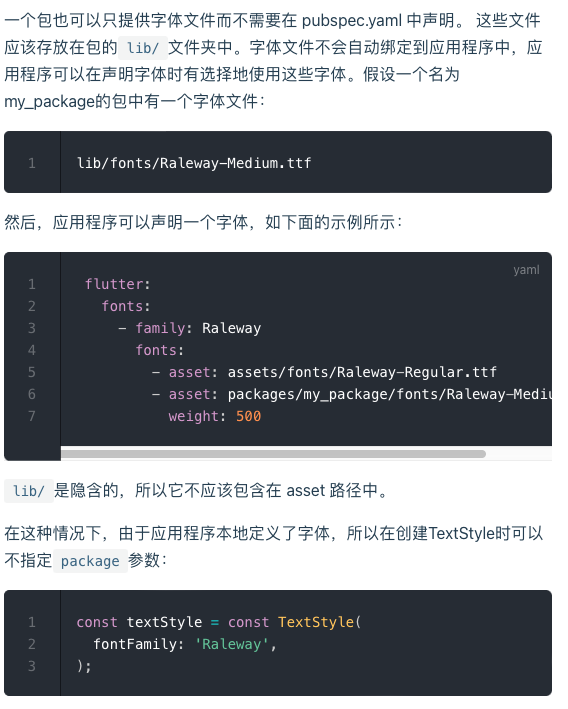
3.1.5字体
- 先将文字资源打包到应用,然后再pubspec.yaml中指定位置
根目录/assets(fonts)
flutter:fonts:- family: Ralewayfonts:- asset: assets/fonts/Raleway-Regular.ttf- asset: assets/fonts/Raleway-Medium.ttfweight: 500- asset: assets/fonts/Raleway-SemiBold.ttfweight: 600- family: AbrilFatfacefonts:- asset: assets/fonts/abrilfatface/AbrilFatface-Regular.ttf
- 使用字体
// 声明文本样式
const textStyle = const TextStyle(fontFamily: 'Raleway',
);// 使用文本样式
var buttonText = const Text("Use the font for this text",style: textStyle,
);
- Package中的字体
lib/fonts/Raleway-Medium.ttf
const textStyle = const TextStyle(fontFamily: 'Raleway',package: 'my_package', //指定包名
);
3.2按钮
3.2.1 ElevatedButton
ElevatedButton(onPressed: () {}, child: Text("normal"))
3.2.2 TextButton
TextButton(child: Text("normal"),onPressed: () {},)
3.2.3 OutlinedButton
OutlinedButton(child: Text("normal"),onPressed: () {},),
3.2.4 IconButton
IconButton(onPressed: () {}, icon: Icon(Icons.thumb_up))
3.2.5 带图标的按钮
ElevatedButton.icon(onPressed: () {},icon: Icon(Icons.send),label: Text("发送"),),OutlinedButton.icon(onPressed: () {}, label: Text("添加"), icon: Icon(Icons.add)),TextButton.icon(onPressed: () {}, icon: Icon(Icons.info), label: Text("详情"),)3.3图片及ICON
3.3.1 图片
- 从asset中加载图片
- 根目录创建images目录,将图片拷贝到该目录
- 在pubspec.yaml中的flutter部分添加如下内容:
assets:- images/<图片名>.png
- 加载图片
Image(image: AssetImage("images/avatar.png"),width: 100.0
);Image.asset("images/avatar.png",width: 100.0,
)
- 从网络加载图片
Image(image: NetworkImage("https://avatars2.githubusercontent.com/u/20411648?s=460&v=4"),width: 100.0,),Image.network("https://avatars2.githubusercontent.com/u/20411648?s=460&v=4",width: 100.0,)
- 参数
const Image({...this.width, //图片的宽this.height, //图片高度this.color, //图片的混合色值this.colorBlendMode, //混合模式this.fit,//缩放模式this.alignment = Alignment.center, //对齐方式this.repeat = ImageRepeat.noRepeat, //重复方式...
})
-
fit
- fill:会拉伸填充满显示空间,图片本身长宽比会发生变化,图片会变形。
- cover:会按图片的长宽比放大后居中填满显示空间,图片不会变形,超出显示空间部分会被剪裁。
- contain:这是图片的默认适应规则,图片会在保证图片本身长宽比不变的情况下缩放以适应当前显示空间,图片不会变形。
- fitWidth:图片的宽度会缩放到显示空间的宽度,高度会按比例缩放,然后居中显示,图片不会变形,超出显示空间部分会被剪裁。
- fitHeight:图片的高度会缩放到显示空间的高度,宽度会按比例缩放,然后居中显示,图片不会变形,超出显示空间部分会被剪裁。
- none:图片没有适应策略,会在显示空间内显示图片,如果图片比显示空间大,则显示空间只会显示图片中间部分。
-
color和colorBlendMode
Image(image: AssetImage("images/avatar.png"),width: 100.0,color: Colors.blue,colorBlendMode: BlendMode.difference,
);
- repeat
Image(image: AssetImage("images/avatar.png"),width: 100.0,height: 200.0,repeat: ImageRepeat.repeatY ,
)
import 'package:flutter/material.dart';class ImageAndIconRoute extends StatelessWidget {@overrideWidget build(BuildContext context) {var img=AssetImage("imgs/avatar.png");return SingleChildScrollView(child: Column(children: <Image>[Image(image: img,height: 50.0,width: 100.0,fit: BoxFit.fill,),Image(image: img,height: 50,width: 50.0,fit: BoxFit.contain,),Image(image: img,width: 100.0,height: 50.0,fit: BoxFit.cover,),Image(image: img,width: 100.0,height: 50.0,fit: BoxFit.fitWidth,),Image(image: img,width: 100.0,height: 50.0,fit: BoxFit.fitHeight,),Image(image: img,width: 100.0,height: 50.0,fit: BoxFit.scaleDown,),Image(image: img,height: 50.0,width: 100.0,fit: BoxFit.none,),Image(image: img,width: 100.0,color: Colors.blue,colorBlendMode: BlendMode.difference,fit: BoxFit.fill,),Image(image: img,width: 100.0,height: 200.0,repeat: ImageRepeat.repeatY ,)].map((e){return Row(children: <Widget>[Padding(padding: EdgeInsets.all(16.0),child: SizedBox(width: 100,child: e,),),Text(e.fit.toString())],);}).toList()),);}
}
3.3.2 ICON
- 使用Material Design字体图标
- pubspec.yaml中配置
flutter:uses-material-design: true
- 查看所有icon
String icons = "";
// accessible: 0xe03e
icons += "\uE03e";
// error:  0xe237
icons += " \uE237";
// fingerprint: 0xe287
icons += " \uE287";Text(icons,style: TextStyle(fontFamily: "MaterialIcons",fontSize: 24.0,color: Colors.green,),)
Row(mainAxisAlignment: MainAxisAlignment.center,children: <Widget>[Icon(Icons.accessibility,color: Colors.green,),Icon(Icons.error,color: Colors.green,),Icon(Icons.fingerprint,color: Colors.green,)],)
- 使用自定义字体图标
- iconfont.cn中选择icon,使用ttf格式
- 将多个icon加入购物车,下载代码,几个icon会下载到一起,本地有ttf
- 导入图标文件 fonts/iconfont.ttf
- fonts要和pubspec.yaml同级
fonts:- family: myIcon #指定一个字体名fonts:- asset: fonts/iconfont.ttf
import 'package:flutter/cupertino.dart';class MyIcons{static const IconData book = const IconData(0xf00a1,fontFamily: 'myIcon',matchTextDirection: true);static const IconData wechat = const IconData(0xe607,fontFamily: 'myIcon',matchTextDirection: true);
}
Row(mainAxisAlignment: MainAxisAlignment.center,children: <Widget>[Icon(MyIcons.book,color: Colors.purple,),Icon(MyIcons.wechat,color: Colors.green,)],)
3.4单选开关和复选框
3.4.1.简介
class SwitchAndCheckBoxTestRoute extends StatefulWidget {@override_SwitchAndCheckBoxTestRouteState createState() => _SwitchAndCheckBoxTestRouteState();
}class _SwitchAndCheckBoxTestRouteState extends State<SwitchAndCheckBoxTestRoute> {bool _switchSelected=true; //维护单选开关状态bool _checkboxSelected=true;//维护复选框状态@overrideWidget build(BuildContext context) {return Column(children: <Widget>[Switch(value: _switchSelected,//当前状态onChanged:(value){//重新构建页面  setState(() {_switchSelected=value;});},),Checkbox(value: _checkboxSelected,activeColor: Colors.red, //选中时的颜色onChanged:(value){setState(() {_checkboxSelected=value;});} ,)],);}
}
- 使用
SwitchAndCheckBoxTestRoute()
3.4.2 属性及外观
无代码
3.4.3 注意
无代码
3.5输入框及表单
3.5.1 TextField
const TextField({...TextEditingController controller, FocusNode focusNode,InputDecoration decoration = const InputDecoration(),TextInputType keyboardType,TextInputAction textInputAction,TextStyle style,TextAlign textAlign = TextAlign.start,bool autofocus = false,bool obscureText = false,int maxLines = 1,int maxLength,this.maxLengthEnforcement,ToolbarOptions? toolbarOptions,ValueChanged<String> onChanged,VoidCallback onEditingComplete,ValueChanged<String> onSubmitted,List<TextInputFormatter> inputFormatters,bool enabled,this.cursorWidth = 2.0,this.cursorRadius,this.cursorColor,this.onTap,...
})
-
controller:编辑框的控制器,通过它可以设置/获取编辑框的内容、选择编辑内容、监听编辑文本改变事件。大多数情况下我们都需要显式提供一个controller来与文本框交互。如果没有提供controller,则TextField内部会自动创建一个。
-
focusNode:用于控制TextField是否占有当前键盘的输入焦点。它是我们和键盘交互的一个句柄(handle)。
-
InputDecoration:用于控制TextField的外观显示,如提示文本、背景颜色、边框等。
-
keyboardType:用于设置该输入框默认的键盘输入类型,取值如下:
TextInputType枚举值 含义
-
text 文本输入键盘
-
multiline 多行文本,需和maxLines配合使用(设为null或大于1)
-
number 数字;会弹出数字键盘
-
phone 优化后的电话号码输入键盘;会弹出数字键盘并显示“* #”
-
datetime 优化后的日期输入键盘;Android上会显示“: -”
-
emailAddress 优化后的电子邮件地址;会显示“@ .”
-
url 优化后的url输入键盘; 会显示“/ .”
-
textInputAction:键盘动作按钮图标(即回车键位图标),它是一个枚举值,有多个可选值,全部的取值列表读者可以查看API文档,下面是当值为TextInputAction.search时,原生Android系统下键盘样式如图3-18所示:
-
style:正在编辑的文本样式。
-
textAlign: 输入框内编辑文本在水平方向的对齐方式。
-
autofocus: 是否自动获取焦点。
-
obscureText:是否隐藏正在编辑的文本,如用于输入密码的场景等,文本内容会用“•”替换。
-
maxLines:输入框的最大行数,默认为1;如果为null,则无行数限制。
-
maxLength和maxLengthEnforcement :maxLength代表输入框文本的最大长度,设置后输入框右下角会显示输入的文本计数。maxLengthEnforcement决定当输入文本长度超过maxLength时如何处理,如截断、超出等。
-
toolbarOptions:长按或鼠标右击时出现的菜单,包括 copy、cut、paste 以及 selectAll。
-
onChange:输入框内容改变时的回调函数;注:内容改变事件也可以通过controller来监听。
-
onEditingComplete和onSubmitted:这两个回调都是在输入框输入完成时触发,比如按了键盘的完成键(对号图标)或搜索键(🔍图标)。不同的是两个回调签名不同,onSubmitted回调是ValueChanged类型,它接收当前输入内容做为参数,而onEditingComplete不接收参数。
-
inputFormatters:用于指定输入格式;当用户输入内容改变时,会根据指定的格式来校验。
-
enable:如果为false,则输入框会被禁用,禁用状态不能响应输入和事件,同时显示禁用态样式(在其decoration中定义)。
-
cursorWidth、cursorRadius和cursorColor:这三个属性是用于自定义输入框光标宽度、圆角和颜色的。
1)布局
Column(children: <Widget>[TextField(autofocus: true,decoration: InputDecoration(labelText: "用户名",hintText: "用户名或邮箱",prefixIcon: Icon(Icons.person)),),TextField(decoration: InputDecoration(labelText: "密码",hintText: "您的登录密码",prefixIcon: Icon(Icons.lock)),obscureText: true,),],
);
2)获取输入内容
TextEditingController _unameController = TextEditingController();TextField(autofocus: true,controller: _unameController,)
print(_unameController.text)
3)监听文本变化
TextField(autofocus: true,onChanged: (v){print("onChange:$v");},)
设置默认值,并从第三个字符开始选中后面的字符
TextEditingController _selectionController =  TextEditingController();
_selectionController.text="hello world!";
_selectionController.selection=TextSelection(baseOffset: 2,extentOffset: _selectionController.text.length
);
TextField(controller: _selectionController,
)
4)控制焦点
class FocusTestRoute extends StatefulWidget {@override_FocusTestRouteState createState() => _FocusTestRouteState();
}class _FocusTestRouteState extends State<FocusTestRoute> {FocusNode focusNode1 = FocusNode();FocusNode focusNode2 = FocusNode();FocusScopeNode? focusScopeNode;@overrideWidget build(BuildContext context) {return Padding(padding: EdgeInsets.all(16.0),child: Column(children: <Widget>[TextField(autofocus: true, focusNode: focusNode1,//关联focusNode1decoration: InputDecoration(labelText: "input1"),),TextField(focusNode: focusNode2,//关联focusNode2decoration: InputDecoration(labelText: "input2"),),Builder(builder: (ctx) {return Column(children: <Widget>[ElevatedButton(child: Text("移动焦点"),onPressed: () {//将焦点从第一个TextField移到第二个TextField// 这是一种写法 FocusScope.of(context).requestFocus(focusNode2);// 这是第二种写法if(null == focusScopeNode){focusScopeNode = FocusScope.of(context);}focusScopeNode.requestFocus(focusNode2);},),ElevatedButton(child: Text("隐藏键盘"),onPressed: () {// 当所有编辑框都失去焦点时键盘就会收起  focusNode1.unfocus();focusNode2.unfocus();},),],);},),],),);}}
5)监听焦点状态改变事件
...
// 创建 focusNode
FocusNode focusNode = FocusNode();
...
// focusNode绑定输入框
TextField(focusNode: focusNode);
...
// 监听焦点变化    ,需要写在initState方法里,build不行
focusNode.addListener((){print(focusNode.hasFocus);
});
6)自定义样式
TextField(decoration: InputDecoration(labelText: "请输入用户名",prefixIcon: Icon(Icons.person),// 未获得焦点下划线设为灰色enabledBorder: UnderlineInputBorder(borderSide: BorderSide(color: Colors.grey),),//获得焦点下划线设为蓝色focusedBorder: UnderlineInputBorder(borderSide: BorderSide(color: Colors.blue),),),
),
Container(child: TextField(keyboardType: TextInputType.emailAddress,decoration: InputDecoration(labelText: "Email",hintText: "电子邮件地址",prefixIcon: Icon(Icons.email),border: InputBorder.none //隐藏下划线)),decoration: BoxDecoration(// 下滑线浅灰色,宽度1像素border: Border(bottom: BorderSide(color: Colors.grey[200], width: 1.0))),
)
3.5.2 表单Form
- Form
Form({required Widget child,bool autovalidate = false,WillPopCallback onWillPop,VoidCallback onChanged,
})
- autovalidate:是否自动校验输入内容;当为true时,每一个子 FormField 内容发生变化时都会自动校验合法性,并直接显示错误信息。否则,需要通过调用FormState.validate()来手动校验。
- onWillPop:决定Form所在的路由是否可以直接返回(如点击返回按钮),该回调返回一个Future对象,如果 Future 的最终结果是false,则当前路由不会返回;如果为true,则会返回到上一个路由。此属性通常用于拦截返回按钮。
- onChanged:Form的任意一个子FormField内容发生变化时会触发此回调。
- FormField
const FormField({...FormFieldSetter<T> onSaved, //保存回调FormFieldValidator<T>  validator, //验证回调T initialValue, //初始值bool autovalidate = false, //是否自动校验。
})
- FormState
- FormState.validate():调用此方法后,会调用Form子孙FormField的validate回调,如果有一个校验失败,则返回false,所有校验失败项都会返回用户返回的错误提示。
- FormState.save():调用此方法后,会调用Form子孙FormField的save回调,用于保存表单内容
- FormState.reset():调用此方法后,会将子孙FormField的内容清空。
- 示例
import 'package:flutter/material.dart';class FormTestRoute extends StatefulWidget {@override_FormTestRouteState createState() => _FormTestRouteState();
}class _FormTestRouteState extends State<FormTestRoute> {TextEditingController _unameController = TextEditingController();TextEditingController _pwdController = TextEditingController();GlobalKey _formKey = GlobalKey<FormState>();@overrideWidget build(BuildContext context) {return Form(key: _formKey, //设置globalKey,用于后面获取FormStateautovalidateMode: AutovalidateMode.onUserInteraction,child: Column(children: <Widget>[TextFormField(autofocus: true,controller: _unameController,decoration: InputDecoration(labelText: "用户名",hintText: "用户名或邮箱",icon: Icon(Icons.person),),// 校验用户名validator: (v) {return v!.trim().isNotEmpty ? null : "用户名不能为空";},),TextFormField(controller: _pwdController,decoration: InputDecoration(labelText: "密码",hintText: "您的登录密码",icon: Icon(Icons.lock),),obscureText: true,//校验密码validator: (v) {return v!.trim().length > 5 ? null : "密码不能少于6位";},),// 登录按钮Padding(padding: const EdgeInsets.only(top: 28.0),child: Row(children: <Widget>[Expanded(child: ElevatedButton(child: Padding(padding: const EdgeInsets.all(16.0),child: Text("登录"),),onPressed: () {// 通过_formKey.currentState 获取FormState后,// 调用validate()方法校验用户名密码是否合法,校验// 通过后再提交数据。if ((_formKey.currentState as FormState).validate()) {//验证通过提交数据}},),),],),)],),);}
}
3.6进度指示器
3.6.1 LinearProgressIndicator
LinearProgressIndicator({double value,Color backgroundColor,Animation<Color> valueColor,...
})
// 模糊进度条(会执行一个动画)
LinearProgressIndicator(backgroundColor: Colors.grey[200],valueColor: AlwaysStoppedAnimation(Colors.blue),
),
//进度条显示50%
LinearProgressIndicator(backgroundColor: Colors.grey[200],valueColor: AlwaysStoppedAnimation(Colors.blue),value: .5,
)
3.6.2 CircularProgressIndicator
CircularProgressIndicator({double value,Color backgroundColor,Animation<Color> valueColor,this.strokeWidth = 4.0,...
})
CircularProgressIndicator(backgroundColor: Colors.grey,valueColor: AlwaysStoppedAnimation(Colors.blue),),CircularProgressIndicator(backgroundColor: Colors.grey,valueColor: AlwaysStoppedAnimation(Colors.blue),value: .5,)
3.6.3自定义尺寸
SizedBox(height: 3,child: LinearProgressIndicator(backgroundColor: Colors.grey,valueColor: AlwaysStoppedAnimation(Colors.blue),value: .5,),)SizedBox(height: 100,width: 100,child: CircularProgressIndicator(backgroundColor: Colors.grey,valueColor: AlwaysStoppedAnimation(Colors.blue),value: .7,),)
// 宽高不等,椭圆
SizedBox(height: 100,width: 130,child: CircularProgressIndicator(backgroundColor: Colors.grey[200],valueColor: AlwaysStoppedAnimation(Colors.blue),value: .7,),
),
3.6.3进度色动画
import 'package:flutter/material.dart';class ProgressRoute extends StatefulWidget {@override_ProgressRouteState createState() => _ProgressRouteState();
}class _ProgressRouteState extends State<ProgressRoute>with SingleTickerProviderStateMixin {AnimationController _animationController;@overridevoid initState() {//动画执行时间3秒  _animationController = AnimationController(vsync: this, //注意State类需要混入SingleTickerProviderStateMixin(提供动画帧计时/触发器)duration: Duration(seconds: 3),);_animationController.forward();_animationController.addListener(() => setState(() => {}));super.initState();}@overridevoid dispose() {_animationController.dispose();super.dispose();}@overrideWidget build(BuildContext context) {return SingleChildScrollView(child: Column(children: <Widget>[Padding(padding: EdgeInsets.all(16),child: LinearProgressIndicator(backgroundColor: Colors.grey[200],valueColor: ColorTween(begin: Colors.grey, end: Colors.blue).animate(_animationController), // 从灰色变成蓝色value: _animationController.value,),);],),);}
}
3.6.4自定义进度指示器样式
第三方库
相关文章:
Flutter实战·第二版-第三章 基础组件笔记
第三章:基础组件 3.1文本及样式 3.1.1 Text Text("Hello world",textAlign: TextAlign.left, );Text("Hello world! Im Jack. "*4,maxLines: 1,overflow: TextOverflow.ellipsis, );Text("Hello world",textScaleFactor: 1.5, );3.1…...
一文彻底理解时间复杂度和空间复杂度(附实例)
目录 1 PNP?2 时间复杂度2.1 常数阶复杂度2.2 对数阶复杂度2.3 线性阶复杂度2.4 平方阶复杂度2.5 指数阶复杂度2.6 总结 3 空间复杂度 1 PNP? P类问题(Polynomial)指在多项式时间内能求解的问题;NP类问题(Non-Deterministic Polynomial)指在…...
Mysql的索引详解
零. 索引类型概述 1. 实际开发中使用的索引种类 主键索引唯一索引普通索引联合索引全文索引空间索引 2. 索引的格式类型 BTree类型Hash类型FullText类型(全文索引)RTree类型(空间索引) MySQL 的索引方法,主要包括 BTREE 和 HASH。 顾名思…...
.netcore windows app启动webserver
创建controller: using Microsoft.AspNetCore.Mvc; using Microsoft.Extensions.Logging; using System; using System.Collections.Generic; using System.Linq; using System.Text; using System.Text.Json.Serialization; using System.Threading.Tasks;namespace MyWorker.…...
泰迪大数据挖掘建模平台功能特色介绍
大数据挖掘建模平台面相高校、企业级别用户快速进行数据处理的建模工具。 大数据挖掘建模平台介绍 平台底层算法基于R语言、Python、Spark等引擎,使用JAVA语言开发,采用 B/S 结构,用户无需下载客户端,可直接通过浏览器进行…...

【问题】java序列化,什么时候使用
文章目录 是什么为什么如何做流操作 注事事项 是什么 把对象转换为字节序列的过程称为对象的序列化。 把字节序列恢复为对象的过程称为对象的反序列化。 对象的序列化主要有两种用途: 1)把对象的字节序列永久地保存到硬盘上,通常存放在一…...
【最新可用】VMware中ubuntu与主机window之间使用共享文件夹传输大文件
一、VMware设置共享文件夹 (1)虚拟机关机情况下,创建一个共享文件夹 (2)ubuntu中挂载共享文件夹 1、如果之前已经挂载 hgfs,先取消挂载 sudo umount /mnt/hgfs2、重新使用以下命令挂载 sudo /usr/bin/vmh…...
A. Two Semiknights Meet
题目描述 可知走法为中国象棋中的象的走法 解题思路 利用结构体来存储两个 K K K的位置 x , y x,y x,y,因为两个 K K K同时走,所以会出现两种情况 相向而行,两者距离减少 相反而行,两者距离不变 我们完全可以不考虑格子是好…...

〔011〕Stable Diffusion 之 解决绘制多人或面部很小的人物时面部崩坏问题 篇
✨ 目录 🎈 脸部崩坏🎈 下载脸部修复插件🎈 启用脸部修复插件🎈 插件生成效果🎈 插件功能详解🎈 脸部崩坏 相信很多人在画图时候,特别是画 有多个人物 图片或者 人物在图片中很小 的时候,都会很容易出现面部崩坏的问题这是由于神经网络无法完全捕捉人脸的微妙细节…...
在ubuntu+cpolar+rabbitMQ环境下,实现mq服务端远程访问
文章目录 前言1.安装erlang 语言2.安装rabbitMQ3. 内网穿透3.1 安装cpolar内网穿透(支持一键自动安装脚本)3.2 创建HTTP隧道 4. 公网远程连接5.固定公网TCP地址5.1 保留一个固定的公网TCP端口地址5.2 配置固定公网TCP端口地址 前言 RabbitMQ是一个在 AMQP(高级消息队列协议)基…...

Vue elementui 实现表格selection的默认勾选,翻页记录勾选状态
需求:当弹出一个列表页数据,对其进行筛选选择。 列表更新,填充已选数据 主要使用toggleRowSelection 代码如下: <el-table v-loading"loading" :data"drugList" selection-change"handleSelection…...

CloudCompare——统计滤波
目录 1.统计滤波2.软件实现3.完整操作4.算法源码5.相关代码 本文由CSDN点云侠原创,CloudCompare——统计滤波,爬虫自重。如果你不是在点云侠的博客中看到该文章,那么此处便是不要脸的爬虫。 1.统计滤波 算法原理见:PCL 统计滤波器…...
nodejs+vue古诗词在线测试管理系统
一开始,本文就对系统内谈到的基本知识,从整体上进行了描述,并在此基础上进行了系统分析。为了能够使本系统较好、较为完善的被设计实现出来,就必须先进行分析调查。基于之前相关的基础,在功能上,对新系统进…...

174-地下城游戏
题目 恶魔们抓住了公主并将她关在了地下城 dungeon 的 右下角 。地下城是由 m x n 个房间组成的二维网格。我们英勇的骑士最初被安置在 左上角 的房间里,他必须穿过地下城并通过对抗恶魔来拯救公主。 骑士的初始健康点数为一个正整数。如果他的健康点数在某一时刻…...

Linux定时任务crontab
常用命令 crontab -e 进入定时脚本,编辑后保存即立即生效 crontab -l 查看用户定时脚本 tail -f /var/log/cron 查看执行日志 service crond status 查看定时器运行状态 service crond restart 重启定时器 定时任务不执行原因 定时任务设置的格式正确,手…...

golang字符串切片去重
函数的功能是从输入的字符串切片中去除重复的元素,并返回去重后的结果。具体的实现逻辑如下: 创建一个空的结果切片result,用于存储去重后的字符串。创建一个临时的maptempMap,用于存放不重复的字符串。map的键是字符串࿰…...

git如何检查和修改忽略文件和忽略规则
查询忽略规则 使用命令行:git status --ignored,进行查询, 例: $ git status --ignored On branch develop Your branch is up to date with origin/develop.Ignored files:(use "git add -f <file>..." to inc…...

Android AppCompatActivity标题栏操作
使用 AndroidStudio 新建的工程默认用 AppCompatActivity ,是带标题栏的。 记录下 修改标题栏名称 和 隐藏标题栏 的方法。 修改标题栏名称 Override protected void onCreate(Bundle savedInstanceState) {super.onCreate(savedInstanceState);setContentView(R…...

解决conda activate报错
解决方法 source ~/anaconda3/bin/activate或 source ~/miniconda3/bin/activate然后就可以使用 conda activate xxx环境了 问题解析 请参考github:https://github.com/conda/conda/issues/7980...
)
FreeMarker--表达式和运算符的用法(全面/有示例)
原文网址:FreeMarker--表达式和运算符的用法(全面/有示例)_IT利刃出鞘的博客-CSDN博客 简介 本文介绍FreeMarker的表达式和运算符的用法。 表达式是FreeMarker的核心功能。表达式放置在插值语法(${...})之中时,表明需要输出表达…...

如何用自动化脚本解放双手:淘宝淘金币全任务一键完成指南
如何用自动化脚本解放双手:淘宝淘金币全任务一键完成指南 【免费下载链接】taojinbi 淘宝淘金币自动执行脚本,包含蚂蚁森林收取能量,芭芭农场全任务,解放你的双手 项目地址: https://gitcode.com/gh_mirrors/ta/taojinbi 还…...

LayerDivider:如何用3步将单张插画自动分层为可编辑PSD文件?
LayerDivider:如何用3步将单张插画自动分层为可编辑PSD文件? 【免费下载链接】layerdivider A tool to divide a single illustration into a layered structure. 项目地址: https://gitcode.com/gh_mirrors/la/layerdivider 你是否曾经面对一张精…...
)
省下PLC的钱!用海康VC3000工控机GPIO控制LED灯(C# WinForm实战)
海康VC3000工控机GPIO控制实战:低成本替代PLC的完整方案 在工业自动化领域,PLC(可编程逻辑控制器)长期以来都是控制系统的核心组件。但对于简单的指示灯控制、报警系统或小型继电器控制这类基础应用,动辄数千元的PLC模…...

【Midjourney Gouache风格终极指南】:20年AI绘画专家亲授7大参数黄金组合与3类易踩翻车点
更多请点击: https://intelliparadigm.com 第一章:Gouache风格的本质解构与AI绘画语境迁移 Gouache(水粉画)并非简单意义上的“不透明水彩”,其本质在于颜料颗粒的物理遮盖性、媒介乳化稳定性与干湿叠压响应的三重耦合…...

ppt模板_0013_66tm黑色--运动
PPT模板分享...

从NLP基础到LLM实战:手把手构建大模型全栈能力
1. 从NLP到LLM:为什么你需要一个坚实的“地基” 最近几年,大语言模型(LLM)的火爆程度有目共睹,ChatGPT、Claude、文心一言这些名字几乎成了日常谈资。很多开发者,尤其是刚入行的朋友,可能一上来…...
)
别再傻傻在线等了!手把手教你用命令行精准定制VS2022离线安装包(附.NET/C++/MFC组件命令)
精准定制VS2022离线安装包:命令行高效配置指南 在开发团队协作或特殊网络环境下,Visual Studio 2022的离线安装成为刚需。但直接下载完整离线包不仅耗时(超过25GB),还会占用大量存储空间——而实际上,90%的…...

ExifToolGUI:如何轻松批量管理照片元数据的完整指南
ExifToolGUI:如何轻松批量管理照片元数据的完整指南 【免费下载链接】ExifToolGui A GUI for ExifTool 项目地址: https://gitcode.com/gh_mirrors/ex/ExifToolGui 你是否曾经面对成百上千张照片,想要批量修改拍摄时间、添加版权信息或调整GPS坐标…...

白起杀降将卒,项羽杀降,黄巢他们有的选择吗?
杀降不是暴君的个人意志,而是一场场被逼到极限的“系统自保”。 白起要为40万战俘找活路,项羽要喂活20万张嘴并防止后院起火,黄巢要让自己和十几万兄弟明天不饿死。杀降本身这份“答卷”固然是反人类的,但那份出题人的冷酷与无情&…...

基于堆叠自编码器与LSTM的金融时间序列预测框架解析
1. 项目概述:一个基于多层神经网络的股票回报预测框架如果你对量化交易和机器学习结合感兴趣,并且已经厌倦了那些简单的线性回归或者单层LSTM模型,那么这个名为AIAlpha的项目可能会让你眼前一亮。它不是一个“即插即用”的盈利策略࿰…...