qml相关知识1
qml相关知识1
- QtQuick.Controls 哪个版本支持TreeModel 和 TreeItem
- qt5.12开始,TreeItem 类被删除,无法使用
- delegate 什么时候可以用
- Qt5.15中没有 import QtQuick.Controls 1吗,哪个版本有control1
- qml如何两种版本的controls混用(QML之在QtQuick.Controls 2项目中使用QtQuick.Controls模块中的控件)
- QML Row: Cannot specify left, right, horizontalCenter, fill or centerIn anchors for items inside Row
- qml 虚线边框绘制
- 关闭文件系统视图
- 消息提示框
- Popup
- Dialog相关
- 如何给下边框设置阴影效果
- Qt Design Studio 4.2.0怎么引入Calendar组件,并使用Calendar
- 引入QtQuick.Controls.Styles 2.15,显示module not found
- achors.rightMargin失效
- label
- 下拉框
- .ui.qml不支持function
- 鼠标响应事件
- Menu介绍
- 自定义菜单组件(官方文档)
- 菜单组件Menu应用
- 点击事件出现Dialog弹框
- 弹框中modal属性
- pointSize和pixelSize区别
- 表格自定义内容中,delegate类型:
- Rectangle隐藏下边框
- 表格只显示下边框
- QML 布局详解
- Rectangle
- button
- Button自定义
- 树形结构
- 边的阴影怎么实现
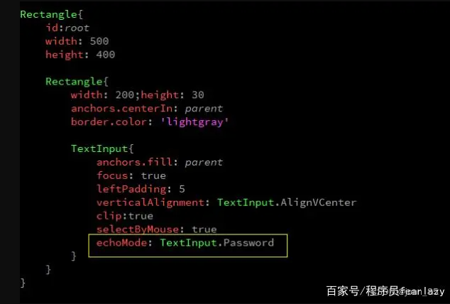
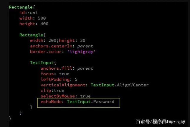
- TextInput的使用方法
- TextInput禁止输入模式
- TextInput文字居中方式
- Text文字右对齐
- Text文字居中方式
- anchors.fill和anchors.centerIn区别
- 自定义组件
- 自定义属性
- Item
- anchors详解
- 什么时候用Item什么时候用Rectangle?什么时候用Row什么时候用RowLayout?
- lable用法
- Column
- Qt中font.pointSize和font.pixelSize的区别
- Qt中fileMode
- 隐藏虚拟键盘
- qt design studioA开发工具中, 新建的.ui.qml中引入ColumnLayout后,无法启动【Run Project】
- 用Column布局可以正常运行,但是加上以下四句,运行失效
- 报错:module "QtQuick.Layouts" version 5.15 is not installed
- qt design studio中用ColumnLayout失效,用Column正常显示【没法用ColumnLayout,RowLayout】
- qt design studio的2D预览和运行不一致的问题,2D预览可能不准确
- 报错:Parameter "mouse" is not declared. Injection of parameters into signal handlers is deprecated. Use JavaScript functions with formal parameters instead.
- 报错:QML Row: Cannot specify left, right, horizontalCenter, fill or centerIn anchors for items inside Row. Row will not function.
- 报错:QML Column: Cannot specify top, bottom, verticalCenter, fill or centerIn anchors for items inside Column. Column will not function.
- 自己写的登录页面的例子
QtQuick.Controls 哪个版本支持TreeModel 和 TreeItem
在QtQuick.Controls模块中并没有直接提供TreeModel和TreeItem。TreeModel和TreeItem是基于Qt的Models模块自定义的模型和项,用于在QML中创建树状结构的数据。
若想在QML中使用TreeModel和TreeItem,你需要自己实现这些模型和项,然后将其在QtQuick.Controls中使用。这并不依赖于QtQuick.Controls模块的特定版本,而是依赖于你自己的实现代码。
你可以参考Qt的Models模块文档,自己实现TreeModel和TreeItem。在应用中,可以将这些自定义的模型与QtQuick.Controls的相关组件(如TreeView、TreeViewItem)结合使用,来展示树状结构的数据。
qt5.12开始,TreeItem 类被删除,无法使用
从 Qt 5.12 开始,TreeView 组件的 API 发生了重大变化,TreeItem 类被删除,并使用命令式的 TreeView 模型进行代替。
delegate 什么时候可以用
在 QtQuick.Controls 中,delegate 是一个可用的属性,可以在不同的版本中使用。根据 Qt 官方文档的最新记录,在 Qt 5.12 或更高版本中的 QtQuick.Controls 中,都可以使用 delegate 属性。
需要注意的是,delegate 是针对一些特定的控件(如 ListView、ComboBox 等)的属性,用于自定义每个项的外观。不是所有的控件都具有 delegate 属性。
如果你在使用 QtQuick.Controls 1.4 版本,可以尝试检查你所使用的控件是否具有 delegate 属性,并按照该版本的文档进行使用。
搜【帮助-》索引-》输入delegate查看】
treeview组件中没有此属性
Qt5.15中没有 import QtQuick.Controls 1吗,哪个版本有control1
在 Qt 5.15 中,QtQuick.Controls 模块的版本仅从 2 开始可用,并没有 QtQuick.Controls 1 的导入语句。
只有从 Qt 5.0 到 Qt 5.14,才提供了 QtQuick.Controls 1 模块。
QtQuick.Controls 2 是自从 Qt 5.7 版本引入的。
所以像TreeView,Calendar的使用一般用controls1,即Qt5.14
【之前不懂这个,自定义日历和表格总是出现确实某个模块的报错,来来回回卸载安装了无数次,希望这次别让我失望!!!!】
qml如何两种版本的controls混用(QML之在QtQuick.Controls 2项目中使用QtQuick.Controls模块中的控件)
参考:https://blog.csdn.net/zbw1185/article/details/81058486
两种方法
1、类型重命名
正确的做法是将使用到的QtQuick.Controls模块进行类型重命名,然后再调用其中的控件。
import QtQuick 2.9
import QtQuick.Window 2.2
import QtQuick.Controls 1.4 as Controls14
import QtQuick.Controls.Styles 1.4 as Styles14
import QtQuick.Controls 2.2Window {visible: truewidth: 640height: 480title: qsTr("Hello World")//qml1Controls14.Button {x: 100y: 200text: "A button"style: Styles14.ButtonStyle {background: Rectangle {implicitWidth: 100implicitHeight: 25border.width: control.activeFocus ? 2 : 1border.color: "#888"radius: 4gradient: Gradient {GradientStop { position: 0 ; color: control.pressed ? "#ccc" : "#eee" }GradientStop { position: 1 ; color: control.pressed ? "#aaa" : "#ccc" }}}}}//qml2Button{x: 300y: 200text: "B button"}
}
2、将控件封装成组件
MyButton.qml
import QtQuick 2.0
import QtQuick.Controls 1.4
import QtQuick.Controls.Styles 1.4Button {x: 100y: 200text: "A button"style: ButtonStyle {background: Rectangle {implicitWidth: 100implicitHeight: 25border.width: control.activeFocus ? 2 : 1border.color: "#888"radius: 4gradient: Gradient {GradientStop { position: 0 ; color: control.pressed ? "#ccc" : "#eee" }GradientStop { position: 1 ; color: control.pressed ? "#aaa" : "#ccc" }}}}
}
直接调用
import QtQuick 2.9
import QtQuick.Window 2.2
import QtQuick.Controls 2.2Window {visible: truewidth: 640height: 480title: qsTr("Hello World")//qml1MyButton{onClicked:{console.log("aaaa")}}//qml2Button{x: 300y: 200text: "B button"}
}
QML Row: Cannot specify left, right, horizontalCenter, fill or centerIn anchors for items inside Row
Row中子元素按照控件属性由左向右分布,通过spacing控制子元素间距,因此通过anchor.left和anchor.right控制Row中子元素的水平位置会发生冲突,但仍然可以通过anchor.top和anchor.bottom控制子元素的垂直分布。如果希望用anchor进行定位,就用Item替换Row。
原文链接:https://blog.csdn.net/weixin_43692244/article/details/103686333
qml 虚线边框绘制

调整参数实现设计要求的效果
Rectangle{width: 400height: 100anchors.centerIn: parentColumn{width:1height:parent.heightspacing: 5clip: trueanchors.left: parent.leftRepeater{anchors.fill: parentmodel: parent.height/10delegate:Rectangle{width: 1height: 10color: "black"}}}Column{width:1height:parent.heightspacing: 5clip: trueanchors.right: parent.rightRepeater{anchors.fill: parentmodel: parent.height/10delegate:Rectangle{width:1height: 10color: "black"}}}Row{width: parent.widthheight: 1spacing: 5clip: trueanchors.top: parent.topRepeater{anchors.fill: parentmodel: parent.width/10delegate:Rectangle{width: 10height: 1color: "black"}}}Row{width: parent.widthheight: 1spacing: 5clip: trueanchors.bottom: parent.bottomRepeater{anchors.fill: parentmodel: parent.width/10delegate:Rectangle{width: 10height: 1color: "black"}}}
}
参考:https://blog.csdn.net/zs1123/article/details/124948191
关闭文件系统视图
消息提示框
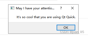
MessageDialog {id: dialogtitle: "May I have your attention please"text: "It's so cool that you are using Qt Quick."onAccepted: {console.log("And of course you could only agree.")Qt.quit()}Component.onCompleted: visible = true
}
Popup
closePolicy : enumeration :此属性决定弹出窗口关闭的情况
Popup.NoAutoClose: Popup 只会在手动指示时关闭。
Popup.CloseOnPressOutside:当鼠标在其外部按下时, Popup 将关闭。
Popup.CloseOnPressOutsideParent:当鼠标在其父级之外按下时, Popup 将关闭。
Popup.CloseOnReleaseOutside:当鼠标离开 Popup 时, Popup 将关闭。
Popup.CloseOnReleaseOutsideParent:当鼠标在其父级之外释放时, Popup 将关闭。
Popup.CloseOnEscape:当 Popup 具有活动焦点时按下退出键, Popup 将关闭。
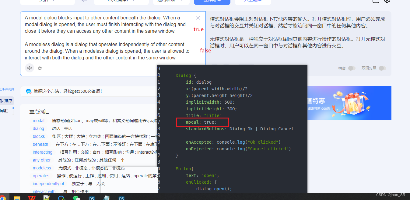
modal : bool:确定弹出窗口是否是模态的
dim : bool:显示弹出窗口是否使背景变暗
Overlay:弹出窗口覆盖
Dialog相关
属性基本与Pupup一致
1.去掉默认的边框
解决:加入background属性,里面为空也可
    Dialog {id: wanGatewayApplywidth: 259//控制整个弹窗的大小height: 160x: (bodyRect.width - width) / 2 // 水平居中y: (bodyRect.height - height) / 2 -100// 垂直居中modal: true// title: "Title" //标题// standardButtons: Dialog.Ok | Dialog.Cancel  //按钮background: Rectangle{
//         implicitWidth: 100
//         implicitHeight: 100
//         anchors.centerIn: parent
//         border.color: "#fff"}onAccepted: console.log("Ok clicked")onRejected: console.log("Cancel clicked")Rectangle{anchors.fill: parentcolor: "#fff"}}
如何给下边框设置阴影效果
gpt搜索的
import QtQuick 2.15
import QtGraphicalEffects 1.15Rectangle {width: 200height: 40color: "#FFFFFF"Rectangle {width: parent.widthheight: 1color: "gray"DropShadow {anchors.bottom: parent.bottomcolor: "#000000"radius: 5samples: 10horizontalOffset: 0verticalOffset: 0}}
}
实践:
import QtQuick 2.15
//import QtQuick.Controls 2.15
import QtGraphicalEffects 1.15//边框效果一般用这个
//************************************************ 顶部区域
Rectangle {id: headerBoxcolor: "#fff"width: parent.widthheight: 60Image {id: mLogox: 55width: 139height: 60source: "images/mLogo.png"}
}
// 顶部-外部阴影-----于要操作的组件同级
DropShadow {anchors.fill: headerBoxhorizontalOffset: 0verticalOffset: 3radius: 8.0samples: 16color: "#DCDCDC"source: headerBox
}
Qt Design Studio 4.2.0怎么引入Calendar组件,并使用Calendar
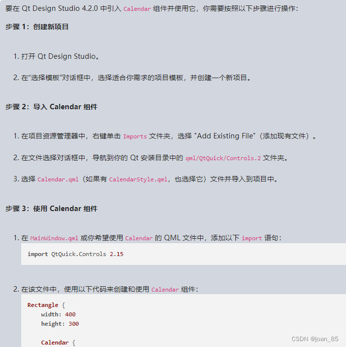
要在 Qt Design Studio 4.2.0 中引入 Calendar 组件并使用它,你需要按照以下步骤进行操作:步骤 1:创建新项目
1.打开 Qt Design Studio。
2.在“选择模板”对话框中,选择适合你需求的项目模板,并创建一个新项目。步骤 2:导入 Calendar 组件
1.在项目资源管理器中,右键单击 Imports 文件夹,选择 "Add Existing File"(添加现有文件)。
2.在文件选择对话框中,导航到你的 Qt 安装目录中的 qml/QtQuick/Controls.2 文件夹。
3.选择 Calendar.qml(如果有 CalendarStyle.qml,也选择它)文件并导入到项目中。步骤 3:使用 Calendar 组件
1.在 MainWindow.qml 或你希望使用 Calendar 的 QML 文件中,添加以下 import 语句:
import QtQuick.Controls 2.15
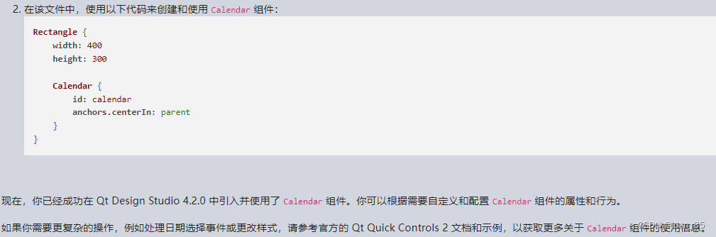
2.在该文件中,使用以下代码来创建和使用 Calendar 组件:
Rectangle {width: 400height: 300Calendar {id: calendaranchors.centerIn: parent}
}现在,你已经成功在 Qt Design Studio 4.2.0 中引入并使用了 Calendar 组件。你可以根据需要自定义和配置 Calendar 组件的属性和行为。如果你需要更复杂的操作,例如处理日期选择事件或更改样式,请参考官方的 Qt Quick Controls 2 文档和示例,以获取更多关于 Calendar 组件的使用信息。
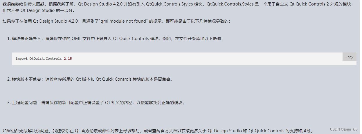
引入QtQuick.Controls.Styles 2.15,显示module not found
import QtQuick 2.15
import QtQuick.Controls 2.15
import WinIFDesigner 1.0
import Qt5Compat.GraphicalEffects
import Qt.labs.qmlmodels 1.0
import QtQuick.Layouts 1.11//import QtQuick.Controls 1.6
//import QtQuick.Controls.Styles 1.4
import QtQuick.Controls.Styles 2.15
Qt Design Studio 4.2.0 并没有引入 QtQuick.Controls.Styles 模块。QtQuick.Controls.Styles 是一个用于自定义 Qt Quick Controls 2 外观的模块,但它不是 Qt Design Studio 的一部分。
查询结果:
achors.rightMargin失效
1.Rectangle,Image 结合,Image 距离右侧设置距离
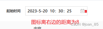
解决:
anchors.right: parent.right
anchors.rightMargin: 8
同时使用
Rectangle{width: 212height: 32anchors.verticalCenter: parent.verticalCenterborder.color: "#D9D9D9"TextInput {id: textInputx:8anchors.verticalCenter: parent.verticalCenterverticalAlignment: Text.AlignVCentertext: qsTr("2023-5-20  10:30:25")font.pointSize: 10}Image {id: startDatesource: "./images/date"anchors.verticalCenter: parent.verticalCenteranchors.right: parent.rightanchors.rightMargin: 8}
}
2.Rectangle,Text 结合,text距离右侧设置距离

Rectangle{id: apnNamewidth: 76height: 32border.color: "#333"Text {text: qsTr("APN")anchors.fill: parentverticalAlignment: Text.AlignVCenterhorizontalAlignment:Text.AlignRightanchors.rightMargin: 20color: "#333"font.family: "PingFang SC"font.pointSize: 10}
}
label

Label {text: "Hello world"font.pixelSize: 22font.italic: true}下拉框
可参考:
https://blog.csdn.net/tanxuan231/article/details/124990398
https://www.5axxw.com/questions/content/3xqy76
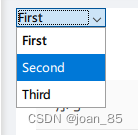
ComboBox {textRole: "key"model: ListModel {ListElement { key: "First"; value: 123 }ListElement { key: "Second"; value: 456 }ListElement { key: "Third"; value: 789 }}}
自定义下拉框

import QtQuickimport QtQuick.ControlsComboBox {id: controlmodel: ["First", "Second", "Third"]delegate: ItemDelegate {width: control.widthcontentItem: Text {text: control.textRole? (Array.isArray(control.model) ? modelData[control.textRole] : model[control.textRole]): modelDatacolor: "#21be2b"font: control.fontelide: Text.ElideRightverticalAlignment: Text.AlignVCenter}highlighted: control.highlightedIndex === index}indicator: Canvas {id: canvasx: control.width - width - control.rightPaddingy: control.topPadding + (control.availableHeight - height) / 2width: 12height: 8contextType: "2d"Connections {target: controlfunction onPressedChanged() { canvas.requestPaint(); }}onPaint: {context.reset();context.moveTo(0, 0);context.lineTo(width, 0);context.lineTo(width / 2, height);context.closePath();context.fillStyle = control.pressed ? "#17a81a" : "#21be2b";context.fill();}}contentItem: Text {leftPadding: 0rightPadding: control.indicator.width + control.spacingtext: control.displayTextfont: control.fontcolor: control.pressed ? "#17a81a" : "#21be2b"verticalAlignment: Text.AlignVCenterelide: Text.ElideRight}background: Rectangle {implicitWidth: 120implicitHeight: 40border.color: control.pressed ? "#17a81a" : "#21be2b"border.width: control.visualFocus ? 2 : 1radius: 2}popup: Popup {y: control.height - 1width: control.widthimplicitHeight: contentItem.implicitHeightpadding: 1contentItem: ListView {clip: trueimplicitHeight: contentHeightmodel: control.popup.visible ? control.delegateModel : nullcurrentIndex: control.highlightedIndexScrollIndicator.vertical: ScrollIndicator { }}background: Rectangle {border.color: "#21be2b"radius: 2}}}.ui.qml不支持function
鼠标响应事件
例子:
MouseArea {anchors.fill: parentacceptedButtons: Qt.LeftButton | Qt.RightButtononClicked: function(mouse){if (mouse.button === Qt.RightButton)contextMenu.popup()}onPressAndHold: function(mouse){if (mouse.source === Qt.MouseEventNotSynthesized)contextMenu.popup()}Menu {id: contextMenuMenuItem { text: "Cut" }MenuItem { text: "Copy" }MenuItem { text: "Paste" }}}
参考:https://blog.csdn.net/qq_41895747/article/details/104597293
Menu介绍
参考:https://blog.csdn.net/hw5230/article/details/131191517
自定义菜单组件(官方文档)
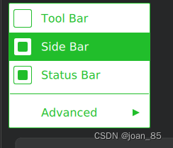
import QtQuickimport QtQuick.ControlsMenu {id: menuAction { text: qsTr("Tool Bar"); checkable: true }Action { text: qsTr("Side Bar"); checkable: true; checked: true }Action { text: qsTr("Status Bar"); checkable: true; checked: true }MenuSeparator {contentItem: Rectangle {implicitWidth: 200implicitHeight: 1color: "#21be2b"}}Menu {title: qsTr("Advanced")// ...}topPadding: 2bottomPadding: 2delegate: MenuItem {id: menuItemimplicitWidth: 200implicitHeight: 40arrow: Canvas {x: parent.width - widthimplicitWidth: 40implicitHeight: 40visible: menuItem.subMenuonPaint: {var ctx = getContext("2d")ctx.fillStyle = menuItem.highlighted ? "#ffffff" : "#21be2b"ctx.moveTo(15, 15)ctx.lineTo(width - 15, height / 2)ctx.lineTo(15, height - 15)ctx.closePath()ctx.fill()}}indicator: Item {implicitWidth: 40implicitHeight: 40Rectangle {width: 26height: 26anchors.centerIn: parentvisible: menuItem.checkableborder.color: "#21be2b"radius: 3Rectangle {width: 14height: 14anchors.centerIn: parentvisible: menuItem.checkedcolor: "#21be2b"radius: 2}}}contentItem: Text {leftPadding: menuItem.indicator.widthrightPadding: menuItem.arrow.widthtext: menuItem.textfont: menuItem.fontopacity: enabled ? 1.0 : 0.3color: menuItem.highlighted ? "#ffffff" : "#21be2b"horizontalAlignment: Text.AlignLeftverticalAlignment: Text.AlignVCenterelide: Text.ElideRight}background: Rectangle {implicitWidth: 200implicitHeight: 40opacity: enabled ? 1 : 0.3color: menuItem.highlighted ? "#21be2b" : "transparent"}}background: Rectangle {implicitWidth: 200implicitHeight: 40color: "#ffffff"border.color: "#21be2b"radius: 2}}菜单组件Menu应用
MouseArea{id:moouseIdanchors.fill: parentonClicked: {dialog.open();}
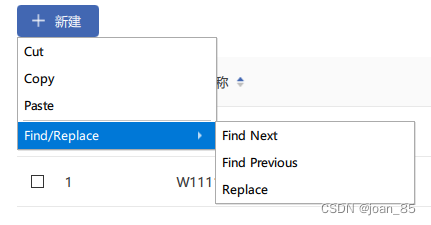
}Menu {id: dialogy: moouseId.heightAction { text: "Cut" }Action { text: "Copy" }Action { text: "Paste" }MenuSeparator { }Menu {title: "Find/Replace"Action { text: "Find Next" }Action { text: "Find Previous" }Action { text: "Replace" }}
}
或者用MenuItem
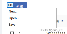
Button {id: fileButtontext: "File"onClicked: menu.open()Menu {id: menuy: fileButton.heightMenuItem {text: "New..."}MenuItem {text: "Open..."}MenuItem {text: "Save"}}
}
点击事件出现Dialog弹框
但自带的边框去不掉(暂没解决)
Rectangle {id: addRectwidth: 82height: 32border.color: "#4267B2"color: "#4267B2"radius: 4Image {id: addImgsource: "images/addWhite.png"width: 13height: 13x: 15anchors.verticalCenter: parent.verticalCenter}Text {id: addTexttext: qsTr("新建")x: 38font.pointSize: 10color: "#fff"anchors.verticalCenter: parent.verticalCenter}//点击MouseArea{anchors.fill: parentonClicked: {dialog.open();}}//弹窗内容Dialog {id: dialogx:0y:34
//  implicitWidth: 185;
//  implicitHeight: 326;width: 185;height: 326;modal: true;
//  standardButtons: Dialog.Ok | Dialog.Cancel
//  onAccepted: console.log("Ok clicked")
//  onRejected: console.log("Cancel clicked")/* 内容样式 */Rectangle{id:dialogConanchors.fill: parentcolor: "#fff"Column {spacing: 15Text {id: iconTextfont.pointSize: 10font.family:  "iconfont"text: "11111"color: "#333"}Text {id: iconText2font.pointSize: 10font.family:  "iconfont"text: "2222"color: "#333"}}}}
}
弹框中modal属性
pointSize和pixelSize区别
font.pointSize: 14
font.pixelSize: 14
通过设置PointSize的字体来说,字体大小是随着屏幕大小以及分辨率自适应的,无须处理字体的缩放;
通过设置PixelSize的字体来说,所占分辨率大小固定,在相同尺寸上更高分辨率的屏幕上,由于其单位长度内的像素点数更多,即像素密度更大,字体会看起来小一些.
要处理这种情况,一种办法就是所有字体都用PointSize来表示大小,但对于已经采用PixelSize的字体来说,就要对其进行控制缩放。
通过qss来实现:
PointSize:    font-size:16pt;
PixelSize:     font-size:16px;
一直被字体自适应这个问题困扰,尤其是使用pixelSize单位字体,在不同的分辨率电脑上会显示不一样的效果,有的大,有的中等,有的贼小,这是因为使用pixelSize会导致字体给固定住,多大就是大多,不会自己变化,遇到分辨率高的就变小,低的就贼大,刚好和设计原型差不多的,就看着很漂亮。
而使用pointSize虽然会自己放大缩小,但是和设计稿的字体差距很大,而且也会存在相应问题,而我更倾向于使用pixelSize,既然它固定了,我可以根据比例自己放大缩小即可,所以本文重点就要解决的就是如何获取放大缩小的比例,使像素字体无论再什么设备上都能看起来是中等好看的!
思路
要想获取到字体的缩放因子,就得知道宽高的原始像素对比现设备的原始像素,分别得到不同的宽高比例值,获取最小值,这就是缩放比例因子,然后乘以当前的字体大小,就可以等比缩放字体了,当然还可以增加一个缩放基础因子,初始化为1,这个需要人为的调整,有的可能1不太好看,需要调整到1.1就会更佳,下面给出具体的获取代码
horizontalRatio = 变化的U
参考:https://it.cha138.com/ios/show-6287196.html
表格自定义内容中,delegate类型:
delegate: CheckBox
delegate: SpinBox
delegate: TextField
delegate: DelegateChooser
{DelegateChoice{column: 0delegate: CheckBox{implicitWidth: header.width*0.1implicitHeight:40checked: model.displayonToggled: model.display = checked}}DelegateChoice{column: 1delegate: SpinBox{implicitWidth: 140implicitHeight:40value: model.displayonValueModified: model.display = value}}DelegateChoice{delegate: TextField{text: model.displayselectByMouse: trueimplicitWidth: 140implicitHeight:40onAccepted: model.display = text}}
}
三四五列没设置column,默认一样
Rectangle隐藏下边框
Rectangle{width: parent.widthheight: 32color: "#F5F5F5"border.color: "#D9D9D9"// border.width: 1//隐藏下边框Rectangle{width: parent.widthheight: 1color: "#F5F5F5"anchors.bottom: parent.bottom}}
表格只显示下边框
delegate: DelegateChooser
{DelegateChoice{column: 0delegate: Rectangle{id:checkBoxRectimplicitWidth: header.width*0.03implicitHeight:50border.width: 1border.color:"#E8E8E8"color:"#fff"
//         CheckBox{
//               anchors.centerIn: parent
//               checked: model.display
//               onToggled: model.display = checked
//         }//加这一层覆盖掉checkBoxRect内容Rectangle{anchors{fill: checkBoxRectbottomMargin: checkBoxRect.border.width}color: "#fff"CheckBox{anchors.centerIn: parentchecked: model.displayonToggled: model.display = checked}}}}DelegateChoice{}.........}
QML 布局详解
在QML中布局分为以下几种:绝对坐标、锚布局、定位器、布局管理器。
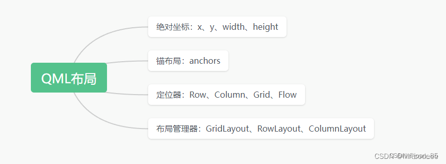
1.设置x、y、width、height能够定位一个组件的位置,这种方法扩展性太差。
Button{width: 50height: 50x: 10y:10background: Rectangle{color:"red"}}
2.锚布局
3.定位器
Row和Column差不多
4.Flow:流式布局
示例:Flow项自动将子Text项并排放置,当超出父控件边界时会自动换行。
5.Grid:网格布局
可以控制绘制几行几列。
参考:https://blog.csdn.net/wzz953200463/article/details/129718412
Rectangle
圆角属性:radius
放发缩小:scale
改变元素的原点位置:transformOrigin: “TopLeft”
移动:transform: Translate { y: -40 }//上移
Rectangle底部颜色和宽度:
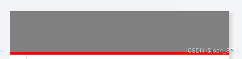
Rectangle {id: rectanchors.fill: parentborder.width: 5//底边宽度color: "gray"border.color: "red"//底边颜色
}
Rectangle {anchors {fill: rectbottomMargin: rect.border.width}color: "gray"
}
button
background属性
Button{id:b1width: 50height: 50anchors.centerIn: parent //在Window的中心background: Rectangle{color:"red"}}
Button自定义
import QtQuickimport QtQuick.ControlsButton {id: controltext: qsTr("Button")contentItem: Text {text: control.textfont: control.fontopacity: enabled ? 1.0 : 0.3color: control.down ? "#17a81a" : "#21be2b"horizontalAlignment: Text.AlignHCenterverticalAlignment: Text.AlignVCenterelide: Text.ElideRight}background: Rectangle {implicitWidth: 100implicitHeight: 40opacity: enabled ? 1 : 0.3border.color: control.down ? "#17a81a" : "#21be2b"border.width: 1radius: 2}}
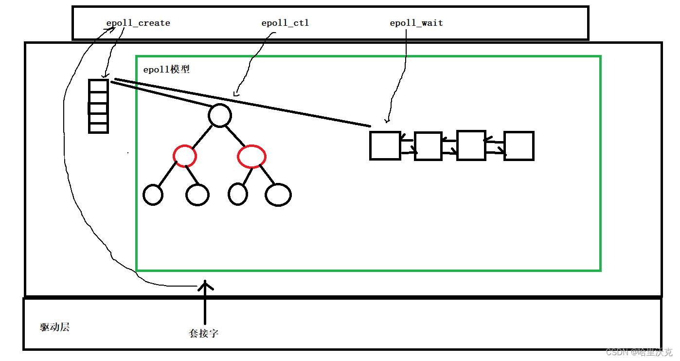
树形结构
可参考下,help中的查询文档
TreeView {id: myTreeanchors.fill: parentheaderVisible: falsebackgroundVisible : false //隐藏背景style: treeViewStylemodel: root.treeModelselection: selTableViewColumn {width: myTree.widthtitle: "Name"role: "name"}itemDelegate: Item {Image {id: nodeTextImageanchors.verticalCenter: parent.verticalCentersource: ""}Text {id: nameTextanchors.left: nodeTextImage.rightanchors.leftMargin: 5anchors.verticalCenter: parent.verticalCentercolor: "white"elide: styleData.elideModetext: styleData.valuefont.pointSize: 16}Drag.active:itemMouse.drag.activeDrag.dragType: Drag.Automatic; //选择自动开始拖动Drag.supportedActions: Qt.CopyAction; //选择复制数据到DropAreaDrag.onDragFinished: { //拖拽结束}MouseArea {id: itemMouseanchors.fill: parenthoverEnabled: truedrag.target: nameTextproperty bool isExpand: true //点击展开树节点onClicked: {sel.setCurrentIndex(styleData.index, 0x0010) //点击Item,设置选中当前节点if (isExpand) {emit: myTree.expand(styleData.index)isExpand = false;mControl.updateNodeName(styleData.index)}else {emit: myTree.collapse(styleData.index)isExpand = true;边的阴影怎么实现
切记:DropShadow要放在需要阴影模块的同级,否者样式错乱

import Qt5Compat.GraphicalEffects
Rectangle {id: headerBoxcolor: "#ffffff"width: parent.widthheight: 60
}
//外部阴影
DropShadow {anchors.fill: headerBoxhorizontalOffset: 7verticalOffset: 3radius: 8.0samples: 16color: "#b9b9b9"source: headerBox
}// 顶部-内部阴影
InnerShadow {anchors.fill: headerBoxcached: truehorizontalOffset: 0verticalOffset: -3radius: 16samples: 32color: "#666"smooth: truesource: headerBox}
参考:
https://blog.csdn.net/luoyayun361/article/details/65428939
https://blog.csdn.net/Marrrrrco/article/details/125204965
TextInput的使用方法
参考:https://baijiahao.baidu.com/s?id=1707087196065011808&wfr=spider&for=pc
https://blog.csdn.net/hahaha113461/article/details/129723861
TextInput禁止输入模式
readOnly: true
TextInput文字居中方式
https://baijiahao.baidu.com/s?id=1707087196065011808&wfr=spider&for=pc
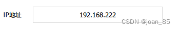
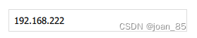
TextInput{anchors.fill: parent//anchors.leftMargin: 8text: "192.168.222"font.pointSize: 10font.family: "PingFang SC"verticalAlignment: Qt.AlignCenter  //或者用verticalAlignment: TextInput.AlignVCenter//horizontalAlignment: Qt.AlignHCenter//或者用verticalAlignment: TextInput.AlignHCenter
}
TextInput{anchors.fill: parentanchors.leftMargin: 8text: "192.168.222"font.pointSize: 10font.family: "PingFang SC"verticalAlignment: Qt.AlignCenter  //或者用verticalAlignment: TextInput.AlignVCenter//horizontalAlignment: Qt.AlignHCenter//或者用verticalAlignment: TextInput.AlignHCenter
}
Text文字右对齐

Rectangle{id: ipNamewidth: 60height: 32border.color: "blue"Text {text: qsTr("IP地址")anchors.fill: parentverticalAlignment: Text.AlignVCenterhorizontalAlignment:Text.AlignRight//anchors.rightMargin: 4}
}
Text文字居中方式
(1)创建一个rectangle,让text在rectangle中居中。
Window {width: 400height: 400title: qsTr("Hello World")visible: trueRectangle{anchors.centerIn: parentwidth: parent.width/2height: parent.height/2color:"yellow"Text {id: nameanchors.centerIn: parenttext: qsTr("text")font.pixelSize: 30}}
}
(2)只创建一个text,设置对其方式。
Window {width: 400height: 400title: qsTr("Hello World")visible: trueText {width: parent.widthheight: parent.heightid: nametext: qsTr("text")font.pixelSize: 30horizontalAlignment: Text.AlignHCenter//(1)verticalAlignment: Text.AlignVCenter//(2)}
}
参考:https://blog.csdn.net/ipfpm/article/details/88687398
anchors.fill和anchors.centerIn区别
anchors.centerIn:parent,是将子控件放在父控件的正中心,子控件的宽高是自己设置的;anchors.fill:parent, 是在子控件的大小设置与父控件大小一样,特别是mouseArea中经常使用anchors.fill:parent,这是为了指定鼠标事件接受的范围。如果是两个矩形控件,颜色不同,那么子控件会完全覆盖父控件,全是子控件的颜色显示。
还有一点,就是parent是指父类,直接相关的父类。anchors.fill指定的父类是必须是直接的父类,如果不是,会报错的。
参考:https://blog.csdn.net/lichen18848950451/article/details/79185611
自定义组件
新建一个自定义文件,文件名为:Button.qml
import QtQuick 2.0
Rectangle {id: rootproperty alias text: label.textsignal clickedwidth: 116; height: 26color: "lightsteelblue"border.color: "slategrey"Text {id: labelanchors.centerIn: parenttext: "Start"}MouseArea {anchors.fill: parentonClicked: {root.clicked()}}
}
下面我们需要修改 main.qml 来使用这个组件:
import QtQuick 2.0Rectangle {width: 360height: 360Button {id: buttonx: 12; y: 12text: "Start"onClicked: {status.text = "Button clicked!"}}Text {id: statusx: 12; y: 76width: 116; height: 26text: "waiting ..."horizontalAlignment: Text.AlignHCenter}
}
在 main.qml 中,我们直接使用了Button这个组件,就像 QML 其它元素一样。由于 Button.qml 与 main.qml 位于同一目录下,所以不需要额外的操作。但是,如果我们将 Button.qml 放在不同目录,比如构成如下的目录结果:
app|- QML| |- main.qml|- components|- Button.qml
那么,我们就需要在 main.qml 的import部分增加一行import …/components才能够找到Button组件。
有时候,选择一个组件的根元素很重要。比如我们的Button组件。我们使用Rectangle作为其根元素。Rectangle元素可以设置背景色等。但是,有时候我们并不允许用户设置背景色。所以,我们可以选择使用Item元素作为根。事实上,Item元素作为根元素会更常见一些。
参考:https://www.bookstack.cn/read/qt-study-road-2/15edfd7a031f980e.md
自定义属性
// 自定义属性
property int times: 24
// 属性别名
property alias anotherTimes: times
//声明一个默认属性
default property var defaultText
参考:https://www.bookstack.cn/read/qt-study-road-2/ffdc17d45ca95b72.md
Item
Item是QML中最基本的元素,所有其他元素都继承自它。它代表了一个可视化的对象,可以在界面上显示出来。
Item的属性包括位置、大小、旋转角度、缩放比例等。还可以设置颜色、透明度、边框等外观属性。此外,Item还可以响应用户输入事件,例如鼠标点击、键盘按键等。
在QML中,通常使用Item作为容器来组织其他元素,例如Rectangle、Text等。可以将多个Item嵌套在一起,形成复杂的界面布局。
下面是一个简单的例子,展示了如何使用Item创建一个红色矩形:
import QtQuick 2.0
Item {width: 100height: 100color: "red"
}
参考:https://blog.csdn.net/m0_60259116/article/details/130270827
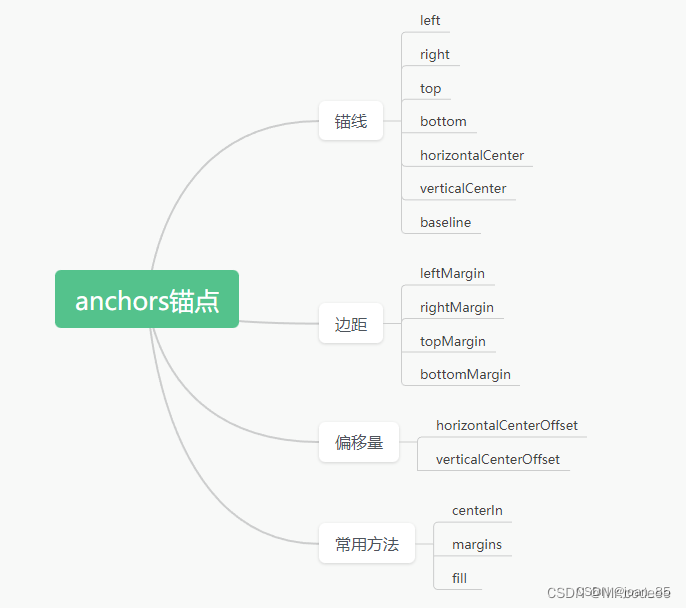
anchors详解
https://baijiahao.baidu.com/s?id=1706546262009663031&wfr=spider&for=pc
https://zhuanlan.zhihu.com/p/477876610?utm_id=0
什么时候用Item什么时候用Rectangle?什么时候用Row什么时候用RowLayout?
什么时候用Item,就是你要做一个组件,这个组件是一个复合的组件,组件有部分是有显示项。这种情况下,就用Item。如果你的元素是作为一个整体,以后不需要变动和更改,那么就用Rectangle。
什么时候用Row布局,当布局里面的所有元素的尺寸宽高都明确的时候,用Row布局,你可以精确细化到每个元素的宽高。
RowLayout布局,自带了一个自适应的布局方式,比如填充满,然后比如元素的比例。如果一个行中只有部分元素的尺寸是已知的,那么可以考虑用此布局。
参考:https://www.cnblogs.com/xianqingzh/p/4569176.html
lable用法
import QtQuick 2.12
import QtQuick.Window 2.12
import QtQuick.Controls 2.5Window {visible: truewidth: 640height: 480title: qsTr("Hello World")Label{x:100y:100width: 100height: 50text: qsTr("我是标签")  //可被翻译color: "red"  //设置Label字体颜色font.pixelSize: 22 //字体大小font.italic: true  //斜体//字体对其方式horizontalAlignment:Text.AlignHCenteverticalAlignment:Text.AlignVCenter//设置背景颜色background: Rectangle{color: "gray"}}
}
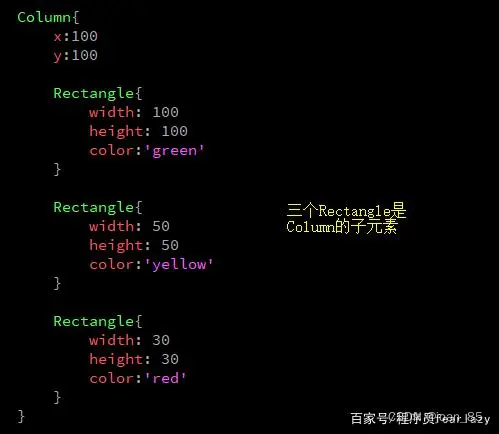
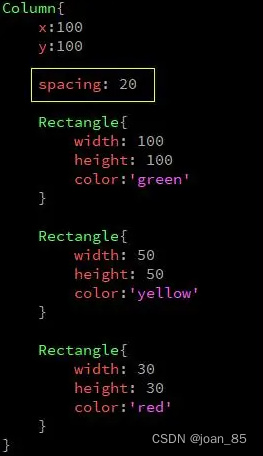
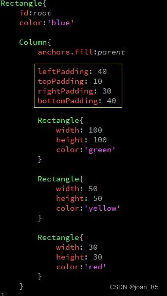
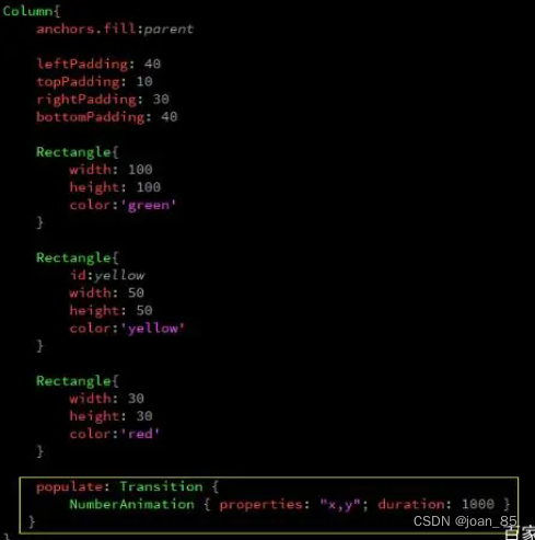
Column
Column可以将它的子元素排列成一列
1.使用:
2.使用spacing设置Column内部元素之间的间隔。
3.设置Column子元素四周的空白使用leftPadding、topPadding、rightPadding和bottomPadding。
4.除了以上属性,Column元素还有三个属性的值是Transition(过渡),这三个属性是populate、add、和move。
它们分别用来设置Column子元素创建时、添加时和移动时的过渡效果(添加动画)。
参考:https://baijiahao.baidu.com/s?id=1706627580638269232&wfr=spider&for=pc
Qt中font.pointSize和font.pixelSize的区别
pixel size 是所占的像素大小 这样有一个缺点 有些显示器的分辨率(dpi)比较大 那么单位长度中的像素点就比较多 这样一个字所占的长度就会比较少
point size 则规定了实际中我们肉眼看到的字体的大小 他和pixel无关的,他和显示器无关 不管在什么样上的显示器上 规定大小是多少就是多少。
注意:
1、当font.pointSize和font.pixelSize同时指定时,font.pixelSize生效。
2、在移动平台,建议使用font.pointSize。
因为像Android智能手机,屏幕尺寸和像素多种多样,使用font.pointSize可以更好的适应屏幕,在不同屏幕上看起来大小比较正常。而使用pixelSize,可能会导致有的手机上看不见,有些手机上特别大的情况。
参考:https://blog.csdn.net/bzs2510568513/article/details/120056541
Qt中fileMode
背景图片设置:
Image {id: imageBgfillMode: Image.PreserveAspectFitsource: "images/loginBg.png"width: parent.widthheight: parent.height
}
Image.Stretch:图片拉伸自适应;(默认的)
Image.PreserveAspectFit:按比例缩放,不裁剪
Image.PreserveAspectCrop:均匀缩放,必要时裁剪
Image.Tile:像贴瓷砖一样
Image.TileVertically:水平拉伸,垂直平铺
Image.TileHorizontally:垂直拉伸,水平平铺
Image.Pad:原始图像不做处理
参考:https://blog.csdn.net/qq78442761/article/details/89891547
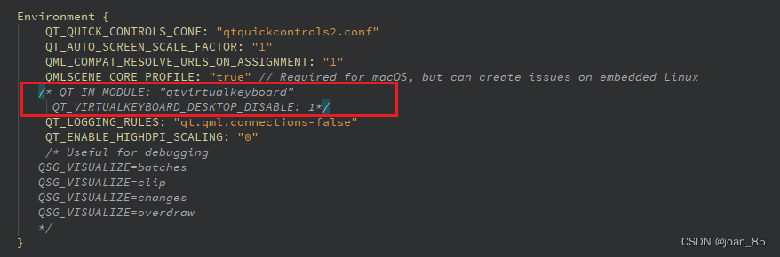
隐藏虚拟键盘
在WinIFDesigner.qmlproject文件中,注释下面两行代码即可
qt design studioA开发工具中, 新建的.ui.qml中引入ColumnLayout后,无法启动【Run Project】
加入下面一句代码后,可以显示,无法启动,暂未知原因
import QtQuick.Layouts 5.15
代码如下:
import QtQuick 2.15
import QtQuick.Controls 2.15
import WinIFDesigner 1.0
import QtQuick.Layouts 5.15//可以显示,无法启动Rectangle {width: Constants.widthheight: Constants.heightcolor: '#F0F2F5'ColumnLayout {id: columnLayout//        anchors.fill: parentwidth: parent.widthheight: parent.heightspacing: 0Rectangle {id: rectanglewidth: parent.widthheight: 60color: "#ffffff"}}
}
用Column布局可以正常运行,但是加上以下四句,运行失效
//anchors.top: 60//有以下四行,不能运行,注释后正常
//anchors.bottom: 0
//anchors.right: 0
//anchors.left: 0
import QtQuick 2.15
import QtQuick.Controls 2.15
import WinIFDesigner 1.0
Rectangle {width: Constants.widthheight: Constants.heightcolor: '#F0F2F5'Column {id: columnanchors.fill: parentRectangle {id: rectanglewidth: parent.widthheight: 60color: "#ffffff"}Rectangle {id: rectangle2width: parent.widthheight: parent.height - 60//anchors.top: 60//有以下四行,不能运行,注释后正常//anchors.bottom: 0//anchors.right: 0//anchors.left: 0}}
}
报错:module “QtQuick.Layouts” version 5.15 is not installed
拖拽组件默认是:import QtQuick.Layouts 5.15
将版本改为1.11即可
//import QtQuick.Layouts 5.15
import QtQuick.Layouts 1.11
参考官方文档:https://doc.qt.io/qt-5/qtquicklayouts-overview.html
qt design studio中用ColumnLayout失效,用Column正常显示【没法用ColumnLayout,RowLayout】
引入版本问题:import QtQuick.Layouts 1.11 可以正常显示
qt design studio的2D预览和运行不一致的问题,2D预览可能不准确
报错:Parameter “mouse” is not declared. Injection of parameters into signal handlers is deprecated. Use JavaScript functions with formal parameters instead.
原因:自Qt6开始,QML中使用信号处理函数参数时,需要显式捕获参数,写法如下
原来:
onClicked:{if (mouse.button === Qt.RightButton)contextMenu.popup()
}
改为:
onClicked: function(mouse){if (mouse.button === Qt.RightButton)contextMenu.popup()
}
报错:QML Row: Cannot specify left, right, horizontalCenter, fill or centerIn anchors for items inside Row. Row will not function.
Row 有次报错,可用Item代替!!!
Row中子元素按照控件属性由左向右分布,通过spacing控制子元素间距,因此通过anchor.left和anchor.right控制Row中子元素的水平位置会发生冲突,但仍然可以通过anchor.top和anchor.bottom控制子元素的垂直分布。如果希望用anchor进行定位,就用Item替换Row。
参考:https://blog.csdn.net/weixin_43692244/article/details/103686333
报错:QML Column: Cannot specify top, bottom, verticalCenter, fill or centerIn anchors for items inside Column. Column will not function.
Column正在尝试将MouseArea锚定到Image和Text旁边,但MouseArea指定其锚点来填充其父级。 这两件事是矛盾的,因此你得到错误的原因。
如果将MouseArea移出Column并进入SmileyDelegate的基本Item,您可能会发现它的效果与预期的一样。
Column is trying to anchor your MouseArea to next to the Image and the Text, but the MouseArea specifies its anchor to fill its parent. Those two things are contradictory, and hence why you get the error.
You’ll probably find it works as you expect if you move the MouseArea out of Column and into the base Item for SmileyDelegate.
参考:https://m.656463.com/wenda/cwQMLlwfwColumnndxzdtopbottomver_283
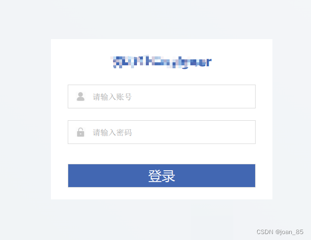
自己写的登录页面的例子
用column排列,子元素为Rectangle可以布局,但是间隔只能设置一样的,暂时找不到解决方案
所以本例子中没有用column,用的父元素为Rectangle 。
/*
This is a UI file (.ui.qml) that is intended to be edited in Qt Design Studio only.
It is supposed to be strictly declarative and only uses a subset of QML. If you edit
this file manually, you might introduce QML code that is not supported by Qt Design Studio.
Check out https://doc.qt.io/qtcreator/creator-quick-ui-forms.html for details on .ui.qml files.
*/
import QtQuick 2.15
import QtQuick.Controls 2.15
import WinIFDesigner 1.0
import Qt5Compat.GraphicalEffectsRectangle {id: rectangleBoxwidth: Constants.widthheight: Constants.heightcolor: Constants.backgroundColor//    背景图片Image {id: imageBgfillMode: Image.PreserveAspectFitsource: "images/loginBg.png"width: parent.widthheight: parent.height}//    登录页面Rectangle {id: loginRectBoxwidth: 448height: 324anchors.horizontalCenter: parent.horizontalCenteranchors.verticalCenter: parent.verticalCentercolor: "#ffffff"Item {id: loginTitleheight: 90width: parent.widthText {id: loginTitleTextanchors.horizontalCenter: parent.horizontalCenteranchors.verticalCenter: parent.verticalCentertext: qsTr("WinIFDesigner")font.bold: truefont.pointSize: 20color: '#4267B2'font.family: 'PingFang SC'}}Rectangle {id: loginContx: 0y: 92width: parent.widthheight: parent.height - 92//  账号Rectangle {id: userContwidth: 380height: 48anchors.horizontalCenter: parent.horizontalCenterborder.color: '#D9D9D9'clip: true //clip是从Item那里继承下来的,让绘制限定在它自己的矩形范围内。 失效!!!Image {id: userNameImgx: 16source: "images/userNum.png"width: 20height: 20anchors.verticalCenter: parent.verticalCenter}Text {id: userTextPlaceholder//  visible: !(userInput.activeFocus || userInput.length > 0)visible: !(userInput.length > 0)anchors.fill: parentverticalAlignment: Text.AlignVCenterleftPadding: 50text: qsTr("请输入账号")font.family: 'PingFang SC'font.pixelSize: 16color: "#999999"}TextInput {id: userInputanchors.fill: parentleftPadding: 50verticalAlignment: TextInput.AlignVCenter //文字显示位置//                    text: "admin"font.pointSize: 16focus: trueselectByMouse: true //鼠标可选中 -复制,剪切//                    echoMode: TextInput.Password //密码形式  TextInput.Normal:显示文本;TextInput.Password:密码;TextInput.NoEcho(啥也不显示);TextInput.PasswordEchoOnEdit(编辑时显示文本)}}//  密码Rectangle {id: pswContwidth: 380height: 48y: 72anchors.horizontalCenter: parent.horizontalCenterborder.color: '#D9D9D9'clip: true //clip是从Item那里继承下来的,让绘制限定在它自己的矩形范围内。 失效!!!Image {id: pswImgx: 16source: "images/userPsw.png"width: 20height: 20anchors.verticalCenter: parent.verticalCenter}Text {id: pswTextPlaceholdervisible: !(pswTextInput.length > 0)anchors.fill: parentverticalAlignment: Text.AlignVCenterleftPadding: 50text: qsTr("请输入密码")font.family: 'PingFang SC'font.pixelSize: 16color: "#999999"}TextInput {id: pswTextInputanchors.fill: parentleftPadding: 50verticalAlignment: TextInput.AlignVCenter //文字显示位置//                    text: "123456"font.pointSize: 16focus: trueselectByMouse: true //鼠标可选中 -复制,剪切echoMode: TextInput.Password //密码形式  TextInput.Normal:显示文本;TextInput.Password:密码;TextInput.NoEcho(啥也不显示);TextInput.PasswordEchoOnEdit(编辑时显示文本)}}Rectangle {id: loginBtnContwidth: 380height: 48anchors.horizontalCenter: parent.horizontalCenterborder.color: '#D9D9D9'y: 160color: '#4267B2'Text {id: loginBtnTexttext: qsTr("登录")font.pointSize: 20anchors.horizontalCenter: parent.horizontalCenteranchors.verticalCenter: parent.verticalCentercolor: '#fff'}}}}//  边框阴影DropShadow {anchors.fill: rectangle1horizontalOffset: 7verticalOffset: 3radius: 8.0samples: 16color: "#80000000"source: rectangle1}
}
相关文章:
qml相关知识1
qml相关知识1 QtQuick.Controls 哪个版本支持TreeModel 和 TreeItemqt5.12开始,TreeItem 类被删除,无法使用delegate 什么时候可以用Qt5.15中没有 import QtQuick.Controls 1吗,哪个版本有control1qml如何两种版本的controls混用(…...
linux+c+qt杂记
虚拟机网络选择; 桥接模式:设置window宿主机的IP/dns,把虚拟机设置为桥接即可。 切换到终端:我的是 ctrlaltFnF1? 问题解决: Ubuntu系统下载(清华大学开源软件镜像站)(ubuntu-20.…...

shouldComponentUpdate有什么作用?
触发时机 当props或state发生变化时,shouldComponentUpdate() 会在渲染执行之前被调用。 作用 根据shouldComponentUpdate()的返回值,判断react组件的输出是否受当前state或props更改影响。默认行为是state每次发生变化组件都会重新渲染。 shouldCompo…...

华为OD-滑动窗口最大值
题目描述 给你一个整数数组 nums,有一个大小为 k 的滑动窗口从数组的最左侧移动到数组的最右侧。你只可以看到在滑动窗口内的 k 个数字。滑动窗口每次只向右移动一位。 返回 滑动窗口中的最大值 。 示例一 输入:nums [1,3,-1,-3,5,3,6,7], k 3 输出…...
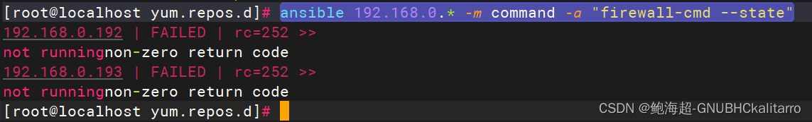
Linux:ansible自动化运维工具
环境介绍 当前所有执行权限我是在root下执行的,如果提示权限之类的,可以在每句命令前 加上 sudo ansible主服务器 192.168.0.194 另外两个客户端分别为 192.168.0.193 192.168.0.192 软件只需要在主服务器上安装,客户端不需…...

前端如何使用WebSocket发送消息
系列文章目录 文章目录 系列文章目录前言一、WebSocket的基本原理二、在前端使用WebSocket1.创建WebSocket实例2.监听事件3.发送消息三、实际应用场景总结前言 WebSocket是一种在Web应用程序中实现双向通信的技术,它允许服务器和客户端之间实时交换数据。在本篇博客中,我们将…...
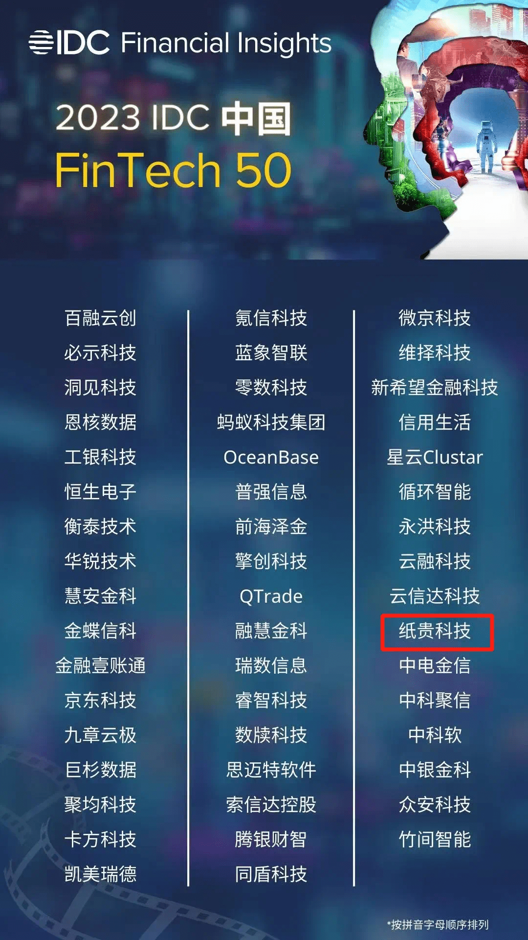
纸贵科技连续三年蝉联IDC中国 FinTech 50榜单
近日,国际权威市场研究机构IDC公布了“2023 IDC中国FinTech 50榜单”。作为领先的区块链技术和解决方案服务商,纸贵科技凭借过硬的区块链技术和丰富的金融科技创新成果,连续第三年荣登IDC中国FinTech 50榜单。 IDC中国FinTech 50榜单是金融科…...

台积电美国厂施工现场混乱,真令人头痛 | 百能云芯
近日,英伟达公司的财报表现异常亮眼,摩根士丹利不仅点名了台积电成为最大的受益者,还预测每售出一颗H100英伟达芯片,台积电就能获得900美元的利润。然而,美国媒体却曝出了一则不利的消息,称美国亚利桑那州的…...
React绑定antd输入框,点击清空或者确定按钮实现清空输入框内容
其实实现原理和vue的双向绑定是一样的,就是监听输入框的onChange事件,绑定value值,当输入框内容发生变化后,就重新设置这个value值。 示例代码:我这里是统一在handleCancel这个函数里面处理清空逻辑了,你们…...

Springboot整合liquIbase组件
liquIbase方式 1、添加依赖 <!-- Liquibase 依赖 --> <dependency><groupId>org.liquibase</groupId><artifactId>liquibase-core</artifactId> </dependency>2、添加配置项 spring:# datasource 数据源配置内容,对应…...
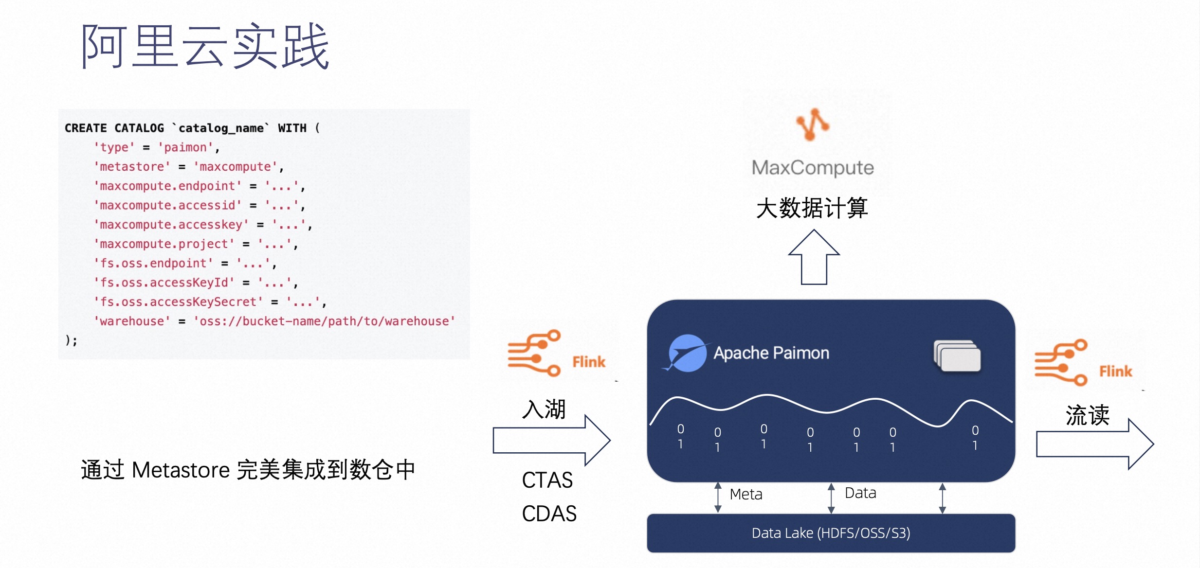
Apache Paimon 实时数据湖 Streaming Lakehouse 的存储底座
摘要:本文整理自阿里云开源大数据表存储团队负责人,阿里巴巴高级技术专家李劲松(之信),在 Streaming Lakehouse Meetup 的分享。内容主要分为四个部分: 流计算邂逅数据湖 Paimon CDC 实时入湖 Paimon 不止…...
计算机网络(10) --- 高级IO
计算机网络(9) --- 数据链路层与MAC帧_哈里沃克的博客-CSDN博客数据链路层与MAC帧https://blog.csdn.net/m0_63488627/article/details/132178583?spm1001.2014.3001.5501 1.IO介绍 1.IO本质 1.如果数据没有出现,那么读取文件其实会被阻塞住…...

学习中ChatGPT的17种用法
ChatGPT本质上是一个聊天工具,旧金山的人工智能企业OpenAI于2022年11月正式推出ChatGPT。那么,ChatGPT与其他人工智能产品相比有什么特殊呢? 它除了可以回答结构性的问题,例如语法修正、翻译和查找答案之外。最关键的是它能够去解…...
融合CDN 如何有效的抵抗DDoS攻击
绝大部分对外网站所有者都离不开CDN的支持,据统计,全球高达70%的互联网流量都是通过CDN来进行缓存和加速的,不论是国外知名的CDN厂商:如Cloudflare、AWS、Akamai等,还是国内主流的CDN厂商阿里云华为云腾讯云等…...
Git 原理与使用
1.版本控制器 所谓的版本控制器,就是能让你了解到⼀个⽂件的历史,以及它的发展过程的系统。通俗的讲就是⼀个可以记录⼯程的每⼀次改动和版本迭代的⼀个管理系统,同时也⽅便多⼈协同作业。 ⽬前最主流的版本控制器就是 Git 。Git 可以控制电脑…...

如何批量加密PDF文件并设置不同密码 - 批量PDF加密工具使用教程
如果你正在寻找一种方法来批量加密和保护你的PDF文件,批量PDF加密工具是一个不错的选择。 它是一个体积小巧但功能强大的Windows工具软件,能够批量给多个PDF文件加密和限制,包括设置打印限制、禁止文字复制,并增加独立的打开密码。…...

【Unity 工程化】unity一些资源路径用途
Resources Resources 目录用于存放可以通过 Unity 的 Resources.Load 函数进行加载的资源。这些资源会在构建时被打包为一个单独的资源包,因此它们必须满足一些 Unity 所要求的命名和文件夹结构规则。由于这些资源被打包在一起,因此在构建后的游戏中可以…...

使用Docker进行模型部署
一、常见的模型部署场景 实时的、小数据量的预测应用 部署方式:采用python-httpserve应用部署(如flask, fastApi, django),缺点是可能需要跨环境,从Java跨到Python环境实时的、大数据量的预测应用 部署方式࿱…...
第59步 深度学习图像识别:误判病例分析(TensorFlow)
基于WIN10的64位系统演示 一、写在前面 本期内容对等于机器学习二分类系列的误判病例分析(传送门)。既然前面的数据可以这么分析,那么图形识别自然也可以。 本期以mobilenet_v2模型为例,因为它建模速度快。 同样,基…...
【Vue框架】基本的login登录
前言 最近事情比较多,只能抽时间看了,放几天就把之前弄的都忘了,现在只挑着核心的部分看。现在铺垫了这么久,终于可以看前端最基本的登录了😂。 1、views\login\index.vue 由于代码比较长,这里将vue和js…...

抖音视频收藏革命:从水印困扰到纯净收藏的完美蜕变
抖音视频收藏革命:从水印困扰到纯净收藏的完美蜕变 【免费下载链接】douyin_downloader 抖音短视频无水印下载 win编译版本下载:https://www.lanzous.com/i9za5od 项目地址: https://gitcode.com/gh_mirrors/dou/douyin_downloader 你是否曾经在抖…...

Arduino与WS2812B打造智能节日彩灯:从硬件连接到编程实战
1. 项目概述:从零到一,点亮你的节日氛围又到年底了,各种节日接踵而至,无论是圣诞、元旦还是春节,家里总感觉少了点氛围感。买来的成品彩灯,要么模式单一,要么造型固定,总感觉差点意思…...

微软:小模型替代大模型执行终端任务
📖标题:Terminus-4B: Can a Smaller Model Replace Frontier LLMs at Agentic Execution Tasks? 🌐来源:arXiv, 2605.03195v1 🛎️文章简介 🔸研究问题:在代码智能体的终端执行子任务中&#x…...

无人机巡检避坑指南:用YOLOv5n做罂粟识别,这些光照和遮挡问题怎么解决?
无人机巡检实战:YOLOv5n在复杂环境下的罂粟识别优化策略 清晨的露珠还挂在叶片上,无人机已经盘旋在田野上空。对于从事智能巡检的工程师来说,这样的场景再熟悉不过——但随之而来的挑战也令人头疼:强烈的晨光让部分区域过曝&#…...

STM32F103C8T6最小系统板避坑指南:从ST-LINK接线到Keil5乱码,新手必看的5个实战问题
STM32F103C8T6最小系统板避坑指南:从ST-LINK接线到Keil5乱码,新手必看的5个实战问题 第一次点亮STM32开发板的LED时,那种成就感就像电子工程师的"成人礼"。但通往成功的路上往往布满荆棘——接错一根线可能导致整晚的调试失败&…...
)
QGIS二次开发实战:手把手教你用C++ API为矢量点数据实现动态分级渲染(附完整代码)
QGIS二次开发实战:C API实现矢量点数据动态分级渲染 在GIS应用开发中,数据可视化是核心需求之一。当我们需要展示实时传感器数据、业务指标或环境监测数据时,如何让用户一眼看出数值分布和热点区域?分级渲染技术正是解决这一问题的…...

对比ubuntu本地直接调用与通过taotoken调用的开发便捷性
🚀 告别海外账号与网络限制!稳定直连全球优质大模型,限时半价接入中。 👉 点击领取海量免费额度 对比 Ubuntu 本地直接调用与通过 Taotoken 调用的开发便捷性 在 Ubuntu 等 Linux 开发环境中集成大模型能力,开发者通常…...

深圳清关代理口碑爆棚,不找它你就亏大啦!
事件经过某外贸公司近期有一批从国外进口的电子产品要在深圳口岸清关。该公司原本以为按照常规流程操作即可顺利完成清关,便自行准备了相关单证资料。然而,当货物到达深圳口岸进行报关时,却遭遇了清关受阻的情况。海关在合规审核过程中发现&a…...

【NotebookLM内容可信度跃迁关键】:如何用“证据锚定法”让讨论部分通过专家级评审?
更多请点击: https://intelliparadigm.com 第一章:NotebookLM讨论部分的可信度本质与评审标准 可信度的本质:语义对齐与溯源可验证性 NotebookLM 的讨论部分并非传统意义上的“生成式问答”,而是基于用户上传文档构建的语义索引…...

基于红外传感器与CircuitPython的互动声光糖果碗制作指南
1. 项目概述:一个会“尖叫”的互动糖果碗又到了捣鼓点有趣玩意儿的时候了。作为一个喜欢在万圣节搞点小惊喜的创客,我总觉得光是发糖有点平淡。能不能让糖果碗自己“活”过来,在孩子们伸手时,用灯光和声音制造一点既有趣又不会太过…...