浅谈WPF之控件模板和数据模板
WPF不仅支持传统的Windows Forms编程的用户界面和用户体验设计,同时还推出了以模板为核心的新一代设计理念。在WPF中,通过引入模板,将数据和算法的“内容”和“形式”进行解耦。模板主要分为两大类:数据模板【Data Template】和控件模板【Control Template】。

基本上,ControlTemplate描述如何显示控件,而DataTemplate描述如何显示数据。
控件模板 Control Template
控件模板让我们可以定义控件的外观,改变控件的展现形式,通过Control Template实现。
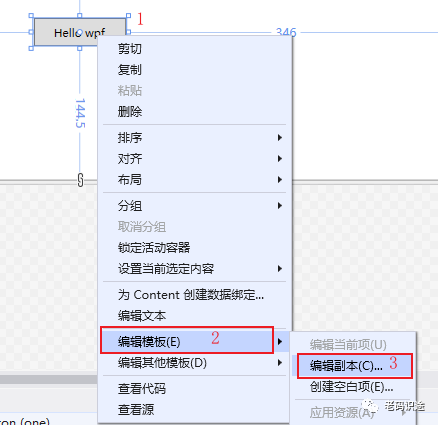
1. 编辑默认模板
选中控件--右键--编辑模板--编辑副本,打开创建Style资源对话框,如下所示:
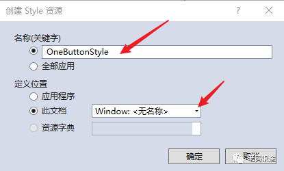
创建Style资源,输入资源名称,定义位置,默认为此文档【Window】,然后点击【确定】,创建资源。如下所示:
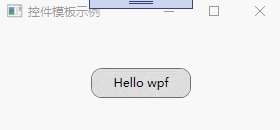
创建控件元素的默认资源,如下所示:
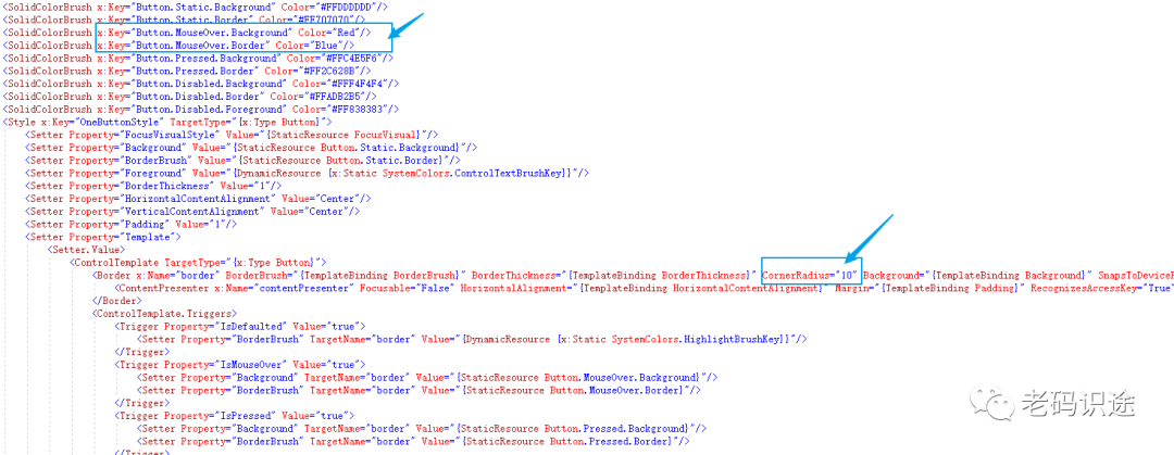
<Window x:Class="WpfApp2.TwoWindow"xmlns="http://schemas.microsoft.com/winfx/2006/xaml/presentation"xmlns:x="http://schemas.microsoft.com/winfx/2006/xaml"xmlns:d="http://schemas.microsoft.com/expression/blend/2008"xmlns:mc="http://schemas.openxmlformats.org/markup-compatibility/2006"xmlns:local="clr-namespace:WpfApp2"mc:Ignorable="d"Title="TwoWindow" Height="350" Width="800"><Window.Resources><Style x:Key="FocusVisual"><Setter Property="Control.Template"><Setter.Value><ControlTemplate><Rectangle Margin="2" SnapsToDevicePixels="true" Stroke="{DynamicResource {x:Static SystemColors.ControlTextBrushKey}}" StrokeThickness="1" StrokeDashArray="1 2"/></ControlTemplate></Setter.Value></Setter></Style><SolidColorBrush x:Key="Button.Static.Background" Color="#FFDDDDDD"/><SolidColorBrush x:Key="Button.Static.Border" Color="#FF707070"/><SolidColorBrush x:Key="Button.MouseOver.Background" Color="#FFBEE6FD"/><SolidColorBrush x:Key="Button.MouseOver.Border" Color="#FF3C7FB1"/><SolidColorBrush x:Key="Button.Pressed.Background" Color="#FFC4E5F6"/><SolidColorBrush x:Key="Button.Pressed.Border" Color="#FF2C628B"/><SolidColorBrush x:Key="Button.Disabled.Background" Color="#FFF4F4F4"/><SolidColorBrush x:Key="Button.Disabled.Border" Color="#FFADB2B5"/><SolidColorBrush x:Key="Button.Disabled.Foreground" Color="#FF838383"/><Style x:Key="OneButtonStyle" TargetType="{x:Type Button}"><Setter Property="FocusVisualStyle" Value="{StaticResource FocusVisual}"/><Setter Property="Background" Value="{StaticResource Button.Static.Background}"/><Setter Property="BorderBrush" Value="{StaticResource Button.Static.Border}"/><Setter Property="Foreground" Value="{DynamicResource {x:Static SystemColors.ControlTextBrushKey}}"/><Setter Property="BorderThickness" Value="1"/><Setter Property="HorizontalContentAlignment" Value="Center"/><Setter Property="VerticalContentAlignment" Value="Center"/><Setter Property="Padding" Value="1"/><Setter Property="Template"><Setter.Value><ControlTemplate TargetType="{x:Type Button}"><Border x:Name="border" BorderBrush="{TemplateBinding BorderBrush}" BorderThickness="{TemplateBinding BorderThickness}" Background="{TemplateBinding Background}" SnapsToDevicePixels="true"><ContentPresenter x:Name="contentPresenter" Focusable="False" HorizontalAlignment="{TemplateBinding HorizontalContentAlignment}" Margin="{TemplateBinding Padding}" RecognizesAccessKey="True" SnapsToDevicePixels="{TemplateBinding SnapsToDevicePixels}" VerticalAlignment="{TemplateBinding VerticalContentAlignment}"/></Border><ControlTemplate.Triggers><Trigger Property="IsDefaulted" Value="true"><Setter Property="BorderBrush" TargetName="border" Value="{DynamicResource {x:Static SystemColors.HighlightBrushKey}}"/></Trigger><Trigger Property="IsMouseOver" Value="true"><Setter Property="Background" TargetName="border" Value="{StaticResource Button.MouseOver.Background}"/><Setter Property="BorderBrush" TargetName="border" Value="{StaticResource Button.MouseOver.Border}"/></Trigger><Trigger Property="IsPressed" Value="true"><Setter Property="Background" TargetName="border" Value="{StaticResource Button.Pressed.Background}"/><Setter Property="BorderBrush" TargetName="border" Value="{StaticResource Button.Pressed.Border}"/></Trigger><Trigger Property="IsEnabled" Value="false"><Setter Property="Background" TargetName="border" Value="{StaticResource Button.Disabled.Background}"/><Setter Property="BorderBrush" TargetName="border" Value="{StaticResource Button.Disabled.Border}"/><Setter Property="TextElement.Foreground" TargetName="contentPresenter" Value="{StaticResource Button.Disabled.Foreground}"/></Trigger></ControlTemplate.Triggers></ControlTemplate></Setter.Value></Setter></Style></Window.Resources><Grid><Button x:Name="one" Content="Hello wpf" Margin="5" Width="100" Height="30" Style="{DynamicResource OneButtonStyle}"></Button></Grid>
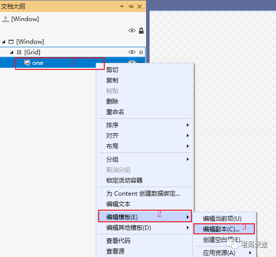
</Window>编辑默认模板,也可以通过【文档大纲】右键--编辑模板--编辑副本,然后打开创建资源对话框,进行操作,如下所示:
2. 修改默认样式
通过默认创建的控件模板Style,可以修改和重定义控件的显示内容,如:设置按钮显示圆角,和鼠标放上去为红色。
要实现以上功能,只需要修改两个地方即可,如下所示:
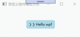
3. 自定义控件模板
通过自定义模板,同样能达到修改控件样式的效果。
控件模板也是资源的一种,每一个控件模板都有一个唯一的key,在控件上通过Template进行绑定,如下所示:
<Window x:Class="WpfApp2.ThreeWindow"xmlns="http://schemas.microsoft.com/winfx/2006/xaml/presentation"xmlns:x="http://schemas.microsoft.com/winfx/2006/xaml"xmlns:d="http://schemas.microsoft.com/expression/blend/2008"xmlns:mc="http://schemas.openxmlformats.org/markup-compatibility/2006"xmlns:local="clr-namespace:WpfApp2"mc:Ignorable="d"Title="自定义控件模板示例" Height="150" Width="300"><Window.Resources><ControlTemplate x:Key="oneStyle" TargetType="Button"><Border Background="LightBlue" CornerRadius="5" x:Name="border"><StackPanel Orientation="Horizontal" HorizontalAlignment="{TemplateBinding HorizontalAlignment}"><TextBlock VerticalAlignment="{TemplateBinding VerticalAlignment}">》》</TextBlock><ContentPresenter HorizontalAlignment="{TemplateBinding HorizontalAlignment}" VerticalAlignment="{TemplateBinding VerticalAlignment}"></ContentPresenter></StackPanel></Border><ControlTemplate.Triggers><Trigger Property="IsMouseOver" Value="true"><Setter Property="Background" TargetName="border" Value="Red"/><Setter Property="BorderBrush" TargetName="border" Value="Blue"/></Trigger></ControlTemplate.Triggers></ControlTemplate></Window.Resources><Grid><Button x:Name="one" Content="Hello wpf" Margin="5" Width="100" Height="30" VerticalAlignment="Center"  HorizontalAlignment="Center" Template="{StaticResource oneStyle}"></Button></Grid>
</Window>
自定义控件模板,示例如下:
数据模板 DataTemplate
控件模板决定了数据的展示形式和用户体检,在软件UI设计中非常重要。同样数据的展示形式越来越多样化,正所谓:横看成岭侧成峰,远近高低各不同。同样的数据内容,在DataGrid中的展示是文本的列表形式,在ComboBox中是下拉框的形式。给数据披上外衣,将数据和形式解耦,是一种新的发展趋势。
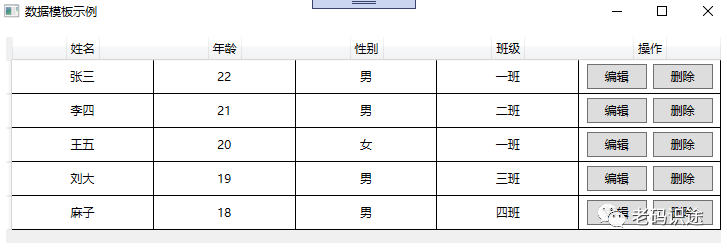
1. DataGrid
1. 数据模板
DataGrid是可以自定义网格数据显示的控件,通过自定义显示的列模板,可以实现各式各样的展现方式。列定义如下:
-
DataGrid的列定义,通过Binding="{Binding Name}"的方式绑定属性,通过ElementStyle="{StaticResource one_center}"的方式绑定样式。
-
DataGrid预制了几种列展示数据的方式,如:DataGridTextColumn【文本】,DataGridCheckBoxColumn【复选框】,DataGridComboBoxColumn【下拉框】,DataGridHyperlinkColumn【链接】等,如果使用数据模板,则采用DataGridTemplateColumn进行定义。
UI示例如下所示:
<Window x:Class="WpfApp2.A1Window"xmlns="http://schemas.microsoft.com/winfx/2006/xaml/presentation"xmlns:x="http://schemas.microsoft.com/winfx/2006/xaml"xmlns:d="http://schemas.microsoft.com/expression/blend/2008"xmlns:mc="http://schemas.openxmlformats.org/markup-compatibility/2006"xmlns:local="clr-namespace:WpfApp2"mc:Ignorable="d"Title="数据模板示例" Height="450" Width="650"><Window.Resources><Style x:Key="one_center" TargetType="TextBlock"><Setter Property="VerticalAlignment" Value="Center"></Setter><Setter Property="HorizontalAlignment" Value="Center"></Setter></Style><Style x:Key="one_header" TargetType="DataGridColumnHeader"><Setter Property="VerticalAlignment" Value="Center"></Setter><Setter Property="HorizontalAlignment" Value="Center"></Setter><Setter Property="HorizontalContentAlignment" Value="Center"></Setter><Setter Property="BorderThickness" Value="0"></Setter></Style></Window.Resources><Grid><DataGrid x:Name="one"  Margin="10" AutoGenerateColumns="False"  CanUserAddRows="False"  CanUserSortColumns="False" BorderThickness="0" ><DataGrid.Columns><DataGridTextColumn Header="姓名" Binding="{Binding Name}" Width="*" ElementStyle="{StaticResource one_center}" HeaderStyle="{StaticResource one_header}"  /><DataGridTextColumn Header="年龄" Binding="{Binding Age}" Width="*" ElementStyle="{StaticResource one_center}" HeaderStyle="{StaticResource one_header}"/><DataGridTextColumn Header="性别" Binding="{Binding Sex}" Width="*" ElementStyle="{StaticResource one_center}" HeaderStyle="{StaticResource one_header}"/><DataGridTextColumn Header="班级" Binding="{Binding Classes}" Width="*" ElementStyle="{StaticResource one_center}" HeaderStyle="{StaticResource one_header}"/><DataGridTemplateColumn Header="操作" Width="*" HeaderStyle="{StaticResource one_header}"><DataGridTemplateColumn.CellTemplate><DataTemplate><StackPanel Orientation="Horizontal" VerticalAlignment="Center" HorizontalAlignment="Center"><Button x:Name="edit" Content="编辑" Width="60" Margin="3" Height="25"></Button><Button x:Name="delete" Content="删除" Width="60" Margin="3" Height="25"></Button></StackPanel></DataTemplate></DataGridTemplateColumn.CellTemplate></DataGridTemplateColumn></DataGrid.Columns></DataGrid></Grid>
</Window>
2.后台数据绑定
后台数据绑定通过ItemsSource进行赋值,绑定的数据的属性名,要和DataGrid的列绑定数据的名称保持一致,如下所示:
namespace WpfApp2
{/// <summary>/// A1Window.xaml 的交互逻辑/// </summary>public partial class A1Window : Window{public A1Window(){InitializeComponent();List<Student> lst = new List<Student>();lst.Add(new Student() { Name = "张三", Age = 22, Sex = "男", Classes = "一班" });lst.Add(new Student() { Name = "李四", Age = 21, Sex = "男", Classes = "二班" });lst.Add(new Student() { Name = "王五", Age = 20, Sex = "女", Classes = "一班" });lst.Add(new Student() { Name = "刘大", Age = 19, Sex = "男", Classes = "三班" });lst.Add(new Student() { Name = "麻子", Age = 18, Sex = "男", Classes = "四班" });one.ItemsSource = lst;}}public class Student{public string Name { get; set; }public int Age { get; set; }public string Sex { get; set; }public string Classes { get; set; }}
}
DataGrid示例,如下所示:
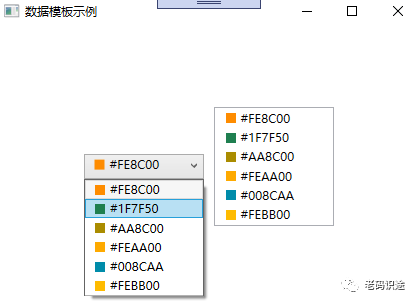
2. ListBox和ComboBox
1. 数据模板
ListBox,ComboBox,均是包含可选择的项的列表,只是ListBox不需要下拉显示,ComboBox需要下拉显示。通过定义数据模板,可以丰富数据的展示形式。
通过ItemTemplate="{StaticResource item_template}"的形式,进行数据模板的绑定。如下所示:
<Window x:Class="WpfApp2.A2Window"xmlns="http://schemas.microsoft.com/winfx/2006/xaml/presentation"xmlns:x="http://schemas.microsoft.com/winfx/2006/xaml"xmlns:d="http://schemas.microsoft.com/expression/blend/2008"xmlns:mc="http://schemas.openxmlformats.org/markup-compatibility/2006"xmlns:local="clr-namespace:WpfApp2"mc:Ignorable="d"Title="数据模板示例" Height="450" Width="800"><Window.Resources><DataTemplate x:Key="item_template"><StackPanel Orientation="Horizontal" Margin="5 ,0"><Border Width="10" Height="10" Background="{Binding Code}"></Border><TextBlock Text="{Binding Code}" Margin="5,0" ></TextBlock></StackPanel></DataTemplate></Window.Resources><Grid><StackPanel Margin="3" Orientation="Horizontal" HorizontalAlignment="Center" VerticalAlignment="Center"><ComboBox x:Name="one" Height="25" Width="120" Margin="5" ItemTemplate="{StaticResource item_template}"></ComboBox><ListBox x:Name="two"  Width="120" Margin="5" ItemTemplate="{StaticResource item_template}"></ListBox></StackPanel></Grid>
</Window>
2.后台数据绑定
与DataGrid一样,后台通过ItemsSource进行数据的绑定。如下所示:
namespace WpfApp2
{/// <summary>/// A2Window.xaml 的交互逻辑/// </summary>public partial class A2Window : Window{public A2Window(){InitializeComponent();List<Color> lst = new List<Color>();lst.Add(new Color() { Code = "#FE8C00" });lst.Add(new Color() { Code = "#1F7F50" });lst.Add(new Color() { Code = "#AA8C00" });lst.Add(new Color() { Code = "#FEAA00" });lst.Add(new Color() { Code = "#008CAA" });lst.Add(new Color() { Code = "#FEBB00" });one.ItemsSource = lst;two.ItemsSource = lst;}}public class Color{public string Code { get; set; }}
}
示例截图,如下所示:
3. ItemsControl
1. 数据模板
ItemsControl,主要用于展示集合数据的项,也是列表控件的一种。ItemsControl 需要设置两个内容:
-
ItemsControl.ItemsPanel,做为数据展示的容器。
-
ItemsControl.ItemTemplate,用于单个数据的展示形式。
具体如下所示:
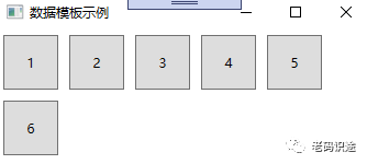
<Window x:Class="WpfApp2.A3Window"xmlns="http://schemas.microsoft.com/winfx/2006/xaml/presentation"xmlns:x="http://schemas.microsoft.com/winfx/2006/xaml"xmlns:d="http://schemas.microsoft.com/expression/blend/2008"xmlns:mc="http://schemas.openxmlformats.org/markup-compatibility/2006"xmlns:local="clr-namespace:WpfApp2"mc:Ignorable="d"Title="A3Window" Height="450" Width="800"><Grid><ItemsControl x:Name="one"><ItemsControl.ItemsPanel><ItemsPanelTemplate><WrapPanel></WrapPanel></ItemsPanelTemplate></ItemsControl.ItemsPanel><ItemsControl.ItemTemplate><DataTemplate><Button Width="50" Height="50" Margin="5" Content="{Binding Code}"></Button></DataTemplate></ItemsControl.ItemTemplate></ItemsControl></Grid>
</Window>
2.后台数据绑定
与DataGrid一样,后台通过ItemsSource进行数据的绑定。如下所示:
namespace WpfApp2
{/// <summary>/// A3Window.xaml 的交互逻辑/// </summary>public partial class A3Window : Window{public A3Window(){InitializeComponent();List<Test> lst = new List<Test>();lst.Add(new Test() { Code = "1" });lst.Add(new Test() { Code = "2" });lst.Add(new Test() { Code = "3" });lst.Add(new Test() { Code = "4" });lst.Add(new Test() { Code = "5" });lst.Add(new Test() { Code = "6" });one.ItemsSource = lst;}}public class Test{public string Code { get; set; }}
}
示例截图
控件模板和数据模板的应用场景还有很多,本文旨在抛砖引玉,一起学习,共同进步。
相关文章:
浅谈WPF之控件模板和数据模板
WPF不仅支持传统的Windows Forms编程的用户界面和用户体验设计,同时还推出了以模板为核心的新一代设计理念。在WPF中,通过引入模板,将数据和算法的“内容”和“形式”进行解耦。模板主要分为两大类:数据模板【Data Template】和控…...
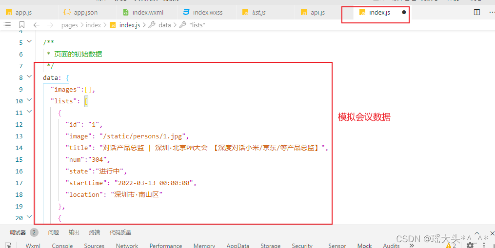
微信小程序会议OA首页-开发说明创建项目关于flex布局关于尺寸单位(rpx)关于WXS轮播图会议信息
目录 1. 创建项目 2. 关于flex布局 3. 关于尺寸单位(rpx) 4. 关于WXS 4. 轮播图 5. 会议信息 1. 创建项目 基于微信原生开发工具,稳定版 Stable Build (1.06.22010310) 创建项目前,请确定有小程序测试账号 使用向导创建一个…...
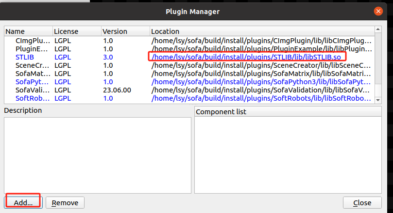
Linux上编译和安装SOFA23.06
前言 你可以直接使用编译安装好的SOFA版本Installing from all-included binaries (v23.06.00): 如果你想自己编译,可以看我下面写的内容,不过绝大多数是从官网来的,如果和官网有出入,建议还是以官网为准。 在Linux下…...

定时任务 Spring Task
一、介绍 Spring Task 是Spring框架提供的任务调度工具,可以按照约定的时间自动执行某个代码逻辑。 定位: 定时任务框架 作用: 定时自动执行某段Java代码 二、cron 表达式 cron表达式在线生成器:https://cron.qqe2.com/ 1、说明…...

golang 上传图片 --chatGPT
问:makeImgUpload(path string) 实现发送发送图片, 发送类型为 multipart/form-data gpt: 下面是一个简单的 makeImgUpload 函数的实现,用于发送图片并以 multipart/form-data 格式进行上传。请注意,此代码假设图片文件路径是正确…...
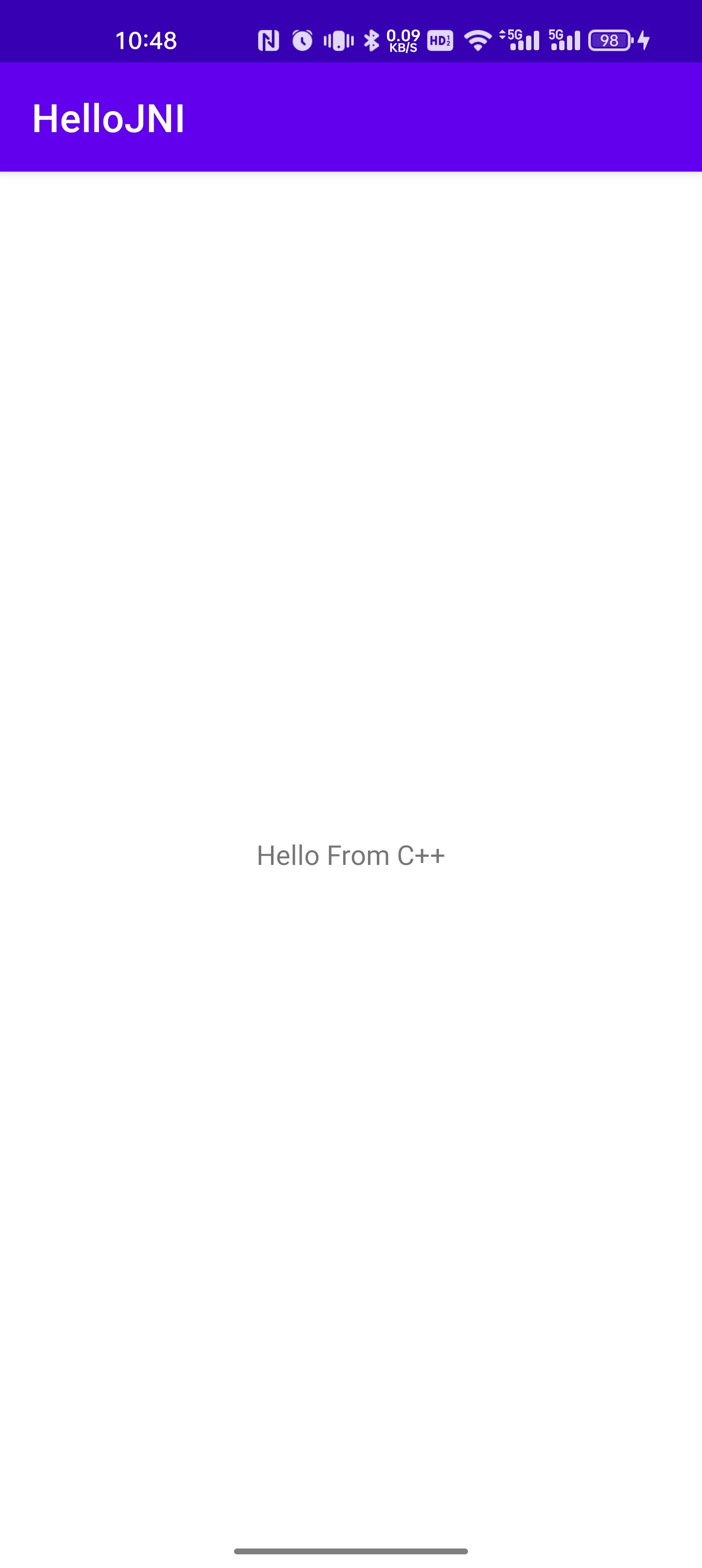
Android Studio 写一个Java调用c++ 的demo
前提条件: 本地已经配置好了ndk环境,如果没有配置好,建议参考macos 配置ndk环境-CSDN博客 这篇链接。 新建一个Empty Project 比如我这里的Project的名字是HelloJNI,包名是com.example.hellojni 然后在src目录下,右键选择Add C …...

Pandas数据操作_Python数据分析与可视化
Pandas数据操作 排序操作对索引进行排序按行排序按值排序 删除操作算数运算去重duplicated()drop_duplicates() 数据重塑层次化索引索引方式内层选取数据重塑 排序操作 对索引进行排序 Series 用 sort_index() 按索引排序,sort_values() 按值排序; Dat…...

【Debug】查询的数据量比数据库中的数据量还要多
今天前端反馈了一个bug,某个接口返回的数据很多,我到mysql数据库看了一下,查询的表名为trs_risk,其中只有1000多条数据,而页面返回有5000多条数据!! 匪夷所思啊,我定位到Mapper层的…...

nodejs微信小程序-慢性胃炎健康管理系统的设计与实现-安卓-python-PHP-计算机毕业设计
目 录 摘 要 I ABSTRACT II 目 录 II 第1章 绪论 1 1.1背景及意义 1 1.2 国内外研究概况 1 1.3 研究的内容 1 第2章 相关技术 3 2.1 nodejs简介 4 2.2 express框架介绍 6 2.4 MySQL数据库 4 第3章 系统分析 5 3.1 需求分析 5 3.2 系统可行性分析 5 3.2.1技术可行性:…...
二十一、数组(1)
本章概要 数组特性 用于显示数组的实用程序 一等对象返回数组 简单来看,数组需要你去创建和初始化,你可以通过下标对数组元素进行访问,数组的大小不会改变。大多数时候你只需要知道这些,但有时候你必须在数组上进行更复杂的操作…...

react hook 获取setState的新值
利用useRef 存储最新值 let [count,setCount] useState(0)let countRef useRef(count)let handleClick function (){setCount((prev)>{countRef.current prev1return countRef.current})console.info(countRef.current)}利用useRef let [count,setCount] useState(0)le…...
JVM判断对象是否存活之引用计数法、可达性分析
目录 前言 引用计数法 概念 优点 缺点 可达性分析 概念 缺点: 扩展: 1.GC Roots 概念 2.STW (Stop the world) 前言 JVM有两种算法来判断对象是否存活,分别是引用计数法和可达性分析算法,针对可达性分析算法STW时间长、…...

报道 | 2023年12月-2024年2月国际运筹优化会议汇总
2023年12月-2024年2月召开会议汇总: The 16th Annual International Conference on Combinatorial Optimization and Applications (COCOA 2023) Location: Virtual Important dates: Conference: December 11, 2023 (Start) - December 13, 2023 (End) Details…...

【科技素养】蓝桥杯STEMA 科技素养组模拟练习试卷C
单选题 1、A right triangle has a side that is 5cm long, and its hypotenuse is 13cm long.The area of the triangle is (). A、30 cm2 B、60 cm2 C、65 cm2 D、32.5 cm2 答案:A 2、一位旅客安检后走在前往登机口的路上。路途中一部…...

“升级图片管理,优化工作流程——轻松将JPG转为PNG“
在图片时代,无论是工作还是生活,图片管理都显得尤为重要。批量处理图片,将JPG格式轻松转换为PNG格式,能够使您的图片管理更优化,提高工作效率。 首先,我们进入首助编辑高手主页面,会看到有多种…...
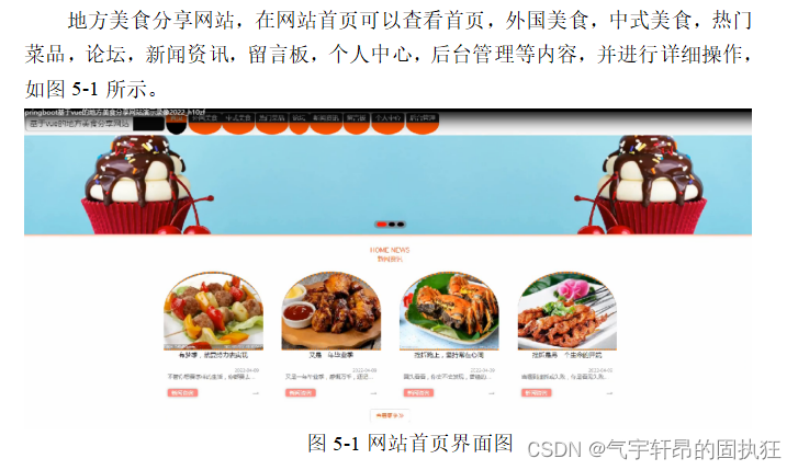
基于Springboot的地方美食分享网站(有报告)。Javaee项目,springboot项目。
演示视频: 基于Springboot的地方美食分享网站(有报告)。Javaee项目,springboot项目。 前些天发现了一个巨牛的人工智能学习网站,通俗易懂,风趣幽默,忍不住分享一下给大家。点击跳转到网站。 项目介绍: 采用…...
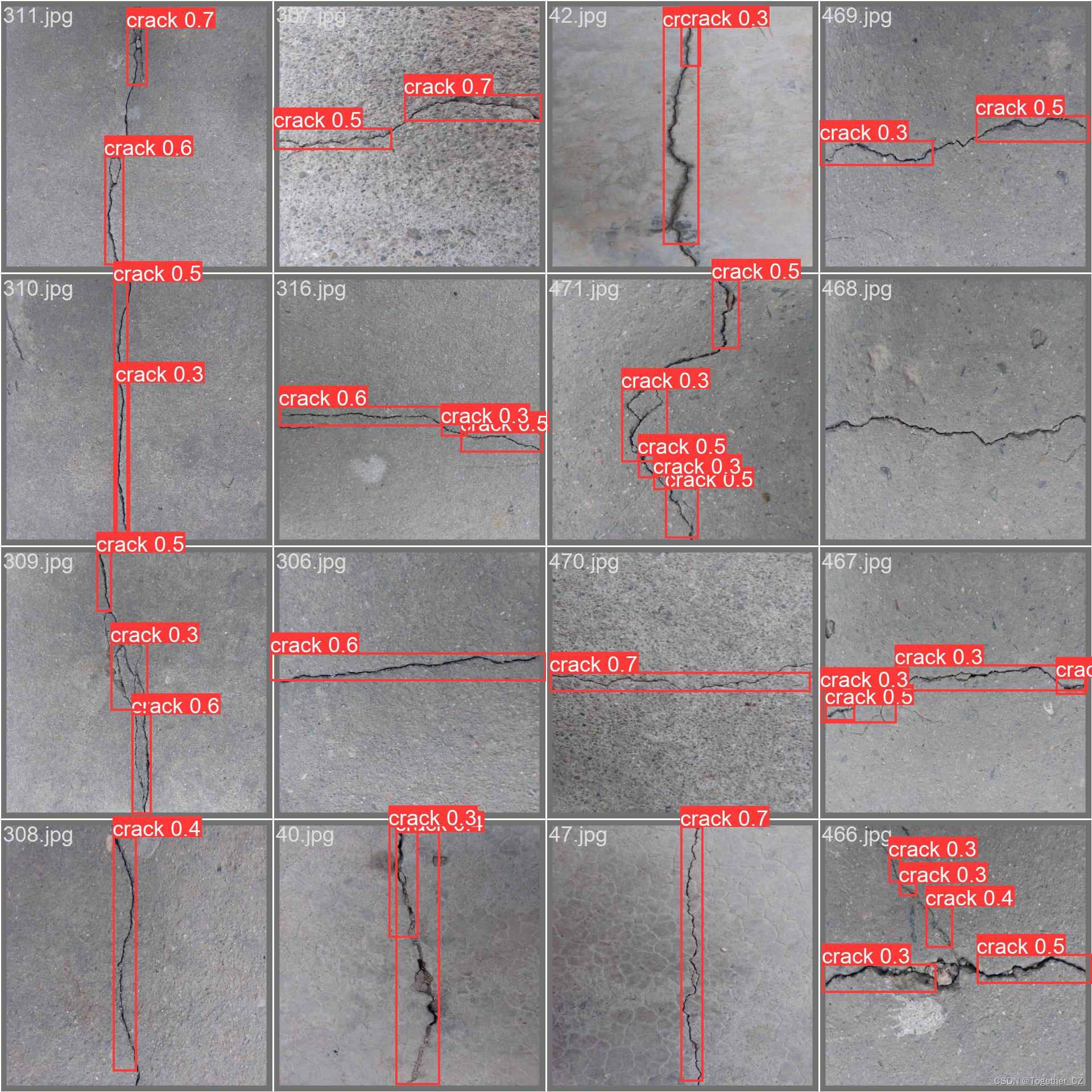
助力水泥基建裂痕自动化巡检,基于yolov5融合ASPP开发构建多尺度融合目标检测识别系统
道路场景下的自动化智能巡检、洞体场景下的壁体类建筑缺陷自动检测识别等等已经在现实生活中不断地落地应用了,在我们之前的很多博文中也已经有过很多相关的实践项目经历了,本文的核心目的是想要融合多尺度感受野技术到yolov5模型中以期在较低参数量的情…...

rk3588使用vscode远程debug 配置文件
进入调试口,需要本地和远程都装C/C estension 下面是在调mpi_enc_test的launch.json 文件自己make生成的 makefile 没改过 args项是输入参数,配置了相机输入,具体参数看他的demo说明, 记录一下,方便以后拷贝方便 {// …...
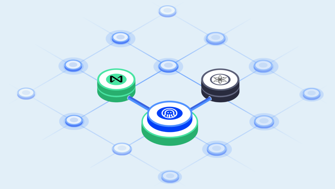
隐私协议 Secret Network 宣布使用 Octopus Network 构建的 NEAR-IBC 连接 NEAR 生态
2023年11月 NearCon2023 活动期间,基于 Cosmos SDK 构建的隐私协议 Secret Network,宣布使用 Octopus Network 开发的 NEAR-IBC,于2024年第一季度实现 Secret Network 与 NEAR Protocol 之间的跨链交互。 这将会是Cosmos 生态与 NEAR 之间的首…...
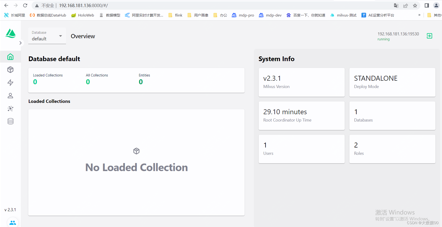
Milvus Standalone安装
使用Docker Compose安装 Milvus standalone(即单机版),进行一个快速milvus的体验。 前提条件: 1.系统可以使用centos 2.系统已经安装docker和docker-compose 3.milvus版本这里选择2.3.1 由于milvus依赖etcd和minio,…...

解决ROS的‘Done checking log file disk usage’卡顿:你的~/.bashrc里ROS_IP设对了吗?
解决ROS日志检查卡顿:环境变量配置的深层解析与实战指南 当你在终端启动roscore时,是否遇到过长时间卡在"Done checking log file disk usage"提示的尴尬?这个问题看似简单,背后却隐藏着ROS环境配置的关键细节。本文将带…...

终极指南:如何永久免费使用Cursor Pro AI编程神器
终极指南:如何永久免费使用Cursor Pro AI编程神器 【免费下载链接】cursor-free-vip [Support 0.45](Multi Language 多语言)自动注册 Cursor Ai ,自动重置机器ID , 免费升级使用Pro 功能: Youve reached your trial r…...

从Xilinx 7系列FPGA看架构演进与工程选型实战
1. 项目概述:从一则旧闻看FPGA的演进与选型看到这个标题,很多朋友可能会觉得这是一则十多年前的“旧闻”了。确实,2011年Xilinx宣布其28nm 7系列FPGA在六个月内获得超过200个设计订单,这在当时是半导体行业的一个里程碑。但今天回…...


手把手教你配置i.MX RT1052的BOOT引脚:从HyperFlash到QSPI的启动选择实战
手把手教你配置i.MX RT1052的BOOT引脚:从HyperFlash到QSPI的启动选择实战 在嵌入式系统开发中,启动配置是硬件工程师和开发者面临的第一个关键挑战。i.MX RT1052作为一款高性能跨界处理器,其灵活的启动选项既带来了强大的适应性,也…...

购买腾讯云时最容易被忽略的痛点:配置、成本和运维闭环
很多客户在购买腾讯云或开始使用腾讯云时,真正的痛点往往不是“不会下单”,而是下单前后缺少一套清晰的决策和运维闭环。第一个痛点是配置选择不确定。不少团队会先纠结 CPU、内存、带宽、地域、系统盘和数据盘怎么选。配置买低了担心业务跑不动…...

2026最新论文降AI攻略:实测5款高效辅助工具,查降一体与结构重构选哪个
最近看了一些行业报告,AI工具在写作方面的普及率真的已经超乎想象了。 很多大学生在写论文时也都习惯用AI来辅助寻找灵感、提高效率。 与此同时,相关部门针对人工智能写作出台了一系列规定,各大学术检测平台也都在不断升级AIGC检测算法。 现…...


别再手动导网表了!巧用OrCAD Capture与Allegro PCB Editor联动,实现原理图变更一键同步
别再手动导网表了!巧用OrCAD Capture与Allegro PCB Editor联动,实现原理图变更一键同步 在PCB设计领域,效率与准确性往往决定着项目成败。当工程师面对频繁的原理图修改时,传统的手动导出-导入网表流程不仅耗时费力,还…...
)
NotebookLM实战指南(NLP任务辅助黄金公式首次公开)
更多请点击: https://intelliparadigm.com 第一章:NotebookLM实战指南(NLP任务辅助黄金公式首次公开) NotebookLM 是 Google 推出的基于可信来源驱动的 AI 助手,专为研究者与工程师设计,其核心能力在于“…...