使用CSS3画出一个叮当猫HTML源码
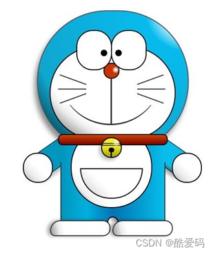
我们经常使用PS或者Flash制作动画,本文则介绍了如何用CSS3画出个叮当猫,实现过程很有趣,感兴趣的朋友可以参考一下
首先,先把HTML结构搭建好:
<div class="wrapper"> <!--叮当猫整体--> <div class="doraemon"> <!--头部--> <div class="head"> <!--眼睛--> <div class="eyes"> <div class="eye left"> <!--眼珠--> <div class="black bleft"></div> </div> <div class="eye right"> <div class="black bright"></div> </div> </div> <!--脸部--> <div class="face"> <!--白色脸底--> <div class="white"></div> <!--鼻子--> <div class="nose"> <!--鼻子高光部分--> <div class="light"></div> </div> <!--鼻子的竖线--> <div class="nose_line"></div> <!--嘴巴--> <div class="mouth"></div> <!--胡须--> <div class="whiskers"> <div class="whisker rTop r160"></div> <div class="whisker rMiddle"></div> <div class="whisker rBottom r20"></div> <div class="whisker lTop r20"></div> <div class="whisker lMiddle"></div> <div class="whisker lBottom r160"></div> </div> </div> </div> <!--脖子和铃铛--> <div class="choker"> <!--铃铛--> <div class="bell"> <div class="bell_line"></div> <div class="bell_circle"></div> <div class="bell_under"></div> <div class="bell_light"></div> </div> </div> <!--身体--> <div class="bodys"> <!--肚子--> <div class="body"></div> <!--肚兜--> <div class="wraps"></div> <!--口袋--> <div class="pocket"></div> <!--遮住一半口袋,使其呈现半圆--> <div class="pocket_mask"></div> </div> <!--右手--> <div class="hand_right"> <!--手臂--> <div class="arm"></div> <!--手掌--> <div class="circle"></div> <!--遮住手臂和身子交接处的线--> <div class="arm_rewrite"></div> </div> <!--左手--> <div class="hand_left"> <div class="arm"></div> <div class="circle"></div> <div class="arm_rewrite"></div> </div> <!--脚--> <div class="foot"> <div class="left"></div> <div class="right"></div> <!--双脚之间的缝隙--> <div class="foot_rewrite"></div> </div> </div>
</div>
最好先把叮当猫的整体结构仔细研究一下,这对以后想要自己动手画别的人物形象很有帮助,思路会比较明朗。
接下来,我们按照头部,脖子,身体,脚部分别进行演示。首先将容器wrapper和叮当猫整体做一些基本的样式,叮当猫整体doraemon 设置position为relative,主要是为了便于 子元素/后代元素进行定位。
.wrapper{ margin: 50px 0 0 500px;
}
.doraemon{ position: relative;
}
头部head的样式,因为叮当猫的头部不是正圆,所以宽高有一点偏差,然后使用border-radius将头部从矩形变成椭圆形,然后再使用径向渐变从右上角给背景来个放射性渐变,然后在加个阴影,使其更有立体感,background:#07bbee;是为了兼容低版本浏览器:
.doraemon .head { position:relative; width: 320px; height: 300px; border-radius: 150px; background: #07bbee; background: -webkit-radial-gradient(right top,#fff 10%,#07bbee 20%,#10a6ce 75%,#000); background: -moz-radial-gradient(right top,#fff 10%,#07bbee 20%,#10a6ce 75%,#000); background: -ms-radial-gradient(right top,#fff 10%,#07bbee 20%,#10a6ce 75%,#000); border:2px solid #555; box-shadow:-5px 10px 15px rgba(0,0,0,0.45);
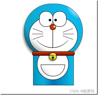
} 看看效果到底怎么样:
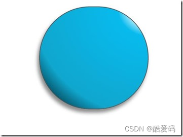
惊讶 shenmgui ,这么丑,别急,慢慢让它活过来:
/*脸部*/ .doraemon .face { position: relative; /*让所有脸部元素可自由定位*/ z-index: 2; /*脸在头部背景上面*/ } /*白色脸底*/ .doraemon .face .white { width: 265px; /*设置宽高*/ height: 195px; border-radius: 150px; position: absolute; /*进行绝对定位*/ top: 75px; left: 25px; background: #fff; /*此放射渐变也是使脸的左下角暗一些,看上去更真实*/ background: -webkit-radial-gradient(right top,#fff 75%,#eee 80%,#999 90%,#444); background: -moz-radial-gradient(right top,#fff 75%,#eee 80%,#999 90%,#444); background: –ms-radial-gradient(right top,#fff 75%,#eee 80%,#999 90%,#444); } /*鼻子*/ .doraemon .face .nose{ width:30px; height:30px; border-radius:15px; background:#c93300; border:2px solid #000; position:absolute; top:110px; left:140px; z-index:3; /*鼻子在白色脸底下面*/ } /*鼻子上的高光*/ .doraemon .face .nose .light { width:10px; height:10px; border-radius: 5px; box-shadow: 19px 8px 5px #fff; /*通过阴影实现高光*/ } /*鼻子下的线*/ .doraemon .face .nose_line{ width:3px; height:100px; background:#333; position:absolute; top:143px; left:155px; z-index:3; } /*嘴巴*/ .doraemon .face .mouth{ width:220px; height:400px; /*通过底边框加上圆角模拟微笑嘴巴*/ border-bottom:3px solid #333; border-radius:120px; position:absolute; top:-160px; left:45px; } /*眼睛*/ .doraemon .eyes { position: relative; z-index: 3; /*眼睛在白色脸底下面*/ } /*眼睛共同的样式*/ .doraemon .eyes .eye{ width:72px; height:82px; background:#fff; border:2px solid #000; border-radius:35px 35px; position:absolute; top:40px; } /*眼珠*/ .doraemon .eyes .eye .black{ width:14px; height:14px; background:#000; border-radius:7px; position:absolute; top:40px; } .doraemon .eyes .left{ left:82px; } .doraemon .eyes .right { left: 156px; } .doraemon .eyes .eye .bleft { left: 50px; } .doraemon .eyes .eye .bright { left: 7px; } 写了这么多样式,结果是怎么样的呢:
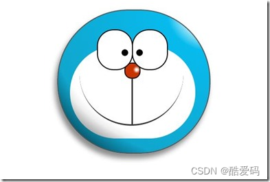
生病 怎么看都觉得别扭,哦!还差胡须须和白色脸底的边框呢,咱给补上:
/*胡须背景,主要用于挡住嘴巴的一部分,不要显得太长*/ .doraemon .whiskers{ width:220px; height:80px; background:#fff; border-radius:15px; position:absolute; top:120px; left:45px; z-index:2; /*在鼻子和眼睛下面*/ } /*所有胡子的公用样式*/ .doraemon .whiskers .whisker { width: 60px; height: 2px; background: #333; position: absolute; z-index: 2; } /*右上胡子*/ .doraemon .whiskers .rTop { left: 165px; top: 25px; } /*右中胡子*/ .doraemon .whiskers .rMiddle { left: 167px; top: 45px; } /*右下胡子*/ .doraemon .whiskers .rBottom { left: 165px; top: 65px; } /*左上胡子*/ .doraemon .whiskers .lTop { left: 0; top: 25px; } /*左中胡子*/ .doraemon .whiskers .lMiddle { left: -2px; top: 45px; } /*左下胡子*/ .doraemon .whiskers .lBottom { left: 0; top: 65px; } /*胡子旋转角度*/ .doraemon .whiskers .r160 { -webkit-transform: rotate(160deg); -moz-transform: rotate(160deg); -ms-transform: rotate(160deg); -o-transform: rotate(160deg); transform: rotate(160deg); } .doraemon .whiskers .r20 { -webkit-transform: rotate(200deg); -moz-transform: rotate(200deg); -ms-transform: rotate(200deg); -o-transform: rotate(200deg); transform: rotate(200deg); }
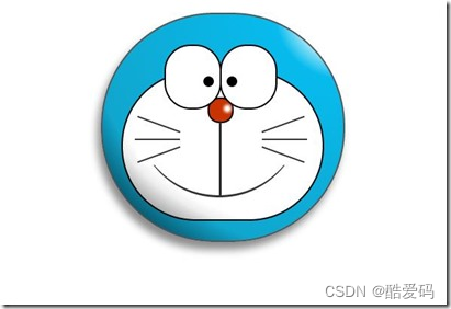
微笑 这样就对了,看着多舒服啊!趁热打铁,做脖子和身体:
/*围脖*/ .doraemon .choker { width: 230px; height: 20px; background: #c40; /*线性渐变 让围巾看上去更自然*/ background: -webkit-gradient(linear,left top,left bottom,from(#c40),to(#800400)); background: -moz-linear-gradient(center top,#c40,#800400); background: -ms-linear-gradient(center top,#c40,#800400); border: 2px solid #000; border-radius: 10px; position: relative; top: -40px; left: 45px; z-index: 4; } /*铃铛*/ .doraemon .choker .bell { width: 40px; height: 40px; _overflow: hidden; /*IE6 hack*/ border: 2px solid #000; border-radius: 50px; background: #f9f12a; background: -webkit-gradient(linear, left top, left bottom, from(#f9f12a),color-stop(0.5, #e9e11a), to(#a9a100)); background: -moz-linear-gradient(top, #f9f12a, #e9e11a 75%,#a9a100); background: -ms-linear-gradient(top, #f9f12a, #e9e11a 75%,#a9a100); box-shadow: -5px 5px 10px rgba(0,0,0,0.25); position: absolute; top: 5px; left: 90px; } /*双横线*/ .doraemon .choker .bell_line { width: 36px; height: 2px; background: #f9f12a; border: 2px solid #333; border-radius: 3px 3px 0 0; position: absolute; top: 10px; } /*黑点*/ .doraemon .choker .bell_circle{ width:12px; height:10px; background:#000; border-radius:5px; position:absolute; top:20px; left:14px; } /*黑点下的线*/ .doraemon .choker .bell_under{ width: 3px; height:15px; background:#000; position:absolute; left: 18px; top:27px; } /*铃铛高光*/ .doraemon .choker .bell_light{ width:12px; height:12px; border-radius:10px; box-shadow:19px 8px 5px #fff; position:absolute; top:-5px; left:5px; opacity:0.7; } /*身子*/ .doraemon .bodys { position: relative; top: -310px; } /*肚子*/ .doraemon .bodys .body { width: 220px; height: 165px; background: #07beea; background: -webkit-gradient(linear,right top,left top,from(#07beea),color-stop(0.5, #0073b3),color-stop(0.75,#00b0e0), to(#0096be)); background: -moz-linear-gradient(right center,#07beea,#0073b3 50%,#00b0e0 75%,#0096be 100%); background: -ms-linear-gradient(right center,#07beea,#0073b3 50%,#00b0e0 75%,#0096be 100%); border:2px solid #333; position:absolute; top:265px; left:50px; } /*白色肚兜*/ .doraemon .bodys .wraps { width: 170px; height: 170px; background: #fff; background: -webkit-gradient(linear, right top, left bottom, from(#fff),color-stop(0.75,#fff),color-stop(0.83,#eee),color-stop(0.90,#999),color-stop(0.95,#444), to(#000)); background: -moz-linear-gradient(right top,#fff,#fff 75%,#eee 83%,#999 90%,#444 95%,#000); background: -ms-linear-gradient(right top,#fff,#fff 75%,#eee 83%,#999 90%,#444 95%,#000); border: 2px solid #000; border-radius: 85px; position: absolute; left: 72px; top: 230px; } /*口袋*/ .doraemon .bodys .pocket { width: 130px; height: 130px; border-radius: 65px; background: #fff; background: -webkit-gradient(linear, right top, left bottom, from(#fff),color-stop(0.70,#fff),color-stop(0.75,#f8f8f8),color-stop(0.80,#eee),color-stop(0.88,#ddd), to(#fff)); background: -moz-linear-gradient(right top, #fff, #fff 70%,#f8f8f8 75%,#eee 80%,#ddd 88%, #fff); background: -ms-linear-gradient(right top, #fff, #fff 70%,#f8f8f8 75%,#eee 80%,#ddd 88%, #fff); border: 2px solid #000; position:absolute; top: 250px; left: 92px; } /*挡住口袋一半*/ .doraemon .bodys .pocket_mask { width: 134px; height: 60px; background:#fff; border-bottom: 2px solid #000; position:absolute; top: 259px; left: 92px; }
好吧,脖子和身子都有啦!上图:
现在看起来有点像摆设品,不过笑容还是那么单纯,好了,赶紧把手脚做出来:
*左右手*/ .doraemon .hand_right, .doraemon .hand_left { height: 100px; width: 100px; position: absolute; top: 272px; left: 248px; } /*左手*/ .doraemon .hand_left { left: -10px; } /*手臂公共部分*/ .doraemon .arm { width:80px; height:50px; background: #07beea; background: -webkit-gradient(linear, left top, left bottom, from(#07beea),color-stop(0.85,#07beea), to(#555)); background: -moz-linear-gradient(center top, #07BEEA, #07BEEA 85%, #555); background: -ms-linear-gradient(center top, #07BEEA, #07BEEA 85%, #555); border: 1px solid #000000; box-shadow: -10px 7px 10px rgba(0, 0, 0, 0.35); z-index: -1; position: relative; } /*右手手臂*/ .doraemon .hand_right .arm { top: 17px; -webkit-transform: rotate(35deg); -moz-transform: rotate(35deg); -ms-transform: rotate(35deg); -o-transform: rotate(35deg); transform: rotate(35deg); } /*左手手臂*/ .doraemon .hand_left .arm { top: 17px; background: #0096be; /*背光一面使用纯色,使其有立体感*/ box-shadow: 5px -7px 10px rgba(0, 0, 0, 0.25); -webkit-transform: rotate(145deg); -moz-transform: rotate(145deg); -ms-transform: rotate(145deg); -o-transform: rotate(145deg); transform: rotate(145deg); } /*圆形手掌公共部分*/ .doraemon .circle { width: 60px; height: 60px; border-radius: 30px; border: 2px solid #000; background: #fff; background: -webkit-gradient(linear, right top, left bottom, from(#fff),color-stop(0.5,#fff),color-stop(0.70,#eee),color-stop(0.8,#ddd), to(#999)); background: -moz-linear-gradient(right top, #fff, #fff 50%, #eee 70%, #ddd 80%,#999); background: -ms-linear-gradient(right top, #fff, #fff 50%, #eee 70%, #ddd 80%,#999); position: absolute; } /*右手手掌*/ .doraemon .hand_right .circle { left: 40px; top: 32px; } /*左手手掌*/ .doraemon .hand_left .circle { left: -20px; top: 32px; } /*手臂和身体结合处,使用背景遮住边框*/ .doraemon .arm_rewrite { height: 45px; width: 5px; background: #07beea; position: relative; } /*右手结合处*/ .doraemon .hand_right .arm_rewrite { top: -45px; left: 22px; } /*左手结合处*/ .doraemon .hand_left .arm_rewrite { top: -45px; left: 60px; background: #0096be; /*同理,背光一面使用纯色,使其有立体感*/ } /*脚部*/ .doraemon .foot { width: 280px; height: 40px; position: relative; top: 55px; left: 20px; } /*左右脚共同样式*/ .doraemon .foot .left, .doraemon .foot .right { width: 125px; height: 30px; background: #fff; background: -webkit-gradient(linear, right top, left bottom, from(#fff),color-stop(0.75,#fff),color-stop(0.85,#eee), to(#999)); background: -moz-linear-gradient(right top, #fff, #fff 75%, #eee 85%, #999); background: -ms-linear-gradient(right top, #fff, #fff 75%, #eee 85%, #999); border: 2px solid #333; border-radius: 80px 60px 60px 40px; box-shadow: -6px 0 10px rgba(0, 0, 0, 0.35); position: relative; } .doraemon .foot .left { left: 8px; top: 65px; } .doraemon .foot .right { top: 31px; left: 141px; } /*双脚之间的缝隙,加阴影使用立体感*/ .doraemon .foot .foot_rewrite { width: 20px; height: 10px; background: #fff; background: -webkit-gradient(linear, right top, left bottom, from(#666),color-stop(0.83,#fff), to(#fff)); background: -moz-linear-gradient(right top, #666, #fff 83%, #fff); background: -ms-linear-gradient(right top, #666, #fff 83%, #fff); /*制作半圆效果*/ border: 2px solid #000; border-bottom: none; border-radius: 40px 40px 0 0; position: relative; top: -11px; left: 130px; _left: 127px; }
好了,最后完整结果:
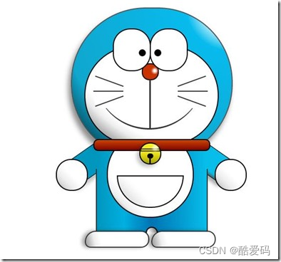
看一下,效果是不是和一开始的一样呢 大笑 ,虽然做好了,但是还是可以让它动起来的,比如眼睛,我们可以给它加个动画效果,让眼睛转动起来:
/*眼珠*/ .doraemon .eyes .eye .black { width: 14px; height: 14px; background: #000; border-radius: 7px; position: absolute; top: 40px; -webkit-animation: eyemove 3s linear infinite; -moz-animation: eyemove 3s linear infinite; -ms-animation: eyemove 3s linear infinite; -o-animation: eyemove 3s linear infinite; animation: eyemove 3s linear infinite; } /*让眼睛动起来*/ @-webkit-keyframes eyemove { 70%{ margin:0 0 0 0; } 80% { margin: -22px 0 0 0; } 85% { margin: -22px 0 0 5px; } 90% { margin: -22px 10px 0 0; } 93% { margin: -22px 0 0 0; } 96% { margin: 0 0 0 0; } } @-moz-keyframes eyemove { 70% { margin: 0 0 0 0; } 80% { margin: -22px 0 0 0; } 85% { margin: -22px 0 0 5px; } 90% { margin: -22px 10px 0 0; } 93% { margin: -22px 0 0 0; } 96% { margin: 0 0 0 0; } } @-o-keyframes eyemove { 70% { margin: 0 0 0 0; } 80% { margin: -22px 0 0 0; } 85% { margin: -22px 0 0 5px; } 90% { margin: -22px 10px 0 0; } 93% { margin: -22px 0 0 0; } 96% { margin: 0 0 0 0; } } @keyframes eyemove { 70% { margin: 0 0 0 0; } 80% { margin: -22px 0 0 0; } 85% { margin: -22px 0 0 5px; } 90% { margin: -22px 10px 0 0; } 93% { margin: -22px 0 0 0; } 96% { margin: 0 0 0 0; } } OK,这样,眼睛就会动了,有兴趣的可以试一下,这里就无法展示了。但是如果你有什么更好的动画效果也可以尝试,那么这个案例就结束了。
相关文章:
使用CSS3画出一个叮当猫HTML源码
我们经常使用PS或者Flash制作动画,本文则介绍了如何用CSS3画出个叮当猫,实现过程很有趣,感兴趣的朋友可以参考一下 首先,先把HTML结构搭建好: <div class"wrapper"> <!--叮当猫整体--> <di…...
Spring Boot 自动化单元测试类的编写过程
前言 Web环境模拟测试 企业开发不仅要保障业务层与数据层的功能安全有效,也要保障表现层的功能正常。但是我们一般对表现层的测试都是通过postman手工测试的,并没有在打包过程中代码体现表现层功能被测试通过。那么能否在测试用例中对表现层进行功能测…...

复试专业前沿问题问答合集8-3——RNN、Hadoop、GPT大语言模型
复试专业前沿问题问答合集8-3——RNN、Hadoop、GPT大语言模型 深度学习中的的RNN、Hadoop、GPT大语言模型的原理关系问答: GPT(Generative Pre-trained Transformer)和RNN(Recurrent Neural Network)是两种在自然语言处理(NLP)领域广泛使用的深度学习模型。它们在处理…...

序列的使用
目录 序列的创建 序列的使 Oracle从入门到总裁:https://blog.csdn.net/weixin_67859959/article/details/135209645 在许多数据库之中都会存在有一种数据类型 — 自动增长列,它能够创建流水号。如果想在 Oracle 中实现这样的自动增长列,可…...

golang kafka sarama 源码解析
消费者组重平衡 github.com/!shopify/saramav1.27.2/consumer_group.go func (c *consumerGroup) newSession(ctx context.Context, topics []string, handler ConsumerGroupHandler, retries int) (*consumerGroupSession, error) {// 获取broker组协调器coordinator, err :…...

Flutter知识点整理
JVM 1.Flutter Hot reload 实现原理 一、原理概述 Hot Reload 只能在 Debug 模式下使用,因为 Debug 模式下,Flutter 采用的是 JIT( 动态编译),代码是运行在 Dart VM 上,JIT 将 Dart 编译成可以运行在 Dart…...
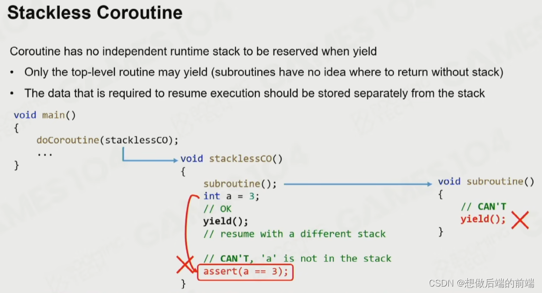
现代游戏引擎架构
一、并行编程 1.1 为什么需要并行编程 游戏的渲染计算对算力要求很高,所以我们需要把操作系统的资源利用到极致。 但是摩尔定律已经不在适用了,硬件的发展目前已经达到瓶颈。所以我们需要通过数量来提高计算效率。 1.2 并行编程基础 进程与线程&#…...
深度学习:复杂工业场景下的复杂缺陷检测方法
摘要:在复杂的工业场景中,缺陷检测一直是一个重要而具有挑战性的任务。近年来,深度学习技术的快速发展为复杂工业场景下的缺陷检测提供了新的解决方案。本文将介绍深度学习在复杂工业场景下的复杂缺陷检测中的应用,并探讨其技术进…...
CSDN个人简介优化 html font属性
CSDN个人简介优化 html font属性 个人简介个人简介优化字体21种样式选择字体大小设置4号字体 字体颜色设计渐变色(可惜不能显示) 字体加粗设置 <b>标签 个人简介 🌈你好呀!我是 是Yu欸 🌌 2024每日百字篆刻时光…...

从哈希桶角度看 unordered_map 与 unordered_set 的实现
文章目录 一、引言二、C unordered系列的无序关联式容器概览三、基于哈希桶的C unordered系列数据结构模拟实现1、unordered_map的模拟实现2、unordered_set的模拟实现3、哈希桶及其迭代器实现的代码 四、扩展与应用1. 自定义哈希函数2. 其他unordered数据结构unordered_multim…...

飞天使-k8s知识点27-kubernetes温故知新2-deployment
文章目录 RC和RS无状态应用管理 deployment有状态应用statefulSetdaemonSet RC和RS RC不会使用在生产环境 RS 比RC 多了标签选择器 ,RS 用deployment管理,用于容器编排无状态应用管理 deployment apiVersion: apps/v1 kind: Deployment metadata:name:…...
手机网页关键词视频爬虫采集软件可导出视频分享链接|视频无水印批量下载工具
全新音视频批量下载工具,为您解放视频管理烦恼! 现如今,音上涌现出大量精彩的视频内容,但是要想高效地获取、管理和分享这些视频却是一件颇具挑战的事情。针对这一难题,我们自主研发了全新的音视频批量下载工具&#x…...

基于OpenCV的图像处理案例之图像矫正(Python)
Index 目录索引 写在前面解决思路参考 写在前面 本文通过一个案例介绍如何使用OpenCV将倾斜的扫描文档图像进行水平矫正。 解决思路 因为扫描图像中的大部分文字倾斜后,同一行文字也在同一条直线,所以可以通过拟合直线来计算文本倾斜角度,…...
创建linux虚拟机系统:(安装Ubuntu镜像文件,包含语言设置、中文输入法、时间设置)
我下载的是清华大写开源软件镜像站中的ubuntu-20.04.6-desktop-amd64.iso这个镜像文件, 这个文件我下载完成之后没有解压,直接在创建虚拟机的时候选择的压缩包。 地址为:Index of /ubuntu-releases/20.04/ | 清华大学开源软件镜像站 | Tsin…...

3.0 V-22V 宽输入电压,高效率异步升压芯片-ZCC5429
一、产品综述 ZCC5429 芯片是一款自动调频、最高 600KHz工作频率、高效率、宽输入电压范围的电流模式异 步升压(BOOST)芯片,且可调输入限流功能。用户可灵活地通过外部补偿建立动态环路,获得在所有条件下最优瞬态性能。 ZCC542…...
Sphinx + Readthedocs 避坑速通指南
博主在学习使用 Sphinx 和 Read the docs 的过程中, 碰到了许多奇葩的 bug, 使得很简单的任务花费了很长的时间才解决,现在在这里做一个分享,帮助大家用更少的时间高效上线文档的内容。 总的来说, 任务分为两个部分: …...

IPP-7010 表面贴装 90 度混合耦合器
IPP-7010 表面贴装 90 度混合耦合器 IPP-7010 是一款表面贴装 90 度混合耦合器,工作频率为 800 至 2500 MHz(0.8 至 2.5 GHz),平均额定功率为 200 瓦。IPP-7010 采用 0.40 x 1.80 英寸表面贴装封装。IPP-7010的幅度平衡小于0.6dB&…...

25.2 微服务Dubbo
25.2 微服务Dubbo 1. Dubbo简介2. RPC3. Dubbo工作原理4. 代码实操4.1 父项目1. 依赖4.2 服务提供者1. 依赖2. 配置文件3. 启动类4. 业务类4.3 服务消费者1. 依赖2. 配置文件3. 消费者启动类4. 业务:实现远程调用...
CI/CD环境搭建
服务简介 Gitlab 官网:https://about.gitlab.com/ GitLab 是一个用于仓库管理系统的开源项目,使用Git作为代码管理工具,并在此基础上搭建起来的Web服务。安装方法是参考GitLab在GitHub上的Wiki页面。Gitlab是被广泛使用的基于git的开源代码管…...
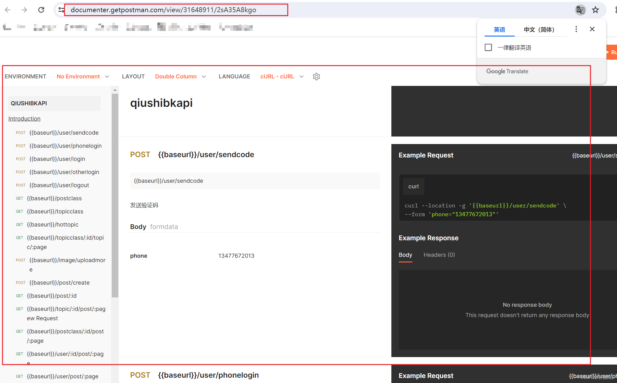
API调试管理工具Postman下载及操作介绍
1.下载安装postman地址:https://www.getpostman.com/downloads/ 2.创建项目 3.创建请求API 然后点击save保存api 4.用一个变量保存主域名,方便后续操作 就类似下面的baseurl 5.创建新环境 6.添加变量(如添加本地测试环境url——ba…...
)
从USB转TTL接线到手机热点配网:ESP8266无线通信保姆级避坑指南(附软件包)
从USB转TTL接线到手机热点配网:ESP8266无线通信保姆级避坑指南 当你第一次拿起ESP8266模块时,可能会被这个小巧的Wi-Fi模块惊艳到——它只有指甲盖大小,却蕴含着强大的无线通信能力。但很快,这种惊艳就会变成困惑:为什…...

作业本耐用度差距巨大?深圳大明印刷厂拆解合规工艺,告别定制作业本掉页开裂通病
在校园日常教学中,很多学校都会遇到同一个难题:同一学期采购的作业本、定制作业本,品质差距悬殊,有的完好无损用到期末,有的短短几周就出现书脊开裂、页面脱落、边角破损、翻页卡顿等问题。不少人误以为是学生使用习惯…...

2026年HR招聘偏好白皮书:这5项附加技能出现频率暴涨
2026 年的招聘市场,正在从“看你会什么岗位技能”,转向“看你能不能把岗位做得更智能”。HR筛简历时,越来越关注候选人的AI应用能力、数据化思维和业务落地能力。人社部近年发布的新职业中,已经出现生成式人工智能系统应用员、人工…...

Visual Paradigm 17.0 团队协作新功能实测:手把手教你用项目模板和文件夹管理提效
Visual Paradigm 17.0 团队协作实战指南:从模板配置到文件夹管理的高效工作流在敏捷开发团队中,项目启动速度和资产管理的规范性往往直接影响整体效率。Visual Paradigm 17.0针对这一痛点推出的团队协作增强功能,特别是服务器端项目模板和文件…...

自制射频功率计:基于AD8317芯片,成本43欧元实现1MHz-10GHz测量
1. 项目概述:为什么我要亲手打造一台射频功率计在无人机和模型飞行器的圈子里,尤其是在我们荷兰FMS Spaarnwoude俱乐部,合规飞行是头等大事。我给我的八轴飞行器加装了云台相机和图传系统,工作在5.8GHz频段。根据本地法规…...

对比 Token Plan 与按量计费在 Taotoken 平台上的成本体感差异
🚀 告别海外账号与网络限制!稳定直连全球优质大模型,限时半价接入中。 👉 点击领取海量免费额度 对比 Token Plan 与按量计费在 Taotoken 平台上的成本体感差异 对于个人开发者或项目管理者而言,在接入大模型服务时&a…...

OpenClaw用户如何快速接入Taotoken并开始Agent工作流
🚀 告别海外账号与网络限制!稳定直连全球优质大模型,限时半价接入中。 👉 点击领取海量免费额度 OpenClaw用户如何快速接入Taotoken并开始Agent工作流 对于使用OpenClaw框架构建AI智能体的开发者而言,快速接入稳定、多…...

Burp Suite深度解析:从流量抓包到业务逻辑漏洞挖掘
1. 这不是“学个插件”——Burp Suite 是渗透测试的呼吸系统 很多人第一次听说 Burp Suite,是在某篇“三步拿下登录框”的速成教程里:装好Java、拖进浏览器代理、点几下Repeater就弹出密码明文。结果真去测一个中型SaaS后台,不到十分钟就卡在…...

股票买卖最佳时机:LeetCode121题解
题目LeetCode121给定一个数组 prices ,它的第 i 个元素 prices[i] 表示一支给定股票第 i 天的价格。你只能选择 某一天 买入这只股票,并选择在 未来的某一个不同的日子 卖出该股票。设计一个算法来计算你所能获取的最大利润。返回你可以从这笔交易中获取…...

PCL 基于强度的双边滤波【2026最新版】
目录 一、算法原理 1、计算步骤 2、算法源码 3、函数解析 4、参考文献 二、代码实现 三、结果展示 四、滤波后未发生变化的原因 五、解决办法 六、结果展示 七、相关链接 本文由CSDN点云侠原创,博客长期更新,本文最近一次更新时间为:2026年5月24日。 一、算法原理 1、计算…...