HOW - CSS 常见效果实现
目录
- 渐隐渐显
- 曲线&抛物线
- 气泡框
- 水波纹
- 悬浮&漂浮
- 长按控制进度条
- 圆弧&圆形进度条
- 引导蒙层
- 随机物品掉落
- 渐变边框
- 光晕
- 按钮下压反馈
- 头像(圆形+半透明阴影)
常见 CSS 效果实现总结。
渐隐渐显
<!DOCTYPE html>
<html>
<style>body {background-color: black;color: #fff;}.click_links {font-size: 44px;animation: a_link_enter 3s linear infinite;}@keyframes a_link_enter {0% {opacity: 0;}30% {opacity: 1;}70% {opacity: 1;}100% {opacity: 0;}}
</style><body><span class="click_links">请点击进入</span>
</body></html>
曲线&抛物线
<!DOCTYPE html>
<html><head><meta charset="utf-8"><style>.outer-div {width: 100px;height: 100px;padding: 10px;background-color: #fff;}.inner-div {height: 100%;background-color: yellow;}.outer-div:hover {transform: translateX(100px);transition: transform 2s linear;}.outer-div:hover>.inner-div {transform: translateY(100px);transition: transform 2s cubic-bezier(.55, 0, .85, .36);}</style>
</head><body><div class="outer-div"><div class="inner-div">Hello</div></div>
</body></html>
更多关于抛物线的解释阅读 WHAT - CSS Animationtion 动画系列(二)
气泡框
<!DOCTYPE html>
<html>
<style>body {background-color: red;}.wrapper {width: 300px;height: 200px;margin-top: 100px;position: relative;border: 2px solid #cccccc;border-radius: 15px;background: rgba(0, 0, 0, 0.5);}.wrapper:before {content: '';width: 0;height: 0;border: 20px solid transparent;border-bottom-color: #cccccc;position: absolute;top: 0;right: 20%;margin-top: -40px;}.wrapper:after {content: "";width: 0;height: 0;border: 18px solid transparent;border-bottom-color: #FFFFFF;position: absolute;top: 0;right: 21%;margin-top: -36px;}
</style><body><!-- 方案一 --><!-- https://blog.csdn.net/LLL_liuhui/article/details/80916265 --><!-- 有边框的三角形、空心三角形(叠加两层div 外层作为边框) --><!-- div border方案 --><div class="wrapper"></div><!-- svg方案 --><div><svg xmlns="http://www.w3.org/2000/svg" width="181" height="69" viewBox="0 0 181 69" fill="none"><pathd="M37.4416 41.7506L23.125 66.6287V42V41.5H22.625H7C3.41015 41.5 0.5 38.5899 0.5 35V7C0.5 3.41015 3.41015 0.5 7 0.5H174C177.59 0.5 180.5 3.41015 180.5 7V35C180.5 38.5899 177.59 41.5 174 41.5H90.5H37.875H37.5859L37.4416 41.7506Z"fill="black" fill-opacity="0.5" stroke="white" /></svg><svg xmlns="http://www.w3.org/2000/svg" width="181" height="61" viewBox="0 0 181 61" fill="none"><g filter="url(#filter0_b_1345_620)"><pathd="M0 7C0 3.13401 3.13401 0 7 0H174C177.866 0 181 3.13401 181 7V35C181 38.866 177.866 42 174 42H90.5H57.875L35.625 60.5L42.625 42H7C3.13401 42 0 38.866 0 35V7Z"fill="black" fill-opacity="0.2" /><pathd="M57.875 41.5H57.6943L57.5553 41.6155L36.764 58.9027L43.0926 42.1769L43.3488 41.5H42.625H7C3.41015 41.5 0.5 38.5899 0.5 35V7C0.5 3.41015 3.41015 0.5 7 0.5H174C177.59 0.5 180.5 3.41015 180.5 7V35C180.5 38.5899 177.59 41.5 174 41.5H90.5H57.875Z"stroke="white" /></g><defs><filter id="filter0_b_1345_620" x="-10" y="-10" width="201" height="80.5" filterUnits="userSpaceOnUse"color-interpolation-filters="sRGB"><feFlood flood-opacity="0" result="BackgroundImageFix" /><feGaussianBlur in="BackgroundImage" stdDeviation="5" /><feComposite in2="SourceAlpha" operator="in" result="effect1_backgroundBlur_1345_620" /><feBlend mode="normal" in="SourceGraphic" in2="effect1_backgroundBlur_1345_620" result="shape" /></filter></defs></svg></div>
</body></html>
水波纹
<!DOCTYPE html>
<html>
<style>body {background-color: red;}.wrapper {width: 300px;height: 200px;margin-top: 100px;position: relative;border: 2px solid #cccccc;border-radius: 15px;background: rgba(0, 0, 0, 0.5);}.wrapper:before {content: '';width: 0;height: 0;border: 20px solid transparent;border-bottom-color: #cccccc;position: absolute;top: 0;right: 20%;margin-top: -40px;}.wrapper:after {content: "";width: 0;height: 0;border: 18px solid transparent;border-bottom-color: #FFFFFF;position: absolute;top: 0;right: 21%;margin-top: -36px;}
</style><body><!-- 方案一 --><!-- https://blog.csdn.net/LLL_liuhui/article/details/80916265 --><!-- 有边框的三角形、空心三角形(叠加两层div 外层作为边框) --><!-- div border方案 --><div class="wrapper"></div><!-- svg方案 --><div><svg xmlns="http://www.w3.org/2000/svg" width="181" height="69" viewBox="0 0 181 69" fill="none"><pathd="M37.4416 41.7506L23.125 66.6287V42V41.5H22.625H7C3.41015 41.5 0.5 38.5899 0.5 35V7C0.5 3.41015 3.41015 0.5 7 0.5H174C177.59 0.5 180.5 3.41015 180.5 7V35C180.5 38.5899 177.59 41.5 174 41.5H90.5H37.875H37.5859L37.4416 41.7506Z"fill="black" fill-opacity="0.5" stroke="white" /></svg><svg xmlns="http://www.w3.org/2000/svg" width="181" height="61" viewBox="0 0 181 61" fill="none"><g filter="url(#filter0_b_1345_620)"><pathd="M0 7C0 3.13401 3.13401 0 7 0H174C177.866 0 181 3.13401 181 7V35C181 38.866 177.866 42 174 42H90.5H57.875L35.625 60.5L42.625 42H7C3.13401 42 0 38.866 0 35V7Z"fill="black" fill-opacity="0.2" /><pathd="M57.875 41.5H57.6943L57.5553 41.6155L36.764 58.9027L43.0926 42.1769L43.3488 41.5H42.625H7C3.41015 41.5 0.5 38.5899 0.5 35V7C0.5 3.41015 3.41015 0.5 7 0.5H174C177.59 0.5 180.5 3.41015 180.5 7V35C180.5 38.5899 177.59 41.5 174 41.5H90.5H57.875Z"stroke="white" /></g><defs><filter id="filter0_b_1345_620" x="-10" y="-10" width="201" height="80.5" filterUnits="userSpaceOnUse"color-interpolation-filters="sRGB"><feFlood flood-opacity="0" result="BackgroundImageFix" /><feGaussianBlur in="BackgroundImage" stdDeviation="5" /><feComposite in2="SourceAlpha" operator="in" result="effect1_backgroundBlur_1345_620" /><feBlend mode="normal" in="SourceGraphic" in2="effect1_backgroundBlur_1345_620" result="shape" /></filter></defs></svg></div>
</body></html>
悬浮&漂浮
<!DOCTYPE html>
<html lang="en"><div class="itemActivity3Whale"></div>
<head><meta charset="UTF-8"><meta http-equiv="X-UA-Compatible" content="IE=edge"><meta name="viewport" content="width=device-width, initial-scale=1.0"><title>Document</title>
</head>
<style>.itemActivity3Whale {position: absolute;top: 120px;left: 14px;width: 56px;height: 72px;background-image: url("../../assets/images/footballTour/footballtour-activity3-whale.png");background-repeat: no-repeat;background-size: 100% 100%;animation: a_whale_suspended 3s linear both infinite;}@keyframes a_whale_suspended {0% {transform: scale(1, 1) translate(0, 0px);}20% {transform: scale(1.10, 0.94) translate(0, 0px);}40% {transform: scale(0.92, 1.08) translate(0, -10px);}60% {transform: scale(1.05, 0.98) translate(0, 0px);}80% {transform: scale(0.98, 1.02) translate(0, -6px);}100% {transform: scale(1, 1) translate(0, 0px);}}
</style><body></body></html>
长按控制进度条
<!DOCTYPE html>
<html>
<style>body {background-color: gray;margin: 0px;}#circle {transition: all .1s;stroke-dasharray: 314, 314;stroke-dashoffset: 314;}#triangle {transition: all .1s;position: absolute;top: 30px;left: 95px;transform-origin: 5px 70px;}.triangleAni {animation: a_whale_suspended 2s linear both infinite;}@keyframes a_whale_suspended {0% {transform: scale(1, 1) translate(0, 0px);}50% {transform: scale(1, 1) translate(0, -2px);}100% {transform: scale(1, 1) translate(0, 0px);}}
</style><body><!-- <div id="circleButton"><svg width="200" height="200" viewBox="0 0 200 200"><circle id="circleBg" transform="rotate(-90 100 100)" cx="100" cy="100" r="50" fill="none" stroke-width="10"stroke="gray" /><circle id="circle" stroke-linecap="round" transform="rotate(-90 100 100)" cx="100" cy="100" r="50" fill="none"stroke-width="10" stroke="green" /><circle cx="100" cy="100" r="45" fill="#040404" /><text x="100" y="100" fill="#6b778c" text-anchor="middle" dominant-baseline="central"><tspan id="percent">0</tspan>%</text></svg></div> --><div id="circleButton"><svg width="200" height="200" viewBox="0 0 200 200"><circle id="circleBg" transform="rotate(-90 100 100)" cx="100" cy="100" r="50" fill="none" stroke-width="10"stroke="rgba(255, 255, 255, 0.4)" /><circle id="circle" transform="rotate(-90 100 100)" stroke-linecap="round" cx="100" cy="100" r="50" fill="none"stroke-width="10" stroke="#FFC700" /><circle cx="100" cy="100" r="45" fill="#FFF" /></svg><svg id="triangle" class="triangleAni" width="10" height="10"><polygon id="triangleSelf" points="0 0, 10 0, 5 10, 0 0" fill="#FFC700" /></svg></div></body><script>// 更推荐使用path绘制圆形// https://www.joubn.com/blog/js/2017-09-26-svg-path-arclet circle = document.getElementById('circle')// let percent = document.getElementById('percent')let triangle = document.getElementById('triangle')let triangleSelf = document.getElementById('triangleSelf')let init = 314let v = initlet rotate = 360function getPercent(num) {// let percent = Math.round(((init - num) / init) * 100)let percent = (((init - num) / init)).toFixed(2)return percent}function getRotate(v) {let percent = getPercent(v)triangle.style.transform = `rotate(${rotate * percent}deg)`const percents = percent * 100if (percents > 70 && percents < 90) {circle.style.stroke = 'red'triangleSelf.style.fill = 'red'} else {circle.style.stroke = '#FFC700'triangleSelf.style.fill = '#FFC700'}}function add() {console.log('2222');v = v - 3if (v <= 0) {if (timer) {clearInterval(timer)timer = null}v = 0}getRotate(v)// percent.innerHTML = getPercent(v)circle.style['stroke-dashoffset'] = v}function minus(reset) {if (reset) {v = 314} else {v = v + 10if (v >= 314) {v = 314}}// percent.innerHTML = getPercent(v)console.log(v);circle.style['stroke-dashoffset'] = v}let progressBtn = document.getElementById('circleButton')let timer;// handle presses through the mouse cursorprogressBtn.addEventListener('mousedown', toggleActive);progressBtn.addEventListener('mouseup', removeActive);function toggleActive() {if (timer) {return}console.log('1111');triangle.classList.remove('triangleAni')timer = setInterval(() => {add();}, 16);}function removeActive() {// console.log(minus);// if (timer) {//   clearInterval(timer)//   timer = null//   minus(true)// }if (timer) {clearInterval(timer)timer = null}}
</script></html>
圆弧&圆形进度条
<!DOCTYPE html>
<html lang="en"><head><meta charset="UTF-8"><title>HTML5中的SVG属性实现圆形进度条效果</title>
</head><body><svg width="300" height="300" version="1.1" xmlns="http://www.w3.org/2000/svg"><path id="ring" fill="none" stroke="#fd30ae" stroke-width="10px" /></svg><script>var path = document.getElementById('ring');var r = 100;var progress = 0.5;//将path平移到我们需要的坐标位置ring.setAttribute('transform', 'translate(' + 150 + ',' + 150 + ')');// 计算当前的进度对应的角度值var degrees = progress * 360;// 计算当前角度对应的弧度值var rad = degrees * (Math.PI / 180);//极坐标转换成直角坐标var x = (Math.sin(rad) * r).toFixed(2);var y = -(Math.cos(rad) * r).toFixed(2);//大于180度时候画大角度弧,小于180度的画小角度弧,(deg > 180) ? 1 : 0var lenghty = window.Number(degrees > 180);//path 属性var descriptions = ['M', 0, -r, 'A', r, r, 0, lenghty, 1, x, y];// 给path 设置属性path.setAttribute('d', descriptions.join(' '));</script>
</body></html>
引导蒙层
<!DOCTYPE html>
<html>
<style>body {}/* z-index方案 *//* .mask {position: absolute;top: 0;width: 100%;height: 100vh;background-color: rgba(0, 0, 0, .2);}.click_links {width: 100px;height: 100px;background-color: antiquewhite;margin-bottom: 10px;}.show {position: relative;z-index: 100;} *//* 动态opacity方案 *//* .wrap {display: flex;flex-wrap: wrap;width: 150px;}.z {width: 50px;height: 50px;transition: all 1s;}.z1 {background: blue;}.z2 {background: black;}.z3 {background: yellow;}.z4 {background: red;}.z5 {background: green;}.z6 {background: orange;} *//* canvas xor方案 */.content {padding: 10px;}#mask {position: fixed;left: 0;top: 0;width: 100%;height: 100%;z-index: 900;}
</style><body><!-- z-index方案 --><!-- 该方案最简单 --><!-- <div class="click_links">请点击进入</div><div class="click_links">请点击进入</div><div class="click_links">请点击进入</div><div class="click_links">请点击进入</div><div id="clickme" class="click_links show">请点击进入</div><div class="click_links">请点击进入</div><div class="click_links">请点击进入</div><div class="click_links">请点击进入</div><div id="maskdiv" class="mask"></div><script>const div = document.getElementById('clickme');const mask = document.getElementById('maskdiv')div.addEventListener('click', () => {mask.className = ''})</script> --><!-- 动态opacity方案 类似于骨架屏 --><!-- <div class="wrap"><div class="z z1"></div><div class="z z2"></div><div class="z z3"></div><div class="z z4"></div><div id="z5div" class="z z5"></div><div class="z z6"></div></div><script>let arry = Array.from(document.querySelectorAll(".z"));let index = -1;let direct = 1;arry.forEach((d, i) => {(i !== 4) && (d.style.opacity = 0.5)});const div = document.getElementById('z5div');div.addEventListener('click', () => {arry.forEach((d, i) => {(i !== 4) && (d.style.opacity = 1)});})</script> --><!-- canvas xor方案 --><!-- 该方案最为灵活 --><!-- 思路1. 新增一个canvas,绘制两次图形2. 第一次绘制全屏半透明阴影3. 第二次使用 xor 绘制一个和需要高亮的元素位置和尺寸完全重合的区域。因为 xor 会透明,所以可以让下层元素完全显示出来--><div class="content one">我是第一个div,我是第一个div</div><div class="content two">我是第二个div,我是第二个div</div><div class="content three">我是第三个div,我是第三个div</div><div class="content four">我是第四个div,我是第四个div</div><canvas id="mask"></canvas><script>function mask(cls) {// 获取需要高亮的元素的位置和尺寸信息let targetNode = document.querySelector(`.${cls}`);let pos = targetNode.getBoundingClientRect();// 设置canvas尺寸let canvas = document.getElementById("mask");let width = window.innerWidth;let height = window.innerHeight;canvas.setAttribute("width", width);canvas.setAttribute("height", height);// 绘制canvasvar ctx = canvas.getContext("2d");ctx.globalCompositeOperation = 'source-over';ctx.fillStyle = 'rgba(0, 0, 0, 0.5)';ctx.fillRect(0, 0, width, height);ctx.fill();ctx.fillStyle = 'white';ctx.globalCompositeOperation = "xor";ctx.fillRect(pos.left, pos.top, pos.width, pos.height);ctx.fill();}let array = ['one', 'two', 'three', 'four'];let i = 0;setInterval(() => {mask(array[i]);i++;if (i >= 4) i = 0;}, 1000)</script><!-- border透明度方案 --><!-- 一个div有四个边框,如果我们把边框都设置成半透明,然后中间的区域设置成全透明就可以实现区域引导蒙层了,然后再把边框设置成超过屏幕的大小,就是全景引导蒙层了 --><!-- box-shadow 阴影的尺寸+透明度方案 --><!-- 与上面一个方案类似 box-shadow: 10px 10px 5px 100px rgba(0,0,0,.5); --><!-- box-shadow 的阴影距离切勿盲目设置过大,经过测试这个值如果过大,比如4000px,在部分手机上阴影无法显示出来。设置为2000px为佳。 --><!-- 页面节点复制方案 --><!-- 该方案类似于dialog,将要显示的内容放到dialog中,底层页面节点被蒙层挡住。只是在这里我们可以把需要高亮的元素复制到dialog内容里,并设置同等位置和尺寸 --></body></html>
随机物品掉落
<!DOCTYPE html>
<html><head><meta charset="utf-8"><style>.rain_area {width: 100px;height: 100px;}.drop {display: inline-block;width: 5px;height: 5px;border-radius: 50%;background-color: black;}.drop1 {animation: a_drop_1 1s 0.6s linear both infinite;}.drop2 {animation: a_drop_1 0.8s 0.9s linear both infinite;}.drop3 {animation: a_drop_1 1.1s 1s linear both infinite;}.drop4 {animation: a_drop_1 1.1s 0.9s linear both infinite;}@keyframes a_drop_1 {0% {opacity: 0;transform: translate(0, 0);scale: (1, 1);}20% {opacity: 1;transform: translate(0, 30px);scale: (1, 2);}45% {opacity: 1;transform: translate(0, 79px);scale: (1, 2);}50% {opacity: 1;transform: translate(0, 81px);scale: (1, 1);}75% {opacity: 0.6;transform: translate(0, 96px);scale: (1, 1);}100% {opacity: 0;transform: translate(0, 116px);scale: (1, 1);}}</style>
</head><body><!-- 关键:除非时间是各个元素时间的最小公倍数,否则不会回归到初始状态,从而产生随即感 --><div class="rain_area"><div class="drop drop1"></div><div class="drop drop2"></div><div class="drop drop3"></div><div class="drop drop4"></div></div>
</body></html>
渐变边框
<!DOCTYPE html>
<html>
<style>.border-box {border: 4px solid transparent;border-radius: 16px;position: relative;background-color: #222;background-clip: padding-box;/*important*/}.border-box::before {content: '';position: absolute;top: 0;right: 0;left: 0;bottom: 0;z-index: -1;margin: -4px;border-radius: inherit;/*important*/background: linear-gradient(to right, #8F41E9, #578AEF);}
</style><body><div class="border-box"><div class="content">Lorem ipsum dolor, sit amet consectetur adipisicing elit. Iste ratione necessitatibus numquam sunt nihil quossaepe sit facere. Alias accusamus voluptate accusantium facere fugiat animi temporibus adipisci! Corporis,accusamus tempora.</div></div>
</body></html>
光晕
<!DOCTYPE html>
<html>
<style>body {background-color: black;}div {width: 407px;height: 407px;background: radial-gradient(50% 50% at 50% 50%, #2B50D7 0%, rgba(43, 80, 215, 0) 100%);filter: blur(40px);}
</style><body><div></div>
</body></html>
按钮下压反馈
<!DOCTYPE html>
<html lang="en"><head><meta charset="UTF-8"><meta http-equiv="X-UA-Compatible" content="IE=edge"><meta name="viewport" content="width=device-width, initial-scale=1.0"><title>Document</title><style>.splash-section__button {display: flex;align-items: center;justify-content: center;height: 44px;border-radius: 30px;background-color: #3b8beb;color: #ffffff;font-weight: 600;font-size: 16px;width: 240px;border: none;}.splash-section__button:active {background-color: #1b6bcb;transform: translate(0, 2px);}</style>
</head><body><button class="splash-section__button">Create a Free Profile</button></div>
</body></html>
头像(圆形+半透明阴影)
<!DOCTYPE html>
<html>
<style>.outer {width: 100px;height: 100px;border-radius: 50%;background-color: rgb(156, 140, 140);position: relative;text-align: center;overflow: hidden;}.shadow {background: rgba(0, 0, 0, 0.73);position: absolute;width: 100px;height: 25px;bottom: 0;color: white;}
</style><body><div class="outer"><div class="shadow">html test</div></div>
</body></html>
相关文章:

HOW - CSS 常见效果实现
目录 渐隐渐显曲线&抛物线气泡框水波纹悬浮&漂浮长按控制进度条圆弧&圆形进度条引导蒙层随机物品掉落渐变边框光晕按钮下压反馈头像(圆形半透明阴影) 常见 CSS 效果实现总结。 渐隐渐显 <!DOCTYPE html> <html> <style>…...
EI/CPCI/Scopus会议论文是啥?
EI/CPCI/Scopus会议论文是啥? EI/CPCI/Scopus是学术圈常见的字母缩写了,它们并非某一种期刊或是某一种杂志,而是一种便捷的论文检索工具。它们之间的区别在于,各自涵盖的领域的不同。▌EI (The Engineering Index&…...

【递归、搜索与回溯】穷举vs暴搜vs深搜vs回溯vs剪枝
穷举vs暴搜vs深搜vs回溯vs剪枝 1.全排列2.子集 点赞👍👍收藏🌟🌟关注💖💖 你的支持是对我最大的鼓励,我们一起努力吧!😃😃 管他什么深搜、回溯还是剪枝,画出决…...
)
celery-redbeat方案(动态定时任务、异步任务)
文章目录 为什么选择 RedBeat?方案坑事项记录 记一次工作上的问题 问题:项目上当前定时任务框架和服务端耦合,容易出现加载定时任务时间很长,影响后端服务启动,容易改动引发定时任务的问题。且能方便的动态的增加或删除…...

js解析成语法树以及还原
const {parse} require("babel/parser"); const traverse require("babel/traverse").default; const generator require("babel/generator").default;// 1.定义要处理的代码 const jscode function square(n) {return n * n; };// 2.使用ba…...

基于python可伸缩JSON格式列表实现
对于消息体为一个json格式列表,列表长度变化的代码设计,如下实现可供参考。 1、python语言实现(直接取值) #codingutf-8n 2 # 行项目数 productCode [11111,222222,333333] unit [H06,H07,H08] qty [6,7,8] items []for i in range(0, n):item …...

h5相机功能
h5相机功能 利用vant input file <template><div class"mb10"><divv-for"(item, index) in info.imgList":key"index"class"imgItem f32 mr20"click"preview(item, index)"><img :src"doFileUrl…...
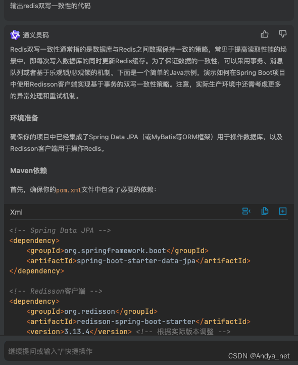
IDEA | 安装通义灵码插件,开启智能编码旅程
安装步骤 从插件市场安装,点击导航-插件,打开应用市场,搜索通义灵码(TONGYI Lingma),找到通义灵码后点击安装。 https://tongyi.aliyun.com/lingma/download 使用方式 https://help.aliyun.com/documen…...
过程中遇到的挑战?)
技术人员如何克服在使用行列视(RCV)过程中遇到的挑战?
技术人员在使用行列视(RCV)过程中可能会遇到多种挑战,以下是一些建议,帮助他们克服这些挑战: 1. 深入了解系统架构和功能: - 熟练掌握RCV的架构设计,包括数据中心层、计算服务层、函数层、人机…...

手把手教你安装 Vivado2019.2(附安装包)
一、Vivado 2019.2优点 Vivado 2019.2 作为 Xilinx 公司发布的一款设计套件版本,具有多个显著的优点,以下是对其优点的详细归纳: 集成度高:开发工具丰富并行综合功能灵活的许可证策略用户友好的界面强大的仿真和验证功能丰富的文…...
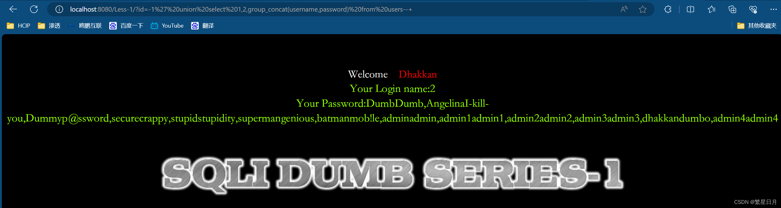
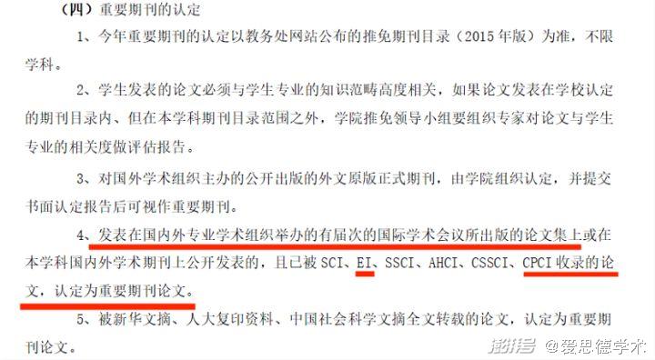
Sql-labs的第一关
前言 我们在使用Sql-libs靶场进行Sql注入实验的时候,前提要求我们对mysql数据库结构要有一个大概的了解,因为mysql5.0以上的版本都会自带一个名为information_schema的数据库,这个数据库下面会有columns和tables两个表。 tables这个表的table…...

10_1 Linunx Web服务管理
10_1 Linunx Web服务管理 文章目录 10_1 Linunx Web服务管理[toc]1. 环境准备2. Web服务2.1 Web服务简介 2.2 Web配置2.2.1 提供的默认配置2.2.2 Web服务的主配置文件2.2.3 /etc/httpd/conf/httpd.conf 文件反映出来的”访问控制信息“2.2.4 修改监听端口,访问2.2.5…...

苹果WWDC 2024:十三大亮点公布,一切都有关AI|TodayAI
在刚刚结束的苹果全球开发者大会(WWDC 2024)上,苹果公司展示了一系列令人瞩目的新功能,特别是在人工智能(AI)领域的重大进展。以下是本次大会的十三大亮点。 1. 苹果推出首个AI系统 苹果宣布推出其首个AI系统——Apple Intelligence,这一系统将强大的生成模型直接集成到…...

Nginx访问日志
Nginx日志是Nginx Web服务器产生的记录文件,主要用于跟踪和分析服务器的访问情况以及错误信息。Nginx日志主要分为两大类:访问日志 (access_log): 访问日志记录了每一次客户端对Nginx服务器的HTTP请求的详细信息,这对于统计分析、流量监控、用…...
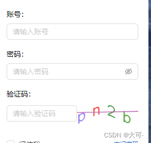
Java使用Hutool工具类轻松生成验证码
一、效果展示 二、Hutool工具类实现验证码生成 2.1 引入依赖 <!--hutool工具包--> <dependency><groupId>cn.hutool</groupId><artifactId>hutool-all</artifactId><version>5.7.15</version> </dependency2.2 简单实现方…...

leetcode 40. 组合总和 II
题目 给定一个候选人编号的集合 candidates 和一个目标数 target ,找出 candidates 中所有可以使数字和为 target 的组合。 candidates 中的每个数字在每个组合中只能使用 一次 。 注意:解集不能包含重复的组合。 原题链接:https://leetc…...
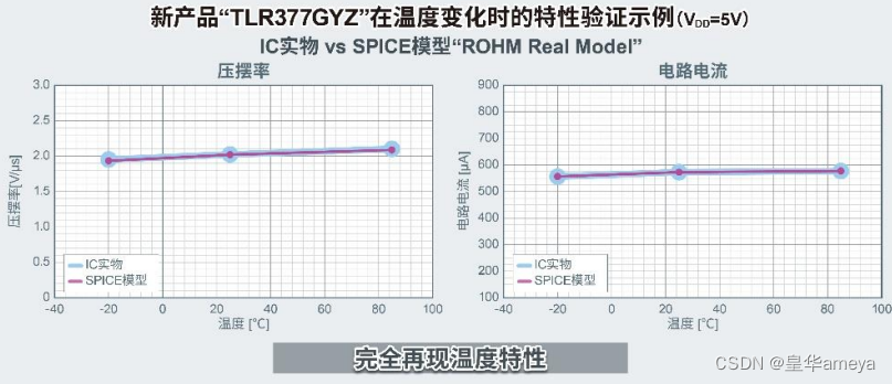
AMEYA360代理品牌:ROHM开发出世界超小CMOS运算放大器,适用于智能手机和小型物联网设备等应用
全球知名半导体制造商ROHM(总部位于日本京都市)开发出一款超小型封装的CMOS运算放大器“TLR377GYZ”,该产品非常适合在智能手机和小型物联网设备等应用中放大温度、压力、流量等的传感器检测信号。 智能手机和物联网终端越来越小型化,这就要求搭载的元器…...

第1章Hello world 4/5:对比Rust/Java/C++创建和运行Hello world全过程:运行第一个程序
讲动人的故事,写懂人的代码 1.7 对比Rust/Java/C++创建和运行Hello world全过程 有了会听懂人类的讲话,还能做记录的编程助理艾极思,他们三人的讨论内容,都可以变成一份详细的会议纪要啦。 接下来,我们一起看看艾极思是如何记录下赵可菲创建和运行Java程序Hello world,…...

golang优雅代码【lock实现】
golang优雅代码【lock实现】 1.局部锁1.1 具体实现方式 本文代码风格来源参考 database/sql 包 更加深刻理解go语言圣经中函数是一等公民 1.局部锁 database/sql源码中使用 withLock(dc, func(){...}) 方法实现局部锁,完美利用了 golang 的 defer 关键字对 入参dc…...
)
Dijkstra算法(迪杰斯特拉算法)
迪杰斯特拉算法通常用在图的最短路径问题上 而迷宫的最短路径可以用BFS来做,虽然BFS不能用于带权值的迷宫,但是可以对BFS稍微改进,只需要把判断是否走过的数组改为最短路径的数组,在判断是否可走时判断是否比最短的小即可 Dijks…...

隧道裂缝剥落病害AI识别系统
我国现有公路隧道超2.5万座,总里程超2.8万公里,其中运营超过15年的老旧隧道占比达35%。据交通运输部2025年统计,年均因隧道结构病害导致的交通中断超1200次,直接经济损失超45亿元。传统检测模式暴露四大核心痛点:检测周…...

2026在线测评系统十大量表对比:信效度与场景全解析
【30s 核心摘要】2026 年在线测评成人才管理刚需,信效度与场景适配成选型核心。本文聚焦十大量表,从信度、效度、适配场景等维度深度对比,重点解析问卷星、北森、金数据等主流平台的量表能力与落地效果,为企业、高校及机构提供科学…...

【CP-05】RTE运行时环境 - SWC的操作系统接口
CP-05_RTE运行时环境【CP-05】RTE运行时环境 - SWC的“操作系统接口”前言在AUTOSAR架构中,RTE(Runtime Environment,运行时环境)是一个常被提及却难以理解的概念。它像是应用层软件组件(SW-C)与底层基础软…...

微信小程序3D开发框架技术对比:XR-Frame与threejs-miniprogram
随着微信小程序逐步支持3D渲染与AR能力,开发者面临两个主要官方方案:自研的XR-Frame和适配Three.js的threejs-miniprogram。本文将从架构设计、渲染机制、功能集成、开发模式及适用场景等维度进行技术分析,为技术选型提供参考。一、XR-Frame&…...

翻译 GDB 官方文档
翻译 GDB 官方文档项目地址官方文档地址下载源码包编译html运行翻译程序项目地址 https://github.com/shootercheng/gdb-translate.git 项目结构 $ tree -L 1 . ├── cmd ├── go.mod ├── input ├── internal ├── LICENSE ├── output ├── README.md ├─…...

UE5 Mac环境搭好了,然后呢?给新手的第一个5分钟:创建、操控并理解你的第一个角色
UE5 Mac环境搭好了,然后呢?给新手的第一个5分钟:创建、操控并理解你的第一个角色当你第一次打开UE5的Mac版本,面对那个闪烁着光芒的启动界面,内心可能既兴奋又忐忑。安装只是第一步,真正的旅程现在才开始。…...
)
从零到上机:我的第一个Quest 3空间锚点应用是如何跑起来的(附完整Unity工程)
从零到上机:我的第一个Quest 3空间锚点应用是如何跑起来的(附完整Unity工程)第一次戴上Meta Quest 3时,那种虚拟与现实交织的震撼感至今难忘。但作为开发者,更让我着迷的是如何让虚拟物体在真实空间中"记住"…...

Performance-Fish:让你的《环世界》后期游戏帧率提升400%的终极优化方案
Performance-Fish:让你的《环世界》后期游戏帧率提升400%的终极优化方案 【免费下载链接】Performance-Fish Performance Mod for RimWorld 项目地址: https://gitcode.com/gh_mirrors/pe/Performance-Fish 你是否曾在《环世界》游戏后期,面对庞大…...

多模型聚合平台如何助力网站AIB测试与选型
🚀 告别海外账号与网络限制!稳定直连全球优质大模型,限时半价接入中。 👉 点击领取海量免费额度 多模型聚合平台如何助力网站AIB测试与选型 对于网站产品经理而言,首页文案的生成质量直接影响用户的第一印象和转化率。…...

PvZ Toolkit终极指南:三步掌握植物大战僵尸最强修改器
PvZ Toolkit终极指南:三步掌握植物大战僵尸最强修改器 【免费下载链接】pvztoolkit 植物大战僵尸 PC 版综合修改器 项目地址: https://gitcode.com/gh_mirrors/pv/pvztoolkit PvZ Toolkit是一款专为植物大战僵尸PC版设计的综合修改器工具,能够让你…...