Layout 布局组件快速搭建
文章目录
- 设置主题样式变量
- 封装公共布局组件
- 封装 Logo 组件
- 封装 Menu 菜单组件
- 封装 Breadcrumb 面包屑组件
- 封装 TabBar 标签栏组件
- 封装 Main 内容区组件
- 封装 Footer 底部组件
- 封装 Theme 主题组件
- 经典布局
- 水平布局
- 响应式布局
- 搭建 Layout 布局组件
- 添加 Layout 路由配置
- 启动项目
设置主题样式变量
-
创建主题变量文件:
src/assets/styles/theme.scss -
添加页面布局组件用到的变量:
:root {--os-layout-aside-width: 224px; // 侧边栏宽度--os-layout-logo-height: 56px; // 头部高度--os-layout-header-height: 56px; // 头部高度--os-layout-header-menu-width: 300px; // 头部菜单宽度--os-layout-footer-height: 40px; // 底部高度--os-layout-tab-height: 40px; // 底部高度 } -
设置全局滚动条样式:
/* scroll bar */ ::-webkit-scrollbar {width: 6px;height: 6px; }::-webkit-scrollbar-thumb {background-color: var(--el-border-color-darker);border-radius: 20px; } -
在统一管理和维护项目的样式文件
src/assets/styles/index.scss中导入主题样式文件:@import "theme.scss";
注:统一管理和维护项目的样式文件src/assets/styles/index.scss需在mian.ts中导入,注意导入顺序。
封装公共布局组件
封装 Logo 组件
-
创建 Logo 组件:
src/layouts/components/Logo/index.vue -
通过
import.meta.env获取.env文件中定义的环境变量,环境变量使用详情跳转认识和使用 Vite 环境变量配置:<script setup lang="ts"> const app_title = import.meta.env.VITE_APP_TITLE </script> -
Logo 组件内容,添加 Logo 图标和项目标题:
<template><!-- logo 容器 --><div class="logo-container"><!-- logo 图标 --><svg-icon width="32px" height="32px" name="logo" /><!-- 应用标题,只在中等及以上屏幕尺寸上可见 --><span class="logo-title hidden md:block">{{ app_title }}</span></div> </template> -
添加样式:
<style scoped lang="postcss">
.logo-container {@apply flex items-center justify-center;height: var(--os-layout-logo-height);width: var(--os-layout-aside-width);.logo-title {@apply text-lg font-bold subpixel-antialiased;@apply bg-clip-text text-transparent bg-gradient-to-r from-pink-500 to-violet-500;}
}
</style>
封装 Menu 菜单组件
-
创建 Menu 菜单组件:
src/layouts/components/Menu/index.vue -
在
el-menu组件中使用props来控制mode属性,可以实现菜单的不同显示模式(如vertical或horizontal):<script setup lang="ts"> const props = defineProps<{mode?: 'vertical' | 'horizontal' }>() </script> -
使用 ElementPlus 的 el-menu 菜单组件搭建垂直菜单:
<template><!-- 菜单容器 --><div class="menu-container"><!-- Element UI 菜单组件 --><el-menuclass="os-menu":mode="props.mode"><!-- 一级菜单 --><el-sub-menu index="1"><!-- 一级菜单标题 --><template #title><span>Navigator One</span></template><!-- 二级菜单 --><el-menu-item index="1-1">item one</el-menu-item><el-menu-item index="1-2">item two</el-menu-item></el-sub-menu><!-- 一级菜单 --><el-menu-item index="2"><span>Navigator Two</span></el-menu-item></el-menu></div> </template> -
添加样式:
<style scoped lang="postcss">
.menu-container{background-color: var(--el-menu-bg-color);.os-menu{@apply border-0;&.el-menu--horizontal{height: calc(var(--os-layout-logo-height) - 1px);}}
}
</style>
封装 Breadcrumb 面包屑组件
-
创建
src/layouts/components/Breadcrumb/index.vue -
使用 ElementPlus el-breadcrumb 面包屑组件:
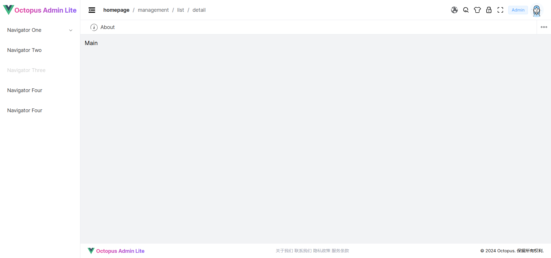
<template><el-breadcrumb separator="/" class="breadcrumb-container"><el-breadcrumb-item :to="{ path: '/' }">homepage</el-breadcrumb-item><el-breadcrumb-item>management</el-breadcrumb-item><el-breadcrumb-item>list</el-breadcrumb-item><el-breadcrumb-item>detail</el-breadcrumb-item></el-breadcrumb> </template> -
添加样式:
<style scoped lang="postcss">
.breadcrumb-container {display: flex;flex-wrap: nowrap; /* 防止换行 */overflow: hidden; /* 横向滚动溢出处理 */padding-right: 12px;
}
</style>
封装 TabBar 标签栏组件
-
创建
src/layouts/components/TabBar/index.vue -
生成 TabBar 标签数据:
<script setup lang="ts"> const tabs = Array(1).fill({label: 'About',name: 'about',icon: 'About',path: '/about' }) </script> -
使用 ElementPlus el-tabs 标签组件,Scrollbar 组件替换浏览器原生滚动条:
<template><!-- Tab Bar --><div class="tab-bar-container"><div class="tab-bar-box"><el-scrollbar><el-tabstab-position="top"type="card"closable><el-tab-panev-for="(item, index) in tabs":key="index":name="item.name"><template #label><span class="tab-title"><svg-icon :name="item.icon" /><span>{{ item.label }}</span></span></template></el-tab-pane></el-tabs></el-scrollbar></div><div class="more-button"><el-dropdown trigger="click"><span><svg-icon name="More" /></span><template #dropdown><el-dropdown-menu><el-dropdown-item>关闭</el-dropdown-item></el-dropdown-menu></template></el-dropdown></div></div> </template> -
添加样式:
<style scoped lang="scss">
.tab-bar-container {display: flex;align-items: center;gap: 8px;border-bottom: 1px solid var(--el-border-color-light);.tab-bar-box {display: flex;flex-grow: 1;margin-left: 8px;width: calc(100% - 60px);.tab-title{display: flex;align-items: center;gap: 8px;}}.more-button {display: flex;align-items: center;justify-content: center;width: var(--os-layout-tab-height);height: var(--os-layout-tab-height);border-left: 1px solid var(--el-border-color-light);}
}:deep(.el-tabs) {.el-tabs__header {height: var(--os-layout-tab-height);padding: 0;margin: 0;border-bottom: none;.el-tabs__nav-wrap {.el-tabs__nav-scroll {.el-tabs__nav {border: none;.el-tabs__item {height: calc(var(--os-layout-tab-height) - 2px);line-height: calc(var(--os-layout-tab-height) - 2px);border: none;position: relative; // 确保父元素是相对定位的&::before {content: '';position: absolute;bottom: 0;width: 100%;height: 2px;background-color: transparent;}&.is-active {color: var(--el-color-primary);fill: var(--el-color-primary);&::before {background-color: var(--el-color-primary); // 改变背景色以显示下划线}}}}}}}
}
</style>
封装 Main 内容区组件
-
创建
src/layouts/components/Main/index.vue:<script setup lang="ts"></script><template><div>Main</div> </template><style scoped lang="scss"></style> -
后续补充内容…
封装 Footer 底部组件
-
创建
src/layouts/components/Footer/index.vue -
通过
import.meta.env获取.env文件中定义的环境变量<script setup lang="ts"> const app_title = import.meta.env.VITE_APP_TITLE </script> -
添加内容:
<template><div class="footer-container"><!-- 左侧:公司名称或标志 --><div class="flex-content"><svg-icon name="logo" /><span class="logo-title">{{ app_title }}</span></div><!-- 中间:导航链接 --><div class="flex-content"><a href="about">关于我们</a><a href="#contact">联系我们</a><a href="#privacy-policy">隐私政策</a><a href="#terms-of-service">服务条款</a></div><!-- 右侧:版权信息 --><div class="text-right">© 2024 Octopus. 保留所有权利.</div></div> </template> -
添加样式:
<style scoped lang="postcss">
.footer-container{@apply flex items-center w-full;@apply select-none text-xs;height: var(--os-layout-footer-height);@apply justify-center lg:justify-between;.flex-content{@apply items-center gap-2;@apply flex justify-center gap-1 text-gray-400;@apply hidden lg:flex;.logo-title {@apply font-bold subpixel-antialiased text-sm;@apply bg-clip-text text-transparent bg-gradient-to-r from-pink-500 to-violet-500;}}
}
</style>
封装 Theme 主题组件
-
创建
src/stores/modules/theme/types.ts定义主题类型:export type LayoutMode = 'classic' | 'horizontal' | 'responsive' // 主题配置 export interface ThemeConfig {showThemeConfig: boolean,darkThemeEnabled: boolean,grayThemeEnabled: boolean,layoutMode: LayoutMode,themePrimaryColor: string,predefineColors: string[] } -
创建
src/stores/modules/theme/index.ts仓库存储主题状态:import { defineStore } from 'pinia' import { reactive, watch } from 'vue' import { ThemeConfig } from './types' import { ElMessage } from 'element-plus' import { getDarkColor, getLightColor } from '@/utils/Color'// theme store export const useThemeStore = defineStore('theme',() => {const themeConfig = reactive<ThemeConfig>({showThemeConfig: false,darkThemeEnabled: false,grayThemeEnabled: false,layoutMode: 'classic',themePrimaryColor: '#409eff',predefineColors: ['#409eff']})// 切换显示状态的方法const toggleThemeConfig = () => {themeConfig.showThemeConfig = !themeConfig.showThemeConfig}// 黑暗主题切换watch(() => themeConfig.darkThemeEnabled, () => {const html = document.documentElement as HTMLElementif (themeConfig.darkThemeEnabled) {html.setAttribute('class', 'dark')} else {html.removeAttribute('class')}changeThemeColor(themeConfig.themePrimaryColor)})watch(() => themeConfig.grayThemeEnabled,() => {if (themeConfig.grayThemeEnabled) {document.documentElement.dataset.theme = 'gray'} else {document.documentElement.dataset.theme = ''}})// 添加预定义颜色function addPredefineColor(color:string) {console.log('color', color)const predefineColors = themeConfig.predefineColors// 查找元素的索引const index = predefineColors.indexOf(color)if (index !== -1) {// 使用 splice 方法删除该元素predefineColors.splice(index, 1)}if (themeConfig.predefineColors.length === 10) {themeConfig.predefineColors.pop() // 删除队列中的第一个元素}themeConfig.predefineColors.unshift(color)}// 修改主题颜色const changeThemeColor = (color:string ) => {if (!color) {color = '#409eff'ElMessage({ type: 'success', message: '主题颜色已重置' })}addPredefineColor(color)// 计算主题颜色变化document.documentElement.style.setProperty('--el-color-primary', color)document.documentElement.style.setProperty('--el-color-primary-dark-2',themeConfig.darkThemeEnabled ? `${getLightColor(color, 0.2)}` : `${getDarkColor(color, 0.3)}`)for (let i = 1; i <= 9; i++) {const primaryColor = themeConfig.darkThemeEnabled ? `${getDarkColor(color, i / 10)}` : `${getLightColor(color, i / 10)}`document.documentElement.style.setProperty(`--el-color-primary-light-${i}`, primaryColor)}}return {themeConfig,toggleThemeConfig,changeThemeColor}},{persist: true}) -
创建
src/layouts/components/Theme/index.vue主题组件并引入主题仓库:<script setup lang="ts"> import { useThemeStore } from '@/stores/modules/theme' import { onMounted } from 'vue'const { themeConfig, changeThemeColor } = useThemeStore()onMounted(() => {// 在组件挂载到 DOM 后更新主题颜色changeThemeColor(themeConfig.themePrimaryColor) }) </script> -
使用
el-drawer抽屉组件进行主题布局:<template><div><el-drawer v-model="themeConfig.showThemeConfig" size="300"><template #header="{ titleId }"><span :id="titleId" class="theme-header"> 主题配置 </span></template><el-scrollbar><div class="mr-4"><el-divider>布局样式</el-divider><div class="layout-box"><el-tooltip effect="dark" content="经典布局" placement="top" :show-after="200"><div:class="['layout-item layout-classic', { 'is-active': themeConfig.layoutMode == 'classic' }]"@click="themeConfig.layoutMode='classic'"><div class="layout-dark"></div><div class="layout-container"><div class="layout-light"></div><div class="layout-content"></div></div><svg-icon class="select-layout" name="About" v-if="themeConfig.layoutMode == 'classic'" /></div></el-tooltip><el-tooltipeffect="dark"content="横向布局"placement="top":show-after="200"><div:class="['layout-item layout-transverse', { 'is-active': themeConfig.layoutMode == 'horizontal' }]"@click="themeConfig.layoutMode='horizontal'"><div class="layout-dark"></div><div class="layout-content"></div><svg-icon class="select-layout" name="About" v-if=" themeConfig.layoutMode == 'horizontal'" /></div></el-tooltip></div><el-divider>主题风格</el-divider><div class="switch-container"><div class="switch-box"><div class="switch-title"><span>主题颜色</span><el-tooltip content="主题颜色" placement="top"><svg-icon class="size-4" name="About"></svg-icon></el-tooltip></div><el-color-pickercolor-format="hex"v-model="themeConfig.themePrimaryColor":predefine="themeConfig.predefineColors"@change="changeThemeColor"/></div><div class="switch-box"><div class="switch-title"><span>暗黑主题</span><el-tooltip content="暗黑主题" placement="top"><svg-icon class="size-4" name="About"></svg-icon></el-tooltip></div><el-switch v-model="themeConfig.darkThemeEnabled" /></div><div class="switch-box"><div class="switch-title"><span>灰色模式</span><el-tooltip content="灰色模式" placement="top"><svg-icon class="size-4" name="About"></svg-icon></el-tooltip></div><el-switch v-model="themeConfig.grayThemeEnabled" /></div></div><el-divider>界面设置</el-divider><div class="switch-container"><div class="switch-box"><div class="switch-title"><span>theme</span></div><el-switch inline-prompt /></div></div></div></el-scrollbar></el-drawer></div> </template> -
为组件添加样式:
<style scoped lang="postcss">
.theme-header {@apply text-base font-bold flex items-center;
}.switch-container {@apply flex-grow space-y-2;
}.switch-box {@apply flex justify-between items-center w-full;
}.switch-title {@apply flex gap-2 items-center;
}:deep(.el-drawer__header) {@apply px-5 py-0 h-12 border-b-2 border-solid m-0;color: var(--el-text-color-regular);border-color: var(--el-border-color-light);
}:deep(.el-drawer__title) {font-size: 20px;
}:deep(.el-drawer__body) {@apply py-0 pr-0;
}.layout-box {position: relative;display: flex;flex-wrap: wrap;justify-content: space-between;padding: 15px 15px 0;.layout-item {position: relative;box-sizing: border-box;width: 100px;height: 70px;padding: 6px;cursor: pointer;border-radius: 5px;box-shadow: 0 0 5px 1px var(--el-border-color-dark);transition: all 0.2s;.layout-dark {background-color: var(--el-color-primary);border-radius: 3px;}.layout-light {background-color: var(--el-color-primary-light-5);border-radius: 3px;}.layout-content {background-color: var(--el-color-primary-light-8);border: 1px dashed var(--el-color-primary);border-radius: 3px;}.select-layout {position: absolute;right: 10px;bottom: 10px;fill: var(--el-color-primary);transition: all 0.2s;}&:hover {box-shadow: 0 0 5px 1px var(--el-text-color-secondary);}}.is-active {box-shadow: 0 0 0 2px var(--el-color-primary) !important;}.layout-classic {display: flex;justify-content: space-between;margin-bottom: 20px;.layout-dark {width: 20%;}.layout-container {display: flex;flex-direction: column;justify-content: space-between;width: 72%;.layout-light {height: 20%;}.layout-content {height: 67%;}}}.layout-transverse {display: flex;flex-direction: column;justify-content: space-between;margin-bottom: 15px;.layout-dark {height: 20%;}.layout-content {height: 67%;}}
}
</style>
经典布局
-
创建经典页面布局组件:
src/layouts/LayoutClassic/index.vue: -
导入布局组件:
<script setup lang="ts"> import Footer from '@/layouts/components/Footer/index.vue'; // 引入页脚组件 import Menu from '@/layouts/components/Menu/index.vue'; // 引入菜单组件 import Logo from '@/layouts/components/Logo/index.vue'; // 引入Logo组件 import Main from '@/layouts/components/Main/index.vue'; // 引入主要内容组件 import TabBar from '@/layouts/components/TabBar/index.vue'; // 引入标签栏组件 import Breadcrumb from '@/layouts/components/Breadcrumb/index.vue'; // 引入面包屑导航组件import { useThemeStore } from '@/stores/modules/theme' // 引入主题仓库 const { toggleThemeConfig } = useThemeStore() -
使用 ElementPlus 提供的 Container 布局容器快速搭建页面的基本结构:
-
在组件中使用布局组件划分出页面结构:侧边菜单栏、顶部、Tab 标签栏、主体和底部:
<el-container>:外层容器。 当子元素中包含<el-header>或<el-footer>时,全部子元素会垂直上下排列, 否则会水平左右排列。<el-header>:顶栏容器。<el-aside>:侧边栏容器。<el-main>:主要区域容器。<el-footer>:底栏容器。<template><div class="layout-container"><el-container><!-- 左侧边栏 --><el-aside><!-- Logo 组件 --><Logo class="os-logo"/><!-- 菜单组件 --><Menu class="menu-classic" /></el-aside><el-container><!-- 页面顶部区域 --><el-header><!-- 头部内容区域 --><div class="header-content"><!-- 折叠按钮 --><svg-icon class="fold-expand-button" name="Fold" /><!-- 面包屑导航 --><Breadcrumb /></div><!-- 头部菜单区域 --><div class="header-menu"><!-- 语言切换下拉菜单 --><el-dropdown :hide-on-click="false"><svg-icon name="Earth" /><template #dropdown><el-dropdown-menu><el-dropdown-item>简体中文</el-dropdown-item></el-dropdown-menu></template></el-dropdown><!-- 搜索按钮 --><svg-icon class="cursor-pointer" name="Search" /><!-- 主题配置按钮 --><el-tooltip content="主题配置" placement="bottom"><svg-icon class="cursor-pointer" name="Theme" @click="toggleThemeConfig" /></el-tooltip><!-- 锁屏按钮 --><el-tooltip content="锁屏" placement="bottom"><svg-icon class="cursor-pointer" name="Lock" /></el-tooltip><!-- 全屏按钮 --><el-tooltip content="全屏" placement="bottom"><svg-icon class="cursor-pointer" name="FullScreen" /></el-tooltip><!-- 用户信息下拉菜单 --><el-dropdown><div class="flex items-center gap-1"><el-tag type="primary">Admin</el-tag><el-avatar src="https://cube.elemecdn.com/0/88/03b0d39583f48206768a7534e55bcpng.png" /></div><template #dropdown><el-dropdown-menu><el-dropdown-item command="profile"><template #default><div class="flex items-center gap-1"><svg-icon name="User" /><span>个人中心</span></div></template></el-dropdown-item><el-dropdown-item command="logout"><template #default><div class="flex items-center gap-1"><svg-icon name="Logout" /><span>退出登录</span></div></template></el-dropdown-item></el-dropdown-menu></template></el-dropdown></div></el-header><!-- 标签栏 --><tab-bar class="tab-container" /><!-- 主内容区域 --><el-main><Main /></el-main><!-- 底部页脚 --><el-footer><Footer /></el-footer></el-container></el-container></div> </template> -
为组件添加样式:
<style scoped lang="postcss">
.layout-container {@apply w-screen h-screen;.el-aside {@apply h-full;@apply border-r border-solid overflow-hidden;border-color: var(--el-border-color-light);width: var(--os-layout-aside-width);.os-logo {@apply overflow-hidden pl-2;}.menu-classic {height: calc(100vh - var(--os-layout-logo-height));}}.el-container {@apply h-full w-full;.tab-container {height: var(--os-layout-tab-height);}.el-header {@apply flex items-center justify-between;@apply border-b border-solid overflow-hidden;border-color: var(--el-border-color-light);height: var(--os-layout-header-height);.header-content {@apply flex items-center gap-5;.fold-expand-button {@apply cursor-pointer;@apply size-6;}}.header-menu {@apply flex items-center justify-between gap-3;}}.el-main {@apply h-full p-3;background-color: var(--el-bg-color-page);}.el-footer {height: var(--os-layout-footer-height);}}
}
</style>
水平布局
-
创建经典页面布局组件:
src/layouts/LayoutClassic/index.vue: -
导入布局组件:
<script setup lang="ts"> import Footer from '@/layouts/components/Footer/index.vue'; // 引入页脚组件 import Menu from '@/layouts/components/Menu/index.vue'; // 引入菜单组件 import Logo from '@/layouts/components/Logo/index.vue'; // 引入Logo组件 import Main from '@/layouts/components/Main/index.vue'; // 引入主要内容组件 import TabBar from '@/layouts/components/TabBar/index.vue'; // 引入标签栏组件import { useThemeStore } from '@/stores/modules/theme' // 引入主题仓库 const { toggleThemeConfig } = useThemeStore() </script> -
在组件中使用 Element UI 的布局组件划分出页面结构:顶部、Tab 标签栏、主体和底部:
<template><div class="layout-container"><el-container><el-container><el-header><div class="flex"><Logo class="os-logo" /><Menu mode="horizontal" class="menu-horizontal " /></div><div class="header-menu"><!-- 语言转换 --><el-dropdown :hide-on-click="false"><svg-icon name="Earth" /><template #dropdown><el-dropdown-menu><el-dropdown-item>简体中文</el-dropdown-item></el-dropdown-menu></template></el-dropdown><!-- 搜索按钮 --><svg-icon class="cursor-pointer" name="Search" /><!-- 皮肤按钮 --><el-tooltip content="主题配置" placement="bottom"><svg-icon class="cursor-pointer" name="Theme" @click="toggleThemeConfig"/></el-tooltip><!-- 锁屏按钮 --><el-tooltip content="锁屏" placement="bottom"><svg-icon class="cursor-pointer" name="Lock" /></el-tooltip><!-- 全屏按钮 --><el-tooltip content="全屏" placement="bottom"><svg-icon class="cursor-pointer" name="FullScreen" /></el-tooltip><!-- 用户信息 --><el-dropdown><div class="flex items-center gap-1"><el-tag type="primary">Admin</el-tag><el-avatar src="https://cube.elemecdn.com/0/88/03b0d39583f48206768a7534e55bcpng.png" /></div><template #dropdown><el-dropdown-menu><el-dropdown-item command="profile"><template #default><div class="flex items-center gap-1"><svg-icon name="User" /><span>个人中心</span></div></template></el-dropdown-item><el-dropdown-item command="logout"><template #default><div class="flex items-center gap-1"><svg-icon name="Logout" /><span>退出登录</span></div></template></el-dropdown-item></el-dropdown-menu></template></el-dropdown></div></el-header><tab-bar class="tab-container" /><el-main><Main /></el-main><el-footer><Footer /></el-footer></el-container></el-container></div> </template> -
添加样式:
<style scoped lang="postcss">
.layout-container {@apply w-screen h-screen;.el-aside {@apply bg-amber-300 h-full;width: var(--os-layout-aside-width);}.el-container {@apply h-full w-full;.tab-container {height: var(--os-layout-tab-height);}.el-header {@apply w-full pl-2 pr-2 flex justify-between;height: var(--os-layout-header-height);@apply border-b border-solid overflow-hidden;border-color: var(--el-border-color-light);.menu-horizontal{width: calc(100vw - var(--os-layout-aside-width) - var(--os-layout-header-menu-width));}.header-menu{@apply flex items-center justify-between gap-3;}}.el-main {@apply h-full p-3;background-color:var(--el-bg-color-page);}.el-footer {height: var(--os-layout-footer-height);}}
}
</style>
响应式布局
-
创建
src/layouts/LayoutResponsive/index.vue响应式布局组件 -
添加公共组件:
<script setup lang="ts"> import Logo from '@/layouts/components/Logo/index.vue' import Main from '@/layouts/components/Main/index.vue' import Menu from '@/layouts/components/Menu/index.vue' import { ref } from 'vue'import { useThemeStore } from '@/stores/modules/theme' const { themeConfig } = useThemeStore()const navDrawer = ref(false) const menuDrawer = ref(false) const translateShow = ref(false) </script> -
页面布局:
<template><div class="layout-responsive"><el-container><el-header class="flex items-center justify-between"><div class="h-full flex items-center gap-2"><svg-icon width="30px" height="30px" name="menu" @click="menuDrawer = !menuDrawer" /><Logo /></div><div class="header-menu"><!-- 搜索按钮 --><svg-icon width="28px" height="28px" class="cursor-pointer" name="Search" /><!-- 用户信息 --><el-avatar src="https://cube.elemecdn.com/0/88/03b0d39583f48206768a7534e55bcpng.png"@click="navDrawer = !navDrawer" /><!-- 导航信息 --> <el-drawer v-model="navDrawer" size="100%"><template #header><Logo /></template><div class="nav-container "><a href="#">个人中心</a><el-divider /><div><span class="flex items-center justify-between" @click="translateShow = !translateShow">翻译<svg-icon name="Earth"></svg-icon></span><!-- 语言列表 --><transition name="fade"><div v-show="translateShow" id="language-list" class="language-list mt-2"><ul><li class="p-2">英语</li><li class="p-2">中文</li><li class="p-2">西班牙语</li></ul></div></transition></div><el-divider /><div class="nav-theme-switch"><span>暗黑主题</span><el-switch v-model="themeConfig.darkThemeEnabled" size="large" /></div><el-divider /><span>退出登录</span></div></el-drawer></div></el-header><el-main><el-backtop target=".el-main" /><Main /></el-main></el-container><!-- 菜单组件 --><el-drawerv-model="menuDrawer"direction="ltr"size="320px"><Menu /></el-drawer></div> </template> -
添加样式:
<style scoped lang="postcss">
.layout-responsive {@apply w-screen h-screen;.el-container {@apply h-full w-full;.el-header {@apply w-full flex pl-2;height: var(--os-layout-header-height);@apply border-b border-solid overflow-hidden;border-color: var(--el-border-color-light);.header-menu {@apply flex items-center justify-between gap-3;}}.tab-container {background-color: var(--el-bg-color);}.el-main {@apply h-full;background-color: var(--el-bg-color-page);}}
}:deep(.el-drawer__header) {@apply px-3 py-0 h-14 border-solid m-2;color: var(--el-text-color-regular);border-color: var(--el-border-color-light);
}:deep(.el-drawer__title) {font-size: 20px;
}:deep(.el-drawer__body) {@apply py-0 px-8;
}:deep(.el-drawer__close-btn) {@apply text-3xl;
}.nav-container {margin: 0 auto;padding: 24px 0 96px;max-width: 18rem;
}.nav-theme-switch {@apply flex items-center justify-between rounded-md;
}/* 添加动画效果 */
.fade-enter-active {transition: opacity 0.5s ease;
}.fade-leave-active {transition: opacity 0.2s ease;
}.fade-enter-from, .fade-leave-to {opacity: 0;
}.logo-title {@apply text-lg font-bold subpixel-antialiased;@apply bg-clip-text text-transparent bg-gradient-to-r from-pink-500 to-violet-500;
}
</style>
搭建 Layout 布局组件
-
创建 Layout 布局组件
src/layouts/index.vue -
导入经典布局组件
LayoutClassic和水平布局组件LayoutHorizontal,创建一个layoutMode对象来将布局模式字符串映射到相应的组件,使用computed函数根据mode动态选择布局模式。<script setup lang="ts"> import { type Component, computed, onMounted, onUnmounted, ref, watch } from 'vue' import LayoutClassic from '@/layouts/LayoutClassic/index.vue' import LayoutHorizontal from '@/layouts/LayoutHorizontal/index.vue' import LayoutResponsive from '@/layouts/LayoutResponsive/index.vue' import Theme from '@/layouts/components/Theme/index.vue'import { useThemeStore } from '@/stores/modules/theme' const { themeConfig } = useThemeStore()// 定义布局模式与对应的组件类型 const layoutMode: Record<string, Component> = {classic: LayoutClassic, // 经典布局horizontal: LayoutHorizontal, // 横向布局responsive: LayoutResponsive // 响应式布局 }// 布局模式 const layMode = ref(themeConfig.layoutMode)// 监听主题配置模式 watch(() => themeConfig.layoutMode, (newMode) => {layMode.value = newMode })// 计算属性,根据具体逻辑返回所选布局的组件 const mode = computed(() => layoutMode[layMode.value])// 响应式布局,切换布局模式 const updateMode = () => {if (window.innerWidth <= 768) {layMode.value = 'responsive'} else {layMode.value = themeConfig.layoutMode} }onMounted(() => {// 初始更新updateMode()window.addEventListener('resize', updateMode) })onUnmounted(() => {window.removeEventListener('resize', updateMode) }) </script><template><!-- 根据 mode 的值渲染不同的布局样式 --><component :is="mode" /><Theme /> </template><style scoped lang="postcss"> </style>
添加 Layout 路由配置
-
在
src/App.vue中添加代码,当访问路由路径时,Vue Router 会根据路由配置将对应的组件渲染到<router-view>中,实现单页应用的页面切换效果:<template><router-view /> </template> -
在
src/router/index.ts中添加路由:const router = createRouter({routes: [{path: '/',name: 'layout',component: () => import('@/layouts/index.vue')}] })
启动项目
-
终端执行命令启动项目:
pnpm run dev -
浏览器访问:http://localhost:8080/,默认为经典布局样式:
-
在
src/layouts/index.vue中切换为水平布局样式,查看页面:const mode = computed(() => layoutMode['horizontal'])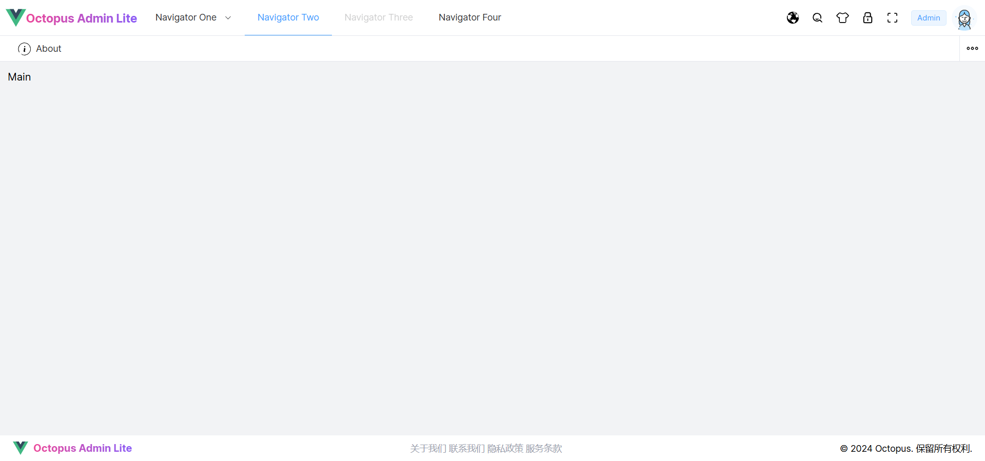
相关文章:
Layout 布局组件快速搭建
文章目录 设置主题样式变量封装公共布局组件封装 Logo 组件封装 Menu 菜单组件封装 Breadcrumb 面包屑组件封装 TabBar 标签栏组件封装 Main 内容区组件封装 Footer 底部组件封装 Theme 主题组件 经典布局水平布局响应式布局搭建 Layout 布局组件添加 Layout 路由配置启动项目 …...
北京城市图书馆-非遗文献馆:OLED透明拼接屏的璀璨应用
在数字化与传统文化深度融合的今天,北京城市图书馆的非遗文献馆以一场前所未有的视觉盛宴,向世人展示了OLED透明拼接屏的非凡魅力与无限可能。这座集阅读、展示、体验于一体的非遗文献馆,通过2*7布局的OLED透明拼接屏,不仅为传统非…...

OpenCV图像滤波(12)图像金字塔处理函数pyrDown()的使用
操作系统:ubuntu22.04 OpenCV版本:OpenCV4.9 IDE:Visual Studio Code 编程语言:C11 算法描述 函数主要是对图像进行模糊处理并将其降采样。 默认情况下,输出图像的大小计算为 Size((src.cols1)/2, (src.rows1)/2),但…...

css如何使一个盒子水平垂直居中
方法一:利用定位(常用方法,推荐) <style> .parent{width: 500px;height: 500px;border: 1px solid #000;position:relative; }.child {width: 100px;height: 100px;border: 1px solid #999;position:absolute;top: 50%;left: 50%;margin-top: -50…...
机器人等方向学习和研究的目标
核心目标类似: 学习一个知识点用时越来越短,研究一个系统效率越来越高。 目标 没有目标是常态,十分普遍。 但其实,目标也可以很宽泛。 感谢朋友们一直以来的鼓励帮助,倍感荣幸,非常感谢。-CSDN blink-…...
封装一个细粒度的限流器
文章目录 原因限流对象限流后的做法怎么确定限流阈值观测业务性能数据压测借鉴链路上的其他服务手动计算 四种静态限流算法令牌桶漏桶固定窗口与滑动窗口 手写限流算法令牌桶漏桶固定窗口滑动窗口 分布式限流的具体实现 原因 尽管云原生网关里有统一入口的限流(根据…...
【Spring Boot - 注解】@ResponseBody 注解:处理 JSON 响应
文章目录 一、ResponseBody 注解概述1. 注解的功能2. 主要功能 二、ResponseBody 的工作原理1. 接口定义2. 消息转换器3. 自动配置与默认行为 三、ResponseBody 的应用场景1. RESTful API 的实现2. 返回复杂数据结构3. 错误处理和异常处理 四、ResponseBody 的配置和自定义1. 自…...
无人机航拍与ArcGIS融合实战:从地表观测到空间数据可视化的全方位指南!无人机图像拼接数据处理与分析、可视化与制图
目录 第一章 无人机航拍基本流程、航线规划与飞行实践 第二章 无人机图像拼接软件的学习与操作实践 第三章 无人机图像拼接典型案例详解 第四章 无人机图像拼接数据在GIS中的处理与分析 第五章 无人机图像拼接数据在GIS中的可视化与制图 第六章 综合案例:无人机航拍植被动…...
日期转时间濯
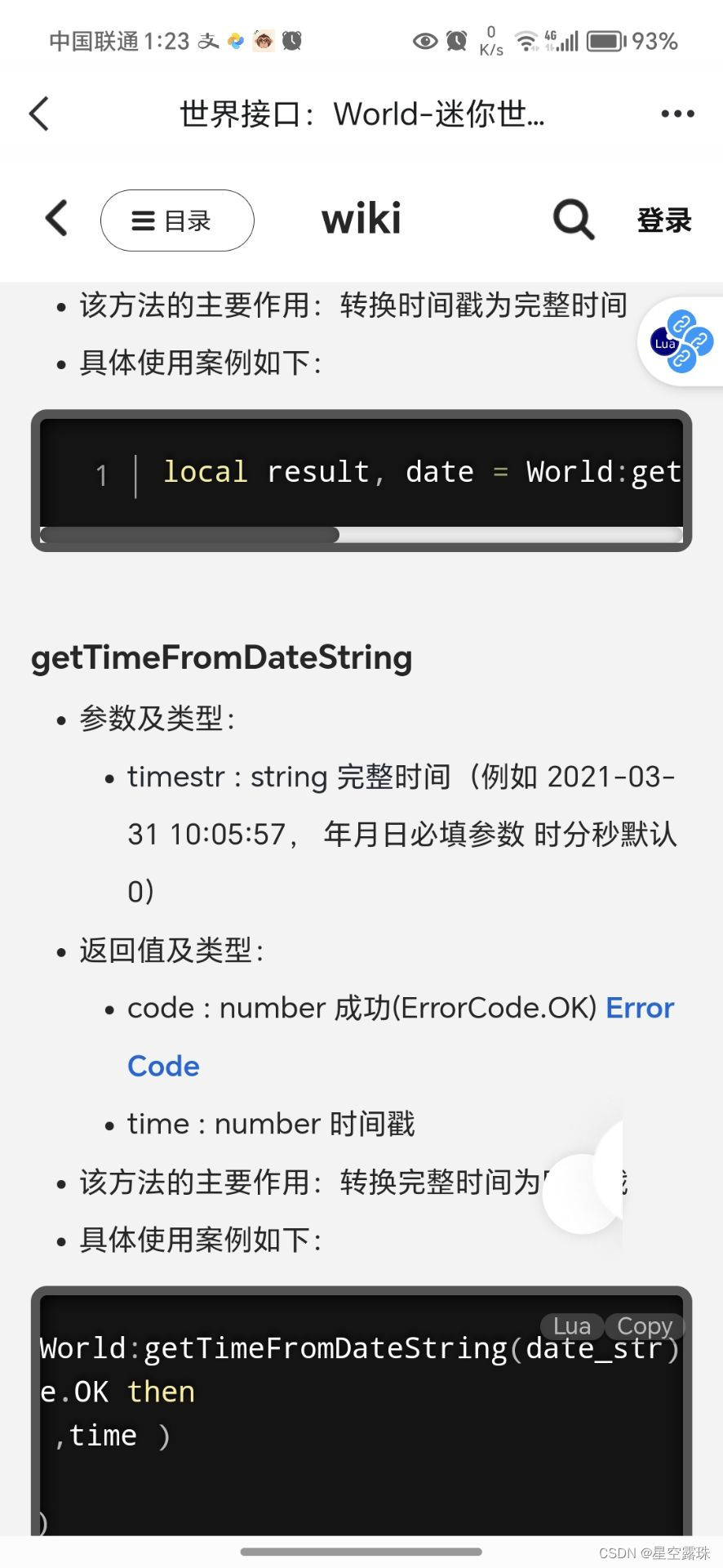
tfunction(date_str) local code ,time World:getTimeFromDateString(date_str) return time/(60*60*24) end print(t(2024-08-16)-t(2024-08-3))...
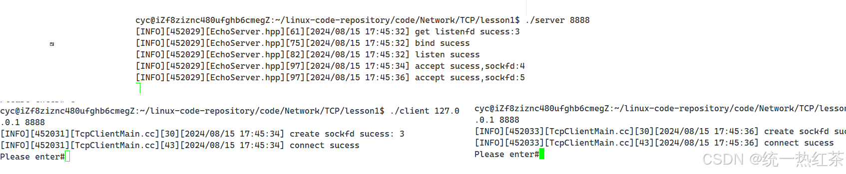
【计算机网络】TCP实战
其实有了UDP的基础,TCP不管怎么说学习起来都还是比较舒服的,至少是比直接就学习TCP的感觉好。 这篇文章最多就是介绍一下起手式,如果想带业务的话和UDP那篇是完全一样的,就不进行演示了。 总的来说还是很简单的。 目录 Echo服务端…...

使用Python制作贪吃蛇小游戏
引言 贪吃蛇游戏是一款经典的电子游戏,玩家通过控制一条不断增长的蛇在格子内移动,并吃掉随机出现的食物来获得分数。随着分数的增加,蛇的身体也会越来越长,游戏的难度也随之提升。在本文中,我们将详细介绍如何使用Py…...
线程的退出
方式1 pthread_exit Void pthread_exit (void *retval) 功能: 结束调用的线程 参数: retval //退出状态值 //需要传的是,退出状态值的地址 注意: 1.pthread_exit 本身表示结束线程 如果用在main函数中 表示结束主线程…...
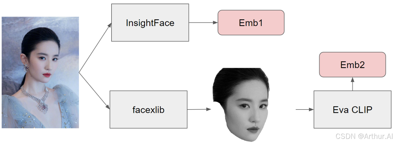
【AI 绘画】Q版人物定制生成
AI 绘画-PulID手办定制 1. 效果展示 本次测试主要结果展示如下: 牛仔风 古风 2. 基本原理 PuLID是一种类似于 ip-adapter 的恢复面部特征的方法。它同时使用 insightface 嵌入和 CLIP 嵌入,类似于 ip-adapter faceid plus 模型所做的。但是,在将图像传递给 CLIP 之前,还…...
Python爬虫——爬取某网站的视频
爬取视频 本次爬取,还是运用的是requests方法 首先进入bilibili官网中,选取你想要爬取的视频,进入视频播放页面,按F12,将网络中的名称栏向上拉找到第一个并点击,可以在标头中,找到后续我们想要…...
Android逆向题解攻防世界-easy-apk
Jeb反编译apk 题目比较简单,就是一个改了码表的base64编码。 protected void onCreate(Bundle savedInstanceState) {super.onCreate(savedInstanceState);this.setContentView(0x7F04001B); // layout:activity_main((Button)this.findViewById(0x7F0B0076)).set…...
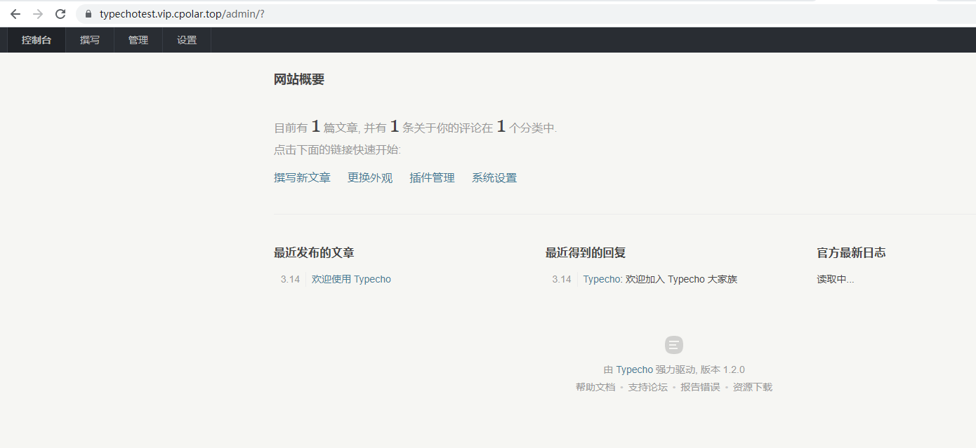
Linux系统使用Typecho搭建个人网站并一键发布公网远程管理本地站点
文章目录 前言1. 安装环境2. 下载Typecho3. 创建站点4. 访问Typecho5. 安装cpolar6. 远程访问Typecho7. 固定远程访问地址8. 配置typecho 💡 推荐 前些天发现了一个巨牛的人工智能学习网站,通俗易懂,风趣幽默,忍不住分享一下给大…...
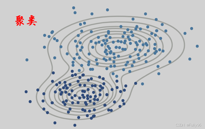
机器学习速成第三集——无监督学习之聚类(理论部分)!
目录 聚类的定义和原理 常见的聚类算法 应用场景 总结 无监督学习中聚类算法的最新进展是什么? K-Means聚类算法在处理大规模数据集时的性能优化方法有哪些? 并行计算模型: 多核处理器优化: 分层抽样: 特征缩…...

【机器学习】CNN的基本架构模块
🌈个人主页: 鑫宝Code 🔥热门专栏: 闲话杂谈| 炫酷HTML | JavaScript基础 💫个人格言: "如无必要,勿增实体" 文章目录 CNN的基本架构模块1. 引言2. 卷积层2.1 基本原理2.2 卷积层的特性2.3 卷积层的超…...
)
第八节AWK报告生成器(2)
3,1,2 printf 语法: printf("format\n", [arguments])格式说明 format是一个用来描述输出格式的字符串,format格式的指示符都以%开头,后跟一个字符,如下: format含义%c显示字符的asicll%d,%i十进制整数%e,%E科学计数法显示数值…...
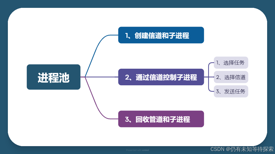
Linux 进程间通信之管道
个人主页:仍有未知等待探索-CSDN博客 专题分栏: Linux 目录 一、通信 1、进程为什么要通信? 1.数据的类型 2.父进程和子进程算通信吗? 2、进程如何通信? 3、进程通信的常见方式? 二、管道 1、概念…...
)
Windows10下V-REP教育版安装保姆级教程(附百度网盘资源与避坑点)
Windows10系统V-REP教育版完整安装指南:从下载到实战避坑在机器人仿真和自动化控制领域,V-REP(现更名为CoppeliaSim)作为一款功能强大的跨平台机器人仿真软件,已经成为众多工科学生和研究人员的首选工具。特别是其教育…...

深度解析网络设备权限管理工具:中兴光猫工厂模式与Telnet服务完整指南
深度解析网络设备权限管理工具:中兴光猫工厂模式与Telnet服务完整指南 【免费下载链接】zteOnu A tool that can open ZTE onu device factory mode 项目地址: https://gitcode.com/gh_mirrors/zt/zteOnu 在当今网络设备管理领域,获取设备完整控制…...

WMPFDebugger与微信开发者工具对比:哪个更适合你的调试需求?
WMPFDebugger与微信开发者工具对比:哪个更适合你的调试需求? 【免费下载链接】WMPFDebugger Yet another WeChat miniapp debugger on Windows 项目地址: https://gitcode.com/gh_mirrors/wm/WMPFDebugger 在Windows平台的微信小程序开发中&#…...

基于ESP8266的可穿戴Wi-Fi设备:从硬件设计到ESPHome智能控制
1. 项目概述:一个可穿戴的Wi-Fi智能小玩意最近在捣鼓智能家居和可穿戴电子,总想把手边的小物件变得更“聪明”一点。于是,我设计并制作了一个基于ESP8266的可穿戴Wi-Fi设备。它的核心思路很简单:把一块功能强大的Wi-Fi微控制器&am…...

别只盯着主控芯片!拆解STM32最小系统板:电源、时钟、复位三大支柱电路深度解析
STM32最小系统板设计进阶:电源、时钟与复位电路的工程实践 在嵌入式系统开发中,我们常常将注意力集中在主控芯片的功能实现上,却忽略了支撑系统稳定运行的三大基础电路——电源、时钟和复位。这些看似简单的电路模块,实则是整个系…...

Windows 11终极优化指南:一键清理系统,释放51%性能潜力
Windows 11终极优化指南:一键清理系统,释放51%性能潜力 【免费下载链接】Win11Debloat A simple, lightweight PowerShell script that allows you to remove pre-installed apps, disable telemetry, as well as perform various other changes to decl…...

终极解决方案:彻底解决UE4SS DLL劫持导致的系统级应用程序启动错误
终极解决方案:彻底解决UE4SS DLL劫持导致的系统级应用程序启动错误 【免费下载链接】RE-UE4SS Injectable LUA scripting system, SDK generator, live property editor and other dumping utilities for UE4/5 games 项目地址: https://gitcode.com/gh_mirrors/r…...

League Akari:英雄联盟客户端智能自动化工具包实战指南
League Akari:英雄联盟客户端智能自动化工具包实战指南 【免费下载链接】League-Toolkit An all-in-one toolkit for LeagueClient. Gathering power 🚀. 项目地址: https://gitcode.com/gh_mirrors/le/League-Toolkit League Akari是一款基于英雄…...

机器学习赋能分子模拟:从数据驱动CV到自适应采样破解采样瓶颈
1. 项目概述与核心价值在分子模拟的世界里,我们常常面临一个根本性的困境:我们想理解一个复杂系统(比如一个蛋白质如何折叠,或者一个催化剂表面如何发生反应)的微观机理,但系统的相空间维度高得吓人——动辄…...
)
TVA 登顶工业视觉的 “iPhone 时刻”(8)
重磅预告:本专栏将独家连载系列丛书《智能体视觉技术与应用》部分精华内容,该书是世界首套系统阐述“因式智能体”视觉理论与实践的专著,特邀美国 TypeOne 公司首席科学家、斯坦福大学博士 Bohan 担任技术顾问。Bohan先生师从美国三院院士、“…...