前端--CSS

文章目录
- CSS的介绍
- 引入方式
- 代码风格
- 选择器
- 复合选择器 (选学)
- 常用元素属性
- 背景属性
- 圆角矩形
- Chrome 调试工具 -- 查看 CSS 属性
- 元素的显示模式
- 盒模型
- 弹性布局
一、CSS的介绍
基础语法规范
- 选择器 + {一条/N条声明}
- 选择器决定针对谁修改 (找谁)
- 声明决定修改啥. (干啥)
- 声明的属性是键值对. 使用 ; 区分键值对, 使用 : 区分键和值.
<style>p {/* 设置字体颜色 */color: red;/* 设置字体大小 */font-size: 30px;}
</style>
<p>hello</p>- CSS 要写到 style 标签中(还有其他写法) .
- style 标签可以放到页面任意位置. 一般放到 head 标签内.
- CSS 使用 /* */ 作为注释. (使用 ctrl + / 快速切换) .
二、引入方式
1.内部样式表
2.行内样式表
<!DOCTYPE html>
<html lang="en">
<head><meta charset="UTF-8"><meta name="viewport" content="width=device-width, initial-scale=1.0"><title>Document</title><style>div {color: red;}</style>
</head>
<body><div style="color:green">想要生活过的去, 头上总得带点绿</div>
</body>
</html>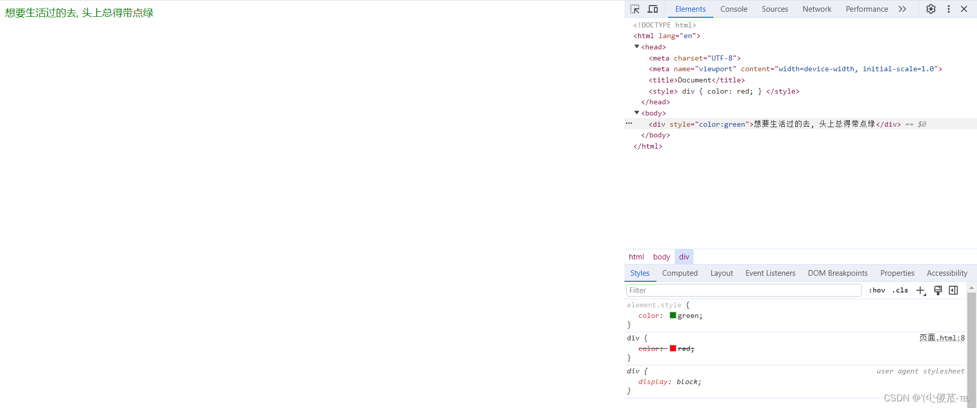
此时我们可以发现此时的红色被覆盖了。
3.外部样式
<link rel="stylesheet" href="[CSS文件路径]">
创建 demo.html
<head><meta charset="UTF-8"><meta name="viewport" content="width=device-width, initial-scale=1.0"><title>外部样式</title><link rel="stylesheet" href="style.css">
</head>
<body><div>上帝为你关上一扇门, 然后就去睡觉了</div>
</body>
创建 style.css
div {color: red;
}
注意: 不要忘记 link 标签调用 CSS, 否则不生效.
- 关于缓存:
- 这是计算机中一种常见的提升性能的技术手段.
- 网页依赖的资源(图片/CSS/JS等)通常是从服务器上获取的. 如果频繁访问该网站, 那么这些外部资源就没必要反复从服务器获取. 就可以使用缓存先存起来(就是存在本地磁盘上了). 从而提高访问效率.
- 可以通过 ctrl + F5 强制刷新页面, 强制浏览器重新获取 css 文件.
三、代码风格
1.样式格式
1.紧凑风格
p { color : red ; font-size : 30px ;}
2.展开风格(推荐)
p {color : red ;font-size : 30px ;}
注意:虽然 CSS 不区分大小写, 我们开发时统一使用小写字母 。
空格规范
- 冒号后面带空格
- 选择器和 { 之间也有一个空格.
四、选择器
1.选择器的功能
1.选择器的种类
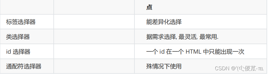
1. 基础选择器: 单个选择器构成的
- 标签选择器
- 类选择器
- id 选择器
- 通配符选择器
2. 复合选择器: 把多种基础选择器综合运用起来.
- 后代选择器
- 子选择器
- 并集选择器
- 伪类选择器
2.基础选择器
<!DOCTYPE html>
<html lang="en">
<head><meta charset="UTF-8"><meta name="viewport" content="width=device-width, initial-scale=1.0"><title>Document</title><style>p {color: red;}div {color: green;}</style>
</head>
<body><p>咬人猫</p><p>咬人猫</p><p>咬人猫</p><div>阿叶君</div><div>阿叶君</div><div>阿叶君</div>
</body>
</html>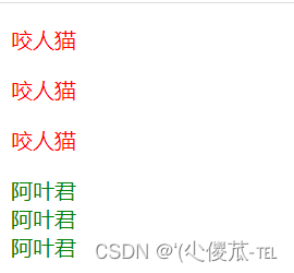
3.类选择器
- 差异化表示不同的标签
- 可以让多个标签的都使用同一个标签.
<!DOCTYPE html><html lang="en"><head><meta charset="UTF-8"><meta name="viewport" content="width=device-width, initial-scale=1.0"><title>Document</title><style>.blue {color: blue;}</style></head><body><div class="blue">咬人猫</div><div>咬人猫</div></body></html>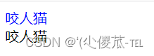
- 类名用 . 开头的
- 下方的标签使用 class 属性来调用.
- 一个类可以被多个标签使用, 一个标签也能使用多个类(多个类名要使用空格分割, 这种做法可以让代码更好复用)
- 如果是长的类名, 可以使用 - 分割.
- 不要使用纯数字, 或者中文, 以及标签名来命名类名.
<!DOCTYPE html><html lang="en"><head><meta charset="UTF-8"><meta name="viewport" content="width=device-width, initial-scale=1.0"><title>Document</title><style>.box {width: 200px;height: 150px;}.red {background-color: red;}.green {background-color: green;}</style></head><body><div class="box red"></div><div class="box green"></div><div class="box red"></div></body></html>
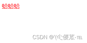
4.id 选择器
- CSS 中使用 # 开头表示 id 选择器
- id 选择器的值和 html 中某个元素的 id 值相同
- html 的元素 id 不必带 #
- id 是唯一的, 不能被多个标签使用 (是和 类选择器 最大的区别)
<!DOCTYPE html><html lang="en"><head><meta charset="UTF-8"><meta name="viewport" content="width=device-width, initial-scale=1.0"><title>Document</title><style>#ha {color: red;}</style></head><body><div id="ha">蛤蛤蛤</div></body></html>
5.通配符选择器
* {color: red;
}6.基础选择器小结
五、复合选择器 (选学)
元素1 元素2 {样式声明}
- 元素 1 和 元素 2 要使用空格分割
- 元素 1 是父级, 元素 2 是子级, 只选元素 2 , 不影响元素 1
<!DOCTYPE html><html lang="en"><head><meta charset="UTF-8"><meta name="viewport" content="width=device-width, initial-scale=1.0"><title>Document</title><style>ol li {color: red;}</style></head><body><ul><li>aaa</li><li>bbb</li><li>ccc</li></ul><ol><li>ddd</li><li>eee</li><li>fff</li></ol></body></html>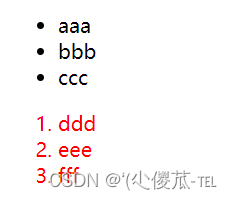
<!DOCTYPE html><html lang="en"><head><meta charset="UTF-8"><meta name="viewport" content="width=device-width, initial-scale=1.0"><title>Document</title><style>/* ul li a {color: yellow;} */ul a {color: yellow;}</style></head><body><ul><li>aaa</li><li>bbb</li><li><a href="#">ccc</a></li></ul></body></html>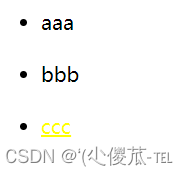
<!DOCTYPE html><html lang="en"><head><meta charset="UTF-8"><meta name="viewport" content="width=device-width, initial-scale=1.0"><title>Document</title><style>.one li a {color: green;}</style></head><body><ol class="one"><li>ddd</li><li>eee</li><li><a href="#">fff</a></li><li><a href="#">fff</a></li><li><a href="#">fff</a></li></ol></body></html>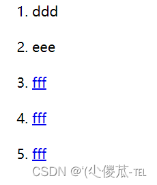
1.子选择器
元素1>元素2 { 样式声明 }
- 使用大于号分割
- 只选亲儿子, 不选孙子元素
<!DOCTYPE html><html lang="en"><head><meta charset="UTF-8"><meta name="viewport" content="width=device-width, initial-scale=1.0"><title>Document</title><style>.two a {color: red;}</style></head><body><div class="two"><a href="#">链接1</a><p><a href="#">链接2</a></p></div></body></html>
<!DOCTYPE html><html lang="en"><head><meta charset="UTF-8"><meta name="viewport" content="width=device-width, initial-scale=1.0"><title>Document</title><style>.two>a {color: red;}</style></head><body><div class="two"><a href="#">链接1</a><p><a href="#">链接2</a></p></div></body></html>
2.并集选择器
元素1, 元素2 { 样式声明 }
- 通过 逗号 分割等多个元素.
- 表示同时选中元素 1 和 元素 2
- 任何基础选择器都可以使用并集选择器.
- 并集选择器建议竖着写. 每个选择器占一行. (最后一个选择器不能加逗号)
<!DOCTYPE html><html lang="en"><head><meta charset="UTF-8"><meta name="viewport" content="width=device-width, initial-scale=1.0"><title>Document</title><style>div, h3 {color: red;}</style></head><body><div>苹果</div><h3>香蕉</h3><ul><li>鸭梨</li><li>橙子</li></ul></body></html>
<!DOCTYPE html><html lang="en"><head><meta charset="UTF-8"><meta name="viewport" content="width=device-width, initial-scale=1.0"><title>Document</title><style>div,h3,ul>li {color: red;}</style></head><body><div>苹果</div><h3>香蕉</h3><ul><li>鸭梨</li><li>橙子</li></ul></body></html>
3.伪类选择器
1) 链接伪类选择器
- a:link 选择未被访问过的链接
- a:visited 选择已经被访问过的链接
- a:hover 选择鼠标指针悬停上的链接
- a:active 选择活动链接(鼠标按下了但是未弹起)
<!DOCTYPE html><html lang="en"><head><meta charset="UTF-8"><meta name="viewport" content="width=device-width, initial-scale=1.0"><title>Document</title><style>a:link {color: black;/* 去掉 a 标签的下划线 */text-decoration: none;}a:visited {color: green;}a:hover {color: red;}a:active {color: blue;}</style></head><body><a href="#">小猫</a></body></html>- 按照 LVHA 的顺序书写, 例如把 active 拿到前面去, 就会导致 active 失效. 记忆规则 "绿化"
- 浏览器的 a 标签都有默认样式, 一般实际开发都需要单独制定样式.
- 实际开发主要给链接做一个样式, 然后给 hover 做一个样式即可. link, visited, active 用的不多.
a {color : black ;}a : hover {color : red ;}
2) :force 伪类选择器
<!DOCTYPE html><html lang="en"><head><meta charset="UTF-8"><meta name="viewport" content="width=device-width, initial-scale=1.0"><title>Document</title><style>.three>input:focus {color: red;}</style></head><body><div class="three"><input type="text"><input type="text"><input type="text"><input type="text"></div></body></html>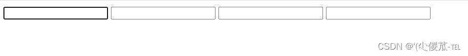
六、常用元素属性
1.字体属性
1.设置字体
body {font-family: '微软雅黑';font-family: 'Microsoft YaHei';
}- 字体名称可以用中文, 但是不建议.
- 多个字体之间使用逗号分隔. (从左到右查找字体, 如果都找不到, 会使用默认字体. )
- 如果字体名有空格, 使用引号包裹.
- 建议使用常见字体, 否则兼容性不好.
<!DOCTYPE html><html lang="en"><head><meta charset="UTF-8"><meta name="viewport" content="width=device-width, initial-scale=1.0"><title>Document</title><style>.font-family .one {font-family: 'Microsoft YaHei';}.font-family .two {font-family: '宋体';}</style></head><body><div class="font-family"><div class="one">这是微软雅黑</div><div class="two">这是宋体</div></div></body></html>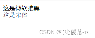
2.大小
p {font-size: 20px;
}- 不同的浏览器默认字号不一样, 最好给一个明确值. (chrome 默认是 16px)
- 可以给 body 标签使用 font-size
- 要注意单位 px 不要忘记.
- 标题标签需要单独指定大小
<!DOCTYPE html><html lang="en"><head><meta charset="UTF-8"><meta name="viewport" content="width=device-width, initial-scale=1.0"><title>Document</title><style>.font-size .one {font-size: 40px;}.font-size .two {font-size: 20px;}</style></head><body><div class="font-size"><div class="one">大大大</div><div class="two">小小小</div></div></body></html>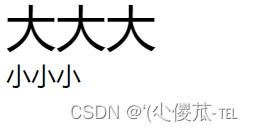
3.粗细
p {font-weight: bold;font-weight: 700;
}- 可以使用数字表示粗细.
- 700 == bold, 400 是不变粗, == normal
- 取值范围是 100 -> 900
/* 设置倾斜 */
font-style: italic;
/* 取消倾斜 */
font-style: normal;
很少把某个文字变倾斜.
但是经常要把 em / i 改成不倾斜.
<!DOCTYPE html><html lang="en"><head><meta charset="UTF-8"><meta name="viewport" content="width=device-width, initial-scale=1.0"><title>Document</title><style>.font-style em {font-style: normal;}.font-style div {font-style: italic;}</style></head><body><div class="font-style"><em>放假啦</em><div class="one">听说要加班</div></div></body></html>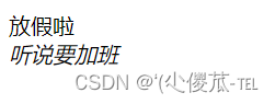
2.文本属性
1.文本颜色
认识 RGB
设置文本颜色
color : red ;color : #ff0000 ;color : rgb ( 255 , 0 , 0 );
- 预定义的颜色值(直接是单词)
- [最常用] 十六进制形式
- RGB 方式
<!DOCTYPE html><html lang="en"><head><meta charset="UTF-8"><meta name="viewport" content="width=device-width, initial-scale=1.0"><title>Document</title><style>.color {color: red;/* color: rgb(255, 0, 0); *//* color: #ff0000; */}</style></head><body><div class="color">这是一段话</div></body></html>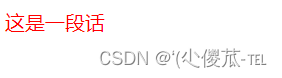
2.文本对齐
不光能控制文本对齐, 也能控制图片等元素居中或者靠右
text-align : [ 值 ];
- center: 居中对齐
- left: 左对齐
- right: 右对齐
<!DOCTYPE html>
<html lang="en"><head><meta charset="UTF-8"><meta name="viewport" content="width=device-width, initial-scale=1.0"><title>Document</title><style>.text-align .one {text-align: left;}.text-align .two {text-align: right;}.text-align .three {text-align: center;}</style>
</head><body><div class="text-align"><div class="one">左对齐</div><div class="two">右对齐</div><div class="three">居中对齐</div></div>
</body></html>

3.文本装饰
text-decoration : [ 值 ];
- underline 下划线. [常用]
- none 啥都没有. 可以给 a 标签去掉下划线.
- overline 上划线. [不常用]
- line-through 删除线 [不常用]
<!DOCTYPE html>
<html lang="en"><head><meta charset="UTF-8"><meta name="viewport" content="width=device-width, initial-scale=1.0"><title>Document</title><style>.text-decorate .one {text-decoration: none;}.text-decorate .two {text-decoration: underline;}.text-decorate .three {text-decoration: overline;}.text-decorate .four {text-decoration: line-through;}</style>
</head><body><div class="text-decorate"><div class="one">啥都没有</div><div class="two">下划线</div><div class="three">上划线</div><div class="four">删除线</div></div>
</body></html>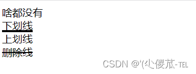
4.文本缩进
控制段落的 首行 缩进 (其他行不影响)
text-indent : [ 值 ];
- 单位可以使用 px 或者 em.
- 使用 em 作为单位更好. 1 个 em 就是当前元素的文字大小.
- 缩进可以是负的, 表示往左缩进. (会导致文字就冒出去了)
<!DOCTYPE html>
<html lang="en"><head><meta charset="UTF-8"><meta name="viewport" content="width=device-width, initial-scale=1.0"><title>Document</title><style>.text-indent .one {text-indent: 2em;}.text-indent .two {text-indent: -2em;}</style>
</head><body><div class="text-indent"><div class="one">正常缩进</div><div class="two">反向缩进</div></div>
</body></html> 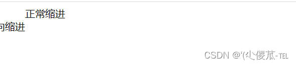
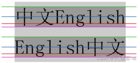
5.行高
- 顶线
- 中线
- 基线 (相当于英语四线格的倒数第二条线)
- 底线
text-indent : [ 值 ];
<!DOCTYPE html>
<html lang="en"><head><meta charset="UTF-8"><meta name="viewport" content="width=device-width, initial-scale=1.0"><title>Document</title><style>.line-height .one {line-height: 40px;font-size: 16px;}</style>
</head><body><div class="line-height"><div>上一行</div><div class="one">中间行</div><div>下一行</div></div>
</body></html>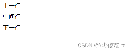
<!DOCTYPE html>
<html lang="en"><head><meta charset="UTF-8"><meta name="viewport" content="width=device-width, initial-scale=1.0"><title>Document</title><style>.line-height .two {height: 100px;line-height: 100px;}</style>
</head><body><div class="line-height"><div class="two">文本垂直居中</div></div>
</body></html>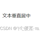
七、背景属性
1.背景颜色
background-color: [ 指定颜色 ]
<!DOCTYPE html>
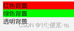
<html lang="en"><head><meta charset="UTF-8"><meta name="viewport" content="width=device-width, initial-scale=1.0"><title>Document</title><style>body {background-color: #f3f3f3;}.bgc .one {background-color: red;}.bgc .two {background-color: #0f0;}.bgc .three {/* 背景透明 */background-color: transparent;}</style>
</head><body><div class="bgc"><div class="one">红色背景</div><div class="two">绿色背景</div><div class="three">透明背景</div></div>
</body></html>
2.背景图片
background-image: url(...);
- 1. url 不要遗漏.
- 2. url 可以是绝对路径, 也可以是相对路径
- 3. url 上可以加引号, 也可以不加.
<!DOCTYPE html>
<html lang="en"><head><meta charset="UTF-8"><meta name="viewport" content="width=device-width, initial-scale=1.0"><title>Document</title><style>.bgi .one {background-image: url(前端.jpg);height: 300px;}</style>
</head><body><div class="bgi"><div class="one">背景图片</div></div>
</body></html>
3.背景平铺
background-repeat: [平铺方式]
- repeat: 平铺
- no-repeat: 不平铺
- repeat-x: 水平平铺
- repeat-y: 垂直平铺
<!DOCTYPE html>
<html lang="en"><head><meta charset="UTF-8"><meta name="viewport" content="width=device-width, initial-scale=1.0"><title>Document</title><style>.bgr .one {background-image: url(前端.jpg);height: 300px;background-repeat: no-repeat;}.bgr .two {background-image: url(前端.jpg);height: 300px;background-repeat: repeat-x;}.bgr .three {background-image: url(前端.jpg);height: 300px;background-repeat: repeat-y;}</style>
</head><body><div class="bgr"><div class="one">不平铺</div><div class="two">水平平铺</div><div class="three">垂直平铺</div></div>
</body></html>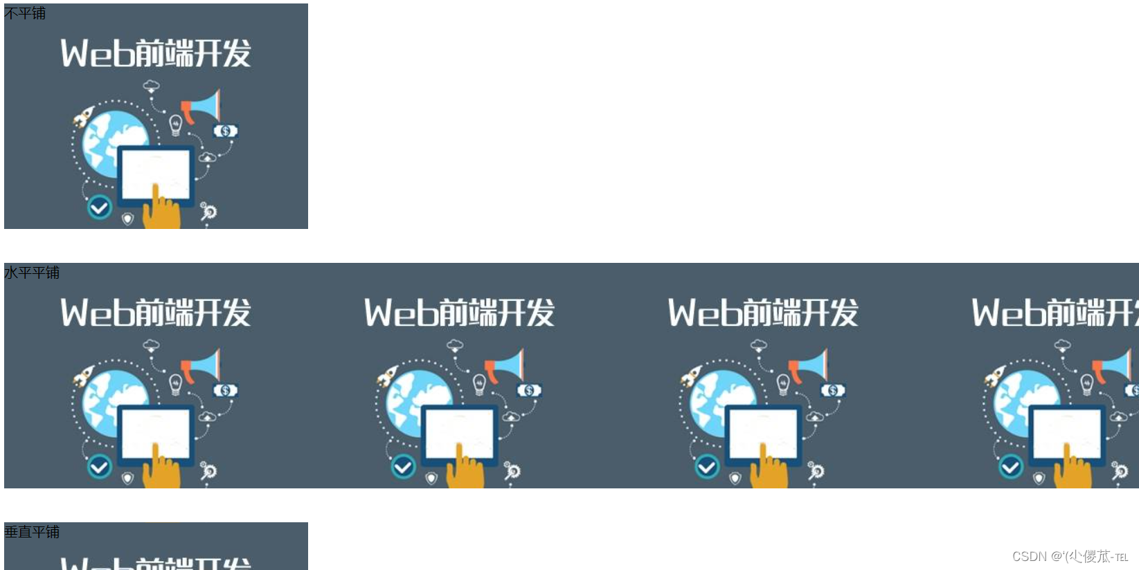
4.背景位置
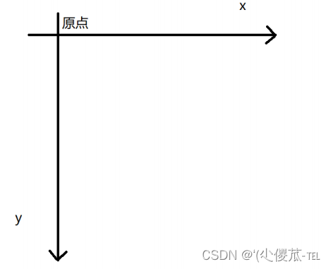
background-position: x y;
修改图片的位置.
- 1. 方位名词: (top, left, right, bottom)
- 2. 精确单位: 坐标或者百分比(以左上角为原点)
- 3. 混合单位: 同时包含方位名词和精确单位
<!DOCTYPE html>
<html lang="en"><head><meta charset="UTF-8"><meta name="viewport" content="width=device-width, initial-scale=1.0"><title>Document</title><style>.bgp .one {background-image: url(前端.jpg);height: 500px;background-repeat: no-repeat;background-color: purple;background-position: center;}</style>
</head><body><div class="bgp"><div class="one">背景居中</div></div>
</body></html>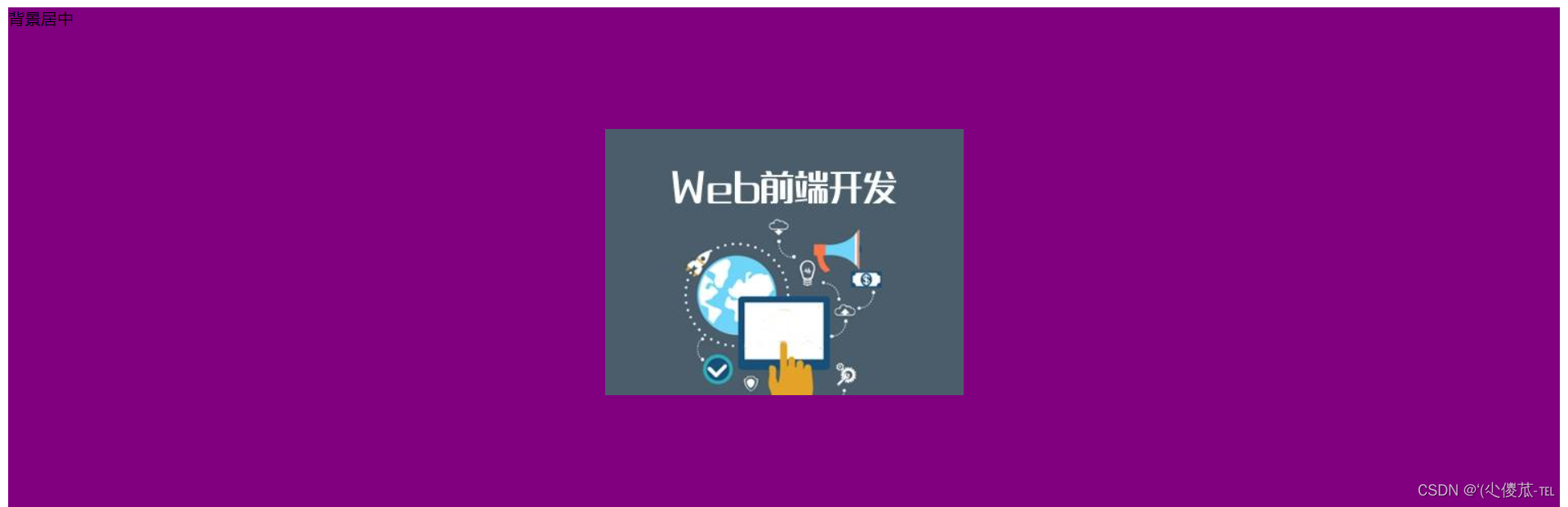
- 如果参数的两个值都是方位名词, 则前后顺序无关. (top left 和 left top 等效)
- 如果只指定了一个方位名词, 则第二个默认居中. (left 则意味着水平居中, top 意味着垂直居中. )
- 如果参数是精确值, 则的的第一个肯定是 x , 第二个肯定是 y. (100 200 意味着 x 为 100, y 为 200)
- 如果参数是精确值, 且只给了一个数值, 则该数值一定是 x 坐标, 另一个默认垂直居中.
- 如果参数是混合单位, 则第一个值一定为 x, 第二个值为 y 坐标. (100 center 表示横坐标为 100, 垂
- 直居中)
5.背景尺寸
background-size : length | percentage | cover | contain ;
- 可以填具体的数值: 如 40px 60px 表示宽度为 40px, 高度为 60px
- 也可以填百分比: 按照父元素的尺寸设置.
- cover: 把背景图像扩展至足够大,以使背景图像完全覆盖背景区域。背景图像的某些部分也许无
- 法显示在背景定位区域中。
- 把图像图像扩展至最大尺寸,以使其宽度和高度完全适应内容区域.
<!DOCTYPE html>
<html lang="en"><head><meta charset="UTF-8"><meta name="viewport" content="width=device-width, initial-scale=1.0"><title>Document</title><style>.bgs .one {width: 500px;height: 300px;background-image: url(前端.jpg);background-repeat: no-repeat;background-position: center;background-size: contain;}</style>
</head><body><div class="bgs"><div class="one">背景尺寸</div></div>
</body></html>
cover:

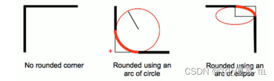
八、圆角矩形
1.基本用法
border-radius: length;
<!DOCTYPE html>
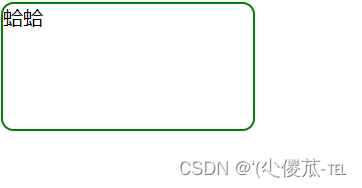
<html lang="en"><head><meta charset="UTF-8"><meta name="viewport" content="width=device-width, initial-scale=1.0"><title>Document</title><style>div {width: 200px;height: 100px;border: 2px solid green;border-radius: 10px;}</style>
</head><body><div>蛤蛤</div>
</body></html>
2.生成圆形
<!DOCTYPE html>
<html lang="en"><head><meta charset="UTF-8"><meta name="viewport" content="width=device-width, initial-scale=1.0"><title>Document</title><style>div {width: 200px;height: 200px;border: 2px solid green;border-radius: 100px;/* 或者用 50% 表示宽度的一半 */border-radius: 50%;}</style>
</head><body><div>蛤蛤</div>
</body></html>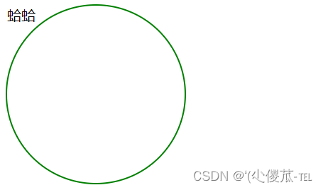
3.生成圆角矩形
<!DOCTYPE html>
<html lang="en"><head><meta charset="UTF-8"><meta name="viewport" content="width=device-width, initial-scale=1.0"><title>Document</title><style>div {width: 200px;height: 100px;border: 2px solid green;border-radius: 50px;}</style>
</head><body><div>蛤蛤</div>
</body></html>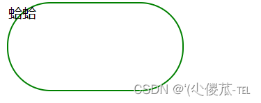
4.展开写法
border-radius : 2em ;
border-top-left-radius : 2em ;border-top-right-radius : 2em ;border-bottom-right-radius : 2em ;border-bottom-left-radius : 2em ;
border-radius: 10px 20px 30px 40px;
border-top-left-radius : 10px ;border-top-right-radius : 20px ;border-bottom-right-radius : 30px ;border-bottom-left-radius : 40px ;
九、Chrome 调试工具 -- 查看 CSS 属性
1.打开浏览器
- 直接按 F12 键
- 鼠标右键页面 => 检查元素
2.标签页含义
- elements 查看标签结构
- console 查看控制台
- source 查看源码+断点调试
- network 查看前后端交互过程
- application 查看浏览器提供的一些扩展功能(本地存储等)
- Performance, Memory, Security, Lighthouse
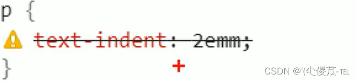
3.elements 标签页使用
- ctrl + 滚轮进行缩放, ctrl + 0 恢复原始大小.
- 使用 左上角 箭头选中元素
- 右侧可以查看当前元素的属性, 包括引入的类.
- 右侧可以修改选中元素的 css 属性. 例如颜色, 可以点击颜色图标, 弹出颜色选择器, 修改颜色. 例如
- 字体大小, 可以使用方向键来微调数值.
- 此处的修改不会影响代码, 刷新就还原了~
- 如果 CSS 样式写错了, 也会在这里有提示. (黄色感叹号)
十、元素的显示模式
在 CSS 中, HTML 的标签的显示模式有很多.此处只重点介绍两个:
- 块级元素
- 行内元素
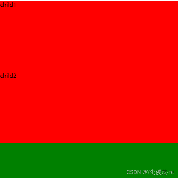
1.块级元素
- h1 - h6
- p
- div
- ul
- ol
- li
- ....
- 独占一行
- 高度, 宽度, 内外边距, 行高都可以控制.
- 宽度默认是父级元素宽度的 100% (和父元素一样宽)
- 是一个容器(盒子), 里面可以放行内和块级元素.
<!DOCTYPE html>
<html lang="en"><head><meta charset="UTF-8"><meta name="viewport" content="width=device-width, initial-scale=1.0"><title>Document</title><style>.demo1 .parent {width: 500px;height: 500px;background-color: green;}.demo1 .child {/* 不写 width, 默认和父元素一样宽 *//* 不写 height, 默认为 0 (看不到了) */height: 200px;background-color: red;}</style>
</head><body><div class="demo1"><div class="parent"><div class="child">child1</div><div class="child">child2</div></div></div>
</body></html>
注意:
- 文字类的元素内不能使用块级元素
- p 标签主要用于存放文字, 内部不能放块级元素, 尤其是 div
<body><p><div> 蛤蛤 </div></p></body>
2.行内元素/内联元素
- a
- strong
- b
- em
- i
- del
- s
- ins
- u
- span
- 不独占一行, 一行可以显示多个
- 设置高度, 宽度, 行高无效
- 左右外边距有效(上下无效). 内边距有效.
- 默认宽度就是本身的内容
- 行内元素只能容纳文本和其他行内元素, 不能放块级元素
<!DOCTYPE html>
<html lang="en"><head><meta charset="UTF-8"><meta name="viewport" content="width=device-width, initial-scale=1.0"><title>Document</title><style>.demo2 span {width: 200px;height: 200px;background-color: red;}</style>
</head><body><div class="demo2"><span>child1</span><span>child2</span><span>child3</span></div>
</body></html>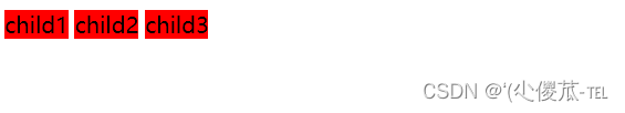
注意:
- a 标签中不能再放 a 标签 (虽然 chrome 不报错, 但是最好不要这么做).
- a 标签里可以放块级元素, 但是更建议先把 a 转换成块级元素.
3.行内元素和块级元素的区别
- 块级元素独占一行, 行内元素不独占一行
- 块级元素可以设置宽高, 行内元素不能设置宽高.
- 块级元素四个方向都能设置内外边距, 行内元素垂直方向不能设置.
4.改变显示模式
- 可以把 div 等变成行内元素, 也可以把 a , span 等变成块级元素.
- display: block 改成块级元素 [常用]
- display: inline 改成行内元素 [很少用]
- display: inline-block 改成行内块元素
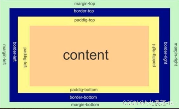
十一、盒模型
- 边框 border
- 内容 content
- 内边距 padding
- 外边距 margin
 <style>
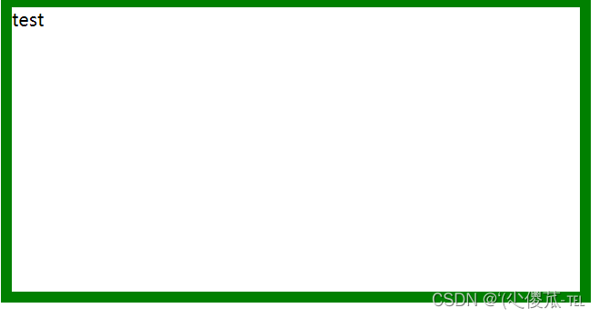
1.边框
基础属性
- 粗细: border-width
- 样式: border-style, 默认没边框. solid 实线边框 dashed 虚线边框 dotted 点线边框
- 颜色: border-color
<!DOCTYPE html>
<html lang="en"><head><meta charset="UTF-8"><meta name="viewport" content="width=device-width, initial-scale=1.0"><title>Document</title><style>div {width: 500px;height: 250px;border-width: 10px;border-style: solid;border-color: green;}</style>
</head><body><div>test</div>
</body></html>
border: 1px solid red;
border-top/bottom/left/right
border: 1px solid blue;border-top: red;
2.边框会撑大盒子
* {box-sizing : border-box ;}
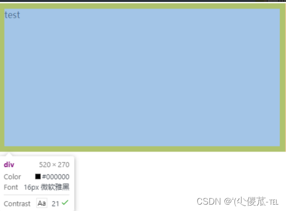
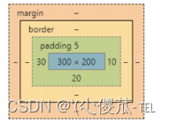
3.内边距
基础写法
- padding-top
- padding-bottom
- padding-left
- padding-right
加上 padding 之后
此时可以看到带有了一个绿色的内边距.
- 整个盒子的大小从原来的 300 * 200 => 310 * 205. 说明内边距也会影响到盒子大小(撑大盒 子).
- 使用 box-sizing: border-box 属性也可以使内边距不再撑大盒子. (和上面 border 类似)
- padding: 5px; 表示四个方向都是 5px
- padding: 5px 10px; 表示上下内边距 5px, 左右内边距为 10px
- padding: 5px 10px 20px; 表示上边距 5px, 左右内边距为 10px, 下内边距为 20px
- padding: 5px 10px 20px 30px; 表示 上5px, 右10px, 下20px, 左30px (顺时针)
4.外边距
基础写法
- margin-top
- margin-bottom
- margin-left
- margin-right
<!DOCTYPE html>
<html lang="en"><head><meta charset="UTF-8"><meta name="viewport" content="width=device-width, initial-scale=1.0"><title>Document</title><style>div {background-color: red;width: 200px;height: 200px;}.first {margin-bottom: 20px;}</style>
</head><body><div class="first">蛤蛤</div><div>呵呵</div>
</body></html>

复合写法
- margin: 10px; // 四个方向都设置
- margin: 10px 20px; // 上下为 10, 左右 20
- margin: 10px 20px 30px; // 上 10, 左右 20, 下 30
- margin: 10px 20px 30px 40px; // 上 10, 右 20, 下 30, 左 40
块级元素水平居中
- 前提:
- 指定宽度(如果不指定宽度, 默认和父元素一致)
- 把水平 margin 设为 auto
- margin-left: auto; margin-right: auto;
- margin: auto;
- margin: 0 auto;
<!DOCTYPE html>
<html lang="en"><head><meta charset="UTF-8"><meta name="viewport" content="width=device-width, initial-scale=1.0"><title>Document</title><style>div {width: 500px;height: 200px;background-color: red;margin: 0 auto;}</style>
</head><body><div>蛤蛤</div>
</body></html>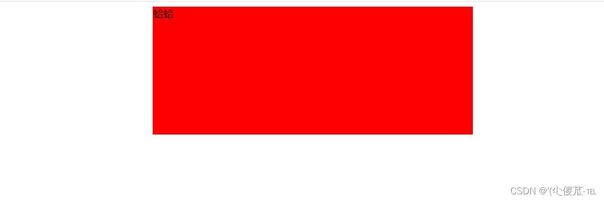
- 这个水平居中的方式和 text-align 不一样.
- margin: auto 是给块级元素用得到.
- text-align: center 是让行内元素或者行内块元素居中的.
- 另外, 对于垂直居中, 不能使用 "上下 margin 为 auto " 的方式.
去除浏览器默认样式
* {marign : 0 ;padding : 0 ;}
十一、弹性布局
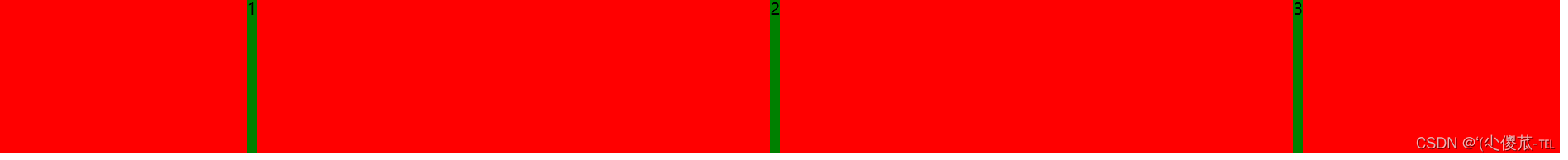
<!DOCTYPE html>
<html lang="en"><head><meta charset="UTF-8"><meta name="viewport" content="width=device-width, initial-scale=1.0"><title>Document</title><style>div {width: 100%;height: 150px;background-color: red;}div>span {background-color: green;idth: 100px;}</style>
</head><body><div><span>1</span><span>2</span><span>3</span></div>
</body></html>

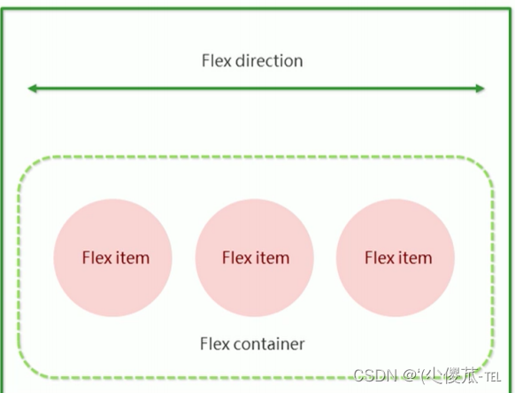
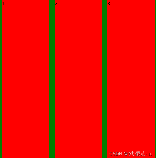
1.flex 布局基本概念
flex 是 flexible box 的缩写. 意思为 "弹性盒子".
基础概念:
- 被设置为 display:flex 属性的元素, 称为 flex container
- 它的所有子元素立刻称为了该容器的成员, 称为 flex item
- flex item 可以纵向排列, 也可以横向排列, 称为 flex direction(主轴)
常用属性
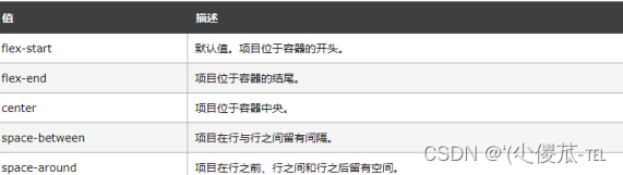
justify-content
<!DOCTYPE html>
<html lang="en"><head><meta charset="UTF-8"><meta name="viewport" content="width=device-width, initial-scale=1.0"><title>Document</title><style>div {width: 100%;height: 150px;background-color: red;display: flex;}div span {width: 100px;height: 100px;background-color: green;}</style>
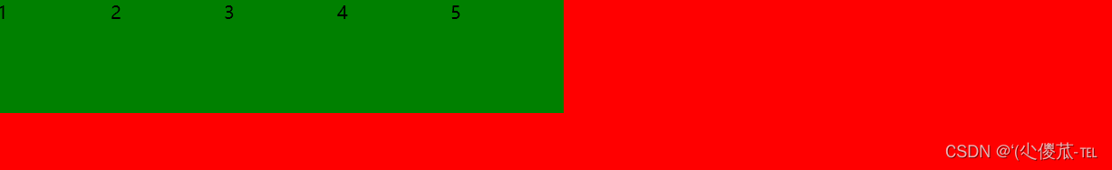
</head><body><div><span>1</span><span>2</span><span>3</span><span>4</span><span>5</span></div>
</body></html>未指定 justify-content 时, 默认按照从左到右的方向布局.
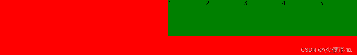
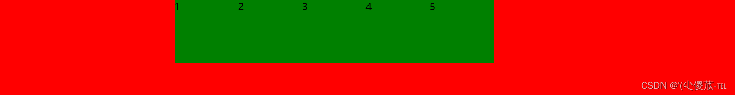
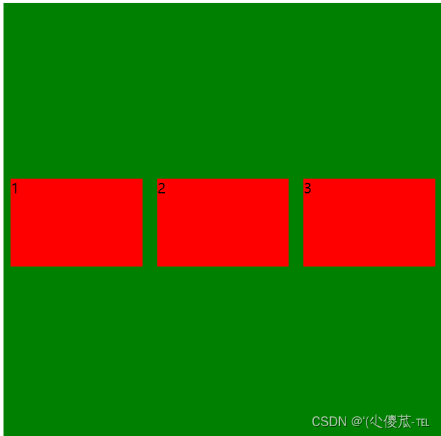
设置 justify-content: space-around;平分了剩余空间.


align-items
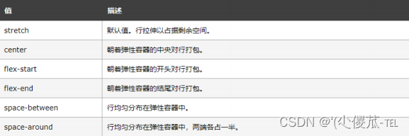
- 理解 stretch(拉伸): 这个是 align-content 的默认值. 意思是如果子元素没有被显式指定高度, 那么就会填充满父元素的高度.
<!DOCTYPE html>
<html lang="en"><head><meta charset="UTF-8"><meta name="viewport" content="width=device-width, initial-scale=1.0"><title>Document</title><style>div {width: 500px;height: 500px;background-color: green;display: flex;justify-content: space-around;}div span {width: 150px;background-color: red;}</style>
</head><body><div><span>1</span><span>2</span><span>3</span></div>
</body></html>
<!DOCTYPE html>
<html lang="en"><head><meta charset="UTF-8"><meta name="viewport" content="width=device-width, initial-scale=1.0"><title>Document</title><style>div {width: 500px;height: 500px;background-color: green;display: flex;justify-content: space-around;align-items: center;}div span {width: 150px;height: 100px;background-color: red;}</style>
</head><body><div><span>1</span><span>2</span><span>3</span></div>
</body></html>
- align-items 只能针对单行元素来实现. 如果有多行元素, 就需要使用 item-contents
相关文章:
前端--CSS
文章目录 CSS的介绍 引入方式 代码风格 选择器 复合选择器 (选学) 常用元素属性 背景属性 圆角矩形 Chrome 调试工具 -- 查看 CSS 属性 元素的显示模式 盒模型 弹性布局 一、CSS的介绍 层叠样式表 (Cascading Style Sheets). CSS 能够对网页中元素位置的排版进行像素级精…...
实操指南|如何用 OpenTiny Vue 组件库从 Vue 2 升级到 Vue 3
前言 根据 Vue 官网文档的说明,Vue2 的终止支持时间是 2023 年 12 月 31 日,这意味着从明年开始: Vue2 将不再更新和升级新版本,不再增加新特性,不再修复缺陷 虽然 Vue3 正式版本已经发布快3年了,但据我了…...

系统架构设计:15 论软件架构的生命周期
目录 一 软件架构的生命周期 1 需求分析阶段 2 设计阶段 3 实现阶段 4 构件组装阶段...

金山wps golang面试题总结
简单自我介绍如果多个协程并发写map 会导致什么问题如何解决(sync.map,互斥锁,信号量)chan 什么时候会发生阻塞如果 chan 缓冲区满了是阻塞还是丢弃还是panicchan 什么时候会 panic描述一下 goroutine 的调度机制goroutine 什么时…...

计算机视觉实战--直方图均衡化和自适应直方图均衡化
计算机视觉 文章目录 计算机视觉前言一、直方图均衡化1.得到灰度图2. 直方图统计3. 绘制直方图4. 直方图均衡化 二、自适应直方图均衡化1.自适应直方图均衡化(AHE)2.限制对比度自适应直方图均衡化(CRHE)3.读取图片4.自适应直方图均…...

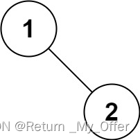
501. 二叉搜索树中的众数
501. 二叉搜索树中的众数 # Definition for a binary tree node. # class TreeNode: # def __init__(self, val0, leftNone, rightNone): # self.val val # self.left left # self.right right class Solution:def findMode(self, root: Option…...

【Linux】常用命令
目录 文件解压缩服务器文件互传scprsync 进程资源网络curl发送简单get请求发送 POST 请求发送 JSON 数据保存响应到文件 文件 ls,打印当前目录下所有文件和目录; ls -l,打印每个文件的基本信息 pwd,查看当前目录的路径 查看文件 catless:可以左右滚动阅读more :翻…...
机器人制作开源方案 | 齿轮传动轴偏心轮摇杆简易四足
1. 功能描述 齿轮传动轴偏心轮摇杆简易四足机器人是一种基于齿轮传动和偏心轮摇杆原理的简易四足机器人。它的设计原理通常如下: ① 齿轮传动:通过不同大小的齿轮传动,实现机器人四条腿的运动。通常采用轮式齿轮传动或者行星齿轮传动…...
Windows中将tomcat以服务的形式安装,然后在服务进行启动管理
Windows中将tomcat以服务的形式安装,然后在服务进行启动管理 第一步: 在已经安装好的tomcat的bin目录下: 输入cmd,进入命令窗口 安装服务: 输入如下命令,最后是你的服务名,避免中文和特殊字符 service.…...
解决ERROR: No query specified的错误以及\G 和 \g 的区别
文章目录 1. 复现错误2. 分析错误3. 解决问题4. \G和\g的区别 1. 复现错误 今天使用powershell连接数据库后,执行如下SQL语句: mysql> select * from student where id 39 \G;虽然成功查询除了数据,但报出如下错误的信息: my…...

mysql中SUBSTRING_INDEX函数用法详解
MySQL中的SUBSTRING_INDEX函数用于从字符串中提取子字符串,其用法如下: SUBSTRING_INDEX(str, delim, count)参数说明: str:要提取子字符串的原始字符串。delim:分隔符,用于确定子字符串的位置。count&am…...

AndroidStudio报错:android.support.v4.app.Fragment
解决办法一 android.support.v4.app.Fragment替换为android.app.Fragment 解决办法二 有时太多,先类型过去再说。 找到gradle.properties,修改: android.useAndroidXfalse android.enableJetifierfalse...

今年这情况,还能不能选计算机了?
在知乎上看到一个有意思的问题,是劝退计算机的。 主要观点: 计算机从业人员众多加班,甚至需要99635岁危机秃头 综上所属,计算机不仅卷,而且还是一个高危职业呀,可别来干了。 关于卷 近两年确实能明显感觉…...

Elastic Cloud v.s. Zilliz Cloud:性能大比拼
Elastic Cloud v.s. Zilliz Cloud:性能大比拼 Zilliz 经常会收到来自开发者和架构师的提问:“Zilliz Cloud 和 Elastic Cloud 比起来,谁进行向量处理能力比较强?” 诸如此类的问题很多,究其根本,大都是开发者/架构师在为语义相似性检索系统进行数据库选型时缺少决策依据有…...
设计模式03———包装器模式 c#
首先我们打开一个项目 在这个初始界面我们需要做一些准备工作 创建基础通用包 创建一个Plane 重置后 缩放100倍 加一个颜色 (个人喜好)调节渐变色 可更改同种颜色的色调 (个人喜好) 调节天空盒 准备工作做完后 接下我们做【…...

《动手学深度学习 Pytorch版》 8.3 语言模型和数据集
8.3.1 学习语言模型 依靠在 8.1 节中对序列模型的分析,可以在单词级别对文本数据进行词元化。基本概率规则如下: P ( x 1 , x 2 , … , x T ) ∏ t 1 T P ( x t ∣ x 1 , … , x t − 1 ) P(x_1,x_2,\dots,x_T)\prod^T_{t1}P(x_t|x_1,\dots,x_{t-1}) …...
Linux桌面环境(桌面系统)
早期的 Linux 系统都是不带界面的,只能通过命令来管理,比如运行程序、编辑文档、删除文件等。所以,要想熟练使用 Linux,就必须记忆很多命令。 后来随着 Windows 的普及,计算机界面变得越来越漂亮,点点鼠标…...
【LeetCode刷题(数据结构)】:二叉树的前序遍历
给你二叉树的根节点root 返回它节点值的前序遍历 示例1: 输入:root [1,null,2,3] 输出:[1,2,3] 示例 2: 输入:root [] 输出:[] 示例 3: 输入:root [1] 输出:[1] 示例…...

自定义Flink kafka连接器Decoding和Serialization格式
前言 使用kafka连接器时: 1.作为source端时,接受的消息报文的格式并不是kafka支持的格式,这时则需要自定义Decoding格式。 2.作为sink端时,期望发送的消息报文格式并非kafka支持的格式,这时则需要自定义Serializati…...

推荐八个大学搜题软件和学习工具哪个好用且免费,一起对比看看
以下分享的软件提供了各种实用的功能,如数学公式计算、语文阅读辅助等,让大学生们在学习过程中更加高效和便利。 1.九超查题 这是一个老公众号了,我身边的很多朋友都在用,支持超新星、学习强国、知到、智慧树和各类专业网课题目…...

VHD2VL:破解硬件描述语言转换难题的开源解决方案
VHD2VL:破解硬件描述语言转换难题的开源解决方案 【免费下载链接】vhd2vl 项目地址: https://gitcode.com/gh_mirrors/vh/vhd2vl 在FPGA和ASIC设计领域,技术团队常常面临VHDL与Verilog两种硬件描述语言之间的转换挑战。当项目需要跨语言协作、工…...

Windows上运行Swift代码的三种实战路径
1. 为什么Windows开发者需要Swift? Swift作为苹果生态的主力编程语言,近年来在服务端开发、机器学习等领域的应用越来越广泛。但很多刚接触Swift的Windows开发者会发现:官方文档里压根没提Windows支持!这其实是因为Swift最初就是…...
)
别再拷贝exe到NXBIN了!用批处理文件搞定NX二次开发外部exe的环境变量(附VS2015/NX12配置)
告别手动拷贝:用批处理智能管理NX二次开发环境变量 每次修改完NX二次开发的外部exe程序,都要手动拷贝到NXBIN目录?这种重复劳动不仅低效,还容易导致版本混乱。其实只需一个简单的批处理脚本,就能彻底解决环境变量配置问…...

3步强力清理:Pearcleaner让你轻松解决Mac应用残留文件问题
3步强力清理:Pearcleaner让你轻松解决Mac应用残留文件问题 【免费下载链接】Pearcleaner A free, source-available and fair-code licensed mac app cleaner 项目地址: https://gitcode.com/gh_mirrors/pe/Pearcleaner 你是否曾删除Mac应用后,发…...

FastAPI+AI应用脚手架:模块化架构与生产级实践指南
1. 项目概述:一个为AI应用量身定制的FastAPI脚手架如果你正在寻找一个能快速启动、结构清晰且功能强大的AI应用后端框架,那么fastapi-genai-boilerplate这个项目绝对值得你花时间研究。它不是一个简单的“Hello World”示例,而是一个面向生产…...

基于Python/Flask的洗车店业务管理系统设计与实现
1. 项目概述:从“洗车”到“洗车服务”的数字化重构最近在GitHub上看到一个挺有意思的项目,叫“washing-cars”。光看名字,你可能会觉得这只是一个关于洗车的小工具或者记录表。但当我深入进去,才发现它远不止于此。这个项目本质上…...

Minecraft物品堆叠架构深度解析:突破64限制的技术实现方案
Minecraft物品堆叠架构深度解析:突破64限制的技术实现方案 【免费下载链接】UltimateStack A Minecraft mod,can modify ur item MaxStackSize (more then 64) 项目地址: https://gitcode.com/gh_mirrors/ul/UltimateStack 在Minecraft模组开发领域…...

低成本接入GPT-4级能力:从开源模型自建到安全API实践
1. 项目概述与核心价值最近在GitHub上看到一个挺有意思的项目,叫a37836323/-chatgpt4.0-api-key。光看这个标题,很多朋友可能会立刻联想到“免费API密钥”、“共享资源”之类的。确实,在AI工具日益普及的今天,如何高效、低成本地使…...

基于RK3568核心板的智能家居控制器:从硬件选型到软件架构实战
1. 项目概述:当智能家居控制器遇上国产高性能核心板最近在做一个智能家居中控的案子,客户对性能、成本和本地化能力要求都比较高。选型阶段,我们团队把市面上主流的几款ARM核心板都摸了一遍,从传统的树莓派CM4到全志、瑞芯微的方案…...

AI 术语通俗词典:优化器
优化器是机器学习、深度学习、神经网络和人工智能中非常核心的一个术语。它用来描述:模型在得到梯度之后,如何更新权重和偏置,使损失函数逐渐变小。 换句话说,优化器是在回答:模型已经知道自己错在哪里之后,…...