CSS3 用户界面、图片、按钮
一、CSS3用户界面:
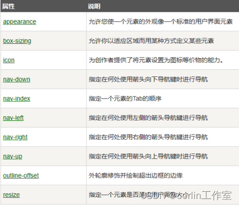
在CSS3中,增加了一些新的用户界面特性来调整元素尺寸、框尺寸和外边框。CSS3用户界面属性:resize、box-sizing、outline-offset。
1、resize:
resize属性指定一个元素是否应该由用户去调整大小。
<style>
div
{
border:2px solid;
padding:10px 40px;
width:300px;
resize:both;
overflow:auto;
}
</style>
2、box-sizing:
box-sizing属性允许以确切的方式定义适应某个区域的具体内容。
<style>
#example1 {
box-sizing: content-box;
width: 300px;
height: 100px;
padding: 30px;
border: 10px solid blue;
}
#example2 {
box-sizing: border-box;
width: 300px;
height: 100px;
padding: 30px;
border: 10px solid blue;
}
</style>
3、outline-offset:
outline-offset属性对轮廓进行偏移,并在超出边框边缘的位置绘制轮廓。轮廓与边框有两点不同:轮廓不占用空间;轮廓可能是非矩形。
<style>
div
{
margin:20px;
width:150px;
padding:10px;
height:70px;
border:2px solid black;
outline:2px solid red;
outline-offset:15px;
}
</style>
CSS3用户界面特性:
二、CSS3图片:
1、圆角图片:
<style>
Img2 {
border-radius: 8px;
}
Img1 {
border-radius: 50%;
}
</style>
2、缩略图:
<style>
a {
display: inline-block;
border: 1px solid blue;
border-radius: 4px;
padding: 5px;
transition: 0.3s;
}
a:hover {
box-shadow: 0 0 2px 1px rgba(0, 140, 186, 0.5);
}
</style>
3、响应式图片:
响应式图片会自动适配各种尺寸的屏幕。图片放大的尺寸不大于其原始的最大值。
<style>
img {
max-width: 100%;
height: auto;
}
</style>
4、图片文本:
<style>
.container {
position: relative;
}
.center {
position: absolute;
left: 0;
top: 50%;
width: 100%;
text-align: center;
font-size: 18px;
margin-top:-9px;
}
img {
width: 100%;
height: auto;
opacity: 0.3;
}
</style>
5、卡片式图片:
<style>
body {margin:25px;}
div.polaroid {
width: 80%;
background-color: white;
box-shadow: 0 4px 8px 0 rgba(0, 0, 0, 0.2), 0 6px 20px 0 rgba(0, 0, 0, 0.19);
margin-bottom: 25px;
}
div.container {
text-align: center;
padding: 10px 20px;
}
</style>
6、图片滤镜:
Css filter属性为元素添加可是效果(如模糊、饱和度)
<style>
img {
width: 33%;
height: auto;
float: left;
max-width: 235px;
}
.blur {-webkit-filter: blur(4px);filter: blur(4px);}
.brightness {-webkit-filter: brightness(250%);filter: brightness(250%);}
.contrast {-webkit-filter: contrast(180%);filter: contrast(180%);}
.grayscale {-webkit-filter: grayscale(100%);filter: grayscale(100%);}
.huerotate {-webkit-filter: hue-rotate(180deg);filter: hue-rotate(180deg);}
.invert {-webkit-filter: invert(100%);filter: invert(100%);}
.opacity {-webkit-filter: opacity(50%);filter: opacity(50%);}
.saturate {-webkit-filter: saturate(7); filter: saturate(7);}
.sepia {-webkit-filter: sepia(100%);filter: sepia(100%);}
.shadow {-webkit-filter: drop-shadow(8px 8px 10px green);filter: drop-shadow(8px 8px 10px green);}
</style>
7、响应式图片相册:
<style>
div.img {
border: 1px solid #ccc;
}
div.img:hover {
border: 1px solid #777;
}
div.img img {
width: 100%;
height: auto;
}
div.desc {
padding: 15px;
text-align: center;
}
* {
box-sizing: border-box;
}
.responsive {
padding: 0 6px;
float: left;
width: 24.99999%;
}
@media only screen and (max-width: 700px){
.responsive {
width: 49.99999%;
margin: 6px 0;
}
}
@media only screen and (max-width: 500px){
.responsive {
width: 100%;
}
}
.clearfix:after {
content: "";
display: table;
clear: both;
}
</style>
8、图片模态:
<style>
#myImg {
border-radius: 5px;
cursor: pointer;
transition: 0.3s;
}
#myImg:hover {opacity: 0.7;}
/* The Modal (background) */
.modal {
display: none; /* Hidden by default */
position: fixed; /* Stay in place */
z-index: 1; /* Sit on top */
padding-top: 100px; /* Location of the box */
left: 0;
top: 0;
width: 100%; /* Full width */
height: 100%; /* Full height */
overflow: auto; /* Enable scroll if needed */
background-color: rgb(0,0,0); /* Fallback color */
background-color: rgba(0,0,0,0.9); /* Black w/ opacity */
}
/* Modal Content (image) */
.modal-content {
margin: auto;
display: block;
width: 80%;
max-width: 700px;
}
/* Caption of Modal Image */
#caption {
margin: auto;
display: block;
width: 80%;
max-width: 700px;
text-align: center;
color: #ccc;
padding: 10px 0;
height: 150px;
}
/* Add Animation */
.modal-content, #caption {
-webkit-animation-name: zoom;
-webkit-animation-duration: 0.6s;
animation-name: zoom;
animation-duration: 0.6s;
}
@-webkit-keyframes zoom {
from {-webkit-transform: scale(0)}
to {-webkit-transform: scale(1)}
}
@keyframes zoom {
from {transform: scale(0.1)}
to {transform: scale(1)}
}
/* The Close Button */
.close {
position: absolute;
top: 15px;
right: 35px;
color: #f1f1f1;
font-size: 40px;
font-weight: bold;
transition: 0.3s;
}
.close:hover,
.close:focus {
color: #bbb;
text-decoration: none;
cursor: pointer;
}
/* 100% Image Width on Smaller Screens */
@media only screen and (max-width: 700px){
.modal-content {
width: 100%;
}
}
</style>
三、CSS3按钮:
1、按钮颜色:
<style>
.button {
background-color: #4CAF50; /* 绿色 */
border: none;
color: white;
padding: 15px 32px;
text-align: center;
text-decoration: none;
display: inline-block;
font-size: 16px;
margin: 4px 2px;
cursor: pointer;
}
.button2 {background-color: #008CBA;} /* 蓝色 */
.button3 {background-color: #f44336;} /* 红色 */
.button4 {background-color: #e7e7e7; color: black;} /* 灰色 */
.button5 {background-color: #555555;} /* 黑色 */
</style>
2、按钮大小:
<style>
.button {
background-color: #4CAF50; /* Green */
border: none;
color: white;
padding: 15px 32px;
text-align: center;
text-decoration: none;
display: inline-block;
font-size: 16px;
margin: 4px 2px;
cursor: pointer;
}
.button1 {font-size: 10px;}
.button2 {font-size: 12px;}
.button3 {font-size: 16px;}
.button4 {font-size: 20px;}
.button5 {font-size: 24px;}
</style>
3、圆角按钮:
<style>
.button {
background-color: #4CAF50; /* Green */
border: none;
color: white;
padding: 15px 32px;
text-align: center;
text-decoration: none;
display: inline-block;
font-size: 16px;
margin: 4px 2px;
cursor: pointer;
}
.button1 {border-radius: 2px;}
.button2 {border-radius: 4px;}
.button3 {border-radius: 8px;}
.button4 {border-radius: 12px;}
.button5 {border-radius: 50%;}
</style>
4、按钮边框颜色:
<style>
.button {
background-color: #4CAF50; /* Green */
border: none;
color: white;
padding: 15px 32px;
text-align: center;
text-decoration: none;
display: inline-block;
font-size: 16px;
margin: 4px 2px;
cursor: pointer;
}
.button1 {
background-color: white;
color: black;
border: 2px solid #4CAF50;
}
.button2 {
background-color: white;
color: black;
border: 2px solid #008CBA;
}
.button3 {
background-color: white;
color: black;
border: 2px solid #f44336;
}
.button4 {
background-color: white;
color: black;
border: 2px solid #e7e7e7;
}
.button5 {
background-color: white;
color: black;
border: 2px solid #555555;
}
</style>
5、鼠标悬停按钮:
<style>
.button {
background-color: #4CAF50; /* Green */
border: none;
color: white;
padding: 16px 32px;
text-align: center;
text-decoration: none;
display: inline-block;
font-size: 16px;
margin: 4px 2px;
-webkit-transition-duration: 0.4s; /* Safari */
transition-duration: 0.4s;
cursor: pointer;
}
.button1 {
background-color: white;
color: black;
border: 2px solid #4CAF50;
}
.button1:hover {
background-color: #4CAF50;
color: white;
}
.button2 {
background-color: white;
color: black;
border: 2px solid #008CBA;
}
.button2:hover {
background-color: #008CBA;
color: white;
}
.button3 {
background-color: white;
color: black;
border: 2px solid #f44336;
}
.button3:hover {
background-color: #f44336;
color: white;
}
.button4 {
background-color: white;
color: black;
border: 2px solid #e7e7e7;
}
.button4:hover {background-color: #e7e7e7;}
.button5 {
background-color: white;
color: black;
border: 2px solid #555555;
}
.button5:hover {
background-color: #555555;
color: white;
}
</style>
6、按钮阴影:
<style>
.button {
background-color: #4CAF50; /* Green */
border: none;
color: white;
padding: 15px 32px;
text-align: center;
text-decoration: none;
display: inline-block;
font-size: 16px;
margin: 4px 2px;
cursor: pointer;
-webkit-transition-duration: 0.4s; /* Safari */
transition-duration: 0.4s;
}
.button1 {
box-shadow: 0 8px 16px 0 rgba(0,0,0,0.2), 0 6px 20px 0 rgba(0,0,0,0.19);
}
.button2:hover {
box-shadow: 0 12px 16px 0 rgba(0,0,0,0.24),0 17px 50px 0 rgba(0,0,0,0.19);
}
</style>
7、禁用按钮:
<style>
.button {
background-color: #4CAF50; /* Green */
border: none;
color: white;
padding: 15px 32px;
text-align: center;
text-decoration: none;
display: inline-block;
font-size: 16px;
margin: 4px 2px;
cursor: pointer;
}
.disabled {
opacity: 0.6;
cursor: not-allowed;
}
</style>
8、按钮宽度:
<style>
.button {
background-color: #4CAF50; /* Green */
border: none;
color: white;
padding: 15px 32px;
text-align: center;
text-decoration: none;
display: inline-block;
font-size: 16px;
margin: 4px 2px;
cursor: pointer;
}
.button1 {width: 250px;}
.button2 {width: 50%;}
.button3 {
padding-left: 0;
padding-right: 0;
width: 100%;
}
</style>
9、按钮组:
<style>
.button {
background-color: #4CAF50; /* Green */
border: none;
color: white;
padding: 15px 32px;
text-align: center;
text-decoration: none;
display: inline-block;
font-size: 16px;
cursor: pointer;
float: left;
}
.button:hover {
background-color: #3e8e41;
}
</style>
10、带边框按钮组:
<style>
.button {
background-color: #4CAF50; /* Green */
border: 1px solid green;
color: white;
padding: 15px 32px;
text-align: center;
text-decoration: none;
display: inline-block;
font-size: 16px;
cursor: pointer;
float: left;
}
.button:hover {
background-color: #3e8e41;
}
</style>
11、按钮动画:
<style>
.button {
display: inline-block;
border-radius: 4px;
background-color: #f4511e;
border: none;
color: #FFFFFF;
text-align: center;
font-size: 28px;
padding: 20px;
width: 200px;
transition: all 0.5s;
cursor: pointer;
margin: 5px;
}
.button span {
cursor: pointer;
display: inline-block;
position: relative;
transition: 0.5s;
}
.button span:after {
content: '»';
position: absolute;
opacity: 0;
top: 0;
right: -20px;
transition: 0.5s;
}
.button:hover span {
padding-right: 25px;
}
.button:hover span:after {
opacity: 1;
right: 0;
}
</style>
波纹效果:
<style>
.button {
position: relative;
background-color: #4CAF50;
border: none;
font-size: 28px;
color: #FFFFFF;
padding: 20px;
width: 200px;
text-align: center;
-webkit-transition-duration: 0.4s; /* Safari */
transition-duration: 0.4s;
text-decoration: none;
overflow: hidden;
cursor: pointer;
}
.button:after {
content: "";
background: #90EE90;
display: block;
position: absolute;
padding-top: 300%;
padding-left: 350%;
margin-left: -20px!important;
margin-top: -120%;
opacity: 0;
transition: all 0.8s
}
.button:active:after {
padding: 0;
margin: 0;
opacity: 1;
transition: 0s
}
</style>
按压效果:
<style>
.button {
display: inline-block;
padding: 15px 25px;
font-size: 24px;
cursor: pointer;
text-align: center;
text-decoration: none;
outline: none;
color: #fff;
background-color: #4CAF50;
border: none;
border-radius: 15px;
box-shadow: 0 9px #999;
}
.button:hover {background-color: #3e8e41}
.button:active {
background-color: #3e8e41;
box-shadow: 0 5px #666;
transform: translateY(4px);
}
</style>
相关文章:
CSS3 用户界面、图片、按钮
一、CSS3用户界面: 在CSS3中,增加了一些新的用户界面特性来调整元素尺寸、框尺寸和外边框。CSS3用户界面属性:resize、box-sizing、outline-offset。 1、resize: resize属性指定一个元素是否应该由用户去调整大小。 <style…...

说说对Redux中间件的理解?常用的中间件有哪些?实现原理?
一、是什么 中间件(Middleware)是介于应用系统和系统软件之间的一类软件,它使用系统软件所提供的基础服务(功能),衔接网络上应用系统的各个部分或不同的应用,能够达到资源共享、功能共享的目的…...
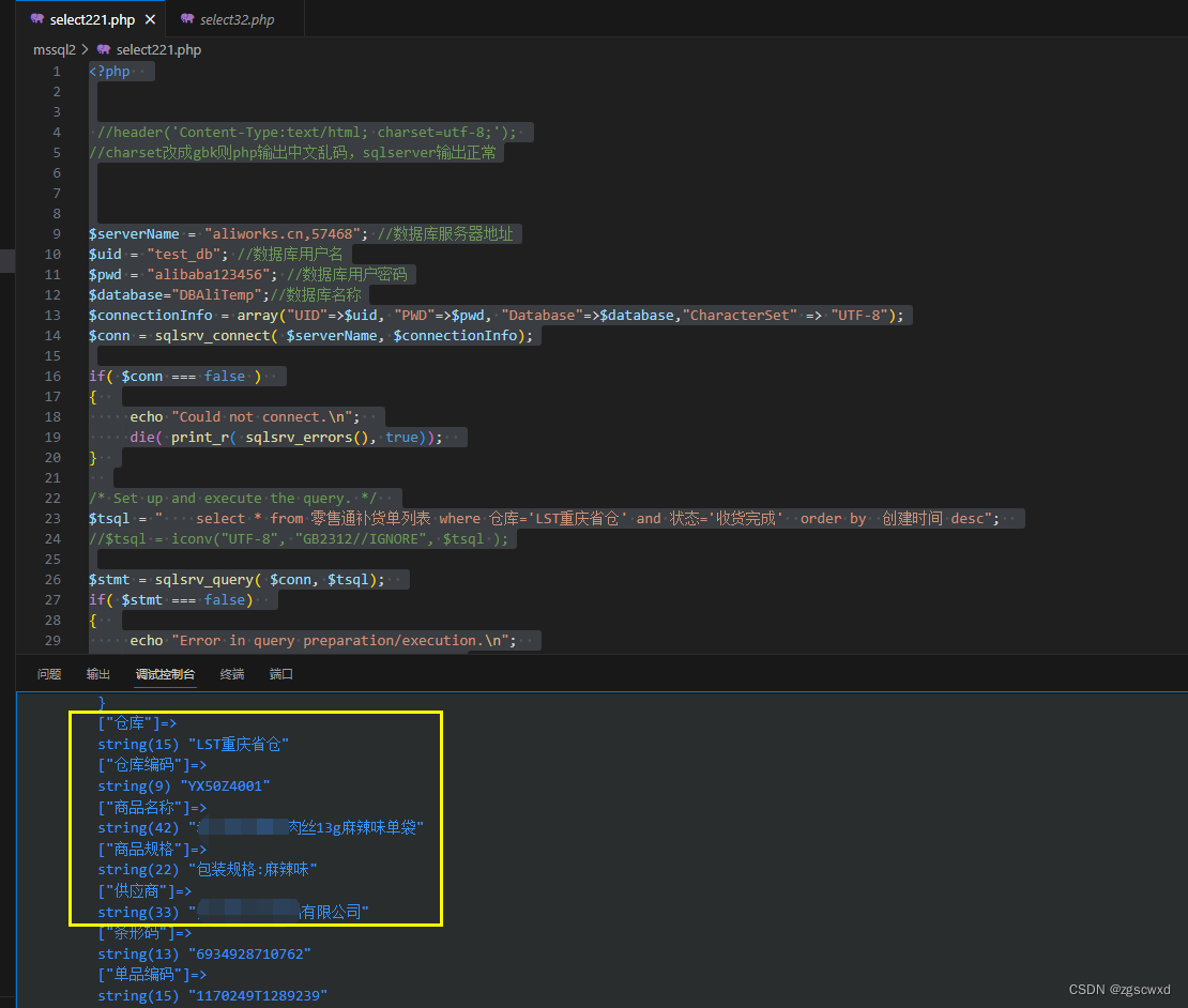
【已验证】php配置连接sql server中文乱码(解决方法)更改utf-8格式
解决数据库中的中文数据在页面显示乱码的问题 在连接的$connectionInfo中设置"CharacterSet" > "UTF-8",指定编码方式即可 $connectionInfo array("UID">$uid, "PWD">$pwd, "Database">$database…...
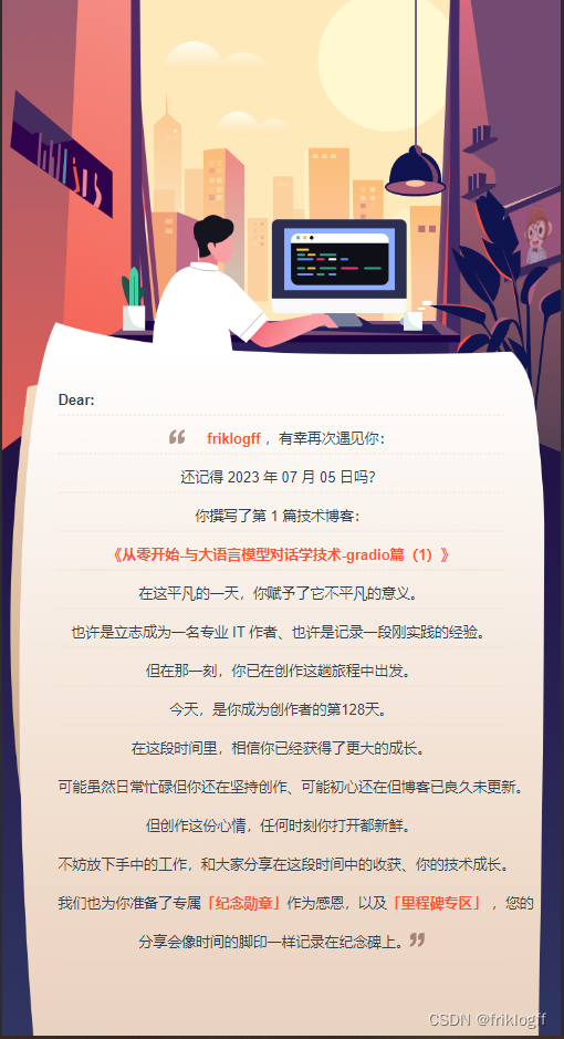
《未来之路:技术探索与梦想的追逐》
创作纪念日 日期:2023年07月05日文章标题:《从零开始-与大语言模型对话学技术-gradio篇(1)》成为创作者第128天 在这个平凡的一天,我撰写了自己的第一篇技术博客,题为《从零开始-与大语言模型对话学技术-…...
vue3 自动导入composition-apiI和组件
1.api的自动导入 常规写法: <script setup>import { ref, reactive, onMounted, computed ,watch } from vue;import { useRouter } from "vue-router";const router useRouter();const person reactive ({name:张三,age…...

LeetCode15-三数之和
本文最精华的就是下面的视频讲解! 🔗:参考的视频讲解 class Solution {public List<List<Integer>> threeSum(int[] nums) {List<List<Integer>> ans new ArrayList<>();Arrays.sort(nums);int nnums.length;int i0,j0,k0,sum0;for(…...
)
安全物理环境(设备和技术注解)
网络安全等级保护相关标准参考《GB/T 22239-2019 网络安全等级保护基本要求》和《GB/T 28448-2019 网络安全等级保护测评要求》 密码应用安全性相关标准参考《GB/T 39786-2021 信息系统密码应用基本要求》和《GM/T 0115-2021 信息系统密码应用测评要求》 1物理位置选择 1.1机房…...
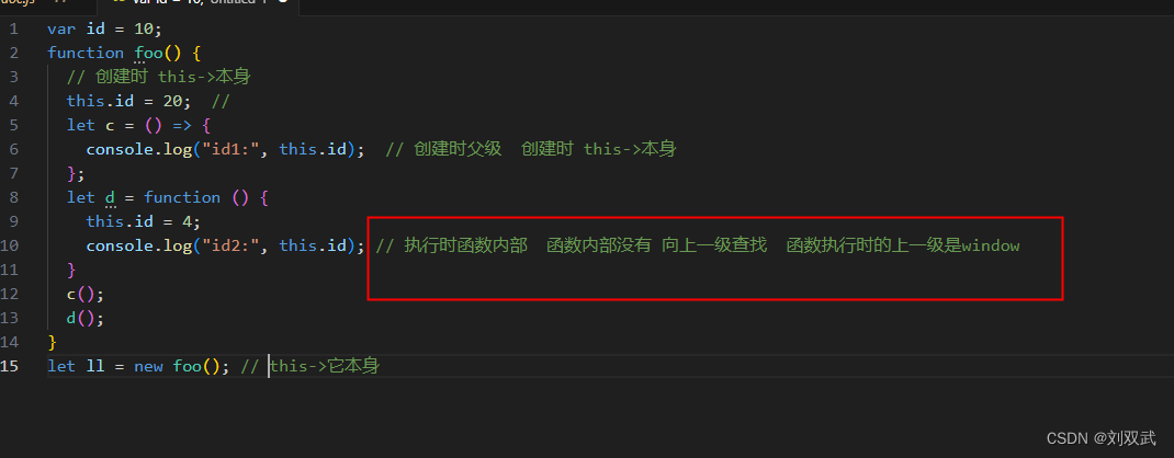
箭头函数 跟匿名函数this的指向问题
var id 10; function foo() {// 创建时 this->windowthis.id 20; // 等价于 window.id 20let c () > {console.log("id1:", this.id); // 创建时父级 创建时 this->window};let d function () {console.log("id2:", this.id); // 执行时本…...

Java Stream:List分组成Map或LinkedHashMap
在Java中,使用Stream API可以轻松地对集合进行操作,包括将List转换为Map或LinkedHashMap。本篇博客将演示如何利用Java Stream实现这两种转换,同时假设List中的元素是User对象。 1. 数据准备 List<User> list new ArrayList<>(…...
vue2+elementui使用MessageBox 弹框$msgbox自定义VNode内容:实现radio
虽说实现下面的效果,用el-dialog很轻松就能搞定。但是这种简单的交互,我更喜欢使用MessageBox。 话不多说,直接上代码~ <el-button type"primary" size"mini" click"handleApply()" >处理申请</el-b…...

OC 实现手指滑动拖动View
RPReplay_Final1699613924 实现手指滑动拖动View 支持手势移动的控件 支持 Masonry frame 布局 使用富文本 也支持自动高度 核心代码 - (void)handlePanGesture:(UIPanGestureRecognizer *)p {CGPoint panPoint [p locationInView:self.view];CGPoint currentViewPoint _dr…...

多级缓存之实现多级缓存
多级缓存的实现离不开Nginx编程,而Nginx编程又离不开OpenResty。 1. OpenResty快速入门 我们希望达到的多级缓存架构如图: 其中: windows上的nginx用来做反向代理服务,将前端的查询商品的ajax请求代理到OpenResty集群 OpenRest…...
React【axios、全局处理、 antd UI库、更改主题、使用css module的情况下修改第三方库的样式、支持sass less】(十三)
文件目录 Proxying in Development http-proxy-middleware fetch_get fetch 是否成功 axios 全局处理 antd UI库 更改主题 使用css module的情况下修改第三方库的样式 支持sass & less Proxying in Development 在开发模式下,如果客户端所在服务器跟后…...
在gitlab中指定自定义 CI/CD 配置文件
文章目录 1. 介绍2. 配置操作3. 配置场景3.1 CI/CD 配置文件在当前项目step1:在当前项目中创建目录,编写流水线文件存放在该目录中step2:在当前项目中配置step3:运行流水线测试 3.2 CI/CD 配置文件位于外部站点上step1:…...
Learning a Deep Compact Image Representation for Visual Tracking)
(论文阅读22/100)Learning a Deep Compact Image Representation for Visual Tracking
文献阅读笔记 简介 题目 Learning a Deep Compact Image Representation for Visual Tracking 作者 N Wang, DY Yeung 原文链接 Learning a Deep Compact Image Representation for Visual Tracking (neurips.cc) 关键词 Object tracking、DLT、SDAE 研究问题 track…...

浅谈设计模式
文章目录 一、单例模式 1.饿汉模式 2.懒汉模式 二、工厂模式 三、建造者模式 四、代理模式 设计模式是前辈们对代码开发的总结,是解决特定问题的一系列套路。它不是语法规定,而是一套用来提高代码可复用性、可维护性、可读性、稳健性以及安全性的解…...
企业年会/年终活动如何邀请媒体记者报道?
媒体邀约是企业或组织进行宣传的重要手段之一。通过邀请媒体参加活动,可以增加活动的曝光度和知名度,吸引更多的关注和参与。同时,媒体报道还可以提高企业或组织的权威性和可信度,从而让公众更容易接受其传达的信息。 企业年会或…...

C语言如何执行HTTP GET请求
在现代互联网时代,网络数据的获取和分析变得越来越重要。无论是为了研究市场趋势,还是为了收集信息进行数据分析,编写一个网络爬虫可以帮助我们自动化这一过程。在这篇文章中,我们将使用C语言和libcurl库来编写一个简单的网络爬虫…...

.Net 6 Nacos日志控制台疯狂发输出+Log4Net日志过滤
我们的项目配置了Log4Net 作为日志输出工具,在引入Nacos后,控制台和日志里疯狂输出nacos心跳日志和其他相关信息,导致自己记录的信息被淹没了,找了很多解决办法: 1、提高nacos日志级别,然后再屏蔽相应级别…...
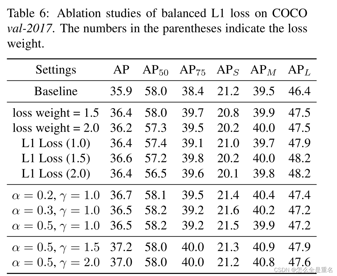
Libra R-CNN: Towards Balanced Learning for Object Detection(2019.4)
文章目录 AbstractIntroduction引入问题1) Sample level imbalance2) Feature level imbalance3) Objective level imbalance进行解决贡献 Related Work(他人的work,捎带与我们的对比)Model architectures for object detection&a…...

结构建模设计——Solidworks装配体操作核心入门:界面导航、零件装配与基础配合实战解析
1. Solidworks装配体入门:从零开始认识界面 第一次打开Solidworks装配体界面时,确实会有点懵。作为过来人,我清楚地记得当初自己面对满屏图标和菜单时的茫然。不过别担心,这个界面设计其实非常人性化,用上半小时就能摸…...

地理位置服务坐标转换与路径规划
## 地理位置服务:坐标转换与路径规划的智慧引擎 在数字化时代,地理位置服务(LBS)已成为日常生活不可或缺的一部分。无论是导航软件中的实时路径规划,还是地图应用中不同坐标系的精准转换,这些功能背后都依…...

Android App想跑AI模型?试试用Chaquopy把Python 3.9环境打包进去
Android应用集成Python AI实战:用Chaquopy打造移动端智能引擎 当我们在咖啡馆用手机拍照时,那个自动识别咖啡种类的AR特效;当健身APP实时分析我们的运动姿态时,那些精准的关节标记点——这些让人眼前一亮的移动端AI功能࿰…...

AI专著撰写必备!实测8款AI工具,快速生成20万字专著且低查重率!
研究者专著创作困境与AI工具解决方案 对于多数研究者而言,编写学术专著常常面临最大的挑战,便是“有限的精力”与“无限的需求”之间的矛盾。撰写一本专著通常需要3到5年,甚至更长的时间,而研究者们平常还需要完成教学、科研项目…...

终极窗口编辑神器:用SRWE打破Windows程序分辨率限制的完整指南
终极窗口编辑神器:用SRWE打破Windows程序分辨率限制的完整指南 【免费下载链接】SRWE Simple Runtime Window Editor 项目地址: https://gitcode.com/gh_mirrors/sr/SRWE 你是否曾因游戏截图分辨率不够高而失望?或者因应用程序窗口无法调整到理想…...
)
从卡车仪表盘到CAN总线:手把手拆解SAE J1939协议的数据帧(附报文分析)
从卡车仪表盘到CAN总线:手把手拆解SAE J1939协议的数据帧(附报文分析) 当商用车的仪表盘突然亮起故障灯时,大多数司机只会看到表面的警示符号。但在这背后,整辆车正在通过CAN总线以每秒数千条消息的速度,用…...

GauStudio:3D高斯喷洒技术的模块化框架深度解析
GauStudio:3D高斯喷洒技术的模块化框架深度解析 【免费下载链接】gaustudio A Modular Framework for 3D Gaussian Splatting and Beyond 项目地址: https://gitcode.com/gh_mirrors/ga/gaustudio 1. 项目概述与背景意义 3D高斯喷洒(3D Gaussian…...

暗黑2自动化终极指南:告别手动刷怪,用Botty轻松获取稀有装备
暗黑2自动化终极指南:告别手动刷怪,用Botty轻松获取稀有装备 【免费下载链接】botty D2R Pixel Bot 项目地址: https://gitcode.com/gh_mirrors/bo/botty 还在为暗黑2中重复刷怪感到疲惫吗?Botty是一款专为《暗黑破坏神2:重…...

AvalancheGo网络通信:P2P协议和消息队列的实现原理
AvalancheGo网络通信:P2P协议和消息队列的实现原理 【免费下载链接】avalanchego Go implementation of an Avalanche node. 项目地址: https://gitcode.com/gh_mirrors/ava/avalanchego AvalancheGo是Avalanche节点的Go语言实现,其网络通信系统基…...

UE5 Lumen性能调优实战:从30帧到60帧,我的项目优化踩坑全记录
UE5 Lumen性能调优实战:从30帧到60帧的完整优化指南 当你的UE5项目终于实现了梦寐以求的Lumen全局光照效果,却发现帧率卡在30帧无法突破时,那种挫败感每个开发者都深有体会。去年我们的开放世界项目就遭遇了这个典型困境——在PS5上开启Lumen…...