R可视化:R语言基础图形合集
R语言基础图形合集
欢迎大家关注全网生信学习者系列:
- WX公zhong号:生信学习者
- Xiao hong书:生信学习者
- 知hu:生信学习者
- CDSN:生信学习者2
基础图形可视化
数据分析的图形可视化是了解数据分布、波动和相关性等属性必不可少的手段。不同的图形类型对数据属性的表征各不相同,通常具体问题使用具体的可视化图形。R语言在可视化方面具有极大的优势,因其本身就是统计学家为了研究统计问题开发的编程语言,因此极力推荐使用R语言可视化数据。
散点图
散点图是由x值和y值确定的点散乱分布在坐标轴上,一是可以用来展示数据的分布和聚合情况,二是可通过分布情况得到x和y之间的趋势结论。多用于回归分析,发现自变量和因变量的变化趋势,进而选择合适的函数对数据点进行拟合。
library(ggplot2)
library(dplyr)dat <- %>% mutate(cyl = factor(cyl))
ggplot(dat, aes(x = wt, y = mpg, shape = cyl, color = cyl)) + geom_point(size = 3, alpha = 0.4) + geom_smooth(method = lm, linetype = "dashed", color = "darkred", fill = "blue") + geom_text(aes(label = rownames(dat)), size = 4) + theme_bw(base_size = 12) + theme(plot.title = element_text(size = 10, color = "black", face = "bold", hjust = 0.5), axis.title = element_text(size = 10, color = "black", face = "bold"), axis.text = element_text(size = 9, color = "black"), axis.ticks.length = unit(-0.05, "in"), axis.text.y = element_text(margin = unit(c(0.3, 0.3, 0.3, 0.3), "cm"), size = 9), axis.text.x = element_blank(), text = element_text(size = 8, color = "black"), strip.text = element_text(size = 9, color = "black", face = "bold"), panel.grid = element_blank())

直方图
直方图是一种对数据分布情况进行可视化的图形,它是二维统计图表,对应两个坐标分别是统计样本以及该样本对应的某个属性如频率等度量。
library(ggplot2)data <- data.frame(Conpany = c("Apple", "Google", "Facebook", "Amozon", "Tencent"), Sale2013 = c(5000, 3500, 2300, 2100, 3100), Sale2014 = c(5050, 3800, 2900, 2500, 3300), Sale2015 = c(5050, 3800, 2900, 2500, 3300), Sale2016 = c(5050, 3800, 2900, 2500, 3300))
mydata <- tidyr::gather(data, Year, Sale, -Conpany)
ggplot(mydata, aes(Conpany, Sale, fill = Year)) + geom_bar(stat = "identity", position = "dodge") +guides(fill = guide_legend(title = NULL)) + ggtitle("The Financial Performance of Five Giant") + scale_fill_wsj("rgby", "") + theme_wsj() + theme(axis.ticks.length = unit(0.5, "cm"), axis.title = element_blank()))

library(patternplot)data <- read.csv(system.file("extdata", "monthlyexp.csv", package = "patternplot"))
data <- data[which(data$City == "City 1"), ]
x <- factor(data$Type, c("Housing", "Food", "Childcare"))
y <- data$Monthly_Expenses
pattern.type <- c("hdashes", "blank", "crosshatch")
pattern.color <- c("black", "black", "black")
background.color <- c("white", "white", "white")
density <- c(20, 20, 10)patternplot::patternbar(data, x, y, group = NULL, ylab = "Monthly Expenses, Dollar", pattern.type = pattern.type, pattern.color = pattern.color,background.color = background.color, pattern.line.size = 0.5, frame.color = c("black", "black", "black"), density = density) +
ggtitle("(A) Black and White with Patterns"))

箱线图
箱线图是一种显示一组数据分布情况的统计图,它形状像箱子因此被也被称为箱形图。它通过六个数据节点将一组数据从大到小排列(上极限到下极限),反应原始数据分布特征。意义在于发现关键数据如平均值、任何异常值、数据分布紧密度和偏分布等。
library(ggplot2)
library(dplyr)pr <- unique(dat$Fruit)
grp.col <- c("#999999", "#E69F00", "#56B4E9")dat %>% mutate(Fruit = factor(Fruit)) %>% ggplot(aes(x = Fruit, y = Weight, color = Fruit)) + stat_boxplot(geom = "errorbar", width = 0.15) + geom_boxplot(aes(fill = Fruit), width = 0.4, outlier.colour = "black",                       outlier.shape = 21, outlier.size = 1) + stat_summary(fun.y = mean, geom = "point", shape = 16,size = 2, color = "black") +# 在顶部显示每组的数目stat_summary(fun.data = function(x) {return(data.frame(y = 0.98 * 120, label = length(x)))}, geom = "text", hjust = 0.5, color = "red", size = 6) + stat_compare_means(comparisons = list(c(pr[1], pr[2]), c(pr[1], pr[3]), c(pr[2], pr[3])),label = "p.signif", method = "wilcox.test") + labs(title = "Weight of Fruit", x = "Fruit", y = "Weight (kg)") +scale_color_manual(values = grp.col, labels = pr) +scale_fill_manual(values = grp.col, labels = pr) + guides(color = F, fil = F) + scale_y_continuous(sec.axis = dup_axis(label = NULL, name = NULL),breaks = seq(90, 108, 2), limits = c(90, 120)) + theme_bw(base_size = 12) + theme(plot.title = element_text(size = 10, color = "black", face = "bold", hjust = 0.5),axis.title = element_text(size = 10, color = "black", face = "bold"), axis.text = element_text(size = 9, color = "black"),axis.ticks.length = unit(-0.05, "in"), axis.text.y = element_text(margin = unit(c(0.3, 0.3, 0.3, 0.3), "cm"), size = 9),axis.text.x = element_text(margin = unit(c(0.3, 0.3, 0.3, 0.3), "cm")),text = element_text(size = 8, color = "black"),strip.text = element_text(size = 9, color = "black", face = "bold"),panel.grid = element_blank())

面积图
面积图是一种展示个体与整体的关系的统计图,更多用于时间序列变化的研究。
library(ggplot2)
library(dplyr)dat %>% group_by(Fruit, Store) %>%
summarize(mean_Weight = mean(Weight)) %>% ggplot(aes(x = Store, group = Fruit)) + geom_area(aes(y = mean_Weight, fill = as.factor(Fruit)), position = "stack", linetype = "dashed") + geom_hline(aes(yintercept = mean(mean_Weight)), color = "blue", linetype = "dashed", size = 1) + guides(fill = guide_legend(title = NULL)) + theme_bw(base_size = 12) + theme(plot.title = element_text(size = 10, color = "black", face = "bold", hjust = 0.5), axis.title = element_text(size = 10, color = "black", face = "bold"), axis.text = element_text(size = 9, color = "black"), axis.ticks.length = unit(-0.05, "in"), axis.text.y = element_text(margin = unit(c(0.3, 0.3, 0.3, 0.3), "cm"), size = 9), axis.text.x = element_text(margin = unit(c(0.3, 0.3, 0.3, 0.3), "cm")), text = element_text(size = 8, color = "black"), strip.text = element_text(size = 9, color = "black", face = "bold"), panel.grid = element_blank())

热图
热图也是一种对数据分布情况可视化的统计图形,如下图表现得是数据差异性的具象化实例。一般用于样本聚类等可视化过程。在基因表达或者丰度表达差异研究中,热图既可以展现数据质量间的差异性,也可以用于聚类等。
library(ggplot2)data <- as.data.frame(matrix(rnorm(9 * 10), 9, 10))
rownames(data) <- paste("Gene", 1:9, sep = "_")
colnames(data) <- paste("sample", 1:10, sep = "_")
data$ID <- rownames(data)
data_m <- tidyr::gather(data, sampleID, value, -ID)ggplot(data_m, aes(x = sampleID, y = ID)) + geom_tile(aes(fill = value)) + scale_fill_gradient2("Expression", low = "green", high = "red", mid = "black") + xlab("samples") + theme_classic() + theme(axis.ticks = element_blank(), axis.line = element_blank(), panel.grid.major = element_blank(),legend.key = element_blank(), axis.text.x = element_text(angle = 45, hjust = 1, vjust = 1),legend.position = "top")

相关图
相关图是热图的一种特殊形式,展示的是样本间相关系数大小的热图。
library(corrplot)corrplot(corr = cor(dat[1:7]), order = "AOE", type = "upper", tl.pos = "d")
corrplot(corr = cor(dat[1:7]), add = TRUE, type = "lower", method = "number", order = "AOE", diag = FALSE, tl.pos = "n", cl.pos = "n")

折线图
折线图是反应数据分布趋势的可视化图形,其本质和堆积图或者说面积图有些相似。
library(ggplot2)
library(dplyr)grp.col <- c("#999999", "#E69F00", "#56B4E9")
dat.cln <- sampling::strata(dat, stratanames = "Fruit", size = rep(round(nrow(dat) * 0.1/3, -1), 3), method = "srswor")dat %>% slice(dat.cln$ID_unit) %>% mutate(Year = as.character(rep(1996:2015, times = 3))) %>% mutate(Year = factor(as.character(Year))) %>% ggplot(aes(x = Year, y = Weight, linetype = Fruit, colour = Fruit, shape = Fruit, fill = Fruit)) + geom_line(aes(group = Fruit)) + geom_point() + scale_linetype_manual(values = c(1:3)) + scale_shape_manual(values = c(19, 21, 23)) +scale_color_manual(values = grp.col, labels = pr) + scale_fill_manual(values = grp.col, labels = pr) + theme_bw() + theme(plot.title = element_text(size = 10, color = "black", face = "bold", hjust = 0.5),axis.title = element_text(size = 10, color = "black", face = "bold"), axis.text = element_text(size = 9, color = "black"),axis.ticks.length = unit(-0.05, "in"), axis.text.y = element_text(margin = unit(c(0.3, 0.3, 0.3, 0.3), "cm"), size = 9),axis.text.x = element_text(margin = unit(c(0.3, 0.3, 0.3, 0.3), "cm")),text = element_text(size = 8, color = "black"),strip.text = element_text(size = 9, color = "black", face = "bold"), 					  panel.grid = element_blank())

韦恩图
韦恩图是一种展示不同分组之间集合重叠区域的可视化图。
library(VennDiagram)A <- sample(LETTERS, 18, replace = FALSE)
B <- sample(LETTERS, 18, replace = FALSE)
C <- sample(LETTERS, 18, replace = FALSE)
D <- sample(LETTERS, 18, replace = FALSE)venn.diagram(x = list(A = A, D = D, B = B, C = C),filename = "Group4.png", height = 450, width = 450, resolution = 300, imagetype = "png", col = "transparent", fill = c("cornflowerblue", "green", "yellow", "darkorchid1"),alpha = 0.5, cex = 0.45, cat.cex = 0.45)

library(ggplot2)
library(UpSetR)movies <- read.csv(system.file("extdata", "movies.csv", package = "UpSetR"), header = T, sep = ";")
mutations <- read.csv(system.file("extdata", "mutations.csv", package = "UpSetR"), header = T, sep = ",")another.plot <- function(data, x, y) {round_any_new <- function(x, accuracy, f = round) {f(x/accuracy) * accuracy}data$decades <- round_any_new(as.integer(unlist(data[y])), 10, ceiling)data <- data[which(data$decades >= 1970), ]myplot <- (ggplot(data, aes_string(x = x)) + geom_density(aes(fill = factor(decades)), alpha = 0.4) + theme_bw() + theme(plot.margin = unit(c(0, 0, 0, 0), "cm"), legend.key.size = unit(0.4, "cm")))
}upset(movies, main.bar.color = "black", mb.ratio = c(0.5, 0.5), queries = list(list(query = intersects, params = list("Drama"),color = "red", active = F), list(query = intersects, params = list("Action", "Drama"), active = T),list(query = intersects, params = list("Drama", "Comedy", "Action"),color = "orange",active = T)), attribute.plots = list(gridrows = 50, plots = list(list(plot = histogram, x = "ReleaseDate", queries = F), list(plot = scatter_plot, x = "ReleaseDate", y = "AvgRating", queries = T), list(plot = another.plot,x = "AvgRating", y = "ReleaseDate",queries = F)),ncols = 3)))

火山图
火山图通过两个属性Fold change和P value反应两组数据的差异性。
library(ggplot2)data <- read.table(choose.files(),header = TRUE)
data$color <- ifelse(data$padj<0.05 & abs(data$log2FoldChange)>= 1,ifelse(data$log2FoldChange > 1,'red','blue'),'gray')
color <- c(red = "red",gray = "gray",blue = "blue")ggplot(data, aes(log2FoldChange, -log10(padj), col = color)) +geom_point() +theme_bw() +scale_color_manual(values = color) +labs(x="log2 (fold change)",y="-log10 (q-value)") +geom_hline(yintercept = -log10(0.05), lty=4,col="grey",lwd=0.6) +geom_vline(xintercept = c(-1, 1), lty=4,col="grey",lwd=0.6) +theme(legend.position = "none",panel.grid=element_blank(),axis.title = element_text(size = 16),axis.text = element_text(size = 14))

饼图
饼图是用于刻画分组间如频率等属性的相对关系图。
library(patternplot)data <- read.csv(system.file("extdata", "vegetables.csv", package = "patternplot"))
pattern.type <- c("hdashes", "vdashes", "bricks")
pattern.color <- c("red3", "green3", "white")
background.color <- c("dodgerblue", "lightpink", "orange")patternpie(group = data$group, pct = data$pct, label = data$label, pattern.type = pattern.type,pattern.color = pattern.color, background.color = background.color, frame.color = "grey40", pixel = 0.3, pattern.line.size = 0.3, frame.size = 1.5, label.size = 5, label.distance = 1.35) + ggtitle("(B) Colors with Patterns"))

密度曲线图
密度曲线图反应的是数据在不同区间的密度分布情况,和概率密度函数PDF曲线类似。
library(ggplot2)
library(plyr)set.seed(1234)
df <- data.frame(sex=factor(rep(c("F", "M"), each=200)),weight=round(c(rnorm(200, mean=55, sd=5),rnorm(200, mean=65, sd=5)))
)
mu <- ddply(df, "sex", summarise, grp.mean=mean(weight))ggplot(df, aes(x=weight, fill=sex)) +geom_histogram(aes(y=..density..), alpha=0.5, position="identity") +geom_density(alpha=0.4) +geom_vline(data=mu, aes(xintercept=grp.mean, color=sex),linetype="dashed") + scale_color_grey() + theme_classic()+theme(legend.position="top")

边界散点图(Scatterplot With Encircling)
library(ggplot2)
library(ggalt)
midwest_select <- midwest[midwest$poptotal > 350000 & midwest$poptotal <= 500000 & midwest$area > 0.01 & midwest$area < 0.1, ]ggplot(midwest, aes(x=area, y=poptotal)) + geom_point(aes(col=state, size=popdensity)) +   # draw pointsgeom_smooth(method="loess", se=F) + xlim(c(0, 0.1)) + ylim(c(0, 500000)) +   # draw smoothing linegeom_encircle(aes(x=area, y=poptotal), data=midwest_select, color="red", size=2, expand=0.08) +   # encirclelabs(subtitle="Area Vs Population", y="Population", x="Area", title="Scatterplot + Encircle", caption="Source: midwest")

边缘箱图/直方图(Marginal Histogram / Boxplot)
2、边缘箱图/直方图(Marginal Histogram / Boxplot)
library(ggplot2)
library(ggExtra)
data(mpg, package="ggplot2")theme_set(theme_bw())
mpg_select <- mpg[mpg$hwy >= 35 & mpg$cty > 27, ]
g <- ggplot(mpg, aes(cty, hwy)) + geom_count() + geom_smooth(method="lm", se=F)ggMarginal(g, type = "histogram", fill="transparent")
#ggMarginal(g, type = "boxplot", fill="transparent")

拟合散点图
library(ggplot2)
theme_set(theme_bw())
data("midwest")ggplot(midwest, aes(x=area, y=poptotal)) + geom_point(aes(col=state, size=popdensity)) + geom_smooth(method="loess", se=F) + xlim(c(0, 0.1)) + ylim(c(0, 500000)) + labs(subtitle="Area Vs Population", y="Population", x="Area", title="Scatterplot", caption = "Source: midwest")

相关系数图(Correlogram)
library(ggplot2)
library(ggcorrplot)data(mtcars)
corr <- round(cor(mtcars), 1)ggcorrplot(corr, hc.order = TRUE, type = "lower", lab = TRUE, lab_size = 3, method="circle", colors = c("tomato2", "white", "springgreen3"), title="Correlogram of mtcars", ggtheme=theme_bw)

水平发散型文本(Diverging Texts)
library(ggplot2)
library(dplyr)
library(tibble)
theme_set(theme_bw())  # Data Prep
data("mtcars")plotdata <- mtcars %>% rownames_to_column("car_name") %>%mutate(mpg_z=round((mpg - mean(mpg))/sd(mpg), 2),mpg_type=ifelse(mpg_z < 0, "below", "above")) %>%arrange(mpg_z)
plotdata$car_name <- factor(plotdata$car_name, levels = as.character(plotdata$car_name))ggplot(plotdata, aes(x=car_name, y=mpg_z, label=mpg_z)) + geom_bar(stat='identity', aes(fill=mpg_type), width=.5)  +scale_fill_manual(name="Mileage", labels = c("Above Average", "Below Average"), values = c("above"="#00ba38", "below"="#f8766d")) + labs(subtitle="Normalised mileage from 'mtcars'", title= "Diverging Bars") + coord_flip()

水平棒棒糖图(Diverging Lollipop Chart)
ggplot(plotdata, aes(x=car_name, y=mpg_z, label=mpg_z)) + geom_point(stat='identity', fill="black", size=6) +geom_segment(aes(y = 0, x = car_name, yend = mpg_z, xend = car_name), color = "black") +geom_text(color="white", size=2) +labs(title="Diverging Lollipop Chart", subtitle="Normalized mileage from 'mtcars': Lollipop") + ylim(-2.5, 2.5) +coord_flip()

去棒棒糖图(Diverging Dot Plot)
ggplot(plotdata, aes(x=car_name, y=mpg_z, label=mpg_z)) + geom_point(stat='identity', aes(col=mpg_type), size=6) +scale_color_manual(name="Mileage", labels = c("Above Average", "Below Average"), values = c("above"="#00ba38", "below"="#f8766d")) + geom_text(color="white", size=2) +labs(title="Diverging Dot Plot", subtitle="Normalized mileage from 'mtcars': Dotplot") + ylim(-2.5, 2.5) +coord_flip()
面积图(Area Chart)
library(ggplot2)
library(quantmod)
data("economics", package = "ggplot2")economics$returns_perc <- c(0, diff(economics$psavert)/economics$psavert[-length(economics$psavert)])brks <- economics$date[seq(1, length(economics$date), 12)]
lbls <- lubridate::year(economics$date[seq(1, length(economics$date), 12)])ggplot(economics[1:100, ], aes(date, returns_perc)) + geom_area() + scale_x_date(breaks=brks, labels=lbls) + theme(axis.text.x = element_text(angle=90)) + labs(title="Area Chart", subtitle = "Perc Returns for Personal Savings", y="% Returns for Personal savings", caption="Source: economics")

排序条形图(Ordered Bar Chart)
cty_mpg <- aggregate(mpg$cty, by=list(mpg$manufacturer), FUN=mean)
colnames(cty_mpg) <- c("make", "mileage")
cty_mpg <- cty_mpg[order(cty_mpg$mileage), ]
cty_mpg$make <- factor(cty_mpg$make, levels = cty_mpg$make)  library(ggplot2)
theme_set(theme_bw())ggplot(cty_mpg, aes(x=make, y=mileage)) + geom_bar(stat="identity", width=.5, fill="tomato3") + labs(title="Ordered Bar Chart", subtitle="Make Vs Avg. Mileage", caption="source: mpg") + theme(axis.text.x = element_text(angle=65, vjust=0.6))

直方图(Histogram)
library(ggplot2)
theme_set(theme_classic())g <- ggplot(mpg, aes(displ)) + scale_fill_brewer(palette = "Spectral")g + geom_histogram(aes(fill=class), binwidth = .1, col="black", size=.1) +  # change binwidthlabs(title="Histogram with Auto Binning", subtitle="Engine Displacement across Vehicle Classes")

g + geom_histogram(aes(fill=class), bins=5, col="black", size=.1) + # change number of binslabs(title="Histogram with Fixed Bins", subtitle="Engine Displacement across Vehicle Classes")

library(ggplot2)
theme_set(theme_classic())g <- ggplot(mpg, aes(manufacturer))
g + geom_bar(aes(fill=class), width = 0.5) + theme(axis.text.x = element_text(angle=65, vjust=0.6)) + labs(title="Histogram on Categorical Variable", subtitle="Manufacturer across Vehicle Classes")

核密度图(Density plot)
library(ggplot2)
theme_set(theme_classic())g <- ggplot(mpg, aes(cty))
g + geom_density(aes(fill=factor(cyl)), alpha=0.8) + labs(title="Density plot", subtitle="City Mileage Grouped by Number of cylinders",caption="Source: mpg",x="City Mileage",fill="# Cylinders")

点图结合箱图(Dot + Box Plot)
library(ggplot2)
theme_set(theme_bw())# plot
g <- ggplot(mpg, aes(manufacturer, cty))
g + geom_boxplot() + geom_dotplot(binaxis='y', stackdir='center', dotsize = .5, fill="red") +theme(axis.text.x = element_text(angle=65, vjust=0.6)) + labs(title="Box plot + Dot plot", subtitle="City Mileage vs Class: Each dot represents 1 row in source data",caption="Source: mpg",x="Class of Vehicle",y="City Mileage")

小提琴图(Violin Plot)
library(ggplot2)
theme_set(theme_bw())# plot
g <- ggplot(mpg, aes(class, cty))
g + geom_violin() + labs(title="Violin plot", subtitle="City Mileage vs Class of vehicle",caption="Source: mpg",x="Class of Vehicle",y="City Mileage")

饼图
library(ggplot2)
theme_set(theme_classic())# Source: Frequency table
df <- as.data.frame(table(mpg$class))
colnames(df) <- c("class", "freq")
pie <- ggplot(df, aes(x = "", y=freq, fill = factor(class))) + geom_bar(width = 1, stat = "identity") +theme(axis.line = element_blank(), plot.title = element_text(hjust=0.5)) + labs(fill="class", x=NULL, y=NULL, title="Pie Chart of class", caption="Source: mpg")pie + coord_polar(theta = "y", start=0)

时间序列图(Time Series多图)
## From Timeseries object (ts)
library(ggplot2)
library(ggfortify)
theme_set(theme_classic())# Plot
autoplot(AirPassengers) + labs(title="AirPassengers") + theme(plot.title = element_text(hjust=0.5))

library(ggplot2)
theme_set(theme_classic())# Allow Default X Axis Labels
ggplot(economics, aes(x=date)) + geom_line(aes(y=returns_perc)) + labs(title="Time Series Chart", subtitle="Returns Percentage from 'Economics' Dataset", caption="Source: Economics", y="Returns %")

data(economics_long, package = "ggplot2")
library(ggplot2)
library(lubridate)
theme_set(theme_bw())df <- economics_long[economics_long$variable %in% c("psavert", "uempmed"), ]
df <- df[lubridate::year(df$date) %in% c(1967:1981), ]# labels and breaks for X axis text
brks <- df$date[seq(1, length(df$date), 12)]
lbls <- lubridate::year(brks)# plot
ggplot(df, aes(x=date)) + geom_line(aes(y=value, col=variable)) + labs(title="Time Series of Returns Percentage", subtitle="Drawn from Long Data format", caption="Source: Economics", y="Returns %", color=NULL) +  # title and captionscale_x_date(labels = lbls, breaks = brks) +  # change to monthly ticks and labelsscale_color_manual(labels = c("psavert", "uempmed"), values = c("psavert"="#00ba38", "uempmed"="#f8766d")) +  # line colortheme(axis.text.x = element_text(angle = 90, vjust=0.5, size = 8),  # rotate x axis textpanel.grid.minor = element_blank())  # turn off minor grid

堆叠面积图(Stacked Area Chart)
library(ggplot2)
library(lubridate)
theme_set(theme_bw())df <- economics[, c("date", "psavert", "uempmed")]
df <- df[lubridate::year(df$date) %in% c(1967:1981), ]# labels and breaks for X axis text
brks <- df$date[seq(1, length(df$date), 12)]
lbls <- lubridate::year(brks)# plot
ggplot(df, aes(x=date)) + geom_area(aes(y=psavert+uempmed, fill="psavert")) + geom_area(aes(y=uempmed, fill="uempmed")) + labs(title="Area Chart of Returns Percentage", subtitle="From Wide Data format", caption="Source: Economics", y="Returns %") +  # title and captionscale_x_date(labels = lbls, breaks = brks) +  # change to monthly ticks and labelsscale_fill_manual(name="", values = c("psavert"="#00ba38", "uempmed"="#f8766d")) +  # line colortheme(panel.grid.minor = element_blank())  # turn off minor grid

分层树形图(Hierarchical Dendrogram)
library(ggplot2)
library(ggdendro)
theme_set(theme_bw())hc <- hclust(dist(USArrests), "ave")  # hierarchical clustering# plot
ggdendrogram(hc, rotate = TRUE, size = 2)

聚类图(Clusters)
library(ggplot2)
library(ggalt)
library(ggfortify)
theme_set(theme_classic())# Compute data with principal components ------------------
df <- iris[c(1, 2, 3, 4)]
pca_mod <- prcomp(df)  # compute principal components# Data frame of principal components ----------------------
df_pc <- data.frame(pca_mod$x, Species=iris$Species)  # dataframe of principal components
df_pc_vir <- df_pc[df_pc$Species == "virginica", ]  # df for 'virginica'
df_pc_set <- df_pc[df_pc$Species == "setosa", ]  # df for 'setosa'
df_pc_ver <- df_pc[df_pc$Species == "versicolor", ]  # df for 'versicolor'# Plot ----------------------------------------------------
ggplot(df_pc, aes(PC1, PC2, col=Species)) + geom_point(aes(shape=Species), size=2) +   # draw pointslabs(title="Iris Clustering", subtitle="With principal components PC1 and PC2 as X and Y axis",caption="Source: Iris") + coord_cartesian(xlim = 1.2 * c(min(df_pc$PC1), max(df_pc$PC1)), ylim = 1.2 * c(min(df_pc$PC2), max(df_pc$PC2))) +   # change axis limitsgeom_encircle(data = df_pc_vir, aes(x=PC1, y=PC2)) +   # draw circlesgeom_encircle(data = df_pc_set, aes(x=PC1, y=PC2)) + geom_encircle(data = df_pc_ver, aes(x=PC1, y=PC2))

气泡图
# Libraries
library(ggplot2)
library(dplyr)
library(plotly)
library(viridis)
library(hrbrthemes)# The dataset is provided in the gapminder library
library(gapminder)
data <- gapminder %>% filter(year=="2007") %>% dplyr::select(-year)# Interactive version
p <- data %>%mutate(gdpPercap=round(gdpPercap,0)) %>%mutate(pop=round(pop/1000000,2)) %>%mutate(lifeExp=round(lifeExp,1)) %>%# Reorder countries to having big bubbles on toparrange(desc(pop)) %>%mutate(country = factor(country, country)) %>%# prepare text for tooltipmutate(text = paste("Country: ", country, "\nPopulation (M): ", pop, "\nLife Expectancy: ", lifeExp, "\nGdp per capita: ", gdpPercap, sep="")) %>%# Classic ggplotggplot( aes(x=gdpPercap, y=lifeExp, size = pop, color = continent, text=text)) +geom_point(alpha=0.7) +scale_size(range = c(1.4, 19), name="Population (M)") +scale_color_viridis(discrete=TRUE, guide=FALSE) +theme_ipsum() +theme(legend.position="none")# turn ggplot interactive with plotly
pp <- ggplotly(p, tooltip="text")
pp

小提琴图Violin
# Libraries
library(ggplot2)
library(dplyr)
library(hrbrthemes)
library(viridis)# create a dataset
data <- data.frame(name=c( rep("A",500), rep("B",500), rep("B",500), rep("C",20), rep('D', 100)  ),value=c( rnorm(500, 10, 5), rnorm(500, 13, 1), rnorm(500, 18, 1), rnorm(20, 25, 4), rnorm(100, 12, 1) )
)# sample size
sample_size = data %>% group_by(name) %>% summarize(num=n())# Plot
data %>%left_join(sample_size) %>%mutate(myaxis = paste0(name, "\n", "n=", num)) %>%ggplot( aes(x=myaxis, y=value, fill=name)) +geom_violin(width=1.4) +geom_boxplot(width=0.1, color="grey", alpha=0.2) +scale_fill_viridis(discrete = TRUE) +theme_ipsum() +theme(legend.position="none",plot.title = element_text(size=11)) +ggtitle("A Violin wrapping a boxplot") +xlab("")

# Libraries
library(ggplot2)
library(dplyr)
library(tidyr)
library(forcats)
library(hrbrthemes)
library(viridis)# Load dataset from github
data <- read.table("dataset/viz/probly.csv", header=TRUE, sep=",")# Data is at wide format, we need to make it 'tidy' or 'long'
data <- data %>% gather(key="text", value="value") %>%mutate(text = gsub("\\.", " ",text)) %>%mutate(value = round(as.numeric(value),0)) %>%filter(text %in% c("Almost Certainly","Very Good Chance","We Believe","Likely","About Even", "Little Chance", "Chances Are Slight", "Almost No Chance"))# Plot
p <- data %>%mutate(text = fct_reorder(text, value)) %>% # Reorder dataggplot( aes(x=text, y=value, fill=text, color=text)) +geom_violin(width=2.1, size=0.2) +scale_fill_viridis(discrete=TRUE) +scale_color_viridis(discrete=TRUE) +theme_ipsum() +theme(legend.position="none") +coord_flip() + # This switch X and Y axis and allows to get the horizontal versionxlab("") +ylab("Assigned Probability (%)")p

核密度图 density chart
library(ggplot2)
library(hrbrthemes)
library(dplyr)
library(tidyr)
library(viridis)data <- read.table("dataset/viz/probly.csv", header=TRUE, sep=",")
data <- data %>%gather(key="text", value="value") %>%mutate(text = gsub("\\.", " ",text)) %>%mutate(value = round(as.numeric(value),0))# A dataframe for annotations
annot <- data.frame(text = c("Almost No Chance", "About Even", "Probable", "Almost Certainly"),x = c(5, 53, 65, 79),y = c(0.15, 0.4, 0.06, 0.1)
)# Plot
data %>%filter(text %in% c("Almost No Chance", "About Even", "Probable", "Almost Certainly")) %>%ggplot( aes(x=value, color=text, fill=text)) +geom_density(alpha=0.6) +scale_fill_viridis(discrete=TRUE) +scale_color_viridis(discrete=TRUE) +geom_text( data=annot, aes(x=x, y=y, label=text, color=text), hjust=0, size=4.5) +theme_ipsum() +theme(legend.position="none") +ylab("") +xlab("Assigned Probability (%)")

# library
library(ggplot2)
library(ggExtra)# classic plot :
p <- ggplot(mtcars, aes(x=wt, y=mpg, color=cyl, size=cyl)) +geom_point() +theme(legend.position="none")# Set relative size of marginal plots (main plot 10x bigger than marginals)
p1 <- ggMarginal(p, type="histogram", size=10)# Custom marginal plots:
p2 <- ggMarginal(p, type="histogram", fill = "slateblue", xparams = list(  bins=10))# Show only marginal plot for x axis
p3 <- ggMarginal(p, margins = 'x', color="purple", size=4)cowplot::plot_grid(p, p1, p2, p3, ncol = 2, align = "hv", labels = LETTERS[1:4])

柱状图 histogram
# library
library(ggplot2)
library(dplyr)
library(hrbrthemes)# Build dataset with different distributions
data <- data.frame(type = c( rep("variable 1", 1000), rep("variable 2", 1000) ),value = c( rnorm(1000), rnorm(1000, mean=4) )
)# Represent it
p <- data %>%ggplot( aes(x=value, fill=type)) +geom_histogram( color="#e9ecef", alpha=0.6, position = 'identity') +scale_fill_manual(values=c("#69b3a2", "#404080")) +theme_ipsum() +labs(fill="")
p

# Libraries
library(ggplot2)
library(hrbrthemes)# Dummy data
data <- data.frame(var1 = rnorm(1000),var2 = rnorm(1000, mean=2)
)# Chart
p <- ggplot(data, aes(x=x) ) +# Topgeom_density( aes(x = var1, y = ..density..), fill="#69b3a2" ) +geom_label( aes(x=4.5, y=0.25, label="variable1"), color="#69b3a2") +# Bottomgeom_density( aes(x = var2, y = -..density..), fill= "#404080") +geom_label( aes(x=4.5, y=-0.25, label="variable2"), color="#404080") +theme_ipsum() +xlab("value of x")p1 <- ggplot(data, aes(x=x) ) +geom_histogram( aes(x = var1, y = ..density..), fill="#69b3a2" ) +geom_label( aes(x=4.5, y=0.25, label="variable1"), color="#69b3a2") +geom_histogram( aes(x = var2, y = -..density..), fill= "#404080") +geom_label( aes(x=4.5, y=-0.25, label="variable2"), color="#404080") +theme_ipsum() +xlab("value of x")
cowplot::plot_grid(p, p1, ncol = 2, align = "hv", labels = LETTERS[1:2])

箱线图 boxplot
# Library
library(ggplot2)
library(dplyr)
library(forcats)# Dataset 1: one value per group
data <- data.frame(name=c("north","south","south-east","north-west","south-west","north-east","west","east"),val=sample(seq(1,10), 8 )
)# Reorder following the value of another column:
p1 <- data %>%mutate(name = fct_reorder(name, val)) %>%ggplot( aes(x=name, y=val)) +geom_bar(stat="identity", fill="#f68060", alpha=.6, width=.4) +coord_flip() +xlab("") +theme_bw()# Reverse side
p2 <- data %>%mutate(name = fct_reorder(name, desc(val))) %>%ggplot( aes(x=name, y=val)) +geom_bar(stat="identity", fill="#f68060", alpha=.6, width=.4) +coord_flip() +xlab("") +theme_bw()# Using median
p3 <- mpg %>%mutate(class = fct_reorder(class, hwy, .fun='median')) %>%ggplot( aes(x=reorder(class, hwy), y=hwy, fill=class)) + geom_boxplot() +geom_jitter(color="black", size=0.4, alpha=0.9) +xlab("class") +theme(legend.position="none") +xlab("")# Using number of observation per group
p4 <- mpg %>%mutate(class = fct_reorder(class, hwy, .fun='length' )) %>%ggplot( aes(x=class, y=hwy, fill=class)) + stat_summary(fun.y=mean, geom="point", shape=20, size=6, color="red", fill="red") +geom_boxplot() +xlab("class") +theme(legend.position="none") +xlab("") +xlab("")p5 <- data %>%arrange(val) %>%    # First sort by val. This sort the dataframe but NOT the factor levelsmutate(name=factor(name, levels=name)) %>%   # This trick update the factor levelsggplot( aes(x=name, y=val)) +geom_segment( aes(xend=name, yend=0)) +geom_point( size=4, color="orange") +coord_flip() +theme_bw() +xlab("")p6 <- data %>%arrange(val) %>%mutate(name = factor(name, levels=c("north", "north-east", "east", "south-east", "south", "south-west", "west", "north-west"))) %>%ggplot( aes(x=name, y=val)) +geom_segment( aes(xend=name, yend=0)) +geom_point( size=4, color="orange") +theme_bw() +xlab("")cowplot::plot_grid(p1, p2, p3, p4, p5, p6, ncol = 2, align = "hv", labels = LETTERS[1:6])

library(dplyr)
# Dummy data
names <- c(rep("A", 20) , rep("B", 8) , rep("C", 30), rep("D", 80))
value <- c( sample(2:5, 20 , replace=T) , sample(4:10, 8 , replace=T), sample(1:7, 30 , replace=T), sample(3:8, 80 , replace=T) )
data <- data.frame(names, value) %>%mutate(names=factor(names))# Draw the boxplot. Note result is also stored in a object called boundaries
boundaries <- boxplot(data$value ~ data$names , col="#69b3a2" , ylim=c(1,11))
# Now you can type boundaries$stats to get the boundaries of the boxes# Add sample size on top
nbGroup <- nlevels(data$names)
text( x=c(1:nbGroup), y=boundaries$stats[nrow(boundaries$stats),] + 0.5, paste("n = ",table(data$names),sep="")
)

山脊图 ridgeline
# library
library(ggridges)
library(ggplot2)
library(dplyr)
library(tidyr)
library(forcats)# Load dataset from github
data <- read.table("dataset/viz/probly.csv", header=TRUE, sep=",")
data <- data %>% gather(key="text", value="value") %>%mutate(text = gsub("\\.", " ",text)) %>%mutate(value = round(as.numeric(value),0)) %>%filter(text %in% c("Almost Certainly","Very Good Chance","We Believe","Likely","About Even", "Little Chance", "Chances Are Slight", "Almost No Chance"))# Plot
p1 <- data %>%mutate(text = fct_reorder(text, value)) %>%ggplot( aes(y=text, x=value,  fill=text)) +geom_density_ridges(alpha=0.6, stat="binline", bins=20) +theme_ridges() +theme(legend.position="none",panel.spacing = unit(0.1, "lines"),strip.text.x = element_text(size = 8)) +xlab("") +ylab("Assigned Probability (%)")p2 <- data %>%mutate(text = fct_reorder(text, value)) %>%ggplot( aes(y=text, x=value,  fill=text)) +geom_density_ridges_gradient(scale = 3, rel_min_height = 0.01) +theme_ridges() +theme(legend.position="none",panel.spacing = unit(0.1, "lines"),strip.text.x = element_text(size = 8)) +xlab("") +ylab("Assigned Probability (%)")cowplot::plot_grid(p1, p2, ncol = 2, align = "hv", labels = LETTERS[1:2])

散点图 Scatterplot
library(ggplot2)
library(dplyr)ggplot(data=mtcars %>% mutate(cyl=factor(cyl)), aes(x=mpg, disp))+geom_point(aes(color=cyl), size=3)+geom_rug(col="black", alpha=0.5, size=1)+geom_smooth(method=lm , color="red", fill="#69b3a2", se=TRUE)+  geom_text(label=rownames(mtcars), nudge_x = 0.25, nudge_y = 0.25, check_overlap = T,label.size = 0.35,color = "black",family="serif")+theme_classic()+theme(axis.title = element_text(face = 'bold',color = 'black',size = 14),axis.text = element_text(color = 'black',size = 10),text = element_text(size = 8, color = "black", family="serif"),legend.position = 'right',legend.key.height = unit(0.6,'cm'),legend.text = element_text(face = "bold", color = 'black',size = 10),strip.text = element_text(face = "bold", size = 14))

热图 heatmap
library(ComplexHeatmap)
library(circlize)set.seed(123)
mat <- matrix(rnorm(100), 10)
rownames(mat) <- paste0("R", 1:10)
colnames(mat) <- paste0("C", 1:10)
column_ha <- HeatmapAnnotation(foo1 = runif(10), bar1 = anno_barplot(runif(10)))
row_ha <- rowAnnotation(foo2 = runif(10), bar2 = anno_barplot(runif(10)))col_fun <- colorRamp2(c(-2, 0, 2), c("green", "white", "red"))Heatmap(mat, name = "mat",column_title = "pre-defined distance method (1 - pearson)",column_title_side = "bottom",column_title_gp = gpar(fontsize = 10, fontface = "bold"),col = col_fun, clustering_distance_rows = "pearson",cluster_rows = TRUE, show_column_dend = FALSE,row_km = 2,column_km = 3,width = unit(6, "cm"), height = unit(6, "cm"), top_annotation = column_ha, right_annotation = row_ha)

相关图 correlogram
library(GGally)
library(ggplot2)data(flea)
ggpairs(flea, columns = 2:4, aes(colour=species))+theme_bw()+theme(axis.title = element_text(face = 'bold',color = 'black',size = 14),axis.text = element_text(color = 'black',size = 10),text = element_text(size = 8, color = "black", family="serif"),legend.position = 'right',legend.key.height = unit(0.6,'cm'),legend.text = element_text(face = "bold", color = 'black',size = 10),strip.text = element_text(face = "bold", size = 14))

气泡图 Bubble
library(ggplot2)
library(dplyr)
library(gapminder)data <- gapminder %>% filter(year=="2007") %>%dplyr::select(-year)
data %>%arrange(desc(pop)) %>%mutate(country = factor(country, country)) %>%ggplot(aes(x=gdpPercap, y=lifeExp, size=pop, color=continent)) +geom_point(alpha=0.5) +scale_size(range = c(.1, 24), name="Population (M)")+theme_bw()+theme(axis.title = element_text(face = 'bold',color = 'black',size = 14),axis.text = element_text(color = 'black',size = 10),text = element_text(size = 8, color = "black", family="serif"),legend.position = 'right',legend.key.height = unit(0.6,'cm'),legend.text = element_text(face = "bold", color = 'black',size = 10),strip.text = element_text(face = "bold", size = 14))

连线点图 Connected Scatterplot
library(ggplot2)
library(dplyr)
library(babynames)
library(ggrepel)
library(tidyr)data <- babynames %>% filter(name %in% c("Ashley", "Amanda")) %>%filter(sex == "F") %>%filter(year > 1970) %>%select(year, name, n) %>%spread(key = name, value=n, -1)tmp_date <- data %>% sample_frac(0.3)data %>% ggplot(aes(x=Amanda, y=Ashley, label=year)) +geom_point(color="#69b3a2") +geom_text_repel(data=tmp_date) +geom_segment(color="#69b3a2", aes(xend=c(tail(Amanda, n=-1), NA), yend=c(tail(Ashley, n=-1), NA)),arrow=arrow(length=unit(0.3,"cm")))+theme_bw()+theme(axis.title = element_text(face = 'bold',color = 'black',size = 14),axis.text = element_text(color = 'black',size = 10),text = element_text(size = 8, color = "black", family="serif"),legend.position = 'right',legend.key.height = unit(0.6,'cm'),legend.text = element_text(face = "bold", color = 'black',size = 10),strip.text = element_text(face = "bold", size = 14))

二维密度图 Density 2d
library(tidyverse)a <- data.frame( x=rnorm(20000, 10, 1.9), y=rnorm(20000, 10, 1.2) )
b <- data.frame( x=rnorm(20000, 14.5, 1.9), y=rnorm(20000, 14.5, 1.9) )
c <- data.frame( x=rnorm(20000, 9.5, 1.9), y=rnorm(20000, 15.5, 1.9) )
data <- rbind(a, b, c)pl1 <- ggplot(data, aes(x=x, y=y))+stat_density_2d(aes(fill = ..density..), geom = "raster", contour = FALSE)+scale_x_continuous(expand = c(0, 0))+scale_y_continuous(expand = c(0, 0))+scale_fill_distiller(palette=4, direction=-1)+theme(legend.position='none')pl2 <- ggplot(data, aes(x=x, y=y))+geom_hex(bins = 70) +scale_fill_continuous(type = "viridis") +theme_bw()+theme(axis.title = element_text(face = 'bold',color = 'black',size = 14),axis.text = element_text(color = 'black',size = 10),text = element_text(size = 8, color = "black", family="serif"),legend.position = 'right',legend.key.height = unit(0.6,'cm'),legend.text = element_text(face = "bold", color = 'black',size = 10),strip.text = element_text(face = "bold", size = 14)) cowplot::plot_grid(pl1, pl2, ncol = 2, align = "h", labels = LETTERS[1:2])

条形图 Barplot
library(ggplot2)
library(dplyr)data <- iris %>% select(Species, Sepal.Length) %>%group_by(Species) %>%summarise( n=n(),mean=mean(Sepal.Length),sd=sd(Sepal.Length)) %>%mutate( se=sd/sqrt(n))  %>%mutate( ic=se * qt((1-0.05)/2 + .5, n-1))ggplot(data)+geom_bar(aes(x=Species, y=mean), stat="identity", fill="skyblue", alpha=0.7)+geom_errorbar(aes(x=Species, ymin=mean-sd, ymax=mean+sd), width=0.4, colour="orange", alpha=0.9, size=1.3)+# geom_errorbar(aes(x=Species, ymin=mean-ic, ymax=mean+ic), #              width=0.4, colour="orange", alpha=0.9, size=1.5)+   # geom_crossbar(aes(x=Species, y=mean, ymin=mean-sd, ymax=mean+sd), #                width=0.4, colour="orange", alpha=0.9, size=1.3)+geom_pointrange(aes(x=Species, y=mean, ymin=mean-sd, ymax=mean+sd), colour="orange", alpha=0.9, size=1.3)+scale_y_continuous(expand = c(0, 0),limits = c(0, 8))+labs(x="",y="")+theme_bw()+theme(axis.title = element_text(face = 'bold',color = 'black',size = 14),axis.text = element_text(color = 'black',size = 10),text = element_text(size = 8, color = "black", family="serif"),legend.position = 'right',legend.key.height = unit(0.6,'cm'),legend.text = element_text(face = "bold", color = 'black',size = 10),strip.text = element_text(face = "bold", size = 14))

- 根据大小控制条形图宽度
library(ggplot2)data <- data.frame(group=c("A ","B ","C ","D ") , value=c(33,62,56,67) , number_of_obs=c(100,500,459,342)
)data$right <- cumsum(data$number_of_obs) + 30*c(0:(nrow(data)-1))
data$left <- data$right - data$number_of_obs ggplot(data, aes(ymin = 0))+ geom_rect(aes(xmin = left, xmax = right, ymax = value, color = group, fill = group))+xlab("number of obs")+ ylab("value")+scale_y_continuous(expand = c(0, 0),limits = c(0, 81))+  theme_bw()+theme(axis.title = element_text(face = 'bold',color = 'black',size = 14),axis.text = element_text(color = 'black',size = 10),text = element_text(size = 8, color = "black", family="serif"),legend.position = 'right',legend.key.height = unit(0.6,'cm'),legend.text = element_text(face = "bold", color = 'black',size = 10),strip.text = element_text(face = "bold", size = 14))

雷达图 radar chart
library(fmsb)set.seed(99)
data <- as.data.frame(matrix( sample( 0:20 , 15 , replace=F) , ncol=5))
colnames(data) <- c("math" , "english" , "biology" , "music" , "R-coding" )
rownames(data) <- paste("mister" , letters[1:3] , sep="-")
data <- rbind(rep(20,5) , rep(0,5) , data)colors_border <- c(rgb(0.2,0.5,0.5,0.9), rgb(0.8,0.2,0.5,0.9), rgb(0.7,0.5,0.1,0.9))
colors_in <- c(rgb(0.2,0.5,0.5,0.4), rgb(0.8,0.2,0.5,0.4), rgb(0.7,0.5,0.1,0.4) )radarchart(data, axistype=1, pcol=colors_border, pfcol=colors_in, plwd=4, plty=1,cglcol="grey", cglty=1, axislabcol="grey", caxislabels=seq(0,20,5), cglwd=0.8,vlcex=0.8)
legend(x=1.2, y=1.2, legend=rownames(data[-c(1,2),]), bty = "n", pch=20 , col=colors_in , text.col = "grey", cex=1.2, pt.cex=3)

词云 wordcloud
library(wordcloud2) wordcloud2(demoFreq, size = 2.3, minRotation = -pi/6,maxRotation = -pi/6, rotateRatio = 1)

平行坐标系统 Parallel Coordinates chart
library(hrbrthemes)
library(GGally)
library(viridis)data <- irisp1 <- ggparcoord(data,columns = 1:4, groupColumn = 5, order = "anyClass",scale="globalminmax",showPoints = TRUE, title = "No scaling",alphaLines = 0.3)+ scale_color_viridis(discrete=TRUE)+theme_ipsum()+theme(legend.position="none",plot.title = element_text(size=13))+xlab("")p2 <- ggparcoord(data,columns = 1:4, groupColumn = 5, order = "anyClass",scale="uniminmax",showPoints = TRUE, title = "Standardize to Min = 0 and Max = 1",alphaLines = 0.3)+ scale_color_viridis(discrete=TRUE)+theme_ipsum()+theme(legend.position="none",plot.title = element_text(size=13))+xlab("")p3 <- ggparcoord(data,columns = 1:4, groupColumn = 5, order = "anyClass",scale="std",showPoints = TRUE, title = "Normalize univariately (substract mean & divide by sd)",alphaLines = 0.3)+ scale_color_viridis(discrete=TRUE)+theme_ipsum()+theme(legend.position="none",plot.title = element_text(size=13))+xlab("")p4 <- ggparcoord(data,columns = 1:4, groupColumn = 5, order = "anyClass",scale="center",showPoints = TRUE, title = "Standardize and center variables",alphaLines = 0.3)+ scale_color_manual(values=c( "#69b3a2", "#E8E8E8", "#E8E8E8"))+theme_ipsum()+theme(legend.position="none",plot.title = element_text(size=13))+xlab("")cowplot::plot_grid(p1, p2, p3, p4, ncol = 2, align = "hv", labels = LETTERS[1:4])

棒棒糖图 Lollipop plot
library(ggplot2)data <- data.frame(x=LETTERS[1:26],y=abs(rnorm(26))) %>%arrange(y) %>%mutate(x=factor(x, x))p1 <- ggplot(data, aes(x=x, y=y))+geom_segment(aes(x=x, xend=x, y=1, yend=y), color="grey")+geom_point(color="orange", size=4)+xlab("") +ylab("Value of Y")+ theme_light()+theme(axis.title = element_text(face = 'bold',color = 'black',size = 14),axis.text = element_text(color = 'black',size = 10),text = element_text(size = 8, color = "black", family="serif"),panel.grid.major.x = element_blank(),panel.border = element_blank(),axis.ticks.x = element_blank(),legend.position = 'right',legend.key.height = unit(0.6, 'cm'),legend.text = element_text(face = "bold", color = 'black',size = 10),strip.text = element_text(face = "bold", size = 14)) p2 <- ggplot(data, aes(x=x, y=y))+geom_segment(aes(x=x, xend=x, y=0, yend=y), color=ifelse(data$x %in% c("A", "D"), "blue", "red"), size=ifelse(data$x %in% c("A", "D"), 1.3, 0.7) ) +geom_point(color=ifelse(data$x %in% c("A", "D"), "blue", "red"), size=ifelse(data$x %in% c("A","D"), 5, 2))+annotate("text", x=grep("D", data$x),y=data$y[which(data$x=="D")]*1.2,label="Group D is very impressive",color="orange", size=4 , angle=0, fontface="bold", hjust=0)+annotate("text", x = grep("A", data$x),y = data$y[which(data$x=="A")]*1.2,label = paste("Group A is not too bad\n (val=",data$y[which(data$x=="A")] %>% round(2),")",sep=""),color="orange", size=4 , angle=0, fontface="bold", hjust=0)+theme_ipsum()+coord_flip()+theme(legend.position="none")+xlab("")+ylab("Value of Y")+ggtitle("How did groups A and D perform?") cowplot::plot_grid(p1, p2, ncol = 2, align = "h", labels = LETTERS[1:4])

循环条形图 circular barplot
library(tidyverse)data <- data.frame(individual=paste("Mister ", seq(1,60), sep=""),group=c(rep('A', 10), rep('B', 30), rep('C', 14), rep('D', 6)) ,value=sample( seq(10,100), 60, replace=T)) %>%mutate(group=factor(group))# Set a number of 'empty bar' to add at the end of each group
empty_bar <- 3
to_add <- data.frame(matrix(NA, empty_bar*nlevels(data$group), ncol(data)))
colnames(to_add) <- colnames(data)
to_add$group <- rep(levels(data$group), each=empty_bar)
data <- rbind(data, to_add)
data <- data %>% arrange(group)
data$id <- seq(1, nrow(data))# Get the name and the y position of each label
label_data <- data
number_of_bar <- nrow(label_data)
angle <- 90 - 360 * (label_data$id-0.5) /number_of_bar
label_data$hjust <- ifelse( angle < -90, 1, 0)
label_data$angle <- ifelse(angle < -90, angle+180, angle)# prepare a data frame for base lines
base_data <- data %>% group_by(group) %>% summarize(start=min(id), end=max(id) - empty_bar) %>% rowwise() %>% mutate(title=mean(c(start, end)))# prepare a data frame for grid (scales)
grid_data <- base_data
grid_data$end <- grid_data$end[ c( nrow(grid_data), 1:nrow(grid_data)-1)] + 1
grid_data$start <- grid_data$start - 1
grid_data <- grid_data[-1, ]# Make the plot
p <- ggplot(data, aes(x=as.factor(id), y=value, fill=group))+geom_bar(aes(x=as.factor(id), y=value, fill=group), stat="identity", alpha=0.5)+# Add a val=100/75/50/25 lines. I do it at the beginning to make sur barplots are OVER it.geom_segment(data=grid_data, aes(x = end, y = 80, xend = start, yend = 80), colour = "grey", alpha=1, size=0.3 , inherit.aes = FALSE )+geom_segment(data=grid_data, aes(x = end, y = 60, xend = start, yend = 60), colour = "grey", alpha=1, size=0.3 , inherit.aes = FALSE )+geom_segment(data=grid_data, aes(x = end, y = 40, xend = start, yend = 40), colour = "grey", alpha=1, size=0.3 , inherit.aes = FALSE )+geom_segment(data=grid_data, aes(x = end, y = 20, xend = start, yend = 20), colour = "grey", alpha=1, size=0.3 , inherit.aes = FALSE )+# Add text showing the value of each 100/75/50/25 linesannotate("text", x = rep(max(data$id),4), y = c(20, 40, 60, 80), label = c("20", "40", "60", "80"), color="grey", size=3, angle=0, fontface="bold", hjust=1) +geom_bar(aes(x=as.factor(id), y=value, fill=group), stat="identity", alpha=0.5)+ylim(-100,120)+theme_minimal()+theme(legend.position = "none",axis.text = element_blank(),axis.title = element_blank(),panel.grid = element_blank(),plot.margin = unit(rep(-1,4), "cm"))+coord_polar()+ geom_text(data=label_data, aes(x=id, y=value+10, label=individual, hjust=hjust), color="black", fontface="bold",alpha=0.6, size=2.5, angle= label_data$angle, inherit.aes = FALSE )+# Add base line informationgeom_segment(data=base_data, aes(x = start, y = -5, xend = end, yend = -5), colour = "black", alpha=0.8, size=0.6 , inherit.aes = FALSE )  +geom_text(data=base_data, aes(x = title, y = -18, label=group), hjust=c(1,1,0,0), colour = "black", alpha=0.8, size=4, fontface="bold", inherit.aes = FALSE)p

分组堆积图 grouped stacked barplot
library(ggplot2)
library(viridis)
library(hrbrthemes)specie <- c(rep("sorgho" , 3) , rep("poacee" , 3) , rep("banana" , 3) , rep("triticum" , 3) )
condition <- rep(c("normal" , "stress" , "Nitrogen") , 4)
value <- abs(rnorm(12 , 0 , 15))
data <- data.frame(specie,condition,value)ggplot(data, aes(fill=condition, y=value, x=specie)) + geom_bar(position="stack", stat="identity") +scale_fill_viridis(discrete = T) +ggtitle("Studying 4 species..") +theme_ipsum() +xlab("")

矩形树图 Treemap
library(treemap)group <- c(rep("group-1",4),rep("group-2",2),rep("group-3",3))
subgroup <- paste("subgroup" , c(1,2,3,4,1,2,1,2,3), sep="-")
value <- c(13,5,22,12,11,7,3,1,23)
data <- data.frame(group,subgroup,value)treemap(data,index=c("group","subgroup"),vSize="value",type="index")

圆圈图 doughhut
library(ggplot2)data <- data.frame(category=c("A", "B", "C"),count=c(10, 60, 30))data$fraction <- data$count / sum(data$count)
data$ymax <- cumsum(data$fraction)
data$ymin <- c(0, head(data$ymax, n=-1))
data$labelPosition <- (data$ymax + data$ymin) / 2
data$label <- paste0(data$category, "\n value: ", data$count)ggplot(data, aes(ymax=ymax, ymin=ymin, xmax=4, xmin=3, fill=category)) +geom_rect() +geom_label( x=3.5, aes(y=labelPosition, label=label), size=6) +scale_fill_brewer(palette=4) +coord_polar(theta="y") +xlim(c(2, 4)) +theme_void() +theme(legend.position = "none")

饼图 pie
library(ggplot2)
library(dplyr)data <- data.frame(group=LETTERS[1:5],value=c(13,7,9,21,2))data <- data %>% arrange(desc(group)) %>%mutate(prop = value / sum(data$value) *100) %>%mutate(ypos = cumsum(prop)- 0.5*prop )ggplot(data, aes(x="", y=prop, fill=group)) +geom_bar(stat="identity", width=1, color="white") +coord_polar("y", start=0) +theme_void() + theme(legend.position="none") +geom_text(aes(y = ypos, label = group), color = "white", size=6) +scale_fill_brewer(palette="Set1")

系统树图 dendrogram
library(ggraph)
library(igraph)
library(tidyverse)theme_set(theme_void())d1 <- data.frame(from="origin", to=paste("group", seq(1,7), sep=""))
d2 <- data.frame(from=rep(d1$to, each=7), to=paste("subgroup", seq(1,49), sep="_"))
edges <- rbind(d1, d2)name <- unique(c(as.character(edges$from), as.character(edges$to)))
vertices <- data.frame(name=name,group=c( rep(NA,8) ,  rep( paste("group", seq(1,7), sep=""), each=7)),cluster=sample(letters[1:4], length(name), replace=T),value=sample(seq(10,30), length(name), replace=T))mygraph <- graph_from_data_frame( edges, vertices=vertices)ggraph(mygraph, layout = 'dendrogram') + geom_edge_diagonal() +geom_node_text(aes( label=name, filter=leaf, color=group) , angle=90 , hjust=1, nudge_y=-0.1) +geom_node_point(aes(filter=leaf, size=value, color=group) , alpha=0.6) +ylim(-.6, NA) +theme(legend.position="none")

sample <- paste(rep("sample_",24) , seq(1,24) , sep="")
specie <- c(rep("dicoccoides" , 8) , rep("dicoccum" , 8) , rep("durum" , 8))
treatment <- rep(c(rep("High",4 ) , rep("Low",4)),3)
data <- data.frame(sample,specie,treatment)
for (i in seq(1:5)){gene=sample(c(1:40) , 24 )data=cbind(data , gene)colnames(data)[ncol(data)]=paste("gene_",i,sep="")}
data[data$treatment=="High" , c(4:8)]=data[data$treatment=="High" , c(4:8)]+100
data[data$specie=="durum" , c(4:8)]=data[data$specie=="durum" , c(4:8)]-30
rownames(data) <- data[,1]    dist <- dist(data[ , c(4:8)] , diag=TRUE)
hc <- hclust(dist)
dhc <- as.dendrogram(hc)
specific_leaf <- dhc[[1]][[1]][[1]]i=0
colLab<<-function(n){if(is.leaf(n)){a=attributes(n)ligne=match(attributes(n)$label,data[,1])treatment=data[ligne,3];if(treatment=="Low"){col_treatment="blue"};if(treatment=="High"){col_treatment="red"}specie=data[ligne,2];if(specie=="dicoccoides"){col_specie="red"};if(specie=="dicoccum"){col_specie="Darkgreen"};if(specie=="durum"){col_specie="blue"}attr(n,"nodePar")<-c(a$nodePar,list(cex=1.5,lab.cex=1,pch=20,col=col_treatment,lab.col=col_specie,lab.font=1,lab.cex=1))}return(n)
}dL <- dendrapply(dhc, colLab)
plot(dL , main="structure of the population")
legend("topright", legend = c("High Nitrogen" , "Low Nitrogen" , "Durum" , "Dicoccoides" , "Dicoccum"), col = c("red", "blue" , "blue" , "red" , "Darkgreen"), pch = c(20,20,4,4,4), bty = "n",  pt.cex = 1.5, cex = 0.8 , text.col = "black", horiz = FALSE, inset = c(0, 0.1))

library(dendextend)
d1 <- USArrests %>% dist() %>% hclust( method="average" ) %>% as.dendrogram()
d2 <- USArrests %>% dist() %>% hclust( method="complete" ) %>% as.dendrogram()dl <- dendlist(d1 %>% set("labels_col", value = c("skyblue", "orange", "grey"), k=3) %>%set("branches_lty", 1) %>%set("branches_k_color", value = c("skyblue", "orange", "grey"), k = 3),d2 %>% set("labels_col", value = c("skyblue", "orange", "grey"), k=3) %>%set("branches_lty", 1) %>%set("branches_k_color", value = c("skyblue", "orange", "grey"), k = 3)
)tanglegram(dl, common_subtrees_color_lines = FALSE, highlight_distinct_edges  = TRUE, highlight_branches_lwd=FALSE, margin_inner=7,lwd=2)

library(dendextend)
library(tidyverse)dend <- mtcars %>% select(mpg, cyl, disp) %>% dist() %>% hclust() %>% as.dendrogram()
my_colors <- ifelse(mtcars$am==0, "forestgreen", "green")par(mar=c(9,1,1,1))
dend %>%set("labels_col", value = c("skyblue", "orange", "grey"), k=3) %>%set("branches_k_color", value = c("skyblue", "orange", "grey"), k = 3) %>%set("leaves_pch", 19)  %>% set("nodes_cex", 0.7) %>% plot(axes=FALSE)
rect.dendrogram( dend, k=3, lty = 5, lwd = 0, x=1, col=rgb(0.1, 0.2, 0.4, 0.1) )
colored_bars(colors = my_colors, dend = dend, rowLabels = "am")

library(ggraph)
library(igraph)
library(tidyverse)
library(RColorBrewer) d1 <- data.frame(from="origin", to=paste("group", seq(1,10), sep=""))
d2 <- data.frame(from=rep(d1$to, each=10), to=paste("subgroup", seq(1,100), sep="_"))
edges <- rbind(d1, d2)vertices <- data.frame(name = unique(c(as.character(edges$from), as.character(edges$to))) , value = runif(111))
vertices$group <- edges$from[ match( vertices$name, edges$to ) ]vertices$id <- NA
myleaves <- which(is.na( match(vertices$name, edges$from) ))
nleaves <- length(myleaves)
vertices$id[myleaves] <- seq(1:nleaves)
vertices$angle <- 90 - 360 * vertices$id / nleavesvertices$hjust <- ifelse( vertices$angle < -90, 1, 0)
vertices$angle <- ifelse(vertices$angle < -90, vertices$angle+180, vertices$angle)
mygraph <- graph_from_data_frame( edges, vertices=vertices )# Make the plot
ggraph(mygraph, layout = 'dendrogram', circular = TRUE) + geom_edge_diagonal(colour="grey") +scale_edge_colour_distiller(palette = "RdPu") +geom_node_text(aes(x = x*1.15, y=y*1.15, filter = leaf, label=name, angle = angle, hjust=hjust, colour=group), size=2.7, alpha=1) +geom_node_point(aes(filter = leaf, x = x*1.07, y=y*1.07, colour=group, size=value, alpha=0.2)) +scale_colour_manual(values= rep( brewer.pal(9,"Paired") , 30)) +scale_size_continuous( range = c(0.1,10) ) +theme_void() +theme(legend.position="none",plot.margin=unit(c(0,0,0,0),"cm"),) +expand_limits(x = c(-1.3, 1.3), y = c(-1.3, 1.3))

圆形图 Circular packing
library(ggraph)
library(igraph)
library(tidyverse)
library(viridis)edges <- flare$edges %>% filter(to %in% from) %>% droplevels()
vertices <- flare$vertices %>% filter(name %in% c(edges$from, edges$to)) %>% droplevels()
vertices$size <- runif(nrow(vertices))# Rebuild the graph object
mygraph <- graph_from_data_frame(edges, vertices=vertices)ggraph(mygraph, layout = 'circlepack') + geom_node_circle(aes(fill = depth)) +geom_node_label( aes(label=shortName, filter=leaf, size=size)) +theme_void() + theme(legend.position="FALSE") + scale_fill_viridis()

分组线条图 grouped line chart
library(ggplot2)
library(babynames)
library(dplyr)
library(hrbrthemes)
library(viridis)# Keep only 3 names
don <- babynames %>% filter(name %in% c("Ashley", "Patricia", "Helen")) %>%filter(sex=="F")# Plot
don %>%ggplot( aes(x=year, y=n, group=name, color=name)) +geom_line() +scale_color_viridis(discrete = TRUE) +ggtitle("Popularity of American names in the previous 30 years") +theme_ipsum() +ylab("Number of babies born")

面积图 Area
library(ggplot2)
library(hrbrthemes)xValue <- 1:10
yValue <- abs(cumsum(rnorm(10)))
data <- data.frame(xValue,yValue)ggplot(data, aes(x=xValue, y=yValue)) +geom_area( fill="#69b3a2", alpha=0.4) +geom_line(color="#69b3a2", size=2) +geom_point(size=3, color="#69b3a2") +theme_ipsum() +ggtitle("Evolution of something")

面积堆积图 Stacked area chart
library(ggplot2)
library(dplyr)time <- as.numeric(rep(seq(1,7),each=7))
value <- runif(49, 10, 100)
group <- rep(LETTERS[1:7],times=7)
data <- data.frame(time, value, group)plotdata <- data  %>%group_by(time, group) %>%summarise(n = sum(value)) %>%mutate(percentage = n / sum(n))ggplot(plotdata, aes(x=time, y=percentage, fill=group)) + geom_area(alpha=0.6 , size=1, colour="white")+scale_fill_viridis(discrete = T) +theme_ipsum()

Streamgraph
# devtools::install_github("hrbrmstr/streamgraph")
library(streamgraph)
library(dplyr)
library(babynames)babynames %>%filter(grepl("^Kr", name)) %>%group_by(year, name) %>%tally(wt=n) %>%streamgraph("name", "n", "year")babynames %>%filter(grepl("^I", name)) %>%group_by(year, name) %>%tally(wt=n) %>%streamgraph("name", "n", "year", offset="zero", interpolate="linear") %>%sg_legend(show=TRUE, label="I- names: ")

Time Series
library(ggplot2)
library(dplyr)
library(hrbrthemes)data <- data.frame(day = as.Date("2017-06-14") - 0:364,value = runif(365) + seq(-140, 224)^2 / 10000
)ggplot(data, aes(x=day, y=value)) +geom_line( color="steelblue") + geom_point() +xlab("") +theme_ipsum() +theme(axis.text.x=element_text(angle=60, hjust=1)) +scale_x_date(limit=c(as.Date("2017-01-01"),as.Date("2017-02-11"))) +ylim(0,1.5)

library(dygraphs)
library(xts)
library(tidyverse)
library(lubridate)data <- read.table("https://python-graph-gallery.com/wp-content/uploads/bike.csv", header=T, sep=",") %>% head(300)
data$datetime <- ymd_hms(data$datetime)don <- xts(x = data$count, order.by = data$datetime)dygraph(don) %>%dyOptions(labelsUTC = TRUE, fillGraph=TRUE, fillAlpha=0.1, drawGrid = FALSE, colors="#D8AE5A") %>%dyRangeSelector() %>%dyCrosshair(direction = "vertical") %>%dyHighlight(highlightCircleSize = 5, highlightSeriesBackgroundAlpha = 0.2, hideOnMouseOut = FALSE)  %>%dyRoller(rollPeriod = 1)

相关文章:
R可视化:R语言基础图形合集
R语言基础图形合集 欢迎大家关注全网生信学习者系列: WX公zhong号:生信学习者Xiao hong书:生信学习者知hu:生信学习者CDSN:生信学习者2 基础图形可视化 数据分析的图形可视化是了解数据分布、波动和相关性等属性必…...
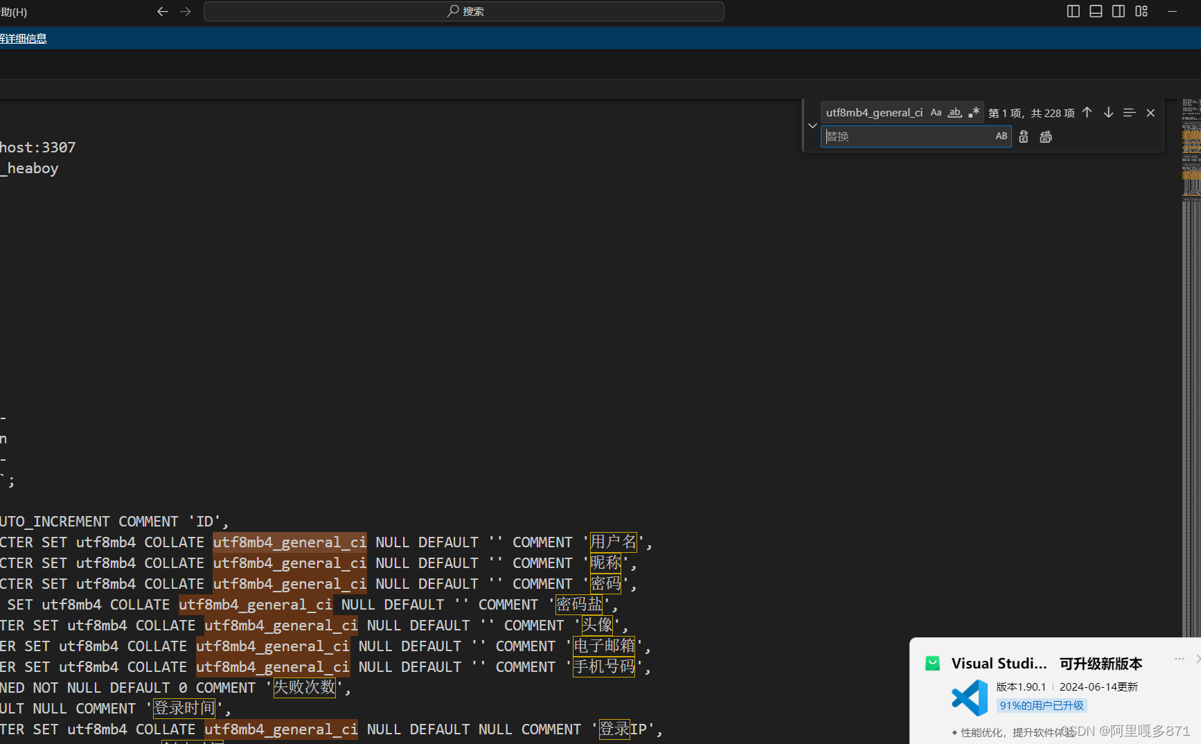
mysql导入sql文件失败及解决措施
1.报错找不到表 1.1 原因 表格创建失败,编码问题mysql8相较于mysql5出现了新的编码集 1.2解决办法: 使用vscode打开sql文件ctrlh,批量替换,替换到你所安装mysql支持的编码集。 2.timestmp没有设置默认值 Error occured at:20…...

JS:获取鼠标点击位置
一、获取鼠标在目标元素中的点击位置 getClickPos.ts: export const getClickPos (e: MouseEvent) > {return {x: e.offsetX,y: e.offsetY,}; };二、获取鼠标在页面中的点击位置 getClickPos.ts: export const getPageClickPos (e: MouseEvent) > {return {x: e.pa…...
)
使用开源的zip.cpp和unzip.cpp实现压缩包的创建与解压(附源码)
目录 1、使用场景 2、压缩包的创建 3、压缩包的解压 4、CloseZipZ和CloseZipU两接口的区别...

npm 异常:peer eslint@“>=1.6.0 <7.0.0“ from eslint-loader@2.2.1
node 用16版本 npm install npm6.14.15 -g将版本降级到6...

Docker|了解容器镜像层(2)
引言 容器非常神奇。它们允许简单的进程表现得像虚拟机。在这种优雅的底层是一组模式和实践,最终使一切运作起来。在设计的根本是层。层是存储和分发容器化文件系统内容的基本方式。这种设计既出人意料地简单,同时又非常强大。在今天的帖子[1]中…...

使用Python爬取temu商品与评论信息
【🏠作者主页】:吴秋霖 【💼作者介绍】:擅长爬虫与JS加密逆向分析!Python领域优质创作者、CSDN博客专家、阿里云博客专家、华为云享专家。一路走来长期坚守并致力于Python与爬虫领域研究与开发工作! 【&…...

mybatis学习--自定义映射resultMap
1.1、resultMap处理字段和属性的映射关系 如果字段名和实体类中的属性名不一致的情况下,可以通过resultMap设置自定义映射。 常规写法 /***根据id查询员工信息* param empId* return*/ Emp getEmpByEmpId(Param("empId") Integer empId);<select id…...
Elasticsearch之写入原理以及调优
1、ES 的写入过程 1.1 ES支持四种对文档的数据写操作 create:如果在PUT数据的时候当前数据已经存在,则数据会被覆盖,如果在PUT的时候加上操作类型create,此时如果数据已存在则会返回失败,因为已经强制指定了操作类型…...

python中装饰器的用法
最近发现装饰器是一个非常有意思的东西,很高级! 允许你在不修改函数或类的源代码的情况下,为它们添加额外的功能或修改它们的行为。装饰器本质上是一个接受函数作为参数的可调用对象(通常是函数或类),并返…...
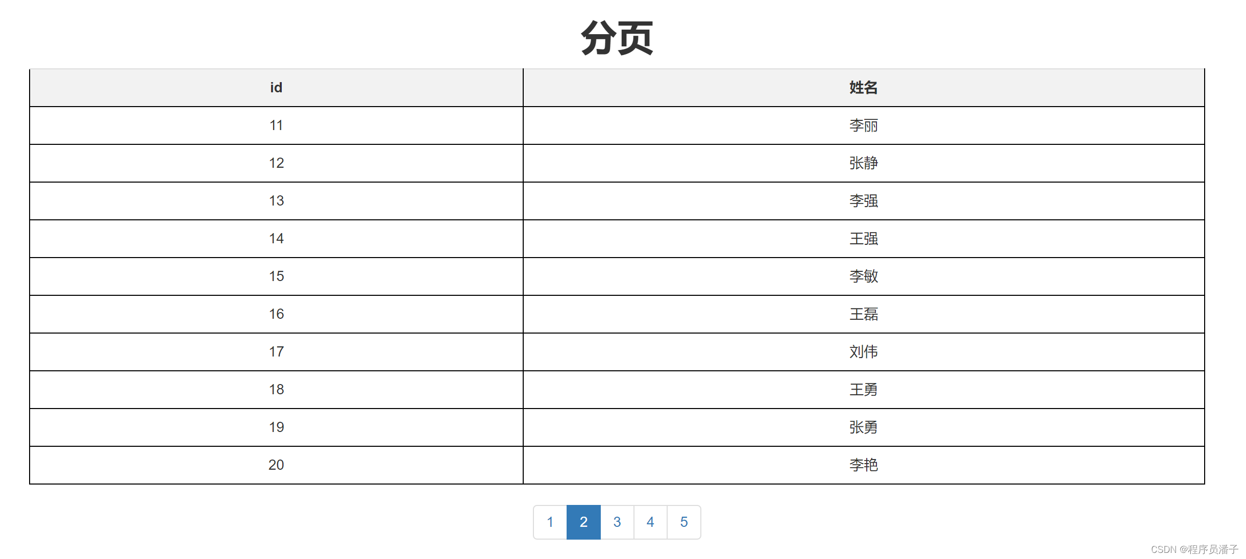
php实现一个简单的MySQL分页
一、案例演示: 二、php 代码 <?php $servername "localhost"; // MySQL服务器名称或IP地址 $username "root"; // MySQL用户名 $password "123456"; // MySQL密码 $dbname "test"; // 要连接…...

算法训练营day23补签
题目1:530. 二叉搜索树的最小绝对差 - 力扣(LeetCode) class Solution { public:int reslut INT_MAX;TreeNode* pre NULL;void trackingback(TreeNode* node) {if(node NULL) return;trackingback(node->left);if(pre ! NULL) {reslut…...

国密SM2JS加密后端解密
1.前端加密 前端加密开源库 sm-crypto 1.1 传统web,下载 sm-crypto 进行打包为 dist/sm2.js 相关打包命令 npm install --save sm-crypto npm install npm run prepublish在web页面引用打包后的文件 <script type"text/javascript" src"<%path %>…...

Cheat Engine.exe修改植物大战僵尸阳光与冷却
Cheat Engine.exe修改植物大战僵尸阳光与冷却 打开Cheat Engine.exe和植物大战僵尸,点CE中文件下面红框位置,选择植物大战僵尸,点击打开 修改冷却: 等冷却完毕,首次扫描0安放植物,再次扫描变动值等冷却完…...
用法)
python内置模块之queue(队列)用法
queue是python3的内置模块,创建堆栈队列,用来处理多线程通信,队列对象构造方法如下: queue.Queue(maxsize0) 是先进先出(First In First Out: FIFO)队列。 入参 maxsize 是一个整数,用于设置…...

Spring Security——结合JWT实现令牌的验证与授权
目录 JWT(JSON Web Token) 项目总结 新建一个SpringBoot项目 pom.xml PayloadDto JwtUtil工具类 MyAuthenticationSuccessHandler(验证成功处理器) JwtAuthenticationFilter(自定义token过滤器) W…...

Vector的底层结构剖析
vector的介绍: 1.Vector实现了List接口的集合。 2.Vector的底层也是一个数组,protected Object[] elementData; 3.Vector 是线程同步的,即线程安全,Vector类的操作方法带有Synchronized. 4.在开发中,需要线程同步时࿰…...

实现抖音视频滑动功能vue3+swiper
首先,你需要安装和引入Swiper库。可以使用npm或者yarn进行安装。 pnpm install swiper然后在Vue组件中引入Swiper库和样式。 // 导入Swiper组件和SwiperSlide组件,用于创建轮播图 import {Swiper, SwiperSlide } from swiper/vue; // 导入Swiper的CSS样式,确保轮播图的正确…...

Linux文件系统【真的很详细】
目录 一.认识磁盘 1.1磁盘的物理结构 1.2磁盘的存储结构 1.3磁盘的逻辑存储结构 二.理解文件系统 2.1如何管理磁盘 2.2如何在磁盘中找到文件 2.3关于文件名 哈喽,大家好。今天我们学习文件系统,我们之前在Linux基础IO中研究的是进程和被打开文件…...

JAVA学习笔记DAY5——Spring_Ioc
文章目录 Bean配置注解方式配置注解配置文件调用组件 注解方法作用域 DI注入注解引用类型自动装配文件结构自动装配实现 基本数据类型DI装配 Bean配置 注解方式配置 类上添加Ioc注解配置文件中告诉SpringIoc容器要检查哪些包 注解仅是一个标记 注解 不同注解仅是为了方便开…...

如何高效配置Kodi PVR IPTV Simple:专业级家庭IPTV直播系统部署指南
如何高效配置Kodi PVR IPTV Simple:专业级家庭IPTV直播系统部署指南 【免费下载链接】pvr.iptvsimple IPTV Simple client for Kodi PVR 项目地址: https://gitcode.com/gh_mirrors/pv/pvr.iptvsimple Kodi PVR IPTV Simple是一款功能强大的开源IPTV客户端插…...

如何用Steam Achievement Manager掌控游戏成就?解锁7大实用技巧
如何用Steam Achievement Manager掌控游戏成就?解锁7大实用技巧 【免费下载链接】SteamAchievementManager A manager for game achievements in Steam. 项目地址: https://gitcode.com/gh_mirrors/st/SteamAchievementManager 在游戏世界中,成就…...

ENet核心架构深度解析:从主机管理到对等通信
ENet核心架构深度解析:从主机管理到对等通信 【免费下载链接】enet ENet reliable UDP networking library 项目地址: https://gitcode.com/gh_mirrors/en/enet ENet是一款高性能的可靠UDP网络库,专为实时多人游戏和低延迟应用设计。它通过创新的…...

Windows右键菜单重构指南:从混乱到高效的ContextMenuManager实战
Windows右键菜单重构指南:从混乱到高效的ContextMenuManager实战 【免费下载链接】ContextMenuManager 🖱️ 纯粹的Windows右键菜单管理程序 项目地址: https://gitcode.com/gh_mirrors/co/ContextMenuManager 问题诊断:你的右键菜单是…...

终极Chromium性能优化方案:Thorium浏览器让你的上网体验快如闪电
终极Chromium性能优化方案:Thorium浏览器让你的上网体验快如闪电 【免费下载链接】thorium Chromium fork named after radioactive element No. 90. Windows and MacOS/Raspi/Android/Special builds are in different repositories, links are towards the top of…...

软考高项“上岸”指南:三位宝藏老师,专治你的备考焦虑
备战软考高项,尤其是面对2026年可能更加灵活的考情,选择一位对的引路人至关重要。今天,就为大家深度介绍软考老金团队的三位王牌导师——尹老师、金老师、秦老师。他们风格互补,却有着共同的目标:陪你稳稳上岸。尹老师…...
)
告别配置迷茫!手把手教你用DaVinci Configurator配置Autosar NvM Block(含三种类型详解)
告别配置迷茫!手把手教你用DaVinci Configurator配置Autosar NvM Block(含三种类型详解) 在汽车电子开发中,非易失性存储(NVM)的配置往往是工程师们最头疼的环节之一。面对复杂的AUTOSAR存储协议栈…...

抖音内容一键保存:3分钟搞定无水印批量下载完整指南
抖音内容一键保存:3分钟搞定无水印批量下载完整指南 【免费下载链接】douyin-downloader 项目地址: https://gitcode.com/GitHub_Trending/do/douyin-downloader 你是不是也遇到过这样的烦恼?看到精彩的抖音视频想保存下来反复学习,却…...

OpenAddresses多语言支持:全球地址数据的终极处理指南
OpenAddresses多语言支持:全球地址数据的终极处理指南 【免费下载链接】openaddresses A global repository of open address data. 项目地址: https://gitcode.com/gh_mirrors/op/openaddresses OpenAddresses是全球最大的开源地址数据仓库,提供…...

LFM2.5-1.2B-Thinking-GGUF部署教程:解决‘返回为空’问题的max_tokens调优策略
LFM2.5-1.2B-Thinking-GGUF部署教程:解决返回为空问题的max_tokens调优策略 1. 模型简介与部署准备 LFM2.5-1.2B-Thinking-GGUF是Liquid AI推出的轻量级文本生成模型,特别适合在资源有限的环境中快速部署使用。这个模型采用GGUF格式和llama.cpp运行时&…...