前端学习-day10
文章目录
- 01-体验平面转换
- 02-平移效果
- 03-绝对定位元素居中
- 04-案例-双开门
- 06-转换旋转中心点
- 07-案例-时钟-转换原点
- 08-平面转换-多重转换
- 09-缩放效果
- 10-案例-按钮缩放
- 11-倾斜效果
- 12-渐变-线性
- 13-案例-产品展示
- 14-渐变-径向
- 15-综合案例-喜马拉雅
01-体验平面转换
<!DOCTYPE html>
<html lang="en">
<head><meta charset="UTF-8"><meta name="viewport" content="width=device-width, initial-scale=1.0"><title>Document</title><style>div{width: 100px;height: 100px;background-color: pink;/* :转变 过度 */transition: all 1s;}div:hover{/* 变压器 */transform: translate(800px) rotate(360deg) scale(2) skew(180deg);}</style>
</head>
<body><div></div>
</body>
</html>
02-平移效果
<!DOCTYPE html>
<html lang="en">
<head><meta charset="UTF-8"><meta name="viewport" content="width=device-width, initial-scale=1.0"><title>Document</title><style>.father{width: 500px;height: 300px;margin: 50px auto;border: 1px solid #000;}.son{width: 200px;height: 100px;background-color: pink;transition: all 1s;}/* 鼠标移入到父盒子,son改变位置 */.father:hover .son{transform: translate(200px,100px);/* 百分比参照盒子自身尺寸改变位置 */transform: translate(50%,100%);/* 只写一个数 只移动x方向 */transform: translate(100px);/* 可以单独移动Y方向的 */transform: translateY(100px);}</style>
</head>
<body><div class="father"><div class="son"></div></div>
</body>
</html>
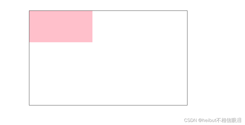
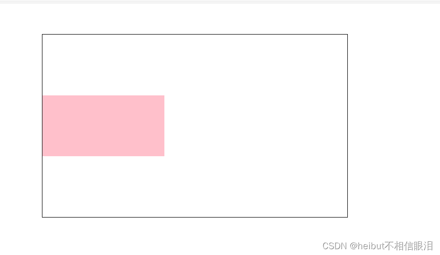
03-绝对定位元素居中
<!DOCTYPE html>
<html lang="en">
<head><meta charset="UTF-8"><meta name="viewport" content="width=device-width, initial-scale=1.0"><title>Document</title><style>.box{position: absolute;left: 50%;top: 50%;/* 向左向上移动自身尺寸的一半 */transform: translate(-50%,-50%);width: 200px;height: 100px;background-color: pink;}</style>
</head>
<body><div class="box"></div>
</body>
</html>
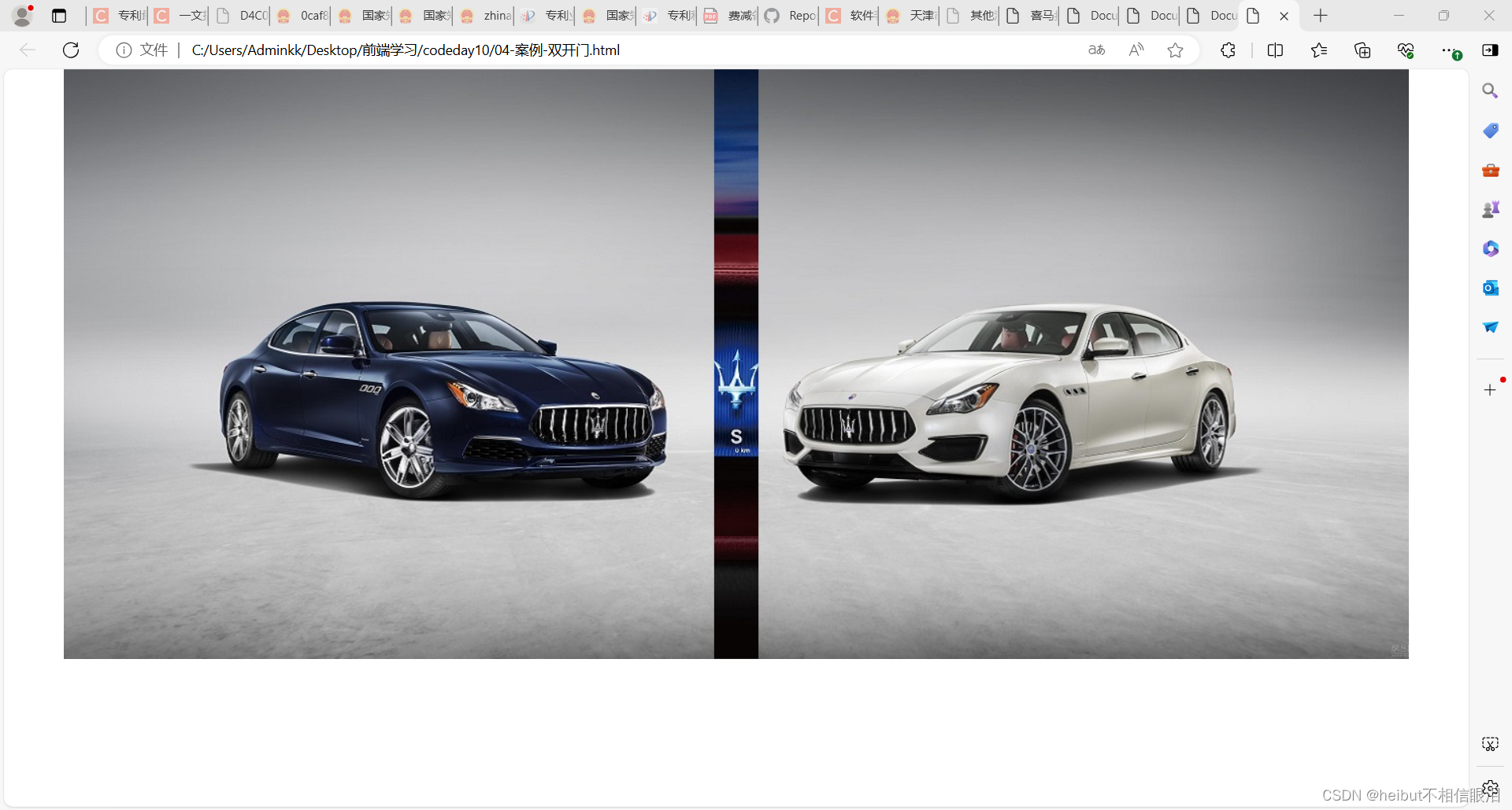
04-案例-双开门
<!DOCTYPE html>
<html lang="en">
<head><meta charset="UTF-8"><meta name="viewport" content="width=device-width, initial-scale=1.0"><title>Document</title><style>*{margin: 0;padding: 0;}/* 1.布局:父子结构,父级是大图,子级是左右小图 */.father{display: flex;margin: 0 auto;width: 1366px;height: 600px;background-image: url(./images/bg.jpg);overflow: hidden;}.father .left,.father .right{width: 50%;height: 600px;background-image: url(./images/fm.jpg);transition: all 1s;}.father .right{/* background-position是对当前区域的背景进行移动 */background-position: right 0;}/* 2.鼠标悬停的效果:左右移动 */.father:hover .left{transform: translate(-100%);}.father:hover .right{transform: translate(100%);}</style>
</head>
<body><div class="father"><div class="left"></div><div class="right"></div></div>
</body>
</html>
06-转换旋转中心点
<!DOCTYPE html>
<html lang="en">
<head><meta charset="UTF-8"><meta name="viewport" content="width=device-width, initial-scale=1.0"><title>Document</title><style>img{width: 200px;border: 1px solid #000;transition: all 1s;/* 转换原点 */transform-origin: right bottom;}img:hover{transform: rotate(360deg);}</style>
</head>
<body><img src="./images/rotate.png" alt="">
</body>
</html>
07-案例-时钟-转换原点
<!DOCTYPE html>
<html lang="en"><head><meta charset="UTF-8" /><meta name="viewport" content="width=device-width, initial-scale=1.0" /><title>Document</title><style>.clock {width: 250px;height: 250px;border: 8px solid #000;border-radius: 50%;margin: 100px auto;position: relative;}.line {/* 1.定位 */position: absolute;width: 4px;height: 250px;background-color: #999;left: 50%;transform: translate(-50%);}/* 线2: 旋转, 每条线旋转角度不同, 单独选中不同的line, 写rotate代码 *//* 一圈是360度, 等分成  xx 份 */.line:nth-child(2) {transform: translate(-50%) rotate(30deg);}.line:nth-child(3) {transform: translate(-50%) rotate(60deg);}.line:nth-child(4) {transform: translate(-50%) rotate(90deg);}.line:nth-child(5) {transform: translate(-50%) rotate(120deg);}.line:nth-child(6) {transform: translate(-50%) rotate(150deg);}/* 第一根和第四跟宽度大一些 */.line:nth-child(1),.line:nth-child(4) {width: 5px;}/* 遮罩圆形 */.cover {position: absolute;left: 50%;top: 50%;transform: translate(-50%, -50%);width: 200px;height: 200px;background-color: #fff;border-radius: 50%;}/* 表针 *//* 并集选择器放在单独选择器的上面, 避免transform属性的层叠 */.hour,.minute,.second {position: absolute;left: 50%;/* 盒子底部在盒子中间 */bottom: 50%;/* 使三个指针围绕底部定点旋转 */transform-origin: center bottom;}.hour {width: 6px;height: 50px;background-color: #333;margin-left: -3px;/* 这是设置的旋转度数 */transform: rotate(15deg);}.minute {width: 5px;height: 65px;background-color: #333;margin-left: -3px;transform: rotate(90deg);}.second {width: 4px;height: 80px;background-color: red;margin-left: -2px;transform: rotate(240deg);}/* 螺丝 */.dotted {position: absolute;left: 50%;top: 50%;transform: translate(-50%, -50%);width: 18px;height: 18px;background-color: #333;border-radius: 50%;}</style></head><body><div class="clock"><!-- 刻度线 --><div class="line"></div><div class="line"></div><div class="line"></div><div class="line"></div><div class="line"></div><div class="line"></div><!-- 遮罩圆形 --><div class="cover"></div><!-- 表针 --><div class="hour"></div><div class="minute"></div><div class="second"></div><!-- 螺丝 --><div class="dotted"></div></div></body>
</html>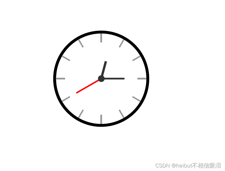
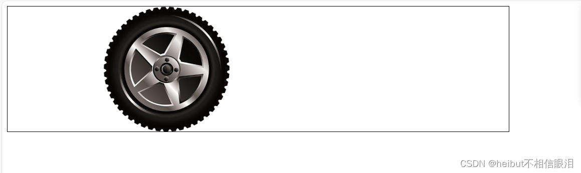
08-平面转换-多重转换
<!DOCTYPE html>
<html lang="en">
<head><meta charset="UTF-8"><meta name="viewport" content="width=device-width, initial-scale=1.0"><title>Document</title><style>.box{width: 800px;height: 200px;border: 1px solid #000;}img{width: 200px;transition: all 1s;}.box:hover img{/* 先平移后旋转 */transform: translate(600px) rotate(360deg);/* 多重转换会以第一种转换形态的坐标轴为准 *//* transform: rotate(360deg) translate(600px); *//* 层叠性 *//* transform: translate(600px); *//* transform: rotate(360deg); */}</style>
</head>
<body><div class="box"><img src="./images/tyre.png" alt=""></div>
</body>
</html>
09-缩放效果
<!DOCTYPE html>
<html lang="en">
<head><meta charset="UTF-8"><meta name="viewport" content="width=device-width, initial-scale=1.0"><title>Document</title>
</head>
<style>.box{width: 300px;height: 210px;margin: 100px auto;}.box img{width: 100%;transition: all 0.5s;}.box:hover img{/* 只设置宽高的效果是从左上角发生改变 *//* width: 500px; *//* height: 400px; *//* 沿着中心点向四周放大 *//* 大于1 :放大   小于1:缩小   等于1 :不变 */transform: scale(2);transform: scale(0.2);transform: scale(1);}
</style>
<body><div class="box"><img src="./images/product.jpeg" alt=""></div>
</body>
</html>
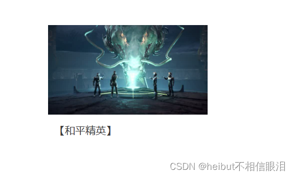
10-案例-按钮缩放
<!DOCTYPE html>
<html lang="en">
<head><meta charset="UTF-8"><meta name="viewport" content="width=device-width, initial-scale=1.0"><title>Document</title><style>*{margin: 0;padding: 0;}li{list-style: none;}img{width: 100%;}.box{width: 249px;height: 210px;margin: 50px auto;}.box p{color: #3b3b3b;padding: 10px 10px 0 10px;}li{overflow: hidden;}/* 1.摆放播放的按钮——>放到图片区域的中间 */.box .pic{position: relative;}.pic::after{/* 2. after是行内元素,宽高不生效,但是加了position 变成行内块,宽高就生效了 */position: absolute;/* 1.after 不加content 不生效 */top: 50%;left: 50%;/* transform: translate(-50%,-50%); *//* margin-left: -28px; *//* margin-top: -28px; */content: '';width: 58px;height: 58px;background-image: url(./images/play.png);/* 变成复合属性,防止标签层叠 */transform: translate(-50%,-50%) scale(5);opacity: 0;transition: all .5s;}/* 2.设置鼠标悬停状态 */li:hover .pic::after{opacity: 1;transform: translate(-50%,-50%) scale(1);}</style>
</head>
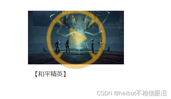
<body><div class="box"><ul><li><div class="pic"><img src="./images/party.jpeg" alt=""></div><p>【和平精英】</p></li></ul></div></body>
</html>
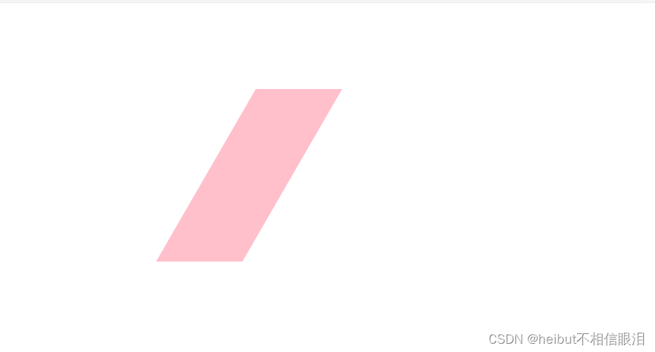
11-倾斜效果
<!DOCTYPE html>
<html lang="en">
<head><meta charset="UTF-8"><meta name="viewport" content="width=device-width, initial-scale=1.0"><title>Document</title><style>div{margin: 100px auto;width: 100px;height: 200px;background-color: pink;transition: all 1s;}div:hover{transform: skew(30deg);transform: skew(-30deg);}</style>
</head>
<body><div></div>
</body>
</html>

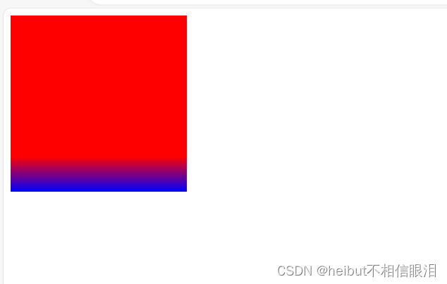
12-渐变-线性
<!DOCTYPE html>
<html lang="en">
<head><meta charset="UTF-8"><meta name="viewport" content="width=device-width, initial-scale=1.0"><title>Document</title><style>div{width: 200px;height: 200px;background-color: blue;background-image: linear-gradient(red,blue);background-image: linear-gradient(to right,red,blue);background-image: linear-gradient(45deg,red,blue);background-image: linear-gradient(red 80%,blue);}</style>
</head>
<body><div></div>
</body>
</html>
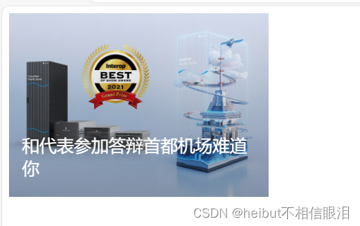
13-案例-产品展示
<!DOCTYPE html>
<html lang="en">
<head><meta charset="UTF-8"><meta name="viewport" content="width=device-width, initial-scale=1.0"><title>Document</title><style>.box{position: relative;width: 300px;height: 212px;}.box img{width: 300px;}.box .title{position: absolute;left: 15px;bottom: 20px;/* 堆叠顺序: 谁的index属性值大,就不会被盖住  */z-index: 2;width: 260px;color: #fff;font-size: 20px;font-weight: 700px;}.mask{position: absolute;top: 0;width: 300px;height: 212px;background-image: linear-gradient(transparent,rgba(0,0,0,0.5));opacity: 0;transition: all .5s;}.box:hover .mask{opacity: 1;}</style>
</head>
<body><div class="box"><img src="./images/product.jpeg" alt=""><div class="title">和代表参加答辩首都机场难道你</div><div class="mask"></div></div>
</body>
</html>

14-渐变-径向
<!DOCTYPE html>
<html lang="en">
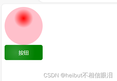
<head><meta charset="UTF-8"><meta name="viewport" content="width=device-width, initial-scale=1.0"><title>Document</title><style>div{width: 100px;height: 100px;background-color: pink;border-radius: 50%;/* 正圆 */background-image: radial-gradient(50px at center center,red,pink);/* 椭圆 */background-image: radial-gradient(50px 20px at center center,red,pink);background-image: radial-gradient(50px at 50px 30px,red,pink 50%/* 半径的50%前是渐变 50%后是pink颜色 */);}button{width: 100px;height: 40px;background-color: green;border: 0;border-radius: 5px;color: #fff;background-image: radial-gradient(50px at 30px 20px,rgba(255,255,255,0.2),transparent);}</style>
</head>
<body><div></div><button>按钮</button>
</body>
</html>
15-综合案例-喜马拉雅
点击查看
相关文章:
前端学习-day10
文章目录 01-体验平面转换02-平移效果03-绝对定位元素居中04-案例-双开门06-转换旋转中心点07-案例-时钟-转换原点08-平面转换-多重转换09-缩放效果10-案例-按钮缩放11-倾斜效果12-渐变-线性13-案例-产品展示14-渐变-径向15-综合案例-喜马拉雅 01-体验平面转换 <!DOCTYPE h…...
深入理解桥接模式(Bridge Pattern)及其实际应用
引言 在软件开发过程中,设计模式为我们提供了优雅且高效的解决方案,以应对常见的设计问题。桥接模式(Bridge Pattern)作为一种结构型设计模式,旨在将抽象部分与其实现部分分离,使它们可以独立变化…...
Springboot + Mybatis 实现sql打印
参照这个视频:https://www.bilibili.com/video/BV1MS411N7mn/?vd_source90ebeef3261cec486646b6583e9f45f5 实现mybatis对外暴露的接口Interceptor 使用Intercepts接口,这里的写法参照mybatis-plus中的拦截器写法 Intercepts({Signature(type Executor.class, m…...
Cesium默认bing地图数据,还支持哪些地图的数据源呢?
传统的前端开发增长乏力了,新兴的web3D方向前端开发需求旺盛,这一块在国外很成熟,在国内兴起不久, 甚至很多前端老铁都没听过,没见过,没有意识到,前端除了框架、vue、uniapp这些烂大街的&#x…...
高效、智能、安全:小型机房EasyCVR+AI视频综合监控解决方案
一、背景需求分析 随着信息技术的迅猛发展,小型机房在企事业单位中扮演着越来越重要的角色。为了确保机房的安全稳定运行,远程监控成为了必不可少的手段。 二、视频监控 视频监控是机房远程监控的重要组成部分。通过安装IP摄像机及部署视频监控系统Ea…...

数据分析的Excel基础操作
数据透视表 1.先备份,创建原数据副本,将副本sheet隐藏掉。 2.看数据的量级,总行和总列。 3.浏览数据的字段和数值,大致看一下有无异常 4.找到插入->数据透视表,不选择默认点击确认创建,随意点击数据透视…...
【C语言】解决C语言报错:Invalid Pointer
文章目录 简介什么是Invalid PointerInvalid Pointer的常见原因如何检测和调试Invalid Pointer解决Invalid Pointer的最佳实践详细实例解析示例1:未初始化的指针示例2:已释放的指针示例3:返回局部变量的指针示例4:野指针 进一步阅…...
动态图形设计:创造视觉运动的艺术
什么是动态设计?动态设计是一个设计领域,指在用户界面中使用动态效果的设计。简单地说是为了移动用户界面上的元素而设计的。良好的动态设计可以吸引用户的注意,提高用户体验和满意度。动态设计也是界面设计与动态设计的结合,将设…...

CSS 属性 `mix-blend-mode`
CSS 属性 mix-blend-mode 在日常的 Web 开发中,我们大多时候都会使用一些常见的 CSS 属性,比如 font-size、color、background-color 等。但是,CSS 语言中还隐藏着许多鲜为人知但非常强大的属性,今天我们就来探讨其中一个 - mix-blend-mode。 mix-blend-mode 是什么? mix-b…...
三大交易所全面恢复 IPO 申请
6月21日晚间,北交所受理了3家企业的IPO申请,这是北交所时隔3个月之后恢复IPO受理。6月20日晚间,沪深交易所各受理了1家IPO申请,这是沪深交易所时隔半年后再次受理IPO。这也意味着,三大交易所IPO受理全部恢复。 6月21日…...
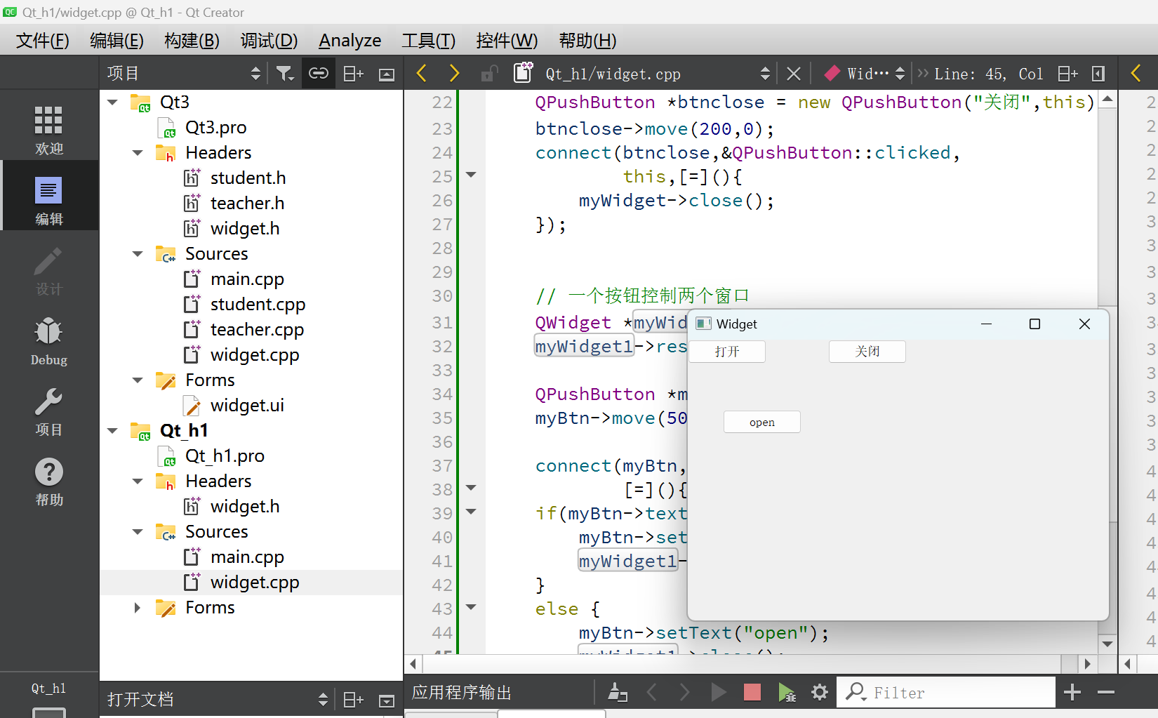
VC++开发积累——vc++6.0中删除函数的方法,右键,Delete
目录 引出插曲:删除函数的方法多行注释的实现代码输入的自动提示搜索出来,标记和取消标记跳转到上一步的位置 ctrl TAB 总结其他规范和帮助文档创建第一个Qt程序对象树概念信号signal槽slot自定义信号和槽1.自定义信号2.自定义槽3.建立连接4.进行触发 自…...

HBDNY-40/1端子排电压继电器 DC110V 导轨安装 约瑟JOSEF
HBDNY系列端子排型电压电流继电器 系列型号:(3、4过/低电压型,5、6过/低电流型) HBDNY-30/1端子排型电压继电器;HBDNY-30/2端子排型电压继电器; HBDNY-30/3端子排型电压继电器;HBDNY-30/4端子…...
Redis-数据类型-Geospatial(地理空间索引)
文章目录 1、查看redis是否启动2、通过客户端连接redis3、切换到db5数据库4、将地理位置信息(经度和纬度)添加到 Redis 的键(key)中4.1、添加大江商厦4.2、添加西部硅谷 5、升序返回有序集key,让分数一起和值返回的结果…...
Python联动Mysql
首先配置pip源(不然在安装库的时候会很慢!!!) pip config set global.index-url https://mirrors.aliyun.com/pypi/simple/安装必要库: mysql.connector MySQL 连接器/ODBC 是 MySQL ODBC 驱动程序(以前称为 MyODBC 驱动程序)系列的名称,它使…...

vue3-openlayers 轨迹回放(历史轨迹)(ol-animation-path实现)
本篇介绍一下使用vue3-openlayers轨迹回放(历史轨迹)(ol-animation-path实现) 1 需求 轨迹回放(历史轨迹)实时轨迹 2 分析 轨迹回放(历史轨迹),一般是一次性拿到所有…...
:图像分割(阈值分割threshold、分水岭算法watershed的使用步骤、洪水填充floodFill算法的使用))
计算机视觉全系列实战教程 (十二):图像分割(阈值分割threshold、分水岭算法watershed的使用步骤、洪水填充floodFill算法的使用)
1.图像分割概述 (1)What(什么是图像分割) 将图像划分为不同的子区域,使得同一子区域具有较高的相似性,不同的子区域具有明显的差异性 (2)Why(对图像进行分割有什么作用) 医学领域:将不同组织分割成不同区域帮助分析病情军事领域ÿ…...
Linux的免交互
交互:我们发出指令控制程序的运行,程序在接收到指令之后按照指令的效果做出对应的反应。 免交互:间接的通过第三方的方式把指令传送给程序,不用直接的下达指令。 1、here document免交互 ere document免交互:是命令…...

查看es p12证书文件过期方法
查看证书过期时间: openssl pkcs12 -in elastic-certificates.p12 -nokeys -out elastic-certificates.crt (需要输入证书生成时配置密码) openssl x509 -enddate -noout -in elastic-certificates.crt...

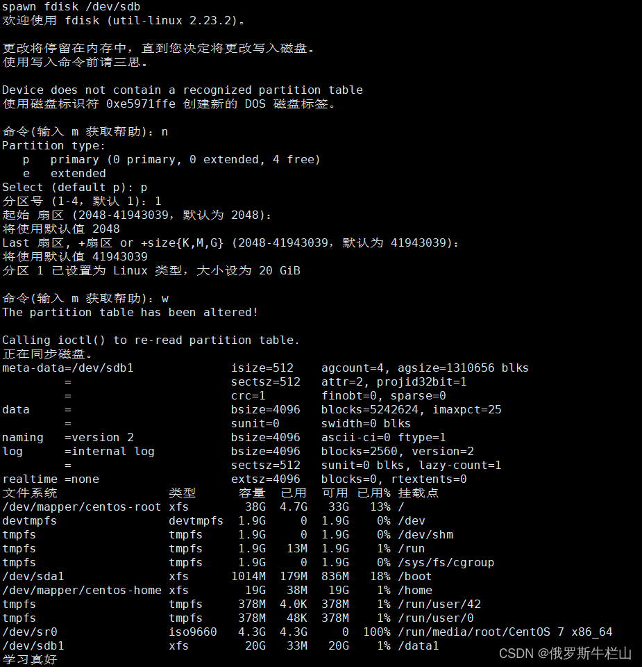
1.8 无符号大数加、减运算
作者 李卫明 单位 杭州电子科技大学 1.8 无符号大数加、减运算。程序设计中经常遇到无符号大数加、减运算问题,请在样例程序Ex1.4基础上实现无符号大数减运算。题目要求输入两个无符号大数,保证一个大数不小于第二个大数,输出它们的和、差。…...

Java常用类--包装类
包装类 一方面出于性能方面的考虑,java为数值使用基本类型,而不是对象。基本类型不是对象层次的组成部分,它们不继承Object。 另一方面有时需要创建表示基本类型的对象,例如集合类只处理对象。为了在类中存储基本类型,…...

InstructPix2Pix:5分钟掌握AI图像编辑的终极指南
InstructPix2Pix:5分钟掌握AI图像编辑的终极指南 【免费下载链接】instruct-pix2pix 项目地址: https://gitcode.com/gh_mirrors/in/instruct-pix2pix 你是否曾经幻想过,只需一句话就能让图片中的对象变成你想要的样子?比如把普通的大…...

基于SpringBoot的民宿预订与评价系统毕业设计
博主介绍:✌ 专注于Java,python,✌关注✌私信我✌具体的问题,我会尽力帮助你。一、研究目的本研究旨在构建一个基于Spring Boot与Vue框架的民宿预订与评价系统以解决当前旅游住宿服务领域存在的信息不对称问题用户体验碎片化问题以及数据管理分散化问题该…...

命令行媒体管理工具amem:本地化素材归档与自动化实践
1. 项目概述:一个被低估的本地化媒体管理工具最近在整理个人数字资产时,我遇到了一个老生常谈但又无比棘手的问题:如何高效、优雅地管理那些散落在硬盘各个角落的短视频、图片和音频文件?无论是手机拍摄的生活片段,还是…...

八大网盘直链解析工具:高效跨平台文件下载全攻略
八大网盘直链解析工具:高效跨平台文件下载全攻略 【免费下载链接】Online-disk-direct-link-download-assistant 一个基于 JavaScript 的网盘文件下载地址获取工具。基于【网盘直链下载助手】修改 ,支持 百度网盘 / 阿里云盘 / 中国移动云盘 / 天翼云盘 …...

单例模式深度解析:从基础实现到生产级避坑指南
1. 单例模式:为什么它既是基石又是“坑”在软件开发的江湖里,单例模式(Singleton Pattern)的名号,几乎无人不知。它被写进教科书,是设计模式中最容易理解、也最常被提及的模式之一。但有趣的是,…...
:一个骰子如何玩转优化问题?)
用Python从零复现混沌博弈算法(CGO):一个骰子如何玩转优化问题?
用Python从零复现混沌博弈算法(CGO):一个骰子如何玩转优化问题? 混沌博弈算法(Chaos Game Optimization, CGO)是近年来兴起的一种新型智能优化算法,它将混沌理论与博弈思想巧妙结合,…...

基于RAG的LLM知识库构建:从智能分块到检索增强生成实战
1. 项目概述:一个为大型语言模型量身定制的知识库构建工具如果你和我一样,经常和大型语言模型打交道,无论是用它们来辅助编程、分析文档,还是构建问答系统,那你一定遇到过这个核心痛点:如何让模型精准地理解…...

40希尔排序 - 以递减间距进行插入排序
希尔排序 - 以递减间距进行插入排序 040希尔排序:用长距离跳跃打破速度壁垒📰 5W1H 发明者故事 Who(何人)- 发明者是谁? 发明者:唐纳德希尔(Donald L. Shell) 背景:希尔…...

codex出现Reconnecting和stream disconnected before completion:stream closed before response.complete解决方案
大家好,我是爱编程的喵喵。双985硕士毕业,现担任全栈工程师一职,热衷于将数据思维应用到工作与生活中。从事机器学习以及相关的前后端开发工作。曾在阿里云、科大讯飞、CCF等比赛获得多次Top名次。现为CSDN博客专家、人工智能领域优质创作者。喜欢通过博客创作的方式对所学的…...

Tungsten自适应采样算法:如何智能分配计算资源提升渲染质量
Tungsten自适应采样算法:如何智能分配计算资源提升渲染质量 【免费下载链接】tungsten High performance physically based renderer in C11 项目地址: https://gitcode.com/gh_mirrors/tu/tungsten Tungsten渲染器的自适应采样算法是一种革命性的渲染优化技…...