HarmonyOS Next开发学习手册——弹性布局 (Flex)
概述
弹性布局( Flex )提供更加有效的方式对容器中的子元素进行排列、对齐和分配剩余空间。常用于页面头部导航栏的均匀分布、页面框架的搭建、多行数据的排列等。
容器默认存在主轴与交叉轴,子元素默认沿主轴排列,子元素在主轴方向的尺寸称为主轴尺寸,在交叉轴方向的尺寸称为交叉轴尺寸。
图1 主轴为水平方向的Flex容器示意图

基本概念
-
主轴:Flex组件布局方向的轴线,子元素默认沿着主轴排列。主轴开始的位置称为主轴起始点,结束位置称为主轴结束点。
-
交叉轴:垂直于主轴方向的轴线。交叉轴开始的位置称为交叉轴起始点,结束位置称为交叉轴结束点。
布局方向
在弹性布局中,容器的子元素可以按照任意方向排列。通过设置参数direction,可以决定主轴的方向,从而控制子元素的排列方向。
图2 弹性布局方向图

- FlexDirection.Row(默认值):主轴为水平方向,子元素从起始端沿着水平方向开始排布。
Flex({ direction: FlexDirection.Row }) {Text('1').width('33%').height(50).backgroundColor(0xF5DEB3)Text('2').width('33%').height(50).backgroundColor(0xD2B48C)Text('3').width('33%').height(50).backgroundColor(0xF5DEB3)
}
.height(70)
.width('90%')
.padding(10)
.backgroundColor(0xAFEEEE)

- FlexDirection.RowReverse:主轴为水平方向,子元素从终点端沿着FlexDirection. Row相反的方向开始排布。
Flex({ direction: FlexDirection.RowReverse }) {Text('1').width('33%').height(50).backgroundColor(0xF5DEB3)Text('2').width('33%').height(50).backgroundColor(0xD2B48C)Text('3').width('33%').height(50).backgroundColor(0xF5DEB3)
}
.height(70)
.width('90%')
.padding(10)
.backgroundColor(0xAFEEEE)

- FlexDirection.Column:主轴为垂直方向,子元素从起始端沿着垂直方向开始排布。
Flex({ direction: FlexDirection.Column }) {Text('1').width('100%').height(50).backgroundColor(0xF5DEB3)Text('2').width('100%').height(50).backgroundColor(0xD2B48C)Text('3').width('100%').height(50).backgroundColor(0xF5DEB3)
}
.height(70)
.width('90%')
.padding(10)
.backgroundColor(0xAFEEEE)

- FlexDirection.ColumnReverse:主轴为垂直方向,子元素从终点端沿着FlexDirection. Column相反的方向开始排布。
Flex({ direction: FlexDirection.ColumnReverse }) {Text('1').width('100%').height(50).backgroundColor(0xF5DEB3)Text('2').width('100%').height(50).backgroundColor(0xD2B48C)Text('3').width('100%').height(50).backgroundColor(0xF5DEB3)
}
.height(70)
.width('90%')
.padding(10)
.backgroundColor(0xAFEEEE)

布局换行
弹性布局分为单行布局和多行布局。默认情况下,Flex容器中的子元素都排在一条线(又称“轴线”)上。wrap属性控制当子元素主轴尺寸之和大于容器主轴尺寸时,Flex是单行布局还是多行布局。在多行布局时,通过交叉轴方向,确认新行排列方向。
- FlexWrap. NoWrap(默认值):不换行。如果子元素的宽度总和大于父元素的宽度,则子元素会被压缩宽度。
Flex({ wrap: FlexWrap.NoWrap }) {Text('1').width('50%').height(50).backgroundColor(0xF5DEB3)Text('2').width('50%').height(50).backgroundColor(0xD2B48C)Text('3').width('50%').height(50).backgroundColor(0xF5DEB3)
}
.width('90%')
.padding(10)
.backgroundColor(0xAFEEEE)

- FlexWrap. Wrap:换行,每一行子元素按照主轴方向排列。
Flex({ wrap: FlexWrap.Wrap }) {Text('1').width('50%').height(50).backgroundColor(0xF5DEB3)Text('2').width('50%').height(50).backgroundColor(0xD2B48C)Text('3').width('50%').height(50).backgroundColor(0xD2B48C)
}
.width('90%')
.padding(10)
.backgroundColor(0xAFEEEE)

- FlexWrap. WrapReverse:换行,每一行子元素按照主轴反方向排列。
Flex({ wrap: FlexWrap.WrapReverse}) {Text('1').width('50%').height(50).backgroundColor(0xF5DEB3)Text('2').width('50%').height(50).backgroundColor(0xD2B48C)Text('3').width('50%').height(50).backgroundColor(0xF5DEB3)
}
.width('90%')
.padding(10)
.backgroundColor(0xAFEEEE)

主轴对齐方式
通过justifyContent参数设置子元素在主轴方向的对齐方式。

- FlexAlign.Start(默认值):子元素在主轴方向起始端对齐, 第一个子元素与父元素边沿对齐,其他元素与前一个元素对齐。
let PTopBottom:Record<string,number> = { 'top': 10, 'bottom': 10 }
Flex({ justifyContent: FlexAlign.Start }) {  Text('1').width('20%').height(50).backgroundColor(0xF5DEB3)Text('2').width('20%').height(50).backgroundColor(0xD2B48C)    Text('3').width('20%').height(50).backgroundColor(0xF5DEB3)
}
.width('90%')
.padding(PTopBottom)
.backgroundColor(0xAFEEEE)

- FlexAlign.Center:子元素在主轴方向居中对齐。
let PTopBottom:Record<string,number> = { 'top': 10, 'bottom': 10 }
Flex({ justifyContent: FlexAlign.Center }) {  Text('1').width('20%').height(50).backgroundColor(0xF5DEB3)  Text('2').width('20%').height(50).backgroundColor(0xD2B48C)   Text('3').width('20%').height(50).backgroundColor(0xF5DEB3)
}
.width('90%')
.padding(PTopBottom)
.backgroundColor(0xAFEEEE)

- FlexAlign.End:子元素在主轴方向终点端对齐, 最后一个子元素与父元素边沿对齐,其他元素与后一个元素对齐。
let PTopBottom:Record<string,number> = { 'top': 10, 'bottom': 10 }
Flex({ justifyContent: FlexAlign.End }) {  Text('1').width('20%').height(50).backgroundColor(0xF5DEB3)  Text('2').width('20%').height(50).backgroundColor(0xD2B48C)   Text('3').width('20%').height(50).backgroundColor(0xF5DEB3)
}
.width('90%')
.padding(PTopBottom)
.backgroundColor(0xAFEEEE)

- FlexAlign.SpaceBetween:Flex主轴方向均匀分配弹性元素,相邻子元素之间距离相同。第一个子元素和最后一个子元素与父元素边沿对齐。
let PTopBottom1:Record<string,number> = { 'top': 10, 'bottom': 10 }
Flex({ justifyContent: FlexAlign.SpaceBetween }) {  Text('1').width('20%').height(50).backgroundColor(0xF5DEB3)  Text('2').width('20%').height(50).backgroundColor(0xD2B48C)   Text('3').width('20%').height(50).backgroundColor(0xF5DEB3)
}
.width('90%')
.padding(PTopBottom1)
.backgroundColor(0xAFEEEE)

- FlexAlign.SpaceAround:Flex主轴方向均匀分配弹性元素,相邻子元素之间距离相同。第一个子元素到主轴起始端的距离和最后一个子元素到主轴终点端的距离是相邻元素之间距离的一半。
let PTopBottom:Record<string,number> = { 'top': 10, 'bottom': 10 }
Flex({ justifyContent: FlexAlign.SpaceAround }) {  Text('1').width('20%').height(50).backgroundColor(0xF5DEB3)  Text('2').width('20%').height(50).backgroundColor(0xD2B48C)   Text('3').width('20%').height(50).backgroundColor(0xF5DEB3)
}
.width('90%')
.padding(PTopBottom)
.backgroundColor(0xAFEEEE)

- FlexAlign.SpaceEvenly:Flex主轴方向元素等间距布局,相邻子元素之间的间距、第一个子元素与主轴起始端的间距、最后一个子元素到主轴终点端的间距均相等。
let PTopBottom:Record<string,number> = { 'top': 10, 'bottom': 10 }
Flex({ justifyContent: FlexAlign.SpaceEvenly }) {  Text('1').width('20%').height(50).backgroundColor(0xF5DEB3)  Text('2').width('20%').height(50).backgroundColor(0xD2B48C)   Text('3').width('20%').height(50).backgroundColor(0xF5DEB3)
}
.width('90%')
.padding(PTopBottom)
.backgroundColor(0xAFEEEE)

交叉轴对齐方式
容器和子元素都可以设置交叉轴对齐方式,且子元素设置的对齐方式优先级较高。
容器组件设置交叉轴对齐
可以通过Flex组件的alignItems参数设置子元素在交叉轴的对齐方式。
- ItemAlign.Auto:使用Flex容器中默认配置。
let SWh:Record<string,number|string> = { 'width': '90%', 'height': 80 }
Flex({ alignItems: ItemAlign.Auto }) {  Text('1').width('33%').height(30).backgroundColor(0xF5DEB3)  Text('2').width('33%').height(40).backgroundColor(0xD2B48C)  Text('3').width('33%').height(50).backgroundColor(0xF5DEB3)
}
.size(SWh)
.padding(10)
.backgroundColor(0xAFEEEE)

- ItemAlign.Start:交叉轴方向首部对齐。
let SWh:Record<string,number|string> = { 'width': '90%', 'height': 80 }
Flex({ alignItems: ItemAlign.Start }) {  Text('1').width('33%').height(30).backgroundColor(0xF5DEB3)  Text('2').width('33%').height(40).backgroundColor(0xD2B48C)  Text('3').width('33%').height(50).backgroundColor(0xF5DEB3)
}
.size(SWh)
.padding(10)
.backgroundColor(0xAFEEEE)

- ItemAlign.Center:交叉轴方向居中对齐。
let SWh:Record<string,number|string> = { 'width': '90%', 'height': 80 }
Flex({ alignItems: ItemAlign.Center }) {  Text('1').width('33%').height(30).backgroundColor(0xF5DEB3)  Text('2').width('33%').height(40).backgroundColor(0xD2B48C)  Text('3').width('33%').height(50).backgroundColor(0xF5DEB3)
}
.size(SWh)
.padding(10)
.backgroundColor(0xAFEEEE)

- ItemAlign.End:交叉轴方向底部对齐。
let SWh:Record<string,number|string> = { 'width': '90%', 'height': 80 }
Flex({ alignItems: ItemAlign.End }) {  Text('1').width('33%').height(30).backgroundColor(0xF5DEB3)  Text('2').width('33%').height(40).backgroundColor(0xD2B48C)  Text('3').width('33%').height(50).backgroundColor(0xF5DEB3)
}
.size(SWh)
.padding(10)
.backgroundColor(0xAFEEEE)

- ItemAlign.Stretch:交叉轴方向拉伸填充,在未设置尺寸时,拉伸到容器尺寸。
let SWh:Record<string,number|string> = { 'width': '90%', 'height': 80 }
Flex({ alignItems: ItemAlign.Stretch }) {  Text('1').width('33%').backgroundColor(0xF5DEB3)  Text('2').width('33%').backgroundColor(0xD2B48C)  Text('3').width('33%').backgroundColor(0xF5DEB3)
}
.size(SWh)
.padding(10)
.backgroundColor(0xAFEEEE)

- ItemAlign. Baseline:交叉轴方向文本基线对齐。
let SWh:Record<string,number|string> = { 'width': '90%', 'height': 80 }
Flex({ alignItems: ItemAlign.Baseline }) {  Text('1').width('33%').height(30).backgroundColor(0xF5DEB3)  Text('2').width('33%').height(40).backgroundColor(0xD2B48C)  Text('3').width('33%').height(50).backgroundColor(0xF5DEB3)
}
.size(SWh)
.padding(10)
.backgroundColor(0xAFEEEE)

子元素设置交叉轴对齐
子元素的 alignSelf 属性也可以设置子元素在父容器交叉轴的对齐格式,且会覆盖Flex布局容器中alignItems配置。如下例所示:
Flex({ direction: FlexDirection.Row, alignItems: ItemAlign.Center }) { // 容器组件设置子元素居中Text('alignSelf Start').width('25%').height(80).alignSelf(ItemAlign.Start).backgroundColor(0xF5DEB3)Text('alignSelf Baseline').alignSelf(ItemAlign.Baseline).width('25%').height(80).backgroundColor(0xD2B48C)Text('alignSelf Baseline').width('25%').height(100).backgroundColor(0xF5DEB3).alignSelf(ItemAlign.Baseline)Text('no alignSelf').width('25%').height(100).backgroundColor(0xD2B48C)Text('no alignSelf').width('25%').height(100).backgroundColor(0xF5DEB3)}.width('90%').height(220).backgroundColor(0xAFEEEE)

上例中,Flex容器中alignItems设置交叉轴子元素的对齐方式为居中,子元素自身设置了alignSelf属性的情况,覆盖父组件的alignItems值,表现为alignSelf的定义。
内容对齐
可以通过 alignContent 参数设置子元素各行在交叉轴剩余空间内的对齐方式,只在多行的Flex布局中生效,可选值有:
- FlexAlign.Start:子元素各行与交叉轴起点对齐。
Flex({ justifyContent: FlexAlign.SpaceBetween, wrap: FlexWrap.Wrap, alignContent: FlexAlign.Start }) {Text('1').width('30%').height(20).backgroundColor(0xF5DEB3)Text('2').width('60%').height(20).backgroundColor(0xD2B48C)Text('3').width('40%').height(20).backgroundColor(0xD2B48C)Text('4').width('30%').height(20).backgroundColor(0xF5DEB3)Text('5').width('20%').height(20).backgroundColor(0xD2B48C)
}
.width('90%')
.height(100)
.backgroundColor(0xAFEEEE)

- FlexAlign.Center:子元素各行在交叉轴方向居中对齐。
Flex({ justifyContent: FlexAlign.SpaceBetween, wrap: FlexWrap.Wrap, alignContent: FlexAlign.Center }) {Text('1').width('30%').height(20).backgroundColor(0xF5DEB3)Text('2').width('60%').height(20).backgroundColor(0xD2B48C)Text('3').width('40%').height(20).backgroundColor(0xD2B48C)Text('4').width('30%').height(20).backgroundColor(0xF5DEB3)Text('5').width('20%').height(20).backgroundColor(0xD2B48C)
}
.width('90%')
.height(100)
.backgroundColor(0xAFEEEE)

- FlexAlign.End:子元素各行与交叉轴终点对齐。
Flex({ justifyContent: FlexAlign.SpaceBetween, wrap: FlexWrap.Wrap, alignContent: FlexAlign.End }) {Text('1').width('30%').height(20).backgroundColor(0xF5DEB3)Text('2').width('60%').height(20).backgroundColor(0xD2B48C)Text('3').width('40%').height(20).backgroundColor(0xD2B48C)Text('4').width('30%').height(20).backgroundColor(0xF5DEB3)Text('5').width('20%').height(20).backgroundColor(0xD2B48C)
}
.width('90%')
.height(100)
.backgroundColor(0xAFEEEE)

- FlexAlign.SpaceBetween:子元素各行与交叉轴两端对齐,各行间垂直间距平均分布。
Flex({ justifyContent: FlexAlign.SpaceBetween, wrap: FlexWrap.Wrap, alignContent: FlexAlign.SpaceBetween }) {Text('1').width('30%').height(20).backgroundColor(0xF5DEB3)Text('2').width('60%').height(20).backgroundColor(0xD2B48C)Text('3').width('40%').height(20).backgroundColor(0xD2B48C)Text('4').width('30%').height(20).backgroundColor(0xF5DEB3)Text('5').width('20%').height(20).backgroundColor(0xD2B48C)
}
.width('90%')
.height(100)
.backgroundColor(0xAFEEEE)

- FlexAlign.SpaceAround:子元素各行间距相等,是元素首尾行与交叉轴两端距离的两倍。
Flex({ justifyContent: FlexAlign.SpaceBetween, wrap: FlexWrap.Wrap, alignContent: FlexAlign.SpaceAround }) {Text('1').width('30%').height(20).backgroundColor(0xF5DEB3)Text('2').width('60%').height(20).backgroundColor(0xD2B48C)Text('3').width('40%').height(20).backgroundColor(0xD2B48C)Text('4').width('30%').height(20).backgroundColor(0xF5DEB3)Text('5').width('20%').height(20).backgroundColor(0xD2B48C)
}
.width('90%')
.height(100)
.backgroundColor(0xAFEEEE)

- FlexAlign.SpaceEvenly: 子元素各行间距,子元素首尾行与交叉轴两端距离都相等。
Flex({ justifyContent: FlexAlign.SpaceBetween, wrap: FlexWrap.Wrap, alignContent: FlexAlign.SpaceEvenly }) {Text('1').width('30%').height(20).backgroundColor(0xF5DEB3)Text('2').width('60%').height(20).backgroundColor(0xD2B48C)Text('3').width('40%').height(20).backgroundColor(0xD2B48C)Text('4').width('30%').height(20).backgroundColor(0xF5DEB3)Text('5').width('20%').height(20).backgroundColor(0xD2B48C)
}
.width('90%')
.height(100)
.backgroundColor(0xAFEEEE)

自适应拉伸
在弹性布局父组件尺寸过小时,通过子元素的以下属性设置其在父容器的占比,达到自适应布局。
- flexBasis:设置子元素在父容器主轴方向上的基准尺寸。如果设置了该属性,则子项占用的空间为该属性所设置的值;如果没设置该属性,那子项的空间为width/height的值。
Flex() {Text('flexBasis("auto")').flexBasis('auto') // 未设置width以及flexBasis值为auto,内容自身宽度.height(100).backgroundColor(0xF5DEB3)Text('flexBasis("auto")'+' width("40%")').width('40%').flexBasis('auto') //设置width以及flexBasis值auto,使用width的值.height(100).backgroundColor(0xD2B48C)Text('flexBasis(100)')  // 未设置width以及flexBasis值为100,宽度为100vp.flexBasis(100)  .height(100).backgroundColor(0xF5DEB3)Text('flexBasis(100)').flexBasis(100).width(200) // flexBasis值为100,覆盖width的设置值,宽度为100vp.height(100).backgroundColor(0xD2B48C)
}.width('90%').height(120).padding(10).backgroundColor(0xAFEEEE)

- flexGrow:设置父容器的剩余空间分配给此属性所在组件的比例。用于分配父组件的剩余空间。
Flex() {Text('flexGrow(2)').flexGrow(2).width(100).height(100).backgroundColor(0xF5DEB3)Text('flexGrow(3)').flexGrow(3).width(100).height(100).backgroundColor(0xD2B48C)Text('no flexGrow').width(100).height(100).backgroundColor(0xF5DEB3)
}.width(420).height(120).padding(10).backgroundColor(0xAFEEEE)

父容器宽度420vp,三个子元素原始宽度为100vp,左右padding为20vp,总和320vp,剩余空间100vp根据flexGrow值的占比分配给子元素,未设置flexGrow的子元素不参与“瓜分”。
第一个元素以及第二个元素以2:3分配剩下的100vp。第一个元素为100vp+100vp * 2/5=140vp,第二个元素为100vp+100vp * 3/5=160vp。
- flexShrink: 当父容器空间不足时,子元素的压缩比例。
Flex({ direction: FlexDirection.Row }) {Text('flexShrink(3)').flexShrink(3).width(200).height(100).backgroundColor(0xF5DEB3)Text('no flexShrink').width(200).height(100).backgroundColor(0xD2B48C)Text('flexShrink(2)').flexShrink(2).width(200).height(100).backgroundColor(0xF5DEB3)
}.width(400).height(120).padding(10).backgroundColor(0xAFEEEE)

场景示例
使用弹性布局,可以实现子元素沿水平方向排列,两端对齐,子元素间距平分,垂直方向上子元素居中的效果。
@Entry
@Component
struct FlexExample {build() {Column() {Column({ space: 5 }) {Flex({ direction: FlexDirection.Row, wrap: FlexWrap.NoWrap, justifyContent: FlexAlign.SpaceBetween, alignItems: ItemAlign.Center }) {Text('1').width('30%').height(50).backgroundColor(0xF5DEB3)Text('2').width('30%').height(50).backgroundColor(0xD2B48C)Text('3').width('30%').height(50).backgroundColor(0xF5DEB3)}.height(70).width('90%').backgroundColor(0xAFEEEE)}.width('100%').margin({ top: 5 })}.width('100%') }
}

鸿蒙全栈开发全新学习指南
为了积极培养鸿蒙生态人才,让大家都能学习到鸿蒙开发最新的技术,针对一些在职人员、0基础小白、应届生/计算机专业、鸿蒙爱好者等人群,整理了一套纯血版鸿蒙(HarmonyOS Next)全栈开发技术的学习路线【包含了大厂APP实战项目开发】。
本路线共分为四个阶段:
第一阶段:鸿蒙初中级开发必备技能

第二阶段:鸿蒙南北双向高工技能基础:gitee.com/MNxiaona/733GH
第三阶段:应用开发中高级就业技术
第四阶段:全网首发-工业级南向设备开发就业技术:gitee.com/MNxiaona/733GH

《鸿蒙 (Harmony OS)开发学习手册》(共计892页)
如何快速入门?
1.基本概念
2.构建第一个ArkTS应用
3.……

开发基础知识:gitee.com/MNxiaona/733GH
1.应用基础知识
2.配置文件
3.应用数据管理
4.应用安全管理
5.应用隐私保护
6.三方应用调用管控机制
7.资源分类与访问
8.学习ArkTS语言
9.……

基于ArkTS 开发
1.Ability开发
2.UI开发
3.公共事件与通知
4.窗口管理
5.媒体
6.安全
7.网络与链接
8.电话服务
9.数据管理
10.后台任务(Background Task)管理
11.设备管理
12.设备使用信息统计
13.DFX
14.国际化开发
15.折叠屏系列
16.……

鸿蒙开发面试真题(含参考答案):gitee.com/MNxiaona/733GH
鸿蒙入门教学视频:
美团APP实战开发教学:gitee.com/MNxiaona/733GH

写在最后
- 如果你觉得这篇内容对你还蛮有帮助,我想邀请你帮我三个小忙:
- 点赞,转发,有你们的 『点赞和评论』,才是我创造的动力。
- 关注小编,同时可以期待后续文章ing🚀,不定期分享原创知识。
- 想要获取更多完整鸿蒙最新学习资源,请移步前往小编:
gitee.com/MNxiaona/733GH

相关文章:
HarmonyOS Next开发学习手册——弹性布局 (Flex)
概述 弹性布局( Flex )提供更加有效的方式对容器中的子元素进行排列、对齐和分配剩余空间。常用于页面头部导航栏的均匀分布、页面框架的搭建、多行数据的排列等。 容器默认存在主轴与交叉轴,子元素默认沿主轴排列,子元素在主轴…...
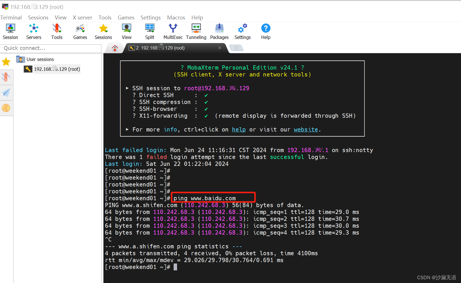
centOS7网络配置_NAT模式设置
第一步:查看电脑网卡 nat模式对应本地网卡的VMnet 8 ,查看对应的IP地址。 第二步:虚拟网络编辑器 打开VMWare,编辑--虚拟网络编辑器,整个都默认设置好了,只需要查看对应的DHCP设置中对应的IP的起始&#…...

喜报 | 极限科技获得北京市“创新型”中小企业资格认证
2024年6月20日,北京市经济和信息化局正式发布《关于对2024年度4月份北京市创新型中小企业名单进行公告的通知》,极限数据(北京)科技有限公司凭借其出色的创新能力和卓越的企业实力,成功获得“北京市创新型中小企业”的…...

整合Spring Boot和Pulsar实现可扩展的消息处理
整合Spring Boot和Pulsar实现可扩展的消息处理 大家好,我是免费搭建查券返利机器人省钱赚佣金就用微赚淘客系统3.0的小编,也是冬天不穿秋裤,天冷也要风度的程序猿! 在现代分布式系统中,消息队列是实现异步通信和解耦…...
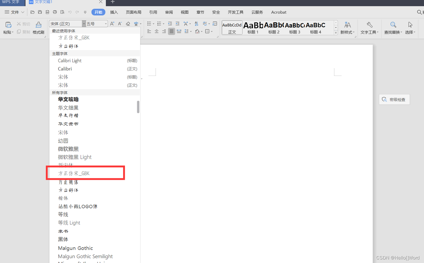
如何给WPS、Word、PPT等办公三件套添加收费字体---方正仿宋GBK
1.先下载需要的字体。 下载字体的网站比较多,基本上都是免费的。随便在网上搜索一个就可以了,下面是下载的链接。 方正仿宋GBK字体免费下载和在线预览-字体天下 www.fonts.net.cn/font-31602268591.html 注意:切记不要商用,以免…...
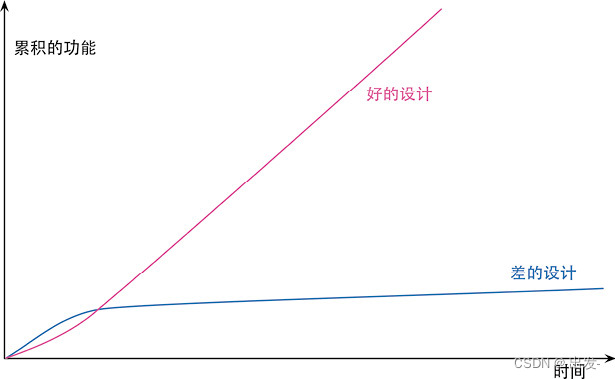
《重构》读书笔记【第1章 重构,第一个示例,第2章 重构原则】
文章目录 第1章 重构,第一个示例1.1 重构前1.2 重构后 第2章 重构原则2.1 何谓重构2.2 两顶帽子2.3 为何重构2.4 何时重构2.5 重构和开发过程 第1章 重构,第一个示例 我这里使用的IDE是IntelliJ IDEA 1.1 重构前 plays.js export const plays {&quo…...
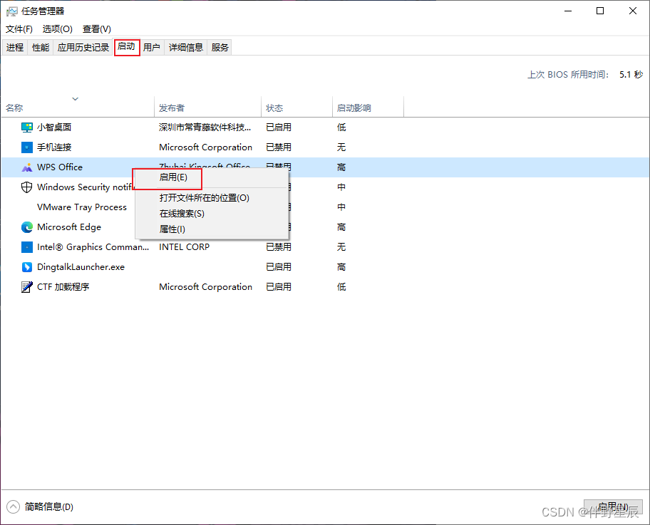
学会整理电脑,基于小白用户(无关硬件升级)
如果你不想进行硬件升级,就要学会进行整理维护电脑 基于小白用户,每一个操作点我都会在后续整理出流程,软件推荐会选择占用小且实用的软件 主要从三个角度去讨论【如果有新的内容我会随时修改,也希望有补充告诉我,我…...
使用ioDraw,AI绘图只需几秒钟!
只需几秒钟,就能将文字或图片转化为精准的思维导图、流程图、折线图、柱状图、饼图等各种图表! 思维导图 思维导图工具使用入口 文字转思维导图 将文本大纲或想法转换成可视化的思维导图,以组织和结构化您的想法。 图片转思维导图 从现有…...
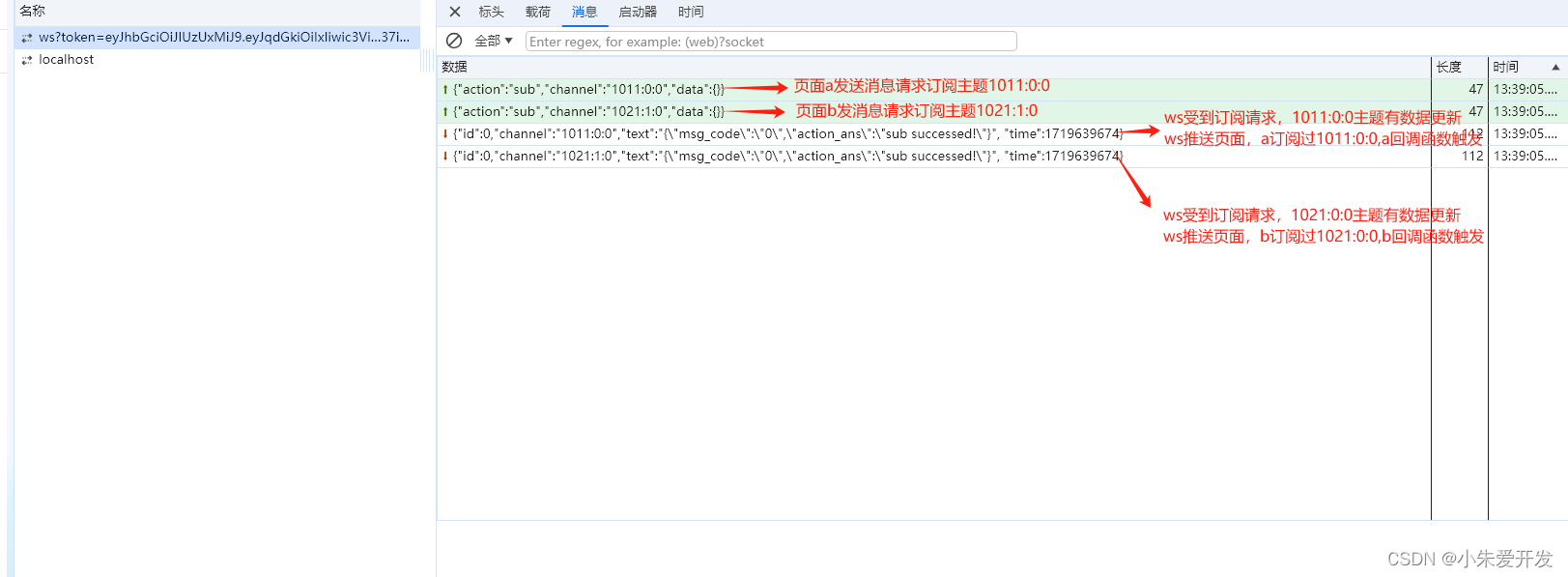
Websocket解析及用法(封装一个通用订阅发布主题的webSocket类)
1、什么是WebSocket? websocket的目标是通过一个长连接实现与服务器全双工,双向的通信。是一种在单个TCP连接上进行全双工通信的协议,使得客户端和服务器之间的数据交换变得更加简单,允许服务端主动向客户端推送数据。在 js中创建websocket…...
详细安装和使用教程)
Foxit Reader(福昕阅读器)详细安装和使用教程
第一部分:Foxit Reader简介和基本信息 1.1 什么是Foxit Reader? Foxit Reader(福昕阅读器)是一款功能强大的PDF阅读和编辑软件,以其快速、轻巧和丰富的功能而闻名。它不仅支持常规的PDF阅读功能,还提供了…...

c++静态成员变量和静态成员函数
1)C入门级小知识,分享给将要学习或者正在学习C开发的同学。 2)内容属于原创,若转载,请说明出处。 3)提供相关问题有偿答疑和支持。 我们可以使用 static 关键字来把类成员定义为静态的。当我们声明类的成…...
视频共享融合赋能平台LntonCVS统一视频接入平台数字化升级医疗体系
医疗健康事关国计民生,然而,当前我国医疗水平的地区发展不平衡、医疗资源分布不均和医疗信息系统老化等问题,制约了整体服务能力和水平的提升。视频融合云平台作为推动数字医疗的关键工具,在医疗领域的广泛应用和普及,…...
Gin框架基础
1、一个简单的Gin示例 下载并安装Gin: go get -u github.com/gin-gonic/gin1.1 一个简单的例子 package mainimport ("net/http""github.com/gin-gonic/gin" )func main() {// 创建一个默认的路由引擎r : gin.Default()// 当客户端以GET方式访问 /hello…...
用GPT-4纠错GPT-4 OpenAI推出CriticGPT模型
根据OpenAI周四(6月27日)发布的新闻稿,该公司新推出了一个基于GPT-4的模型——CriticGPT,用于捕获ChatGPT代码输出中的错误。CriticGPT的作用相当于让人们用GPT-4来查找GPT-4的错误。该模型可以对ChatGPT响应结果做出批评评论&…...

SQL CASE WHEN语句的使用技巧
SQL CASE WHEN语句的使用技巧 大家好,我是免费搭建查券返利机器人省钱赚佣金就用微赚淘客系统3.0的小编,也是冬天不穿秋裤,天冷也要风度的程序猿! 在SQL查询中,经常需要根据不同的条件进行分支处理,这时就…...

虹科技术丨跨越距离障碍:PCAN系列网关在远程CAN网络通信的应用潜力
来源:虹科技术丨跨越距离障碍:PCAN系列网关在远程CAN网络通信的应用潜力 原文链接:虹科技术 | 跨越距离障碍:PCAN系列网关在远程CAN网络通信的应用潜力 欢迎关注虹科,为您提供最新资讯! #PCAN #网关 #CA…...

【UE 网络】RPC远程过程调用 入门篇
目录 0 引言1 RPC基本概念1.1 定义1.2 分类 2 RPC的使用2.1 Client RPC2.2 Server RPC2.3 Multicast RPC 🙋♂️ 作者:海码007📜 专栏:UE虚幻引擎专栏💥 标题:【UE 网络】RPC远程过程调用 入门篇❣️ 寄语…...
安装maven与nexus
安装maven与nexus Maven官网下载地址:http://maven.apache.org cd /data/software/wget https://mirrors.tuna.tsinghua.edu.cn/apache/maven/maven-3/3.8.1/binaries/apache-maven-3.8.8-bin.tar.gz# 解压 tar xf apache-maven-3.8.1-bin.tar.gz -C /opt/[rooth…...
如何用DCA1000持续采集雷达数据
摘要:本文介绍一下如何通过mmwave studio软件,搭配DCA1000数据采集卡,对AWR1843BOOST进行不间断的数据采集。本文要求读者已经掌握了有关基础知识。 本文开放获取,无需关注。 到SensorConfig页面下,一步步操作…...

怎么用JavaScript写爬虫
随着互联网技术的不断发展,爬虫(web crawler)已经成为当前最热门的爬取信息方式之一。通过爬虫技术,我们可以轻松地获取互联网上的数据,并用于数据分析、挖掘、建模等多个领域。而javascript语言则因其强大的前端开发工…...

J-Link V8变砖别慌!手把手教你用SAM-BA 2.14救活AT91SAM7S64芯片
J-Link V8救砖实战:用SAM-BA 2.14拯救AT91SAM7S64芯片全指南 当你的J-Link V8调试器突然"变砖"——LED灯熄灭、电脑无法识别、所有功能瘫痪时,那种感觉就像外科医生在手术台上突然失去所有仪器。但别急着宣布它的"死亡",…...

2026届最火的十大降重复率网站横评
Ai论文网站排名(开题报告、文献综述、降aigc率、降重综合对比) TOP1. 千笔AI TOP2. aipasspaper TOP3. 清北论文 TOP4. 豆包 TOP5. kimi TOP6. deepseek 当下,学术创作效率需求持续提升,智能一键论文生成类工具,…...

2026 电子招投标全流程操作指南:环境搭建→签章→上传→解密全避坑
据安华招标 2025 年度电子招投标技术白皮书显示,全国公共资源交易平台电子标覆盖率已达98.7%,但因纯技术操作失误导致的废标率仍高达22%。其中环境配置错误、签章失效、解密失败三大问题,占所有技术类废标的85% 以上。很多企业投入数月打磨标…...

Cursor配置管理:使用符号链接与CLI实现多项目环境一键切换
1. 项目概述:为什么我们需要管理Cursor的配置?如果你和我一样,每天大部分时间都泡在Cursor这个AI驱动的代码编辑器里,那你肯定遇到过这样的场景:早上打开电脑,准备开始一个全新的前端项目,你熟练…...

别再乱删注册表了!Windows 10/11 下 MySQL 8.0.32 保姆级卸载与重装避坑指南
MySQL 8.0 深度清理与重装实战手册:从根源解决安装冲突问题 当你在Windows系统上反复安装MySQL时,是否遇到过这些令人抓狂的提示?"Service already exists"、"Port 3306 already in use"或是安装程序莫名其妙回滚。这些问…...

从芯片选型到PCB布线:手把手拆解基于Zynq-7100的10Gbps雷达数据采集卡硬件设计
从芯片选型到PCB布线:Zynq-7100雷达数据采集卡硬件设计实战 在高速数据采集领域,10Gbps量级的实时信号处理对硬件设计提出了严苛挑战。当我们面对雷达回波、医学影像或工业检测等场景时,传统采集方案往往在吞吐量、延迟和同步精度上捉襟见肘。…...

如何在macOS上运行Windows应用:Whisky完整使用指南
如何在macOS上运行Windows应用:Whisky完整使用指南 【免费下载链接】Whisky A modern Wine wrapper for macOS built with SwiftUI 项目地址: https://gitcode.com/gh_mirrors/wh/Whisky 想要在Mac上运行Windows专属软件和游戏?厌倦了虚拟机的高资…...

LibreCAD符号库创建终极指南:快速构建您的专业CAD图库
LibreCAD符号库创建终极指南:快速构建您的专业CAD图库 【免费下载链接】LibreCAD LibreCAD is a cross-platform 2D CAD program. It can read DXF and write DXF/PDF/SVG files, with basic support for DWG reading. It supports point/line/circle/ellipse/parab…...
)
别再乱点JIRA后台了!手把手教你配置项目专属的工单创建界面(附界面方案关联避坑点)
JIRA界面配置实战:从零构建高可用工单系统的避坑指南 当团队规模扩张到15人以上时,随意创建的JIRA工单开始暴露致命问题——用户故事缺少"验收标准"字段,缺陷报告漏填"重现步骤",而技术债务卡片却显示着完全不…...
)
TVA 在宠物混合监护场景中的创新应用(1)
重磅预告:本专栏将独家连载新书《智能体视觉技术与应用》(系列丛书)部分精华内容,该书是世界首套系统阐述“因式智能体”视觉理论与实践的专著,特邀美国 TypeOne 公司首席科学家、斯坦福大学博士 Bohan 担任技术顾问。…...