复现文章:R语言复现文章画图


文章目录
- 介绍
- 数据和代码
- 图1
- 图2
- 图6
- 附图2
- 附图3
- 附图4
- 附图5
- 附图6
介绍
文章提供画图代码和数据,本文记录
数据和代码
数据可从以下链接下载(画图所需要的所有数据):
-
百度云盘链接: https://pan.baidu.com/s/1peU1f8_TG2kUKXftkpYqug
-
提取码: 7pjy
图1
#### Figure 1: Census of cell types of the mouse uterine tube ######## Packages Load ####library(dplyr)
library(patchwork)
library(Seurat)
library(harmony)
library(ggplot2)
library(cowplot)
library(SoupX)
library(DoubletFinder)
library(data.table)
library(parallel)
library(tidyverse)
library(SoupX)
library(ggrepel)library(ggplot2)
library(gplots)
library(RColorBrewer)
library(viridisLite)
library(Polychrome)
library(circlize)
library(NatParksPalettes)#### Distal and Proximal Datasets ####Distal <- readRDS(file = "../dataset/Distal_Filtered_Cells.rds" , refhook =  NULL)Proximal <- readRDS( file = "../dataset/Proximal_Filtered_Cells.rds" , refhook =  NULL)#### Figure 1b: Cells of the Distal Uterine Tube ####Distal_Named <- RenameIdents(Distal, '0' = "Fibroblast 1", '1' = "Fibroblast 2", '2' = "Secretory Epithelial",'3' = "Smooth Muscle", '4' = "Ciliated Epithelial 1", '5' = "Fibroblast 3", '6' = "Stem-like Epithelial 1",'7' = "Stem-like Epithelial 2",'8' = "Ciliated Epithelial 2", '9' = "Blood Endothelial", '10' = "Pericyte", '11' = "Intermediate Epithelial", '12' = "T/NK Cell", '13' = "Epithelial/Fibroblast", '14' = "Macrophage", '15' = "Erythrocyte", '16' = "Luteal",'17' = "Mesothelial",'18' = "Lymph Endothelial/Epithelial") # Remove cluster due few data points and suspected doubletDistal_Named@active.ident <- factor(x = Distal_Named@active.ident, levels = c('Fibroblast 1','Fibroblast 2','Fibroblast 3','Smooth Muscle','Pericyte','Blood Endothelial','Lymph Endothelial/Epithelial','Epithelial/Fibroblast','Stem-like Epithelial 1','Stem-like Epithelial 2','Intermediate Epithelial','Secretory Epithelial','Ciliated Epithelial 1','Ciliated Epithelial 2','T/NK Cell','Macrophage','Erythrocyte','Mesothelial','Luteal'))Distal_Named <- SetIdent(Distal_Named, value = Distal_Named@active.ident)Fibroblasts <- c('#FF9D00' , '#FFB653' , '#FFCB9A')   # Oranges
Muscle <- c('#E55451' , '#FFB7B2') # Reds
Endothelial <- c('#A0E6FF')  # Reds
FiboEpi <- "#FFE0B3" # Reddish Brown
Epi <-c('#6E3E6E','#8A2BE2','#CCCCFF','#DA70D6','#DF73FF','#604791') # Blues/Purples
Immune <- c( '#5A5E6B'  , '#B8C2CC' , '#FC86AA') # Yellowish Brown
Meso <- "#9EFFFF" # Pink
Lut <- "#9DCC00" # Greencolors <- c(Fibroblasts, Muscle, Endothelial, FiboEpi, Epi, Immune, Meso, Lut)pie(rep(1,length(colors)), col=colors) Distal_Named <- subset(Distal_Named, idents = c('Fibroblast 1','Fibroblast 2','Fibroblast 3','Smooth Muscle','Pericyte','Blood Endothelial','Epithelial/Fibroblast','Stem-like Epithelial 1','Stem-like Epithelial 2','Intermediate Epithelial','Secretory Epithelial','Ciliated Epithelial 1','Ciliated Epithelial 2','T/NK Cell','Macrophage','Erythrocyte','Mesothelial','Luteal'))p1 <- DimPlot(Distal_Named,reduction='umap',cols=colors,pt.size = 0.5,label.size = 4,label.color = "black",repel = TRUE,label=F) +NoLegend() +labs(x="UMAP_1",y="UMAP_2")LabelClusters(p1, id="ident", color = "black", repel = T , size = 4, box.padding = .75)ggsave(filename = "FIG1b_all_distal_umap.pdf", plot = p1, width = 8, height = 12, dpi = 600)## Figure 1c: Distal Uterine Tube Features for Cell Type Identification ##features <- c("Dcn","Col1a1",           # Fibroblasts        "Acta2","Myh11","Myl9",   # Smooth Muscle"Pdgfrb","Mcam","Cspg4",  # Pericyte"Sele","Vwf","Tek",             # Blood Endothelial"Lyve1","Prox1","Icam1",          # Lymph Endothelial"Epcam","Krt8",           # Epithelial"Foxj1",                  # Ciliated Epithelial"Ovgp1",                  # Secretory Epithelial"Slc1a3","Pax8","Cd44","Itga6",         # Stem-like Epithelieal "Ptprc",                  # Immune                            "Cd8a","Cd4","Cd3e",      # T-Cell                            "Klrc1","Runx3",          # T/NK Cell"Klrd1",                  # NK Cell"Aif1","Cd68","Csf1r","Itgax", # Macrophage"Hbb-bs", "Hba-a1",       # Erythrocytes"Fras1","Rspo1","Lrrn4","Msln", # Mesothelial"Cyp11a1","Bcat1","Fkbp5","Spp1","Prlr") # Luteal Cellsall_dp <- DotPlot(object = Distal_Named,                    # Seurat objectassay = 'RNA',                        # Name of assay to use.  Default is the active assayfeatures = features,                  # List of features (select one from above or create a new one)# Colors to be used in the gradientcol.min = 0,                       # Minimum scaled average expression threshold (everything smaller will be set to this)col.max = 2.5,                        # Maximum scaled average expression threshold (everything larger will be set to this)dot.min = 0,                          # The fraction of cells at which to draw the smallest dot (default is 0)dot.scale = 9,                        # Scale the size of the pointsgroup.by = NULL,              # How the cells are going to be groupedsplit.by = NULL,                      # Whether to split the data (if you fo this make sure you have a different color for each variable)scale = TRUE,                         # Whether the data is scaledscale.by = "radius",                  # Scale the size of the points by 'size' or 'radius'scale.min = NA,                       # Set lower limit for scalingscale.max = NA                        # Set upper limit for scaling
)+    labs(x = NULL, y = NULL)+scale_color_viridis_c(option="F",begin=.4,end=0.9, direction = -1)+geom_point(aes(size=pct.exp), shape = 21, colour="black", stroke=0.6)+#theme_linedraw()+guides(x =  guide_axis(angle = 90))+ theme(axis.text.x = element_text(size = 14 , face = "italic"))+theme(axis.text.y = element_text(size = 14))+scale_y_discrete(limits = rev(levels(Distal_Named)))+theme(legend.title = element_text(size = 14))ggsave(filename = "FIG1c_all_distal_dotplot.pdf", plot = all_dp, width = 18, height = 10, dpi = 600)
图2
#### Figure 2: Characterization of distal epithelial cell states ######## Packages Load ####library(dplyr)
library(patchwork)
library(Seurat)
library(harmony)
library(ggplot2)
library(cowplot)
library(SoupX)
library(DoubletFinder)
library(data.table)
library(parallel)
library(tidyverse)
library(SoupX)
library(ggrepel)library(ggplot2)
library(gplots)
library(RColorBrewer)
library(viridisLite)
library(Polychrome)
library(circlize)
library(NatParksPalettes)library(monocle3)#### Load Distal Epithelial Dataset ####Epi_Filter <- readRDS(file = "../dataset/Distal_Epi_Cells.rds" , refhook =  NULL)Epi_Named <- RenameIdents(Epi_Filter, '0' = "Spdef+ Secretory", '1' = "Slc1a3+ Stem/Progenitor", '2' = "Cebpdhigh/Foxj1- Progenitor",'3' = "Ciliated 1", '4' = "Ciliated 2", '5' = "Pax8low/Prom1+ Cilia-forming", '6' = "Fibroblast-like",'7' = "Slc1a3med/Sox9+ Cilia-forming",'8' = "Selenop+/Gstm2high Secretory")Epi_Named@active.ident <- factor(x = Epi_Named@active.ident, levels = c( c("Slc1a3+ Stem/Progenitor","Cebpdhigh/Foxj1- Progenitor","Slc1a3med/Sox9+ Cilia-forming","Pax8low/Prom1+ Cilia-forming", "Fibroblast-like","Spdef+ Secretory","Selenop+/Gstm2high Secretory","Ciliated 1","Ciliated 2")))EpiSecStemMarkers <- FindMarkers(Epi_Named, ident.1 = "Spdef+ Secretory",ident.2 = "Slc1a3+ Stem/Progenitor")
write.csv(EpiSecStemMarkers, file = "20240319_Staining_Markers2.csv")#### Figure 2a: Epithelial Cells of the Distal Uterine Tube ####epi_umap <- DimPlot(object = Epi_Named,                # Seurat object  reduction = 'umap',                 # Axes for the plot (UMAP, PCA, etc.) repel = TRUE,                       # Whether to repel the cluster labelslabel = FALSE,                       # Whether to have cluster labels cols = c("#35EFEF", #1"#00A1C6", #2"#2188F7", #3"#EA68E1", #4"#59D1AF", #5"#B20224", #6"#F28D86", #7"#A374B5", #8"#9000C6"), #9pt.size = 0.6,                      # Size of each dot is (0.1 is the smallest)label.size = 0.5) +                   # Font size for labels    # You can add any ggplot2 1customizations herelabs(title = 'Colored by Cluster')+        # Plot titleNoLegend() +labs(x="UMAP_1",y="UMAP_2")ggsave(filename = "Fig2a_epi_umap.pdf", plot = epi_umap, width = 15, height = 12, dpi = 600)#### Figure 2c: Distal Uterine Tube Features for Epithelial Cell State Identification ####distal_features <- c("Krt8","Epcam","Slc1a3","Cd44","Sox9","Ovgp1","Sox17","Pax8", "Egr1","Itga6", "Bmpr1b","Rhoj", "Klf6","Msln","Cebpd","Dpp6", "Sec14l3", "Fam161a","Prom1", "Ly6a", "Kctd8", "Adam8","Dcn", "Col1a1", "Col1a2", "Timp3", "Pdgfra","Lgals1","Upk1a", "Thrsp","Spdef","Lcn2","Selenop", "Gstm2","Foxj1","Fam183b","Rgs22","Dnali1", "Mt1" , "Dynlrb2","Cdh1")epi_dp <- DotPlot(object = Epi_Named,                    # Seurat objectassay = 'RNA',                        # Name of assay to use.  Default is the active assayfeatures = distal_features,                  # List of features (select one from above or create a new one)# Colors to be used in the gradientcol.min = 0,                       # Minimum scaled average expression threshold (everything smaller will be set to this)col.max = 2.5,                        # Maximum scaled average expression threshold (everything larger will be set to this)dot.min = 0,                          # The fraction of cells at which to draw the smallest dot (default is 0)dot.scale = 4,                        # Scale the size of the pointsgroup.by = NULL,              # How the cells are going to be groupedsplit.by = NULL,                      # Whether to split the data (if you fo this make sure you have a different color for each variable)scale = TRUE,                         # Whether the data is scaledscale.by = "radius",                  # Scale the size of the points by 'size' or 'radius'scale.min = NA,                       # Set lower limit for scalingscale.max = NA )+                       # Set upper limit for scalinglabs(x = NULL,                              # x-axis labely = NULL)+scale_color_viridis_c(option="F",begin=.4,end=0.9, direction = -1)+geom_point(aes(size=pct.exp), shape = 21, colour="black", stroke=0.6)+#theme_linedraw()+guides(x =  guide_axis(angle = 90))+theme(axis.text.x = element_text(size = 8 , face = "italic"))+theme(axis.text.y = element_text(size = 9))+theme(legend.title = element_text(size = 9))+theme(legend.text = element_text(size = 8))+ scale_y_discrete(limits = c("Ciliated 2","Ciliated 1","Selenop+/Gstm2high Secretory","Spdef+ Secretory","Fibroblast-like","Pax8low/Prom1+ Cilia-forming", "Slc1a3med/Sox9+ Cilia-forming","Cebpdhigh/Foxj1- Progenitor","Slc1a3+ Stem/Progenitor"))ggsave(filename = "Fig2b_epi_dot_plot.pdf", plot = epi_dp, width = 8.3, height = 4.0625, dpi = 600)#### Load Distal Epithelial Pseudotime Dataset ####Distal_PHATE <- readRDS(file = "../dataset/Distal_Epi_PHATE.rds" , refhook = NULL)Beeg_PHATE <- Distal_PHATEBeeg_PHATE@reductions[["phate"]]@cell.embeddings <- Distal_PHATE@reductions[["phate"]]@cell.embeddings*100cds <- readRDS(file = "../dataset/Distal_Epi_PHATE_Monocle3.rds" , refhook = NULL)#### Figure 2b: PHATE embedding for differentiation trajectory of distal epithelial cells ####phate_dif <- DimPlot(Beeg_PHATE , reduction = "phate", cols = c("#B20224", "#35EFEF", "#00A1C6", "#A374B5", "#9000C6", "#EA68E1", "#59D1AF", "#2188F7", "#F28D86"),pt.size = 0.7,shuffle = TRUE,seed = 0,label = FALSE)+  labs(title = 'Colored by Cluster')+        # Plot titleNoLegend() +labs(x="UMAP_1",y="UMAP_2")ggsave(filename = "Fig3a_epi_phate.pdf", plot = phate_dif, width = 15, height = 12, dpi = 600)#### Figure 2d: PHATE and Monocle3 differentiation trajectory path ####pseudtotime <- plot_cells(cds, color_cells_by = "pseudotime",label_cell_groups=FALSE,label_leaves=FALSE,label_branch_points=FALSE,graph_label_size=0,cell_size = .01,cell_stroke = 1)+theme(axis.title.x = element_blank())+theme(axis.title.y = element_blank())+theme(axis.line.x = element_blank())+theme(axis.line.y = element_blank())+theme(axis.ticks.x = element_blank())+theme(axis.ticks.y = element_blank())+theme(axis.text.x = element_blank())+theme(axis.text.y = element_blank())+theme(legend.text = element_text(size = 12))ggsave(filename = "Fig3b_epi_pseudtotime.pdf", plot = pseudtotime, width = 18, height = 12, dpi = 600)#### Figure 2e: Slc1a3 PHATE Feature Plot ####Slc1a3_PHATE <- FeaturePlot(Beeg_PHATE, features = c("Slc1a3"), reduction = "phate", pt.size = 0.5)+scale_color_viridis_c(option="F",begin=.4,end=0.99, direction = -1)+theme(plot.title = element_text(size = 32,face = "bold.italic"))+theme(axis.title.x = element_blank())+theme(axis.title.y = element_blank())+theme(axis.line.x = element_blank())+theme(axis.line.y = element_blank())+theme(axis.ticks.x = element_blank())+theme(axis.ticks.y = element_blank())+theme(axis.text.x = element_blank())+theme(axis.text.y = element_blank())+theme(legend.text = element_text(size = 12))ggsave(filename = "Fig3c_SLC1A3_PHATE.pdf", plot = Slc1a3_PHATE, width = 18, height = 9, dpi = 600)#### Figure 2f: Pax8 PHATE Feature Plot ####Pax8_PHATE <- FeaturePlot(Beeg_PHATE, features = c("Pax8"), reduction = "phate", pt.size = 0.5)+scale_color_viridis_c(option="F",begin=.4,end=0.99, direction = -1)+theme(plot.title = element_text(size = 32,face = "bold.italic"))+theme(axis.title.x = element_blank())+theme(axis.title.y = element_blank())+theme(axis.line.x = element_blank())+theme(axis.line.y = element_blank())+theme(axis.ticks.x = element_blank())+theme(axis.ticks.y = element_blank())+theme(axis.text.x = element_blank())+theme(axis.text.y = element_blank())+theme(legend.text = element_text(size = 12))ggsave(filename = "Fig3d_PAX8_PHATE.pdf", plot = Pax8_PHATE, width = 18, height = 9, dpi = 600)
图6
#### Figure 6: Identification of cancer-prone cell states ######## Packages Load ####library(dplyr)
library(patchwork)
library(Seurat)
library(harmony)
library(ggplot2)
library(cowplot)
library(SoupX)
library(DoubletFinder)
library(data.table)
library(parallel)
library(tidyverse)
library(SoupX)
library(ggrepel)library(ggplot2)
library(gplots)
library(RColorBrewer)
library(viridisLite)
library(Polychrome)
library(circlize)
library(NatParksPalettes)library(monocle3)
library(ComplexHeatmap)
library(ggExtra)
library(gridExtra)
library(egg)library(scales)#### Load and Prepare Distal Epithelial and Epithelial Pseudotime Datasets ####Distal_PHATE <- readRDS(file = "../dataset/Distal_Epi_PHATE.rds" , refhook = NULL)cds <- readRDS(file = "../dataset/Distal_Epi_PHATE_Monocle3.rds" , refhook = NULL)Epi_Filter <- readRDS(file = "../dataset/Distal_Epi_Cells.rds" , refhook =  NULL)Epi_Named <- RenameIdents(Epi_Filter, '0' = "Spdef+ Secretory", '1' = "Slc1a3+ Stem/Progenitor", '2' = "Cebpdhigh/Foxj1- Progenitor",'3' = "Ciliated 1", '4' = "Ciliated 2", '5' = "Pax8low/Prom1+ Cilia-forming", '6' = "Fibroblast-like",'7' = "Slc1a3med/Sox9+ Cilia-forming",'8' = "Selenop+/Gstm2high Secretory")Epi_Named@active.ident <- factor(x = Epi_Named@active.ident, levels = c( c("Slc1a3+ Stem/Progenitor","Cebpdhigh/Foxj1- Progenitor","Slc1a3med/Sox9+ Cilia-forming","Pax8low/Prom1+ Cilia-forming", "Fibroblast-like","Spdef+ Secretory","Selenop+/Gstm2high Secretory","Ciliated 1","Ciliated 2")))## Calculate Pseudotime Values ##pseudo <- pseudotime(cds)Distal_PHATE@meta.data$Pseudotime <- pseudo # Add to Seurat Metadata## Subset Seurat Object ##color_cells <- DimPlot(Distal_PHATE , reduction = "phate", cols = c("#B20224", #1"#35EFEF", #2"#00A1C6", #3"#A374B5", #4"#9000C6", #5"#EA68E1", #6"lightgrey", #7"#2188F7", #8"#F28D86"),pt.size = 0.7,shuffle = TRUE,seed = 0,label = FALSE)## Psuedotime and Lineage Assignment ##cellID <- rownames(Distal_PHATE@reductions$phate@cell.embeddings)
phate_embeddings <- Distal_PHATE@reductions$phate@cell.embeddings
pseudotime_vals <- Distal_PHATE@meta.data$Pseudotimecombined_data <- data.frame(cellID, phate_embeddings, pseudotime_vals)# Calculate the Average PHATE_1 Value for Pseudotime Points = 0 #
avg_phate_1 <- mean(phate_embeddings[pseudotime_vals == 0, 1])# Pseudotime Values lower than avge PHATE_1 Embedding will be Negative to split lineages
combined_data$Split_Pseudo <- ifelse(phate_embeddings[, 1] < avg_phate_1, -pseudotime_vals, pseudotime_vals)# Define Lineage #
combined_data$lineage <- ifelse(combined_data$PHATE_1 < avg_phate_1, "Secretory",ifelse(combined_data$PHATE_1 > avg_phate_1, "Ciliogenic", "Progenitor"))Distal_PHATE$Pseudotime_Adj <- combined_data$Split_Pseudo
Distal_PHATE$Lineage <- combined_data$lineage# Subset #Pseudotime_Lineage <- subset(Distal_PHATE, idents = c("Secretory 1","Secretory 2","Msln+ Progenitor","Slc1a3+/Sox9+ Cilia-forming","Pax8+/Prom1+ Cilia-forming","Progenitor","Ciliated 1","Ciliated 2"))## Set Bins ##bins <- cut_number(Pseudotime_Lineage@meta.data$Pseudotime_Adj , 40) # Evenly distribute bins Pseudotime_Lineage@meta.data$Bin <- bins # Metadata for Bins## Set Idents to PSeudoime Bin ##time_ident <- SetIdent(Pseudotime_Lineage, value = Pseudotime_Lineage@meta.data$Bin)av.exp <- AverageExpression(time_ident, return.seurat = T)$RNA # Calculate Avg log normalized expression# Calculates Average Expression for Each Bin #
# if you set return.seurat=T, NormalizeData is called which by default performs log-normalization #
# Reported as avg log normalized expression ##### Figure 6c: PHATE embedding for differentiation trajectory of distal epithelial cells ##### Create the stacked barplot
rainbow20 <- c('#FF0000','#FF6000','#FF8000','#FFA000','#FFC000','#FFE000','#FFFF00','#E0FF00','#C0FF00','#A0FF00','#00FF00','#00FFA0','#00F0FF','#00A0FF','#0020FF','#4000FF','#8000FF','#A000FF','#C000FF','#E000FF')rainbow_pseudo <- DimPlot(Pseudotime_Lineage , reduction = "phate", cols = c(rev(rainbow20),rainbow20),pt.size = 1.2,shuffle = TRUE,seed = 0,label = FALSE,group.by = "Bin")+    NoLegend()ggsave(filename = "rainbow_pseudo.pdf", plot = rainbow_pseudo, width = 20, height = 10, dpi = 600)#### Figure 6d: PHATE embedding for differentiation trajectory of distal epithelial cells ###### Pseudotime Scale Bar ##list <- 1:40
colors = c(rev(rainbow20),rainbow20)
df <- data.frame(data = list, color = colors)pseudo_bar <- ggplot(df, aes(x = 1:40, y = 1, fill = color)) + geom_bar(stat = "identity",position = "fill", color = "black", size = 0, width = 1) +scale_fill_identity() +theme_void()+ theme(axis.line = element_blank(),axis.ticks = element_blank(),axis.text = element_blank(),axis.title = element_blank())ggsave(filename = "pseudo_bar.pdf", plot = pseudo_bar, width = 0.98, height = 0.19, dpi = 600)## Plot gene list across pseudotime bin ##features <- c('Upk1a', "Spdef", "Ovgp1", "Gstm2", "Selenop", "Msln", "Slc1a3","Itga6", "Pax8",'Ecrg4', 'Sox5', 'Pde4b', 'Lcn2','Klf6','Trp53' , 'Trp73','Krt5','Foxa2','Prom1','Clstn2','Spef2','Dnah12','Foxj1', 'Fam166c' , 'Cfap126','Fam183b')# Create Bin List and expression of features #bin_list <- unique(Pseudotime_Lineage@meta.data$Bin) plot_info <- as.data.frame(av.exp[features, ]) # Call Avg Expression for featuresz_score <- transform(plot_info, SD=apply(plot_info,1, mean, na.rm = TRUE))
z_score <- transform(z_score, MEAN=apply(plot_info,1, sd, na.rm = TRUE))z_score1 <- (plot_info-z_score$MEAN)/z_score$SDplot_info$y <- rownames(plot_info) # y values as features
z_score1$y <- rownames(plot_info)plot_info <- gather(data = plot_info, x, expression, bin_list) #set plot
z_score1 <- gather(data = z_score1, x, z_score, bin_list) #set plot# Create Cell Clusters DF #Labeled_Pseudotime_Lineage <- RenameIdents(Pseudotime_Lineage, 'Secretory 1' = "Spdef+ Secretory", 'Progenitor' = "Slc1a3+ Stem/Progenitor", 'Msln+ Progenitor' = "Cebpdhigh/Foxj1- Progenitor",'Ciliated 1' = "Ciliated 1", 'Ciliated 2' = "Ciliated 2", 'Pax8+/Prom1+ Cilia-forming' = "Pax8low/Prom1+ Cilia-forming", 'Fibroblast-like' = "Fibroblast-like", #removed'Slc1a3+/Sox9+ Cilia-forming' = "Slc1a3med/Sox9+ Cilia-forming",'Secretory 2' = "Selenop+/Gstm2high Secretory")cluster_table <- table(Labeled_Pseudotime_Lineage@active.ident, Labeled_Pseudotime_Lineage@meta.data$Bin)clusters <- data.frame(cluster_table)clusters <- clusters %>% group_by(Var2) %>%mutate(Perc = Freq / sum(Freq))# Create Pseudotime DF #pseudotime_table <- table(seq(1, length(bin_list), 1), unique(Labeled_Pseudotime_Lineage@meta.data$Bin),seq(1, length(bin_list), 1))pseudotime_bins <- data.frame(pseudotime_table)  # calculate max and min z-scores
max_z <- max(z_score1$z_score, na.rm = TRUE)
min_z <- min(z_score1$z_score, na.rm = TRUE)# set color for outliers
outlier_color <- ifelse(z_score1$z_score > max_z | z_score1$z_score < min_z, ifelse(z_score1$z_score > 0, "#AD1F24", "#51A6DC"), "#e2e2e2")## Plot Gene Expression ### Set different na.value options for positive and negative values
na_color_pos <- "#AD1F24" # color for positive NA values
na_color_neg <- "#51A6DC" # color for negative NA valuescustom_bin_names <- c(paste0("S", 20:1), paste0("C", 1:20))figure <- ggplot(z_score1, aes(x, y, fill = z_score)) +geom_tile(color = "black",lwd = 1,linetype = 1) +scale_fill_gradientn(colors=c("#1984c5", "#e2e2e2", "#c23728"), name = "Average Expression \nZ-Score", limits = c(-3,3), na.value = ifelse(is.na(z_score1) & z_score1 > 0, na_color_pos, ifelse(is.na(z_score1) & z_score1 < 0, na_color_neg, "grey50")),oob = scales::squish)+scale_x_discrete(limits= sort(bin_list) , labels= custom_bin_names)+scale_y_discrete(limits= rev(features))+theme(panel.background = element_blank())+labs(title = "Expression of Genes by Pseudotime Bin" ,x = element_blank(),y = element_blank())+theme(text = element_text(size = 12, face = "bold"),                                      # Text size throughout the plotaxis.text.x = element_text(color = 'black', angle = 0, hjust = 0.5, size = 10, face = "bold"),    # Text color, angle, and horizontal adjustment on x-axis axis.text.y = element_text(color = 'black', hjust = 1, size = 14, face = "bold.italic"))+theme(plot.title = element_blank(),plot.margin=unit(c(-0.5,1,1,1), "cm"))## Plot Cluster Percentage ##`Spdef+ Secretory` <- ggplot(clusters, aes(Var2, Var1, fill = Perc)) +geom_tile(color = "black",lwd = 1,linetype = 1) +scale_fill_gradient2(low="white", high="#000000", mid = "white", midpoint = 0, name = "Percentage")+scale_x_discrete(limits= sort(bin_list) , labels= seq(1, length(bin_list), 1))+scale_y_discrete(limits= "Spdef+ Secretory")+theme(panel.background = element_blank())+labs(title = "Expression of Genes by Pseudotime Bin" ,x = element_blank(),y = element_blank())+theme(text = element_text(size = 12, face = "bold"),# Text size throughout the plotaxis.ticks.x = element_blank(),axis.ticks.y = element_blank(),axis.text.x = element_blank(),    # Text color, angle, and horizontal adjustment on x-axis axis.text.y = element_text(color = 'black', hjust = 1, size = 14, face = "bold"))+theme(plot.title = element_blank(),plot.margin=unit(c(1,1,1,1), "cm"))`Selenop+/Gstm2high Secretory` <- ggplot(clusters, aes(Var2, Var1, fill = Perc)) +geom_tile(color = "black",lwd = 1,linetype = 1) +scale_fill_gradient2(low="white", high="#000000", mid = "white", midpoint = 0, name = "Percentage")+scale_x_discrete(limits= sort(bin_list) , labels= seq(1, length(bin_list), 1))+scale_y_discrete(limits= "Selenop+/Gstm2high Secretory")+theme(panel.background = element_blank())+labs(title = "Expression of Genes by Pseudotime Bin" ,x = element_blank(),y = element_blank())+theme(text = element_text(size = 12, face = "bold"),# Text size throughout the plotaxis.ticks.x = element_blank(),axis.ticks.y = element_blank(),axis.text.x = element_blank(),    # Text color, angle, and horizontal adjustment on x-axis axis.text.y = element_text(color = 'black', hjust = 1, size = 14, face = "bold"))+theme(plot.title = element_blank(),plot.margin=unit(c(-1.25,1,1,1), "cm"))`Cebpdhigh/Foxj1- Progenitor` <- ggplot(clusters, aes(Var2, Var1, fill = Perc)) +geom_tile(color = "black",lwd = 1,linetype = 1) +scale_fill_gradient2(low="white", high="#000000", mid = "white", midpoint = 0, name = "Percentage")+scale_x_discrete(limits= sort(bin_list) , labels= seq(1, length(bin_list), 1))+scale_y_discrete(limits= "Cebpdhigh/Foxj1- Progenitor")+theme(panel.background = element_blank())+labs(title = "Expression of Genes by Pseudotime Bin" ,x = element_blank(),y = element_blank())+theme(text = element_text(size = 12, face = "bold"),# Text size throughout the plotaxis.ticks.x = element_blank(),axis.ticks.y = element_blank(),axis.text.x = element_blank(),    # Text color, angle, and horizontal adjustment on x-axis axis.text.y = element_text(color = 'black', hjust = 1, size = 14, face = "bold"))+theme(plot.title = element_blank(),plot.margin=unit(c(-1.25,1,1,1), "cm"))`Slc1a3+ Stem/Progenitor` <- ggplot(clusters, aes(Var2, Var1, fill = Perc)) +geom_tile(color = "black",lwd = 1,linetype = 1) +scale_fill_gradient2(low="white", high="#000000", mid = "white", midpoint = 0, name = "Percentage")+scale_x_discrete(limits= sort(bin_list) , labels= seq(1, length(bin_list), 1))+scale_y_discrete(limits= "Slc1a3+ Stem/Progenitor")+theme(panel.background = element_blank())+labs(title = "Expression of Genes by Pseudotime Bin" ,x = element_blank(),y = element_blank())+theme(text = element_text(size = 12, face = "bold"),# Text size throughout the plotaxis.ticks.x = element_blank(),axis.ticks.y = element_blank(),axis.text.x = element_blank(),    # Text color, angle, and horizontal adjustment on x-axis axis.text.y = element_text(color = 'black', hjust = 1, size = 14, face = "bold"))+theme(plot.title = element_blank(),plot.margin=unit(c(-1.25,1,1,1), "cm"))`Slc1a3med/Sox9+ Cilia-forming` <- ggplot(clusters, aes(Var2, Var1, fill = Perc)) +geom_tile(color = "black",lwd = 1,linetype = 1) +scale_fill_gradient2(low="white", high="#000000", mid = "white", midpoint = 0, name = "Percentage")+scale_x_discrete(limits= sort(bin_list) , labels= seq(1, length(bin_list), 1))+scale_y_discrete(limits= "Slc1a3med/Sox9+ Cilia-forming")+theme(panel.background = element_blank())+labs(title = "Expression of Genes by Pseudotime Bin" ,x = element_blank(),y = element_blank())+theme(text = element_text(size = 12, face = "bold"),# Text size throughout the plotaxis.ticks.x = element_blank(),axis.ticks.y = element_blank(),axis.text.x = element_blank(),    # Text color, angle, and horizontal adjustment on x-axis axis.text.y = element_text(color = 'black', hjust = 1, size = 14, face = "bold"))+theme(plot.title = element_blank(),plot.margin=unit(c(-1.25,1,1,1), "cm"))`Pax8low/Prom1+ Cilia-forming` <- ggplot(clusters, aes(Var2, Var1, fill = Perc)) +geom_tile(color = "black",lwd = 1,linetype = 1) +scale_fill_gradient2(low="white", high="#000000", mid = "white", midpoint = 0, name = "Percentage")+scale_x_discrete(limits= sort(bin_list) , labels= seq(1, length(bin_list), 1))+scale_y_discrete(limits= "Pax8low/Prom1+ Cilia-forming")+theme(panel.background = element_blank())+labs(title = "Expression of Genes by Pseudotime Bin" ,x = element_blank(),y = element_blank())+theme(text = element_text(size = 12, face = "bold"),# Text size throughout the plotaxis.ticks.x = element_blank(),axis.ticks.y = element_blank(),axis.text.x = element_blank(),    # Text color, angle, and horizontal adjustment on x-axis axis.text.y = element_text(color = 'black', hjust = 1, size = 14, face = "bold"))+theme(plot.title = element_blank(),plot.margin=unit(c(-1.25,1,1,1), "cm"))`Ciliated 1` <- ggplot(clusters, aes(Var2, Var1, fill = Perc)) +geom_tile(color = "black",lwd = 1,linetype = 1) +scale_fill_gradient2(low="white", high="#000000", mid = "white", midpoint = 0, name = "Percentage")+scale_x_discrete(limits= sort(bin_list) , labels= seq(1, length(bin_list), 1))+scale_y_discrete(limits= "Ciliated 1")+theme(panel.background = element_blank())+labs(title = "Expression of Genes by Pseudotime Bin" ,x = element_blank(),y = element_blank())+theme(text = element_text(size = 12, face = "bold"),# Text size throughout the plotaxis.ticks.x = element_blank(),axis.ticks.y = element_blank(),axis.text.x = element_blank(),    # Text color, angle, and horizontal adjustment on x-axis axis.text.y = element_text(color = 'black', hjust = 1, size = 14, face = "bold"))+theme(plot.title = element_blank(),plot.margin=unit(c(-1.25,1,1,1), "cm"))`Ciliated 2` <- ggplot(clusters, aes(Var2, Var1, fill = Perc)) +geom_tile(color = "black",lwd = 1,linetype = 1) +scale_fill_gradient2(low="white", high="#000000", mid = "white", midpoint = 0, name = "Percentage")+scale_x_discrete(limits= sort(bin_list) , labels= seq(1, length(bin_list), 1))+scale_y_discrete(limits= "Ciliated 2")+theme(panel.background = element_blank())+labs(title = "Expression of Genes by Pseudotime Bin" ,x = element_blank(),y = element_blank())+theme(text = element_text(size = 12, face = "bold"),# Text size throughout the plotaxis.ticks.x = element_blank(),axis.ticks.y = element_blank(),axis.text.x = element_blank(),    # Text color, angle, and horizontal adjustment on x-axis axis.text.y = element_text(color = 'black', hjust = 1, size = 14, face = "bold"))+theme(plot.title = element_blank(),plot.margin=unit(c(-1.25,1,1,1), "cm"))## Plot Pseudotime Color ##list <- 1:40
colors = c(rev(rainbow20),rainbow20)
df <- data.frame(data = list, color = colors)binning <- ggplot(df, aes(x = 1:40, y = 1, fill = color)) + geom_bar(stat = "identity",position = "fill", color = "black", size = 1, width = 1) +scale_fill_identity() +theme_void()+ theme(axis.line = element_blank(),axis.ticks = element_blank(),axis.text = element_blank(),axis.title = element_blank())+scale_x_discrete(limits= sort(bin_list) , labels= seq(1, length(bin_list), 1))+scale_y_discrete(limits= "Pseudotime Bin ")+theme(panel.background = element_blank())+labs(title = "Expression of Genes by Pseudotime Bin" ,x = element_blank(),y = element_blank())+theme(text = element_text(size = 12, face = "bold"),# Text size throughout the plotaxis.ticks.x = element_blank(),axis.ticks.y = element_blank(),axis.text.x = element_blank(),    # Text color, angle, and horizontal adjustment on x-axis axis.text.y = element_text(color = 'black', hjust =1, vjust = .75, size = 14, face = "bold"))+theme(plot.title = element_blank(),plot.margin=unit(c(-1.25,1,1,1), "cm"))### Combine Plots ###psuedotime_lineage <- ggarrange(`Spdef+ Secretory`,`Selenop+/Gstm2high Secretory`,`Cebpdhigh/Foxj1- Progenitor`,`Slc1a3+ Stem/Progenitor`,`Slc1a3med/Sox9+ Cilia-forming`,`Pax8low/Prom1+ Cilia-forming`,`Ciliated 1`,`Ciliated 2`,`binning`,figure , ncol=1,heights = c(2, 2, 2, 2, 2, 2, 2, 2, 2, (2*length(features)),widths = c(3)),padding = unit(0.01))ggsave(filename = "FIG6d_psuedotime_lineage.pdf", plot = psuedotime_lineage, width = 18, height = 9, dpi = 600)#### Figure 6e: Stacked violin plots for cancer-prone cell states ####### Stacked Violin Plot Function ####https://divingintogeneticsandgenomics.rbind.io/post/stacked-violin-plot-for-visualizing-single-cell-data-in-seurat/## remove the x-axis text and tick
## plot.margin to adjust the white space between each plot.
## ... pass any arguments to VlnPlot in Seurat
modify_vlnplot <- function(obj, feature, pt.size = 0, plot.margin = unit(c(-0.75, 0, -0.75, 0), "cm"),...) {p<- VlnPlot(obj, features = feature, pt.size = pt.size, ... )  + xlab("") + ylab(feature) + ggtitle("") + theme(legend.position = "none", axis.text.x = element_blank(), axis.ticks.x = element_blank(), axis.title.y = element_text(size = rel(1), angle = 0, face = "bold.italic"), axis.text.y = element_text(size = rel(1)), plot.margin = plot.margin ) return(p)
}## extract the max value of the y axis
extract_max<- function(p){ymax<- max(ggplot_build(p)$layout$panel_scales_y[[1]]$range$range)return(ceiling(ymax))
}## main function
StackedVlnPlot<- function(obj, features,pt.size = 0, plot.margin = unit(c(-0.75, 0, -0.75, 0), "cm"),...) {plot_list<- purrr::map(features, function(x) modify_vlnplot(obj = obj,feature = x, ...))# Add back x-axis title to bottom plot. patchwork is going to support this?plot_list[[length(plot_list)]]<- plot_list[[length(plot_list)]] +theme(axis.text.x=element_text(angle = 60, hjust=1, vjust=0.95), axis.ticks.x = element_line())# change the y-axis tick to only max value ymaxs<- purrr::map_dbl(plot_list, extract_max)plot_list<- purrr::map2(plot_list, ymaxs, function(x,y) x + scale_y_continuous(breaks = c(y)) + expand_limits(y = y))p<- patchwork::wrap_plots(plotlist = plot_list, ncol = 1)return(p)
}features<- c("Slc1a3", "Pax8" , "Trp73" , "Prom1" )features<- c("Pax8", "Ovgp1" ,  "Lcn2" , "Upk1a" , "Spdef" ,"Thrsp" )colors <- c("#35EFEF", #1"#00A1C6", #2"#2188F7", #3"#EA68E1", #4#"#59D1AF", #5"#B20224", #6"#F28D86", #7"#A374B5", #8"#9000C6")
No_Fibro <- subset(x = Epi_Named, idents =  c("Slc1a3+ Stem/Progenitor","Cebpdhigh/Foxj1- Progenitor","Slc1a3med/Sox9+ Cilia-forming","Pax8low/Prom1+ Cilia-forming", #"Fibroblast-like","Spdef+ Secretory","Selenop+/Gstm2high Secretory","Ciliated 1","Ciliated 2"))stack_vln <- StackedVlnPlot(obj = No_Fibro, features = features, slot = "data",pt.size = 0,cols = c("#35EFEF", #1"#00A1C6", #2"#2188F7", #3"#EA68E1", #4#"#59D1AF", #5"#B20224", #6"#F28D86", #7"#A374B5", #8"#9000C6"))+ #9theme(plot.title = element_text(size = 32, face = "bold.italic"))+scale_x_discrete(limits = c("Slc1a3+ Stem/Progenitor","Cebpdhigh/Foxj1- Progenitor","Slc1a3med/Sox9+ Cilia-forming","Pax8low/Prom1+ Cilia-forming", #"Fibroblast-like","Spdef+ Secretory","Selenop+/Gstm2high Secretory","Ciliated 1","Ciliated 2"))+theme(axis.text.x = element_text(size = 16, angle = 60))+theme(axis.text.y = element_text(size = 14))+theme(axis.title.y.left = element_text(size = 16))ggsave(filename = "FIG6e_stacked_vln_noFibro.pdf", plot = stack_vln, width = 18, height = 12, dpi = 600)#### Figure 6f: Krt5 expression within epithelial cell states ####ggsave(filename = "Krt5_dp_others.pdf", plot = Krt5_dp_others, width = 1.89*8, height = 3.06*8, dpi = 600)Krt5_dp <- DotPlot(object = No_Fibro,                    # Seurat objectassay = 'RNA',                        # Name of assay to use.  Default is the active assayfeatures = 'Krt5',                  # List of features (select one from above or create a new one)# Colors to be used in the gradientcol.min = 0,                       # Minimum scaled average expression threshold (everything smaller will be set to this)col.max = 2.5,                        # Maximum scaled average expression threshold (everything larger will be set to this)dot.min = 0,                          # The fraction of cells at which to draw the smallest dot (default is 0)dot.scale = 24,                        # Scale the size of the pointsgroup.by = NULL,              # How the cells are going to be groupedsplit.by = NULL,                      # Whether to split the data (if you fo this make sure you have a different color for each variable)scale = TRUE,                         # Whether the data is scaledscale.by = "radius",                  # Scale the size of the points by 'size' or 'radius'scale.min = NA,                       # Set lower limit for scalingscale.max = NA )+                       # Set upper limit for scalinglabs(x = NULL,                              # x-axis labely = NULL)+scale_color_viridis_c(option="F",begin=.4,end=0.9, direction = -1)+geom_point(aes(size=pct.exp), shape = 21, colour="black", stroke=0.7)+theme_linedraw(base_line_size = 5)+guides(x =  guide_axis(angle = 90))+theme(axis.text.x = element_text(size = 32 , face = "italic"))+theme(axis.text.y = element_text(size = 32))+theme(legend.title = element_text(size = 12))+  scale_y_discrete(limits = c("Ciliated 2","Ciliated 1","Selenop+/Gstm2high Secretory","Spdef+ Secretory",#"Fibroblast-like","Pax8low/Prom1+ Cilia-forming", "Slc1a3med/Sox9+ Cilia-forming","Cebpdhigh/Foxj1- Progenitor","Slc1a3+ Stem/Progenitor"))ggsave(filename = "Krt5_dp_noFibro.pdf", plot = Krt5_dp, width = 1.89*8, height = 3.06*8, dpi = 600)

附图2
#### Figure Supp 2: Characterization of distal epithelial cell states ######## Packages Load ####library(dplyr)
library(patchwork)
library(Seurat)
library(harmony)
library(ggplot2)
library(cowplot)
library(SoupX)
library(DoubletFinder)
library(data.table)
library(parallel)
library(tidyverse)
library(SoupX)
library(ggrepel)library(ggplot2)
library(gplots)
library(RColorBrewer)
library(viridisLite)
library(Polychrome)
library(circlize)
library(NatParksPalettes)#### Unprocessed and Processed Distal Dataset ####All.merged <- readRDS(file = "../dataset/Unfiltered_Mouse_Distal.rds", refhook = NULL) # Prior to Quality ControlDistal <- readRDS(file = "../dataset/Distal_Filtered_Cells.rds" , refhook =  NULL) # After to Quality ControlDistal_Named <- RenameIdents(Distal, '0' = "Fibroblast 1", '1' = "Fibroblast 2", '2' = "Secretory Epithelial",'3' = "Smooth Muscle", '4' = "Ciliated Epithelial 1", '5' = "Fibroblast 3", '6' = "Stem-like Epithelial 1",'7' = "Stem-like Epithelial 2",'8' = "Ciliated Epithelial 2", '9' = "Blood Endothelial", '10' = "Pericyte", '11' = "Intermediate Epithelial", '12' = "T/NK Cell", '13' = "Epithelial/Fibroblast", '14' = "Macrophage", '15' = "Erythrocyte", '16' = "Luteal",'17' = "Mesothelial",'18' = "Lymph Endothelial/Epithelial") # Remove cluster due few data points and suspected doubletDistal_Named@active.ident <- factor(x = Distal_Named@active.ident, levels = c('Fibroblast 1','Fibroblast 2','Fibroblast 3','Smooth Muscle','Pericyte','Blood Endothelial','Lymph Endothelial/Epithelial','Epithelial/Fibroblast','Stem-like Epithelial 1','Stem-like Epithelial 2','Intermediate Epithelial','Secretory Epithelial','Ciliated Epithelial 1','Ciliated Epithelial 2','T/NK Cell','Macrophage','Erythrocyte','Mesothelial','Luteal'))Distal_Named <- subset(Distal_Named, idents = c('Fibroblast 1','Fibroblast 2','Fibroblast 3','Smooth Muscle','Pericyte','Blood Endothelial','Epithelial/Fibroblast','Stem-like Epithelial 1','Stem-like Epithelial 2','Intermediate Epithelial','Secretory Epithelial','Ciliated Epithelial 1','Ciliated Epithelial 2','T/NK Cell','Macrophage','Erythrocyte','Mesothelial','Luteal'))Distal_Named <- SetIdent(Distal_Named, value = Distal_Named@active.ident)Epi_Filter <- readRDS(file = "../dataset/Distal_Epi_Cells.rds" , refhook =  NULL)Epi_Named <- RenameIdents(Epi_Filter, '0' = "Spdef+ Secretory", '1' = "Slc1a3+ Stem/Progenitor", '2' = "Cebpdhigh/Foxj1- Progenitor",'3' = "Ciliated 1", '4' = "Ciliated 2", '5' = "Pax8low/Prom1+ Cilia-forming", '6' = "Fibroblast-like",'7' = "Slc1a3med/Sox9+ Cilia-forming",'8' = "Selenop+/Gstm2high Secretory")Epi_Named@active.ident <- factor(x = Epi_Named@active.ident, levels = c( c("Slc1a3+ Stem/Progenitor","Cebpdhigh/Foxj1- Progenitor","Slc1a3med/Sox9+ Cilia-forming","Pax8low/Prom1+ Cilia-forming", "Fibroblast-like","Spdef+ Secretory","Selenop+/Gstm2high Secretory","Ciliated 1","Ciliated 2")))#### Figure Supp 2a: Unfilitered % MT Genes ####unfiltered_MT <- VlnPlot(All.merged, features = c("percent.mt"), group.by = 'Sample', pt.size = 0,cols = natparks.pals(name="Arches2",n=3))+theme(legend.position = 'none')+theme(axis.text.x = element_text(size = 16))+     # Change X-Axis Text Sizetheme(axis.text.y = element_text(size = 16))+     # Change Y-Axis Text Sizetheme(axis.title.y = element_text(size = 18))+    # Change Y-Axis Title Text Sizetheme(plot.title = element_text(size = 32,face = "bold.italic"))+theme(axis.title.x = element_blank())ggsave(filename = "FIGs2a_unfiltered_MT.pdf", plot = unfiltered_MT, width = 12, height = 9, dpi = 600)#exprs <- as.data.frame(FetchData(object = All.merged, vars = c('nCount_RNA' , "Sample")))#df_new <- filter(exprs, Sample == 'mD1')#mean(df_new$nCount_RNA)
#sd(df_new$nCount_RNA)# Remove the original 'Value' column if needed
df_new <- df_new %>%select(-Value)x <- spread(exprs, Sample, percent.mt )
mean(exprs)
#### Figure Supp 2b: Unfilitered nFeature RNA #### unfiltered_nFeature <- VlnPlot(All.merged, features = c("nFeature_RNA"), group.by = 'Sample', pt.size = 0,cols = natparks.pals(name="Arches2",n=3))+theme(legend.position = 'none')+theme(axis.text.x = element_text(size = 16))+theme(axis.text.y = element_text(size = 16))+theme(axis.title.y = element_text(size = 18))+theme(plot.title = element_text(size = 32,face = "bold.italic"))+theme(axis.title.x = element_blank()) # Change object to visualize other samplesggsave(filename = "FIGs2b_unfiltered_nFeature.pdf", plot = unfiltered_nFeature, width = 12, height = 9, dpi = 600)#### Figure Supp 2c: Unfilitered nCount RNA #### unfiltered_nCount <- VlnPlot(All.merged, features = c("nCount_RNA"), group.by = 'Sample', pt.size = 0,cols = natparks.pals(name="Arches2",n=3))+theme(legend.position = 'none')+theme(axis.text.x = element_text(size = 16))+theme(axis.text.y = element_text(size = 16))+theme(axis.title.y = element_text(size = 18))+theme(plot.title = element_text(size = 32,face = "bold.italic"))+theme(axis.title.x = element_blank()) # Change object to visualize other samplesggsave(filename = "FIGs2c_unfiltered_nCount.pdf", plot = unfiltered_nCount, width = 12, height = 9, dpi = 600)#### Figure Supp 2d: Doublets All Cells #### All_Doublet <- DimPlot(object = Distal, reduction = 'umap', group.by = "Doublet",cols = c( "#ffb6c1", "#380b11"),repel = TRUE, label = F, pt.size = 1.2, order = c("Doublet","Singlet"),label.size = 5) +labs(x="UMAP_1",y="UMAP_2")ggsave(filename = "FIGs2d1_All_Doublet_umap.pdf", plot = All_Doublet, width = 22, height = 17, dpi = 600)## Stacked Bar Doublets ##table <- table(Distal_Named@active.ident ,Distal_Named@meta.data$Doublet)    # Create a table of countsdf <- data.frame(table) doublet <- ggplot(data = df,                # Dataset to use for plot.  Needs to be a data.frame  aes(x = Var1,              # Variable to plot on the x-axisy = Freq,              # Variable to plot on the y-axisfill = factor(Var2,    # Variable to fill the barslevels = c("Doublet","Singlet")))) + # Order of the stacked barstheme_classic() +               # ggplot2 theme# Bar plotgeom_bar(position = 'fill',     # Position of bars.  Fill means the bars are stacked.stat = "identity",     # Height of bars represent values in the datasize = 1) +            # Size of bars# Color schemescale_fill_manual("Doublet", limits = c("Doublet","Singlet"),values = c('#8B0000','#808080')) +# Add plot labelslabs(x = NULL,                     # x-axis labely = "Fraction of Cells") +    # y-axis labeltheme(text = element_text(size = 15),                                      # Text size throughout the plotaxis.text.x = element_text(color = 'black', angle = 60, hjust = 1, size = 11),    # Text color, angle, and horizontal adjustment on x-axis axis.text.y = element_text(color = 'black', hjust = 1))+       # Text color and horizontal adjustment on y-axisscale_x_discrete(limits = (c('Intermediate Epithelial','Epithelial/Fibroblast','Stem-like Epithelial 1','Ciliated Epithelial 1','Erythrocyte','Smooth Muscle','Stem-like Epithelial 2','Mesothelial','Blood Endothelial','Pericyte','Fibroblast 2','Secretory Epithelial','Fibroblast 1','Ciliated Epithelial 2','Fibroblast 3','T/NK Cell','Macrophage','Luteal')))+coord_flip()ggsave(filename = "FIGs2d2_doublet_quant.pdf", plot = doublet, width = 10, height = 16, dpi = 600)#### Figure Supp 2e: Sample Distribution for All Cells #### table <- table(Distal_Named@active.ident ,Distal_Named@meta.data$Sample)    # Create a table of countsdf <- data.frame(table) table2 <- table(Epi_Named@meta.data$Sample)all_sample_dist <- ggplot(data = df,                # Dataset to use for plot.  Needs to be a data.frame  aes(x = Var1,              # Variable to plot on the x-axisy = Freq,              # Variable to plot on the y-axisfill = factor(Var2,    # Variable to fill the barslevels = c("mD1","mD2","mD4")))) + # Order of the stacked barstheme_classic() +               # ggplot2 theme# Bar plotgeom_bar(position = 'fill',     # Position of bars.  Fill means the bars are stacked.stat = "identity",     # Height of bars represent values in the datasize = 1) +            # Size of bars# Color schemescale_fill_manual("Location", limits = c("mD1","mD2","mD4"),values = c(natparks.pals(name="Arches2",n=3))) +# Add plot labelslabs(x = NULL,                     # x-axis labely = "Fraction of Cells") +    # y-axis labeltheme(text = element_text(size = 15),                                      # Text size throughout the plotaxis.text.x = element_text(color = 'black', angle = 60, hjust = 1, size = 11),    # Text color, angle, and horizontal adjustment on x-axis axis.text.y = element_text(color = 'black', hjust = 1))               # Text color and horizontal adjustment on y-axisggsave(filename = "FIGs2f_all_sample_dist.pdf", plot = epi_sample_dist, width = 16, height = 12, dpi = 600)#### Figure Supp 2f: Doublets Epithelial Cells #### Epi_Doublet <- DimPlot(object = Epi_Named, reduction = 'umap', group.by = "Doublet",cols = c( "#ffb6c1", "#380b11"),repel = TRUE, label = F, pt.size = 1.2, order = c("Doublet","Singlet"),label.size = 5) +labs(x="UMAP_1",y="UMAP_2")ggsave(filename = "FIGs2e1_Epi_Doublet_umap.pdf", plot = All_Doublet, width = 22, height = 17, dpi = 600)## Stacked Bar Doublets ##table <- table(Epi_Named@active.ident ,Epi_Named@meta.data$Doublet)    # Create a table of countsdf <- data.frame(table) epi_doublet <- ggplot(data = df,                # Dataset to use for plot.  Needs to be a data.frame  aes(x = Var1,              # Variable to plot on the x-axisy = Freq,              # Variable to plot on the y-axisfill = factor(Var2,    # Variable to fill the barslevels = c("Doublet","Singlet")))) + # Order of the stacked barstheme_classic() +               # ggplot2 theme# Bar plotgeom_bar(position = 'fill',     # Position of bars.  Fill means the bars are stacked.stat = "identity",     # Height of bars represent values in the datasize = 1) +            # Size of bars# Color schemescale_fill_manual("Doublet", limits = c("Doublet","Singlet"),values = c('#8B0000','#808080')) +# Add plot labelslabs(x = NULL,                     # x-axis labely = "Fraction of Cells") +    # y-axis labeltheme(text = element_text(size = 15),                                      # Text size throughout the plotaxis.text.x = element_text(color = 'black', angle = 60, hjust = 1, size = 11),    # Text color, angle, and horizontal adjustment on x-axis axis.text.y = element_text(color = 'black', hjust = 1))+       # Text color and horizontal adjustment on y-axisscale_x_discrete(limits = (c("Slc1a3med/Sox9+ Cilia-forming","Fibroblast-like","Pax8low/Prom1+ Cilia-forming","Slc1a3+ Stem/Progenitor","Cebpdhigh/Foxj1- Progenitor","Ciliated 1","Ciliated 2", "Spdef+ Secretory","Selenop+/Gstm2high Secretory")))+coord_flip()ggsave(filename = "FIGs2e2_epi_doublet_quant.pdf", plot = epi_doublet, width = 10, height = 16, dpi = 600)#### Figure Supp 2g: Sample Distribution for Epithelial Cells #### table <- table(Epi_Named@active.ident ,Epi_Named@meta.data$Sample)    # Create a table of countsdf <- data.frame(table) table2 <- table(Epi_Named@meta.data$Samlpe)epi_sample_dist <- ggplot(data = df,                # Dataset to use for plot.  Needs to be a data.frame  aes(x = Var1,              # Variable to plot on the x-axisy = Freq,              # Variable to plot on the y-axisfill = factor(Var2,    # Variable to fill the barslevels = c("mD1","mD2","mD4")))) + # Order of the stacked barstheme_classic() +               # ggplot2 theme# Bar plotgeom_bar(position = 'fill',     # Position of bars.  Fill means the bars are stacked.stat = "identity",     # Height of bars represent values in the datasize = 1) +            # Size of bars# Color schemescale_fill_manual("Location", limits = c("mD1","mD2","mD4"),values = c(natparks.pals(name="Arches2",n=3))) +# Add plot labelslabs(x = NULL,                     # x-axis labely = "Fraction of Cells") +    # y-axis labeltheme(text = element_text(size = 15),                                      # Text size throughout the plotaxis.text.x = element_text(color = 'black', angle = 60, hjust = 1, size = 11),    # Text color, angle, and horizontal adjustment on x-axis axis.text.y = element_text(color = 'black', hjust = 1))               # Text color and horizontal adjustment on y-axisggsave(filename = "FIGs2g_epi_sample_dist.pdf", plot = epi_sample_dist, width = 16, height = 12, dpi = 600)#### Figure Supp 2h: Distal Tile Mosaic ####library(treemap)dist_cell_types <- table(Idents(Distal_Named), Distal_Named$orig.ident)
dist_cell_type_df <- as.data.frame(dist_cell_types)## Colors ##Fibroblasts <- c('#FF9D00' , '#FFB653' , '#FFCB9A')   # Oranges
FiboEpi <- "#FFE0B3" # Reddish Brown
Muscle <- c('#E55451' , '#FFB7B2') # Reds
Endothelial <- c('#A0E6FF')  # Reds
Epi <-c('#6E3E6E','#8A2BE2','#604791','#CCCCFF','#DA70D6','#DF73FF') # Blues/Purples
Immune <- c( '#5A5E6B'  , '#B8C2CC' , '#FC86AA') # Yellowish Brown
Meso <- "#9EFFFF" # Pink
Lut <- "#9DCC00" # Greencolors <- c(Fibroblasts, FiboEpi, Muscle, Endothelial, Epi, Immune, Meso, Lut)## Tile Mosaic ##distal_treemap <- treemap(dist_cell_type_df, index = 'Var1', vSize= 'Freq', vColor = colors, palette = colors)ggsave(filename = "20240612_all_distal_tile.pdf", plot = distal_treemap, width = 12, height = 8, dpi = 600)#### Figure Supp 2i: Epi Markers All Distal Cells ####### Stacked Violin Plot Function ####https://divingintogeneticsandgenomics.rbind.io/post/stacked-violin-plot-for-visualizing-single-cell-data-in-seurat/## remove the x-axis text and tick
## plot.margin to adjust the white space between each plot.
## ... pass any arguments to VlnPlot in Seuratmodify_vlnplot <- function(obj, feature, pt.size = 0, plot.margin = unit(c(-0.75, 0, -0.75, 0), "cm"),...) {p<- VlnPlot(obj, features = feature, pt.size = pt.size, ... )  + xlab("") + ylab(feature) + ggtitle("") + theme(legend.position = "none", axis.text.x = element_blank(), axis.ticks.x = element_blank(), axis.title.y = element_text(size = rel(1), angle = 0, face = "bold.italic"), axis.text.y = element_text(size = rel(1)), plot.margin = plot.margin ) return(p)
}## extract the max value of the y axis
extract_max<- function(p){ymax<- max(ggplot_build(p)$layout$panel_scales_y[[1]]$range$range)return(ceiling(ymax))
}## main function
StackedVlnPlot<- function(obj, features,pt.size = 0, plot.margin = unit(c(-0.75, 0, -0.75, 0), "cm"),...) {plot_list<- purrr::map(features, function(x) modify_vlnplot(obj = obj,feature = x, ...))# Add back x-axis title to bottom plot. patchwork is going to support this?plot_list[[length(plot_list)]]<- plot_list[[length(plot_list)]] +theme(axis.text.x=element_text(angle = 60, hjust=1, vjust=0.95), axis.ticks.x = element_line())# change the y-axis tick to only max value ymaxs<- purrr::map_dbl(plot_list, extract_max)# plot_list<- purrr::map2(plot_list, ymaxs, function(x,y) x + plot_list<- purrr::map2(plot_list, c(5,5,8,5), function(x,y) x +                           scale_y_continuous(breaks = c(y)) + expand_limits(y = y))p<- patchwork::wrap_plots(plotlist = plot_list, ncol = 1)return(p)
}features<- c("Epcam", "Krt8" , "Ovgp1" , "Foxj1" )Fibroblasts <- c('#FF9D00' , '#FFB653' , '#FFCB9A')   # Oranges
Muscle <- c('#E55451' , '#FFB7B2') # Reds
Endothelial <- c('#A0E6FF')  # Reds
FiboEpi <- "#FFE0B3" # Reddish Brown
Epi <-c('#6E3E6E','#8A2BE2','#604791','#CCCCFF','#DA70D6','#DF73FF') # Blues/Purples
Immune <- c( '#5A5E6B'  , '#B8C2CC' , '#FC86AA') # Yellowish Brown
Meso <- "#9EFFFF" # Pink
Lut <- "#9DCC00" # Greencolors <- c(Fibroblasts, FiboEpi, Muscle, Endothelial, Epi, Immune, Meso, Lut)stack_vln <- StackedVlnPlot(obj = Distal_Named, features = features, slot = "data",pt.size = 0,cols = colors)+ #9theme(plot.title = element_text(size = 32, face = "bold.italic"))+scale_x_discrete(limits = c('Fibroblast 1','Fibroblast 2','Fibroblast 3','Epithelial/Fibroblast','Smooth Muscle','Pericyte','Blood Endothelial','Stem-like Epithelial 1','Stem-like Epithelial 2','Intermediate Epithelial','Secretory Epithelial','Ciliated Epithelial 1','Ciliated Epithelial 2','T/NK Cell','Macrophage','Erythrocyte','Mesothelial','Luteal'))+theme(axis.text.x = element_text(size = 16, angle = 60))+theme(axis.text.y = element_text(size = 14))+theme(axis.title.y.left = element_text(size = 16))ggsave(filename = "20240612_All_Distal_stacked_vln.pdf", plot = stack_vln, width = 18, height = 12, dpi = 600)#### Figure Supp 2j: Epi Markers Distal Epi Cells ####Epi_Sub <- subset(Epi_Named, idents = c("Slc1a3+ Stem/Progenitor","Cebpdhigh/Foxj1- Progenitor","Slc1a3med/Sox9+ Cilia-forming","Pax8low/Prom1+ Cilia-forming", "Fibroblast-like","Spdef+ Secretory","Selenop+/Gstm2high Secretory","Ciliated 1","Ciliated 2"))colors <- c("#35EFEF", #1"#00A1C6", #2"#2188F7", #3"#EA68E1", #4"#59D1AF", #5"#B20224", #6"#F28D86", #7"#A374B5", #8"#9000C6")stack_vln <- StackedVlnPlot(obj = Epi_Named, features = features, slot = "data",pt.size = 0,cols = c("#35EFEF", #1"#00A1C6", #2"#2188F7", #3"#EA68E1", #4"#59D1AF", #5"#B20224", #6"#F28D86", #7"#A374B5", #8"#9000C6"))+ #9theme(plot.title = element_text(size = 32, face = "bold.italic"))+scale_x_discrete(limits = c("Slc1a3+ Stem/Progenitor","Cebpdhigh/Foxj1- Progenitor","Slc1a3med/Sox9+ Cilia-forming","Pax8low/Prom1+ Cilia-forming", "Fibroblast-like","Spdef+ Secretory","Selenop+/Gstm2high Secretory","Ciliated 1","Ciliated 2"))+theme(axis.text.x = element_text(size = 16, angle = 60))+theme(axis.text.y = element_text(size = 14))+theme(axis.title.y.left = element_text(size = 16))ggsave(filename = "20240612_Distal_Epi_stacked_vln.pdf", plot = stack_vln, width = 18, height = 12, dpi = 600)
附图3
#### Figure Supp 3: Doublet detection of fibroblast and epithelial markers ######## Packages Load ####library(dplyr)
library(patchwork)
library(Seurat)
library(harmony)
library(ggplot2)
library(cowplot)
library(SoupX)
library(DoubletFinder)
library(data.table)
library(parallel)
library(tidyverse)
library(SoupX)
library(ggrepel)library(ggplot2)
library(gplots)
library(RColorBrewer)
library(viridisLite)
library(Polychrome)
library(circlize)
library(NatParksPalettes)#### Load Distal Epithelial Dataset ####Epi_Filter <- readRDS(file = "../dataset/Distal_Epi_Cells.rds" , refhook =  NULL)Epi_Named <- RenameIdents(Epi_Filter, '0' = "Spdef+ Secretory", '1' = "Slc1a3+ Stem/Progenitor", '2' = "Cebpdhigh/Foxj1- Progenitor",'3' = "Ciliated 1", '4' = "Ciliated 2", '5' = "Pax8low/Prom1+ Cilia-forming", '6' = "Fibroblast-like",'7' = "Slc1a3med/Sox9+ Cilia-forming",'8' = "Selenop+/Gstm2high Secretory")Epi_Named@active.ident <- factor(x = Epi_Named@active.ident, levels = c( c("Slc1a3+ Stem/Progenitor","Cebpdhigh/Foxj1- Progenitor","Slc1a3med/Sox9+ Cilia-forming","Pax8low/Prom1+ Cilia-forming", "Fibroblast-like","Spdef+ Secretory","Selenop+/Gstm2high Secretory","Ciliated 1","Ciliated 2")))table(Epi_Named@active.ident)#### Plot Compilation ####feature_scatter <- FeatureScatter( Fibroblast, "Krt8","Col1a1",cols = c("#35EFEF", #1"#00A1C6", #2"#2188F7", #3"#EA68E1", #4"#59D1AF", #5"#B20224", #6"#F28D86", #7"#A374B5", #8"#9000C6"))x <- DotPlot(Epi_Named , features = c("Krt8" , "Col1a1"))
write.csv(x$data , "doublet_data.csv")Fibroblast <- subset(Epi_Named, idents = c("Fibroblast-like"))custom_labels <- function(x) {ifelse(x %% 1 == 0, as.character(x), "")
}feature_scatter <- FeatureScatter( Fibroblast, "Krt8","Col1a1",cols = "black")+  # Scatter plotNoLegend()+labs(title = NULL)+theme(panel.grid.major = element_line(color = "grey", size = 0.5),panel.grid.minor = element_blank())+theme(axis.text.x = element_text(color = 'black', size = 12),axis.title.x = element_text(color = 'black', size = 14, face = "bold.italic"),axis.ticks.x = element_line(color = 'black'),axis.text.y = element_text(color = 'black', size = 12),axis.title.y = element_text(color = 'black', size = 14, face = "bold.italic"),axis.ticks.y = element_line(color = 'black'),plot.margin = unit(c(0, 0, 0, 0), "mm"))+scale_x_continuous(limits = c(0,4) , breaks = seq(0, 10, by = 0.5),labels = custom_labels) +  # Set breaks every 0.5 units on x-axisscale_y_continuous(limits = c(0,5) , breaks = seq(0, 10, by = 0.5),labels = custom_labels)   # Set breaks every 0.5 units on y-axisplot_data <- as.data.frame(feature_scatter$data)# Create density plot for x-axis
density_x <- ggplot(plot_data, aes(x = Krt8 , fill = 'black')) +geom_density() +theme(axis.line = element_line(color='white'),panel.background = element_blank()) +theme(axis.text.x = element_blank(),axis.title.x = element_blank(),axis.ticks.x = element_blank(),axis.text.y = element_text(color = 'white', size = 12),axis.title.y = element_text(color = 'white', size = 14, face = "bold.italic"),axis.ticks.y = element_line(color = 'white'),plot.margin = unit(c(0, 0, 0, 0), "mm"))+scale_y_continuous(labels = function(y) sprintf("%.0f", y))+ NoLegend()+scale_fill_manual(values = c("grey"))+scale_x_continuous(limits = c(0,4) , breaks = seq(0, 10, by = 0.5))  # Set breaks every 0.5 units on x-axis# Create density plot for y-axis
density_y <- ggplot(plot_data, aes(x = Col1a1 , fill = 'black')) +geom_density() +coord_flip() +  # Flip axes for y-density plottheme(axis.line = element_line(color='white'),panel.background = element_blank()) +theme(axis.text.x = element_text(color = 'white', size = 12),axis.title.x = element_text(color = 'white', size = 14, face = "bold.italic"),axis.ticks.x = element_line(color = 'white'),axis.text.y = element_blank(),axis.title.y = element_blank(),axis.ticks.y = element_blank(),plot.margin = unit(c(0, 0, 0, 0), "mm"))+NoLegend()+scale_fill_manual(values = c("grey"))+scale_x_continuous(limits = c(0,5))+scale_y_continuous(limits = c(0,1) , breaks = seq(0, 10, by = 0.5))   # Set breaks every 0.5 units on y-axis# Arrange plotstop_row <- cowplot::plot_grid(density_x, NULL,nrow = 1, rel_widths = c(3, 1), rel_heights = c(0.5,0.5))bottom_row <- cowplot::plot_grid(feature_scatter,density_y,nrow = 1, rel_widths = c(3, 1), rel_heights = c(3,3))combined_plot <- cowplot::plot_grid(top_row , bottom_row,nrow = 2 , rel_widths = c(3, 1), rel_heights = c(0.25,3))ggsave(filename = "20240221_Fibroblast_Doublet.pdf", plot = combined_plot, width = 12, height = 12, dpi = 600)## Stem ##c("Cebpdhigh/Foxj1- Progenitor","Slc1a3med/Sox9+ Cilia-forming","Pax8low/Prom1+ Cilia-forming","Spdef+ Secretory","Selenop+/Gstm2high Secretory","Ciliated 1","Ciliated 2")Stem <- subset(Epi_Named, idents = c("Slc1a3+ Stem/Progenitor"))custom_labels <- function(x) {ifelse(x %% 1 == 0, as.character(x), "")
}feature_scatter <- FeatureScatter( Stem, "Krt8","Col1a1",cols = "black")+  # Scatter plotNoLegend()+labs(title = NULL)+theme(panel.grid.major = element_line(color = "grey", size = 0.5),panel.grid.minor = element_blank())+theme(axis.text.x = element_text(color = 'black', size = 12),axis.title.x = element_text(color = 'black', size = 14, face = "bold.italic"),axis.ticks.x = element_line(color = 'black'),axis.text.y = element_text(color = 'black', size = 12),axis.title.y = element_text(color = 'black', size = 14, face = "bold.italic"),axis.ticks.y = element_line(color = 'black'),plot.margin = unit(c(0, 0, 0, 0), "mm"))+scale_x_continuous(limits = c(0,4) , breaks = seq(0, 10, by = 0.5),labels = custom_labels) +  # Set breaks every 0.5 units on x-axisscale_y_continuous(limits = c(0,5) , breaks = seq(0, 10, by = 0.5),labels = custom_labels)   # Set breaks every 0.5 units on y-axisplot_data <- as.data.frame(feature_scatter$data)# Create density plot for x-axis
density_x <- ggplot(plot_data, aes(x = Krt8 , fill = 'black')) +geom_density() +theme(axis.line = element_line(color='white'),panel.background = element_blank()) +theme(axis.text.x = element_blank(),axis.title.x = element_blank(),axis.ticks.x = element_blank(),axis.text.y = element_text(color = 'white', size = 12),axis.title.y = element_text(color = 'white', size = 14, face = "bold.italic"),axis.ticks.y = element_line(color = 'white'),plot.margin = unit(c(0, 0, 0, 0), "mm"))+scale_y_continuous(labels = function(y) sprintf("%.0f", y))+ NoLegend()+scale_fill_manual(values = c("grey"))+scale_x_continuous(limits = c(0,4) , breaks = seq(0, 10, by = 0.5))  # Set breaks every 0.5 units on x-axis# Create density plot for y-axis
density_y <- ggplot(plot_data, aes(x = Col1a1 , fill = 'black')) +geom_density() +coord_flip() +  # Flip axes for y-density plottheme(axis.line = element_line(color='white'),panel.background = element_blank()) +theme(axis.text.x = element_text(color = 'white', size = 12),axis.title.x = element_text(color = 'white', size = 14, face = "bold.italic"),axis.ticks.x = element_line(color = 'white'),axis.text.y = element_blank(),axis.title.y = element_blank(),axis.ticks.y = element_blank(),plot.margin = unit(c(0, 0, 0, 0), "mm"))+NoLegend()+scale_fill_manual(values = c("grey"))+scale_x_continuous(limits = c(0,5))+scale_y_continuous(limits = c(0,1) , breaks = seq(0, 10, by = 0.5))   # Set breaks every 0.5 units on y-axis# Arrange plotstop_row <- cowplot::plot_grid(density_x, NULL,nrow = 1, rel_widths = c(3, 1), rel_heights = c(0.5,0.5))bottom_row <- cowplot::plot_grid(feature_scatter,density_y,nrow = 1, rel_widths = c(3, 1), rel_heights = c(3,3))combined_plot <- cowplot::plot_grid(top_row , bottom_row,nrow = 2 , rel_widths = c(3, 1), rel_heights = c(0.25,3))ggsave(filename = "20240221_Slc1a3_Doublet.pdf", plot = combined_plot, width = 12, height = 12, dpi = 600)## Prog ##c("Slc1a3med/Sox9+ Cilia-forming","Pax8low/Prom1+ Cilia-forming","Spdef+ Secretory","Selenop+/Gstm2high Secretory","Ciliated 1","Ciliated 2")Prog <- subset(Epi_Named, idents = c("Cebpdhigh/Foxj1- Progenitor"))custom_labels <- function(x) {ifelse(x %% 1 == 0, as.character(x), "")
}feature_scatter <- FeatureScatter( Prog, "Krt8","Col1a1",cols = "black")+  # Scatter plotNoLegend()+labs(title = NULL)+theme(panel.grid.major = element_line(color = "grey", size = 0.5),panel.grid.minor = element_blank())+theme(axis.text.x = element_text(color = 'black', size = 12),axis.title.x = element_text(color = 'black', size = 14, face = "bold.italic"),axis.ticks.x = element_line(color = 'black'),axis.text.y = element_text(color = 'black', size = 12),axis.title.y = element_text(color = 'black', size = 14, face = "bold.italic"),axis.ticks.y = element_line(color = 'black'),plot.margin = unit(c(0, 0, 0, 0), "mm"))+scale_x_continuous(limits = c(0,4) , breaks = seq(0, 10, by = 0.5),labels = custom_labels) +  # Set breaks every 0.5 units on x-axisscale_y_continuous(limits = c(0,5) , breaks = seq(0, 10, by = 0.5),labels = custom_labels)   # Set breaks every 0.5 units on y-axisplot_data <- as.data.frame(feature_scatter$data)# Create density plot for x-axis
density_x <- ggplot(plot_data, aes(x = Krt8 , fill = 'black')) +geom_density() +theme(axis.line = element_line(color='white'),panel.background = element_blank()) +theme(axis.text.x = element_blank(),axis.title.x = element_blank(),axis.ticks.x = element_blank(),axis.text.y = element_text(color = 'white', size = 12),axis.title.y = element_text(color = 'white', size = 14, face = "bold.italic"),axis.ticks.y = element_line(color = 'white'),plot.margin = unit(c(0, 0, 0, 0), "mm"))+scale_y_continuous(labels = function(y) sprintf("%.0f", y))+ NoLegend()+scale_fill_manual(values = c("grey"))+scale_x_continuous(limits = c(0,4) , breaks = seq(0, 10, by = 0.5))  # Set breaks every 0.5 units on x-axis# Create density plot for y-axis
density_y <- ggplot(plot_data, aes(x = Col1a1 , fill = 'black')) +geom_density() +coord_flip() +  # Flip axes for y-density plottheme(axis.line = element_line(color='white'),panel.background = element_blank()) +theme(axis.text.x = element_text(color = 'white', size = 12),axis.title.x = element_text(color = 'white', size = 14, face = "bold.italic"),axis.ticks.x = element_line(color = 'white'),axis.text.y = element_blank(),axis.title.y = element_blank(),axis.ticks.y = element_blank(),plot.margin = unit(c(0, 0, 0, 0), "mm"))+NoLegend()+scale_fill_manual(values = c("grey"))+scale_x_continuous(limits = c(0,5))+scale_y_continuous(limits = c(0,1) , breaks = seq(0, 10, by = 0.5))   # Set breaks every 0.5 units on y-axis# Arrange plotstop_row <- cowplot::plot_grid(density_x, NULL,nrow = 1, rel_widths = c(3, 1), rel_heights = c(0.5,0.5))bottom_row <- cowplot::plot_grid(feature_scatter,density_y,nrow = 1, rel_widths = c(3, 1), rel_heights = c(3,3))combined_plot <- cowplot::plot_grid(top_row , bottom_row,nrow = 2 , rel_widths = c(3, 1), rel_heights = c(0.25,3))ggsave(filename = "20240221_Cebpd_Doublet.pdf", plot = combined_plot, width = 12, height = 12, dpi = 600)## Cilia-forming ##c("Pax8low/Prom1+ Cilia-forming","Spdef+ Secretory","Selenop+/Gstm2high Secretory","Ciliated 1","Ciliated 2")trans <- subset(Epi_Named, idents = c("Slc1a3med/Sox9+ Cilia-forming"))custom_labels <- function(x) {ifelse(x %% 1 == 0, as.character(x), "")
}feature_scatter <- FeatureScatter( trans, "Krt8","Col1a1",cols = "black")+  # Scatter plotNoLegend()+labs(title = NULL)+theme(panel.grid.major = element_line(color = "grey", size = 0.5),panel.grid.minor = element_blank())+theme(axis.text.x = element_text(color = 'black', size = 12),axis.title.x = element_text(color = 'black', size = 14, face = "bold.italic"),axis.ticks.x = element_line(color = 'black'),axis.text.y = element_text(color = 'black', size = 12),axis.title.y = element_text(color = 'black', size = 14, face = "bold.italic"),axis.ticks.y = element_line(color = 'black'),plot.margin = unit(c(0, 0, 0, 0), "mm"))+scale_x_continuous(limits = c(0,4) , breaks = seq(0, 10, by = 0.5),labels = custom_labels) +  # Set breaks every 0.5 units on x-axisscale_y_continuous(limits = c(0,5) , breaks = seq(0, 10, by = 0.5),labels = custom_labels)   # Set breaks every 0.5 units on y-axisplot_data <- as.data.frame(feature_scatter$data)# Create density plot for x-axis
density_x <- ggplot(plot_data, aes(x = Krt8 , fill = 'black')) +geom_density() +theme(axis.line = element_line(color='white'),panel.background = element_blank()) +theme(axis.text.x = element_blank(),axis.title.x = element_blank(),axis.ticks.x = element_blank(),axis.text.y = element_text(color = 'white', size = 12),axis.title.y = element_text(color = 'white', size = 14, face = "bold.italic"),axis.ticks.y = element_line(color = 'white'),plot.margin = unit(c(0, 0, 0, 0), "mm"))+scale_y_continuous(labels = function(y) sprintf("%.0f", y))+ NoLegend()+scale_fill_manual(values = c("grey"))+scale_x_continuous(limits = c(0,4) , breaks = seq(0, 10, by = 0.5))  # Set breaks every 0.5 units on x-axis# Create density plot for y-axis
density_y <- ggplot(plot_data, aes(x = Col1a1 , fill = 'black')) +geom_density() +coord_flip() +  # Flip axes for y-density plottheme(axis.line = element_line(color='white'),panel.background = element_blank()) +theme(axis.text.x = element_text(color = 'white', size = 12),axis.title.x = element_text(color = 'white', size = 14, face = "bold.italic"),axis.ticks.x = element_line(color = 'white'),axis.text.y = element_blank(),axis.title.y = element_blank(),axis.ticks.y = element_blank(),plot.margin = unit(c(0, 0, 0, 0), "mm"))+NoLegend()+scale_fill_manual(values = c("grey"))+scale_x_continuous(limits = c(0,5))+scale_y_continuous(limits = c(0,1) , breaks = seq(0, 10, by = 0.5))   # Set breaks every 0.5 units on y-axis# Arrange plotstop_row <- cowplot::plot_grid(density_x, NULL,nrow = 1, rel_widths = c(3, 1), rel_heights = c(0.5,0.5))bottom_row <- cowplot::plot_grid(feature_scatter,density_y,nrow = 1, rel_widths = c(3, 1), rel_heights = c(3,3))combined_plot <- cowplot::plot_grid(top_row , bottom_row,nrow = 2 , rel_widths = c(3, 1), rel_heights = c(0.25,3))ggsave(filename = "20240221_SlcCilia_Doublet.pdf", plot = combined_plot, width = 12, height = 12, dpi = 600)## Pax8 Cilia-forming ##c("Spdef+ Secretory","Selenop+/Gstm2high Secretory","Ciliated 1","Ciliated 2")cancer <- subset(Epi_Named, idents = c("Pax8low/Prom1+ Cilia-forming"))custom_labels <- function(x) {ifelse(x %% 1 == 0, as.character(x), "")
}feature_scatter <- FeatureScatter( cancer, "Krt8","Col1a1",cols = "black")+  # Scatter plotNoLegend()+labs(title = NULL)+theme(panel.grid.major = element_line(color = "grey", size = 0.5),panel.grid.minor = element_blank())+theme(axis.text.x = element_text(color = 'black', size = 12),axis.title.x = element_text(color = 'black', size = 14, face = "bold.italic"),axis.ticks.x = element_line(color = 'black'),axis.text.y = element_text(color = 'black', size = 12),axis.title.y = element_text(color = 'black', size = 14, face = "bold.italic"),axis.ticks.y = element_line(color = 'black'),plot.margin = unit(c(0, 0, 0, 0), "mm"))+scale_x_continuous(limits = c(0,4) , breaks = seq(0, 10, by = 0.5),labels = custom_labels) +  # Set breaks every 0.5 units on x-axisscale_y_continuous(limits = c(0,5) , breaks = seq(0, 10, by = 0.5),labels = custom_labels)   # Set breaks every 0.5 units on y-axisplot_data <- as.data.frame(feature_scatter$data)# Create density plot for x-axis
density_x <- ggplot(plot_data, aes(x = Krt8 , fill = 'black')) +geom_density() +theme(axis.line = element_line(color='white'),panel.background = element_blank()) +theme(axis.text.x = element_blank(),axis.title.x = element_blank(),axis.ticks.x = element_blank(),axis.text.y = element_text(color = 'white', size = 12),axis.title.y = element_text(color = 'white', size = 14, face = "bold.italic"),axis.ticks.y = element_line(color = 'white'),plot.margin = unit(c(0, 0, 0, 0), "mm"))+scale_y_continuous(labels = function(y) sprintf("%.0f", y))+ NoLegend()+scale_fill_manual(values = c("grey"))+scale_x_continuous(limits = c(0,4) , breaks = seq(0, 10, by = 0.5))  # Set breaks every 0.5 units on x-axis# Create density plot for y-axis
density_y <- ggplot(plot_data, aes(x = Col1a1 , fill = 'black')) +geom_density() +coord_flip() +  # Flip axes for y-density plottheme(axis.line = element_line(color='white'),panel.background = element_blank()) +theme(axis.text.x = element_text(color = 'white', size = 12),axis.title.x = element_text(color = 'white', size = 14, face = "bold.italic"),axis.ticks.x = element_line(color = 'white'),axis.text.y = element_blank(),axis.title.y = element_blank(),axis.ticks.y = element_blank(),plot.margin = unit(c(0, 0, 0, 0), "mm"))+NoLegend()+scale_fill_manual(values = c("grey"))+scale_x_continuous(limits = c(0,5))+scale_y_continuous(limits = c(0,1) , breaks = seq(0, 10, by = 0.5))   # Set breaks every 0.5 units on y-axis# Arrange plotstop_row <- cowplot::plot_grid(density_x, NULL,nrow = 1, rel_widths = c(3, 1), rel_heights = c(0.5,0.5))bottom_row <- cowplot::plot_grid(feature_scatter,density_y,nrow = 1, rel_widths = c(3, 1), rel_heights = c(3,3))combined_plot <- cowplot::plot_grid(top_row , bottom_row,nrow = 2 , rel_widths = c(3, 1), rel_heights = c(0.25,3))ggsave(filename = "20240221_Prom1_Doublet.pdf", plot = combined_plot, width = 12, height = 12, dpi = 600)## Spdef Secretory ##c("Selenop+/Gstm2high Secretory","Ciliated 1","Ciliated 2")sec1 <- subset(Epi_Named, idents = c("Spdef+ Secretory"))custom_labels <- function(x) {ifelse(x %% 1 == 0, as.character(x), "")
}feature_scatter <- FeatureScatter( sec1, "Krt8","Col1a1",cols = "black")+  # Scatter plotNoLegend()+labs(title = NULL)+theme(panel.grid.major = element_line(color = "grey", size = 0.5),panel.grid.minor = element_blank())+theme(axis.text.x = element_text(color = 'black', size = 12),axis.title.x = element_text(color = 'black', size = 14, face = "bold.italic"),axis.ticks.x = element_line(color = 'black'),axis.text.y = element_text(color = 'black', size = 12),axis.title.y = element_text(color = 'black', size = 14, face = "bold.italic"),axis.ticks.y = element_line(color = 'black'),plot.margin = unit(c(0, 0, 0, 0), "mm"))+scale_x_continuous(limits = c(0,4) , breaks = seq(0, 10, by = 0.5),labels = custom_labels) +  # Set breaks every 0.5 units on x-axisscale_y_continuous(limits = c(0,5) , breaks = seq(0, 10, by = 0.5),labels = custom_labels)   # Set breaks every 0.5 units on y-axisplot_data <- as.data.frame(feature_scatter$data)# Create density plot for x-axis
density_x <- ggplot(plot_data, aes(x = Krt8 , fill = 'black')) +geom_density() +theme(axis.line = element_line(color='white'),panel.background = element_blank()) +theme(axis.text.x = element_blank(),axis.title.x = element_blank(),axis.ticks.x = element_blank(),axis.text.y = element_text(color = 'white', size = 12),axis.title.y = element_text(color = 'white', size = 14, face = "bold.italic"),axis.ticks.y = element_line(color = 'white'),plot.margin = unit(c(0, 0, 0, 0), "mm"))+scale_y_continuous(labels = function(y) sprintf("%.0f", y))+ NoLegend()+scale_fill_manual(values = c("grey"))+scale_x_continuous(limits = c(0,4) , breaks = seq(0, 10, by = 0.5))  # Set breaks every 0.5 units on x-axis# Create density plot for y-axis
density_y <- ggplot(plot_data, aes(x = Col1a1 , fill = 'black')) +geom_density() +coord_flip() +  # Flip axes for y-density plottheme(axis.line = element_line(color='white'),panel.background = element_blank()) +theme(axis.text.x = element_text(color = 'white', size = 12),axis.title.x = element_text(color = 'white', size = 14, face = "bold.italic"),axis.ticks.x = element_line(color = 'white'),axis.text.y = element_blank(),axis.title.y = element_blank(),axis.ticks.y = element_blank(),plot.margin = unit(c(0, 0, 0, 0), "mm"))+NoLegend()+scale_fill_manual(values = c("grey"))+scale_x_continuous(limits = c(0,5))+scale_y_continuous(limits = c(0,1) , breaks = seq(0, 10, by = 0.5))   # Set breaks every 0.5 units on y-axis# Arrange plotstop_row <- cowplot::plot_grid(density_x, NULL,nrow = 1, rel_widths = c(3, 1), rel_heights = c(0.5,0.5))bottom_row <- cowplot::plot_grid(feature_scatter,density_y,nrow = 1, rel_widths = c(3, 1), rel_heights = c(3,3))combined_plot <- cowplot::plot_grid(top_row , bottom_row,nrow = 2 , rel_widths = c(3, 1), rel_heights = c(0.25,3))ggsave(filename = "20240221_Spdef_Doublet.pdf", plot = combined_plot, width = 12, height = 12, dpi = 600)## Selenop Secretory ##c("Ciliated 1","Ciliated 2")sec2 <- subset(Epi_Named, idents = c("Selenop+/Gstm2high Secretory"))custom_labels <- function(x) {ifelse(x %% 1 == 0, as.character(x), "")
}feature_scatter <- FeatureScatter( sec2, "Krt8","Col1a1",cols = "black")+  # Scatter plotNoLegend()+labs(title = NULL)+theme(panel.grid.major = element_line(color = "grey", size = 0.5),panel.grid.minor = element_blank())+theme(axis.text.x = element_text(color = 'black', size = 12),axis.title.x = element_text(color = 'black', size = 14, face = "bold.italic"),axis.ticks.x = element_line(color = 'black'),axis.text.y = element_text(color = 'black', size = 12),axis.title.y = element_text(color = 'black', size = 14, face = "bold.italic"),axis.ticks.y = element_line(color = 'black'),plot.margin = unit(c(0, 0, 0, 0), "mm"))+scale_x_continuous(limits = c(0,4) , breaks = seq(0, 10, by = 0.5),labels = custom_labels) +  # Set breaks every 0.5 units on x-axisscale_y_continuous(limits = c(0,5) , breaks = seq(0, 10, by = 0.5),labels = custom_labels)   # Set breaks every 0.5 units on y-axisplot_data <- as.data.frame(feature_scatter$data)# Create density plot for x-axis
density_x <- ggplot(plot_data, aes(x = Krt8 , fill = 'black')) +geom_density() +theme(axis.line = element_line(color='white'),panel.background = element_blank()) +theme(axis.text.x = element_blank(),axis.title.x = element_blank(),axis.ticks.x = element_blank(),axis.text.y = element_text(color = 'white', size = 12),axis.title.y = element_text(color = 'white', size = 14, face = "bold.italic"),axis.ticks.y = element_line(color = 'white'),plot.margin = unit(c(0, 0, 0, 0), "mm"))+scale_y_continuous(labels = function(y) sprintf("%.0f", y))+ NoLegend()+scale_fill_manual(values = c("grey"))+scale_x_continuous(limits = c(0,4) , breaks = seq(0, 10, by = 0.5))  # Set breaks every 0.5 units on x-axis# Create density plot for y-axis
density_y <- ggplot(plot_data, aes(x = Col1a1 , fill = 'black')) +geom_density() +coord_flip() +  # Flip axes for y-density plottheme(axis.line = element_line(color='white'),panel.background = element_blank()) +theme(axis.text.x = element_text(color = 'white', size = 12),axis.title.x = element_text(color = 'white', size = 14, face = "bold.italic"),axis.ticks.x = element_line(color = 'white'),axis.text.y = element_blank(),axis.title.y = element_blank(),axis.ticks.y = element_blank(),plot.margin = unit(c(0, 0, 0, 0), "mm"))+NoLegend()+scale_fill_manual(values = c("grey"))+scale_x_continuous(limits = c(0,5))+scale_y_continuous(limits = c(0,1) , breaks = seq(0, 10, by = 0.5))   # Set breaks every 0.5 units on y-axis# Arrange plotstop_row <- cowplot::plot_grid(density_x, NULL,nrow = 1, rel_widths = c(3, 1), rel_heights = c(0.5,0.5))bottom_row <- cowplot::plot_grid(feature_scatter,density_y,nrow = 1, rel_widths = c(3, 1), rel_heights = c(3,3))combined_plot <- cowplot::plot_grid(top_row , bottom_row,nrow = 2 , rel_widths = c(3, 1), rel_heights = c(0.25,3))ggsave(filename = "20240221_Selenop_Doublet.pdf", plot = combined_plot, width = 12, height = 12, dpi = 600)## Ciliated 1 ##c("Ciliated 2")cil1 <- subset(Epi_Named, idents = c("Ciliated 1"))custom_labels <- function(x) {ifelse(x %% 1 == 0, as.character(x), "")
}feature_scatter <- FeatureScatter( cil1, "Krt8","Col1a1",cols = "black")+  # Scatter plotNoLegend()+labs(title = NULL)+theme(panel.grid.major = element_line(color = "grey", size = 0.5),panel.grid.minor = element_blank())+theme(axis.text.x = element_text(color = 'black', size = 12),axis.title.x = element_text(color = 'black', size = 14, face = "bold.italic"),axis.ticks.x = element_line(color = 'black'),axis.text.y = element_text(color = 'black', size = 12),axis.title.y = element_text(color = 'black', size = 14, face = "bold.italic"),axis.ticks.y = element_line(color = 'black'),plot.margin = unit(c(0, 0, 0, 0), "mm"))+scale_x_continuous(limits = c(0,4) , breaks = seq(0, 10, by = 0.5),labels = custom_labels) +  # Set breaks every 0.5 units on x-axisscale_y_continuous(limits = c(0,5) , breaks = seq(0, 10, by = 0.5),labels = custom_labels)   # Set breaks every 0.5 units on y-axisplot_data <- as.data.frame(feature_scatter$data)# Create density plot for x-axis
density_x <- ggplot(plot_data, aes(x = Krt8 , fill = 'black')) +geom_density() +theme(axis.line = element_line(color='white'),panel.background = element_blank()) +theme(axis.text.x = element_blank(),axis.title.x = element_blank(),axis.ticks.x = element_blank(),axis.text.y = element_text(color = 'white', size = 12),axis.title.y = element_text(color = 'white', size = 14, face = "bold.italic"),axis.ticks.y = element_line(color = 'white'),plot.margin = unit(c(0, 0, 0, 0), "mm"))+scale_y_continuous(labels = function(y) sprintf("%.0f", y))+ NoLegend()+scale_fill_manual(values = c("grey"))+scale_x_continuous(limits = c(0,4) , breaks = seq(0, 10, by = 0.5))  # Set breaks every 0.5 units on x-axis# Create density plot for y-axis
density_y <- ggplot(plot_data, aes(x = Col1a1 , fill = 'black')) +geom_density() +coord_flip() +  # Flip axes for y-density plottheme(axis.line = element_line(color='white'),panel.background = element_blank()) +theme(axis.text.x = element_text(color = 'white', size = 12),axis.title.x = element_text(color = 'white', size = 14, face = "bold.italic"),axis.ticks.x = element_line(color = 'white'),axis.text.y = element_blank(),axis.title.y = element_blank(),axis.ticks.y = element_blank(),plot.margin = unit(c(0, 0, 0, 0), "mm"))+NoLegend()+scale_fill_manual(values = c("grey"))+scale_x_continuous(limits = c(0,5))+scale_y_continuous(limits = c(0,1) , breaks = seq(0, 10, by = 0.5))   # Set breaks every 0.5 units on y-axis# Arrange plotstop_row <- cowplot::plot_grid(density_x, NULL,nrow = 1, rel_widths = c(3, 1), rel_heights = c(0.5,0.5))bottom_row <- cowplot::plot_grid(feature_scatter,density_y,nrow = 1, rel_widths = c(3, 1), rel_heights = c(3,3))combined_plot <- cowplot::plot_grid(top_row , bottom_row,nrow = 2 , rel_widths = c(3, 1), rel_heights = c(0.25,3))ggsave(filename = "20240221_Ciliated_1_Doublet.pdf", plot = combined_plot, width = 12, height = 12, dpi = 600)## Ciliated 2 ##cil2 <- subset(Epi_Named, idents = c("Ciliated 2"))custom_labels <- function(x) {ifelse(x %% 1 == 0, as.character(x), "")
}feature_scatter <- FeatureScatter( cil2, "Krt8","Col1a1",cols = "black")+  # Scatter plotNoLegend()+labs(title = NULL)+theme(panel.grid.major = element_line(color = "grey", size = 0.5),panel.grid.minor = element_blank())+theme(axis.text.x = element_text(color = 'black', size = 12),axis.title.x = element_text(color = 'black', size = 14, face = "bold.italic"),axis.ticks.x = element_line(color = 'black'),axis.text.y = element_text(color = 'black', size = 12),axis.title.y = element_text(color = 'black', size = 14, face = "bold.italic"),axis.ticks.y = element_line(color = 'black'),plot.margin = unit(c(0, 0, 0, 0), "mm"))+scale_x_continuous(limits = c(0,4) , breaks = seq(0, 10, by = 0.5),labels = custom_labels) +  # Set breaks every 0.5 units on x-axisscale_y_continuous(limits = c(0,5) , breaks = seq(0, 10, by = 0.5),labels = custom_labels)   # Set breaks every 0.5 units on y-axisplot_data <- as.data.frame(feature_scatter$data)# Create density plot for x-axis
density_x <- ggplot(plot_data, aes(x = Krt8 , fill = 'black')) +geom_density() +theme(axis.line = element_line(color='white'),panel.background = element_blank()) +theme(axis.text.x = element_blank(),axis.title.x = element_blank(),axis.ticks.x = element_blank(),axis.text.y = element_text(color = 'white', size = 12),axis.title.y = element_text(color = 'white', size = 14, face = "bold.italic"),axis.ticks.y = element_line(color = 'white'),plot.margin = unit(c(0, 0, 0, 0), "mm"))+scale_y_continuous(labels = function(y) sprintf("%.0f", y))+ NoLegend()+scale_fill_manual(values = c("grey"))+scale_x_continuous(limits = c(0,4) , breaks = seq(0, 10, by = 0.5))  # Set breaks every 0.5 units on x-axis# Create density plot for y-axis
density_y <- ggplot(plot_data, aes(x = Col1a1 , fill = 'black')) +geom_density() +coord_flip() +  # Flip axes for y-density plottheme(axis.line = element_line(color='white'),panel.background = element_blank()) +theme(axis.text.x = element_text(color = 'white', size = 12),axis.title.x = element_text(color = 'white', size = 14, face = "bold.italic"),axis.ticks.x = element_line(color = 'white'),axis.text.y = element_blank(),axis.title.y = element_blank(),axis.ticks.y = element_blank(),plot.margin = unit(c(0, 0, 0, 0), "mm"))+NoLegend()+scale_fill_manual(values = c("grey"))+scale_x_continuous(limits = c(0,5))+scale_y_continuous(limits = c(0,1) , breaks = seq(0, 10, by = 0.5))   # Set breaks every 0.5 units on y-axis# Arrange plotstop_row <- cowplot::plot_grid(density_x, NULL,nrow = 1, rel_widths = c(3, 1), rel_heights = c(0.5,0.5))bottom_row <- cowplot::plot_grid(feature_scatter,density_y,nrow = 1, rel_widths = c(3, 1), rel_heights = c(3,3))combined_plot <- cowplot::plot_grid(top_row , bottom_row,nrow = 2 , rel_widths = c(3, 1), rel_heights = c(0.25,3))ggsave(filename = "20240221_Ciliated_2_Doublet.pdf", plot = combined_plot, width = 12, height = 12, dpi = 600)
附图4
#### Figure Supp 4: Census of cell types of the mouse uterine tube ######## Packages Load ####library(dplyr)
library(patchwork)
library(Seurat)
library(harmony)
library(ggplot2)
library(cowplot)
library(SoupX)
library(DoubletFinder)
library(data.table)
library(parallel)
library(tidyverse)
library(SoupX)
library(ggrepel)library(ggplot2)
library(gplots)
library(RColorBrewer)
library(viridisLite)
library(Polychrome)
library(circlize)
library(NatParksPalettes)#### Proximal Datasets ####Proximal <- readRDS( file = "../dataset/Proximal_Filtered_Cells.rds" , refhook =  NULL)Proximal_Named <- RenameIdents(Proximal, '0' = "Fibroblast 1", '1' = "Stem-like Epithelial", '2' = "Fibroblast 2",'3' = "Fibroblast 3", '4' = "Immune", '5' = "Secretory Epithelial", '6' = "Endothelial",'7' = "Ciliated Epithelial",'8' = "Mesothelial", '9' = "Smooth Muscle")Proximal_Named@active.ident <- factor(x = Proximal_Named@active.ident, levels = c('Fibroblast 1','Fibroblast 2','Fibroblast 3','Smooth Muscle','Endothelial','Stem-like Epithelial','Secretory Epithelial','Ciliated Epithelial','Immune','Mesothelial'))Proximal_Named <- SetIdent(Proximal_Named, value = Proximal_Named@active.ident)Epi_Filter <- readRDS(file = "../dataset/Proximal_Epi_Cells.rds" , refhook =  NULL)Epi_Named <- RenameIdents(Epi_Filter, '0' = "Dbi+/Spdefhigh Secretory", '1' = "Bmpr1b+ Progenitor", '2' = "Wfdc2+ Secretory",'3' = "Ciliated", '4' = "Sox17high Secretory", '5' = "Kcne3+ Secretory")Epi_Named@active.ident <- factor(x = Epi_Named@active.ident, levels = c("Ciliated","Dbi+/Spdefhigh Secretory","Kcne3+ Secretory","Sox17high Secretory","Wfdc2+ Secretory","Bmpr1b+ Progenitor"))#### Figure Supp 4a: Proximal All Cell Types ####Fibroblasts <- c('#FF9D00' , '#FFB653' , '#FFCB9A')   # Oranges
Muscle <- c('#E55451') # Reds
Endothelial <- c('#A0E6FF')  # Blues
Epi <-c('#6E3E6E','#CCCCFF','#DF73FF') # Purples
Immune <- c( '#5A5E6B' ) # Grey
Meso <- "#1F51FF" # Neon BLuecolors <- c(Fibroblasts, Muscle, Endothelial, Epi, Immune, Meso)p1 <- DimPlot(Proximal_Named,reduction='umap',cols=colors,pt.size = 1.4,label.size = 4,label.color = "black",repel = TRUE,label=F) +NoLegend() +labs(x="UMAP_1",y="UMAP_2")ggsave(filename = "FIGs3a_all_proximal_umap.pdf", plot = p1, width = 15, height = 12, dpi = 600)#### Figure Supp 4b: Proximal Tile Mosaic  ####library(treemap)Proximal_Named <- RenameIdents(Proximal, '0' = "Fibroblast 1", '1' = "Stem-like Epithelial", '2' = "Fibroblast 2",'3' = "Fibroblast 3", '4' = "Immune", '5' = "Secretory Epithelial", '6' = "Endothelial",'7' = "Ciliated Epithelial",'8' = "Mesothelial", '9' = "Smooth Muscle")Proximal_Named@active.ident <- factor(x = Proximal_Named@active.ident, levels = c('Fibroblast 1','Fibroblast 2','Fibroblast 3','Smooth Muscle','Endothelial','Stem-like Epithelial','Secretory Epithelial','Ciliated Epithelial','Immune','Mesothelial'))Proximal_Named <- SetIdent(Proximal_Named, value = Proximal_Named@active.ident)Fibroblasts <- c('#FF9D00' , '#FFB653' , '#FFCB9A')   # Oranges
Muscle <- c('#E55451') # Reds
Endothelial <- c('#A0E6FF')  # Blues
Epi <-c('#6E3E6E','#CCCCFF','#DF73FF') # Purples
Immune <- c( '#5A5E6B' ) # Grey
Meso <- "#1F51FF" # Neon BLuecolors <- c(Fibroblasts, Muscle, Endothelial, Epi, Immune, Meso)prox_cell_types <- table(Idents(Proximal_Named), Proximal_Named$orig.ident)
prox_cell_type_df <- as.data.frame(prox_cell_types)## Tile Mosaic ##prox_treemap <- treemap(prox_cell_type_df, index = 'Var1', vSize= 'Freq', vColor = colors, palette = colors)ggsave(filename = "20240612_all_prox_tile.pdf", plot = prox_cell_type_df, width = 8, height = 12, dpi = 600)#### Figure Supp 4c: Epi Markers All Distal Cells ####### Stacked Violin Plot Function ####https://divingintogeneticsandgenomics.rbind.io/post/stacked-violin-plot-for-visualizing-single-cell-data-in-seurat/## remove the x-axis text and tick
## plot.margin to adjust the white space between each plot.
## ... pass any arguments to VlnPlot in Seuratmodify_vlnplot <- function(obj, feature, pt.size = 0, plot.margin = unit(c(-0.75, 0, -0.75, 0), "cm"),...) {p<- VlnPlot(obj, features = feature, pt.size = pt.size, ... )  + xlab("") + ylab(feature) + ggtitle("") + theme(legend.position = "none", axis.text.x = element_blank(), axis.ticks.x = element_blank(), axis.title.y = element_text(size = rel(1), angle = 0, face = "bold.italic"), axis.text.y = element_text(size = rel(1)), plot.margin = plot.margin ) return(p)
}## extract the max value of the y axis
extract_max<- function(p){ymax<- max(ggplot_build(p)$layout$panel_scales_y[[1]]$range$range)return(ceiling(ymax))
}## main function
StackedVlnPlot<- function(obj, features,pt.size = 0, plot.margin = unit(c(-0.75, 0, -0.75, 0), "cm"),...) {plot_list<- purrr::map(features, function(x) modify_vlnplot(obj = obj,feature = x, ...))# Add back x-axis title to bottom plot. patchwork is going to support this?plot_list[[length(plot_list)]]<- plot_list[[length(plot_list)]] +theme(axis.text.x=element_text(angle = 60, hjust=1, vjust=0.95), axis.ticks.x = element_line())# change the y-axis tick to only max value ymaxs<- purrr::map_dbl(plot_list, extract_max)# plot_list<- purrr::map2(plot_list, ymaxs, function(x,y) x + plot_list<- purrr::map2(plot_list, c(5,5,8,5), function(x,y) x +                           scale_y_continuous(breaks = c(y)) + expand_limits(y = y))p<- patchwork::wrap_plots(plotlist = plot_list, ncol = 1)return(p)
}features<- c("Epcam", "Krt8" , "Ovgp1" , "Foxj1" )Fibroblasts <- c('#FF9D00' , '#FFB653' , '#FFCB9A')   # Oranges
Muscle <- c('#E55451') # Reds
Endothelial <- c('#A0E6FF')  # Blues
Epi <-c('#6E3E6E','#CCCCFF','#DF73FF') # Purples
Immune <- c( '#5A5E6B' ) # Grey
Meso <- "#1F51FF" # Neon BLuecolors <- c(Fibroblasts, Muscle, Endothelial, Epi, Immune, Meso)stack_vln <- StackedVlnPlot(obj = Proximal_Named, features = features, slot = "data",pt.size = 0,cols = colors)+ #9theme(plot.title = element_text(size = 32, face = "bold.italic"))+scale_x_discrete(limits = c('Fibroblast 1','Fibroblast 2','Fibroblast 3','Smooth Muscle','Endothelial','Stem-like Epithelial','Secretory Epithelial','Ciliated Epithelial','Immune','Mesothelial'))+theme(axis.text.x = element_text(size = 16, angle = 60))+theme(axis.text.y = element_text(size = 14))+theme(axis.title.y.left = element_text(size = 16))ggsave(filename = "20240612_All_Prox_stacked_vln.pdf", plot = stack_vln, width = 18, height = 12, dpi = 600)#### Figure Supp 3d: Proximal Epi Cell Types ####epi_umap <- DimPlot(object = Epi_Named,                # Seurat object  reduction = 'umap',                 # Axes for the plot (UMAP, PCA, etc.) #group.by = "Patient",       # Labels to color the cells by ("seurat_clusters", "Age", "Time.Point)  repel = TRUE,                       # Whether to repel the cluster labelslabel = FALSE,                       # Whether to have cluster labels cols = c( "#35EFEF","#E95FE0","#B20224", "#F28D86", "#FB1111", "#FEB0DB"), pt.size = 1.6,                      # Size of each dot is (0.1 is the smallest)label.size = 2) +                   # Font size for labels    # You can add any ggplot2 1customizations herelabs(title = 'Colored by Cluster')+        # Plot titleNoLegend()ggsave(filename = "FIGs3b_epi_proximal_umap.pdf", plot = epi_umap, width = 15, height = 12, dpi = 600)#### Figure Supp 4e: Epi Markers All Distal Cells ####P_Epi_Filter <- readRDS(file = "../Proximal/20220914_Proximal_Epi_Cells.rds" , refhook =  NULL)P_Epi_Named <- RenameIdents(P_Epi_Filter, '0' = "Dbi+/Spdefhigh Secretory", '1' = "Bmpr1b+ Progenitor", '2' = "Wfdc2+ Secretory",'3' = "Ciliated", '4' = "Sox17high Secretory", '5' = "Kcne3+ Secretory")P_Epi_Named@active.ident <- factor(x = P_Epi_Named@active.ident, levels = c("Bmpr1b+ Progenitor","Wfdc2+ Secretory","Sox17high Secretory","Kcne3+ Secretory","Dbi+/Spdefhigh Secretory","Ciliated"))stack_vln <- StackedVlnPlot(obj = P_Epi_Named, features = features, slot = "data",pt.size = 0,cols = c( "#35EFEF","#F28D86", "#FB1111","#FEB0DB","#B20224","#E95FE0"))+theme(plot.title = element_text(size = 32, face = "bold.italic"))+scale_x_discrete(limits = c("Bmpr1b+ Progenitor","Wfdc2+ Secretory","Sox17high Secretory","Kcne3+ Secretory","Dbi+/Spdefhigh Secretory","Ciliated"))+theme(axis.text.x = element_text(size = 16, angle = 60))+theme(axis.text.y = element_text(size = 14))+theme(axis.title.y.left = element_text(size = 16))ggsave(filename = "20240612_Prox_Epi_stacked_vln.pdf", plot = stack_vln, width = 18, height = 12, dpi = 600)#### Figure Supp 4f: Proximal Epi Features####named_features <- c("Krt8","Epcam", "Msln","Slc1a3","Sox9","Itga6", "Bmpr1b","Ovgp1","Sox17","Pax8", "Egr1","Wfdc2","Dbi","Gsto1","Fxyd4","Vim","Kcne3","Spdef","Lgals1","Upk1a", "Thrsp","Selenop", "Gstm2","Anpep", "Klf6","Id2","Ifit1","Prom1", "Ly6a", "Kctd8", "Adam8","Foxj1","Fam183b","Rgs22","Dnali1", "Mt1" , "Dynlrb2")prox_dp <- DotPlot(object = Epi_Named,                    # Seurat objectassay = 'RNA',                        # Name of assay to use.  Default is the active assayfeatures = named_features,                  # List of features (select one from above or create a new one)# Colors to be used in the gradientcol.min = 0,                       # Minimum scaled average expression threshold (everything smaller will be set to this)col.max = 2.5,                        # Maximum scaled average expression threshold (everything larger will be set to this)dot.min = 0,                          # The fraction of cells at which to draw the smallest dot (default is 0)dot.scale = 6,                        # Scale the size of the pointsgroup.by = NULL,              # How the cells are going to be groupedsplit.by = NULL,                      # Whether to split the data (if you fo this make sure you have a different color for each variable)scale = TRUE,                         # Whether the data is scaledscale.by = "radius",                  # Scale the size of the points by 'size' or 'radius'scale.min = NA,                       # Set lower limit for scalingscale.max = NA                        # Set upper limit for scaling
)+    labs(x = NULL,                              # x-axis labely = NULL)+scale_color_viridis_c(option="F",begin=.4,end=0.9, direction = -1)+geom_point(aes(size=pct.exp), shape = 21, colour="black", stroke=0.6)+theme_linedraw()+guides(x =  guide_axis(angle = 90))+ theme(axis.text.x = element_text(size = 12 , face = "italic"))+theme(axis.text.y = element_text(size = 12))+theme(legend.title = element_text(size = 12))+ scale_y_discrete(limits = c("Ciliated","Dbi+/Spdefhigh Secretory","Kcne3+ Secretory","Sox17high Secretory","Wfdc2+ Secretory","Bmpr1b+ Progenitor"))ggsave(filename = "FIGs3c_epi_proximal_dotplot.pdf", plot = prox_dp, width = 18, height = 10, dpi = 600)
附图5
#### Figure Supp 5: Distal and proximal epithelial cell correlation ######## Packages Load ####
library(dplyr)
library(patchwork)
library(Seurat)
library(harmony)
library(ggplot2)
library(cowplot)
library(SoupX)
library(DoubletFinder)
library(data.table)
library(parallel)
library(tidyverse)
library(SoupX)
library(ggrepel)library(ggplot2)
library(gplots)
library(RColorBrewer)
library(viridisLite)
library(Polychrome)
library(circlize)
library(NatParksPalettes)#### Proximal Datasets ####Proximal <- readRDS( file = "../dataset/Proximal_Filtered_Cells.rds" , refhook =  NULL)Proximal_Named <- RenameIdents(Proximal, '0' = "Fibroblast 1", '1' = "Stem-like Epithelial", '2' = "Fibroblast 2",'3' = "Fibroblast 3", '4' = "Immune", '5' = "Secretory Epithelial", '6' = "Endothelial",'7' = "Ciliated Epithelial",'8' = "Mesothelial", '9' = "Smooth Muscle")Proximal_Named@active.ident <- factor(x = Proximal_Named@active.ident, levels = c('Fibroblast 1','Fibroblast 2','Fibroblast 3','Smooth Muscle','Endothelial','Stem-like Epithelial','Secretory Epithelial','Ciliated Epithelial','Immune','Mesothelial'))Proximal_Named <- SetIdent(Proximal_Named, value = Proximal_Named@active.ident)Epi_Filter <- readRDS(file = "../dataset/Proximal_Epi_Cells.rds" , refhook =  NULL)Epi_Named <- RenameIdents(Epi_Filter, '0' = "Dbi+/Spdefhigh Secretory", '1' = "Bmpr1b+ Progenitor", '2' = "Wfdc2+ Secretory",'3' = "Ciliated", '4' = "Sox17high Secretory", '5' = "Kcne3+ Secretory")Epi_Named@active.ident <- factor(x = Epi_Named@active.ident, levels = c("Ciliated","Dbi+/Spdefhigh Secretory","Kcne3+ Secretory","Sox17high Secretory","Wfdc2+ Secretory","Bmpr1b+ Progenitor"))#### Proximal vs Distal Cluster Correlation ####Distal_Epi_Filter <- readRDS(file = "../dataset/Distal_Epi_Cells.rds" , refhook =  NULL)Distal_Epi_Named <- RenameIdents(Distal_Epi_Filter, '0' = "Spdef+ Secretory", '1' = "Slc1a3+ Stem/Progenitor", '2' = "Cebpdhigh/Foxj1- Progenitor",'3' = "Ciliated 1", '4' = "Ciliated 2", '5' = "Pax8low/Prom1+ Cilia-forming", '6' = "Fibroblast-like",'7' = "Slc1a3med/Sox9+ Cilia-forming",'8' = "Selenop+/Gstm2high Secretory")Distal_Epi_Named@active.ident <- factor(x = Distal_Epi_Named@active.ident, levels = c( c("Slc1a3+ Stem/Progenitor","Cebpdhigh/Foxj1- Progenitor","Slc1a3med/Sox9+ Cilia-forming","Pax8low/Prom1+ Cilia-forming", "Fibroblast-like","Spdef+ Secretory","Selenop+/Gstm2high Secretory","Ciliated 1","Ciliated 2")))prox_avg_exp <- AverageExpression(Epi_Named)$RNA
distal_avg_exp <- AverageExpression(Distal_Epi_Named)$RNAcor.exp <- as.data.frame(cor(x = prox_avg_exp , y = distal_avg_exp))cor.exp$x <- rownames(cor.exp)cor.df <- tidyr::gather(data = cor.exp, y, correlation, c("Slc1a3+ Stem/Progenitor","Cebpdhigh/Foxj1- Progenitor","Slc1a3med/Sox9+ Cilia-forming","Pax8low/Prom1+ Cilia-forming", "Fibroblast-like","Spdef+ Secretory","Selenop+/Gstm2high Secretory","Ciliated 1","Ciliated 2"))distal_cells <- c("Slc1a3+ Stem/Progenitor","Cebpdhigh/Foxj1- Progenitor","Slc1a3med/Sox9+ Cilia-forming","Pax8low/Prom1+ Cilia-forming", "Fibroblast-like","Spdef+ Secretory","Selenop+/Gstm2high Secretory","Ciliated 1","Ciliated 2")prox_cells <- c("Bmpr1b+ Progenitor","Ciliated","Dbi+/Spdefhigh Secretory","Wfdc2+ Secretory","Sox17high Secretory","Kcne3+ Secretory")corr_matrix <- ggplot(cor.df, aes(x, y, fill = correlation)) +geom_tile(color = "black",lwd = 1,linetype = 1) +scale_fill_viridis_c(values = c(0,1),option="rocket", begin=.4,end=0.99, direction = -1,)+theme(panel.background = element_blank())+labs(title = "Expression of Genes by Pseudotime Bin" ,x = element_blank(),y = element_blank())+theme(text = element_text(size = 12, face = "bold"),                                      # Text size throughout the plotaxis.text.x = element_text(color = 'black', angle = 60, hjust = 1, size = 12, face = "bold"),    # Text color, angle, and horizontal adjustment on x-axis axis.text.y = element_text(color = 'black', hjust = 1, size = 12, face = "bold.italic"))+theme(plot.title = element_blank())+scale_y_discrete(limits = c("Ciliated 2","Ciliated 1","Selenop+/Gstm2high Secretory","Spdef+ Secretory","Fibroblast-like","Pax8low/Prom1+ Cilia-forming", "Slc1a3med/Sox9+ Cilia-forming","Cebpdhigh/Foxj1- Progenitor","Slc1a3+ Stem/Progenitor"))+scale_x_discrete(limits = c("Bmpr1b+ Progenitor","Wfdc2+ Secretory","Sox17high Secretory","Kcne3+ Secretory","Dbi+/Spdefhigh Secretory","Ciliated"))+geom_text(aes(x, y, label = round(correlation, digits = 2)), color = "black", size = 4)ggsave(filename = "FIGs3d_epi_cluster_corr.pdf", plot = corr_matrix, width = 18, height = 10, dpi = 600)
附图6
#### Figure Supp 6 and 10: Stem and Cancer Markers ######## Packages Load ####library(dplyr)
library(patchwork)
library(Seurat)
library(harmony)
library(ggplot2)
library(cowplot)
library(SoupX)
library(DoubletFinder)
library(data.table)
library(parallel)
library(tidyverse)
library(SoupX)
library(ggrepel)library(ggplot2)
library(gplots)
library(RColorBrewer)
library(viridisLite)
library(Polychrome)
library(circlize)
library(NatParksPalettes)library(monocle3)
library(ComplexHeatmap)
library(ggExtra)
library(gridExtra)
library(egg)library(scales)#### Distal Epithelial and Pseudotime Dataset ####Epi_Filter <- readRDS(file = "../dataset/Distal_Epi_Cells.rds" , refhook =  NULL)Epi_Named <- RenameIdents(Epi_Filter, '0' = "Spdef+ Secretory", '1' = "Slc1a3+ Stem/Progenitor", '2' = "Cebpdhigh/Foxj1- Progenitor",'3' = "Ciliated 1", '4' = "Ciliated 2", '5' = "Pax8low/Prom1+ Cilia-forming", '6' = "Fibroblast-like",'7' = "Slc1a3med/Sox9+ Cilia-forming",'8' = "Selenop+/Gstm2high Secretory")Epi_Named@active.ident <- factor(x = Epi_Named@active.ident, levels = c( c("Slc1a3+ Stem/Progenitor","Cebpdhigh/Foxj1- Progenitor","Slc1a3med/Sox9+ Cilia-forming","Pax8low/Prom1+ Cilia-forming", "Fibroblast-like","Spdef+ Secretory","Selenop+/Gstm2high Secretory","Ciliated 1","Ciliated 2")))cds <- readRDS(file = "../dataset/Distal_Epi_PHATE_Monocle3.rds" , refhook = NULL)#### Figure Supp 4: Stem Dot Plot ####stem_features <- c("Krt5","Krt17","Cd44","Prom1","Kit","Aldh1a1","Aldh1a2","Aldh1a3","Efnb1","Ephb1","Trp63","Sox2","Sox9","Klf4","Rnf43","Foxm1","Pax8","Nanog","Itga6","Psca","Tcf3","Tcf4","Nrp1","Slc1a3","Tnfrsf19","Smo","Lrig1","Ezh2","Egr1","Tacstd2","Dusp1","Slc38a2","Malat1","Btg2","Cdkn1c","Pdk4","Nedd9","Fos","Jun","Junb","Zfp36","Neat1","Gadd45g","Gadd45b")stem_dp <- DotPlot(object = Epi_Named,                    # Seurat objectassay = 'RNA',                        # Name of assay to use.  Default is the active assayfeatures = stem_features,                  # List of features (select one from above or create a new one)# Colors to be used in the gradientcol.min = 0,                       # Minimum scaled average expression threshold (everything smaller will be set to this)col.max = 2.5,                        # Maximum scaled average expression threshold (everything larger will be set to this)dot.min = 0,                          # The fraction of cells at which to draw the smallest dot (default is 0)dot.scale = 6,                        # Scale the size of the pointsgroup.by = NULL,              # How the cells are going to be groupedsplit.by = NULL,                      # Whether to split the data (if you fo this make sure you have a different color for each variable)scale = TRUE,                         # Whether the data is scaledscale.by = "radius",                  # Scale the size of the points by 'size' or 'radius'scale.min = NA,                       # Set lower limit for scalingscale.max = NA )+                       # Set upper limit for scalinglabs(x = NULL,                              # x-axis labely = NULL)+scale_color_viridis_c(option="F",begin=.4,end=0.9, direction = -1)+geom_point(aes(size=pct.exp), shape = 21, colour="black", stroke=0.6)+#theme_linedraw()+guides(x =  guide_axis(angle = 90))+theme(axis.text.x = element_text(size = 8 , face = "italic"))+theme(axis.text.y = element_text(size = 9))+theme(legend.title = element_text(size = 9))+theme(legend.text = element_text(size = 8))+ scale_y_discrete(limits = c("Ciliated 2","Ciliated 1","Selenop+/Gstm2high Secretory","Spdef+ Secretory","Fibroblast-like","Pax8low/Prom1+ Cilia-forming", "Slc1a3med/Sox9+ Cilia-forming","Cebpdhigh/Foxj1- Progenitor","Slc1a3+ Stem/Progenitor"))ggsave(filename = "FIGs4_stem_dp.pdf", plot = stem_dp, width = 12, height = 6, dpi = 600)x <- stem_dp$datawrite.csv( x , 'stem_dp_data.csv')#### Figure Supp 6: HGSC Driver Gene by Pseudotime ###### Calculate Pseudotime Values ##pseudo <- pseudotime(cds)Distal_PHATE@meta.data$Pseudotime <- pseudo # Add to Seurat Metadata## Subset Seurat Object ##color_cells <- DimPlot(Distal_PHATE , reduction = "phate", cols = c("#B20224", #1"#35EFEF", #2"#00A1C6", #3"#A374B5", #4"#9000C6", #5"#EA68E1", #6"lightgrey", #7"#2188F7", #8"#F28D86"),pt.size = 0.7,shuffle = TRUE,seed = 0,label = FALSE)## Psuedotime and Lineage Assignment ##cellID <- rownames(Distal_PHATE@reductions$phate@cell.embeddings)
phate_embeddings <- Distal_PHATE@reductions$phate@cell.embeddings
pseudotime_vals <- Distal_PHATE@meta.data$Pseudotimecombined_data <- data.frame(cellID, phate_embeddings, pseudotime_vals)# Calculate the Average PHATE_1 Value for Pseudotime Points = 0 #
avg_phate_1 <- mean(phate_embeddings[pseudotime_vals == 0, 1])# Pseudotime Values lower than avge PHATE_1 Embedding will be Negative to split lineages
combined_data$Split_Pseudo <- ifelse(phate_embeddings[, 1] < avg_phate_1, -pseudotime_vals, pseudotime_vals)# Define Lineage #
combined_data$lineage <- ifelse(combined_data$PHATE_1 < avg_phate_1, "Secretory",ifelse(combined_data$PHATE_1 > avg_phate_1, "Ciliogenic", "Progenitor"))Distal_PHATE$Pseudotime_Adj <- combined_data$Split_Pseudo
Distal_PHATE$Lineage <- combined_data$lineage# Subset #Pseudotime_Lineage <- subset(Distal_PHATE, idents = c("Secretory 1","Secretory 2","Msln+ Progenitor","Slc1a3+/Sox9+ Cilia-forming","Pax8+/Prom1+ Cilia-forming","Progenitor","Ciliated 1","Ciliated 2"))## Set Bins ##bins <- cut_number(Pseudotime_Lineage@meta.data$Pseudotime_Adj , 40) # Evenly distribute bins Pseudotime_Lineage@meta.data$Bin <- bins # Metadata for Bins## Set Idents to PSeudoime Bin ##time_ident <- SetIdent(Pseudotime_Lineage, value = Pseudotime_Lineage@meta.data$Bin)av.exp <- AverageExpression(time_ident, return.seurat = T)$RNA # Calculate Avg log normalized expression# Calculates Average Expression for Each Bin #
# if you set return.seurat=T, NormalizeData is called which by default performs log-normalization #
# Reported as avg log normalized expression ### Pseudotime Scale Bar ##list <- 1:40
colors = c(rev(rainbow20),rainbow20)
df <- data.frame(data = list, color = colors)pseudo_bar <- ggplot(df, aes(x = 1:40, y = 1, fill = color)) + geom_bar(stat = "identity",position = "fill", color = "black", size = 0, width = 1) +scale_fill_identity() +theme_void()+ theme(axis.line = element_blank(),axis.ticks = element_blank(),axis.text = element_blank(),axis.title = element_blank())ggsave(filename = "pseudo_bar.pdf", plot = pseudo_bar, width = 0.98, height = 0.19, dpi = 600)## Plot HGSC driver gene list across pseudotime bin ##features <- c("Trp53", "Brca1", "Brca2",	"Csmd3",	"Nf1",	"Fat3",	"Gabra6", "Rb1", "Apc",	"Lrp1b","Prim2",	"Cdkn2a", "Crebbp",	"Wwox", "Ankrd11",	"Map2k4",	"Fancm",	"Fancd2",	"Rad51c",  "Pten")# Create Bin List and expression of features #bin_list <- unique(Pseudotime_Lineage@meta.data$Bin) plot_info <- as.data.frame(av.exp[features,]) # Call Avg Expression for featuresz_score <- transform(plot_info, SD=apply(plot_info,1, mean, na.rm = TRUE))
z_score <- transform(z_score, MEAN=apply(plot_info,1, sd, na.rm = TRUE))z_score1 <- (plot_info-z_score$MEAN)/z_score$SDplot_info$y <- rownames(plot_info) # y values as features
z_score1$y <- rownames(plot_info)plot_info <- gather(data = plot_info, x, expression, bin_list) #set plot
z_score1 <- gather(data = z_score1, x, z_score, bin_list) #set plot# Create Cell Clusters DF #Labeled_Pseudotime_Lineage <- RenameIdents(Pseudotime_Lineage, 'Secretory 1' = "Spdef+ Secretory", 'Progenitor' = "Slc1a3+ Stem/Progenitor", 'Msln+ Progenitor' = "Cebpdhigh/Foxj1- Progenitor",'Ciliated 1' = "Ciliated 1", 'Ciliated 2' = "Ciliated 2", 'Pax8+/Prom1+ Cilia-forming' = "Pax8low/Prom1+ Cilia-forming", 'Fibroblast-like' = "Fibroblast-like", #removed'Slc1a3+/Sox9+ Cilia-forming' = "Slc1a3med/Sox9+ Cilia-forming",'Secretory 2' = "Selenop+/Gstm2high Secretory")cluster_table <- table(Labeled_Pseudotime_Lineage@active.ident, Labeled_Pseudotime_Lineage@meta.data$Bin)clusters <- data.frame(cluster_table)clusters <- clusters %>% group_by(Var2) %>%mutate(Perc = Freq / sum(Freq))# Create Pseudotime DF #pseudotime_table <- table(seq(1, length(bin_list), 1), unique(Labeled_Pseudotime_Lineage@meta.data$Bin),seq(1, length(bin_list), 1))pseudotime_bins <- data.frame(pseudotime_table)  # calculate max and min z-scores
max_z <- max(z_score1$z_score, na.rm = TRUE)
min_z <- min(z_score1$z_score, na.rm = TRUE)# set color for outliers
outlier_color <- ifelse(z_score1$z_score > max_z | z_score1$z_score < min_z, ifelse(z_score1$z_score > 0, "#AD1F24", "#51A6DC"), "#e2e2e2")## Plot Gene Expression ### Set different na.value options for positive and negative values
na_color_pos <- "#AD1F24" # color for positive NA values
na_color_neg <- "#51A6DC" # color for negative NA valuescustom_bin_names <- c(paste0("S", 20:1), paste0("C", 1:20))figure <- ggplot(z_score1, aes(x, y, fill = z_score)) +geom_tile(color = "black",lwd = 1,linetype = 1) +scale_fill_gradientn(colors=c("#1984c5", "#e2e2e2", "#c23728"), name = "Average Expression \nZ-Score", limits = c(-3,3), na.value = ifelse(is.na(z_score1) & z_score1 > 0, na_color_pos, ifelse(is.na(z_score1) & z_score1 < 0, na_color_neg, "grey50")),oob = scales::squish)+scale_x_discrete(limits= sort(bin_list) , labels= custom_bin_names)+scale_y_discrete(limits= rev(features))+theme(panel.background = element_blank())+labs(title = "Expression of Genes by Pseudotime Bin" ,x = element_blank(),y = element_blank())+theme(text = element_text(size = 12, face = "bold"),                                      # Text size throughout the plotaxis.text.x = element_text(color = 'black', angle = 0, hjust = 0.5, size = 10, face = "bold"),    # Text color, angle, and horizontal adjustment on x-axis axis.text.y = element_text(color = 'black', hjust = 1, size = 14, face = "bold.italic"))+theme(plot.title = element_blank(),plot.margin=unit(c(-0.5,1,1,1), "cm"))## Plot Cluster Percentage ##`Spdef+ Secretory` <- ggplot(clusters, aes(Var2, Var1, fill = Perc)) +geom_tile(color = "black",lwd = 1,linetype = 1) +scale_fill_gradient2(low="white", high="#000000", mid = "white", midpoint = 0, name = "Percentage")+scale_x_discrete(limits= sort(bin_list) , labels= seq(1, length(bin_list), 1))+scale_y_discrete(limits= "Spdef+ Secretory")+theme(panel.background = element_blank())+labs(title = "Expression of Genes by Pseudotime Bin" ,x = element_blank(),y = element_blank())+theme(text = element_text(size = 12, face = "bold"),# Text size throughout the plotaxis.ticks.x = element_blank(),axis.ticks.y = element_blank(),axis.text.x = element_blank(),    # Text color, angle, and horizontal adjustment on x-axis axis.text.y = element_text(color = 'black', hjust = 1, size = 14, face = "bold"))+theme(plot.title = element_blank(),plot.margin=unit(c(1,1,1,1), "cm"))`Selenop+/Gstm2high Secretory` <- ggplot(clusters, aes(Var2, Var1, fill = Perc)) +geom_tile(color = "black",lwd = 1,linetype = 1) +scale_fill_gradient2(low="white", high="#000000", mid = "white", midpoint = 0, name = "Percentage")+scale_x_discrete(limits= sort(bin_list) , labels= seq(1, length(bin_list), 1))+scale_y_discrete(limits= "Selenop+/Gstm2high Secretory")+theme(panel.background = element_blank())+labs(title = "Expression of Genes by Pseudotime Bin" ,x = element_blank(),y = element_blank())+theme(text = element_text(size = 12, face = "bold"),# Text size throughout the plotaxis.ticks.x = element_blank(),axis.ticks.y = element_blank(),axis.text.x = element_blank(),    # Text color, angle, and horizontal adjustment on x-axis axis.text.y = element_text(color = 'black', hjust = 1, size = 14, face = "bold"))+theme(plot.title = element_blank(),plot.margin=unit(c(-1.25,1,1,1), "cm"))`Cebpdhigh/Foxj1- Progenitor` <- ggplot(clusters, aes(Var2, Var1, fill = Perc)) +geom_tile(color = "black",lwd = 1,linetype = 1) +scale_fill_gradient2(low="white", high="#000000", mid = "white", midpoint = 0, name = "Percentage")+scale_x_discrete(limits= sort(bin_list) , labels= seq(1, length(bin_list), 1))+scale_y_discrete(limits= "Cebpdhigh/Foxj1- Progenitor")+theme(panel.background = element_blank())+labs(title = "Expression of Genes by Pseudotime Bin" ,x = element_blank(),y = element_blank())+theme(text = element_text(size = 12, face = "bold"),# Text size throughout the plotaxis.ticks.x = element_blank(),axis.ticks.y = element_blank(),axis.text.x = element_blank(),    # Text color, angle, and horizontal adjustment on x-axis axis.text.y = element_text(color = 'black', hjust = 1, size = 14, face = "bold"))+theme(plot.title = element_blank(),plot.margin=unit(c(-1.25,1,1,1), "cm"))`Slc1a3+ Stem/Progenitor` <- ggplot(clusters, aes(Var2, Var1, fill = Perc)) +geom_tile(color = "black",lwd = 1,linetype = 1) +scale_fill_gradient2(low="white", high="#000000", mid = "white", midpoint = 0, name = "Percentage")+scale_x_discrete(limits= sort(bin_list) , labels= seq(1, length(bin_list), 1))+scale_y_discrete(limits= "Slc1a3+ Stem/Progenitor")+theme(panel.background = element_blank())+labs(title = "Expression of Genes by Pseudotime Bin" ,x = element_blank(),y = element_blank())+theme(text = element_text(size = 12, face = "bold"),# Text size throughout the plotaxis.ticks.x = element_blank(),axis.ticks.y = element_blank(),axis.text.x = element_blank(),    # Text color, angle, and horizontal adjustment on x-axis axis.text.y = element_text(color = 'black', hjust = 1, size = 14, face = "bold"))+theme(plot.title = element_blank(),plot.margin=unit(c(-1.25,1,1,1), "cm"))`Slc1a3med/Sox9+ Cilia-forming` <- ggplot(clusters, aes(Var2, Var1, fill = Perc)) +geom_tile(color = "black",lwd = 1,linetype = 1) +scale_fill_gradient2(low="white", high="#000000", mid = "white", midpoint = 0, name = "Percentage")+scale_x_discrete(limits= sort(bin_list) , labels= seq(1, length(bin_list), 1))+scale_y_discrete(limits= "Slc1a3med/Sox9+ Cilia-forming")+theme(panel.background = element_blank())+labs(title = "Expression of Genes by Pseudotime Bin" ,x = element_blank(),y = element_blank())+theme(text = element_text(size = 12, face = "bold"),# Text size throughout the plotaxis.ticks.x = element_blank(),axis.ticks.y = element_blank(),axis.text.x = element_blank(),    # Text color, angle, and horizontal adjustment on x-axis axis.text.y = element_text(color = 'black', hjust = 1, size = 14, face = "bold"))+theme(plot.title = element_blank(),plot.margin=unit(c(-1.25,1,1,1), "cm"))`Pax8low/Prom1+ Cilia-forming` <- ggplot(clusters, aes(Var2, Var1, fill = Perc)) +geom_tile(color = "black",lwd = 1,linetype = 1) +scale_fill_gradient2(low="white", high="#000000", mid = "white", midpoint = 0, name = "Percentage")+scale_x_discrete(limits= sort(bin_list) , labels= seq(1, length(bin_list), 1))+scale_y_discrete(limits= "Pax8low/Prom1+ Cilia-forming")+theme(panel.background = element_blank())+labs(title = "Expression of Genes by Pseudotime Bin" ,x = element_blank(),y = element_blank())+theme(text = element_text(size = 12, face = "bold"),# Text size throughout the plotaxis.ticks.x = element_blank(),axis.ticks.y = element_blank(),axis.text.x = element_blank(),    # Text color, angle, and horizontal adjustment on x-axis axis.text.y = element_text(color = 'black', hjust = 1, size = 14, face = "bold"))+theme(plot.title = element_blank(),plot.margin=unit(c(-1.25,1,1,1), "cm"))`Ciliated 1` <- ggplot(clusters, aes(Var2, Var1, fill = Perc)) +geom_tile(color = "black",lwd = 1,linetype = 1) +scale_fill_gradient2(low="white", high="#000000", mid = "white", midpoint = 0, name = "Percentage")+scale_x_discrete(limits= sort(bin_list) , labels= seq(1, length(bin_list), 1))+scale_y_discrete(limits= "Ciliated 1")+theme(panel.background = element_blank())+labs(title = "Expression of Genes by Pseudotime Bin" ,x = element_blank(),y = element_blank())+theme(text = element_text(size = 12, face = "bold"),# Text size throughout the plotaxis.ticks.x = element_blank(),axis.ticks.y = element_blank(),axis.text.x = element_blank(),    # Text color, angle, and horizontal adjustment on x-axis axis.text.y = element_text(color = 'black', hjust = 1, size = 14, face = "bold"))+theme(plot.title = element_blank(),plot.margin=unit(c(-1.25,1,1,1), "cm"))`Ciliated 2` <- ggplot(clusters, aes(Var2, Var1, fill = Perc)) +geom_tile(color = "black",lwd = 1,linetype = 1) +scale_fill_gradient2(low="white", high="#000000", mid = "white", midpoint = 0, name = "Percentage")+scale_x_discrete(limits= sort(bin_list) , labels= seq(1, length(bin_list), 1))+scale_y_discrete(limits= "Ciliated 2")+theme(panel.background = element_blank())+labs(title = "Expression of Genes by Pseudotime Bin" ,x = element_blank(),y = element_blank())+theme(text = element_text(size = 12, face = "bold"),# Text size throughout the plotaxis.ticks.x = element_blank(),axis.ticks.y = element_blank(),axis.text.x = element_blank(),    # Text color, angle, and horizontal adjustment on x-axis axis.text.y = element_text(color = 'black', hjust = 1, size = 14, face = "bold"))+theme(plot.title = element_blank(),plot.margin=unit(c(-1.25,1,1,1), "cm"))## Plot Pseudotime Color ##list <- 1:40
colors = c(rev(rainbow20),rainbow20)
df <- data.frame(data = list, color = colors)binning <- ggplot(df, aes(x = 1:40, y = 1, fill = color)) + geom_bar(stat = "identity",position = "fill", color = "black", size = 1, width = 1) +scale_fill_identity() +theme_void()+ theme(axis.line = element_blank(),axis.ticks = element_blank(),axis.text = element_blank(),axis.title = element_blank())+scale_x_discrete(limits= sort(bin_list) , labels= seq(1, length(bin_list), 1))+scale_y_discrete(limits= "Pseudotime Bin ")+theme(panel.background = element_blank())+labs(title = "Expression of Genes by Pseudotime Bin" ,x = element_blank(),y = element_blank())+theme(text = element_text(size = 12, face = "bold"),# Text size throughout the plotaxis.ticks.x = element_blank(),axis.ticks.y = element_blank(),axis.text.x = element_blank(),    # Text color, angle, and horizontal adjustment on x-axis axis.text.y = element_text(color = 'black', hjust =1, vjust = .75, size = 14, face = "bold"))+theme(plot.title = element_blank(),plot.margin=unit(c(-1.25,1,1,1), "cm"))### Combine Plots ###psuedotime_lineage <- ggarrange(`Spdef+ Secretory`,`Selenop+/Gstm2high Secretory`,`Cebpdhigh/Foxj1- Progenitor`,`Slc1a3+ Stem/Progenitor`,`Slc1a3med/Sox9+ Cilia-forming`,`Pax8low/Prom1+ Cilia-forming`,`Ciliated 1`,`Ciliated 2`,`binning`,figure , ncol=1,heights = c(2, 2, 2, 2, 2, 2, 2, 2, 2, (2*length(features)),widths = c(3)),padding = unit(0.01))ggsave(filename = "FIGs6_psuedotime_driver_gene.pdf", plot = psuedotime_lineage, width = 18, height = 9, dpi = 600)write.csv(z_score1 , 'cancer_pseudotime.csv')
相关文章:
复现文章:R语言复现文章画图
文章目录 介绍数据和代码图1图2图6附图2附图3附图4附图5附图6 介绍 文章提供画图代码和数据,本文记录 数据和代码 数据可从以下链接下载(画图所需要的所有数据): 百度云盘链接: https://pan.baidu.com/s/1peU1f8_TG2kUKXftkpYq…...

东方仙盟——软件终端架构思维———未来之窗行业应用跨平台架构
一、创生.前世今生 在当今的数字化时代,我们的服务覆盖全球,拥有数亿客户。然而,这庞大的用户规模也带来了巨大的挑战。安全问题至关重要,任何一处的漏洞都可能引发严重的数据泄露危机。网络带宽时刻面临考验,稍有不足…...

支持向量机(SVM)基础教程
一、引言 支持向量机(Support Vector Machine,简称SVM)是一种高效的监督学习算法,广泛应用 于分类和回归分析。SVM以其强大的泛化能力、简洁的数学形式和优秀的分类效果而备受机器学 习领域的青睐。 二、SVM基本原理 2.1 最大间…...

Python小示例——质地不均匀的硬币概率统计
在概率论和统计学中,随机事件的行为可以通过大量实验来研究。在日常生活中,我们经常用硬币进行抽样,比如抛硬币来决定某个结果。然而,当我们处理的是“质地不均匀”的硬币时,事情就变得复杂了。质地不均匀的硬币意味着…...

京东web 京东e卡绑定 第二部分分析
声明 本文章中所有内容仅供学习交流使用,不用于其他任何目的,抓包内容、敏感网址、数据接口等均已做脱敏处理,严禁用于商业用途和非法用途,否则由此产生的一切后果均与作者无关! 有相关问题请第一时间头像私信联系我删…...

【数据结构与算法】Greedy Algorithm
1) 贪心例子 称之为贪心算法或贪婪算法,核心思想是 将寻找最优解的问题分为若干个步骤每一步骤都采用贪心原则,选取当前最优解因为没有考虑所有可能,局部最优的堆叠不一定让最终解最优 贪心算法是一种在每一步选择中都采取在当前状态下最好…...

Ubuntu22.04之mpv播放器高频快捷键(二百七十)
简介: CSDN博客专家、《Android系统多媒体进阶实战》一书作者 新书发布:《Android系统多媒体进阶实战》🚀 优质专栏: Audio工程师进阶系列【原创干货持续更新中……】🚀 优质专栏: 多媒体系统工程师系列【…...

新闻推荐系统:Spring Boot的可扩展性
6系统测试 6.1概念和意义 测试的定义:程序测试是为了发现错误而执行程序的过程。测试(Testing)的任务与目的可以描述为: 目的:发现程序的错误; 任务:通过在计算机上执行程序,暴露程序中潜在的错误。 另一个…...

目录工具类 - C#小函数类推荐
此文记录的是目录工具类。 /***目录工具类Austin Liu 刘恒辉Project Manager and Software DesignerE-Mail: lzhdim163.comBlog: http://lzhdim.cnblogs.comDate: 2024-01-15 15:18:00***/namespace Lzhdim.LPF.Utility {using System.IO;/// <summary>/// The Objec…...

速盾:如何判断高防服务器的防御是否真实?
随着网络攻击日益增多和攻击手段的不断升级,保护网络安全变得越来越重要。高防服务器作为一种提供网络安全保护的解决方案,受到了越来越多的关注。然而,对于用户来说,如何判断高防服务器的防御是否真实,是否能够真正保…...

MySQL连接查询:联合查询
先看我的表结构 emp表 联合查询的关键字(union all, union) 联合查询 基本语法 select 字段列表 表A union all select 字段列表 表B 例子:将薪资低于5000的员工, 和 年龄大于50 岁的员工全部查询出来 第一种 select * fr…...

Gitea 数据迁移
一、从 Windows 迁移 Gitea 1. 备份 Gitea 数据 1.1 备份仓库文件 在 Windows 中,Gitea 仓库文件通常位于 C:\gitea\data\repositories。你可以使用压缩工具将该目录打包: 1.)右键点击 C:\gitea\data\repositories 目录,选择 “…...

MySQL 绪论
数据库相关概念 数据库(DB):存储数据的仓库数据库管理系统(DBMS):操纵和管理数据库的大型软件SQL:操纵关系型数据库的编程语言,定义了一套操作关系型数据库的统一标准主流的关系型数…...

什么是 HTTP Get + Preflight 请求
当在 Chrome 开发者工具的 Network 面板中看到 GET Preflight 的 HTTP 请求方法时,意味着该请求涉及跨域资源共享 (CORS),并且该请求被预检了。理解这种请求的背景,主要在于 CORS 的工作机制和现代浏览器对安全性的管理。 下面是在 Chrome …...

(JAVA)开始熟悉 “二叉树” 的数据结构
1. 二叉树入门 符号表的增删查改操作,随着元素个数N的增多,其耗时也是线性增多的。时间复杂度都是O(n),为了提高运算效率,下面将学习 树 这种数据结构 1.1 树的基本定义 树是我们计算机中非常重要的一种数据结构…...
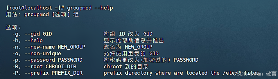
【Linux】Linux命令与操作详解(一)文件管理(文件命令)、用户与用户组管理(创建、删除用户/组)
文章目录 一、前言1.1、Linux的文件结构是一颗从 根目录/ 开始的一个多叉树。1.2、绝对路径与相对路径1.3、命令的本质是可执行文件。1.4、家目录 二、文件管理2.1、文件操作1、pwd2、ls3、cd4、touch5、mkdir6、cp7、rm8、mv9、rmdir 2.2、查看文件1、cat2、more3、less4、hea…...
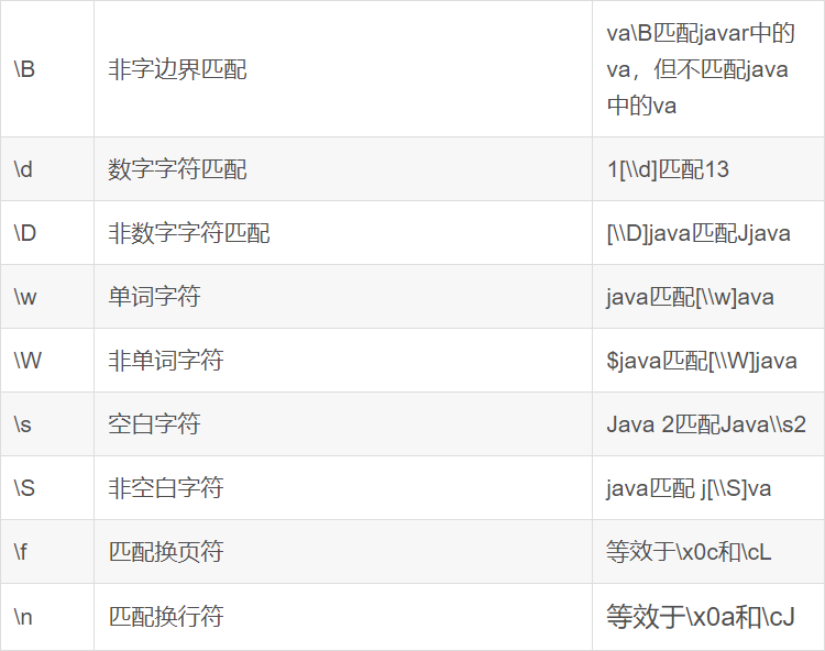
Hadoop大数据入门——Hive-SQL语法大全
Hive SQL 语法大全 基于语法描述说明 CREATE DATABASE [IF NOT EXISTS] db_name [LOCATION] path; SELECT expr, ... FROM tbl ORDER BY col_name [ASC | DESC] (A | B | C)如上语法,在语法描述中出现: [],表示可选,如上[LOCATI…...

个人开发主页
网站 GitHubCSDN知乎豆包Google百度 多媒体 ffmpeg媒矿工厂videolanAPPLE开发者官网华为开发者官网livevideostack高清产业联盟github-xhunmon/VABloggithub-0voice/audio_video_streamingdoom9streamingmediaFourCC-wiki17哥Depth.Love BlogOTTFFmpeg原理介绍wowzavicuesof…...

思维+数论,CF 922C - Cave Painting
目录 一、题目 1、题目描述 2、输入输出 2.1输入 2.2输出 3、原题链接 二、解题报告 1、思路分析 2、复杂度 3、代码详解 一、题目 1、题目描述 2、输入输出 2.1输入 2.2输出 3、原题链接 922C - Cave Painting 二、解题报告 1、思路分析 诈骗题 我们发现 n mo…...

如何下单PCB板和STM贴片服务- 嘉立创EDA
1 PCB 下单 1.1 PCB 设计好,需要进行DRC 检查。 1.2 生成gerber文件、坐标文件和BOM文件 1.3 打开嘉立创下单助手 上传gerber文件 1.4 选择下单数量 1.5 选择板材, 一般常用板材 PR4 板材。 1.6 如果需要阻抗匹配,需要选择设计的时候阻抗叠…...

ONNXRuntime GPU推理想用BFloat16加速?手把手教你搞定PyTorch + CUDA环境配置与避坑
ONNXRuntime GPU推理想用BFloat16加速?手把手教你搞定PyTorch CUDA环境配置与避坑 在深度学习模型部署领域,BFloat16数据类型正逐渐成为提升推理性能的新宠。这种16位浮点格式保留了与32位浮点相同的指数位,在保持数值范围的同时减少了内存占…...

Simple Runtime Window Editor:突破游戏窗口限制的终极解决方案
Simple Runtime Window Editor:突破游戏窗口限制的终极解决方案 【免费下载链接】SRWE Simple Runtime Window Editor 项目地址: https://gitcode.com/gh_mirrors/sr/SRWE 你是否曾为游戏内置分辨率选项太少而烦恼?是否想在窗口模式下获得全屏游戏…...

Unity游戏接入TapTap登录,从后台配置到打包上线的完整避坑指南
Unity游戏接入TapTap登录的全流程避坑指南:从配置到上线的实战经验 在独立游戏开发领域,TapTap平台凭借其庞大的用户基础和便捷的登录系统,已成为许多开发者的首选接入方案。然而,从后台配置到最终打包上线的完整流程中࿰…...

深度集成AI的VSCode扩展:从代码生成到调试的全流程实战指南
1. 项目概述:一个为VSCode注入AI灵魂的扩展如果你和我一样,每天有超过8小时的时间是在Visual Studio Code(VSCode)里度过的,那么你一定对提升编码效率有着近乎偏执的追求。从代码补全、语法高亮到调试、版本控制&#…...

Java 大厂面试 200 题完整版含答案解析
前言本文整理了近两年从阿里、腾讯、字节、美团、京东、拼多多等大厂面试中高频出现的 200 道 Java 面试题,覆盖 Java 基础、集合、并发、JVM、Spring、MySQL、Redis、消息队列、分布式、场景设计 等核心模块,每题都附有简明扼要的答案解析,助…...
研究(Matlab代码实现))
一种用于并网光伏系统的创新型多层逆变器,以降低总谐波失真(THD)研究(Matlab代码实现)
💥💥💞💞欢迎来到本博客❤️❤️💥💥 🏆博主优势:🌞🌞🌞博客内容尽量做到思维缜密,逻辑清晰,为了方便读者。 🎁…...

Godot游戏自动化构建与发布:基于GitHub Actions与Docker的CI/CD实践
1. 项目概述:当Godot遇上CI/CD如果你是一名独立游戏开发者,或者在一个小团队里负责Godot引擎的项目,那么“构建”和“部署”这两个词,大概率是你开发流程里最头疼的环节之一。手动导出项目到不同平台(Windows、Linux、…...

开源AI图像生成工具Dream-Creator:本地部署与Stable Diffusion实战指南
1. 项目概述:一个开源的AI图像生成与创作工具 最近在GitHub上闲逛,发现了一个挺有意思的项目叫“Dream-Creator”。光看名字,你可能会联想到一些AI绘画或者创意生成工具。没错,这确实是一个围绕AI图像生成的开源项目。作为一个在…...

构建轻量级应用沙盒:Microverse原理与实践指南
1. 项目概述:一个轻量级、可移植的“微宇宙”开发沙盒最近在折腾一些边缘计算和嵌入式AI应用的原型验证,经常遇到一个头疼的问题:开发环境和部署环境不一致。在本地笔记本上跑得好好的Python脚本,放到树莓派或者Jetson Nano上&…...

模拟WiFi反向散射技术:无电池物联网通信新突破
1. 项目概述:模拟WiFi反向散射技术的革新突破在物联网设备爆炸式增长的今天,电池续航已成为制约大规模部署的关键瓶颈。传统传感器节点即使采用低功耗设计,其电池寿命也鲜有超过3-5年。而Leggiero提出的模拟WiFi反向散射技术,则开…...