Android FlexboxLayout布局
FlexboxLayout 布局
- 一、简介
- 二、使用
- 三、功能详解
- FlexboxLayout属性
- flexWrap
- flexDirection
- alignItems
- justifyContent
- alignContent
- dividerDrawableHorizontal、showDividerHorizontal
- dividerDrawableVertical、showDividerVertical
- dividerDrawable、showDivider
- maxLine
- FlexboxLayout子控件属性
- layout_order
- layout_flexGrow
- layout_flexShrink
- layout_flexBasisPercent
- layout_wrapBefore
- layout_minWidth、layout_maxWidth、layout_minHeight、layout_maxHeight
- layout_alignSelf
- FlexboxLayout在RecyclerView应用(FlexboxLayoutManager)
一、简介
FlexboxLayout 是2016年 Google I/O 上开源的一个布局控件,FlexBoxLayout是为Android带来了与 CSS Flexible Box Layout Module (CSS 弹性盒子)相似功能的开源布局控件。
FlexboxLayout 官方开源项目地址:https://github.com/google/flexbox-layout
二、使用
在项目的build.gradle引入flexbox:
implementation 'com.google.android.flexbox:flexbox:3.0.0'
从1.1.0开始,该库预计将与AndroidX一起使用。如果还没有迁移到AndroidX,需使用1.0.0版本,如果使用1.1.0或更高版本,需迁移到AndroidX;
从2.0.0开始,FlexboxLayout的alignItems和alignContext的默认值已从stretch更改为flex_start;
从3.0.0开始,groupId更改为com.google.android.flexbox,且上传至google-maven。旧版本的groupId(com.google.android),可以从jcenter中引用,建议迁移至3.0.0;
在布局文件中添加flexbox:
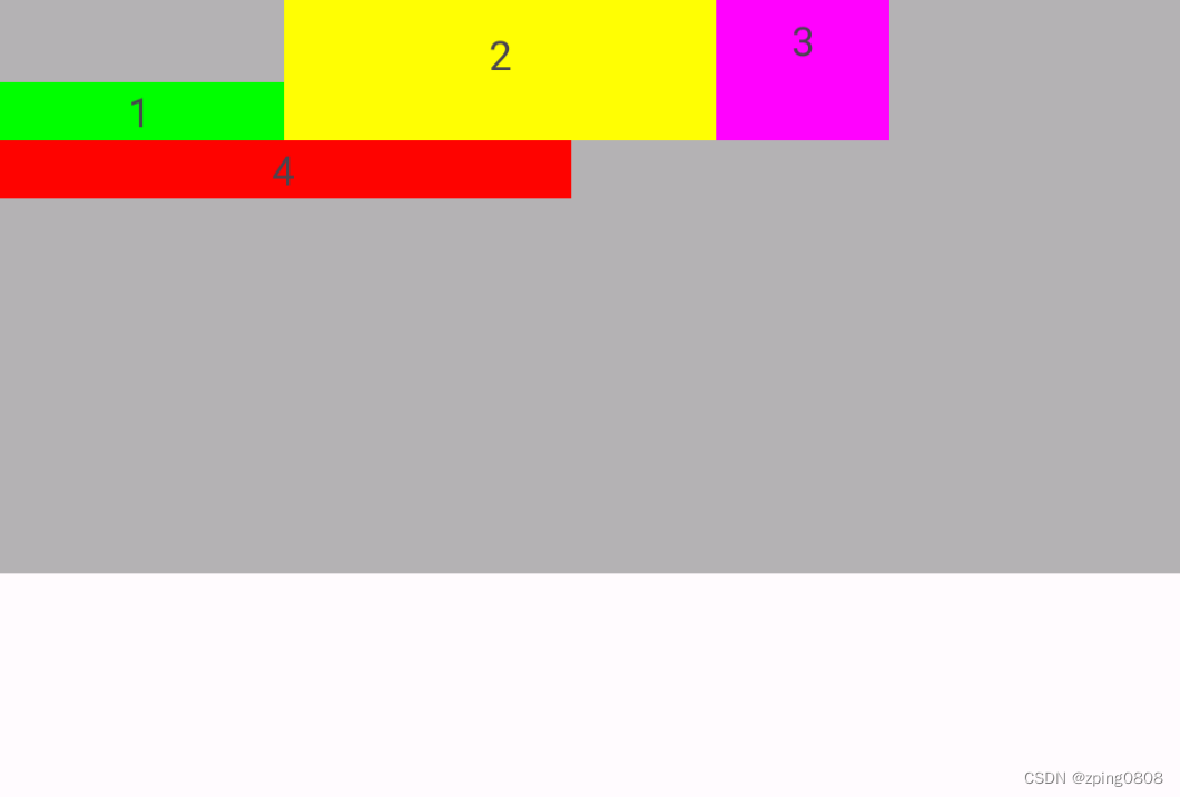
<com.google.android.flexbox.FlexboxLayout xmlns:android="http://schemas.android.com/apk/res/android"xmlns:app="http://schemas.android.com/apk/res-auto"android:layout_width="match_parent"android:layout_height="match_parent"app:flexWrap="wrap"><TextViewandroid:layout_width="100dp"android:layout_height="20dp"android:background="#00FF00"android:gravity="center"android:text="1" /><TextViewandroid:layout_width="150dp"android:layout_height="20dp"android:background="#FFFF00"android:gravity="center"android:text="2" /><TextViewandroid:layout_width="60dip"android:layout_height="20dp"android:background="#FF00FF"android:gravity="center"android:text="3" /><TextViewandroid:layout_width="200dip"android:layout_height="20dp"android:background="#FF0000"android:gravity="center"android:text="4" /></com.google.android.flexbox.FlexboxLayout>
显示效果如下:

三、功能详解
FlexboxLayout属性
flexWrap
控制是否换行和换行的方向
属性值:
<attr name="flexWrap"><enum name="nowrap" value="0"/><enum name="wrap" value="1"/><enum name="wrap_reverse" value="2"/></attr>
示例代码:
<com.google.android.flexbox.FlexboxLayout xmlns:android="http://schemas.android.com/apk/res/android"xmlns:app="http://schemas.android.com/apk/res-auto"android:layout_width="match_parent"android:layout_height="200dip"android:background="#4A000000"app:flexWrap="nowrap"><!-- flexWrap属性控制是否换行和换行的方向--><!-- app:flexWrap="nowrap"//默认 单行显示--><!-- app:flexWrap="wrap"//超过当前行,自动换行显示--><!-- app:flexWrap="wrap_reverse"//反向换行,当内容超过当前行,自动在换行到当前行上方显示--><TextViewandroid:layout_width="100dp"android:layout_height="20dp"android:background="#00FF00"android:gravity="center"android:text="1" /><TextViewandroid:layout_width="150dp"android:layout_height="20dp"android:background="#FFFF00"android:gravity="center"android:text="2" /><TextViewandroid:layout_width="60dip"android:layout_height="20dp"android:background="#FF00FF"android:gravity="center"android:text="3" /><TextViewandroid:layout_width="200dip"android:layout_height="20dp"android:background="#FF0000"android:gravity="center"android:text="4" /></com.google.android.flexbox.FlexboxLayout>
-
app:flexWrap="nowrap"
默认,单行显示

-
app:flexWrap="wrap"
超过当前行,自动换行显示

-
app:flexWrap="wrap_reverse"
反向换行,当内容超过当前行,自动在换行到当前行上方显示

flexDirection
控制主轴的方向,子元素的排列按照轴线方向依次添加
属性值:
 <attr name="flexDirection"><enum name="row" value="0"/><enum name="row_reverse" value="1"/><enum name="column" value="2"/><enum name="column_reverse" value="3"/>
</attr>
示例代码:
<com.google.android.flexbox.FlexboxLayout xmlns:android="http://schemas.android.com/apk/res/android"xmlns:app="http://schemas.android.com/apk/res-auto"android:layout_width="match_parent"android:layout_height="200dip"android:background="#4A000000"app:flexDirection="row"app:flexWrap="wrap">
<!--  flexDirection属性控制主轴的方向,子元素的排列按照轴线方向依次添加-->
<!--  flexDirection="row"默认,主轴方向按水平方向排版(行排版),从左到右-->
<!--  flexDirection="row_reverse"主轴方向按水平方向反向排版(行反向排版),从右到左-->
<!--  flexDirection="column"主轴方向按竖直方向排版(列排版),从上到下-->
<!--  flexDirection="column_reverse"主轴方向按竖直方向反向排版(列反向排版),从下到上--><TextViewandroid:layout_width="100dp"android:layout_height="20dp"android:background="#00FF00"android:gravity="center"android:text="1" /><TextViewandroid:layout_width="150dp"android:layout_height="20dp"android:background="#FFFF00"android:gravity="center"android:text="2" /><TextViewandroid:layout_width="60dip"android:layout_height="20dp"android:background="#FF00FF"android:gravity="center"android:text="3" /><TextViewandroid:layout_width="200dip"android:layout_height="20dp"android:background="#FF0000"android:gravity="center"android:text="4" /></com.google.android.flexbox.FlexboxLayout>
-
app:flexDirection="row"
默认,主轴方向按水平方向排版(行排版),从左到右

-
app:flexDirection="row_reverse"
主轴方向按水平方向反向排版(行反向排版),从右到左

-
app:flexDirection="column"
主轴方向按竖直方向排版(列排版),从上到下

-
app:flexDirection="column_reverse"
主轴方向按竖直方向反向排版(列反向排版),从下到上

alignItems
控制每行轴线上对齐方式
属性值:
<attr name="alignItems"><enum name="flex_start" value="0"/><enum name="flex_end" value="1"/><enum name="center" value="2"/><enum name="baseline" value="3"/><enum name="stretch" value="4"/>
</attr>
示例代码:
<com.google.android.flexbox.FlexboxLayout xmlns:android="http://schemas.android.com/apk/res/android"xmlns:app="http://schemas.android.com/apk/res-auto"android:layout_width="match_parent"android:layout_height="200dip"android:background="#4A000000"app:flexDirection="row"app:flexWrap="wrap"app:justifyContent="flex_start"app:alignContent="flex_start"app:alignItems="flex_start">
<!--    app:alignItems:控制每行轴线上对齐方式-->
<!--    app:alignItems="flex_start"//默认,每行子控件上下顶部对齐-->
<!--    app:alignItems="flex_end"//每行子控件上下底部对齐-->
<!--    app:alignItems="center"//每行子控件上下居中对齐-->
<!--    app:alignItems="baseline"//每行子控件中内容对齐-->
<!--    app:alignItems="stretch"//每行子控件以该行最大高度将每个子控件填充完成--><TextViewandroid:layout_width="100dp"android:layout_height="20dp"android:background="#00FF00"android:gravity="center"android:text="1" /><TextViewandroid:layout_width="150dp"android:layout_height="wrap_content"android:paddingTop="10dip"android:paddingBottom="20dip"android:background="#FFFF00"android:gravity="center"android:text="2" /><TextViewandroid:layout_width="60dip"android:layout_height="wrap_content"android:paddingBottom="20dip"android:background="#FF00FF"android:gravity="center"android:text="3" /><TextViewandroid:layout_width="200dip"android:layout_height="20dp"android:background="#FF0000"android:gravity="center"android:text="4" /></com.google.android.flexbox.FlexboxLayout>
类似于
[外链图片转存失败,源站可能有防盗链机制,建议将图片保存下来直接上传(img-pqekIpWl-1683346777203)(null)]
-
app:alignItems="flex_start"
默认,每行子控件上下顶部对齐

-
app:alignItems="flex_end"
每行子控件上下底部对齐

-
app:alignItems="center"
每行子控件上下居中对齐

-
app:alignItems="baseline"
每行子控件中内容对齐

-
app:alignItems="stretch"
每行子控件以该行最大高度将每个子控件填充完成

类似于 CSS Flexible Box Layout Module 中align-items:
图片来源

justifyContent
控制元素在主轴上的对齐方式,需要配合flexDirection或flexWrap属性来使用
属性值:
<attr name="justifyContent"><enum name="flex_start" value="0"/><enum name="flex_end" value="1"/><enum name="center" value="2"/><enum name="space_between" value="3"/><enum name="space_around" value="4"/><enum name="space_evenly" value="5"/>
</attr>
示例代码:
<com.google.android.flexbox.FlexboxLayout xmlns:android="http://schemas.android.com/apk/res/android"xmlns:app="http://schemas.android.com/apk/res-auto"android:layout_width="match_parent"android:layout_height="200dip"android:background="#4A000000"app:flexDirection="row"app:flexWrap="wrap"app:justifyContent="flex_start"><!--app:justifyContent 控制元素在主轴上的对齐方式,需要配合flexDirection或flexWrap属性来使用--><!--app:justifyContent="flex_start"//默认,每行左对齐--><!--app:justifyContent="flex_end"//每行右对齐--><!--app:justifyContent="center"//每行居中对齐--><!--app:justifyContent="space_between"//两端对齐--><!--app:justifyContent="space_around"//每行分散对齐,每个控件左右间隔均相等,控件之间的间隔比控件与边框的间隔大一倍,因为每个控件均存在左右间隔--><!--app:justifyContent="space_evenly"//每行均匀对齐,每行所有间隔均相等--><TextViewandroid:layout_width="100dp"android:layout_height="20dp"android:background="#00FF00"android:gravity="center"android:text="1" /><TextViewandroid:layout_width="150dp"android:layout_height="20dip"android:background="#FFFF00"android:gravity="center"android:text="2" /><TextViewandroid:layout_width="60dip"android:layout_height="20dp"android:background="#FF00FF"android:gravity="center"android:text="3" /><TextViewandroid:layout_width="200dip"android:layout_height="20dp"android:background="#FF0000"android:gravity="center"android:text="4" /></com.google.android.flexbox.FlexboxLayout>
-
app:justifyContent="flex_start"
默认,每行左对齐

-
app:justifyContent="flex_end"
每行右对齐

-
app:justifyContent="center"
每行居中对齐

-
app:justifyContent="space_between"
两端对齐

-
app:justifyContent="space_around"
每行分散对齐,每个控件左右间隔均相等,控件之间的间隔比控件与边框的间隔大一倍,因为每个控件均存在左右间隔

-
app:justifyContent="space_evenly"
每行均匀对齐,每行所有间隔均相等

alignContent
控制主轴对齐方式(纵向对齐),与justifyContent(横向对齐)对应
属性值:
<attr name="alignContent"><enum name="flex_start" value="0"/><enum name="flex_end" value="1"/><enum name="center" value="2"/><enum name="space_between" value="3"/><enum name="space_around" value="4"/><enum name="stretch" value="5"/>
</attr>
示例代码:
<com.google.android.flexbox.FlexboxLayout xmlns:android="http://schemas.android.com/apk/res/android"xmlns:app="http://schemas.android.com/apk/res-auto"android:layout_width="match_parent"android:layout_height="200dip"android:background="#4A000000"app:alignContent="flex_start"app:flexDirection="row"app:flexWrap="wrap"app:justifyContent="flex_start"><!--app:alignContent 控制主轴对齐方式(纵向对齐),与justifyContent(横向对齐)对应--><!-- app:alignContent="flex_start"//默认,顶部对齐--><!-- app:alignContent="flex_end"//底部对齐--><!-- app:alignContent="center"//上下居中对齐--><!-- app:alignContent="space_between"//上下两端对齐--><!-- app:alignContent="space_around"//上下分散对齐,每行上下间隔均相等,每行之间的间隔比首行/尾行与边框的间隔大一倍,因为每行均存在上下间隔--><!-- app:alignContent="stretch"//每行上下均分整个FlexboxLayout,需要app:alignItems="stretch"才有效,没有设置alignItems时,除首行紧贴边框,其他间隔相等--><TextViewandroid:layout_width="100dp"android:layout_height="20dp"android:background="#00FF00"android:gravity="center"android:text="1" /><TextViewandroid:layout_width="150dp"android:layout_height="20dp"android:background="#FFFF00"android:gravity="center"android:text="2" /><TextViewandroid:layout_width="60dip"android:layout_height="20dp"android:background="#FF00FF"android:gravity="center"android:text="3" /><TextViewandroid:layout_width="200dip"android:layout_height="20dp"android:background="#FF0000"android:gravity="center"android:text="4" /></com.google.android.flexbox.FlexboxLayout>
-
app:alignContent="flex_start"
默认,顶部对齐

-
app:alignContent="flex_end"
底部对齐

-
app:alignContent="center"
上下居中对齐

-
app:alignContent="space_between"
上下两端对齐

-
app:alignContent="space_around"
上下分散对齐,每行上下间隔均相等,每行之间的间隔比首行/尾行与边框的间隔大一倍,因为每行均存在上下间隔

-
app:alignContent="stretch"
每行上下均分整个FlexboxLayout,需要app:alignItems="stretch"才有效,没有设置alignItems时,除首行紧贴边框,其他间隔相等-
没有设置alignItems时:

-
设置
app:alignItems="stretch"时:

-
dividerDrawableHorizontal、showDividerHorizontal
dividerDrawableHorizontal:设置水平分隔线资源,配合showDividerHorizontal使用;showDividerHorizontal:设置水平分隔线显示方式
showDividerHorizontal属性值:
<attr name="showDividerHorizontal"><flag name="none" value="0"/><flag name="beginning" value="1"/><flag name="middle" value="2"/><flag name="end" value="4"/>
</attr>
实例代码:
<com.google.android.flexbox.FlexboxLayout xmlns:android="http://schemas.android.com/apk/res/android"xmlns:app="http://schemas.android.com/apk/res-auto"android:layout_width="match_parent"android:background="#4A000000"android:layout_height="200dip"app:dividerDrawableHorizontal="@drawable/divider"app:flexWrap="wrap"app:showDividerHorizontal="none"><!-- app:dividerDrawableHorizontal:设置水平分隔线资源--><!-- app:showDividerHorizontal:设置水平分隔线显示方式--><!-- app:showDividerHorizontal="none"//默认,设置水平分隔线不显示--><!-- app:showDividerHorizontal="beginning"//设置水平分隔线开始显示--><!-- app:showDividerHorizontal="middle"//设置水平分隔线中间显示--><!-- app:showDividerHorizontal="end"//设置水平分隔线结束显示--><TextViewandroid:layout_width="100dp"android:layout_height="20dp"android:background="#00FF00"android:gravity="center"android:text="1" /><TextViewandroid:layout_width="150dp"android:layout_height="20dp"android:background="#FFFF00"android:gravity="center"android:text="2" /><TextViewandroid:layout_width="60dip"android:layout_height="20dip"android:background="#FF00FF"android:gravity="center"android:text="3" /><TextViewandroid:layout_width="200dip"android:layout_height="20dp"android:background="#FF0000"android:gravity="center"android:text="4" /></com.google.android.flexbox.FlexboxLayout>
分隔线资源divider.xml:
<?xml version="1.0" encoding="utf-8"?>
<shape xmlns:android="http://schemas.android.com/apk/res/android"><sizeandroid:width="10dip"android:height="10dip" /><solid android:color="#D1D1D1" />
</shape>
-
app:showDividerHorizontal="none"
默认,设置水平分隔线不显示

-
app:showDividerHorizontal="beginning"
设置水平分隔线开始显示

-
app:showDividerHorizontal="middle"
设置水平分隔线中间显示

-
app:showDividerHorizontal="end"
设置水平分隔线结束显示

-
也可以组合使用,例如设置水平分隔线中间、结束显示:
app:showDividerHorizontal="middle|end"

dividerDrawableVertical、showDividerVertical
dividerDrawableVertical:设置垂直分隔线资源,配合showDividerVertical使用;showDividerVertical:设置垂直分隔线显示方式
showDividerVertical属性值:
<attr name="showDividerVertical"><flag name="none" value="0"/><flag name="beginning" value="1"/><flag name="middle" value="2"/><flag name="end" value="4"/>
</attr>
实例代码:
<com.google.android.flexbox.FlexboxLayout xmlns:android="http://schemas.android.com/apk/res/android"xmlns:app="http://schemas.android.com/apk/res-auto"android:layout_width="match_parent"android:layout_height="200dip"android:background="#4A000000"app:flexWrap="wrap"app:dividerDrawableVertical="@drawable/divider"app:showDividerVertical="none"><!-- app:dividerDrawableVertical:设置垂直分隔线资源--><!-- app:showDividerVertical :设置垂直分隔线显示方式--><!-- app:showDividerVertical="none"//默认,设置垂直分隔线不显示--><!-- app:showDividerVertical="beginning"//设置垂直分隔线开始显示--><!-- app:showDividerVertical="middle"//设置垂直分隔线中间显示--><!-- app:showDividerVertical="end"//设置垂直分隔线结束显示--><TextViewandroid:layout_width="100dp"android:layout_height="20dp"android:background="#00FF00"android:gravity="center"android:text="1" /><TextViewandroid:layout_width="150dp"android:layout_height="20dp"android:background="#FFFF00"android:gravity="center"android:text="2" /><TextViewandroid:layout_width="60dip"android:layout_height="20dip"android:background="#FF00FF"android:gravity="center"android:text="3" /><TextViewandroid:layout_width="200dip"android:layout_height="20dp"android:background="#FF0000"android:gravity="center"android:text="4" /></com.google.android.flexbox.FlexboxLayout>
分隔线资源同上divider.xml:
-
app:showDividerVertical="none"
默认,设置垂直分隔线不显示
-
app:showDividerVertical="beginning"
设置垂直分隔线开始显示

-
app:showDividerVertical="middle"
设置垂直分隔线中间显示

-
app:showDividerVertical="end"
设置垂直分隔线结束显示

-
也可以组合使用,例如设置垂直分隔线中间、结束显示:
app:showDividerVertical="middle|end"

dividerDrawable、showDivider
dividerDrawable:设置水平和垂直分隔线资源,配合showDivider使用;showDivider:设置水平和垂直分隔线显示方式
showDivider属性值:
<attr name="showDivider"><flag name="none" value="0"/><flag name="beginning" value="1"/><flag name="middle" value="2"/><flag name="end" value="4"/>
</attr>
实例代码:
<com.google.android.flexbox.FlexboxLayout xmlns:android="http://schemas.android.com/apk/res/android"xmlns:app="http://schemas.android.com/apk/res-auto"android:layout_width="match_parent"android:layout_height="200dip"android:background="#4A000000"app:flexWrap="wrap"app:dividerDrawable="@drawable/divider"app:showDivider="none"><!-- app:dividerDrawable:设置水平和垂直分隔线资源--><!-- app:showDivider:设置水平和垂直分隔线显示方式--><!-- app:showDivider="none"//设置水平和垂直分隔线不显示--><!-- app:showDivider="beginning"//设置水平和垂直分隔线开始显示--><!-- app:showDivider="middle"//设置水平和垂直分隔线中间显示--><!-- app:showDivider="end"//设置水平和垂直分隔线结束显示--><TextViewandroid:layout_width="100dp"android:layout_height="20dp"android:background="#00FF00"android:gravity="center"android:text="1" /><TextViewandroid:layout_width="150dp"android:layout_height="20dp"android:background="#FFFF00"android:gravity="center"android:text="2" /><TextViewandroid:layout_width="60dip"android:layout_height="20dip"android:background="#FF00FF"android:gravity="center"android:text="3" /><TextViewandroid:layout_width="200dip"android:layout_height="20dp"android:background="#FF0000"android:gravity="center"android:text="4" /></com.google.android.flexbox.FlexboxLayout>
分隔线资源同上divider.xml:
-
app:showDivider="none"
默认,设置水平和垂直分隔线不显示
-
app:showDivider="beginning"
设置水平和垂直分隔线开始显示

-
app:showDivider="middle"
设置水平和垂直分隔线中间显示

-
app:showDivider="end"
设置水平和垂直分隔线结束显示

-
也可以组合使用,例如设置水平和垂直分隔线中间、结束显示:
app:showDivider="middle|end"

maxLine
设置最大行数,只有flexWrap设置为wrap或wrap_reverse时,此属性才生效
示例代码:
<com.google.android.flexbox.FlexboxLayout xmlns:android="http://schemas.android.com/apk/res/android"xmlns:app="http://schemas.android.com/apk/res-auto"android:layout_width="match_parent"android:background="#4A000000"android:layout_height="200dip"app:flexWrap="wrap"app:maxLine="1"><!-- maxLine:设置最大行数,只有flexWrap设置为wrap或wrap_reverse时,此属性才生效--><!-- app:maxLine="1":设置最大行数为1行--><TextViewandroid:layout_width="100dp"android:layout_height="20dp"android:background="#00FF00"android:gravity="center"android:text="1" /><TextViewandroid:layout_width="150dp"android:layout_height="20dp"android:background="#FFFF00"android:gravity="center"android:text="2" /><TextViewandroid:layout_width="60dip"android:layout_height="20dip"android:background="#FF00FF"android:gravity="center"android:text="3" /><TextViewandroid:layout_width="200dip"android:layout_height="20dp"android:background="#FF0000"android:gravity="center"android:text="4" /></com.google.android.flexbox.FlexboxLayout>
app:maxLine="1"
设置最大行数为1行,只有flexWrap设置为wrap或wrap_reverse时,此属性才生效
FlexboxLayout子控件属性
layout_order
指定子元素排序优先级,值越小越排在前面,默认值为1,类型为int
例如“1” 原本在第一位,layout_order设置为2,则会在整个控件最后:
<com.google.android.flexbox.FlexboxLayout xmlns:android="http://schemas.android.com/apk/res/android"xmlns:app="http://schemas.android.com/apk/res-auto"android:layout_width="match_parent"android:background="#4A000000"android:layout_height="200dip"app:flexWrap="nowrap"><TextViewandroid:layout_width="100dp"android:layout_height="20dp"android:background="#00FF00"android:gravity="center"app:layout_order="2"android:text="1" /><!--    app:layout_order="2"--><!--    app:layout_order:指定子元素排序优先级,值越小越排在前面,默认值为1,类型为int--><!--    例如“1” 原本在第一位,layout_order设置为2,则会在整个控件最后--><TextViewandroid:layout_width="150dp"android:layout_height="20dp"android:background="#FFFF00"android:gravity="center"android:text="2" /><TextViewandroid:layout_width="60dip"android:layout_height="20dip"android:background="#FF00FF"android:gravity="center"android:text="3"/><TextViewandroid:layout_width="200dip"android:layout_height="20dp"android:background="#FF0000"android:gravity="center"android:text="4" />
</com.google.android.flexbox.FlexboxLayout>
效果如下:

没有设置时:

layout_flexGrow
设置同一轴线剩余控件所占权重,类型为float
例如将“2”权重值layout_flexGrow设置为1,则会占满该行剩余空间:
<com.google.android.flexbox.FlexboxLayout xmlns:android="http://schemas.android.com/apk/res/android"xmlns:app="http://schemas.android.com/apk/res-auto"android:layout_width="match_parent"android:background="#4A000000"android:layout_height="200dip"app:flexWrap="nowrap"><TextViewandroid:layout_width="100dp"android:layout_height="20dp"android:background="#00FF00"android:gravity="center"android:text="1" /><TextViewandroid:layout_width="150dp"android:layout_height="20dp"android:background="#FFFF00"android:gravity="center"app:layout_flexGrow="1"android:text="2" /><!-- app:layout_flexGrow="1"--><!-- app:layout_flexGrow:设置同一轴线剩余控件所占权重,类型为float--><!-- 例如将“2”权重值layout_flexGrow设置为1,则会占满该行剩余空间--><TextViewandroid:layout_width="60dip"android:layout_height="20dip"android:background="#FF00FF"android:gravity="center"android:text="3"/><TextViewandroid:layout_width="20dip"android:layout_height="20dp"android:background="#FF0000"android:gravity="center"android:text="4" /></com.google.android.flexbox.FlexboxLayout>
效果如下:

没有设置时:

layout_flexShrink
单个控件缩放比例,值越大缩放比例越大,如果设置了换行(flexWrap=“wrap或wrap_reverse”)则该属性无效,类型为float
例如将"2"缩放比例layout_flexShrink设置为2,则缩放更明显(双倍缩放):
<com.google.android.flexbox.FlexboxLayout xmlns:android="http://schemas.android.com/apk/res/android"xmlns:app="http://schemas.android.com/apk/res-auto"android:layout_width="match_parent"android:background="#4A000000"android:layout_height="200dip"app:flexWrap="nowrap"><TextViewandroid:layout_width="100dp"android:layout_height="20dp"android:background="#00FF00"android:gravity="center"android:text="1" /><TextViewandroid:layout_width="150dp"android:layout_height="20dp"android:background="#FFFF00"android:gravity="center"android:text="2" /><TextViewandroid:layout_width="60dip"android:layout_height="20dip"android:background="#FF00FF"android:gravity="center"android:text="3"app:layout_flexShrink="2" /><!-- app:layout_flexShrink="2"--><!-- app:layout_flexShrink:单个控件缩放比例,值越大缩放比例越大,如果设置了换行(flexWrap=“wrap或wrap_reverse”)则该属性无效,类型为float--><!-- 例如将"2"缩放比例layout_flexShrink设置为2,则缩放更明显(双倍缩放)--><TextViewandroid:layout_width="200dip"android:layout_height="20dp"android:background="#FF0000"android:gravity="center"android:text="4" /></com.google.android.flexbox.FlexboxLayout>
效果如下:

没有设置时:

layout_flexBasisPercent
设置控件宽度占用父控件宽度的百分比,设置后,该控件原有宽度失效,父控件需明确宽度,此设置才生效
例如 将“1” layout_flexBasisPercent设置为50%,则宽度正好是父控件一半:
<com.google.android.flexbox.FlexboxLayout xmlns:android="http://schemas.android.com/apk/res/android"xmlns:app="http://schemas.android.com/apk/res-auto"android:layout_width="match_parent"android:background="#4A000000"android:layout_height="200dip"app:flexWrap="wrap"><TextViewandroid:layout_width="100dp"android:layout_height="20dp"android:background="#00FF00"android:gravity="center"app:layout_flexBasisPercent="50%"android:text="1" />
<!--    app:layout_flexBasisPercent="50%"-->
<!--    app:layout_flexBasisPercent:设置控件宽度占用父控件宽度的百分比,设置后,该控件原有宽度失效,父控件需明确宽度,此设置才生效-->
<!--    例如 将“1” layout_flexBasisPercent设置为50%,则宽度正好是父控件一半--><TextViewandroid:layout_width="150dp"android:layout_height="20dp"android:background="#FFFF00"android:gravity="center"android:text="2" /><TextViewandroid:layout_width="60dip"android:layout_height="20dip"android:background="#FF00FF"android:gravity="center"android:text="3" /><TextViewandroid:layout_width="200dip"android:layout_height="20dp"android:background="#FF0000"android:gravity="center"android:text="4" />
</com.google.android.flexbox.FlexboxLayout>
效果如下:

layout_wrapBefore
设置控件是否强制换行,默认false,如果设置为true,则该控件强制换行展示
例如将"2",“4” layout_wrapBefore 设置为true,则该控件强制换行:
<com.google.android.flexbox.FlexboxLayout xmlns:android="http://schemas.android.com/apk/res/android"xmlns:app="http://schemas.android.com/apk/res-auto"android:layout_width="match_parent"android:background="#4A000000"android:layout_height="200dip"app:flexWrap="wrap"><TextViewandroid:layout_width="100dp"android:layout_height="20dp"android:background="#00FF00"android:gravity="center"android:text="1" /><TextViewandroid:layout_width="150dp"android:layout_height="20dp"android:background="#FFFF00"android:gravity="center"app:layout_wrapBefore="true"android:text="2" /><!--    app:layout_wrapBefore="true"--><!--    app:layout_wrapBefore:设置控件是否强制换行,默认false,如果设置为true,则该控件强制换行展示--><!--    例如将"2","4" layout_wrapBefore 设置为true,则该控件强制换行--><TextViewandroid:layout_width="60dip"android:layout_height="20dip"android:background="#FF00FF"android:gravity="center"android:text="3" /><TextViewandroid:layout_width="200dip"android:layout_height="20dp"android:background="#FF0000"android:gravity="center"app:layout_wrapBefore="true"android:text="4" />
</com.google.android.flexbox.FlexboxLayout>
效果如下:

layout_minWidth、layout_maxWidth、layout_minHeight、layout_maxHeight
layout_minWidth:设置该控件最小宽度,layout_maxWidth:设置该控件最大宽度
layout_minHeight:设置该控件最小高度,layout_maxHeight:设置该控件最大高度
例如,设置"3"的最大、最小宽度和高度都为90dip:
<com.google.android.flexbox.FlexboxLayout xmlns:android="http://schemas.android.com/apk/res/android"xmlns:app="http://schemas.android.com/apk/res-auto"android:layout_width="match_parent"android:background="#4A000000"android:layout_height="200dip"app:flexWrap="wrap"><TextViewandroid:layout_width="100dp"android:layout_height="20dp"android:background="#00FF00"android:gravity="center"android:text="1" /><TextViewandroid:layout_width="150dp"android:layout_height="20dp"android:background="#FFFF00"android:gravity="center"android:text="2" /><TextViewandroid:layout_width="60dip"android:layout_height="20dip"android:background="#FF00FF"android:gravity="center"app:layout_minWidth="90dip"app:layout_maxWidth="90dip"app:layout_minHeight="90dip"app:layout_maxHeight="90dip"android:text="3" /><!-- app:layout_minWidth:设置该控件最小宽度--><!-- app:layout_maxWidth:设置该控件最大宽度--><!-- app:layout_minHeight:设置该控件最小高度--><!-- app:layout_maxHeight:设置该控件最大高度--><TextViewandroid:layout_width="200dip"android:layout_height="20dp"android:background="#FF0000"android:gravity="center"android:text="4" /></com.google.android.flexbox.FlexboxLayout>
效果如下:

未设置时效果:

layout_alignSelf
设置单个控件的对齐方式,不同于app:alignItems是设置每行轴线上对齐方式
属性值:
<attr name="layout_alignSelf"><enum name="auto" value="-1"/><enum name="flex_start" value="0"/><enum name="flex_end" value="1"/><enum name="center" value="2"/><enum name="baseline" value="3"/><enum name="stretch" value="4"/>
</attr>
示例代码:
<com.google.android.flexbox.FlexboxLayout xmlns:android="http://schemas.android.com/apk/res/android"xmlns:app="http://schemas.android.com/apk/res-auto"android:layout_width="match_parent"android:background="#4A000000"android:layout_height="200dip"app:alignItems="flex_end"app:flexWrap="wrap"><TextViewandroid:layout_width="100dp"android:layout_height="20dp"android:background="#00FF00"android:gravity="center"android:text="1" /><TextViewandroid:layout_width="150dp"android:layout_height="wrap_content"android:paddingTop="10dip"android:paddingBottom="20dip"android:background="#FFFF00"android:gravity="center"android:text="2" /><TextViewandroid:layout_width="60dip"android:layout_height="wrap_content"android:paddingBottom="20dip"android:background="#FF00FF"app:layout_alignSelf="auto"android:gravity="center"android:text="3" /><!--    app:layout_alignSelf:设置单个控件的对齐方式,不同于app:alignItems是设置每行轴线上对齐方式-->
<!--    app:layout_alignSelf="auto"//默认,继承父元素的alignItems属性-->
<!--    app:layout_alignSelf="flex_start"//该控件顶部对齐-->
<!--    app:layout_alignSelf="flex_end"//该控件底部对齐-->
<!--    app:layout_alignSelf="center"//该控件居中对齐-->
<!--    app:layout_alignSelf="baseline"//该控件内容对齐-->
<!--    app:layout_alignSelf="stretch"//该控件控件以该行最大高度将控件填充完成--><TextViewandroid:layout_width="200dip"android:layout_height="20dp"android:background="#FF0000"android:gravity="center"app:layout_wrapBefore="true"android:text="4" />
</com.google.android.flexbox.FlexboxLayout>
实例代码效果如下:

-
app:layout_alignSelf="auto"
默认,继承父元素的alignItems属性
-
app:layout_alignSelf="flex_start"
该控件顶部对齐

-
app:layout_alignSelf="flex_end"
该控件底部对齐
-
app:layout_alignSelf="center"
该控件居中对齐

-
app:layout_alignSelf="baseline"
该控件内容对齐

-
app:layout_alignSelf="stretch"
该控件控件以该行最大高度将控件填充完成
FlexboxLayout在RecyclerView应用(FlexboxLayoutManager)
代码中设置RecyclerView的setLayoutManager为FlexboxLayoutManager,配置属性通过FlexboxLayoutManager设置即可:
RecyclerView recyclerView = (RecyclerView) context.findViewById(R.id.recyclerview);
FlexboxLayoutManager layoutManager = new FlexboxLayoutManager(context);
layoutManager.setFlexDirection(FlexDirection.COLUMN);
layoutManager.setJustifyContent(JustifyContent.FLEX_END);
recyclerView.setLayoutManager(layoutManager);
对于FlexboxLayout子控件属性设置方式如下:
mImageView.setImageDrawable(drawable);
ViewGroup.LayoutParams lp = mImageView.getLayoutParams();
if (lp instanceof FlexboxLayoutManager.LayoutParams) {FlexboxLayoutManager.LayoutParams flexboxLp = (FlexboxLayoutManager.LayoutParams) lp;flexboxLp.setFlexGrow(1.0f);flexboxLp.setAlignSelf(AlignSelf.FLEX_END);
}
使用FlexboxLayoutManager优势是:RecyclerView有屏幕外部控件回收复用机制,相对于直接使用FlexboxLayout(大量的子控件时)减少内存消耗。
官方提供了一个在RecyclerView使用FlexboxLayout(FlexboxLayoutManager)可设置的属性对照表如下:
| Attribute / Feature | FlexboxLayout | FlexboxLayoutManager (RecyclerView) |
|---|---|---|
| flexDirection | ✓ | ✓ |
| flexWrap | ✓ | ✓ (except wrap_reverse) |
| justifyContent | ✓ | ✓ |
| alignItems | ✓ | ✓ |
| alignContent | ✓ | - |
| layout_order | ✓ | - |
| layout_flexGrow | ✓ | ✓ |
| layout_flexShrink | ✓ | ✓ |
| layout_alignSelf | ✓ | ✓ |
| layout_flexBasisPercent | ✓ | ✓ |
| layout_(min/max)Width | ✓ | ✓ |
| layout_(min/max)Height | ✓ | ✓ |
| layout_wrapBefore | ✓ | ✓ |
| Divider | ✓ | ✓ |
| View recycling | - | ✓ |
| Scrolling | *1 | ✓ |
*1 Partially possible by wrapping it with ScrollView. But it isn’t likely to work with a large set of views inside the layout. Because it doesn’t consider view recycling.
相关文章:
Android FlexboxLayout布局
FlexboxLayout 布局 一、简介二、使用三、功能详解FlexboxLayout属性flexWrapflexDirectionalignItemsjustifyContentalignContentdividerDrawableHorizontal、showDividerHorizontaldividerDrawableVertical、showDividerVerticaldividerDrawable、showDividermaxLine Flexbox…...
发布过程 相关内容摘录)
GNU编码标准(七)发布过程 相关内容摘录
仅对第7章The Release Process的内容进行摘录。 文章目录 7 发布过程7.1 configure应该如何工作7.2Makefile公约7.2.1 Makefile的一般公约7.2.2 Makefiles中的实用程序7.2.3 指定命令的变量7.2.4 DESTDIR:支持分阶段安装7.2.5 安装目录的变量7.2.6 用户标准目标7.2…...

DX算法还原
早在之前作者就写过一篇关于顶象的滑块验证,潦潦草草几句话就带过了。 出于互相学习的想法,给了一个大学生,奈何不讲武德把源码甩群里了,虽然在大佬们眼里不难, 不过拿着别人的东西乱传还是不太好。自认倒霉…...

多媒体API
私人博客 许小墨のBlog —— 菜鸡博客直通车 系列文章完整版,配图更多,CSDN博文图片需要手动上传,因此文章配图较少,看不懂的可以去菜鸡博客参考一下配图! 系列文章目录 前端系列文章——传送门 后端系列文章——传送…...

免费矢量图标网站有哪些?
图标作为UI设计的必要元素,矢量图标是质量的保证。据说完美的用户体验应该从灵活性开始 。在响应设计盛行的当下,灵活矢量图标的重要性不言而喻。在这种情况下,风格齐全、质量上乘的矢量图标网站堪称设计宝藏。在这篇文章中,我们…...
基于Redis的分布式限流详解
前言 Redis除了能用作缓存外,还有很多其他用途,比如分布式锁,分布式限流,分布式唯一主键等,本文将和大家分享下基于Redis分布式限流的各种实现方案。 一、为什么需要限流 用最简单的话来说:外部请求是不可…...
权限提升:漏洞探针.(Linux系统)
权限提升:漏洞探针. 权限提升简称提权,由于操作系统都是多用户操作系统,用户之间都有权限控制,比如通过 Web 漏洞拿到的是 Web 进程的权限,往往 Web 服务都是以一个权限很低的账号启动的,因此通过 Webshel…...
python-11-多线程模块threading
python使用多线程实例讲解 1 进程和线程 1.1 进程和线程的概念 进程(process)和线程(thread)是操作系统的基本概念。 进程是资源分配的最小单位,线程是CPU调度的最小单位。 线程是程序中一个单一的顺序控制流程,进程内一个相对独立的、可调度的执行单…...
动态gif图片如何在线做?轻松实现图片在线生成gif
常见的jpg、png格式的静态图片想要变成gif格式的动态图片时,要怎么办呢?有没有什么简单实用的gif制作工具呢? 一、什么工具能够在线制作gif? GIF中文网作为一款专业的gif制作(https://www.gif.cn/)工具&a…...
浅谈联网汽车安全漏洞
“智能网联汽车存在内生共性问题,即软硬件的漏洞后门,基于此进行的网络攻击可以直接带来勒索、盗窃、大规模车辆恶意操控风险,还有数据泄露等网络安全事件。如果内生的漏洞后门问题不解决,系统自身难保,很难谈系统安…...
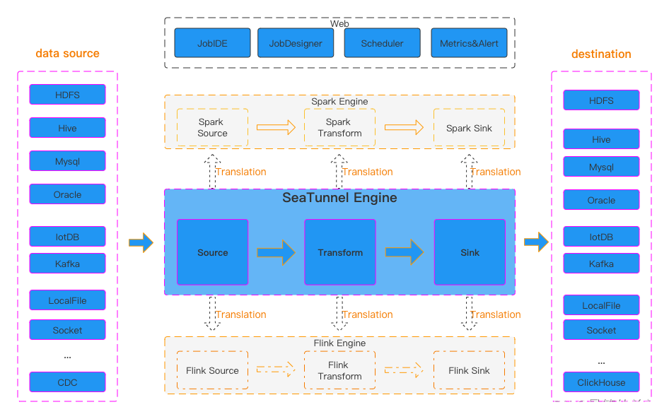
深入理解SeaTunnel:易用、高性能、支持实时流式和离线批处理的海量数据集成平台
深入理解SeaTunnel:易用、高性能、支持实时流式和离线批处理的海量数据集成平台 一、认识SeaTunnel二、SeaTunnel 系统架构、工作流程与特性三、SeaTunnel工作架构四、部署SeaTunnel1.安装Java2.下载SeaTunnel3.安装连接器 五、快速启动作业1.添加作业配置文件以定义…...

项目上线 | 兰精携手盖雅工场,数智驱动绿色转型
近年来,纺织纤维行业零碳行动如火如荼。作为低碳环保消费新时尚引领者,同时也是纤维领域隐形冠军,兰精在推进绿色发展的同时,也在不断向内探索企业数字化转型之道,以此反哺业务快速扩张。 数智转型,管理先…...
102-Linux_I/O复用方法之poll
文章目录 1.poll系统调用的作用2.poll的原型3.poll支持的事件类型4.poll实现TCP服务器(1)服务器端代码:(2)客户端代码:(3)运行结果截图: 1.poll系统调用的作用 poll 系统调用和 select 类似,也是在指定时间内轮询一定数量的文件描述符,以测试其中是否有…...
【VAR模型 | 时间序列】帮助文档:VAR模型的引入和Python实践(含源代码)
向量自回归 (VAR) 是一种随机过程模型,用于捕获多个时间序列之间的线性相互依赖性。 VAR 模型通过允许多个进化变量来概括单变量自回归模型(AR 模型)。 VAR 中的所有变量都以相同的方式进入模型:每个变量都有一个方程式ÿ…...
Spark任务提交流程
1. yarn-client Driver在任务提交的本地机器上运行,Driver启动后会和ResourceManager通讯,申请启动ApplicationMaster; 随后ResourceManager分配Container,在合适的NodeManager上启动ApplicationMaster,此时的ApplicationMaster的…...
python相对路径与绝对路径
9.1 Python 绝对路径与相对路径 - 知乎 (zhihu.com) 目录 1. 绝对路径 1.1 概念 1.2 用绝对路径打开文件 1.2 相对路径 1.3 python路径表示的斜杠问题 1. 绝对路径 1.1 概念 绝对路径 指完整的描述文件位置的路径。绝对路径就是文件或文件夹在硬盘上的完整路径。 在 Win…...
SPSS如何进行基本统计分析之案例实训?
文章目录 0.引言1.描述性分析2.频数分析3.探索分析4.列联表分析5.比率分析 0.引言 因科研等多场景需要进行数据统计分析,笔者对SPSS进行了学习,本文通过《SPSS统计分析从入门到精通》及其配套素材结合网上相关资料进行学习笔记总结,本文对基本…...
)
Python项目实战篇——常用验证码标注和识别(需求分析和实现思路)
前言:验证码识别和标注是现在网络安全中的一个重要任务,尤其是在一些电商平台和在线支付等场景中,验证码的安全性至关重要。本文将介绍如何使用Python实现常用的验证码标注和识别,以便为自己的项目提供参考。 一、需求分析 1、验证…...
MySQL基础(六)多表查询
多表查询,也称为关联查询,指两个或更多个表一起完成查询操作。 前提条件:这些一起查询的表之间是有关系的(一对一、一对多),它们之间一定是有关联字段,这个关联字段可能建立了外键,…...
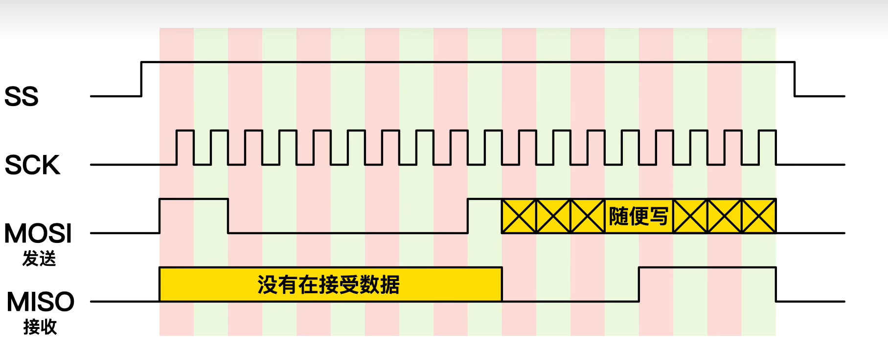
零死角玩转stm32中级篇3-SPI总线
本篇博文目录: 一.基础知识1.什么是SPI2.SPI和IIC有什么不同3.SPI的优缺点4.SPI是怎么实现通信的5.SPI 数据传输的步骤6.SPI菊花链7.通过SPI实现数据的读和写 二.STM32F103C8T6芯片SPI协议案例代码 一.基础知识 1.什么是SPI SPI(Serial Peripheral Interface&#…...

PC市场转型:从性能竞赛到价值回归的产业变革
1. 市场格局的深层演变:从“性能至上”到“够用就好”如果你在2012年前后关注过PC市场,应该能清晰地感受到一股寒流。那几年,行业里最热门的话题不再是英特尔又发布了多快的处理器,或者英伟达的显卡性能提升了多少百分比ÿ…...

Windows平台实战:CMake与MinGW联手编译libmodbus动态库
1. 为什么要在Windows下编译libmodbus动态库 很多工业自动化领域的开发者都会遇到这样一个需求:需要在Windows平台上开发Modbus通信工具。libmodbus作为一款开源的Modbus协议栈实现,因其轻量级和跨平台特性广受欢迎。但在Windows环境下直接使用源码会遇到…...

告别龟速下载!用阿里云Maven仓库和离线驱动包,5分钟搞定DBeaver所有JDBC驱动配置
极速配置DBeaver JDBC驱动的双轨方案:阿里云Maven加速与离线整合包实战 每次打开DBeaver准备连接数据库时,看着进度条缓慢爬升的驱动下载界面,你是否也感到焦虑?特别是在紧急排查生产环境问题的关键时刻,这种等待简直让…...

暖心指南|心理干预案例分享关键点!
行业痛点分析重庆市作为西部人口密集城市,心理健康问题呈现年轻化、复杂化趋势。调研数据显示,2022年全市心理健康机构年接诊量突破18万人次,但供需矛盾持续加剧。当前主要存在三方面挑战:临床诊断精度不足:传统评估依…...

光纤偏振测量:从琼斯矢量到庞加莱球,六种工具深度解析与工程实践
1. 从一道周五小测题说起:光纤测量中的偏振态表征上周五,我在整理旧资料时,翻到了EE Times在2015年发布的一篇“周五小测”文章,主题是光纤光学测量。其中第一道题就很有意思,它问的是:“以下哪种工具不能用…...

工程师如何运用专业技能参与人道主义项目:从思维转变到实践落地
1. 项目概述:工程师的人道主义行动倡议每年8月19日,世界人道主义日都会提醒我们关注那些在全球最艰苦、最危险地区默默奉献的人们。这个日子最初是为了纪念在履职中牺牲的人道主义工作者,如今已演变为一个更广泛的号召——庆祝那种激励全球人…...

memrok:专为开发者设计的命令行记忆管理工具,提升项目效率
1. 项目概述:一个面向开发者的记忆管理工具最近在整理个人知识库和项目代码时,我常常被一个问题困扰:那些零散但关键的代码片段、临时的配置参数、一闪而过的调试思路,到底应该记在哪里?用笔记软件太笨重,用…...
实现大数组和GUI缓存)
告别内存焦虑:用STM32+外部SRAM(IS62WV51216)实现大数组和GUI缓存
STM32外部SRAM实战:突破内存限制的工程化解决方案 当你在STM32上开发图形界面或处理音频流时,是否遇到过程序突然崩溃的窘境?那些隐藏在编译通过背后的内存溢出问题,往往在项目后期才暴露出来。最近接手的一个智能家居控制面板项目…...

WindowsCleaner终极指南:3步彻底解决Windows系统卡顿与C盘爆红问题
WindowsCleaner终极指南:3步彻底解决Windows系统卡顿与C盘爆红问题 【免费下载链接】WindowsCleaner Windows Cleaner——专治C盘爆红及各种不服! 项目地址: https://gitcode.com/gh_mirrors/wi/WindowsCleaner 你是否曾经面对Windows系统日益缓慢…...

Git 入门教程:从命令行到 IDE 集成
文章目录Git 入门教程:从命令行到 IDE 集成一、环境准备与初始配置1.1 安装 Git1.2 配置用户身份2.2 查看仓库状态2.3 添加文件到暂存区2.4 提交文件到本地仓库2.5 查看历史版本2.6 版本回退2.7 删除文件三、Git 分支操作(多人协作核心)3.1 分…...