WPF 滑动条样式
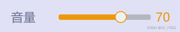
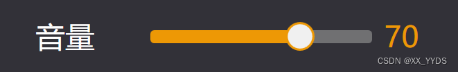
效果图:
浅色:
深色:
滑动条部分代码:
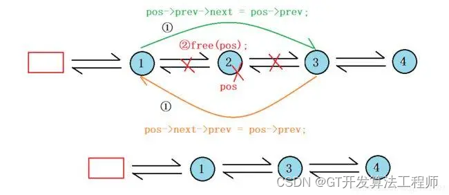
<Style x:Key="RepeatButtonTransparent" TargetType="{x:Type RepeatButton}"><Setter Property="OverridesDefaultStyle" Value="true"/><Setter Property="Background" Value="Transparent"/><Setter Property="Focusable" Value="false"/><Setter Property="IsTabStop" Value="false"/><Setter Property="Template"><Setter.Value><ControlTemplate TargetType="{x:Type RepeatButton}"><Rectangle RadiusX="5" RadiusY="5" Fill="{TemplateBinding Background}" Height="{TemplateBinding Height}" Width="{TemplateBinding Width}"/></ControlTemplate></Setter.Value></Setter></Style><SolidColorBrush x:Key="SliderThumb.Static.Background" Color="#FFF0F0F0"/><SolidColorBrush x:Key="SliderThumb.Static.Border" Color="#FFACACAC"/><SolidColorBrush x:Key="SliderThumb.Static.Foreground" Color="#FFE5E5E5"/><SolidColorBrush x:Key="SliderThumb.MouseOver.Background" Color="#FFDCECFC"/><SolidColorBrush x:Key="SliderThumb.MouseOver.Border" Color="#FF7Eb4EA"/><SolidColorBrush x:Key="SliderThumb.Pressed.Background" Color="#FFDAECFC"/><SolidColorBrush x:Key="SliderThumb.Pressed.Border" Color="#FF569DE5"/><SolidColorBrush x:Key="SliderThumb.Disabled.Background" Color="#FFF0F0F0"/><SolidColorBrush x:Key="SliderThumb.Disabled.Border" Color="#FFD9D9D9"/><SolidColorBrush x:Key="SliderThumb.Track.Background" Color="#FFE7EAEA"/><SolidColorBrush x:Key="SliderThumb.Track.Border" Color="#FFD6D6D6"/><ControlTemplate x:Key="SliderThumbHorizontalDefault" TargetType="{x:Type Thumb}"><Grid HorizontalAlignment="Center" UseLayoutRounding="True" VerticalAlignment="Center"><Path x:Name="grip" Width="40" Height="40" Margin="-2,-2,-2,-2" Fill="{StaticResource SliderThumb.Static.Background}" Stroke="#ED9805" SnapsToDevicePixels="True" Stretch="Fill" StrokeThickness="3" UseLayoutRounding="True" VerticalAlignment="Center"><Path.Data><EllipseGeometry Center="30,30" RadiusX="30" RadiusY="30"></EllipseGeometry></Path.Data></Path></Grid><ControlTemplate.Triggers><Trigger Property="IsMouseOver" Value="true"><Setter Property="Fill" TargetName="grip" Value="{StaticResource SliderThumb.MouseOver.Background}"/><Setter Property="Stroke" TargetName="grip" Value="{StaticResource SliderThumb.MouseOver.Border}"/></Trigger><Trigger Property="IsDragging" Value="true"><Setter Property="Fill" TargetName="grip" Value="{StaticResource SliderThumb.Pressed.Background}"/><Setter Property="Stroke" TargetName="grip" Value="{StaticResource SliderThumb.Pressed.Border}"/></Trigger><Trigger Property="IsEnabled" Value="false"><Setter Property="Fill" TargetName="grip" Value="{StaticResource SliderThumb.Disabled.Background}"/><Setter Property="Stroke" TargetName="grip" Value="{StaticResource SliderThumb.Disabled.Border}"/></Trigger></ControlTemplate.Triggers></ControlTemplate><ControlTemplate x:Key="SliderThumbHorizontalTop" TargetType="{x:Type Thumb}"><Grid HorizontalAlignment="Center" UseLayoutRounding="True" VerticalAlignment="Center"><Path x:Name="grip" Data="M 0,6 C0,6 5.5,0 5.5,0 5.5,0 11,6 11,6 11,6 11,18 11,18 11,18 0,18 0,18 0,18 0,6 0,6 z" Fill="{StaticResource SliderThumb.Static.Background}" Stroke="{StaticResource SliderThumb.Static.Border}" SnapsToDevicePixels="True" Stretch="Fill" StrokeThickness="1" UseLayoutRounding="True" VerticalAlignment="Center"/></Grid><ControlTemplate.Triggers><Trigger Property="IsMouseOver" Value="true"><Setter Property="Fill" TargetName="grip" Value="{StaticResource SliderThumb.MouseOver.Background}"/><Setter Property="Stroke" TargetName="grip" Value="{StaticResource SliderThumb.MouseOver.Border}"/></Trigger><Trigger Property="IsDragging" Value="true"><Setter Property="Fill" TargetName="grip" Value="{StaticResource SliderThumb.Pressed.Background}"/><Setter Property="Stroke" TargetName="grip" Value="{StaticResource SliderThumb.Pressed.Border}"/></Trigger><Trigger Property="IsEnabled" Value="false"><Setter Property="Fill" TargetName="grip" Value="{StaticResource SliderThumb.Disabled.Background}"/><Setter Property="Stroke" TargetName="grip" Value="{StaticResource SliderThumb.Disabled.Border}"/></Trigger></ControlTemplate.Triggers></ControlTemplate><ControlTemplate x:Key="SliderThumbHorizontalBottom" TargetType="{x:Type Thumb}"><Grid HorizontalAlignment="Center" UseLayoutRounding="True" VerticalAlignment="Center"><Path x:Name="grip" Data="M 0,12 C0,12 5.5,18 5.5,18 5.5,18 11,12 11,12 11,12 11,0 11,0 11,0 0,0 0,0 0,0 0,12 0,12 z" Fill="{StaticResource SliderThumb.Static.Background}" Stroke="{StaticResource SliderThumb.Static.Border}" SnapsToDevicePixels="True" Stretch="Fill" StrokeThickness="1" UseLayoutRounding="True" VerticalAlignment="Center"/></Grid><ControlTemplate.Triggers><Trigger Property="IsMouseOver" Value="true"><Setter Property="Fill" TargetName="grip" Value="{StaticResource SliderThumb.MouseOver.Background}"/><Setter Property="Stroke" TargetName="grip" Value="{StaticResource SliderThumb.MouseOver.Border}"/></Trigger><Trigger Property="IsDragging" Value="true"><Setter Property="Fill" TargetName="grip" Value="{StaticResource SliderThumb.Pressed.Background}"/><Setter Property="Stroke" TargetName="grip" Value="{StaticResource SliderThumb.Pressed.Border}"/></Trigger><Trigger Property="IsEnabled" Value="false"><Setter Property="Fill" TargetName="grip" Value="{StaticResource SliderThumb.Disabled.Background}"/><Setter Property="Stroke" TargetName="grip" Value="{StaticResource SliderThumb.Disabled.Border}"/></Trigger></ControlTemplate.Triggers></ControlTemplate><ControlTemplate x:Key="SliderHorizontal" TargetType="{x:Type Slider}"><Border x:Name="border" Background="{TemplateBinding Background}" BorderBrush="{TemplateBinding BorderBrush}" BorderThickness="{TemplateBinding BorderThickness}" SnapsToDevicePixels="True"><Grid><Grid.RowDefinitions><RowDefinition Height="Auto"/><RowDefinition Height="Auto" MinHeight="{TemplateBinding MinHeight}"/><RowDefinition Height="Auto"/></Grid.RowDefinitions><TickBar x:Name="TopTick" Fill="{TemplateBinding Foreground}" Height="4" Margin="0,0,0,2" Placement="Top" Grid.Row="0" Visibility="Collapsed"/><TickBar x:Name="BottomTick" Fill="{TemplateBinding Foreground}" Height="4" Margin="0,2,0,0" Placement="Bottom" Grid.Row="2" Visibility="Collapsed"/><Border x:Name="TrackBackground" Background="Transparent" BorderBrush="Transparent" BorderThickness="1" Height="4.0" Margin="5,0" Grid.Row="1" VerticalAlignment="center"><Canvas Margin="-6,-1"><Rectangle x:Name="PART_SelectionRange" Fill="{DynamicResource {x:Static SystemColors.HighlightBrushKey}}" Height="4.0" Visibility="Hidden"/></Canvas></Border><Track x:Name="PART_Track" Grid.Row="1"><Track.DecreaseRepeatButton><RepeatButton Height="18" Margin="0,0,-5,0" Background="#ED9805" Command="{x:Static Slider.DecreaseLarge}" Style="{StaticResource RepeatButtonTransparent}"/></Track.DecreaseRepeatButton><Track.IncreaseRepeatButton><RepeatButton Height="18" Margin="-5,0,0,0" Background="#99999999" Command="{x:Static Slider.IncreaseLarge}" Style="{StaticResource RepeatButtonTransparent}"/></Track.IncreaseRepeatButton><Track.Thumb><Thumb x:Name="Thumb" Focusable="False" OverridesDefaultStyle="True" Template="{StaticResource SliderThumbHorizontalDefault}" VerticalAlignment="Center" /></Track.Thumb></Track></Grid></Border><ControlTemplate.Triggers><Trigger Property="TickPlacement" Value="TopLeft"><Setter Property="Visibility" TargetName="TopTick" Value="Visible"/><Setter Property="Template" TargetName="Thumb" Value="{StaticResource SliderThumbHorizontalTop}"/><Setter Property="Margin" TargetName="TrackBackground" Value="5,2,5,0"/></Trigger><Trigger Property="TickPlacement" Value="BottomRight"><Setter Property="Visibility" TargetName="BottomTick" Value="Visible"/><Setter Property="Template" TargetName="Thumb" Value="{StaticResource SliderThumbHorizontalBottom}"/><Setter Property="Margin" TargetName="TrackBackground" Value="5,0,5,2"/></Trigger><Trigger Property="TickPlacement" Value="Both"><Setter Property="Visibility" TargetName="TopTick" Value="Visible"/><Setter Property="Visibility" TargetName="BottomTick" Value="Visible"/></Trigger><Trigger Property="IsSelectionRangeEnabled" Value="true"><Setter Property="Visibility" TargetName="PART_SelectionRange" Value="Visible"/></Trigger><Trigger Property="IsKeyboardFocused" Value="true"><Setter Property="Foreground" TargetName="Thumb" Value="Blue"/></Trigger></ControlTemplate.Triggers></ControlTemplate><ControlTemplate x:Key="SliderThumbVerticalDefault" TargetType="{x:Type Thumb}"><Grid HorizontalAlignment="Center" UseLayoutRounding="True" VerticalAlignment="Center"><Path x:Name="grip" Data="M0.5,0.5 L18.5,0.5 18.5,11.5 0.5,11.5z" Fill="{StaticResource SliderThumb.Static.Background}" Stroke="{StaticResource SliderThumb.Static.Border}" Stretch="Fill"/></Grid><ControlTemplate.Triggers><Trigger Property="IsMouseOver" Value="true"><Setter Property="Fill" TargetName="grip" Value="{StaticResource SliderThumb.MouseOver.Background}"/><Setter Property="Stroke" TargetName="grip" Value="{StaticResource SliderThumb.MouseOver.Border}"/></Trigger><Trigger Property="IsDragging" Value="true"><Setter Property="Fill" TargetName="grip" Value="{StaticResource SliderThumb.Pressed.Background}"/><Setter Property="Stroke" TargetName="grip" Value="{StaticResource SliderThumb.Pressed.Border}"/></Trigger><Trigger Property="IsEnabled" Value="false"><Setter Property="Fill" TargetName="grip" Value="{StaticResource SliderThumb.Disabled.Background}"/><Setter Property="Stroke" TargetName="grip" Value="{StaticResource SliderThumb.Disabled.Border}"/></Trigger></ControlTemplate.Triggers></ControlTemplate><ControlTemplate x:Key="SliderThumbVerticalLeft" TargetType="{x:Type Thumb}"><Grid HorizontalAlignment="Center" UseLayoutRounding="True" VerticalAlignment="Center"><Path x:Name="grip" Data="M 6,11 C6,11 0,5.5 0,5.5 0,5.5 6,0 6,0 6,0 18,0 18,0 18,0 18,11 18,11 18,11 6,11 6,11 z" Fill="{StaticResource SliderThumb.Static.Background}" Stroke="{StaticResource SliderThumb.Static.Border}" Stretch="Fill"/></Grid><ControlTemplate.Triggers><Trigger Property="IsMouseOver" Value="true"><Setter Property="Fill" TargetName="grip" Value="{StaticResource SliderThumb.MouseOver.Background}"/><Setter Property="Stroke" TargetName="grip" Value="{StaticResource SliderThumb.MouseOver.Border}"/></Trigger><Trigger Property="IsDragging" Value="true"><Setter Property="Fill" TargetName="grip" Value="{StaticResource SliderThumb.Pressed.Background}"/><Setter Property="Stroke" TargetName="grip" Value="{StaticResource SliderThumb.Pressed.Border}"/></Trigger><Trigger Property="IsEnabled" Value="false"><Setter Property="Fill" TargetName="grip" Value="{StaticResource SliderThumb.Disabled.Background}"/><Setter Property="Stroke" TargetName="grip" Value="{StaticResource SliderThumb.Disabled.Border}"/></Trigger></ControlTemplate.Triggers></ControlTemplate><ControlTemplate x:Key="SliderThumbVerticalRight" TargetType="{x:Type Thumb}"><Grid HorizontalAlignment="Center" UseLayoutRounding="True" VerticalAlignment="Center"><Path x:Name="grip" Data="M 12,11 C12,11 18,5.5 18,5.5 18,5.5 12,0 12,0 12,0 0,0 0,0 0,0 0,11 0,11 0,11 12,11 12,11 z" Fill="{StaticResource SliderThumb.Static.Background}" Stroke="{StaticResource SliderThumb.Static.Border}" Stretch="Fill"/></Grid><ControlTemplate.Triggers><Trigger Property="IsMouseOver" Value="true"><Setter Property="Fill" TargetName="grip" Value="{StaticResource SliderThumb.MouseOver.Background}"/><Setter Property="Stroke" TargetName="grip" Value="{StaticResource SliderThumb.MouseOver.Border}"/></Trigger><Trigger Property="IsDragging" Value="true"><Setter Property="Fill" TargetName="grip" Value="{StaticResource SliderThumb.Pressed.Background}"/><Setter Property="Stroke" TargetName="grip" Value="{StaticResource SliderThumb.Pressed.Border}"/></Trigger><Trigger Property="IsEnabled" Value="false"><Setter Property="Fill" TargetName="grip" Value="{StaticResource SliderThumb.Disabled.Background}"/><Setter Property="Stroke" TargetName="grip" Value="{StaticResource SliderThumb.Disabled.Border}"/></Trigger></ControlTemplate.Triggers></ControlTemplate><ControlTemplate x:Key="SliderVertical" TargetType="{x:Type Slider}"><Border x:Name="border" Background="{TemplateBinding Background}" BorderBrush="{TemplateBinding BorderBrush}" BorderThickness="{TemplateBinding BorderThickness}" SnapsToDevicePixels="True"><Grid><Grid.ColumnDefinitions><ColumnDefinition Width="Auto"/><ColumnDefinition MinWidth="{TemplateBinding MinWidth}" Width="Auto"/><ColumnDefinition Width="Auto"/></Grid.ColumnDefinitions><TickBar x:Name="TopTick" Grid.Column="0" Fill="{TemplateBinding Foreground}" Margin="0,0,2,0" Placement="Left" Visibility="Collapsed" Width="4"/><TickBar x:Name="BottomTick" Grid.Column="2" Fill="{TemplateBinding Foreground}" Margin="2,0,0,0" Placement="Right" Visibility="Collapsed" Width="4"/><Border x:Name="TrackBackground" Background="{StaticResource SliderThumb.Track.Background}" BorderBrush="{StaticResource SliderThumb.Track.Border}" BorderThickness="1" Grid.Column="1" HorizontalAlignment="center" Margin="0,5" Width="4.0"><Canvas Margin="-1,-6"><Rectangle x:Name="PART_SelectionRange" Fill="{DynamicResource {x:Static SystemColors.HighlightBrushKey}}" Visibility="Hidden" Width="4.0"/></Canvas></Border><Track x:Name="PART_Track" Grid.Column="1"><Track.DecreaseRepeatButton><RepeatButton Command="{x:Static Slider.DecreaseLarge}" Style="{StaticResource RepeatButtonTransparent}"/></Track.DecreaseRepeatButton><Track.IncreaseRepeatButton><RepeatButton Command="{x:Static Slider.IncreaseLarge}" Style="{StaticResource RepeatButtonTransparent}"/></Track.IncreaseRepeatButton><Track.Thumb><Thumb x:Name="Thumb" Focusable="False" OverridesDefaultStyle="True" Template="{StaticResource SliderThumbVerticalDefault}" VerticalAlignment="Top"/></Track.Thumb></Track></Grid></Border><ControlTemplate.Triggers><Trigger Property="TickPlacement" Value="TopLeft"><Setter Property="Visibility" TargetName="TopTick" Value="Visible"/><Setter Property="Template" TargetName="Thumb" Value="{StaticResource SliderThumbVerticalLeft}"/><Setter Property="Margin" TargetName="TrackBackground" Value="2,5,0,5"/></Trigger><Trigger Property="TickPlacement" Value="BottomRight"><Setter Property="Visibility" TargetName="BottomTick" Value="Visible"/><Setter Property="Template" TargetName="Thumb" Value="{StaticResource SliderThumbVerticalRight}"/><Setter Property="Margin" TargetName="TrackBackground" Value="0,5,2,5"/></Trigger><Trigger Property="TickPlacement" Value="Both"><Setter Property="Visibility" TargetName="TopTick" Value="Visible"/><Setter Property="Visibility" TargetName="BottomTick" Value="Visible"/></Trigger><Trigger Property="IsSelectionRangeEnabled" Value="true"><Setter Property="Visibility" TargetName="PART_SelectionRange" Value="Visible"/></Trigger><Trigger Property="IsKeyboardFocused" Value="true"><Setter Property="Foreground" TargetName="Thumb" Value="Blue"/></Trigger></ControlTemplate.Triggers></ControlTemplate><Style x:Key="SliderStyle1" TargetType="{x:Type Slider}"><Setter Property="Width" Value="300"/><Setter Property="Height" Value="40"/><Setter Property="Maximum" Value="100"/><Setter Property="IsMoveToPointEnabled" Value="True"/><Setter Property="Stylus.IsPressAndHoldEnabled" Value="false"/><Setter Property="Background" Value="Transparent"/><Setter Property="BorderBrush" Value="Transparent"/><Setter Property="Foreground" Value="{StaticResource SliderThumb.Static.Foreground}"/><Setter Property="Template" Value="{StaticResource SliderHorizontal}"/><Style.Triggers><Trigger Property="Orientation" Value="Vertical"><Setter Property="Template" Value="{StaticResource SliderVertical}"/></Trigger></Style.Triggers></Style>如果要改滑块颜色,可以查找SliderThumbHorizontalDefault,修改其中的Stroke属性
如果要更改滑动条颜色,可以查找SliderHorizontal,修改其中的RepeatButton的Background
将上面代码放入资源文件中,使用时:
<Slider Style="{StaticResource SliderStyle1}" />相关文章:
WPF 滑动条样式
效果图: 浅色: 深色: 滑动条部分代码: <Style x:Key"RepeatButtonTransparent" TargetType"{x:Type RepeatButton}"><Setter Property"OverridesDefaultStyle" Value"true"/&g…...
论文设计任务书学习文档|基于Web的个性化简历职位推荐系统的设计与实现
文章目录 论文(设计)题目:基于Web的个性化简历职位推荐系统的设计与实现1、论文(设计)的主要任务及目标2、论文(设计)的主要内容3、论文(设计)的基本要求4、进度安排论文(设计)题目:基于Web的个性化简历职位推荐系统的设计与实现 1、论文(设计)的主要任务及目标…...
Win11系统安装安卓子系统教程
随着Win11系统的不断普及,以及硬件设备的更新换代,我相信很多同学都已经更新并使用到了最新的Win11系统。那么,Win11系统最受期待的功能“Windows Subsystem for Android”(简称WSA),即《安卓子系统》。他可…...
Python实现双向链表:从基础到应用
一、引言 双向链表是一种比单向链表更复杂的数据结构,每个节点除了包含数据和指向下一个节点的指针外,还包含一个指向前一个节点的指针。这种结构使得我们可以从链表的任何节点开始,向前或向后遍历链表。 目录 一、引言 二、节点定义 三、…...

c# 读取DataGridView中的数据
/// <summary> /// 读取DataGridView中的数据 /// </summary> /// <param name"dgv">DataGridView对象</param> /// <returns>DataTable对象</returns> private DataTable GetDgvToTab…...
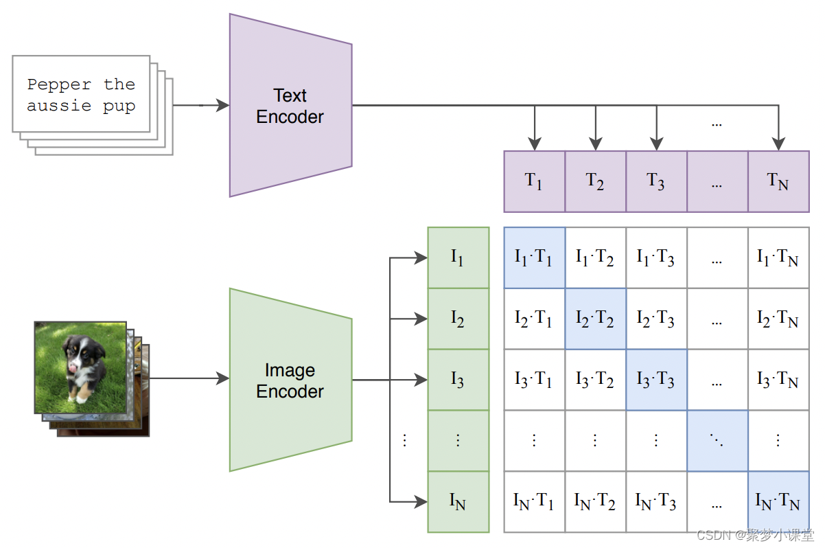
Stable Diffusion中的Clip模型
基础介绍 Stable Diffusion 是一个文本到图像的生成模型,它能够根据用户输入的文本提示(prompt)生成相应的图像。在这个模型中,CLIP(Contrastive Language-Image Pre-training)模型扮演了一个关键的角色&a…...

Python批量提取文件夹中图片的名称及路径到指定的.txt文件中
目录 一、代码二、提取效果 一、代码 import os# 定义要保存的文件名 file_name "TestImage/Image_Visible_Gray.txt"# 读取文件夹路径 folder_path "TestImage/Image_Visible_Gray"# 遍历文件夹中的所有文件 with open(file_name, "w") as f…...
微软开源 SBOM 生成工具:sbom-tool下载及使用详解
github地址 GitHub - microsoft/sbom-tool: The SBOM tool is a highly scalable and enterprise ready tool to create SPDX 2.2 compatible SBOMs for any variety of artifacts.The SBOM tool is a highly scalable and enterprise ready tool to create SPDX 2.2 compatib…...
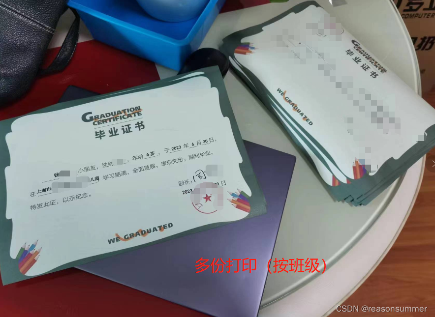
【办公类-18-03】(Python)中班米罗可儿证书批量生成打印(班级、姓名)
作品展示——米罗可儿证书打印幼儿姓名 背景需求 2024年3月1日,中4班孩子一起整理美术操作材料《米罗可儿》的操作本——将每一页纸撕下来,分类摆放、确保纸张上下位置正确。每位孩子们都非常厉害,不仅完成了自己的一本,还将没有…...
)
js【详解】数据类型原理(含变量赋值详解-浅拷贝)
JavaScript 中的数据按存储方式的不同,分为值类型和引用类型。 值类型(共 6 种):赋值的时候传值 —— 数字、字符串、布尔值、null 、undefined,Symbol引用类型(仅 1 种):赋值的时候…...

SAM 影像分割——地理空间数据的分段模型的数据调参和自动分割分析
本笔记本展示了如何使用 Segment Anything Model (SAM) 从图像中分割对象,只需几行代码即可完成。 请确保在本笔记本中使用 GPU 运行时。对于 Google Colab,请转到运行时 -> 更改运行时类型,然后选择 GPU 作为硬件加速器。 地理空间数据的分段模型 Segment Anything M…...

Java底层自学大纲_设计模式篇
设计模式专题_自学大纲所属类别学习主题建议课时(h) A 深入理解设计模式001 SOLID设计原则和策略模式2.5 A 深入理解设计模式002 责任链模式2.5 A 深入理解设计模式003 工厂模式和模版方法模式2.5 A 深入理解设计模式004 装饰者模式2.5 A 深入理解设…...

详解字符串函数<string.h>(上)
1. strlen函数的使用和模拟实现 size_t strlen(const char* str); 1.1 函数功能以及用法 字符串长度 strlen函数的功能是计算字符串的长度。在使用时,要求用户传入需要计算长度的字符串的起始位置,并返回字符串的长度。 #include <stdio.h> #…...
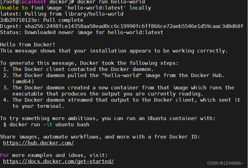
1、docker入门
文章目录 1、tocker简介2、tocker的安装&环境配置2、配置阿里云镜像3、基本命令1、镜像命令2、docker基本命令3、镜像基本命令4、Docker 容器常用命令 1、tocker简介 新一代的虚拟化技术 2、tocker的安装&环境配置 uname -r1、首先查看liunx的内核 yum update -y2、更…...
Qt应用软件【测试篇】cppchecker静态代码检查
文章目录 cppcheker简介下载地址与安装检查项目QT Creator使用CPP Cheker开启检查常见错误总结错误信息说明cppcheker简介 Cppcheck 是一个用于 C/C++ 代码的分析工具。它提供独特的代码分析以检测错误,并专注于检测未定义的行为和危险的编码结构。其目标是仅检测代码中的真实…...

[递推与递归]数的计算
题目描述 给出正整数 n,要求按如下方式构造数列: 只有一个数字 n 的数列是一个合法的数列。在一个合法的数列的末尾加入一个正整数,但是这个正整数不能超过该数列最后一项的一半,可以得到一个新的合法数列。 请你求出ÿ…...
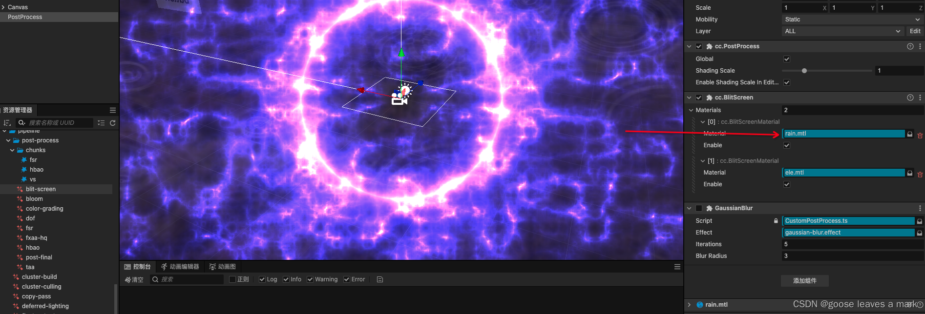
Cocos Creator 3.8.x 后效处理(前向渲染)
关于怎么开启后效效果我这里不再赘述,可以前往Cocos官方文档查看具体细节:后效处理官网 下面讲一下怎么自己定义一个后处理效果,想添加自己的后效处理的话只需要在postProcess节点下添加一个BlitScreen 组件即可,然后自己去添加自…...
【前端素材】推荐优质后台管理系统 Adminity平台模板(附源码)
一、需求分析 1、系统定义 后台管理系统是一种用于管理网站、应用程序或系统的管理界面,通常由管理员和工作人员使用。它提供了访问和控制网站或应用程序后台功能的工具和界面,使其能够管理用户、内容、数据和其他各种功能。 2、功能需求 后台管理系…...

身份证号与姓名实名认证接口-二要素实名认证-C++接口代码
翔云(https://www.netocr.com/idenNoOrd.html)身份证二要素实名认证接口在当今的数字化社会中扮演着至关重要的角色,它不仅守护着网络世界的秩序,也悄然影响着现实生活的点滴。看似普通的身份证号实名认证接口也在悄然守护着人们的…...
笑营宝高校选修课报名考勤系统源码开发方案
一、项目背景与目标 (一)项目背景 随着高等教育的普及和教学模式的不断创新,高校选修课程体系日趋复杂多变。学生对课程选择的自由度提高,使得传统的选课和考勤管理方式变得繁琐且效率低下。目前,许多高校仍然采用纸…...

Innovus许可证服务器搭建全记录:从hostid获取到1patch破解的完整流程
Innovus许可证服务器部署实战指南:从环境配置到稳定运行 1. 环境准备与系统优化 在CentOS 7上部署Innovus许可证服务器前,合理的系统配置是确保后续流程顺利的基础。不同于普通应用部署,EDA工具对系统环境有着更为严格的要求。我们建议使用物…...

LinkSwift:基于JavaScript的网盘直链解析技术架构分析
LinkSwift:基于JavaScript的网盘直链解析技术架构分析 【免费下载链接】Online-disk-direct-link-download-assistant 一个基于 JavaScript 的网盘文件下载地址获取工具。基于【网盘直链下载助手】修改 ,支持 百度网盘 / 阿里云盘 / 中国移动云盘 / 天翼…...

G-Helper:华硕笔记本性能调校的轻量级神器,释放硬件潜能
G-Helper:华硕笔记本性能调校的轻量级神器,释放硬件潜能 【免费下载链接】g-helper Lightweight, open-source control tool for ASUS laptops and ROG Ally. Manage performance modes, fans, GPU, battery, and RGB lighting across Zephyrus, Flow, T…...

HeyGem数字人视频生成系统实战:制作新年祝福短视频批量模板
HeyGem数字人视频生成系统实战:制作新年祝福短视频批量模板 新年将至,无论是企业给客户送祝福,还是团队给员工发问候,制作一段温馨的新年祝福视频都是很有仪式感的事情。但问题来了:如果公司有几十位员工,…...

Qwen3.5-9B提示词工程入门:编写高效指令激发模型潜能
Qwen3.5-9B提示词工程入门:编写高效指令激发模型潜能 1. 为什么需要学习提示词工程 如果你用过AI大模型,可能遇到过这样的情况:明明是个很强大的模型,但给你的回答却总是不尽如人意。问题很可能出在你给它的"指令"上—…...

PP-DocLayoutV3与JavaScript交互:实现浏览器内文档实时预览与分析
PP-DocLayoutV3与JavaScript交互:实现浏览器内文档实时预览与分析 你有没有遇到过这样的场景?用户上传了一份几十页的PDF报告,你需要在网页上快速预览内容,并且自动识别出里面的标题、段落、表格和图片位置。传统做法是让用户下载…...
:理解 Bean 的创建与容器管理过程)
Spring Boot IoC 实践(二):理解 Bean 的创建与容器管理过程
一、前言在上一篇文章中,我们初步了解了 Spring Boot 启动时如何创建 IoC(控制反转)容器。 这篇文章通过一个简单示例,从代码与日志输出两个角度,带你理解:Spring Boot 在何时创建 Bean?IoC 容器…...

吊耳承载力与钢丝绳选型计算软件开发-集成吊耳受力分析工具及钢丝绳匹配计算器
温馨提示:文末有资源获取方式高效解决钢结构吊装难题的智能计算工具在大型建筑项目中,钢柱与钢梁的吊装环节至关重要。 面对不确定使用何种规格吊耳的情况,工程师常常面临安全与效率的双重挑战。 为此,我们开发了集吊耳承重计算与…...

免安装定时音乐播放工具,适用于校园上下课铃声与考试提示音自动播放
温馨提示:文末有资源获取方式免安装绿色音乐定时播放器这是一款无需安装的绿色版定时音乐播放软件,专为学校等教育场景设计。 用户只需双击主程序即可运行,无需复杂配置或注册表修改,真正实现即开即用,方便快捷。适用于…...

从非隔离LED驱动器到SELV:为何你的照明设备需要这道“安全锁”?
1. 当LED灯条亮起时,你触摸到的可能是100多伏电压 去年装修新房时,我差点被客厅的LED灯带"咬"了一口。当时灯带接口处有些松动,我下意识伸手去调整,指尖突然传来一阵刺痛——后来用万用表测量才发现,这条标榜…...