HTML5 + CSS3
HTML 基础
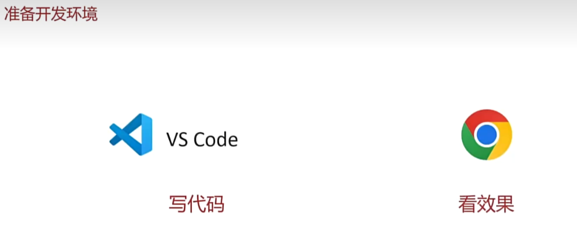
准备开发环境
1.vscode 使用
- 新建文件夹 ---> 左键拖入 vscode 中
2.安装插件
- 扩展 → 搜索插件 → 安装
- 打开网页插件:open in browser
- 汉化菜单插件:Chinese
3.缩放代码字号
- 放大,缩小:Ctrl + 加号,减号
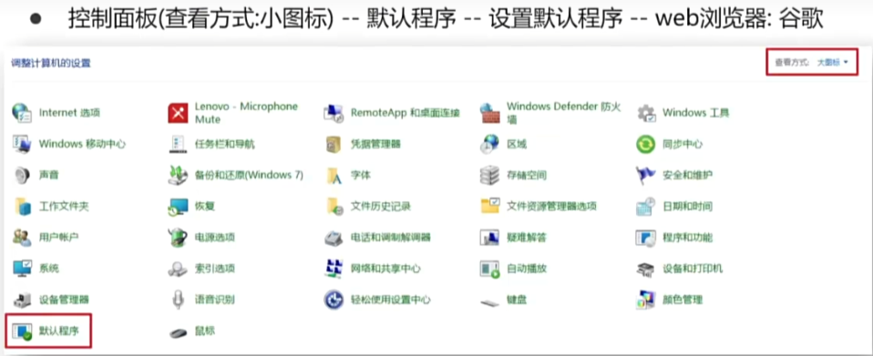
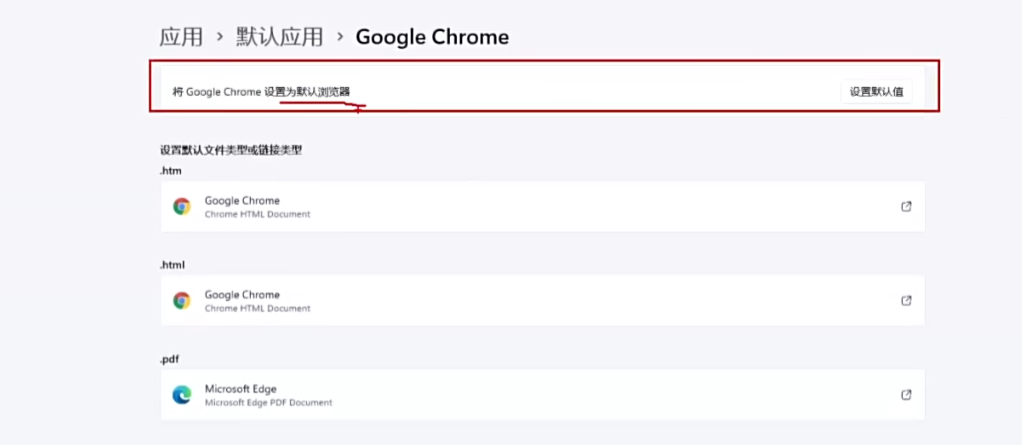
4.设置默认浏览器
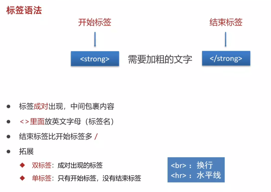
标签基本语法
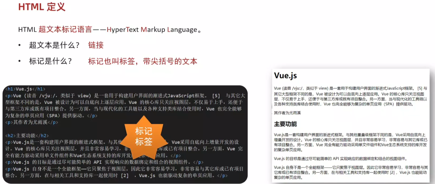
5.HTML定义
6. vscode 折叠侧边栏 ctrl + b
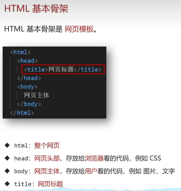
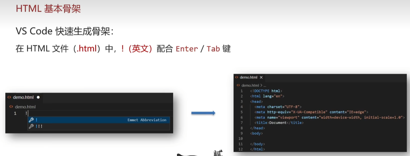
7. HTML 基本骨架
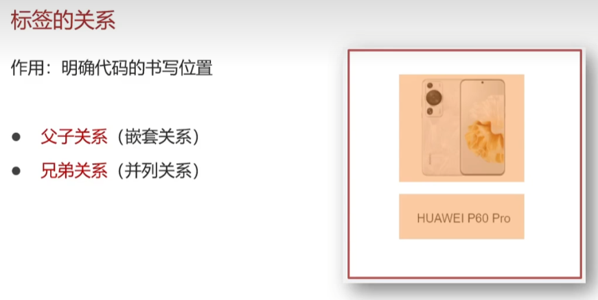
8.标签的关系
向前向后缩进 Tab / Shift + Tab
9.注释

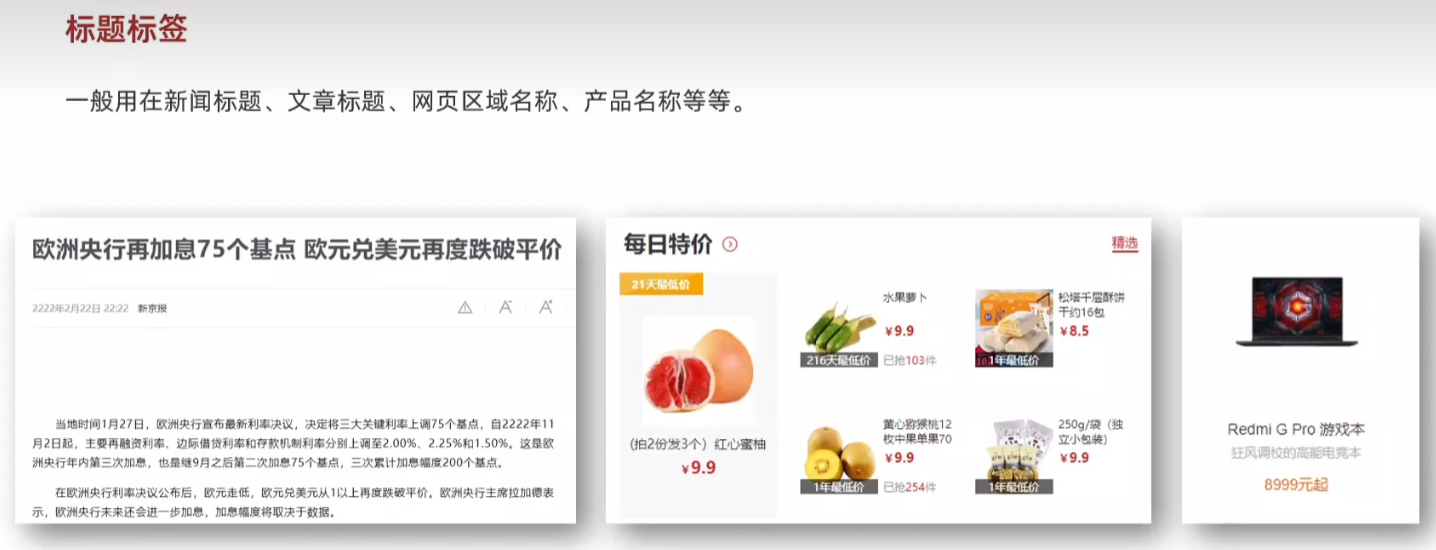
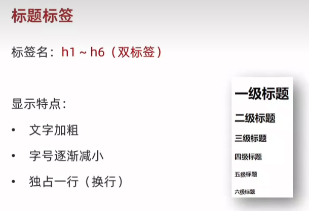
10.标题标签

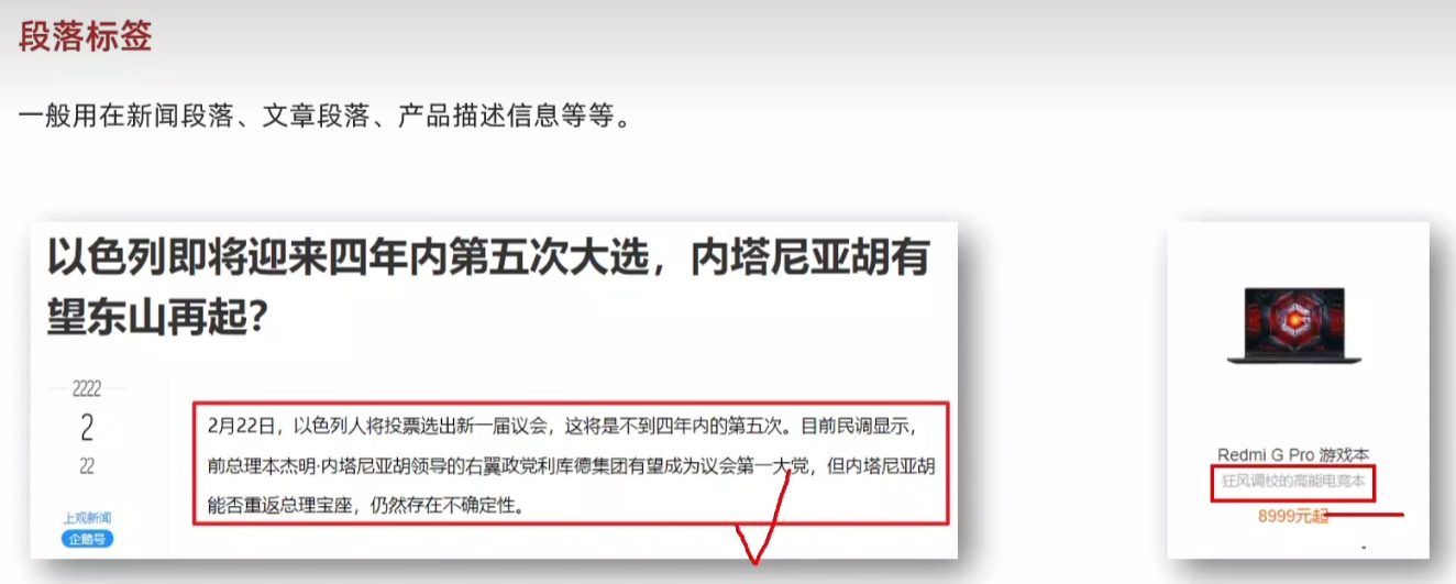
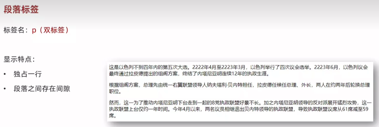
11.段落标签
12.换行与水平线标签
13.文本格式化标签(加粗)
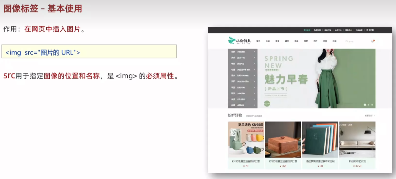
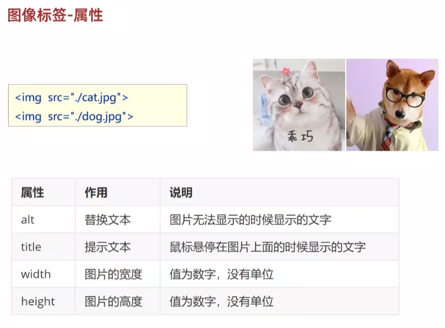
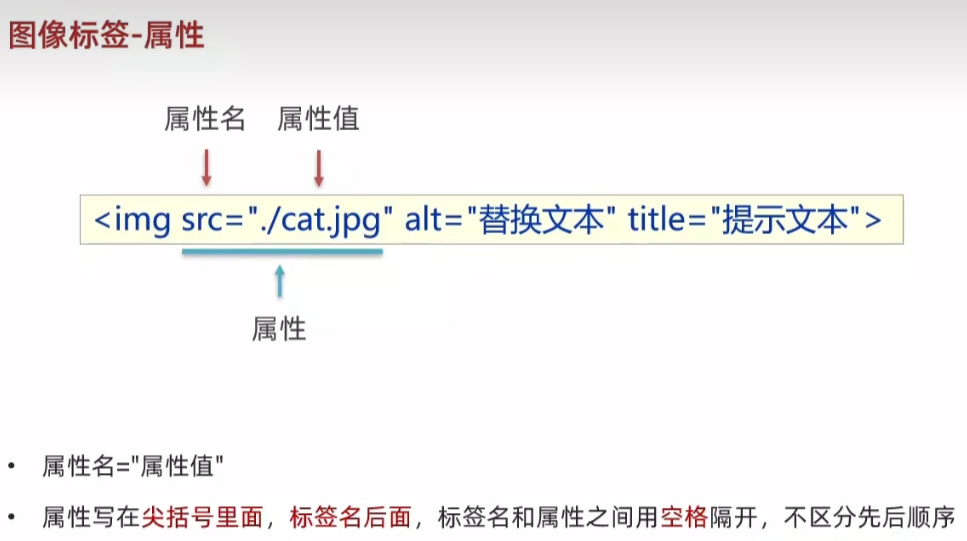
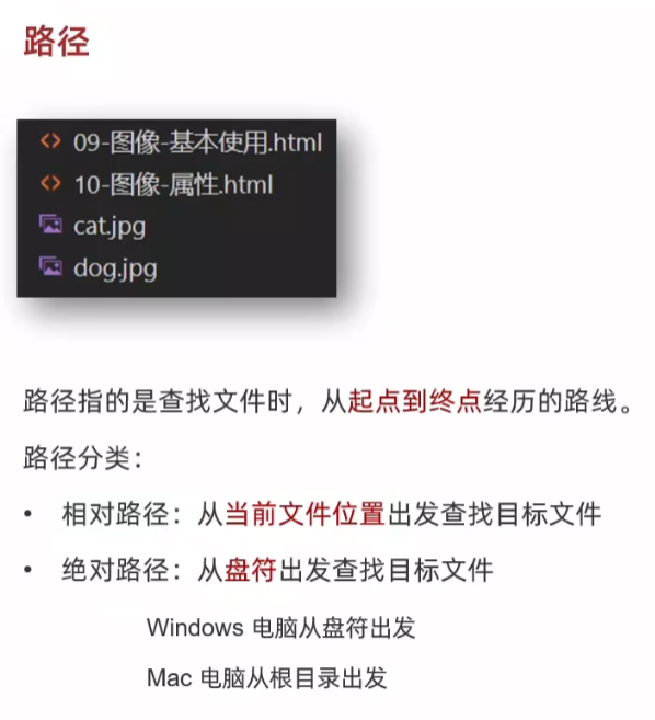
14.图像标签-基本使用
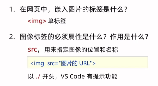
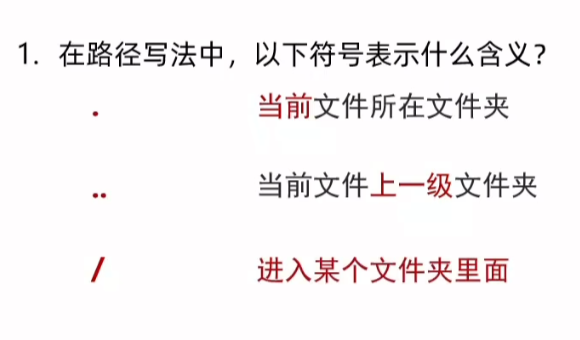
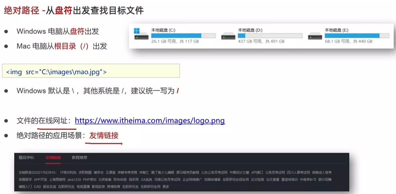
15.路径--相对路径和绝对路径
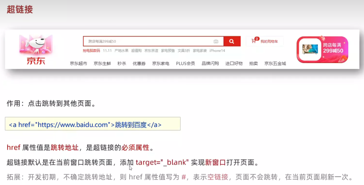
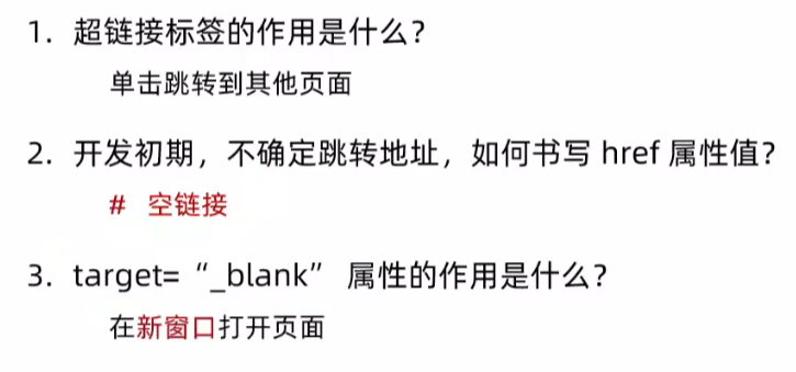
16.超链接
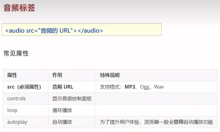
16.音频标签
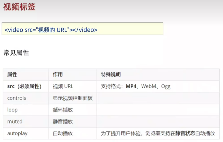
17.视频标签
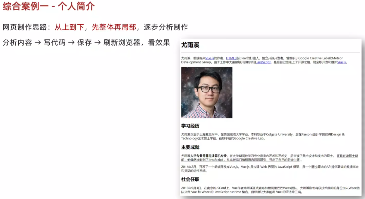
18.综合案例一
<!DOCTYPE html>
<html lang="en">
<head><meta charset="UTF-8"><meta name="viewport" content="width=device-width, initial-scale=1.0"><title>Document</title>
</head>
<body><h1>尤雨溪</h1><hr><p>尤雨溪,前端框架<a href="#">Vue.js</a>的作者,<a href="#">HTML5</a>版Clear的打造人,独立开原开发者。曾就职于Google Creative Labs 和 Meteor Development Group。由于工作中大量接触开源的项目<a href="#">JavaScript</a>,最后自己也走上了开源之路,现全职开发和维护<a href="#">Vue.js</a>。</p><img src="photo.jpg" alt=""><h2>学习经历</h2><p>尤雨溪毕业于上海复旦附中,在美国完成大学专业,本科毕业于Colgate University,后在Parsons设计学院获得Design & Technology艺术硕士学位,任职于纽约Google Creative Lab。</p><h2>主要成就</h2><p>尤雨溪<strong>大学专业并非是计算机专业</strong>,在大学期间他学习专业是室内艺术和艺术史,后来读了美术设计和技术的硕士,<u>正是在读硕士期间,他偶然接触到了JavaScript,从此北这门编程语言深深吸引,开启了自己的前端生涯</u>。</p><h2>社会任职</h2><p>2016年9月3日,在南京的JSConf上,Vue作者尤雨溪正式宣布加盟阿里巴巴Weex团队,尤雨溪称他将以技术顾问的身份加入Weex团队来做Vue和Weex的JavaScript runtime 整合,目标是让大家能用Vue的语法跨三端。</p></body>
</html>
19.综合案例二
<!DOCTYPE html>
<html lang="en">
<head><meta charset="UTF-8"><meta name="viewport" content="width=device-width, initial-scale=1.0"><title>Document</title>
</head>
<body><h1>Vue.js</h1><p>Vue (读音 /vjuː/,类似于 view) 是一套用于构建用户界面的渐进式JavaScript框架。 [5] 与其它大型框架不同的是,Vue 被设计为可以自底向上逐层应用。Vue 的核心库只关注视图层,不仅易于上手,还便于与第三方库或既有项目整合。另一方面,当与现代化的工具链以及各种支持类库结合使用时,Vue 也完全能够为复杂的单页应用(SPA)提供驱动。</p><p>其作者为<a href="01-标签的写法.html">尤雨溪</a></p><h2>主要功能</h2><p>Vue.js是一套构建用户界面的渐进式框架。与其他重量级框架不同的是,Vue采用自底向上增量开发的设计。Vue 的核心库只关注视图层,并且非常容易学习,非常容易与其它库或已有项目整合。另一方面,Vue 完全有能力驱动采用单文件组件和Vue生态系统支持的库开发的复杂单页应用。</p><p>Vue.js 的目标是通过尽可能简单的 API 实现响应的数据绑定和组合的视图组件。</p><p>Vue.js 自身不是一个全能框架——它只聚焦于视图层。因此它非常容易学习,非常容易与其它库或已有项目整合。另一方面,在与相关工具和支持库一起使用时 [2] ,Vue.js 也能驱动复杂的单页应用。</p><video src="media/vue.mp4" controls></video>
</body>
</html>
列表、表格、表单
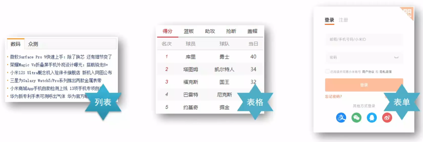
20.列表
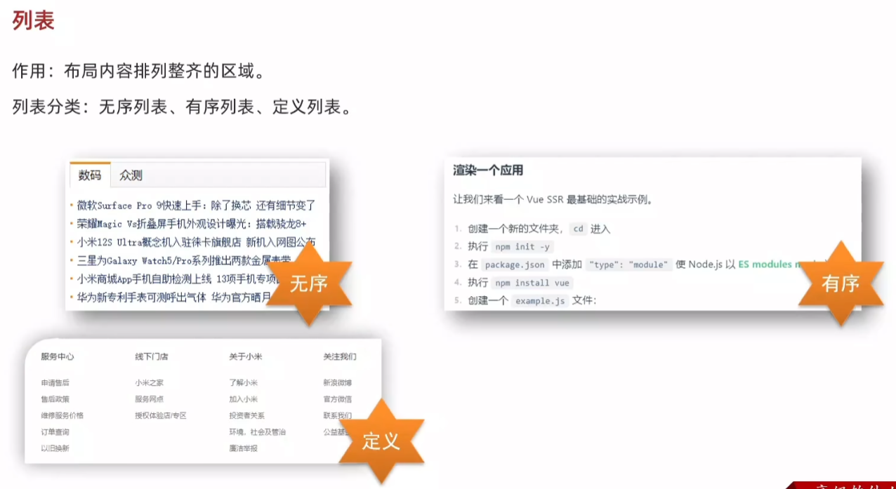
21.无序列表
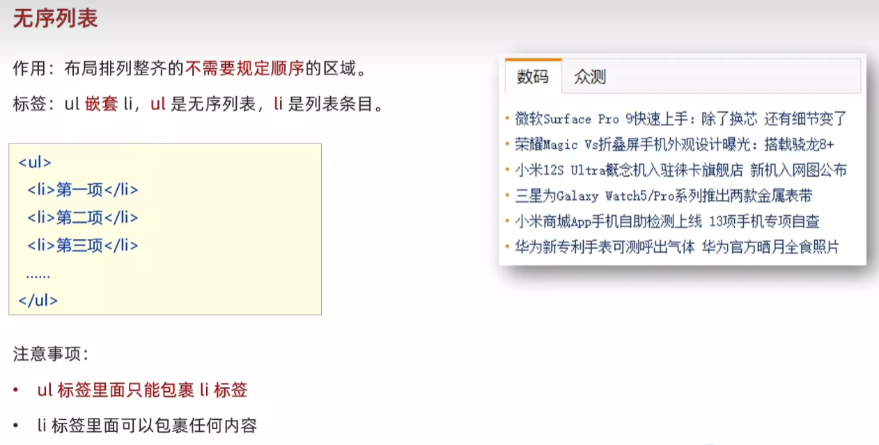
<body><ul><li>列表条目</li><li>列表条目</li><li>列表条目</li></ul>
</body>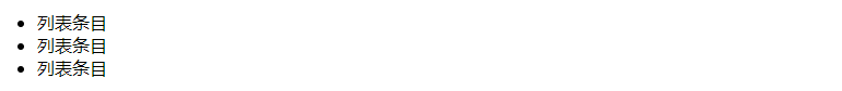
22.有序列表
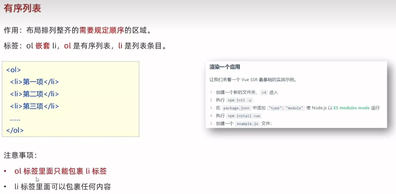
<body><ol><li>列表条目</li><li>列表条目</li><li>列表条目</li></ol>
</body>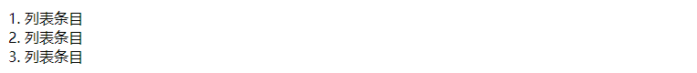
23.定义列表

<body><dl><dt>服务中心</dt><dd>申请售后</dd><dd>售后政策</dd><dt>线下门店</dt><dd>小米之家</dd><dd>服务网点</dd></dl>
</body>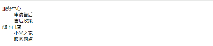
24.表格
<body><table border="1"><tr><th>姓名</th><th>语文</th><th>数学</th><th>总分</th></tr><tr><td>张三</td><td>99</td><td>100</td><td>199</td></tr><tr><td>李四</td><td>98</td><td>100</td><td>198</td></tr><tr><td>总结</td><td>全市第一</td><td>全市第一</td><td>全市第一</td></tr></table>
</body>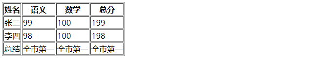
25.表格结构标签
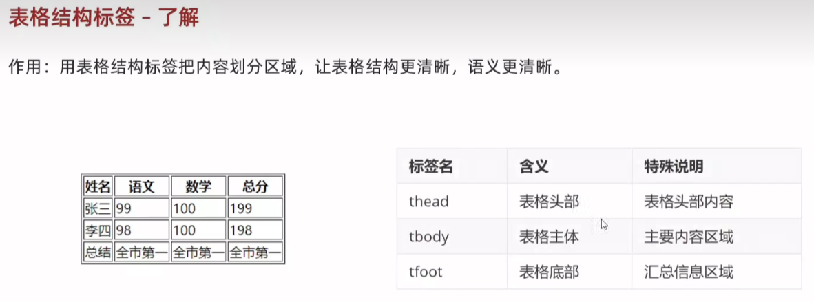
<body><table border="1"><thead><tr><th>姓名</th><th>语文</th><th>数学</th><th>总分</th></tr></thead><tbody><tr><td>张三</td><td>99</td><td>100</td><td>199</td></tr><tr><td>李四</td><td>98</td><td>100</td><td>198</td></tr></tbody><tfoot><tr><td>总结</td><td>全市第一</td><td>全市第一</td><td>全市第一</td></tr></tfoot></table>26.合并单元格
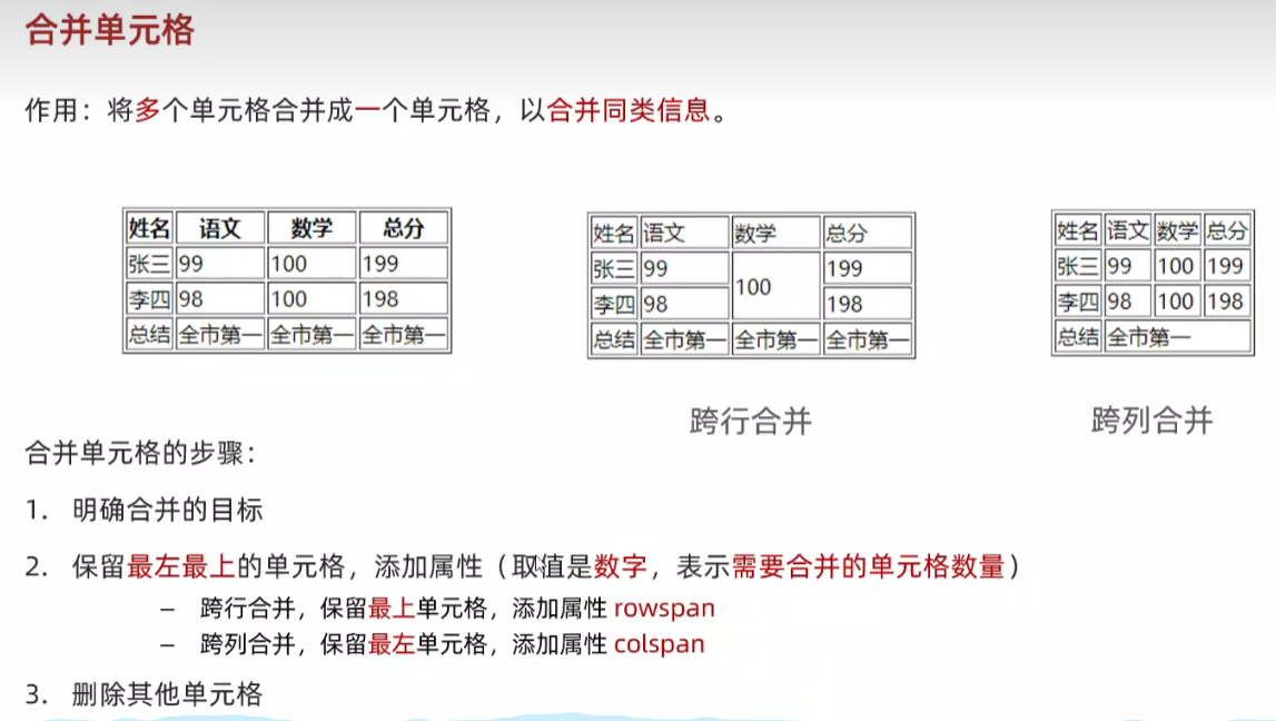
行合并<tbody><tr><td>张三</td><td>99</td><td rowspan="2">100</td><td>199</td></tr><tr><td>李四</td><td>98</td><td>198</td></tr></tbody>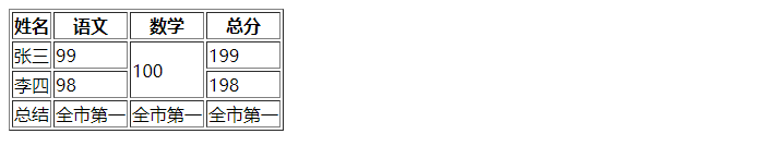
列合并<tfoot><tr><td>总结</td><td colspan="3">全市第一</td></tr></tfoot>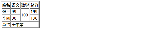
27.表单

28.input标签基本使用
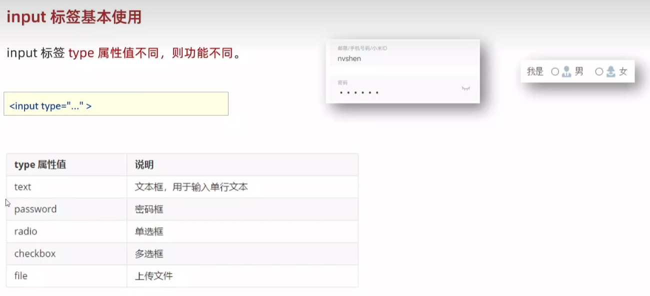
文本框:单行文本
<body>文本框:<input type="text">
</body>
密码框:
<body>密码框:<input type="password">
</body>
单选框:
<input type="radio">
多选框:
<input type="checkbox">
上传文件:
<input type="file">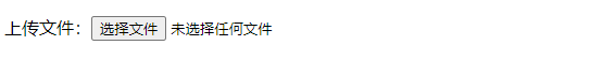
29.input标签占位文本
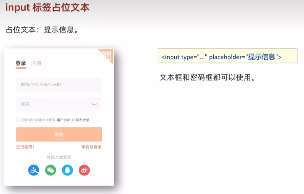
<body>文本框:<input type="text" placeholder="请输入用户名"><br><br>密码框:<input type="password" placeholder="请输入密码">
</body>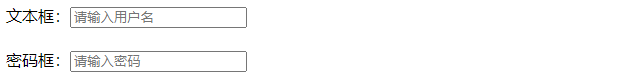
29.单选框radio
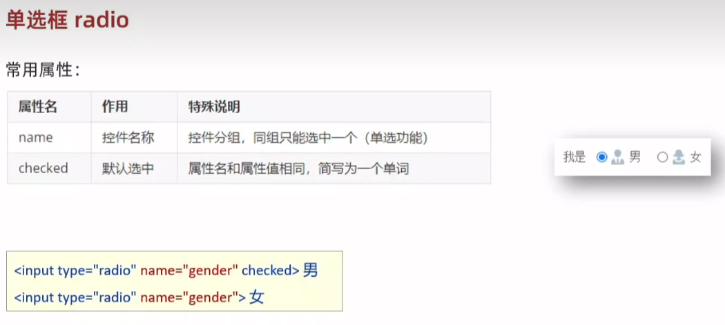
<body>单选框:<input type="radio" name="gender" checked> 男<input type="radio" name="gender"> 女
</body>
30. 上传文件
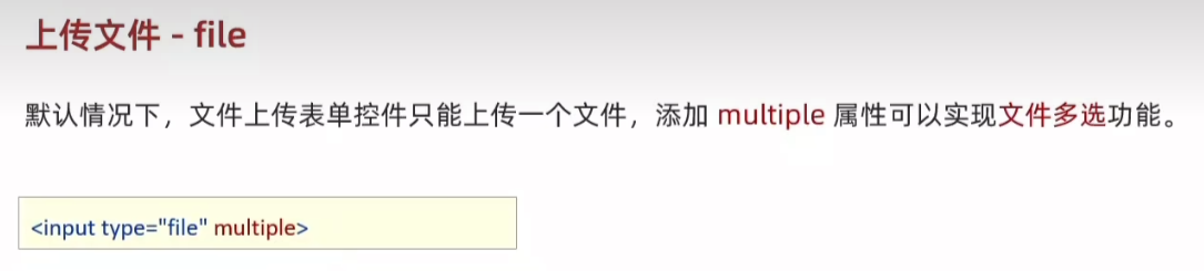
上传文件:<input type="file" multiple>
31.多选框:默认选中 Checked
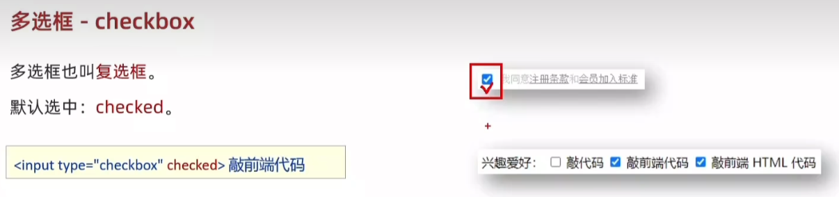
兴趣爱好:<input type="checkbox" checked> 敲代码<input type="checkbox"> 敲前端代码<input type="checkbox"> 敲前端 HTML代码
32.下拉菜单
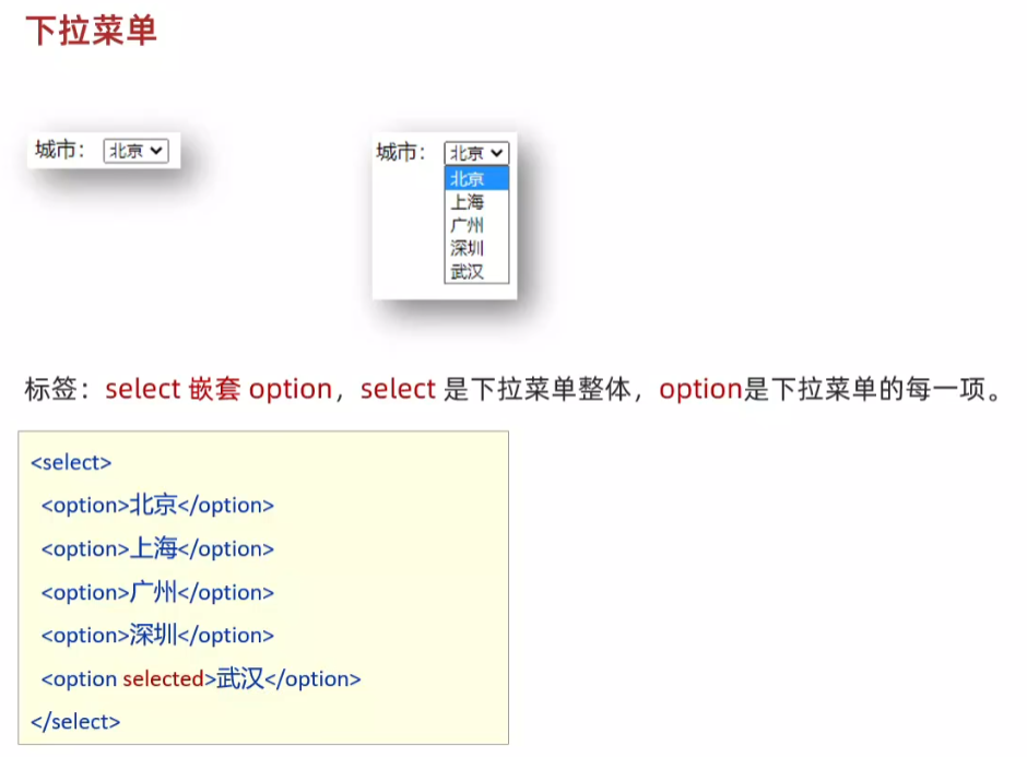
城市:<select><option>北京</option><option>上海</option><option>广州</option><option>深圳</option><option selected>武汉</option></select>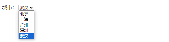
33.文本域
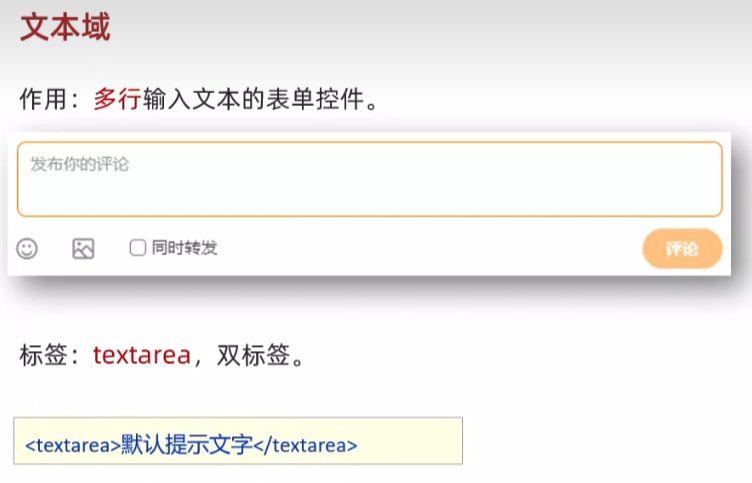
<body><textarea>请输入评论</textarea>
</body>
34.label标签
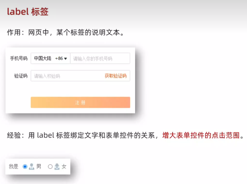
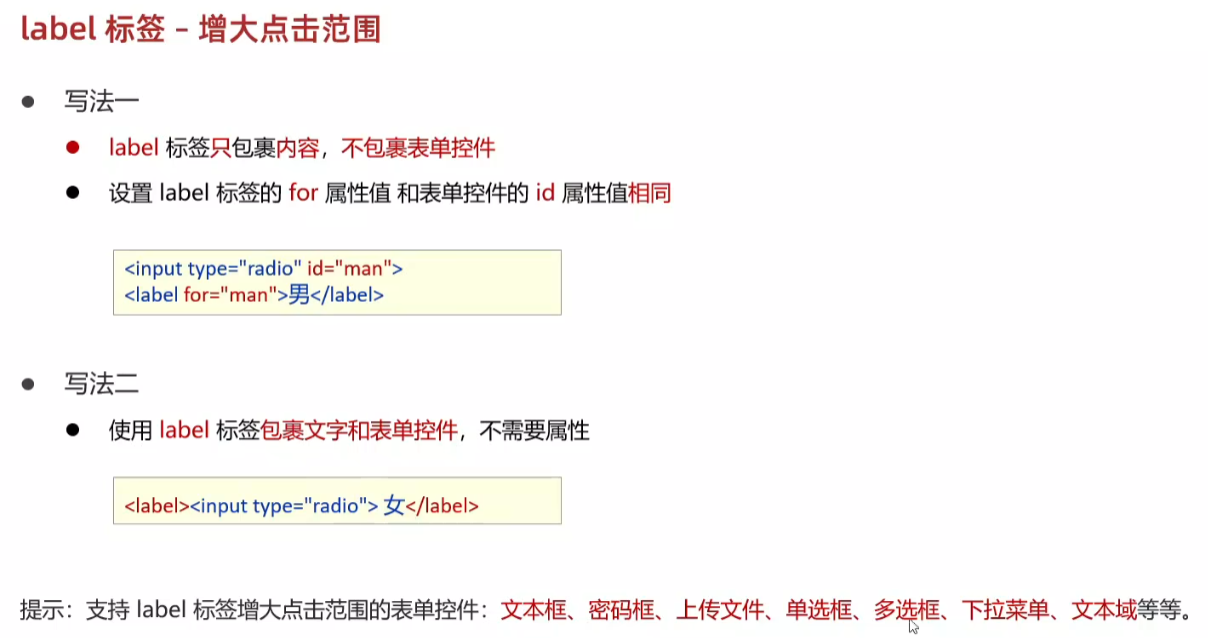
<body>性别:<input type="radio" name="gender" id="man"><label for="man">男</label><label ><input type="radio" name="gender"> 女</label>
</body>
35.按钮button
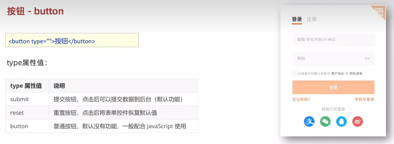
需要用 form 标签 包裹
<body><!-- form 表单区域 --><!-- action=“” 发送数据的地址 --><form action="">用户名:<input type="text"><br><br>密码:<input type="password"><br><br><!-- 如果省略 type 属性,功能是 提交 --><button type="submit">提交</button><button type="reset">重置</button><button type="button">普通按钮</button></form>
</body>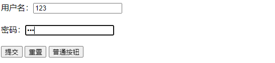
36.div 和 span 无语义的布局标签
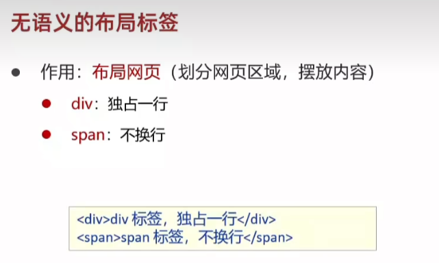
<body><!-- div:大盒子 --><div>这是 div 标签</div><div>这是 div 标签</div><!-- span:小盒子 --><span>这是 span 标签</span><span>这是 span 标签</span>
</body>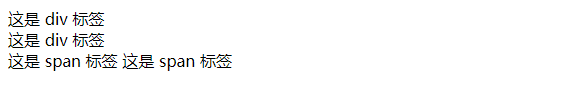
37.字符实体
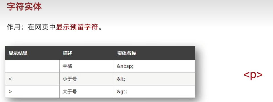
<body><!-- 在代码中敲键盘的空格,网页只识别一个 -->乾坤未定,你我皆是黑 马。<p>
</body>
38.综合案例一
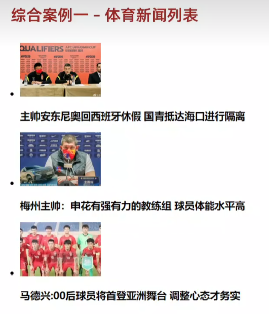
<body><ul><li><img src="media/images/1.jpg"><h4>主帅安东尼奥回西班牙休假</h4></li><li><img src="media/images/2.jpg"><h4>梅州主帅:申花有强有力的教练组</h4></li><li><img src="media/images/3.jpg"><h4>马德兴:00后球员将首登亚洲舞台</h4></li></ul>
</body>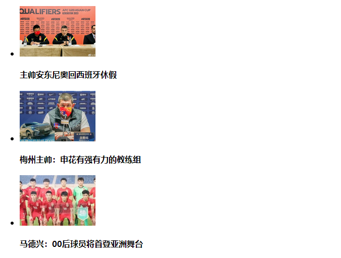
39.综合案例二
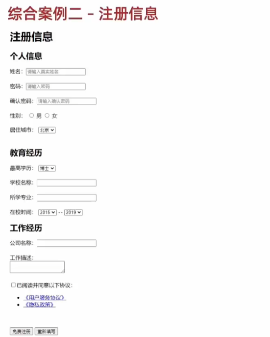
<body>
<h1>注册信息</h1>
<form action=""><h2>个人信息</h2><label>姓名:</label><input type="text" placeholder="请输入真实姓名"><br><br><label>密码:</label><input type="password" placeholder="请输入密码"><br><br><label>确认密码:</label><input type="password" placeholder="请输入确认密码"><br><br><label>性别:</label><label><input type="radio" name="gender">男</label><label><input type="radio" name="gender">女</label><br><br><label>居住城市:</label><select><option selected>北京</option><option>上海</option><option>广州</option></select><h2>教育经历</h2><label>最高学历:</label><select><option selected>本科</option><option>硕士</option><option>博士</option></select><br><br><label>学校名称:</label><input type="text"><br><br><label>所学专业:</label><input type="text"><br><br><label>在校时间:</label><select><option selected>2017</option><option>2018</option><option>2019</option></select>--<select><option selected>2019</option><option>2020</option><option>2021</option></select><h2>工作经历</h2><label>公司名称:</label><input type="text"><br><br><label>工作描述:</label><textarea></textarea><br><br><label><input type="checkbox">已阅读并同意以下协议</label><br><br><ul><li><a href="#">《用户服务协议》</a></li><li><a href="#">《隐私政策》</a></li></ul><button type="submit">免费注册</button><button type="reset">重新填写</button>
</form>
</body>
CSS基础
1.css初体验
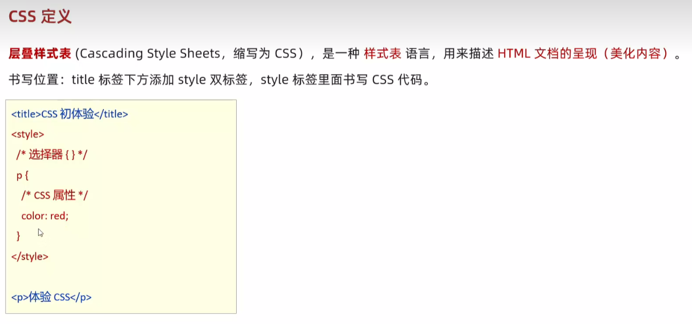
<!DOCTYPE html>
<html lang="en">
<head><meta charset="UTF-8"><meta name="viewport" content="width=device-width, initial-scale=1.0"><title>Document</title><style>/* css 代码 *//* 选择器 { css 属性} */p {/* 文字颜色 */color:red;/* 字号 */font-size: 30px;}</style>
</head>
<body><p>体验 css</p>
</body>
</html>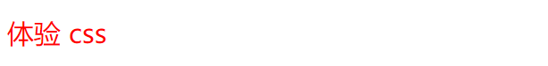

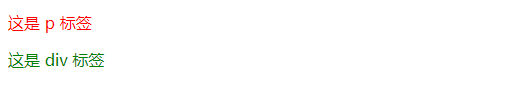
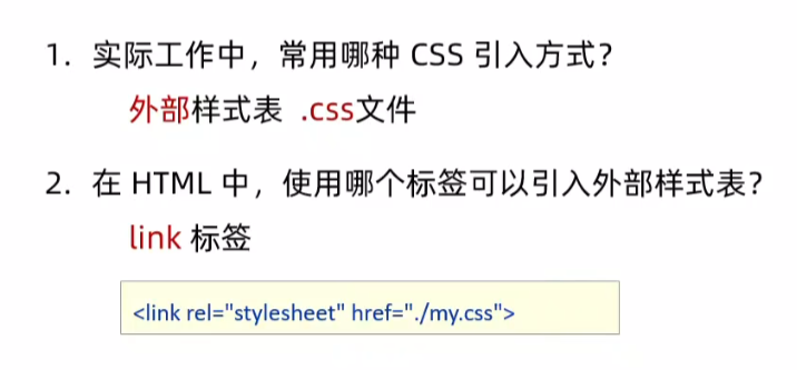
2.css引入样式
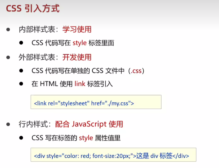
rel:关系 stylesheet:样式表
html文件中:
<!DOCTYPE html>
<html lang="en">
<head><meta charset="UTF-8"><meta name="viewport" content="width=device-width, initial-scale=1.0"><title>Document</title><!-- link 引入外部样式表 :rel:关系,样式表--><link rel="stylesheet" href="my.css">
</head>
<body><p>这是 p 标签</p><div style="color:green">这是 div 标签</div>
</body>
</html>
my.css中
/* 此处放css代码 */
/* 选择器 {css属性} */
p {color: red;
}
3.选择器
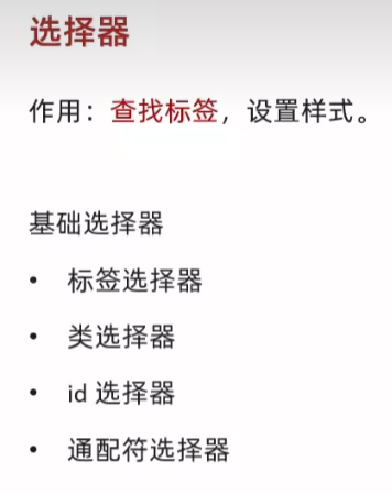
4.标签选择器
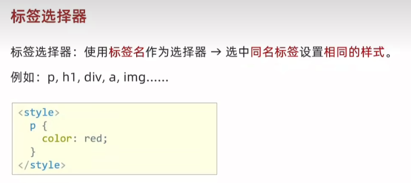
<!DOCTYPE html>
<html lang="en">
<head><meta charset="UTF-8"><meta name="viewport" content="width=device-width, initial-scale=1.0"><title>Document</title><style>/* 特点:选中同名标签设置相同的样式,无法差异化同名标签的样式 */p {color: red;}</style>
</head>
<body><p>这是 p 标签</p><p>111</p><p>222</p>
</body>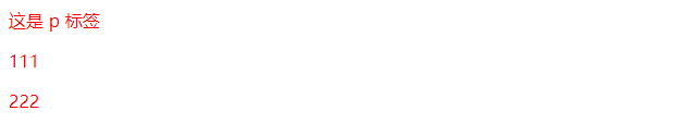
5.类选择器
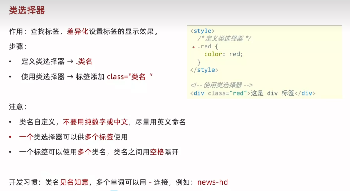
<!DOCTYPE html>
<html lang="en">
<head><meta charset="UTF-8"><meta name="viewport" content="width=device-width, initial-scale=1.0"><title>Document</title><style>/* 定义 */.red {color: red;}.size {font-size: 50px;}</style>
</head>
<body><!-- 使用 --><!-- 一个类选择器可以给多个标签使用 --><p class="red">111</p><p>222</p><!-- 一个标签可以使用多个类名,class属性值写多个类名,类名用空格隔开 --><div class="red size">div 标签</div>
</body>
</html>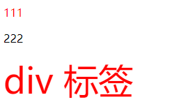
5.id选择器
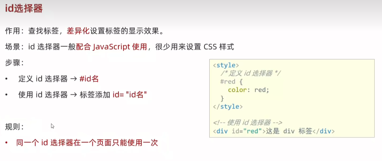
<!DOCTYPE html>
<html lang="en">
<head><meta charset="UTF-8"><meta name="viewport" content="width=device-width, initial-scale=1.0"><title>Document</title><style>/* 定义 */#red {color: red;}</style>
</head>
<body><!-- 使用 --><div id="red">div 标签</div>
</body>
</html>
6.通配符选择器
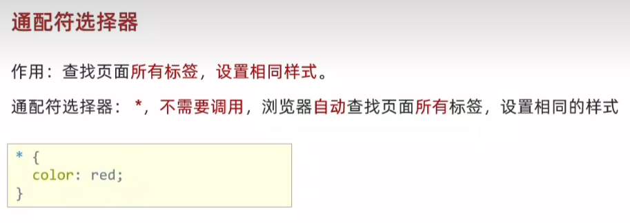
<!DOCTYPE html>
<html lang="en">
<head><meta charset="UTF-8"><meta name="viewport" content="width=device-width, initial-scale=1.0"><title>Document</title><style>/* 定义 */* {color: red;}</style>
</head>
<body><!-- 使用 --><p>p 标签</p><div>div 标签</div><h1>h1 标签</h1><ul><li>li</li><li>li</li></ul>
</body>
</html>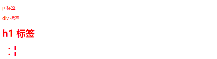
7.画盒子
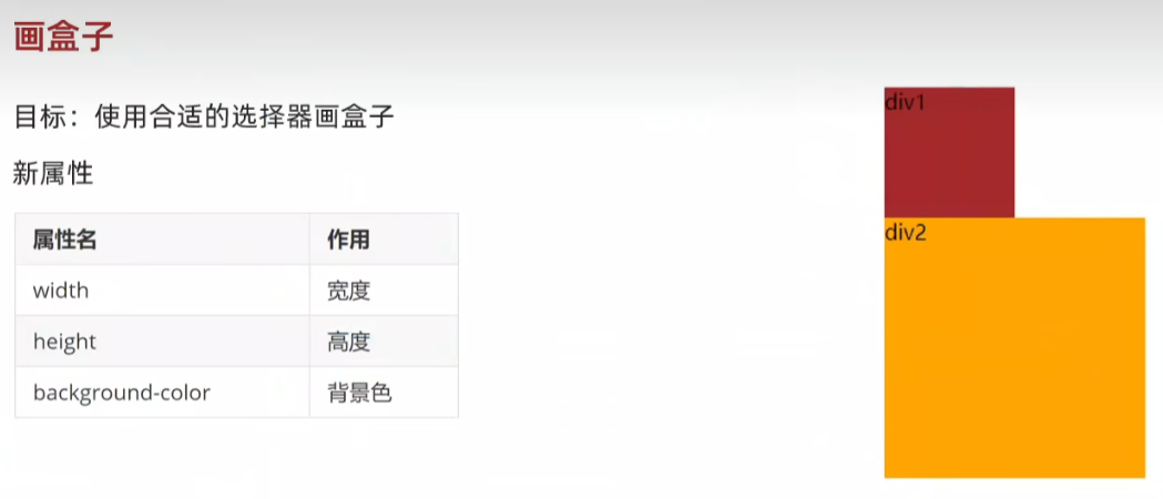
<!DOCTYPE html>
<html lang="en">
<head><meta charset="UTF-8"><meta name="viewport" content="width=device-width, initial-scale=1.0"><title>Document</title><style>/* 定义 */.red {/* 宽度 */width: 100px;/* 高度 */height: 100px;/* 背景色 */background-color: brown;}.orange {width: 200px;height: 200px;background-color: orange;}</style>
</head>
<body><!-- 使用 --><div class="red">div1</div><div class="orange">div2</div>
</body>
</html>
8.文字控制属性
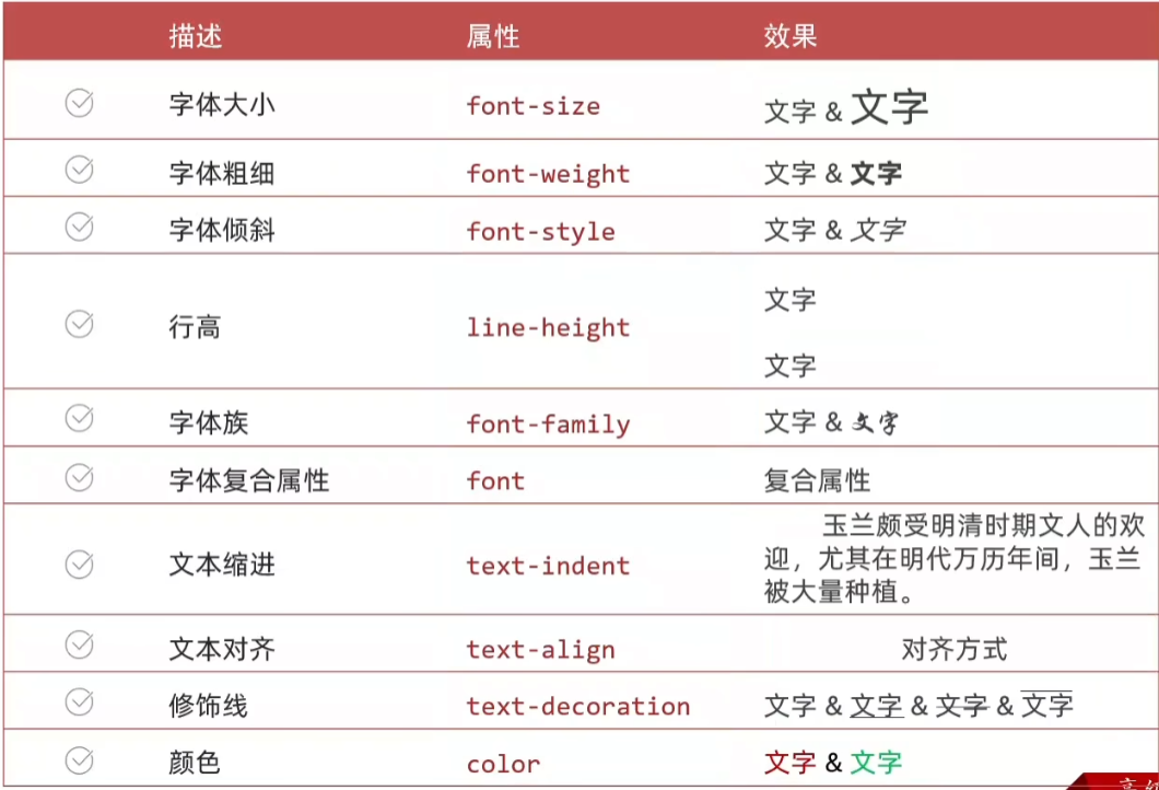
9.字体大小:font-size
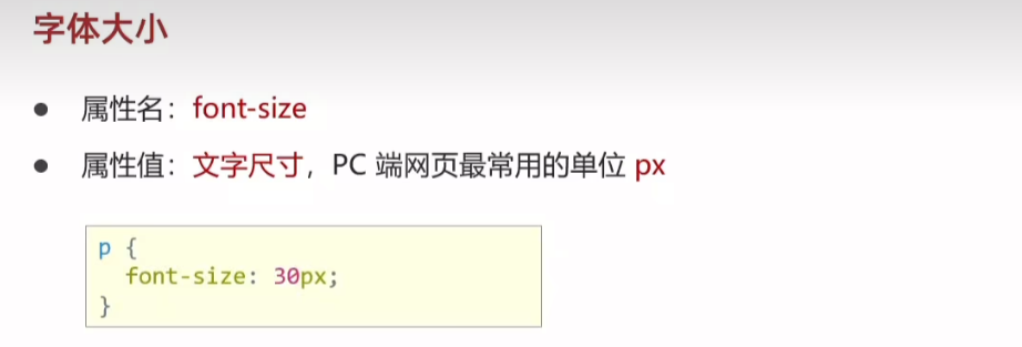
<!DOCTYPE html>
<html lang="en">
<head><meta charset="UTF-8"><meta name="viewport" content="width=device-width, initial-scale=1.0"><title>Document</title><style>/* 经验:谷歌浏览器文字有默认大小 16px */    p {/* font-size  属性必须有单位,否则属性不生效 */font-size: 30px;}</style>
</head>
<body><p>测试字体大小</p><div>测试默认字体大小</div>
</body>
</html>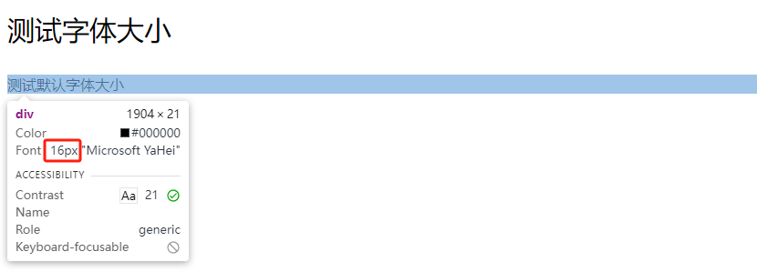
10.字体粗细:font-weight
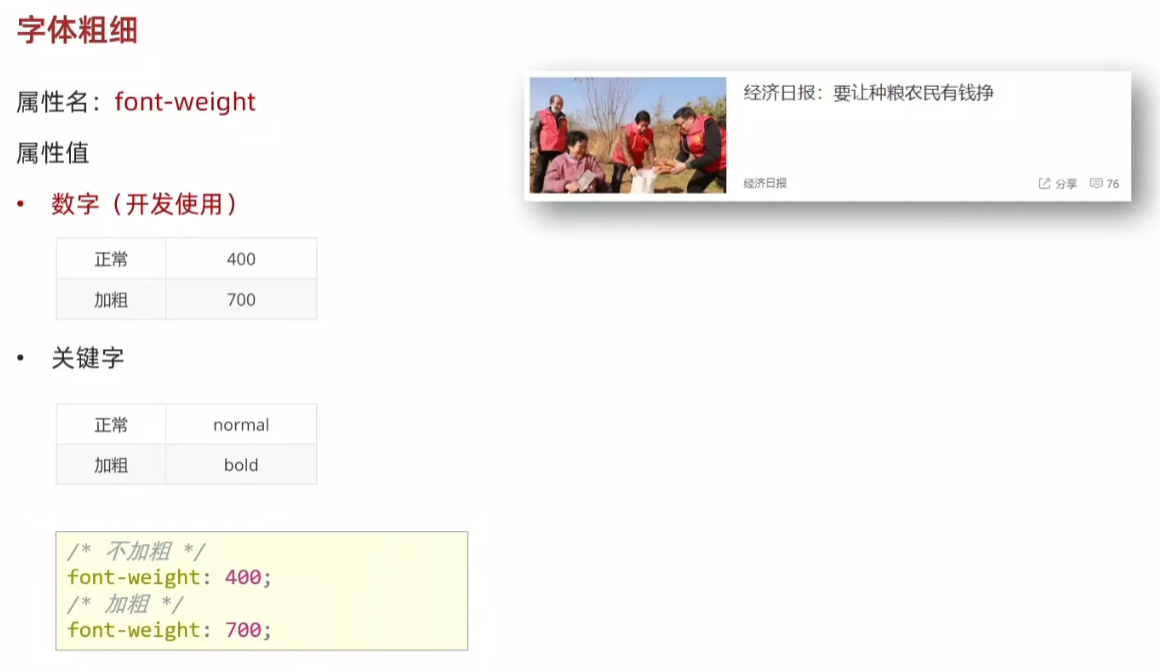
<!DOCTYPE html>
<html lang="en">
<head><meta charset="UTF-8"><meta name="viewport" content="width=device-width, initial-scale=1.0"><title>Document</title><style>h3 {font-weight: 400;}div {font-weight: 700;}</style>
</head>
<body><h3>h3 标题</h3><div>div 标签</div>
</body>
</html>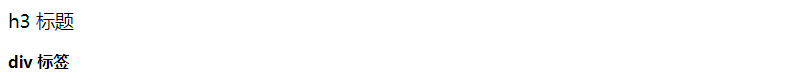
11.字体样式(是否倾斜)font-style
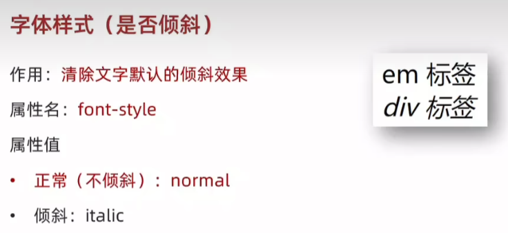
<!DOCTYPE html>
<html lang="en">
<head><meta charset="UTF-8"><meta name="viewport" content="width=device-width, initial-scale=1.0"><title>Document</title><style>em {font-style: normal;}div {font-style: italic;}</style>
</head>
<body><em>em 标签</em><div>div 标签</div>
</body>
</html>
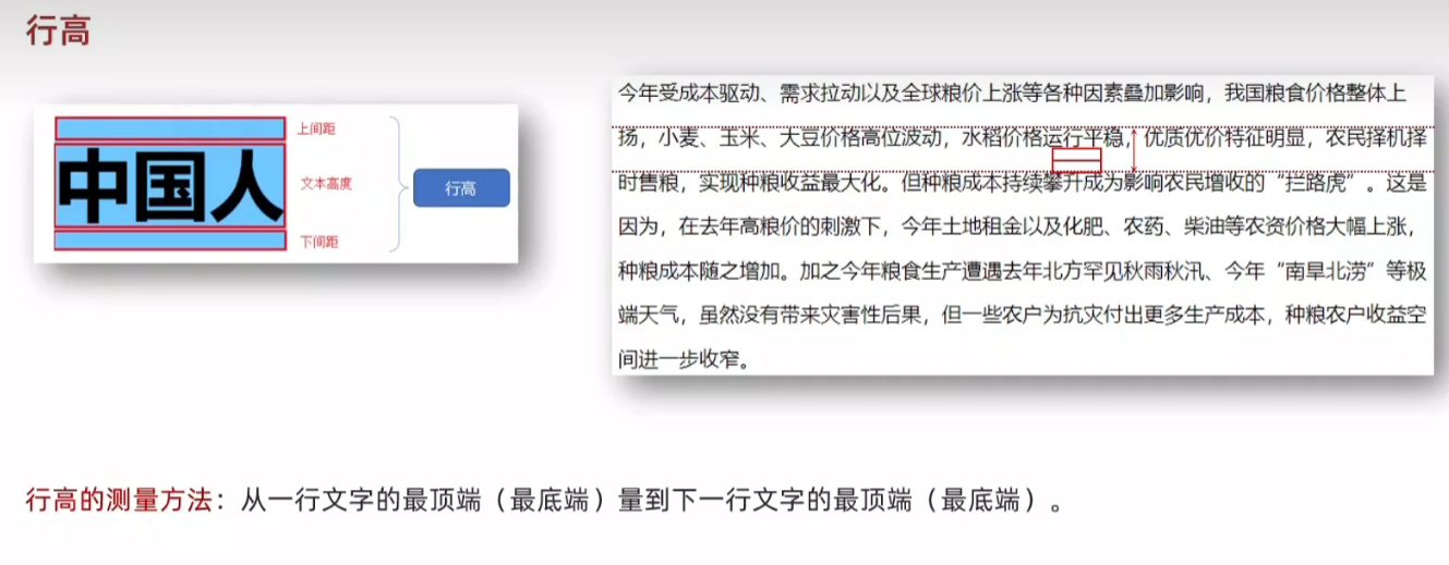
12.行高:line-height
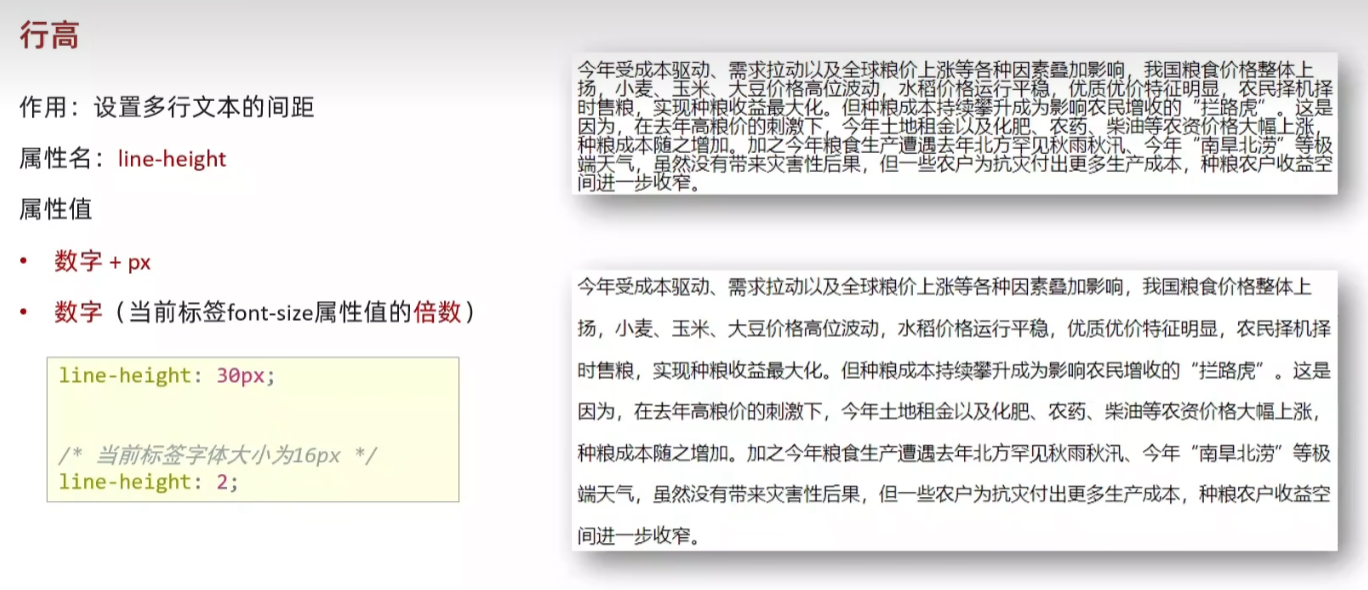
数字 2 代表 2 * font-size 即 2 * 16 px = 32px
<!DOCTYPE html>
<html lang="en">
<head><meta charset="UTF-8"><meta name="viewport" content="width=device-width, initial-scale=1.0"><title>Document</title><style>p {font-size: 20px;/* line-height: 30px; *//* 行高值是数字,表示是当前标签字体大小的倍数 */line-height: 2;}</style>
</head>
<body><p>今年受成本驱动、需求拉动以及全球粮价上涨等各种因素叠加影响,我国粮食价格整体上扬,小麦、玉米、大豆价格高位波动,水稻价格运行平稳,优质优价特征明显,农民择机择时售粮,实现种粮收益最大化。但种粮成本持续攀升成为影响农民增收的“拦路虎”。这是因为,在去年高粮价的刺激下,今年土地租金以及化肥、农药、柴油等农资价格大幅上涨,种粮成本随之增加。加之今年粮食生产遭遇去年北方罕见秋雨秋汛、今年“南旱北涝”等极端天气,虽然没有带来灾害性后果,但一些农户为抗灾付出更多生产成本,种粮农户收益空间进一步收窄。</p>
</body>
</html>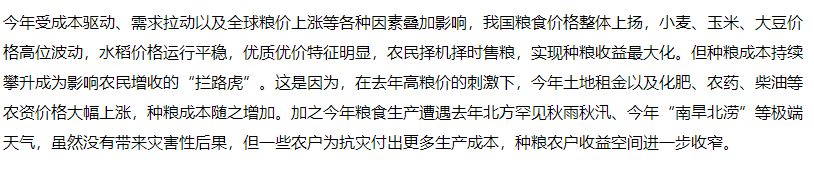
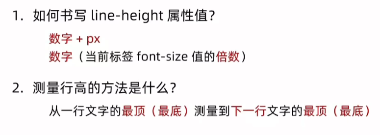
13.行高-垂直居中
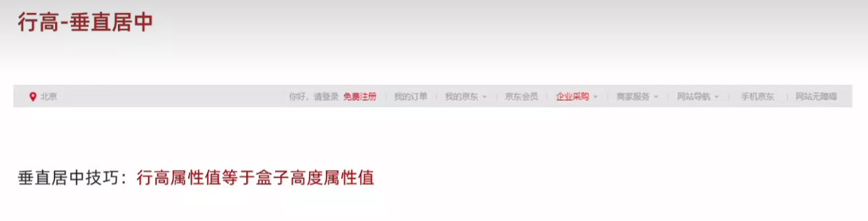
<!DOCTYPE html>
<html lang="en">
<head><meta charset="UTF-8"><meta name="viewport" content="width=device-width, initial-scale=1.0"><title>Document</title><style>div {height: 100px;background-color: skyblue;/* 注意:只能是单行文字垂直居中 */line-height: 100px;}</style>
</head>
<body><div>文字</div>
</body>
</html>
14.字体族 font-family
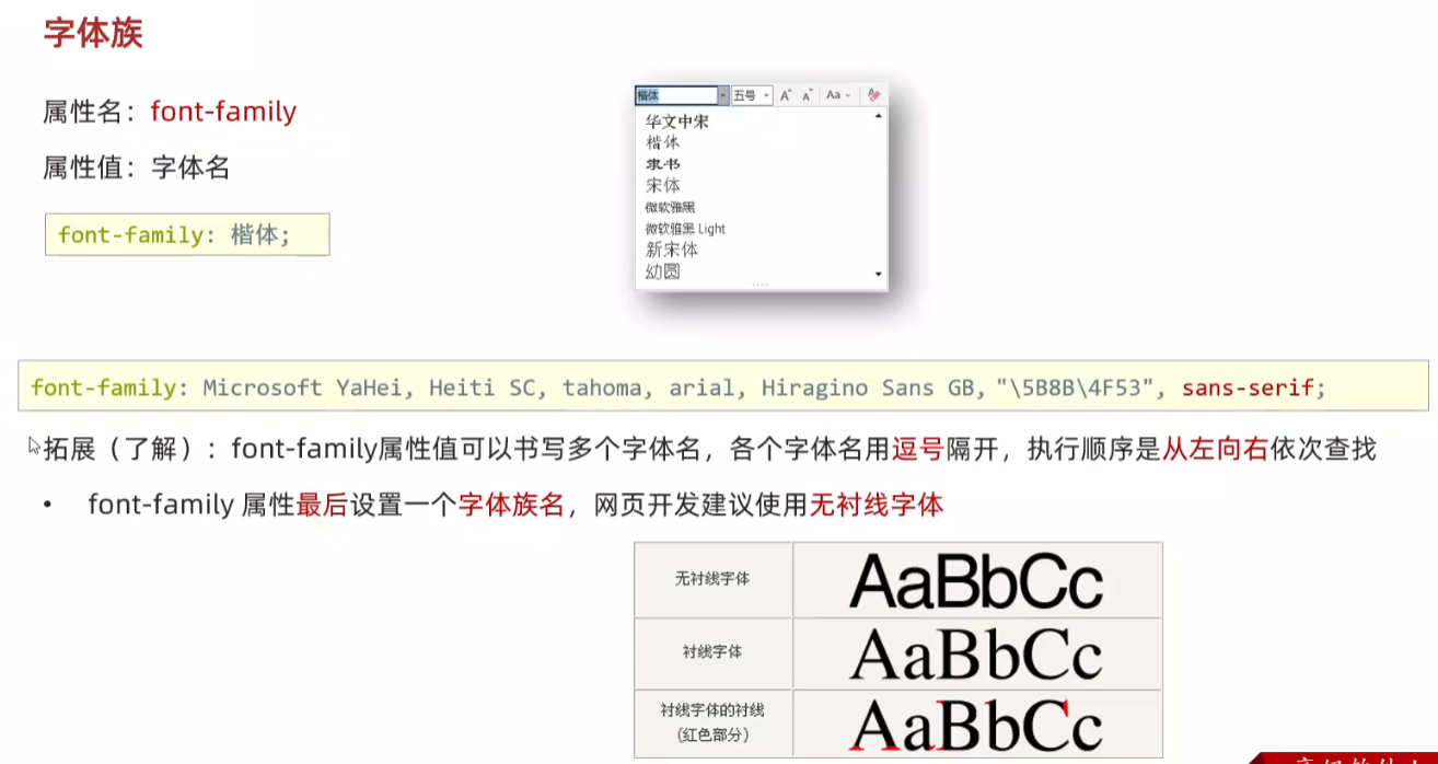
<!DOCTYPE html>
<html lang="en">
<head><meta charset="UTF-8"><meta name="viewport" content="width=device-width, initial-scale=1.0"><title>Document</title><style>div {font-family: 楷体;}</style>
</head>
<body><div>测试文字</div>
</body>
</html>
15.font 复合属性
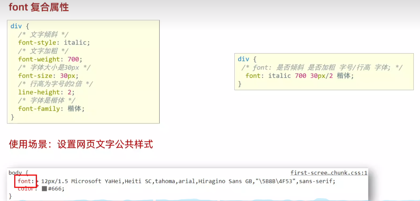
一般在开发初期使用,直接从京东淘宝复制
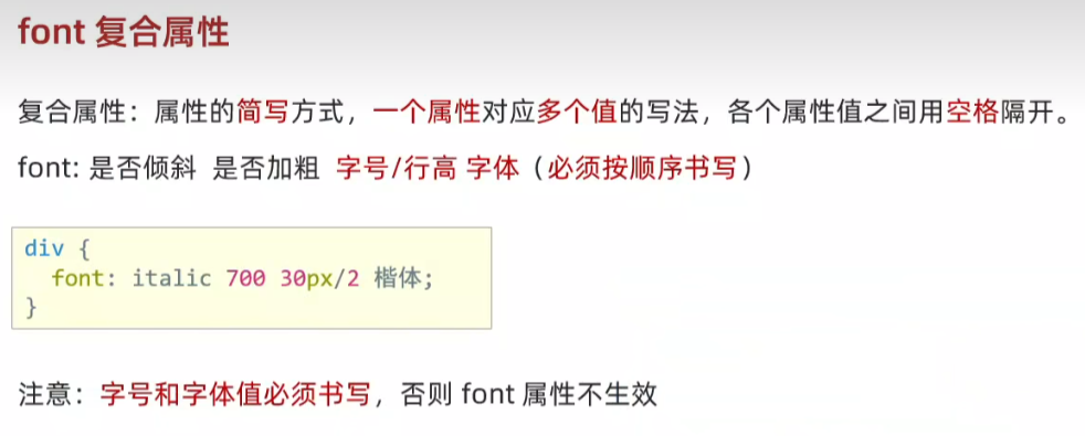
<!DOCTYPE html>
<html lang="en">
<head><meta charset="UTF-8"><meta name="viewport" content="width=device-width, initial-scale=1.0"><title>Document</title><style>div {/* 文字倾斜、文字加粗、字体大小是30px、行高2倍、楷体 */font:italic 700 30px/2 楷体;}</style>
</head>
<body><div>测试 font 属性</div>
</body>
</html>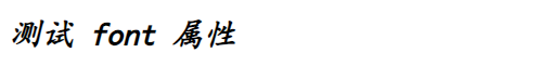
字号和字体值必须书写,否则 font 属性不生效
font:30px 楷体;
16.文本缩进 text-indet 2em
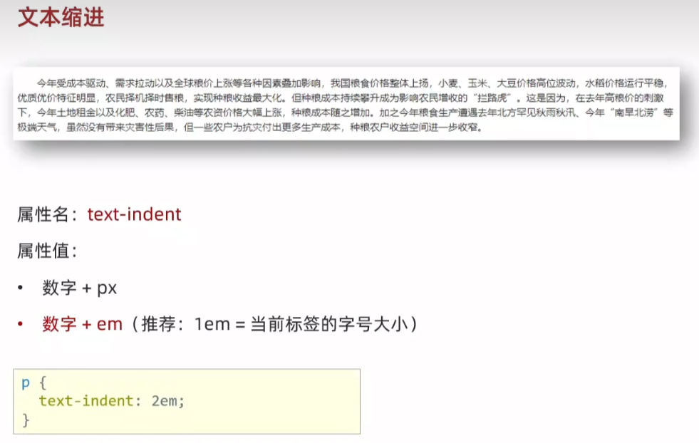
<!DOCTYPE html>
<html lang="en">
<head><meta charset="UTF-8"><meta name="viewport" content="width=device-width, initial-scale=1.0"><title>Document</title><style>p {text-indent: 2em;}</style>
</head>
<body><p>今年受成本驱动、需求拉动以及全球粮价上涨等各种因素叠加影响,我国粮食价格整体上扬,小麦、玉米、大豆价格高位波动,水稻价格运行平稳,优质优价特征明显,农民择机择时售粮,实现种粮收益最大化。但种粮成本持续攀升成为影响农民增收的“拦路虎”。这是因为,在去年高粮价的刺激下,今年土地租金以及化肥、农药、柴油等农资价格大幅上涨,种粮成本随之增加。加之今年粮食生产遭遇去年北方罕见秋雨秋汛、今年“南旱北涝”等极端天气,虽然没有带来灾害性后果,但一些农户为抗灾付出更多生产成本,种粮农户收益空间进一步收窄。</p>
</body>
</html>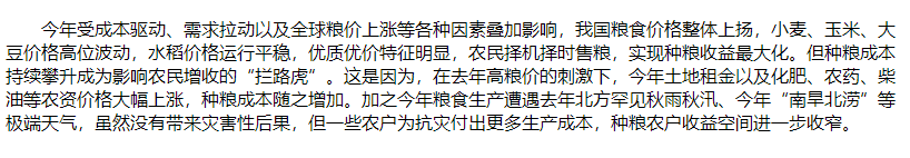
17.文本对齐方式 text-align
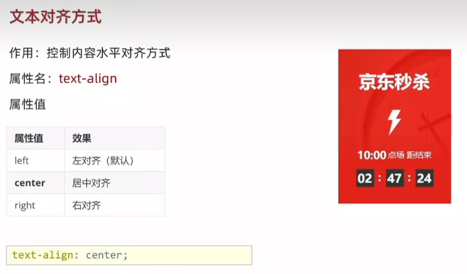
<!DOCTYPE html>
<html lang="en">
<head><meta charset="UTF-8"><meta name="viewport" content="width=device-width, initial-scale=1.0"><title>Document</title><style>h1 {/* 本质:居中的是文字内容,不是标签 *//* text-align: left; */text-align: center;/* text-align: right; */}</style>
</head>
<body><h1>标题文字</h1>
</body>
</html>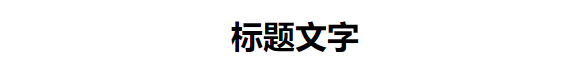
18.水平对齐方式-图片
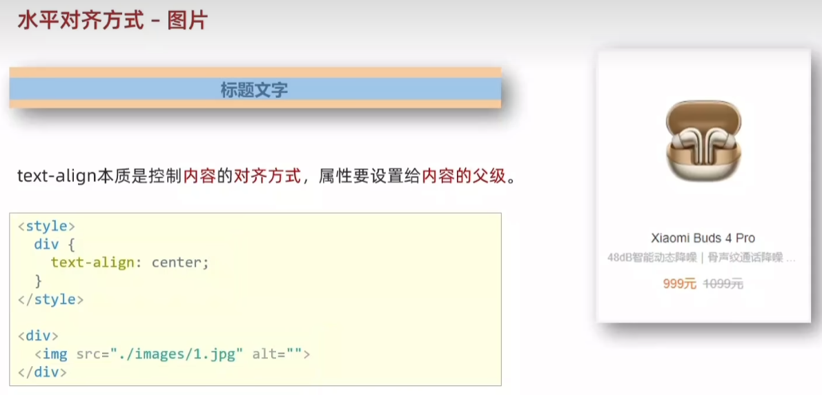
<!DOCTYPE html>
<html lang="en">
<head><meta charset="UTF-8"><meta name="viewport" content="width=device-width, initial-scale=1.0"><title>Document</title><style>div {width: 250px;height: 250px;text-align: center;}.red {color: orange;}</style>
</head>
<body><div><img src="1.jpg" ><h4>Xiaomi Buds 4 Pro</h4><p>48dB智能动态降噪 | 骨声纹通话降噪...</p><span class="red">999元</span> <span><del>1099元</del></span></div>
</body>
</html>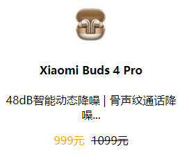
19.文本修饰线 text-decoration
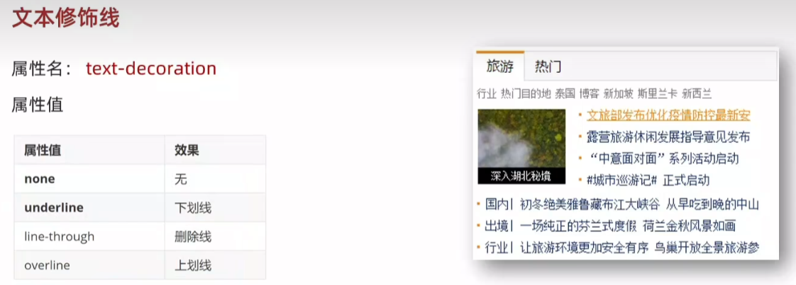
<!DOCTYPE html>
<html lang="en">
<head><meta charset="UTF-8"><meta name="viewport" content="width=device-width, initial-scale=1.0"><title>Document</title><style>a {text-decoration: none;}div {text-decoration: underline;}p {text-decoration: line-through;}span {text-decoration: overline;}</style>
</head>
<body><a href="#">a 标签,去掉下划线</a><div>div 标签,添加下划线</div><p>p 标签,添加删除线</p><span>span 标签,添加顶划线</span>
</body>
</html>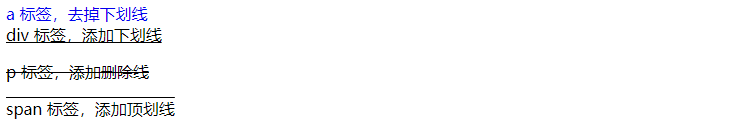
20.color 文字颜色
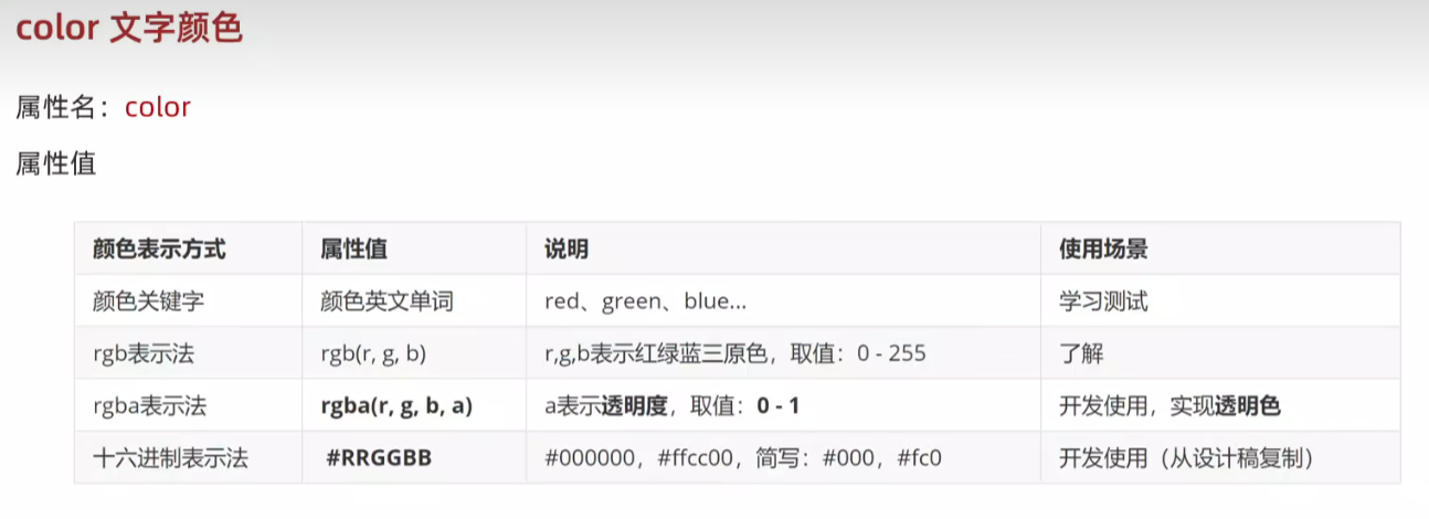
rgba中a越小越透明,a越大越清晰。a=0.3 和 a=0.7
<!DOCTYPE html>
<html lang="en">
<head><meta charset="UTF-8"><meta name="viewport" content="width=device-width, initial-scale=1.0"><title>Document</title><style>h1 {background-color: aqua;/* color: red; *//* color: rgb(0, 255, 0); *//* color: rgba(0, 0, 0,0.7); *//* color: #0000ff; */color: #00f;}</style>
</head>
<body><h1>h1 标签</h1>
</body>
</html>
21.调试工具-谷歌浏览器
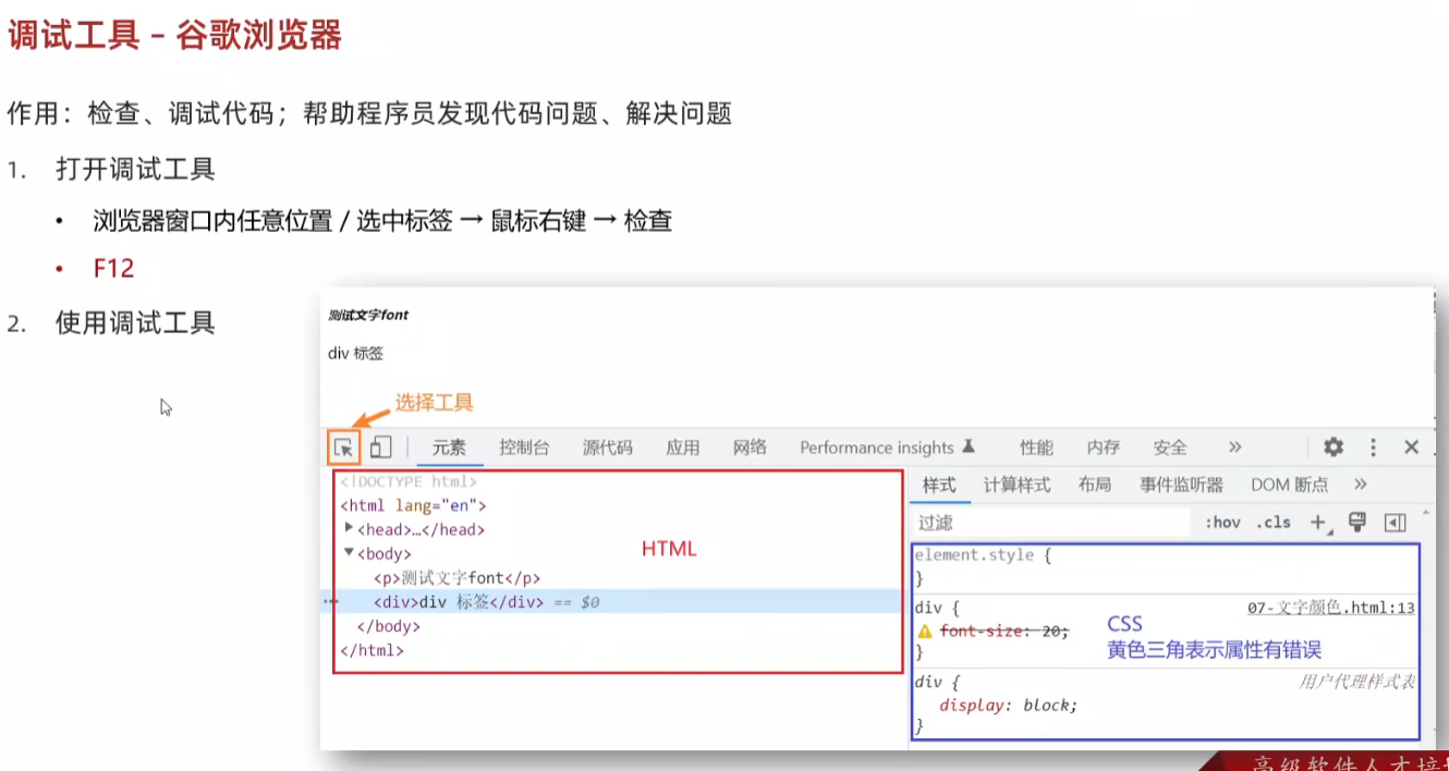
<!DOCTYPE html>
<html lang="en">
<head><meta charset="UTF-8"><meta name="viewport" content="width=device-width, initial-scale=1.0"><title>Document</title><style>div {/* 调试工具的细节:1.如果是错误的属性,有黄色叹号2.CSS 属性的前面有多选框,如果勾选:这个属性生效,如果没有勾选:这个属性不生效*/color:red;font-size: 66px;}</style>
</head>
<body><div>测试文字</div>
</body>
</html>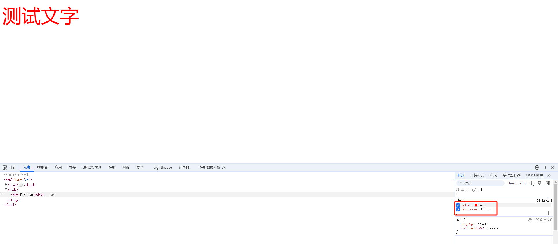
22.综合案例一 - 新闻详情
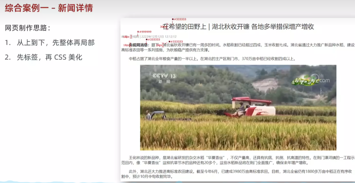
<!DOCTYPE html>
<html lang="en">
<head><meta charset="UTF-8"><meta name="viewport" content="width=device-width, initial-scale=1.0"><title>Document</title><style>* {color: #333;}h1 {font-size: 30px;font-weight: 400;text-align: center;}h5 {font-size: 14px;color: #999;}p {text-indent: 2em;font-size: 18px;}div {text-align: center;}</style>
</head>
<body><h1>在希望的田野上 | 湖北秋收开镰 各地多举措保增产增收</h1><h5>来源:央视网 | 2222年12月12日 12:12:12</h5><p><strong>央视网消息:</strong>眼下,湖北省秋收开镰已有一周多的时间。水稻收割已经超过四成,玉米收割七成。湖北省通过大力推广新品种水稻,建设高标准农田等一系列措施,为秋粮稳产提供有力支撑。</p><p>中稻占据了湖北全年粮食产量的一半以上。在湖北的主产区荆门市,370万亩中稻已经收割四成以上。</p><div><img src="1.jpg" alt=""></div><p>王化林说的新品种,是湖北省研发的杂交水稻“华夏香丝”,不仅产量高,还具有抗病、抗倒、抗高温的特性。在荆门漳河镇的一工程示范田内,像“华夏香丝”这样抗旱节水的品种还有20多个,这些水稻新品将在荆门全面推广,确保来年增产增收。</p><p>此外,湖北还大力推进高标准农田建设。截至今年6月,已建成3980万亩高标准农田。目前,湖北全省仍有1800多万亩中稻正在有序收割中,预计10月中旬收割完毕。</p>
</body>
</html>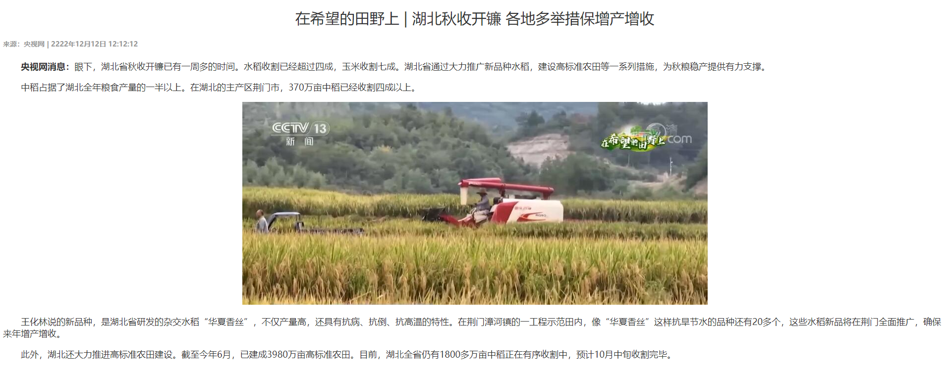
23.综合案例二 - CSS简介
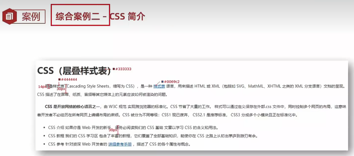
<!DOCTYPE html>
<html lang="en">
<head><meta charset="UTF-8"><meta name="viewport" content="width=device-width, initial-scale=1.0"><title>Document</title><style>h1 {color: #333;}p {font-size: 14px;line-height: 30px;text-indent: 2em;color: #444;}a {color: #0069c2;}li {font-size: 14px;line-height: 30px;color: #444;}</style>
</head>
<body><h1>CSS(层叠样式表)</h1><p>层叠样式表 (Cascading Style Sheets,缩写为 CSS),是一种 <a href="#">样式表</a> 语言,用来描述 HTML 或 XML(包括如 SVG、MathML、XHTML 之类的 XML 分支语言)文档的呈现。CSS 描述了在屏幕、纸质、音频等其它媒体上的元素应该如何被渲染的问题。</p><p><strong>CSS 是开放网络的核心语言之一</strong>,由 W3C 规范 实现跨浏览器的标准化。CSS 节省了大量的工作。 样式可以通过定义保存在外部.css 文件中,同时控制多个网页的布局,这意味着开发者不必经历在所有网页上编辑布局的麻烦。CSS 被分为不同等级:CSS1 现已废弃, CSS2.1 是推荐标准, CSS3 分成多个小模块且正在标准化中。</p><ul><li>CSS 介绍 如果你是 Web 开发的新手,请务必阅读我们的 CSS 基础 文章以学习 CSS 的含义和用法。</li><li>CSS 教程 我们的 CSS 学习区 包含了丰富的教程,它们覆盖了全部基础知识,能使你在 CSS 之路上从初出茅庐到游刃有余。</li><li>CSS 参考 针对资深 Web 开发者的 <a href="#">详细参考手册</a> ,描述了 CSS 的各个属性与概念。</li></ul>
</body>
</html>
24.复合选择器
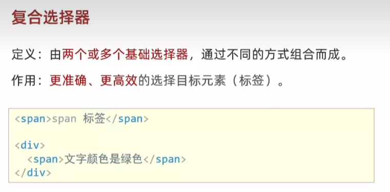
25.后代选择器 div span{}
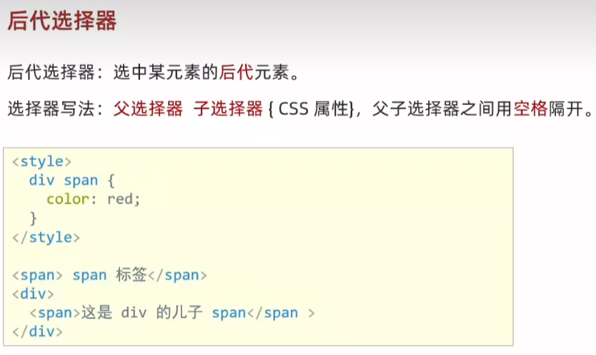
<!DOCTYPE html>
<html lang="en">
<head><meta charset="UTF-8"><meta name="viewport" content="width=device-width, initial-scale=1.0"><title>Document</title><style>/* div 里面的 span 文字颜色是红色 *//* 后代选择器,选中所有后代,包含儿子孙子、重孙子... */div span {color: red;}</style>
</head>
<body><span>span 标签</span><div><span>这是div 的儿子 span</span><p><span>孙子 span</span></p></div>
</body>
</html>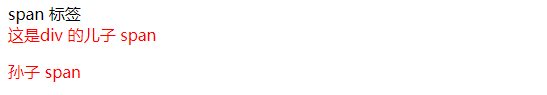
26.子代选择器 div>span{}

<!DOCTYPE html>
<html lang="en">
<head><meta charset="UTF-8"><meta name="viewport" content="width=device-width, initial-scale=1.0"><title>Document</title><style>/* div 的儿子 span 文字颜色是红色 */div > span {color: red;}</style>
</head>
<body><div><span>儿子 span</span><p><span>孙子 span</span></p></div>
</body>
</html>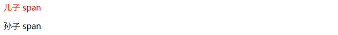
27.并集选择器 div,p,span{}
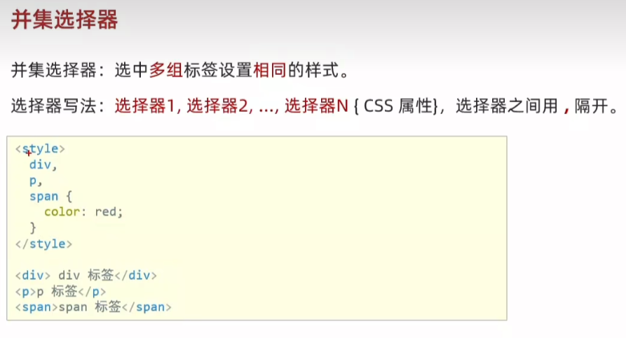
<!DOCTYPE html>
<html lang="en">
<head><meta charset="UTF-8"><meta name="viewport" content="width=device-width, initial-scale=1.0"><title>Document</title><style>/* div、p、span 文字颜色是红色 */div,p,span {color: red;}</style>
</head>
<body><div>div 标签</div><p>p 标签</p><span>span 标签</span>
</body>
</html>
28.交集选择器-了解 p.box{}
<!DOCTYPE html>
<html lang="en">
<head><meta charset="UTF-8"><meta name="viewport" content="width=device-width, initial-scale=1.0"><title>Document</title><style>/* 第一个 p 标签文字颜色是红色 *//* 既又的关系:既是 p 标签,又是有 box 类 */p.box {color: red;}</style>
</head>
<body><p class="box">p 标签,使用了类选择器</p><p>p 标签</p><div class="box">div 标签,使用了类选择器</div>
</body>
</html>
29.伪类选择器 a:hover{}
<!DOCTYPE html>
<html lang="en">
<head><meta charset="UTF-8"><meta name="viewport" content="width=device-width, initial-scale=1.0"><title>Document</title><style>/* 任何标签都可以设置鼠标悬停的状态 */a:hover {color: red;}.box:hover {color: green;}</style>
</head>
<body><a href="#">a 标签,超链接</a><div class="box">div 标签</div>
</body>
</html>
30.伪类-超链接(拓展)
<!DOCTYPE html>
<html lang="en">
<head><meta charset="UTF-8"><meta name="viewport" content="width=device-width, initial-scale=1.0"><title>Document</title><style>/* 任何标签都可以设置鼠标悬停的状态 *//* a:link {color: red;}a:visited {color: green;}a:hover {color: blue;}a:active {color: orange;} *//* 工作中,一个 a 标签选择器设置超链接的样式,hover状态特殊设置 */a {color: red;}a:hover {color: green;}</style>
</head>
<body><a href="#">a 标签,测试伪类</a>
</body>
</html>
31.CSS特性
32.继承性
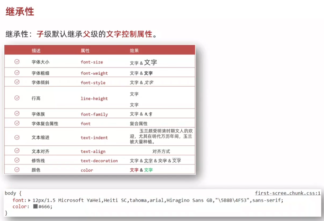
将文字属性写给父标签 body 子标签继承文字属性
<!DOCTYPE html>
<html lang="en">
<head><meta charset="UTF-8"><meta name="viewport" content="width=device-width, initial-scale=1.0"><title>Document</title><style>body {font-size: 30px;color: red;font-weight: 700;}</style>
</head>
<body><div>div 标签</div><p>p 标签</p><span>span 标签</span>
</body>
</html>
如果标签自己有样式,则生效自己的样式,不继承
a标签有自己的颜色,h1标签有自己的字号
<!DOCTYPE html>
<html lang="en">
<head><meta charset="UTF-8"><meta name="viewport" content="width=device-width, initial-scale=1.0"><title>Document</title><style>body {font-size: 30px;color: red;font-weight: 700;}</style>
</head>
<body><div>div 标签</div><p>p 标签</p><span>span 标签</span><!-- 如果标签自己有样式,则生效自己的样式,不继承 --><a href="#">a 标签</a><h1>h1 标签</h1>
</body>
</html>
33.层叠性
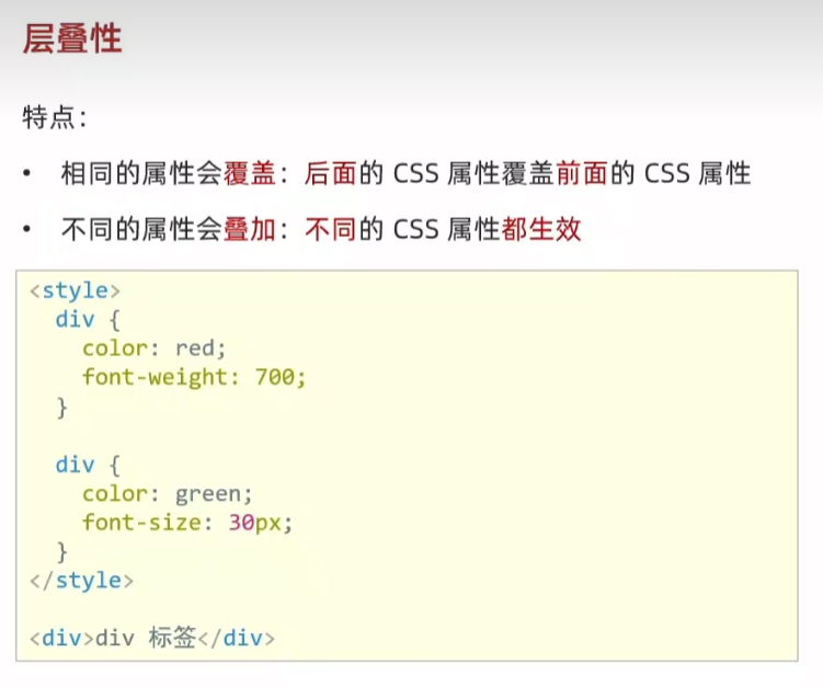
<!DOCTYPE html>
<html lang="en">
<head><meta charset="UTF-8"><meta name="viewport" content="width=device-width, initial-scale=1.0"><title>Document</title><style>/* 覆盖:叠加 */div {color: red;font-weight: 700;}div{color: green;font-size: 30px;}</style>
</head>
<body><div>div 标签</div>
</body>
</html>
34.优先级
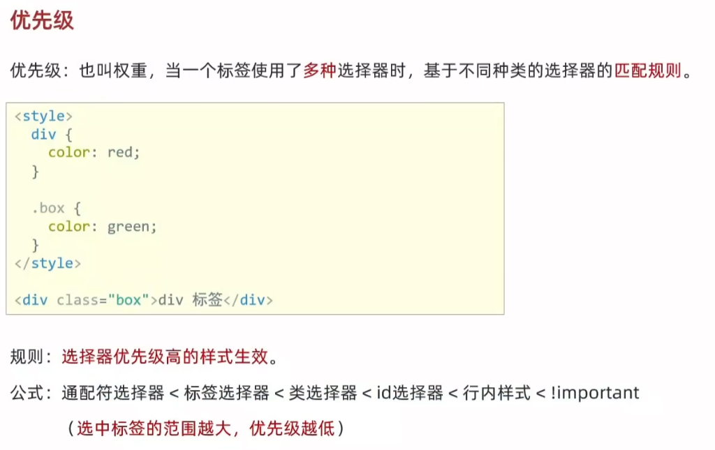
<!DOCTYPE html>
<html lang="en">
<head><meta charset="UTF-8"><meta name="viewport" content="width=device-width, initial-scale=1.0"><title>Document</title><style>/* !important 提权功能,提高权重/优先级到 最高 */* {color: red !important;}div {color: green;}.box {color: blue;}#test {color: orange;}</style>
</head>
<body><div class="box" id="test" style="color: purple;">div 标签</div>
</body>
</html>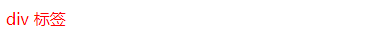
35.优先级-叠加计算规则
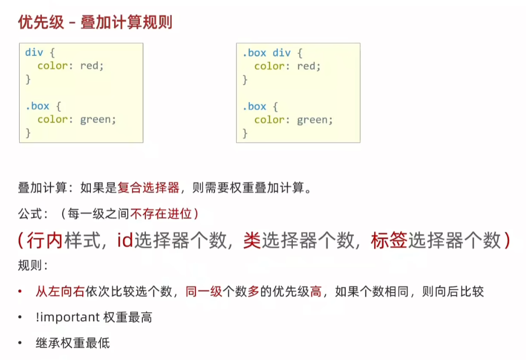
<!DOCTYPE html>
<html lang="en">
<head><meta charset="UTF-8"><meta name="viewport" content="width=device-width, initial-scale=1.0"><title>Document</title><style>/* (行内,id,类,标签) *//* (0,0,2,1) */.c1 .c2 div {color: blue;}/* (0,1,0,1) */div #box3 {color: green;}/* (0,1,1,0) */ #box1 .c3 {color: orange;}</style>
</head>
<body><div id="box1" class="c1"><div id="box2" class="c2"><div id="box3" class="c3">这行文本是什么颜色的?</div></div></div>
</body>
</html>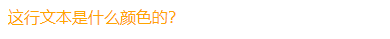
<!DOCTYPE html>
<html lang="en">
<head><meta charset="UTF-8"><meta name="viewport" content="width=device-width, initial-scale=1.0"><title>Document</title><style>/* (行内,id,类,标签) *//* (0,2,0,0) */#father #son {color: blue;}/* (0,1,1,1) */#father p.c2 {color: black;}/* (0,0,2,2) */div.c1 p.c2 {color: red;}/* 继承,优先级最低 */#father {color: green !important;}/* 继承,优先级最低 */div#father.c1 {color: yellow;}</style>
</head>
<body><div id="father" class="c1"><p id="son" class="c2">这行文本是什么颜色的?</p></div>
</body>
</html>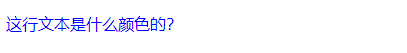
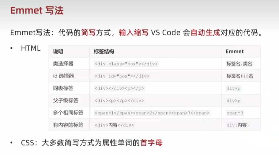
35.Emmet写法
<!DOCTYPE html>
<html lang="en">
<head><meta charset="UTF-8"><meta name="viewport" content="width=device-width, initial-scale=1.0"><title>Document</title><style>div {width: 500px;height: 200px;background-color: #fff;}</style>
</head>
<body><div></div><p class="box"></p><div class="box"></div><p id="box"></p><div></div><p></p><div><p></p></div><span></span><span></span><span></span><div>111</div>
</body>
</html>
36.背景属性
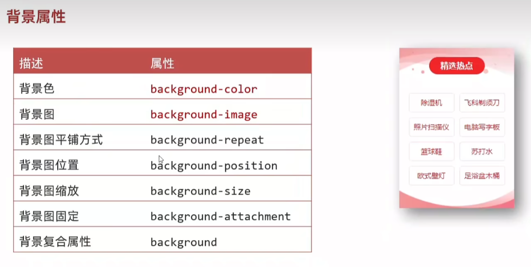
37.背景图 background-image(bgi)
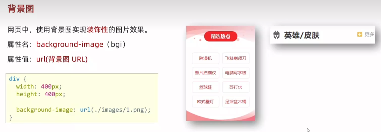
<!DOCTYPE html>
<html lang="en">
<head><meta charset="UTF-8"><meta name="viewport" content="width=device-width, initial-scale=1.0"><title>Document</title><style>/* 盒子是 400 * 400 */div {width: 400px;height: 400px;/* 背景图默认是平铺(复制)的效果 */background-image: url(1.png);}</style>
</head>
<body><div>div 标签</div>
</body>
</html>
38.背景图平铺方式 background-repeat(bgr)
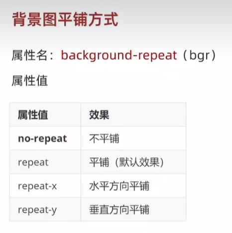
<!DOCTYPE html>
<html lang="en">
<head><meta charset="UTF-8"><meta name="viewport" content="width=device-width, initial-scale=1.0"><title>Document</title><style>div {width: 400px;height: 400px;background-color: pink;background-image: url(1.png);/* 不平铺:盒子的左上角显示一张背景图 *//* background-repeat: no-repeat; *//* background-repeat: repeat; *//* background-repeat: repeat-x; */background-repeat: repeat-y;}</style>
</head>
<body><div>div 标签</div>
</body>
</html>


no-repeat 、repeat(默认)、repeat-x、repeat-y
38.背景图位置 background-position(bgp)
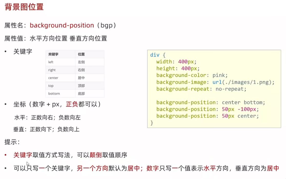
<!DOCTYPE html>
<html lang="en">
<head><meta charset="UTF-8"><meta name="viewport" content="width=device-width, initial-scale=1.0"><title>Document</title><style>div {width: 400px;height: 400px;background-color: pink;background-image: url(1.png);background-repeat: no-repeat;/* 左上角 *//* background-position: 0 0; *//* background-position: left top; *//* 水平:正数向右,负数向左 *//* background-position: 50px 0; *//* background-position: -50px 0; *//*  垂直:正数向下,负数向上 *//* background-position: 0 100px;background-position: 0 -100; *//* background-position: center center; *//* 垂直方向居中 *//* background-position: left; *//* 水平方向居中 */background-position: top;}</style>
</head>
<body><div>div 标签</div>
</body>
</html>


bgp(0,0) 、bgp(50px,0)、bgp(-50px,0)、bgp(center,center)
39.背景图缩放 background-size(bgz)
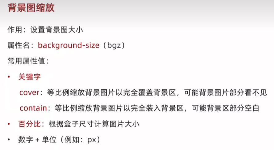
<!DOCTYPE html>
<html lang="en">
<head><meta charset="UTF-8"><meta name="viewport" content="width=device-width, initial-scale=1.0"><title>Document</title><style>div {width: 500px;height: 300px;background-color: pink;background-image: url(1.png);background-repeat: no-repeat;/* contains 如果图的宽高跟盒子尺寸相等停止缩放,可能导致盒子有漏白 *//* background-size: contain; *//* cover:图片完全覆盖盒子,可能导致图片显示不全 *//* 如果盒子和图片比例相同,contain和cover效果一样 *//* background-size: cover; *//* 100% 图片的宽度跟盒子的宽度一样,图片的高度按照图片比例等比缩放 */background-size: 100%;}</style>
</head>
<body><div>div 标签</div>
</body>
</html>

contains、cover
39.背景图固定 background-attachment(bga)
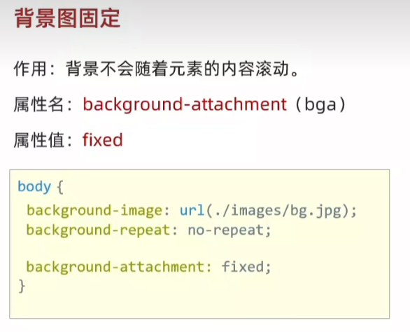
<!DOCTYPE html>
<html lang="en">
<head><meta charset="UTF-8"><meta name="viewport" content="width=device-width, initial-scale=1.0"><title>Document</title><style>body {background-image: url(bg.jpg);background-repeat: no-repeat;background-position: center top;background-attachment: fixed;}</style>
</head>
<body><p>测试文字,撑开body,让浏览器有滚动条</p><p>测试文字,撑开body,让浏览器有滚动条</p><p>测试文字,撑开body,让浏览器有滚动条</p><p>测试文字,撑开body,让浏览器有滚动条</p><p>测试文字,撑开body,让浏览器有滚动条</p><p>测试文字,撑开body,让浏览器有滚动条</p><p>测试文字,撑开body,让浏览器有滚动条</p><p>测试文字,撑开body,让浏览器有滚动条</p><p>测试文字,撑开body,让浏览器有滚动条</p><p>测试文字,撑开body,让浏览器有滚动条</p><p>测试文字,撑开body,让浏览器有滚动条</p><p>测试文字,撑开body,让浏览器有滚动条</p><p>测试文字,撑开body,让浏览器有滚动条</p><p>测试文字,撑开body,让浏览器有滚动条</p><p>测试文字,撑开body,让浏览器有滚动条</p><p>测试文字,撑开body,让浏览器有滚动条</p><p>测试文字,撑开body,让浏览器有滚动条</p><p>测试文字,撑开body,让浏览器有滚动条</p><p>测试文字,撑开body,让浏览器有滚动条</p><p>测试文字,撑开body,让浏览器有滚动条</p><p>测试文字,撑开body,让浏览器有滚动条</p><p>测试文字,撑开body,让浏览器有滚动条</p><p>测试文字,撑开body,让浏览器有滚动条</p><p>测试文字,撑开body,让浏览器有滚动条</p><p>测试文字,撑开body,让浏览器有滚动条</p><p>测试文字,撑开body,让浏览器有滚动条</p><p>测试文字,撑开body,让浏览器有滚动条</p><p>测试文字,撑开body,让浏览器有滚动条</p><p>测试文字,撑开body,让浏览器有滚动条</p><p>测试文字,撑开body,让浏览器有滚动条</p><p>测试文字,撑开body,让浏览器有滚动条</p><p>测试文字,撑开body,让浏览器有滚动条</p><p>测试文字,撑开body,让浏览器有滚动条</p><p>测试文字,撑开body,让浏览器有滚动条</p><p>测试文字,撑开body,让浏览器有滚动条</p><p>测试文字,撑开body,让浏览器有滚动条</p><p>测试文字,撑开body,让浏览器有滚动条</p><p>测试文字,撑开body,让浏览器有滚动条</p><p>测试文字,撑开body,让浏览器有滚动条</p><p>测试文字,撑开body,让浏览器有滚动条</p><p>测试文字,撑开body,让浏览器有滚动条</p><p>测试文字,撑开body,让浏览器有滚动条</p><p>测试文字,撑开body,让浏览器有滚动条</p><p>测试文字,撑开body,让浏览器有滚动条</p><p>测试文字,撑开body,让浏览器有滚动条</p><p>测试文字,撑开body,让浏览器有滚动条</p><p>测试文字,撑开body,让浏览器有滚动条</p><p>测试文字,撑开body,让浏览器有滚动条</p><p>测试文字,撑开body,让浏览器有滚动条</p><p>测试文字,撑开body,让浏览器有滚动条</p>
</body>
</html>
40.背景复合属性
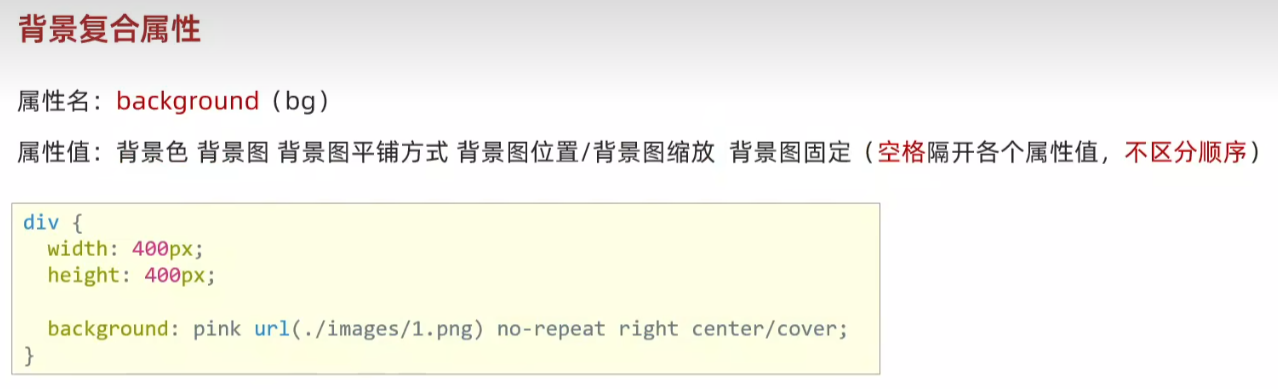
<!DOCTYPE html>
<html lang="en">
<head><meta charset="UTF-8"><meta name="viewport" content="width=device-width, initial-scale=1.0"><title>Document</title><style>div {width: 400px;height: 400px;background: pink url(1.png) no-repeat center/cover;}</style>
</head>
<body><div>div 标签</div>
</body>
</html>
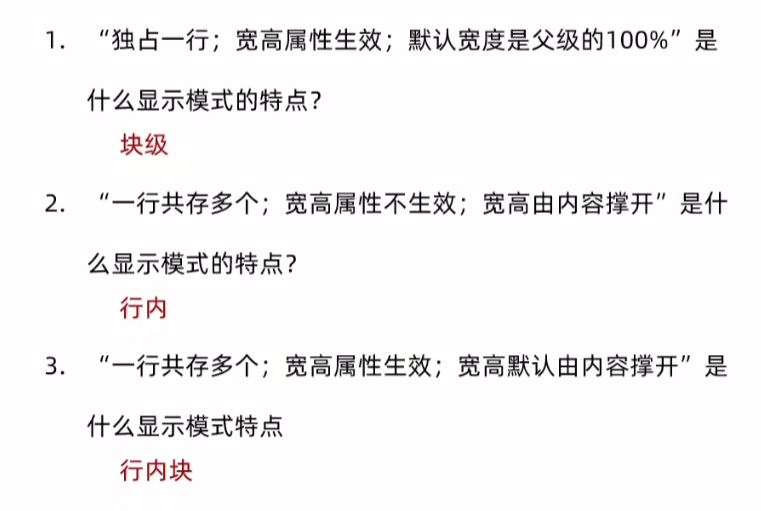
41.显示模式 display
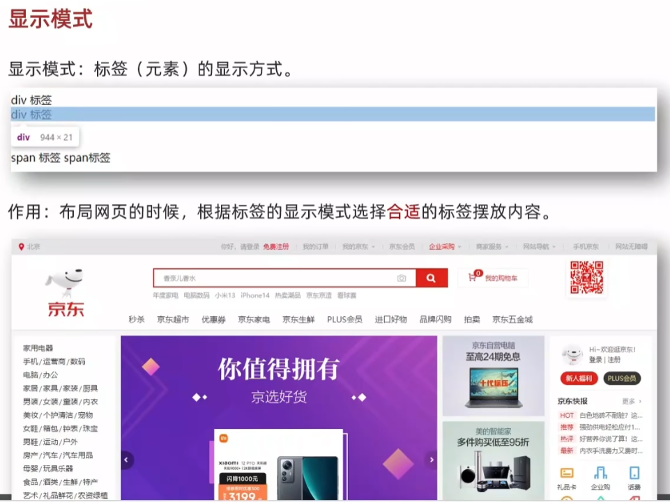
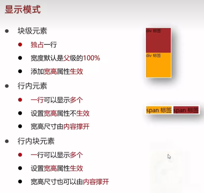
<!DOCTYPE html>
<html lang="en">
<head><meta charset="UTF-8"><meta name="viewport" content="width=device-width, initial-scale=1.0"><title>Document</title><style>/* 块级:独占一行:宽度默认是父级的100%:加宽高生效 */div {width: 100px;height: 100px;}.div1 {background-color: brown;}.div2 {background-color: orange;}/* 行内:一行共存多个:尺寸由内容撑开: 加宽高不生效  */.sapn1 {background-color: brown;}.sapn2 {background-color: orange;}/* 行内快:一行共存多个,默认尺寸由内容撑开,加宽高生效 */img {width: 100px;height: 100px;}</style>
</head>
<body><!-- 块元素 --><div class="div1">div 标签1</div><div class="div2">div 标签2</div><!-- 行内元素 --><span class="sapn1">span11111</span><span class="sapn2">span2</span><!-- 行内块元素 --><img src="1.png"><img src="1.png">
</body>
</html>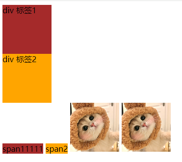
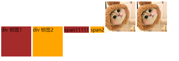
42.转换显示模式
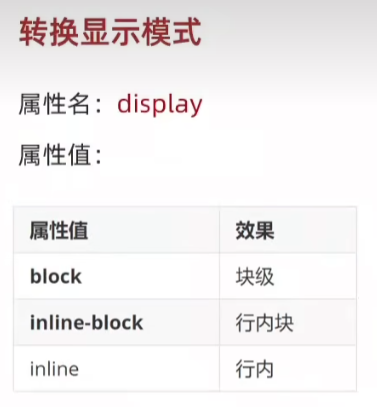
<!DOCTYPE html>
<html lang="en">
<head><meta charset="UTF-8"><meta name="viewport" content="width=device-width, initial-scale=1.0"><title>Document</title><style>/* 块级:独占一行:宽度默认是父级的100%:加宽高生效 */div {width: 100px;height: 100px;display: inline-block;}.div1 {background-color: brown;}.div2 {background-color: orange;}/* 行内:一行共存多个:尺寸由内容撑开: 加宽高不生效  */.sapn1 {background-color: brown;}.sapn2 {background-color: orange;}/* 行内快:一行共存多个,默认尺寸由内容撑开,加宽高生效 */img {width: 100px;height: 100px;}</style>
</head>
<body><!-- 块元素 --><div class="div1">div 标签1</div><div class="div2">div 标签2</div><!-- 行内元素 --><span class="sapn1">span11111</span><span class="sapn2">span2</span><!-- 行内块元素 --><img src="1.png"><img src="1.png">
</body>
</html>
div {width: 100px;height: 100px;display: inline-block;}
div {width: 100px;height: 100px;display: inline;}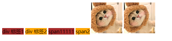
<!DOCTYPE html>
<html lang="en">
<head><meta charset="UTF-8"><meta name="viewport" content="width=device-width, initial-scale=1.0"><title>Document</title><style>/* 块级:独占一行:宽度默认是父级的100%:加宽高生效 */div {width: 100px;height: 100px;display: inline;}.div1 {background-color: brown;}.div2 {background-color: orange;}span {width: 200px;height: 200px;display: block;}/* 行内:一行共存多个:尺寸由内容撑开: 加宽高不生效  */.sapn1 {background-color: brown;}.sapn2 {background-color: orange;}/* 行内快:一行共存多个,默认尺寸由内容撑开,加宽高生效 */img {width: 100px;height: 100px;}</style>
</head>
<body><!-- 块元素 --><div class="div1">div 标签1</div><div class="div2">div 标签2</div><!-- 行内元素 --><span class="sapn1">span11111</span><span class="sapn2">span2</span><!-- 行内块元素 --><img src="1.png"><img src="1.png">
</body>
</html>
span {width: 200px;height: 200px;display: block;}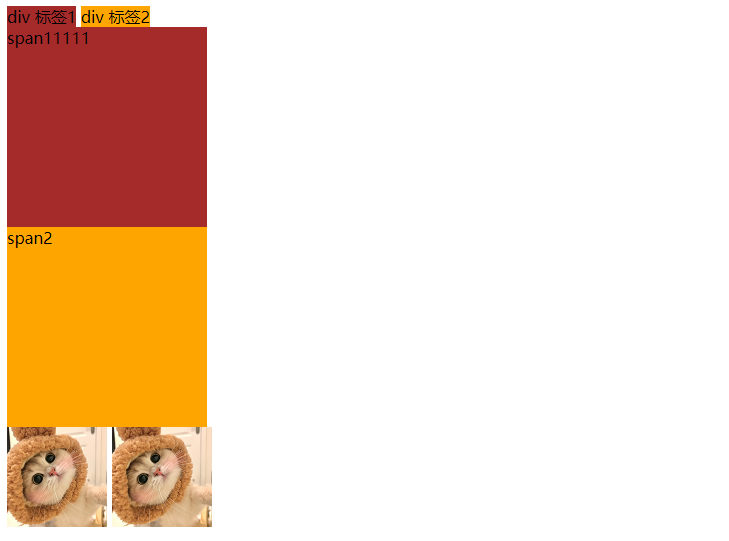
span {width: 200px;height: 200px;display: inline-block;}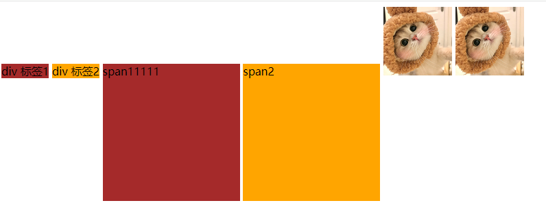
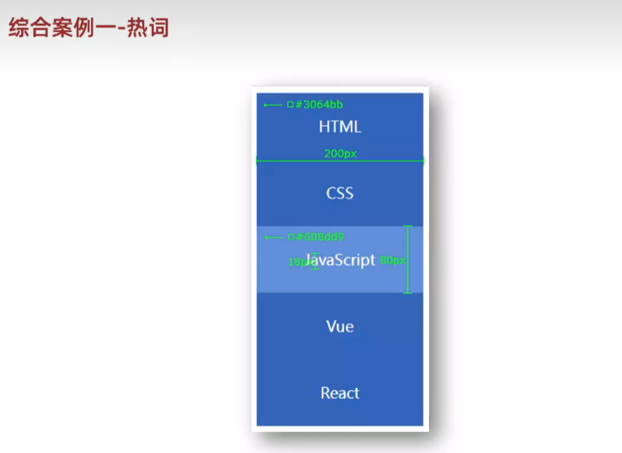
43.综合案例一-热词
<!DOCTYPE html>
<html lang="en">
<head><meta charset="UTF-8"><meta name="viewport" content="width=device-width, initial-scale=1.0"><title>Document</title><style>/* 默认效果 */div {width: 200px;height: 80px;background-color: #3064bb;text-align: center;line-height: 80px;}a {/* 去除下划线 */text-decoration: none;color: #fff;font-size: 18px;}/* 鼠标悬停效果 */div:hover {background-color: #608dd9;}</style>
</head>
<body><div><a href="#">HTML</a></div><div><a href="#">CSS</a></div><div><a href="#">JavaScript</a></div><div><a href="#">Vue</a></div><div><a href="#">React</a></div>
</body>
</html>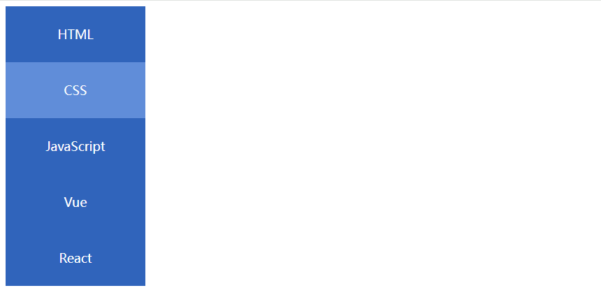
44.综合案例二-banner效果
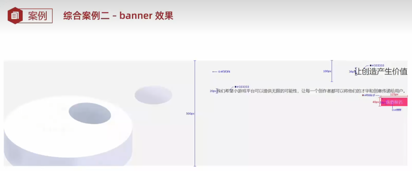
<!DOCTYPE html>
<html lang="en">
<head><meta charset="UTF-8"><meta name="viewport" content="width=device-width, initial-scale=1.0"><title>Document</title><style>.banner {/* 盒子 */height: 500px;background-color: #f3f3f4;/* 背景图 */background-image: url(bk.png);background-repeat: no-repeat;background-position: left bottom;color: #333;text-align: right;}.banner h1 {line-height: 100px;      font-weight: 400;font-size: 36px;}.banner p {line-height: 40px;font-size: 20px;}.banner a {display: inline-block;width: 125px;height: 40px;background-color: orange;line-height: 40px;font-size: 16px;text-decoration: none;text-align: center;color: #fff;}</style>
</head>
<body><div class="banner"><h1>让创造产生价值</h1><p>我们希望小游戏平台可以提供无限的可能性,让每一个创作者都可以将他们的才华和创意传递给用户。</p><a href="#">我要报名</a></div>
</body>
</html>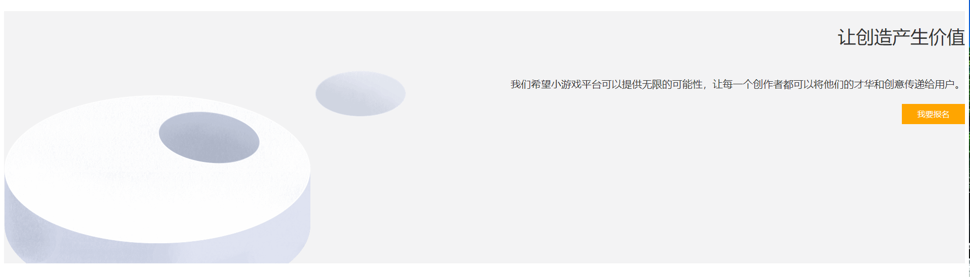
45.结构伪类选择器 a:first-child、last-child、nth-child(3)
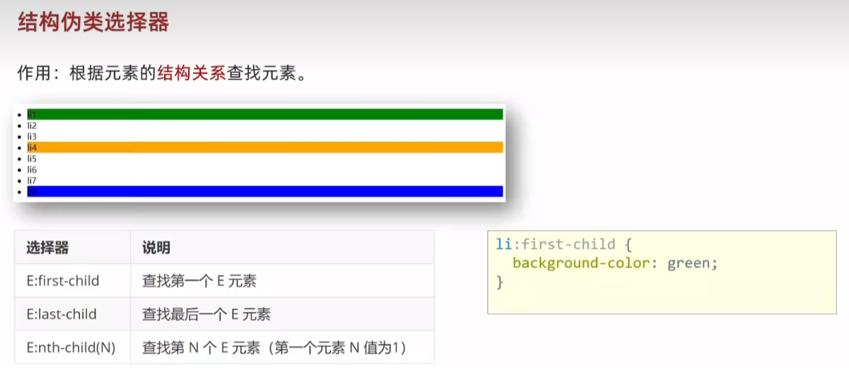
<!DOCTYPE html>
<html lang="en">
<head><meta charset="UTF-8"><meta name="viewport" content="width=device-width, initial-scale=1.0"><title>Document</title><style>li:first-child {background-color: green;}li:last-child {background-color: green;}li:nth-child(3) {background-color: green;}</style>
</head>
<body><ul><li>1</li><li>2</li><li>3</li><li>4</li><li>5</li><li>6</li><li>7</li><li>8</li></ul>
</body>
</html>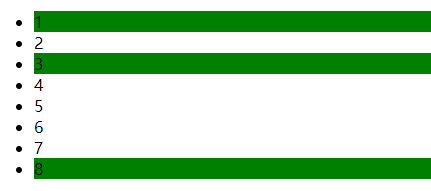
46. :nth-child(公式)
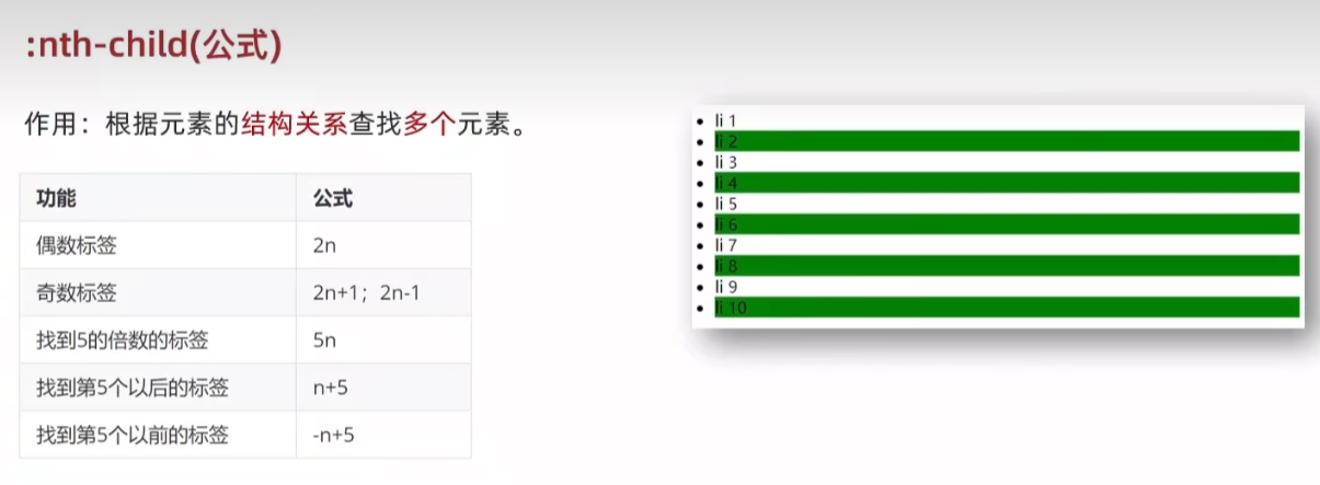
<!DOCTYPE html>
<html lang="en">
<head><meta charset="UTF-8"><meta name="viewport" content="width=device-width, initial-scale=1.0"><title>Document</title><style>/* li:nth-child(2n)  li:nth-child(2n+1)  li:nth-child(n+2)*/li:nth-child(-n+2) {background-color: green;}</style>
</head>
<body><ul><li>1</li><li>2</li><li>3</li><li>4</li><li>5</li><li>6</li><li>7</li><li>8</li><li>9</li><li>10</li></ul>
</body>
</html>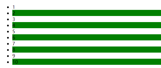
47.伪元素选择器
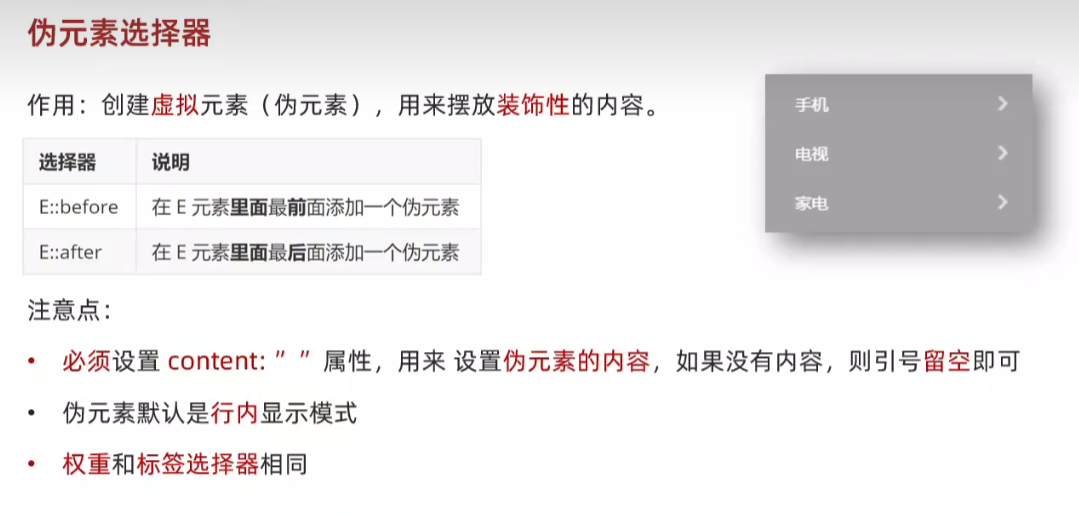
<!DOCTYPE html>
<html lang="en">
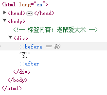
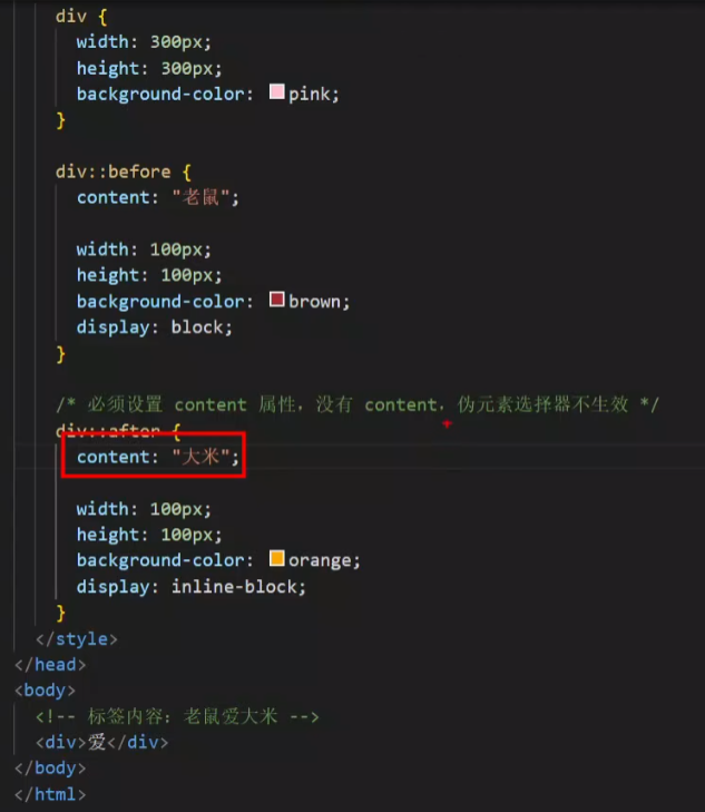
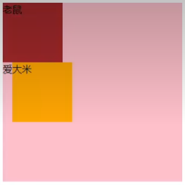
<head><meta charset="UTF-8"><meta name="viewport" content="width=device-width, initial-scale=1.0"><title>Document</title><style>div::before {content: '老鼠';}/* 必须设置 content 属性,没有 content,伪元素选择器不生效 */div::after {content: '大米';}</style>
</head>
<body><!-- 标签内容:老鼠爱大米 --><div>爱</div>
</body>
</html>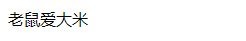
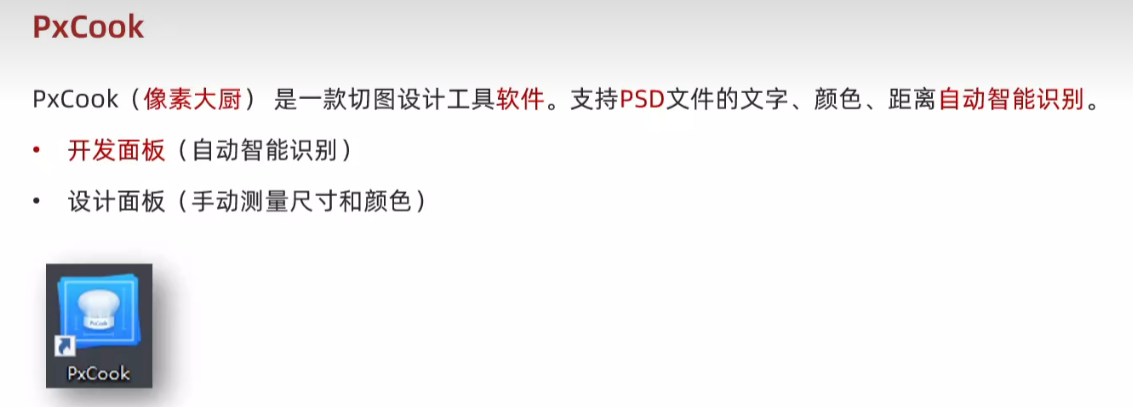
48.PxCook
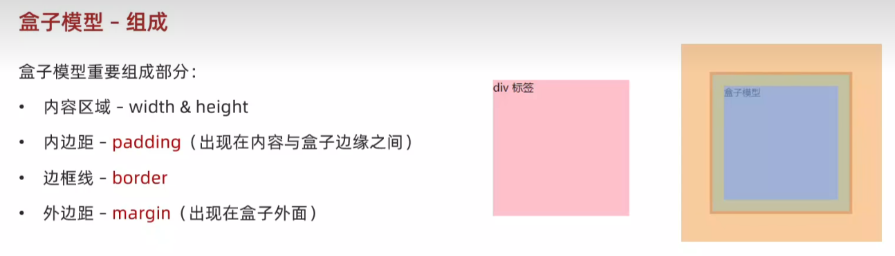
49.盒子模型 padding margin border(bd)
<!DOCTYPE html>
<html lang="en">
<head><meta charset="UTF-8"><meta name="viewport" content="width=device-width, initial-scale=1.0"><title>Document</title><style>div {width: 200px;height: 200px;background-color: pink;/* 内容与盒子边缘之间 */padding: 20px;border: 1px solid #000;/* 出现在盒子外面,拉开两个盒子之间的距离 */margin: 50px;}</style>
</head>
<body><div>div 标签</div>
</body>
</html>


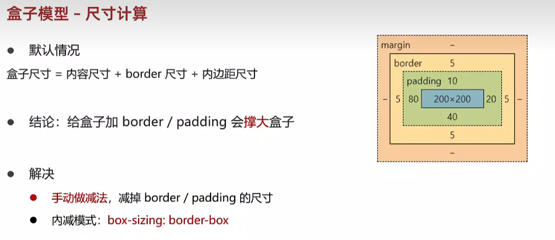
w200+h200 -> padding 20px -> bd (border) -> margin 50px

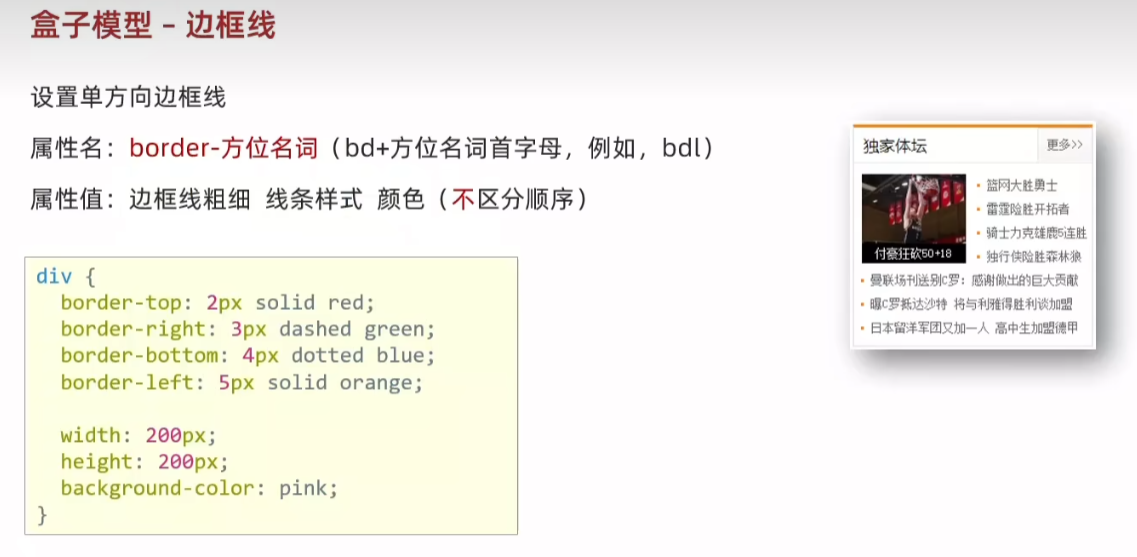
50.盒子模型-边框线 border(bd)
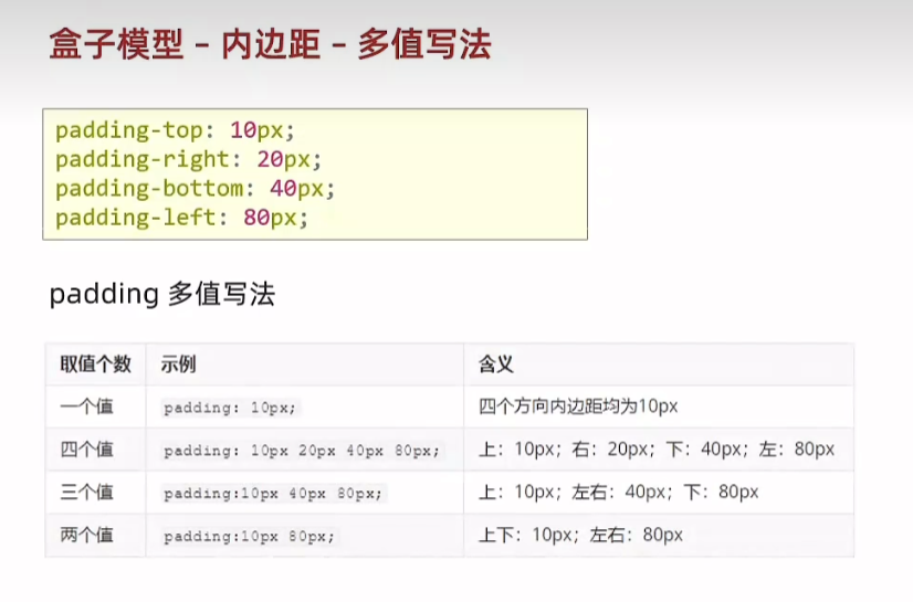
51.盒子模型 - 内边距 padding

52.盒子模型 - 尺寸计算 box-sizing:border-box
<!DOCTYPE html>
<html lang="en">
<head><meta charset="UTF-8"><meta name="viewport" content="width=device-width, initial-scale=1.0"><title>Document</title><style>div {width: 200px;height: 200px;background-color: pink;/* 内容与盒子边缘之间 */padding: 20px;border: 1px solid #000;/* 出现在盒子外面,拉开两个盒子之间的距离 */margin: 50px;/* 内减模式:不需要手动减法,加padding和border不会撑大盒子 */box-sizing: border-box;}</style>
</head>
<body><div>div 标签</div>
</body>
</html>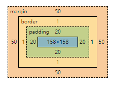
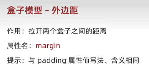
53.盒子模型 - 外边距 margin
54.版心居中 margin: 0 auto;
<!DOCTYPE html>
<html lang="en">
<head><meta charset="UTF-8"><meta name="viewport" content="width=device-width, initial-scale=1.0"><title>Document</title><style>div {width: 1000px;height: 200px;background-color: pink;/* 外边距不会撑大盒子 *//* 上下 0  左右居中 */margin: 0 auto;}</style>
</head>
<body><div>版心内容</div>
</body>
</html>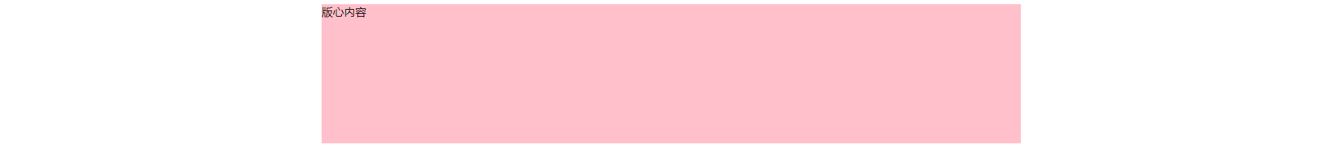
55.清除默认样式 去除列表符号li{list-style:none}
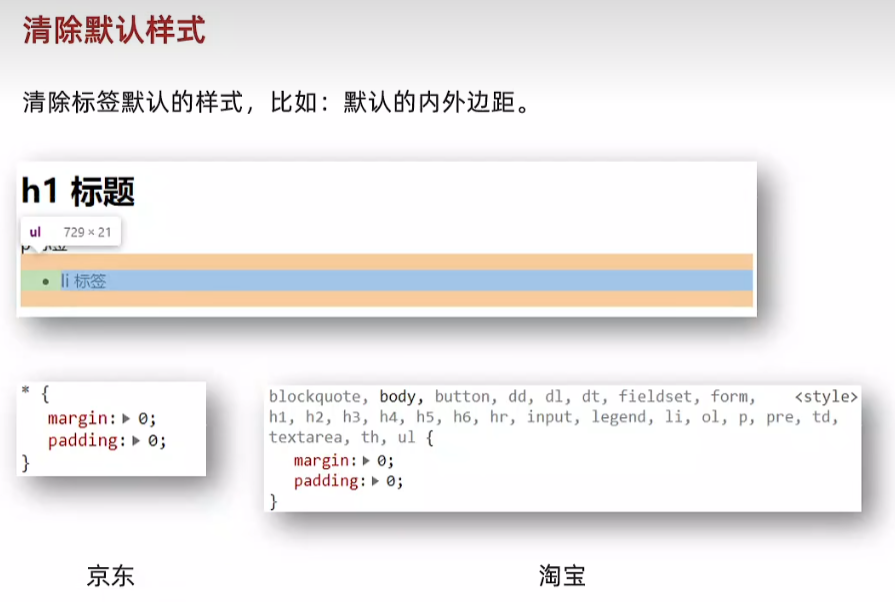
默认格式 橘色 外边距 绿色 内边距
 h1 有上下外边距
 p标签有默认上下外边距
 li有上下外边距和左内边距
  <style>* {margin:0;padding: 0;box-sizing: border-box;}/* 去掉列表的项目符号 */li {list-style: none}</style>
<body><h1>标题</h1><p>ppp</p><ul><li>li</li></ul>
</body>

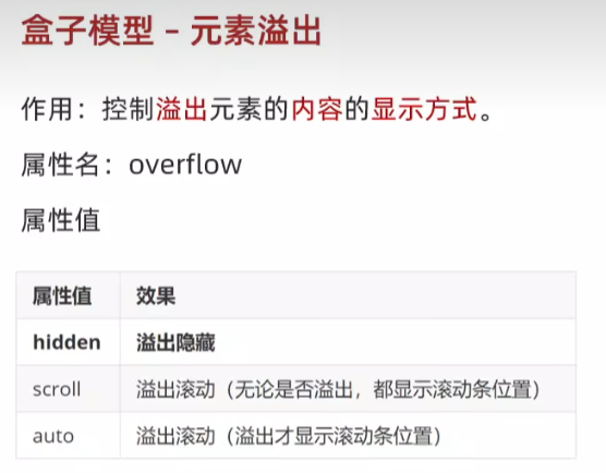
56.盒子模型-元素溢出 overflow:hidden
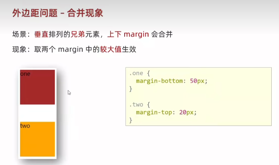
57.外边距问题 - 合并现象
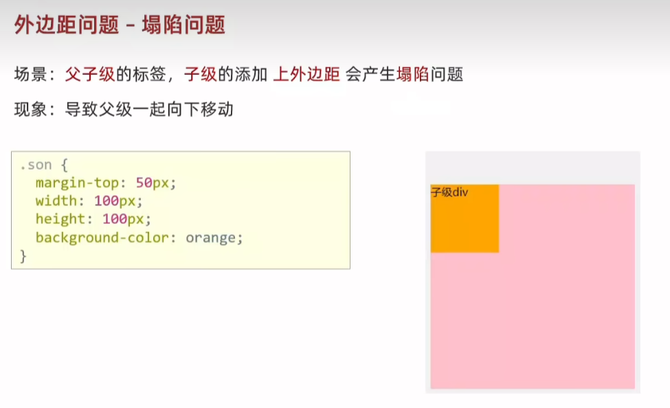
58.外边距问题 - 塌陷问题 取消子级margin设置父级padding
  <style>.father {width: 300px;height: 300px;background-color: pink;}.son {width: 100px;height: 100px;background-color: orange;}</style><body><div class="father"><div class="son">son</div></div>
</body>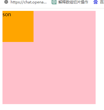
<style>.father {width: 300px;height: 300px;background-color: pink;}.son {width: 100px;height: 100px;background-color: orange;margin-top: 50px;}</style>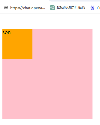
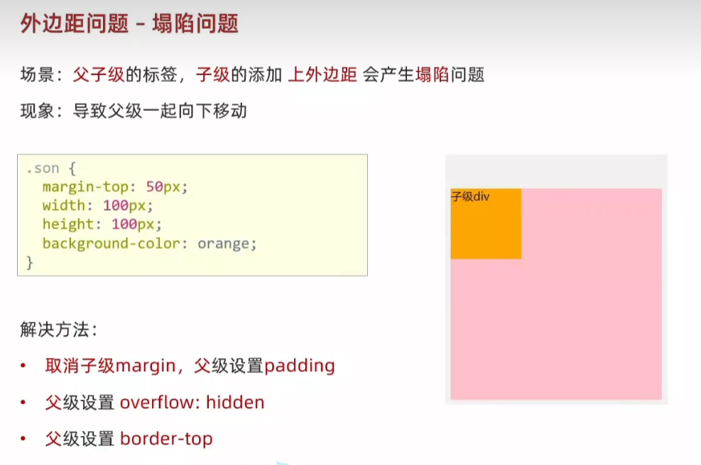
<style>.father {width: 300px;height: 300px;background-color: pink;padding-top: 50px;/* overflow: hidden; *//* border: 1px solid #000;; */}.son {width: 100px;height: 100px;background-color: orange;/* margin-top: 50px; */}</style>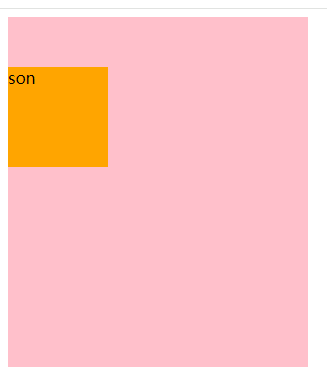
59.行内元素 - 内外边距问题 增加 line-height属性

60.盒子模型 - 圆角border-radius
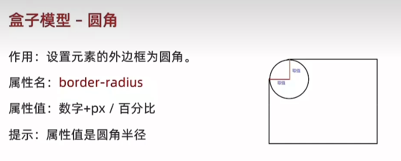
  <style>div {width: 200px;height: 200px;background-color: orange;margin: 50px auto;/* border-radius: 50%; */border-radius: 25%;}</style><body><div></div>
</body>

border-radius: 50% 25%;
  <style>div {width: 500px;height: 200px;background-color: orange;margin: 50px auto;border-radius: 100px;/* border-radius: 50%; *//* border-radius: 25%; */}</style><body><div></div>
</body>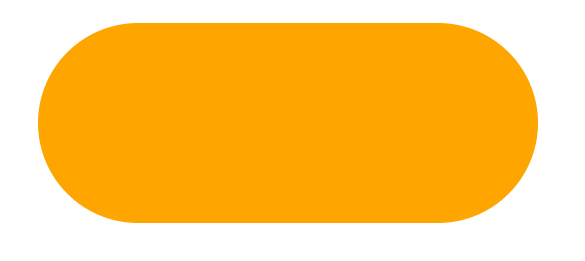
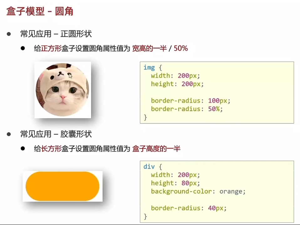
  <style>img {width: 200px;height: 200px;border-radius: 50%;}div {width: 200px;height: 80px;background-color: orange;border-radius: 40px;}</style><body><img src="1.png" alt=""><div></div>
</body>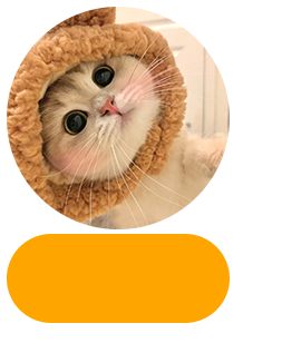
61.盒子模型 - 阴影(拓展)box-shadow
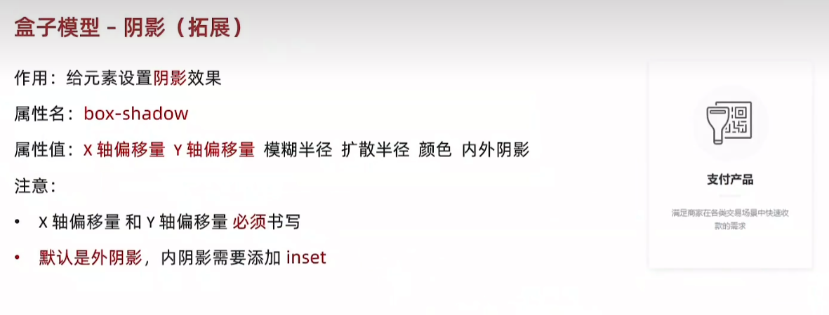
  <style>div {width: 200px;height: 80px;background-color: orange;margin: 50px auto;box-shadow: 2px 5px 10px 1px rgba(0, 0, 0, 0.5);}</style>
</head>
<body><div></div>
</body>
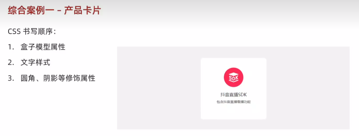
62.综合案例一 - 产品卡片
<body><div class="product"><img src="liveSDK.svg" alt=""><p class="title">抖音直播SDK</p><p class="desc">包含抖音直播看播功能</p></div>
</body>
<style>* {margin: 0;padding: 0;box-sizing: border-box;}body {background-color: #f1f1f1;}.product {margin: 50px auto;padding-top: 40px;width: 270px;height: 253px;/* 不写背景色会自动继承 */background-color: #fff;text-align: center;border-radius: 10px; }.product .title {margin-top: 20px;margin-bottom: 12px;font-size: 18px;color: #333;}.product .desc {font-size: 12px;color: #555;}</style>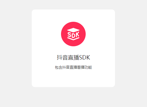
63.综合案例二 - 新闻列表

<body><!-- 新闻区域 包含 标题 + 内容 --><div class="news"><div class="hd"><a href="#">新闻</a></div><div class="bd"><ul><li><a href="#">点赞“新农人” 温暖的伸手</a></li><li><a href="#">在希望的田野上...</a></li><li><a href="#">“中国天眼”又有新发现 已在《自然》杂志发表</a></li><li><a href="#">急!这个领域,缺人!月薪4万元还不好招!啥情况?</a></li><li><a href="#">G9“带货”背后:亏损面持续扩大,竞争环境激烈</a></li>        <li><a href="#">多地力推二手房“带押过户”,有什么好处?</a></li>        </ul></div></div>
</body>
<style>* {margin: 0;padding: 0;box-sizing: border-box;}li {list-style: none;}a {text-decoration: none;}.news {margin: 50px auto;width: 360px;height: 200px;/* background-color: pink; */}.news .hd {height: 34px;background-color: #eee;border: 1px solid #dbdee1;border-left: 0;}.news .hd a {margin-top: -1px;display: inline-block;border-top: 3px solid #ff8400;border-right: 1px solid #dbdee1;width: 48px;height: 34px;background-color: #fff;text-align: center;line-height: 32px;font-size: 14px;color: #333;}.news .bd {padding: 5px;}.news .bd li {padding-left: 15px;background-image: url(square.png);background-repeat: no-repeat;background-position: left center;}.news .bd li a {padding-left: 20px;background-image: url(img.gif);background-repeat: no-repeat;background-position: left center;font-size: 12px;color: #666;line-height: 24px;}.news .bd li a:hover {color: orange;}</style>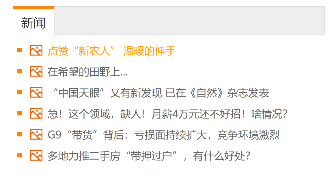
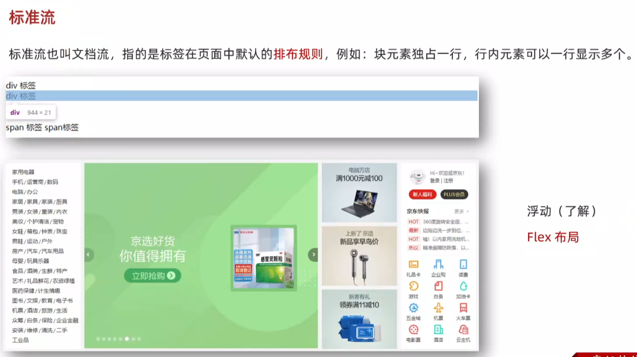
64.标准流
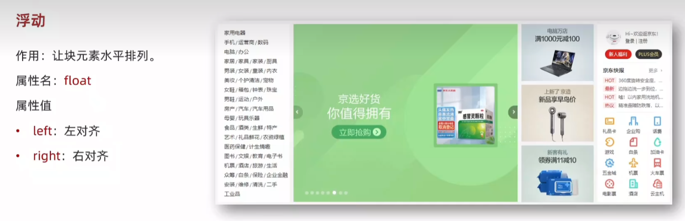
65.浮动
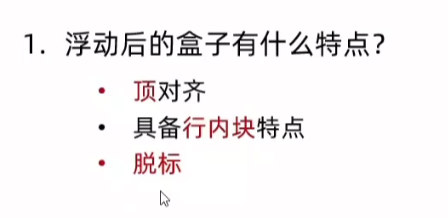
  <style>/* 特点:顶对齐,具备行内块显示模式特点 :浮动的盒子会脱标*/.one {width: 100px;height: 100px;background-color: brown;float: left;}.two {width: 200px;height: 200px;background-color: orange;/* float: left; *//* float: right; */}</style>
</head>
<body><div class="one">one</div><div class="two">two</div>
</body>


66.浮动 - 产品区域布局
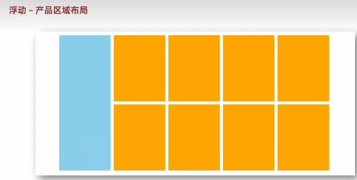
<body><!-- 版心:左右,右面:8个产品 -> 8 个 li --><div class="product"><div class="left"></div><div class="right"><ul><li></li><li></li><li></li><li></li><li></li><li></li><li></li><li></li></ul></div></div>
</body>
<style>* {margin: 0;padding: 0;box-sizing: border-box;}li {list-style: none;}.product {margin: 50px auto;width: 1226px;height: 628px;background-color: pink;}.product .left {float: left;width: 234px;height: 628px;background-color: skyblue; }.product .right {float: right;width: 978px;height: 628px;background-color: brown; }.product .right li {float: left;margin-right: 14px;margin-bottom: 14px;width: 234px;height: 300px;background-color: orange;}/* 第四个li和第八个li 去掉右侧的 margin */.product .right li:nth-child(4n){margin-right:0;}/* 细节:如果父级宽度不够,浮动的盒子会掉下来 */</style> 
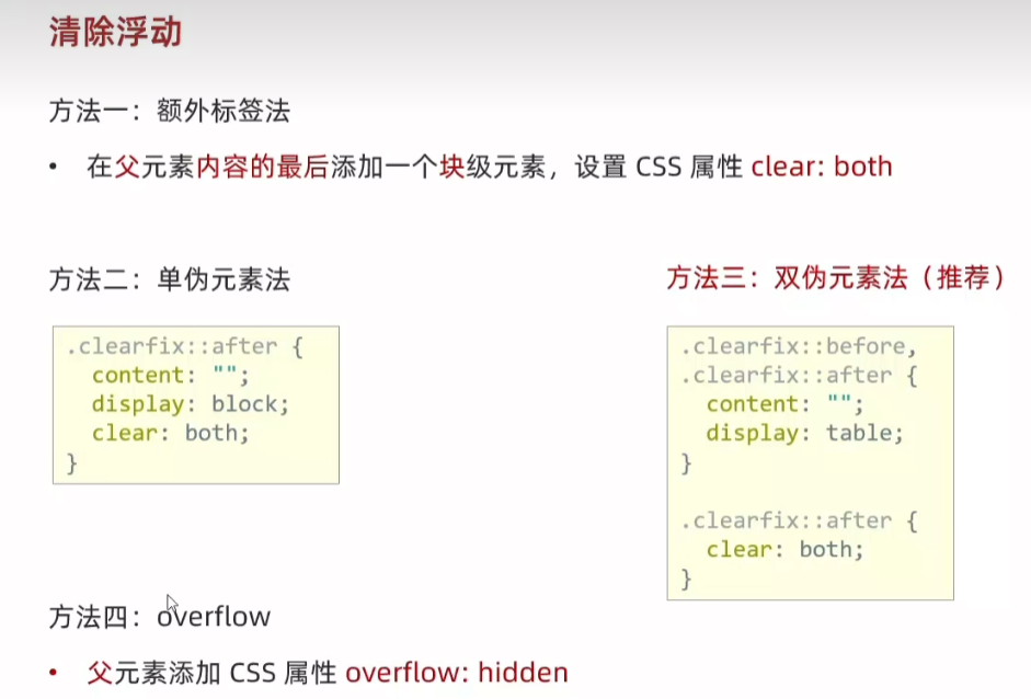
67.清除浮动
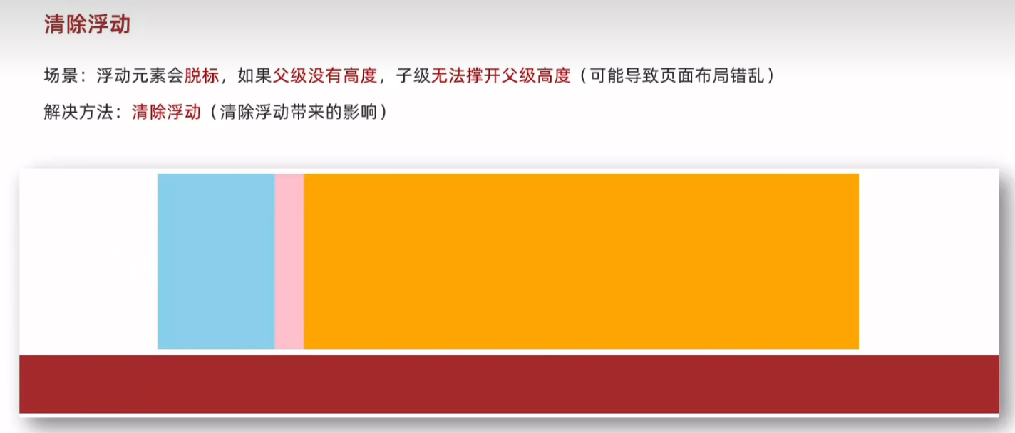
<body><div class="top clearfix"><div class="left"></div><div class="right"></div><!-- <div class="clearfix"></div> --></div><div class="bottom"></div>
</body>
<style>.top {margin: 10px auto;width: 1200px;/* height: 300px; */background-color: pink;overflow: hidden;}.left {float: left;width: 200px;height: 300px;background-color: skyblue;}.right {float: right;width: 950px;height: 300px;background-color: orange;}.bottom {height: 100px;background-color: brown;}.clearfix {clear: both;}/* 单伪元素法.clearfix::after {content: "";display: block;clear: both;} *//* before 解决外边距塌陷问题 *//* 双伪元素法 *//* .clearfix::before,.clearfix::after {content: "";display: table;} *//* after 清除浮动 *//* .clearfix::after {clear:both;} */</style> 
68.浮动-总结
69.Flex 布局
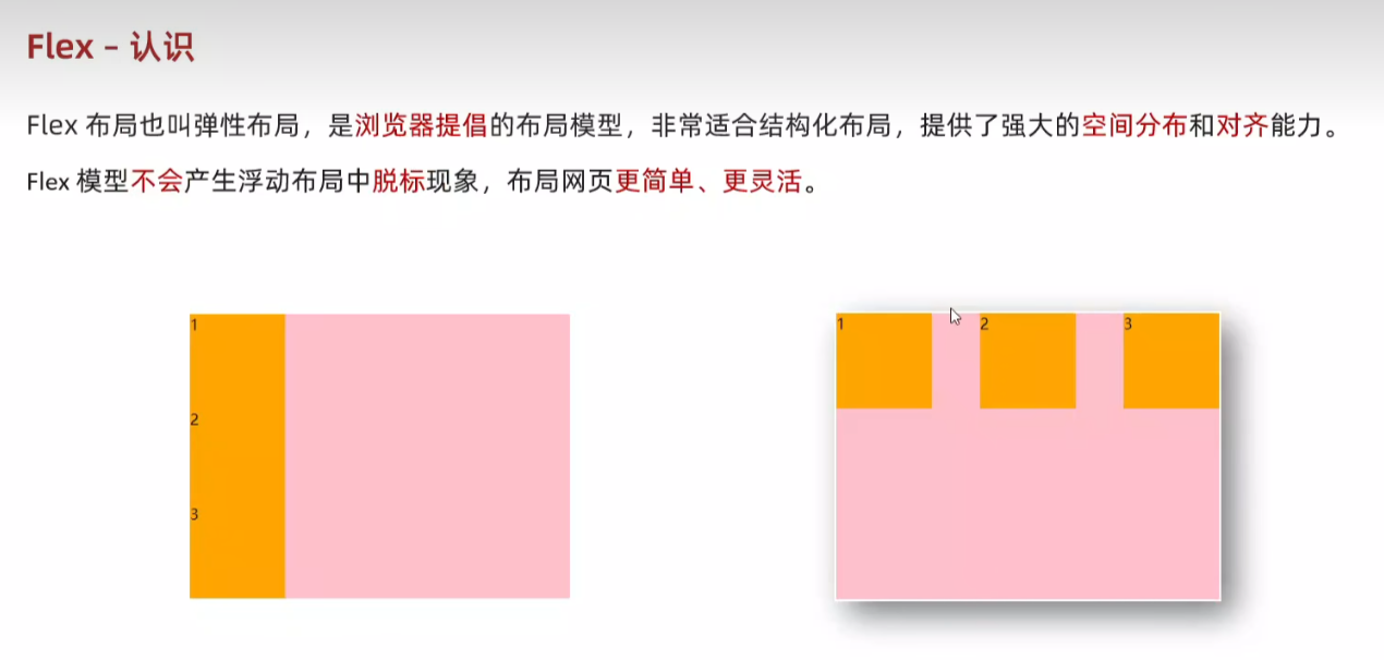
<body><div class="box"><div>1</div><div>2</div><div>3</div></div>
</body>
<style>.box {height: 300px;border: 1px solid #000;}.box div {width: 200px;height: 100px;background-color: pink;}</style> 
<style>.box {display: flex;justify-content: space-between;height: 300px;border: 1px solid #000;}.box div {width: 200px;height: 100px;background-color: pink;}</style> 
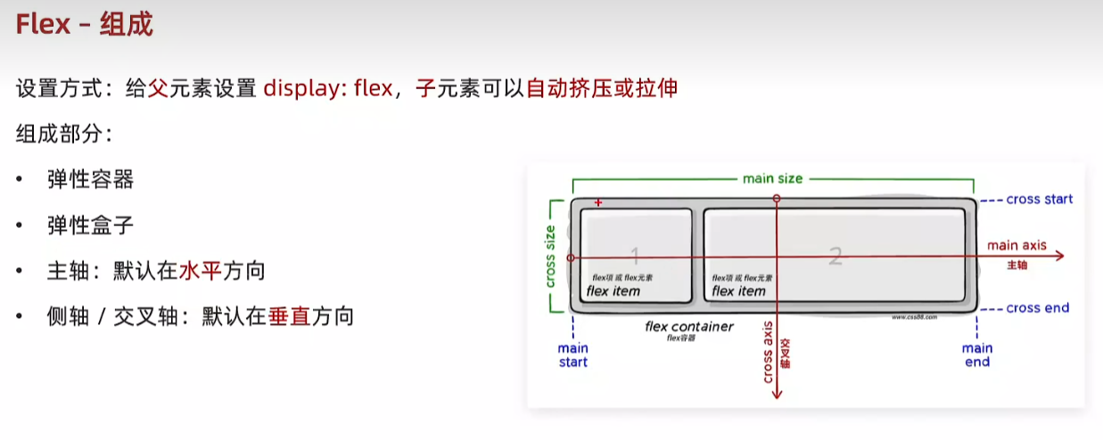
70.Flex-组成
71.Flex 布局
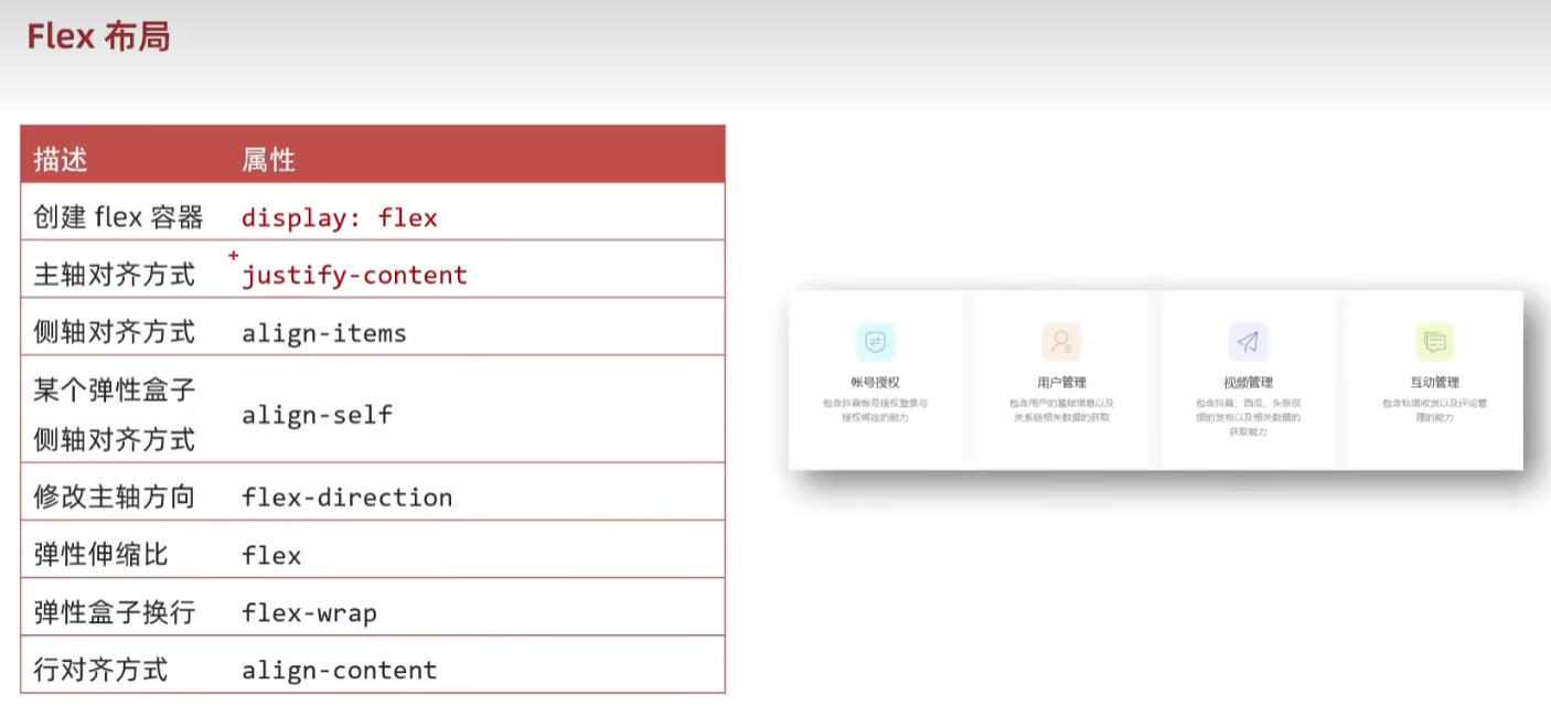
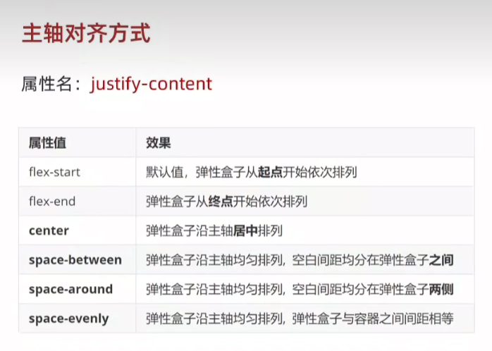
72.主轴对齐方式 justify-content
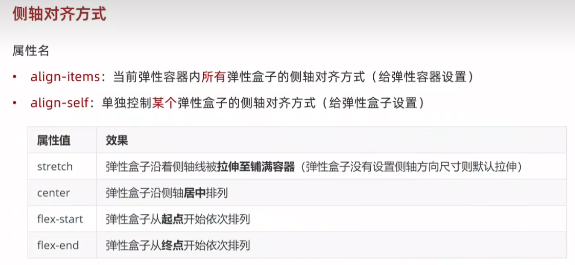
73. 侧轴对齐方式 align-items align-self
  <style>.box {display: flex;align-items: center;height: 300px;border: 1px solid #000;}.box div {width: 200px;height: 100px;background-color: pink;}.box div:nth-child(2){align-self: flex-end;}</style>  <body><div class="box"><div>1</div><div>2</div><div>3</div></div>
</body>
74.修改主轴方向flex-direction
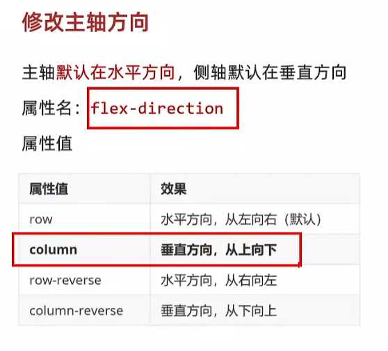
<body><div class="box"><img src="1.png" alt=""><span>媒体</span></div>
</body>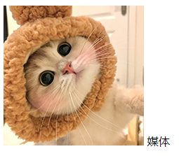
<style>.box {display: flex;/* 修改主轴方向 垂直方向:侧轴自动变换到水平方向 */flex-direction: column;/* 主轴在垂直,视觉效果:垂直居中 */justify-content: center;/* 侧轴在水平,视觉效果:水平居中 */align-items: center;width: 250px;height: 250px;/* background-color: pink; */border: 1px solid #000; }img {width: 200px;height: 200px;}</style> 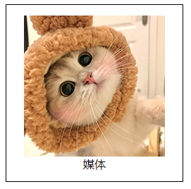
75.弹性伸缩比 flex
<body><div class="box"><div>1</div><div>2</div><div>3</div></div> <style>.box {height: 300px;border: 1px solid #000;}.box div {height: 100px;background-color: pink;}.box div:nth-child(1){width: 200px;}</style> 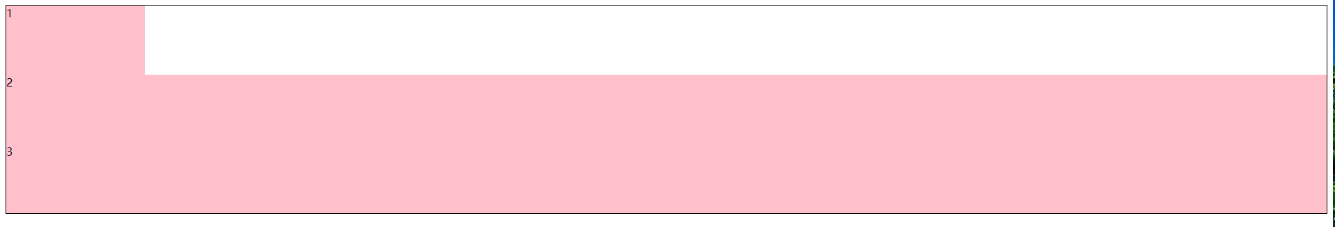
.box {display: flex;height: 300px;border: 1px solid #000;}
<style>.box {display: flex;height: 300px;border: 1px solid #000;}.box div {height: 100px;background-color: pink;}.box div:nth-child(1){width: 200px;}.box div:nth-child(2){flex: 1;}</style> 
盒子2,3按照1:2。
.box div:nth-child(2){flex: 1;}.box div:nth-child(3){flex: 2;}
主轴水平,控制盒子的宽。
主轴垂直,控制盒子的高。
<style>.box {display: flex;flex-direction: column;height: 300px;border: 1px solid #000;}.box div {height: 100px;background-color: pink;}.box div:nth-child(1){width: 200px;}.box div:nth-child(2){flex: 1;}.box div:nth-child(3){flex: 2;}</style> 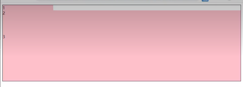
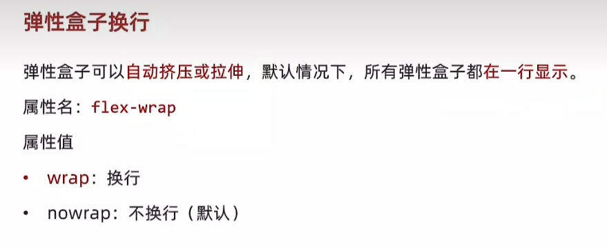
79.弹性盒子换行 flex-wrap
<body><div class="box"><div>1</div><div>2</div><div>3</div><div>4</div><div>5</div><div>6</div><div>7</div><div>8</div><div>9</div><div>10</div><div>11</div><div>12</div></div>
</body>
<style>.box {display: flex;flex-wrap: wrap;height: 300px;border: 1px solid #000;}.box div {width: 200px;height: 100px;background-color: pink;}</style> flex-wrap 默认 nowrap 不换行
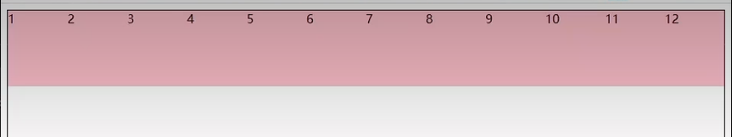


添加 justify-content: space-between
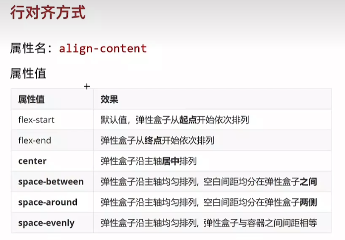
80.行对齐方式 align-content
<body><div class="box"><div>1</div><div>2</div><div>3</div><div>4</div><div>5</div><div>6</div><div>7</div><div>8</div></div>
</body>
<style>.box {display: flex;flex-wrap: wrap;justify-content: space-between;/* 调整行对齐方式 *//* align-content: flex-start; */width: 900px;height: 400px;border: 1px solid #000;}.box div {width: 200px;height: 100px;background-color: pink;}</style> 


null align-content: flex-start flex-end center


space-between space-around space-evenly
81.综合案例 - 抖音解决方案
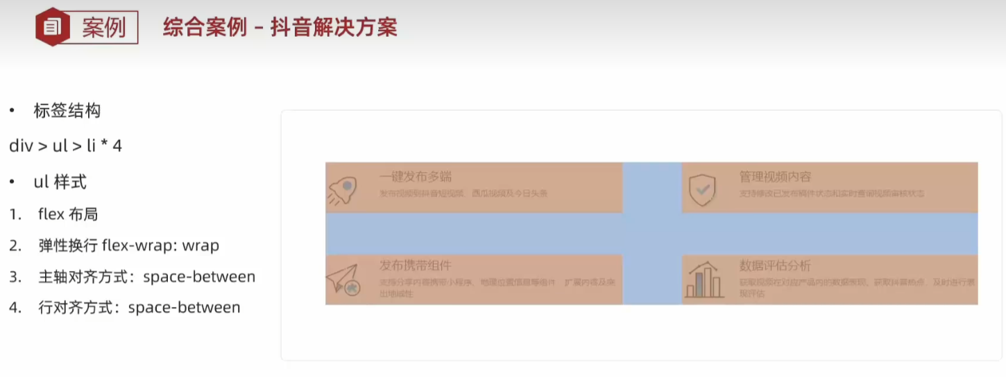
<body><div class="box"><ul><li><div class="left"><img src="1.svg" alt=""></div><div class="right"><h3>一键发布多端</h3><p>发布视频到抖音短视频、西瓜视频及今日头条</p></div></li><li><div class="left"><img src="2.svg" alt=""></div><div class="right"><h3>一键发布多端</h3><p>发布视频到抖音短视频、西瓜视频及今日头条</p></div></li><li><div class="left"><img src="3.svg" alt=""></div><div class="right"><h3>一键发布多端</h3><p>发布视频到抖音短视频、西瓜视频及今日头条</p></div></li><li><div class="left"><img src="4.svg" alt=""></div><div class="right"><h3>一键发布多端</h3><p>发布视频到抖音短视频、西瓜视频及今日头条</p></div></li></ul></div>
</body>
<style>/* 清除默认样式 */* {margin: 0;padding: 0;box-sizing: border-box;}li {list-style: none;}.box {margin: 50px auto;width: 1200px;height: 418px;border: 1px solid #ddd;border-radius: 10px;}.box ul{ display: flex;flex-wrap: wrap;justify-content: space-between;align-content: space-between;padding: 90px 40px 90px 60px;height: 418px;}.box li {display: flex;align-items: center;width: 500px;height: 88px;}</style> 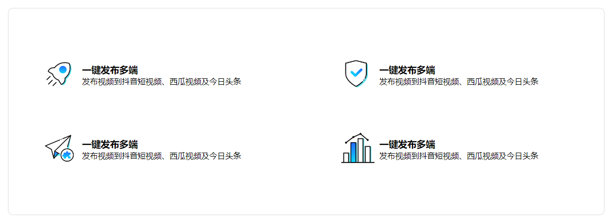
学成在线
1.准备工作
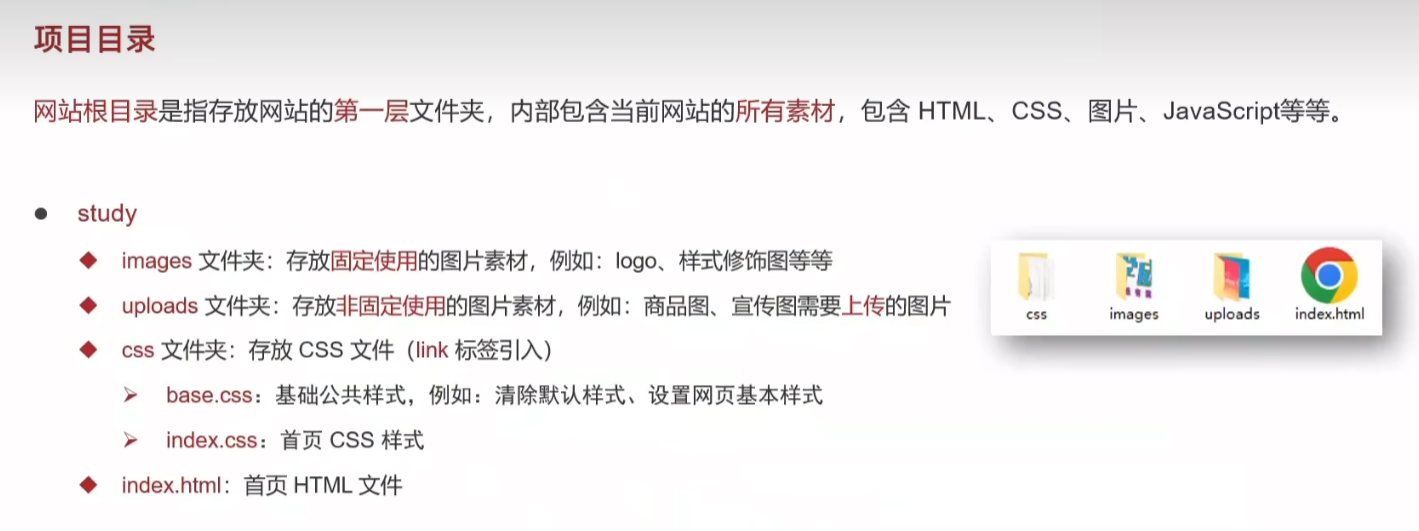
index.html
<!DOCTYPE html>
<html lang="en">
<head><meta charset="UTF-8"><meta name="viewport" content="width=device-width, initial-scale=1.0"><title>学成在线</title><!-- 顺序要求:先清除再设置 --><link rel="stylesheet" href="./css/base.css"><link rel="stylesheet" href="./css/index.css">
</head>
<body></body>
</html>
base.css
/* 基础公共样式:清除默认样式 + 设置通用样式 */
* {margin: 0;padding: 0;box-sizing: border-box;
}li {list-style: none;
}body {font: 14px/1.5 "Microsoft Yahei", "Hiragino Sans GB", "Heiti SC", "WenQuanYi Micro Hei", sans-serif;color: #333;
}a {color: #333;text-decoration: none;
}
2.版心效果

index.html
/* 首页样式 */
/* 版心 */
.wrapper {margin: 0 auto;width: 1200px;
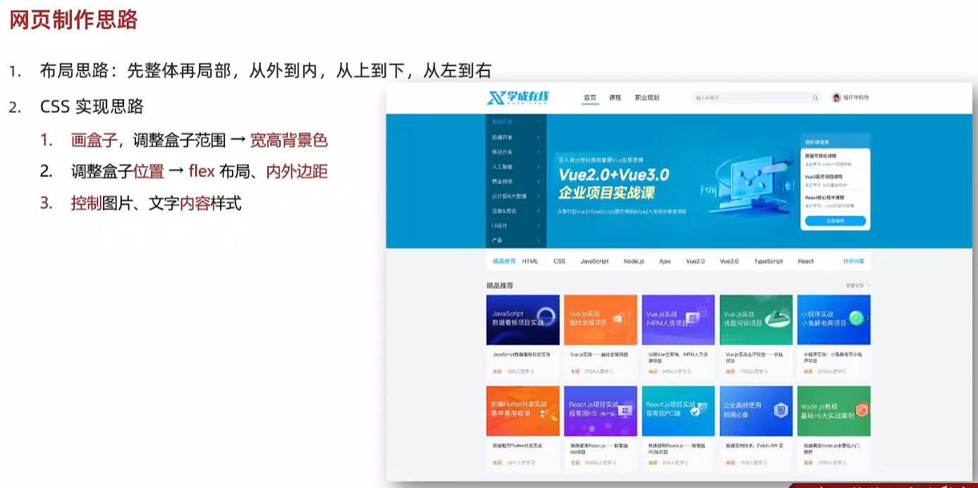
}3.网页制作思路
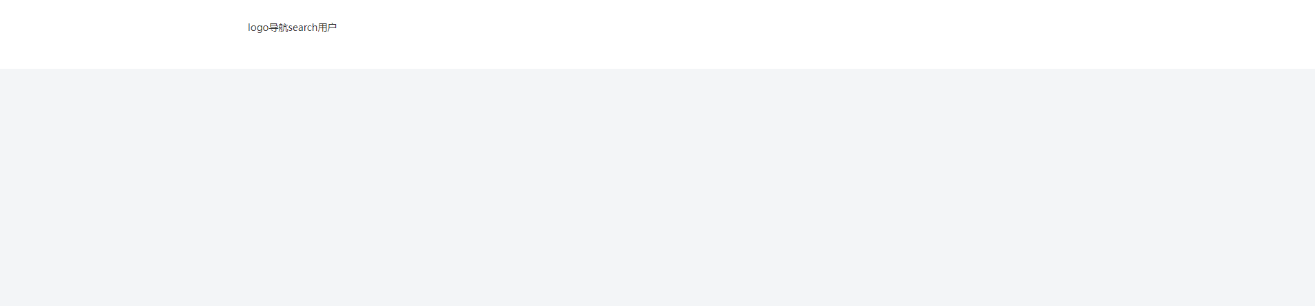
4.header 区域-布局
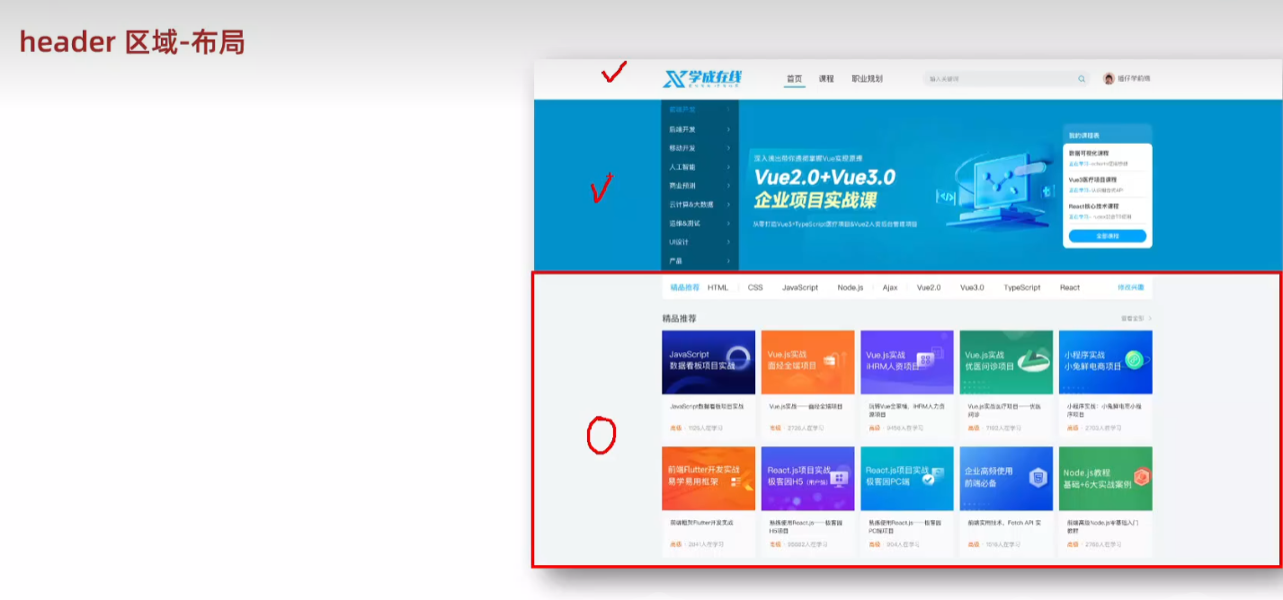
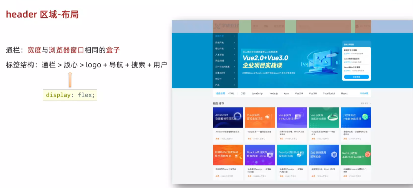
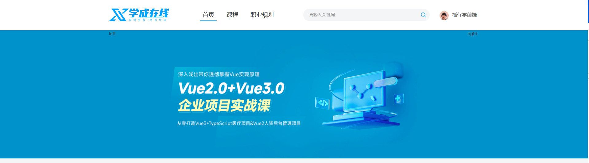
index.html
<!DOCTYPE html>
<html lang="en">
<head><meta charset="UTF-8"><meta name="viewport" content="width=device-width, initial-scale=1.0"><title>学成在线</title><!-- 顺序要求:先清除再设置 --><link rel="stylesheet" href="./css/base.css"><link rel="stylesheet" href="./css/index.css">
</head>
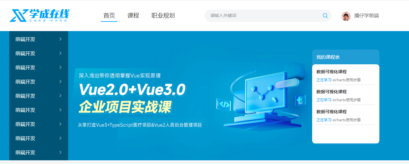
<body><!-- 头部区域 --><div class="header"><div class="wrapper"><!-- logo --><div class="logo">logo</div><!-- 导航 --><div class="nav">导航</div><!-- 搜索 --><div class="search">search</div><!-- 用户 --><div class="user">用户</div></div></div>
</body>
</html>index.css
/* 首页样式 */
/* 版心 */
.wrapper {margin: 0 auto;width: 1200px;
}body {background-color: #f3f5f7;
}/* 头部区域 */
.header {height: 100px;background-color: #fff;
}.header .wrapper {padding-top: 29px;display: flex;align-items: center;
}
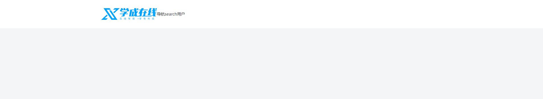
5.logo 制作技巧
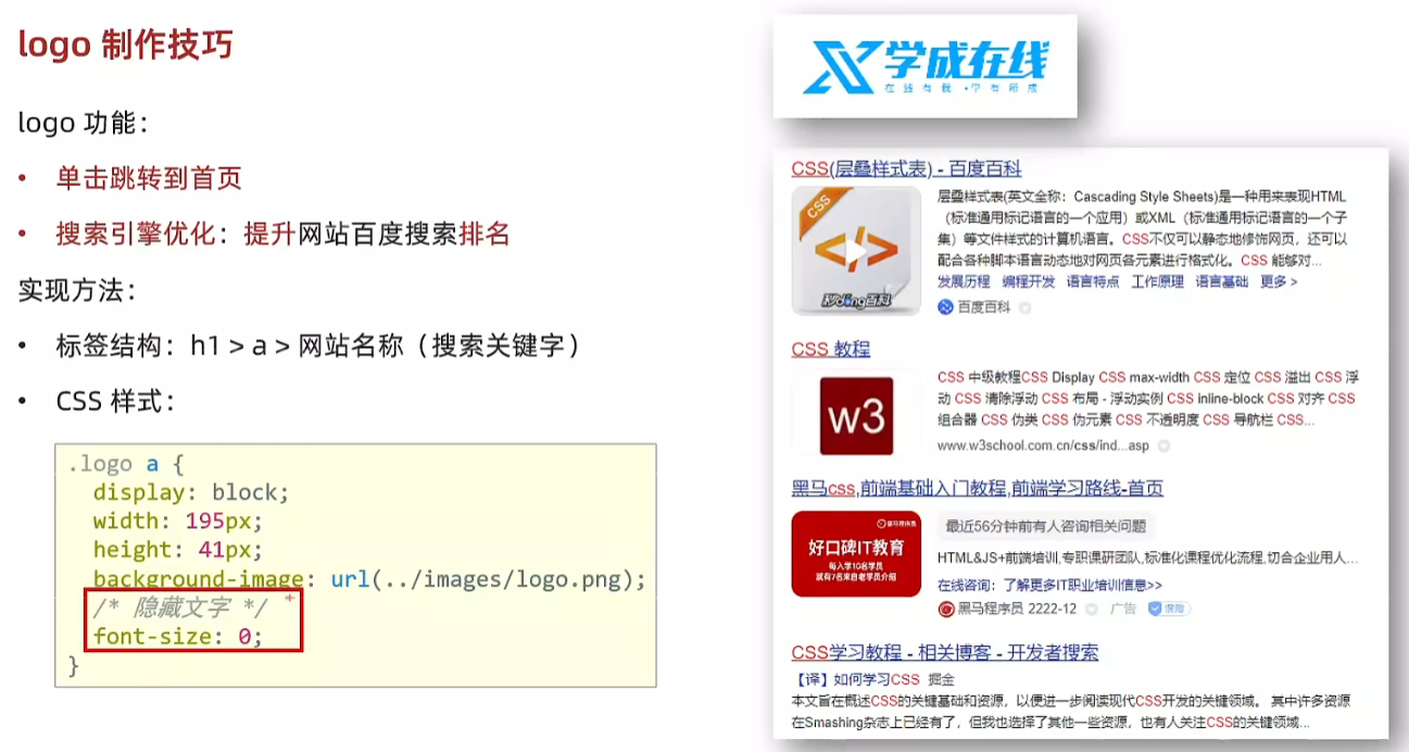
index.html
<body><!-- 头部区域 --><div class="header"><div class="wrapper"><!-- logo --><div class="logo"><h1><a href="#">学成在线</a></h1></div><!-- 导航 --><div class="nav">导航</div><!-- 搜索 --><div class="search">search</div><!-- 用户 --><div class="user">用户</div></div></div>
</body>
/* logo */
.logo a {/* a 为 inline 故宽高不生效 */display: block;width: 195px;height: 41px;background-image: url(../images/logo.png);/* 隐藏文字 */font-size: 0;
}
6.导航制作技巧(nav)
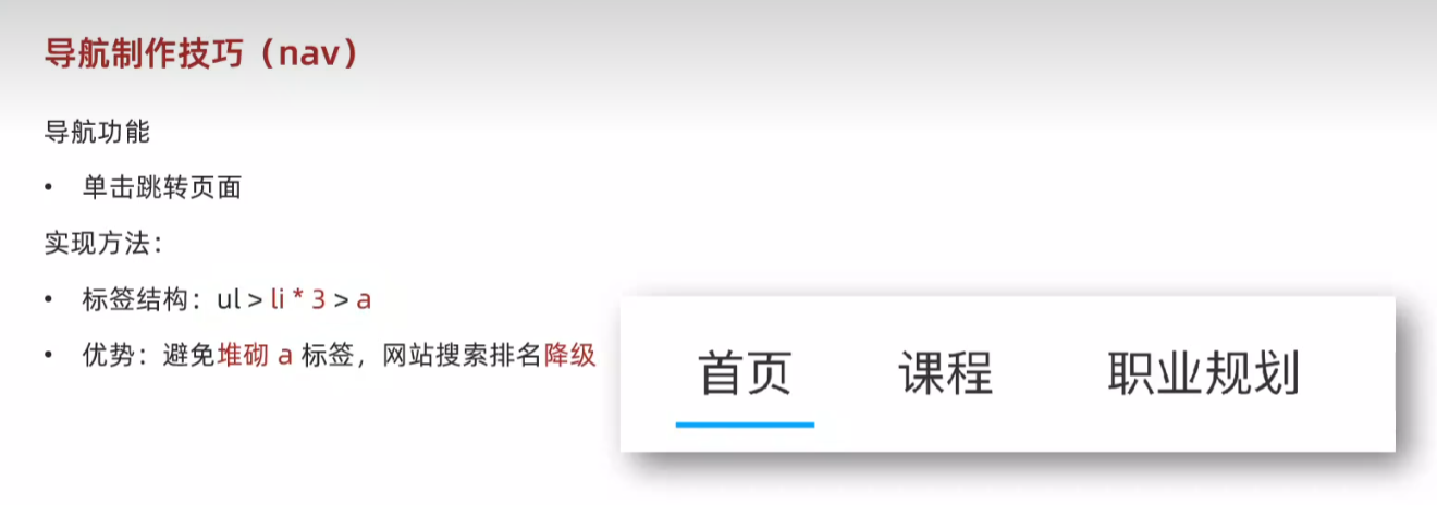
<body><!-- 头部区域 --><div class="header"><div class="wrapper"><!-- logo --><div class="logo"><h1><a href="#">学成在线</a></h1></div><!-- 导航 --><div class="nav"><ul><li><a href="#" class="active">首页</a></li><li><a href="#">课程</a></li><li><a href="#">职业规划</a></li></ul></div><!-- 搜索 --><div class="search">search</div><!-- 用户 --><div class="user">用户</div></div></div>
</body>
/* 导航 */
.header .nav {margin-left: 102px;
}.header .nav ul {display: flex;
}.header .nav ul li {margin-right: 24px;
}.header .nav ul li a {display: block;padding: 6px 8px;line-height: 27px;font-size: 19px;
}/* active 类选择器,表示默认选中的a */
.header .nav li .active,
.header .nav li a:hover {border-bottom: 2px solid #00a4ff;
}
7.搜索区域(search)
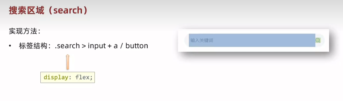
<body><!-- 头部区域 --><div class="header"><div class="wrapper"><!-- logo --><div class="logo"><h1><a href="#">学成在线</a></h1></div><!-- 导航 --><div class="nav"><ul><li><a href="#" class="active">首页</a></li><li><a href="#">课程</a></li><li><a href="#">职业规划</a></li></ul></div><!-- 搜索 --><div class="search"><input type="text" placeholder="请输入关键词"><a href="#"></a></div><!-- 用户 --><div class="user">用户</div></div></div>
</body>
/* 搜索 */
.search {display: flex;margin-left: 64px;padding-left: 19px;padding-right: 12px;width: 412px;height: 40px;background-color: #f3f5f7;border-radius: 20px;
}.search input {flex: 1;border: 0;background-color: transparent;/* 去除焦点框 */outline: none;
}.search input::placeholder {font-size: 14px;color: #999;
}
/* 父级是 flex 布局,子级变弹性盒子:加宽高生效 */
.search a {display: block;width: 16px;height: 16px;background-image: url(../images/search.png);align-self: center;
}
8.用户区域(user)
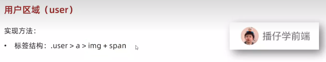
<body><!-- 头部区域 --><div class="header"><div class="wrapper"><!-- logo --><div class="logo"><h1><a href="#">学成在线</a></h1></div><!-- 导航 --><div class="nav"><ul><li><a href="#" class="active">首页</a></li><li><a href="#">课程</a></li><li><a href="#">职业规划</a></li></ul></div><!-- 搜索 --><div class="search"><input type="text" placeholder="请输入关键词"><a href="#"></a></div><!-- 用户 --><div class="user"><a href="#"><img src="uploads/user.png" alt=""><span>播仔学前端</span></a></div></div></div>
</body>
/* 用户 */
.user {margin-left: 32px;margin-top: 4px;
}.user img {margin-right: 7px;/* vertical-align 行内快和行内垂直方向对齐方式 */vertical-align: middle;
}.user span {font-size: 16px;color: #666;
}
9.banner区域
<!-- banner 区域 --><div class="banner"><div class="wrapper"><div class="left">left</div><div class="right">right</div></div></div>/* banner 区域 */
.banner {height: 420px;background-color: #0092cb;
}.banner .wrapper {display: flex;justify-content: space-between;height: 420px;background-image: url(../uploads/banner.png);
}
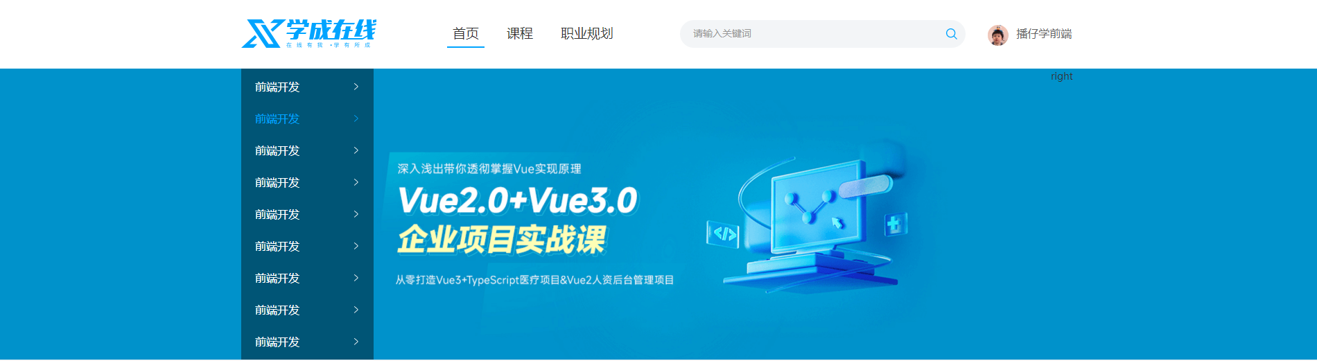
10.banner左侧导航栏(left)
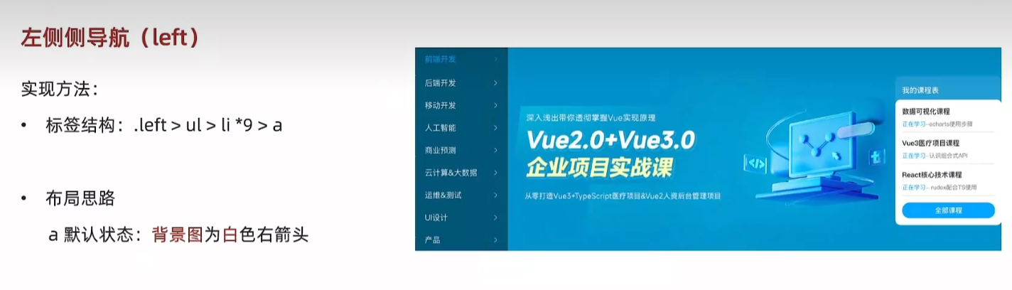
<!-- banner 区域 --><div class="banner"><div class="wrapper"><div class="left"><ul><li><a href="#">前端开发</a></li><li><a href="#">前端开发</a></li><li><a href="#">前端开发</a></li><li><a href="#">前端开发</a></li><li><a href="#">前端开发</a></li><li><a href="#">前端开发</a></li><li><a href="#">前端开发</a></li><li><a href="#">前端开发</a></li><li><a href="#">前端开发</a></li></ul></div><div class="right">right</div></div></div>/* 侧导航 */
.banner .left {padding: 3px 20px;width: 191px;height: 420px;background-color: rgba(0, 0, 0, 0.42);
}.banner .left a {display: block;height: 46px;background-image: url(../images/right.png);background-repeat: no-repeat;background-position: right;line-height: 46px;font-size: 16px;color: #fff;
}.banner .left a:hover {background-image: url(../images/right-hover.png);background-repeat: no-repeat;background-position: right;color: #00a4ff;
}
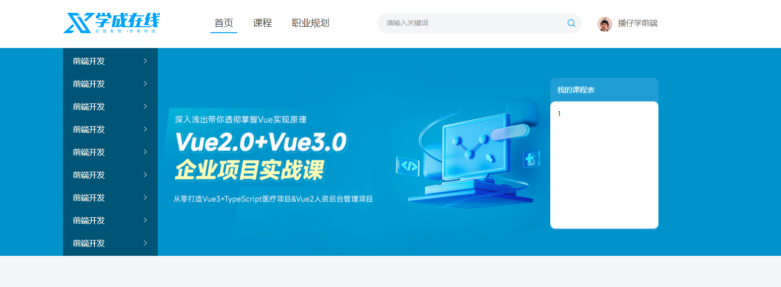
11.右侧课程表(right)
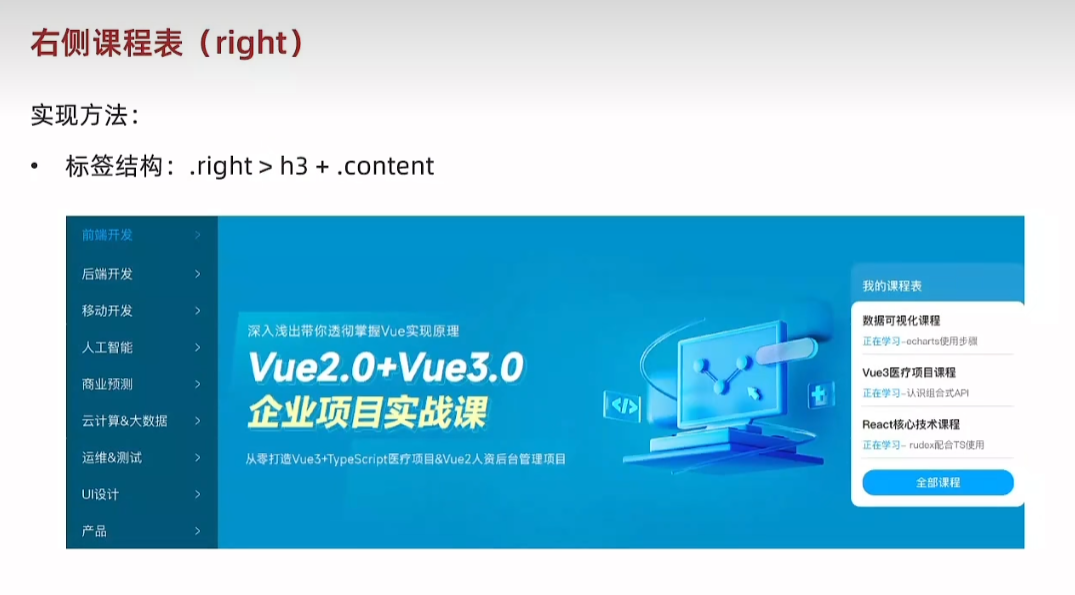
<!-- banner 区域 --><div class="banner"><div class="wrapper"><div class="left"><ul><li><a href="#">前端开发</a></li><li><a href="#">前端开发</a></li><li><a href="#">前端开发</a></li><li><a href="#">前端开发</a></li><li><a href="#">前端开发</a></li><li><a href="#">前端开发</a></li><li><a href="#">前端开发</a></li><li><a href="#">前端开发</a></li><li><a href="#">前端开发</a></li></ul></div><div class="right"><h3>我的课程表</h3><div class="content">1</div></div></div></div>/* 课程表 */
.banner .right {margin-top: 60px;width: 218px;height: 308px;background-color: #209dd5;border-radius: 10px;
}.banner .right h3 {margin-left: 14px;height: 48px;line-height: 48px;font-size: 15px;color: #fff;font-weight: 400;
}.banner .right .content {padding: 14px;height: 257px;background-color: #fff;border-radius: 10px;
}
<!-- banner 区域 --><div class="banner"><div class="wrapper"><div class="left"><ul><li><a href="#">前端开发</a></li><li><a href="#">前端开发</a></li><li><a href="#">前端开发</a></li><li><a href="#">前端开发</a></li><li><a href="#">前端开发</a></li><li><a href="#">前端开发</a></li><li><a href="#">前端开发</a></li><li><a href="#">前端开发</a></li><li><a href="#">前端开发</a></li></ul></div><div class="right"><h3>我的课程表</h3><div class="content"><dl><dt>数据可视化课程</dt><dd><span>正在学习</span>-<strong>echarts使用步骤</strong> </dd></dl><dl><dt>数据可视化课程</dt><dd><span>正在学习</span>-<strong>echarts使用步骤</strong> </dd></dl><dl><dt>数据可视化课程</dt><dd><span>正在学习</span>-<strong>echarts使用步骤</strong> </dd></dl></div></div></div></div>/* 课程表 */
.banner .right {margin-top: 60px;width: 218px;height: 308px;background-color: #209dd5;border-radius: 10px;
}.banner .right h3 {margin-left: 14px;height: 48px;line-height: 48px;font-size: 15px;color: #fff;font-weight: 400;
}.banner .right .content {padding: 14px;height: 257px;background-color: #fff;border-radius: 10px;
}.banner .right .content dl {margin-bottom: 12px;border-bottom: 1px solid #e0e0e0;
}.banner .right .content dt {margin-bottom: 8px;font-size: 14px;line-height: 20px;font-weight: 700;
}.banner .right .content dd {margin-bottom: 8px;font-size: 12px;line-height: 16px;
}.banner .right .content dd span {color:#00a4ff
}.banner .right .content dd strong {color:#7d7d7d;font-weight: 400;
}
82.定位
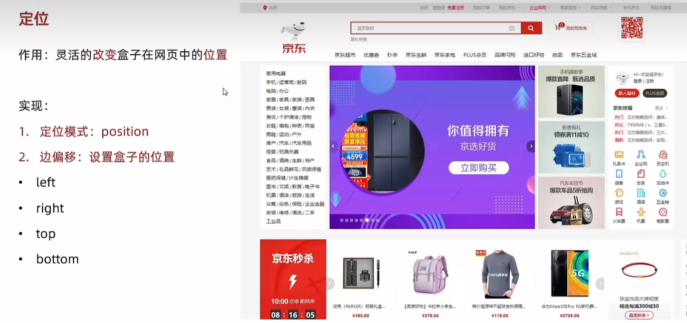
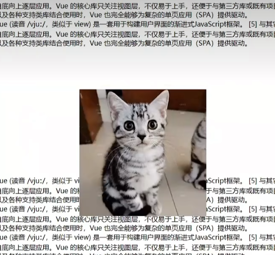
83.相对定位
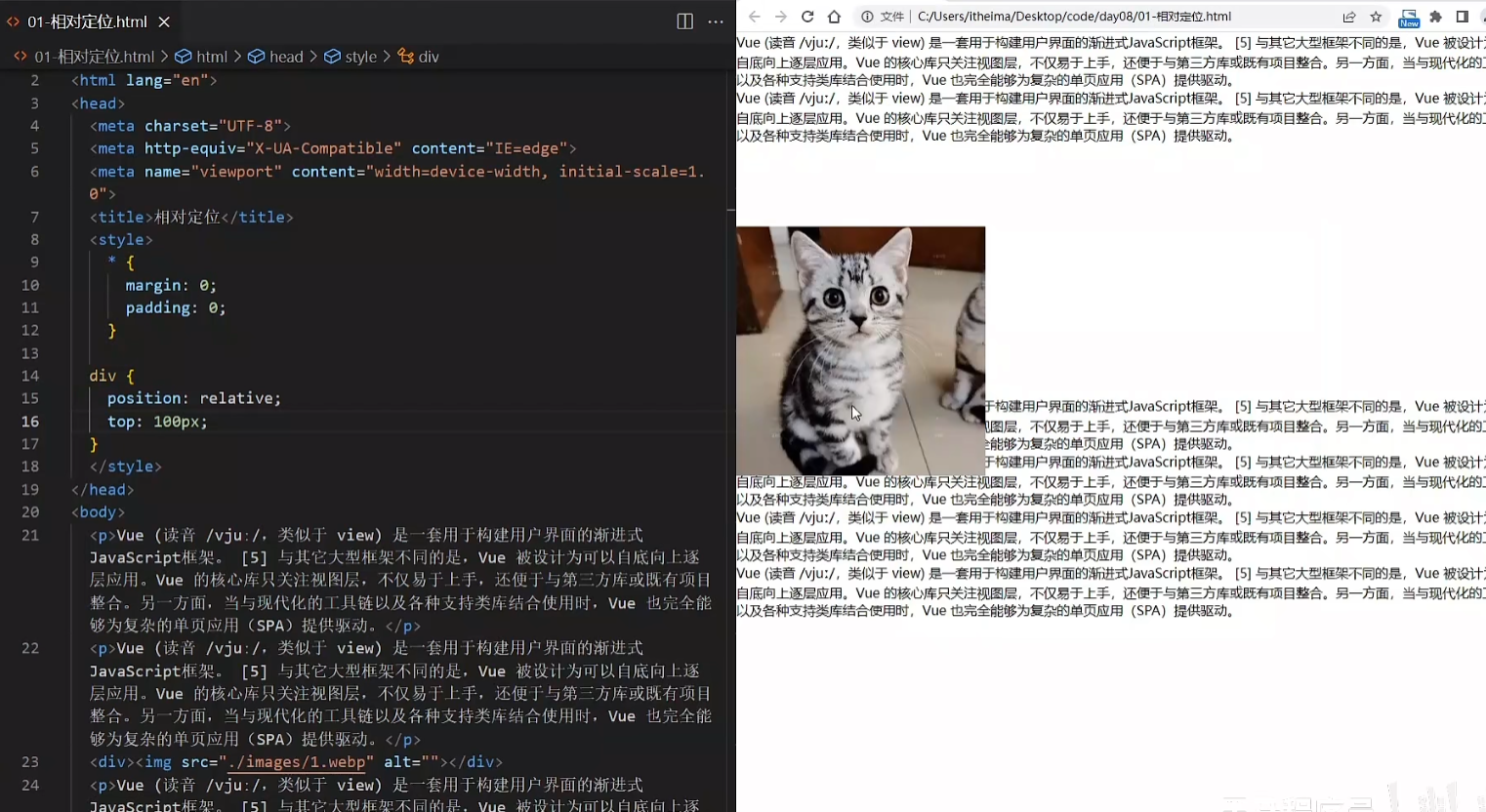
div {position:relative;top: 100px
}
实现图片压在文字上面,原来位置下移100px,不脱标,占位。
div {position:relative;top:100px;left:200px;
}
标签显示模式特点 不变
相关文章:
HTML5 + CSS3
HTML 基础 准备开发环境 1.vscode 使用 新建文件夹 ---> 左键拖入 vscode 中 2.安装插件 扩展 → 搜索插件 → 安装打开网页插件:open in browser汉化菜单插件:Chinese 3.缩放代码字号 放大,缩小:Ctrl 加号,减号 4.设…...
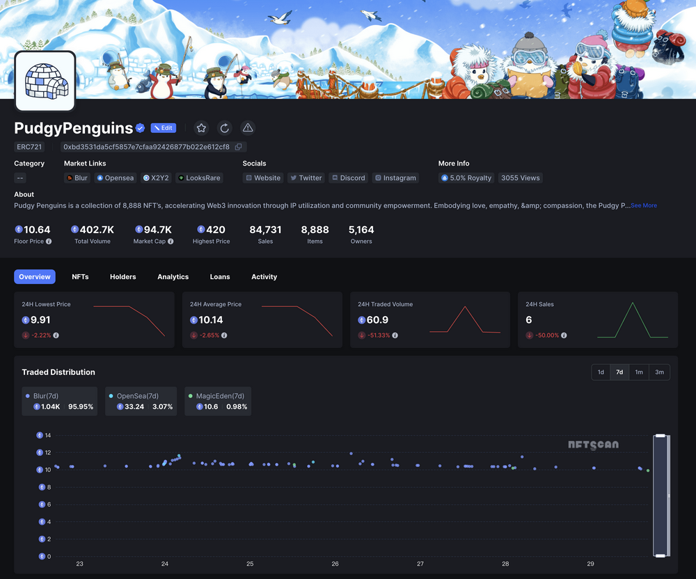
NFTScan | 07.22~07.28 NFT 市场热点汇总
欢迎来到由 NFT 基础设施 NFTScan 出品的 NFT 生态热点事件每周汇总。 周期:2024.07.22~ 2024.07.28 NFT Hot News 01/ 数据:NFT 系列 Liberty Cats 地板价突破 70000 MATIC 7 月 22 日,据 Magic Eden 数据,NFT 系列 Liberty C…...

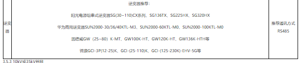
探索分布式光伏运维系统的组成 需要几步呢?
前言 随着光伏发电的不断发展,对于光伏发电监控系统的需求也日益迫切,“互联网”时代,“互联网”的理念已经转化为科技生产的动力,促进了产业的升级发展,本文结合“互联网”技术提出了一种针对分散光伏发电站运行数据…...
做知识付费项目还能做吗?知识付费副业项目如何做?能挣多少钱?
hello,我是阿磊,一个20年的码农,6年前代码写不动了,转型专职做副业项目研究,为劳苦大众深度挖掘互联网副业项目,共同富裕。 现在做知识付费项目还能做吗? 互联网虚拟资源项目我一直在做,做了有…...

K210视觉识别模块学习笔记7:多线程多模型编程识别
今日开始学习K210视觉识别模块: 图形化操作函数 亚博智能 K210视觉识别模块...... 固件库: canmv_yahboom_v2.1.1.bin 训练网站: 嘉楠开发者社区 今日学习使用多线程、多模型来识别各种物体 这里先提前说一下本文这次测试实验的结果吧:结果是不太成…...
Go语言教程(一看就会)
全篇文章 7000 字左右, 建议阅读时长 1h 以上。 Go语言是一门开源的编程语言,目的在于降低构建简单、可靠、高效软件的门槛。Go平衡了底层系统语言的能力,以及在现代语言中所见到的高级特性。它是快速的、静态类型编译语言。 第一个GO程序…...
【Golang 面试 - 基础题】每日 5 题(十)
✍个人博客:Pandaconda-CSDN博客 📣专栏地址:http://t.csdnimg.cn/UWz06 📚专栏简介:在这个专栏中,我将会分享 Golang 面试中常见的面试题给大家~ ❤️如果有收获的话,欢迎点赞👍收藏…...

OD C卷 - 密码输入检测
密码输入检测 (100) 给定一个密码,‘<’ 表示删除前一个字符,输出最终得到的密码,并判断是否满足密码安全要求: 密码长度>8;至少包含一个大写字母;至少包含一个小写字母;至少…...

【每日一题】【逆推法 + 贪心】【数学】造数 河南萌新联赛2024第(一)场:河南农业大学 A题 C++
河南萌新联赛2024第(一)场:河南农业大学 A题 造数 题目描述 样例 #1 样例输入 #1 2样例输出 #1 1样例 #2 样例输入 #2 5样例输出 #2 3做题思路 本题可以用逆推法 将三种操作反过来变为 − 1 , − 2 , / 2 -1 , -2 , /2 −1,−2,/2 …...

刷题计划 day4 【双指针、快慢指针、环形链表】链表下
⚡刷题计划day4继续,可以点个免费的赞哦~ 下一期将会开启哈希表刷题专题,往期可看专栏,关注不迷路, 您的支持是我的最大动力🌹~ 目录 ⚡刷题计划day4继续,可以点个免费的赞哦~ 下一期将会开启哈希表刷题…...

最高200万!苏州成都杭州的这些AI政策补贴,你拿到了吗?
随着全球人工智能技术的迅猛发展,地方政府纷纷出台相关政策以抢占未来科技的制高点。苏州 成都 杭州这三个城市更是推出了一系列AI政策补贴,旨在通过多方面支持,推动本地AI产业的发展。本文将带你了解目前不完全统计到的苏州 成都 杭州三地AI…...

使用两台虚拟机分别部署前端和后端项目
使用两台虚拟机分别部署前端和后端项目 1 部署方案2 准备两台虚拟机,并配置网络环境3 部署后端项目3.1 打包服务3.2 上传jar包到服务器3.3 集成Systemd3.3.1 移动端服务集成Systemd3.3.2 后台管理系统集成Systemd 4 配置域名映射5 部署前端项目5.1 移动端5.1.1 打包…...

Halcon学习之derivate_gauss
HALCON 图像处理库中的一个常用算子,用于计算图像的高斯导数。高斯导数是一种平滑导数,在计算过程中结合了高斯滤波,具有平滑噪声的效果。这个算子可以计算图像的不同导数,如梯度、一阶导数、二阶导数、以及 Hessian 行列式等。 …...

智能优化算法(三):遗传算法
文章目录 1.问题描述2.遗传算法2.1.算法概述2.2.编码操作2.3.选择操作2.4.交叉操作2.5.变异操作2.6.算法流程 3.算法实现3.1.MATLAB代码实现3.2.Python代码实现 4.参考文献 1.问题描述 \quad 在利用启发式算法求解问题时,我们常常需要应用遗传算法解决函数最值问题&…...

Docker部署nacos...用户名密码错误
前提 镜像选择v2.3.0版本,因为最新的没拉下来用的别的地方save load的镜像。 官方示例 官方文档 数据库脚本,直接去数据库新建数据库nacos吧,执行脚本,执行完成后,发现只有建表语句,查询得知,…...

搭建Vue开发环境
一、下载Vue.js 进入官网教程安装 — Vue.js (vuejs.org) 下载开发版本到本地 二、安装 Vue Devtools 安装完成后...

富格林:防范虚假可信投资经验
富格林指出,现货黄金投资作为一种全球性的金融衍生品交易,吸引了无数投资者的目光。它不仅具备避险属性,还是资产配置中不可或缺的一部分。然而,要想在市场中防范虚假陷阱,投资者必须要掌握并且利用可信的投资经验。下…...

Intent的数据传递
在Android开发中,使用Intent在Activity之间传递数据是一种常见的方式。然而,Intent确实有一些大小和类型的限制。 Intent的限制 数据大小限制:虽然官方没有明确说明Intent的数据大小限制,但是Intent是通过Binder机制进行IPC&…...

【NPU 系列专栏 3.1 -- - ARM NPU 有哪些型号?】
请阅读【嵌入式及芯片开发学必备专栏】 文章目录 ARM X 系列和 Z 系列 NPU 详解ARM X 系列 NPUARM X 系列 NPU型号和算力ARM X 系列 NPU 应用场景ARM Z 系列 NPU 简介ARM Z 系列 NPU 型号和算力ARM Z 系列 NPU 应用场景SummaryARM X 系列和 Z 系列 NPU 详解 ARM 的 NPU(Neura…...

浙大联合腾讯让AI“看懂“三维世界
这项由浙江大学、腾讯混元大模型团队、香港科技大学及深圳湾区研究院联合完成的研究,以预印本形式发布于2026年5月,论文编号为arXiv:2605.15876,有兴趣深入了解的读者可通过该编号查询完整论文。当你拿起手机拍下一张客厅照片,现在…...
)
【linux学习】linux工具篇(下)
Linux调试器-gdb使用,Linux项目自动化构建工具-make/Makefile我是程序员小青蛙,下面分享linux的工具利用前言程序的发布方式有两种,debug模式和release模式 Linux gcc/g出来的二进制程序,默认是release模式 要使用gdb调试…...

Claude 3.5架构升级:请求编排器层的零成本蒸发
1. 项目概述:这不是一次普通更新,而是一次架构级“蒸发”“Anthropic Just Shipped the Layer That’s Already Going to Zero”——这个标题乍看像科技媒体的夸张头条,但作为连续跟踪Claude模型演进三年、亲手部署过从Haiku到Sonnet再到Opus…...

AutoML、NAS与超参调优:三层自动化决策模型实战指南
1. 这不是“一键炼丹”,而是给算法工程师配一套智能扳手 “AutoML, NAS and Hyperparameter Tuning: Navigating the Landscape of Machine Learning Automation”——这个标题里没有一个词是新造的,但把它们并列放在一起,恰恰暴露了当前工业…...

GAN与密码学的真实接口:从概念纠偏到工程落地
1. 项目概述:这不是密码学,也不是GAN训练指南,而是一场概念误读的深度解剖 “Understanding GAN Cryptography”——这个标题一出现,我就在笔记本上划了三道横线。不是因为难,而是因为它根本不存在。过去三年里&#x…...

AI Agent预测式防御:毫秒级故障预判与柔性干预
1. 项目概述:这不是又一个“AI Agent故障复盘”,而是一次对失败根因的工程化反演 你有没有遇到过这样的情况:花两周时间精心设计了一个AI Agent流程,接入了最新版的LLM API,配置了多层工具调用和记忆机制,测…...

毕业论文神器!2026年好用AI论文平台榜单,高质初稿轻松写
2026 年实测 10 款主流 AI 论文工具,千笔AI以全流程覆盖 语义级降重 免费查重领跑综合榜;ThouPen 稳坐留学生毕业全流程工具头把交椅;免费工具中DeepSeek Scholar、豆包学术版表现亮眼,30 分钟即可生成万字高质量初稿࿰…...

VIVE Focus3 Unity开发避坑指南:SDK 4.2与XR插件深度适配
1. 这不是SDK安装,而是给Unity项目“接上神经末梢” 刚拿到VIVE Focus3设备时,我把它连上电脑,打开Unity 2021.3.33f1(LTS版),照着官网文档点开Package Manager——结果卡在“Loading...”三分钟࿰…...

【ElevenLabs云南话语音落地实战】:20年语音AI专家亲授3步适配方言模型,避开92%开发者踩过的声学对齐陷阱
更多请点击: https://intelliparadigm.com 第一章:ElevenLabs云南话语音落地实战导论 云南话作为西南官话的重要分支,具有声调丰富、语流连贯、地域变体多样等特点,为语音合成技术带来独特挑战。ElevenLabs 提供的多语言、高保真…...

如何快速搭建个人游戏串流服务器:Sunshine跨平台游戏流媒体完整指南
如何快速搭建个人游戏串流服务器:Sunshine跨平台游戏流媒体完整指南 【免费下载链接】Sunshine Self-hosted game stream host for Moonlight. 项目地址: https://gitcode.com/GitHub_Trending/su/Sunshine 想要在任何设备上畅玩PC游戏?Sunshine游…...