使用vite+react+ts+Ant Design开发后台管理项目(三)
前言
本文将引导开发者从零基础开始,运用vite、react、react-router、react-redux、Ant Design、less、tailwindcss、axios等前沿技术栈,构建一个高效、响应式的后台管理系统。通过详细的步骤和实践指导,文章旨在为开发者揭示如何利用这些技术工具,从项目构思到最终实现的全过程,提供清晰的开发思路和实用的技术应用技巧。
项目gitee地址:lbking666666/enqi-admin
本系列文章:
- 使用vite+react+ts+Ant Design开发后台管理项目(一)
- 使用vite+react+ts+Ant Design开发后台管理项目(二)
- 使用vite+react+ts+Ant Design开发后台管理项目(三)
- 使用vite+react+ts+Ant Design开发后台管理项目(四)
添加配置
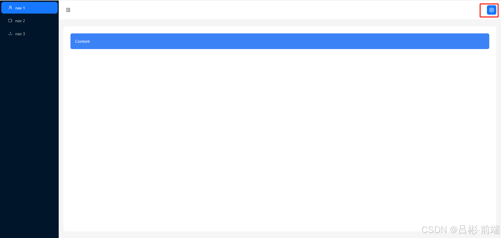
添加设置按钮
目前头部只有一个控制左侧菜单的按钮,需要在右侧添加一个按钮可以设置整体的一些配置。修改layout文件夹下的header.tsx文件
//layout/header.tsx
import React from "react";
import { Button, Layout, theme } from "antd";
import { MenuFoldOutlined, MenuUnfoldOutlined,SettingOutlined } from "@ant-design/icons";
const { Header } = Layout;
interface AppSiderProps {collapsed: boolean;
}
const AppHeader: React.FC<AppSiderProps> = ({ collapsed }) => {const {token: { colorBgContainer },} = theme.useToken();return (<Header style={{ padding: 0, background: colorBgContainer }}><Flex gap="middle" justify="space-between" align="center"><Buttontype="text"icon={collapsed ? <MenuUnfoldOutlined /> : <MenuFoldOutlined />}style={{fontSize: "16px",width: 64,height: 64,}}onClick={handleCollapsed}/><Buttontype="primary"className="mr-4"icon={<SettingOutlined />}/></Flex></Header>);
};
export default AppHeader;
添加Drawer抽屉
从Ant Design选择抽屉组件截图如下
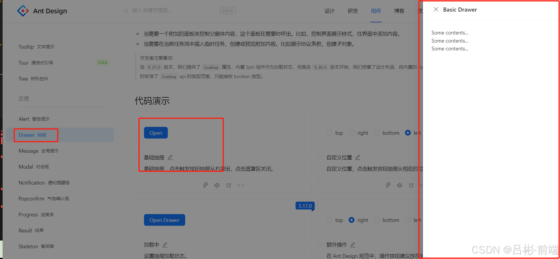
把这里的代码拿到layout文件夹下的header.tsx文件中
//layout/header.tsximport React, { useState } from "react";
import { Button, Layout, theme, Flex, Drawer } from "antd";
import {MenuFoldOutlined,MenuUnfoldOutlined,SettingOutlined,
} from "@ant-design/icons";
import { useAppDispatch } from "@/hooks/UseGlobal.hooks";
import { setCollapsed } from "@/store/reducers/global";
const { Header } = Layout;
interface AppSiderProps {collapsed: boolean;
}const AppHeader: React.FC<AppSiderProps> = ({ collapsed }) => {const {token: { colorBgContainer },} = theme.useToken();const [showPoup, setShowPoup] = useState(false);const dispatch = useAppDispatch();//收缩事件const handleCollapsed = () => {//更新全局状态 collapseddispatch(setCollapsed());};//设置按钮点击事件const handleShowPoup = () => {console.log("点击了按钮");setShowPoup(true);};const onClose = () => {setShowPoup(false);};return (<Header style={{ padding: 0, background: colorBgContainer }}><Flex gap="middle" justify="space-between" align="center"><Buttontype="text"icon={collapsed ? <MenuUnfoldOutlined /> : <MenuFoldOutlined />}style={{fontSize: "16px",width: 64,height: 64,}}onClick={handleCollapsed}/><Buttontype="primary"className="mr-4"icon={<SettingOutlined />}onClick={handleShowPoup}/></Flex><Drawer title="Basic Drawer" onClose={onClose} open={showPoup}><p>Some contents...</p><p>Some contents...</p><p>Some contents...</p></Drawer></Header>);
};
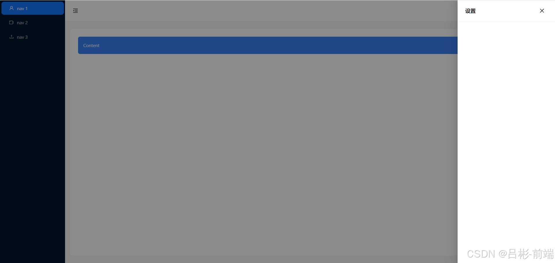
export default AppHeader;查看效果发现关闭按钮在左侧一般我们习惯把关闭按钮放到右侧根据Ant Design的Drawer的api我们可以设置closeIcon和extra这两个
//layout/header.tsx
import React, { useState } from "react";
import { Button, Layout, theme, Flex, Drawer,Space } from "antd";
import {MenuFoldOutlined,MenuUnfoldOutlined,SettingOutlined,CloseOutlined
} from "@ant-design/icons";
import { useAppDispatch } from "@/hooks/UseGlobal.hooks";
import { setCollapsed } from "@/store/reducers/global";
const { Header } = Layout;
interface AppSiderProps {collapsed: boolean;
}const AppHeader: React.FC<AppSiderProps> = ({ collapsed }) => {const {token: { colorBgContainer },} = theme.useToken();const [showPoup, setShowPoup] = useState(false);const dispatch = useAppDispatch();//收缩事件const handleCollapsed = () => {//更新全局状态  collapseddispatch(setCollapsed());};//设置按钮点击事件const handleShowPoup = () => {console.log("点击了按钮");setShowPoup(true);};const onClose = () => {setShowPoup(false);};return (<Header style={{ padding: 0, background: colorBgContainer }}><Flex gap="middle" justify="space-between" align="center"><Buttontype="text"icon={collapsed ? <MenuUnfoldOutlined /> : <MenuFoldOutlined />}style={{fontSize: "16px",width: 64,height: 64,}}onClick={handleCollapsed}/><Buttontype="primary"className="mr-4"icon={<SettingOutlined />}onClick={handleShowPoup}/></Flex><Drawertitle="设置"closeIcon={false}open={showPoup}extra={<Space><Button type="link" onClick={onClose} icon={<CloseOutlined />}></Button></Space>}></Drawer></Header>);
};
export default AppHeader;
效果如下图这里关闭按钮在右侧了
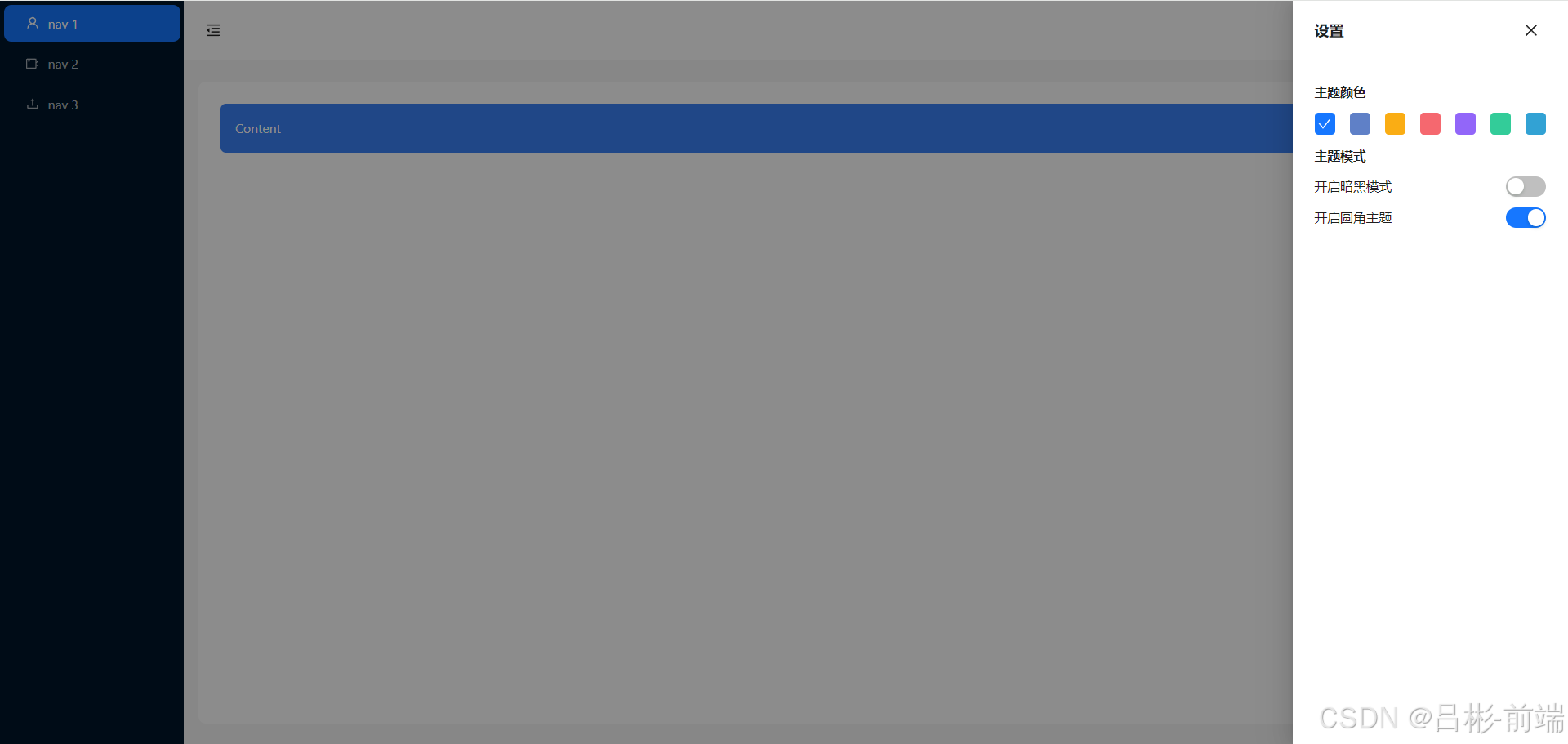
添加设置项
这里的查看Ant Design官网后,选择了三项设置,主题颜色的配置,暗黑模式、圆角模式
先把这三个内容添加进来,控制这三个的响应式变量先使用useState在头部组件中定义出来等调试好之后再更换为redux状态管理
//layout/header.tsx
import React, { useState } from "react";
import { Button, Layout, theme, Flex, Drawer, Space, Switch } from "antd";
import {MenuFoldOutlined,MenuUnfoldOutlined,SettingOutlined,CloseOutlined,CheckOutlined,
} from "@ant-design/icons";
import { useAppDispatch } from "@/hooks/UseGlobal.hooks";
import { setCollapsed } from "@/store/reducers/global";
const { Header } = Layout;
interface AppSiderProps {collapsed: boolean;
}
const colors = [{name: "拂晓蓝",value: "#1677ff",},{name: "薄暮",value: "#5f80c7",},{name: "日暮",value: "#faad14",},{name: "火山",value: "#f5686f",},{name: "酱紫",value: "#9266f9",},{name: "极光绿",value: "#3c9",},{name: "极客蓝",value: "#32a2d4",},
];const AppHeader: React.FC<AppSiderProps> = ({ collapsed }) => {const {token: { colorBgContainer },} = theme.useToken();//抽屉弹出const [showPoup, setShowPoup] = useState(false);const [curColor, setCurColor] = useState("#1677ff");const [isSelectdDark, setIsSelectdDark] = useState(false);const [isSelectdRadius, setIsSelectdRadius] = useState(false);const onChangeDark = (checked: boolean) => {setIsSelectdDark(checked);};const onChangeRadius = (checked: boolean) => {setIsSelectdRadius(checked);};const handlesetCurColor = (color: string) => {setCurColor(color);};const ColorItem: React.FC<{ color: string; isSelectd: boolean }> = ({color,isSelectd,}) => {if (isSelectd) {return (<divclassName="w-6 h-6 flex justify-center items-center  rounded cursor-pointer items"style={{ background: color }}><CheckOutlined style={{ color: "#fff" }} /></div>);} else {return (<divclassName="w-6 h-6 flex justify-center items-center  rounded cursor-pointer items"style={{ background: color }}onClick={() => handlesetCurColor(color)}></div>);}};const dispatch = useAppDispatch();//收缩事件const handleCollapsed = () => {//更新全局状态  collapseddispatch(setCollapsed());};//设置按钮点击事件const handleShowPoup = () => {setShowPoup(true);};const onClose = () => {setShowPoup(false);};return (<Header style={{ padding: 0, background: colorBgContainer }}><Flex gap="middle" justify="space-between" align="center"><Buttontype="text"icon={collapsed ? <MenuUnfoldOutlined /> : <MenuFoldOutlined />}style={{fontSize: "16px",width: 64,height: 64,}}onClick={handleCollapsed}/><Buttontype="primary"className="mr-4"icon={<SettingOutlined />}onClick={handleShowPoup}/></Flex><Drawertitle="设置"width={300}closeIcon={false}open={showPoup}extra={<Space><Buttontype="text"onClick={onClose}icon={<CloseOutlined />}></Button></Space>}><div className="mb-3 font-bold">主题颜色</div><Flex gap="middle" justify="space-between" align="center">{colors.map((item) => (<ColorItemkey={item.value}color={item.value}isSelectd={curColor == item.value}/>))}</Flex><div className="mb-3 mt-3 font-bold">主题模式</div><div className="flex justify-between"><div className="flex gap-2"><span>开启暗黑模式</span></div><div className="flex gap-2"><Switch defaultChecked checked={isSelectdDark} onChange={onChangeDark} /></div></div><div className="flex justify-between"><div className="flex gap-2"><span>开启圆角主题</span></div><div className="flex gap-2"><Switch defaultChecked checked={isSelectdRadius} onChange={onChangeRadius} /></div></div></Drawer></Header>);
};
export default AppHeader;
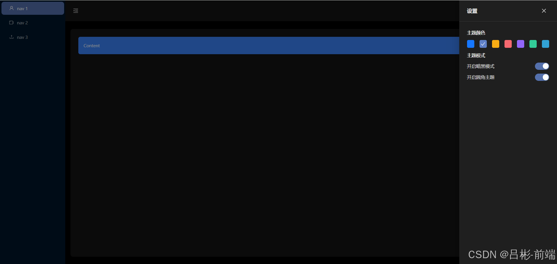
此时查看效果如下图,修改主题颜色、暗黑模式、圆角模式都可以得到对应的效果
改造global.ts
把三个设置项和设置drawer显隐状态抽离到之前的global.ts文件中
//store/reducers/global.ts
import { createSlice } from "@reduxjs/toolkit";
import type { RootState } from "@/store/index.ts";// 定义初始 state 的类型
interface GlobalState {collapsed: boolean;//是否折叠showSetting: boolean;//是否显示设置colorPrimary: string;//主题颜色isDark: boolean;//是否暗黑模式isRadius:boolean;//是否圆角
}
// 使用该类型定义初始 state
const initialState: GlobalState = {collapsed: false,showSetting: false,colorPrimary: "#1677ff",isDark: false,isRadius:true
};
// 创建 slice
export const globalSlice = createSlice({name: "global", // 名称initialState, // 初始 statereducers: {// 定义 reducer 函数,该函数接受 state 和 action 作为参数setCollapsed: (state) => {// 更新 statestate.collapsed = !state.collapsed;},setShowSetting: (state,action) => {// 更新设置状态为 action 载荷state.showSetting = action.payload;},setIsDark: (state) => {// 更新暗黑模式状态state.isDark = !state.isDark;},setColorPrimary: (state, action) => {// 更新主题颜色为 action 载荷state.colorPrimary = action.payload;},setIsRadius: (state) => {// 更新圆角状态state.isRadius = !state.isRadius;},},
});// 为每个 case reducer 函数生成 Action creators
export const { setCollapsed, setIsDark, setColorPrimary,setShowSetting,setIsRadius } =globalSlice.actions;
// selectors 等其他代码可以使用导入的 `RootState` 类型
export const selectCollapsed = (state: RootState) => state.global.collapsed;
export const selectShowSetting = (state: RootState) => state.global.showSetting;
export const selectColorPrimary = (state: RootState) =>state.global.colorPrimary;
export const selectIsDark = (state: RootState) => state.global.isDark;
export const selectIsRadius = (state: RootState) => state.global.isRadius;
// 导出 reducer
export default globalSlice.reducer;
添加设置项组件
把设置项drawer的代码抽离到单独的组件中,在layout文件夹下新增setting.tsx
//layout/setting.tsx
import React, { useState } from "react";
import { Button, Flex, Drawer, Space, Switch } from "antd";
import { CloseOutlined, CheckOutlined } from "@ant-design/icons";
const colors = [{name: "拂晓蓝",value: "#1677ff",},{name: "薄暮",value: "#5f80c7",},{name: "日暮",value: "#faad14",},{name: "火山",value: "#f5686f",},{name: "酱紫",value: "#9266f9",},{name: "极光绿",value: "#3c9",},{name: "极客蓝",value: "#32a2d4",},
];
const Setting = () => {const [showPoup, setShowPoup] = useState(false);const [curColor, setCurColor] = useState("#1677ff");const [isSelectdDark, setIsSelectdDark] = useState(false);const [isSelectdRadius, setIsSelectdRadius] = useState(false);const onChangeDark = (checked: boolean) => {setIsSelectdDark(checked);};const onChangeRadius = (checked: boolean) => {setIsSelectdRadius(checked);};const handlesetCurColor = (color: string) => {setCurColor(color);};const onClose = () => {setShowPoup(false);};const ColorItem: React.FC<{ color: string; isSelectd: boolean }> = ({color,isSelectd,}) => {if (isSelectd) {return (<divclassName="w-6 h-6 flex justify-center items-center  rounded cursor-pointer items"style={{ background: color }}><CheckOutlined style={{ color: "#fff" }} /></div>);} else {return (<divclassName="w-6 h-6 flex justify-center items-center  rounded cursor-pointer items"style={{ background: color }}onClick={() => handlesetCurColor(color)}></div>);}};return (<Drawertitle="设置"width={300}closeIcon={false}open={showPoup}extra={<Space><Buttontype="text"onClick={onClose}icon={<CloseOutlined />}></Button></Space>}><div className="mb-3 font-bold">主题颜色</div><Flex gap="middle" justify="space-between" align="center">{colors.map((item) => (<ColorItemkey={item.value}color={item.value}isSelectd={curColor == item.value}/>))}</Flex><div className="mb-3 mt-3 font-bold">主题模式</div><div className="flex justify-between mb-3"><div className="flex gap-2"><span>开启暗黑模式</span></div><div className="flex gap-2"><SwitchdefaultCheckedchecked={isSelectdDark}onChange={onChangeDark}/></div></div><div className="flex justify-between"><div className="flex gap-2"><span>开启圆角主题</span></div><div className="flex gap-2"><SwitchdefaultCheckedchecked={isSelectdRadius}onChange={onChangeRadius}/></div></div></Drawer>);
};export default Setting;
组件中应用redux状态
头部组件
//laout/header.tsx
import React, { useState } from "react";
import { Button, Flex, Drawer, Space, Switch } from "antd";
import { CloseOutlined, CheckOutlined } from "@ant-design/icons";
const colors = [{name: "拂晓蓝",value: "#1677ff",},{name: "薄暮",value: "#5f80c7",},{name: "日暮",value: "#faad14",},{name: "火山",value: "#f5686f",},{name: "酱紫",value: "#9266f9",},{name: "极光绿",value: "#3c9",},{name: "极客蓝",value: "#32a2d4",},
];
const Setting = () => {const [showPoup, setShowPoup] = useState(false);const [curColor, setCurColor] = useState("#1677ff");const [isSelectdDark, setIsSelectdDark] = useState(false);const [isSelectdRadius, setIsSelectdRadius] = useState(false);const onChangeDark = (checked: boolean) => {setIsSelectdDark(checked);};const onChangeRadius = (checked: boolean) => {setIsSelectdRadius(checked);};const handlesetCurColor = (color: string) => {setCurColor(color);};const onClose = () => {setShowPoup(false);};const ColorItem: React.FC<{ color: string; isSelectd: boolean }> = ({color,isSelectd,}) => {if (isSelectd) {return (<divclassName="w-6 h-6 flex justify-center items-center  rounded cursor-pointer items"style={{ background: color }}><CheckOutlined style={{ color: "#fff" }} /></div>);} else {return (<divclassName="w-6 h-6 flex justify-center items-center  rounded cursor-pointer items"style={{ background: color }}onClick={() => handlesetCurColor(color)}></div>);}};return (<Drawertitle="设置"width={300}closeIcon={false}open={showPoup}extra={<Space><Buttontype="text"onClick={onClose}icon={<CloseOutlined />}></Button></Space>}><div className="mb-3 font-bold">主题颜色</div><Flex gap="middle" justify="space-between" align="center">{colors.map((item) => (<ColorItemkey={item.value}color={item.value}isSelectd={curColor == item.value}/>))}</Flex><div className="mb-3 mt-3 font-bold">主题模式</div><div className="flex justify-between mb-3"><div className="flex gap-2"><span>开启暗黑模式</span></div><div className="flex gap-2"><SwitchdefaultCheckedchecked={isSelectdDark}onChange={onChangeDark}/></div></div><div className="flex justify-between"><div className="flex gap-2"><span>开启圆角主题</span></div><div className="flex gap-2"><SwitchdefaultCheckedchecked={isSelectdRadius}onChange={onChangeRadius}/></div></div></Drawer>);
};export default Setting;
设置组件
//layout/setting.tsx
import React from "react";
import { Button, Flex, Drawer, Space, Switch } from "antd";
import { CloseOutlined, CheckOutlined } from "@ant-design/icons";
import { useAppSelector,useAppDispatch } from "@/hooks/UseGlobal.hooks";
import {  selectColorPrimary,selectIsDark,selectIsRadius,setIsDark, setColorPrimary,setShowSetting,setIsRadius } from "@/store/reducers/global";
const colors = [{name: "拂晓蓝",value: "#1677ff",},{name: "薄暮",value: "#5f80c7",},{name: "日暮",value: "#faad14",},{name: "火山",value: "#f5686f",},{name: "酱紫",value: "#9266f9",},{name: "极光绿",value: "#3c9",},{name: "极客蓝",value: "#32a2d4",},
];
type AppSiderProps = {showPoup: boolean;
}
const Setting:React.FC<AppSiderProps> = ({showPoup}) => {const curColor = useAppSelector(selectColorPrimary);const isSelectdDark = useAppSelector(selectIsDark);const isSelectdRadius = useAppSelector(selectIsRadius);const dispatch = useAppDispatch();const onChangeDark = () => {dispatch(setIsDark());};const onChangeRadius = () => {dispatch(setIsRadius());};const handlesetCurColor = (color: string) => {dispatch(setColorPrimary(color));};const onClose = () => {dispatch(setShowSetting(false));};const ColorItem: React.FC<{ color: string; isSelectd: boolean }> = ({color,isSelectd,}) => {if (isSelectd) {return (<divclassName="w-6 h-6 flex justify-center items-center  rounded cursor-pointer items"style={{ background: color }}><CheckOutlined style={{ color: "#fff" }} /></div>);} else {return (<divclassName="w-6 h-6 flex justify-center items-center  rounded cursor-pointer items"style={{ background: color }}onClick={() => handlesetCurColor(color)}></div>);}};return (<Drawertitle="设置"width={300}closeIcon={false}open={showPoup}extra={<Space><Buttontype="text"onClick={onClose}icon={<CloseOutlined />}></Button></Space>}><div className="mb-3 font-bold">主题颜色</div><Flex gap="middle" justify="space-between" align="center">{colors.map((item) => (<ColorItemkey={item.value}color={item.value}isSelectd={curColor == item.value}/>))}</Flex><div className="mb-3 mt-3 font-bold">主题模式</div><div className="flex justify-between mb-3"><div className="flex gap-2"><span>开启暗黑模式</span></div><div className="flex gap-2"><SwitchdefaultCheckedchecked={isSelectdDark}onChange={onChangeDark}/></div></div><div className="flex justify-between"><div className="flex gap-2"><span>开启圆角主题</span></div><div className="flex gap-2"><SwitchdefaultCheckedchecked={isSelectdRadius}onChange={onChangeRadius}/></div></div></Drawer>);
};export default Setting;
本地存储
设置了不同的主题和是否选择暗黑模式、圆角模式后我们希望使用者在下次进入到系统时候能继续使用之前的选择,这时我们需要对global.ts的状态管理做一些改造,把状态存储到本地存储中
//store/reducers/global.ts
import { createSlice } from "@reduxjs/toolkit";
import type { RootState } from "@/store/index.ts";// 定义初始 state 的类型
interface GlobalState {collapsed: boolean; //是否折叠showSetting: boolean; //是否显示设置colorPrimary: string; //主题颜色isDark: boolean; //是否暗黑模式isRadius: boolean; //是否圆角
}
const getLocal = (type:string) => {//获取本地存储return localStorage.getItem(type);
};
// 使用该类型定义初始 state
const initialState: GlobalState = {collapsed: getLocal("collapsed")==='true' || false,showSetting: false,colorPrimary: getLocal("colorPrimary") || "#1677ff",isDark: getLocal("isDark") ==='true' || false,isRadius: getLocal("isRadius")!=='false' || true,
};
const setLocal = (type:string,value: string | boolean)=>{if (typeof value === 'string') {localStorage.setItem(type, value);
} else {// 可以选择忽略非字符串值,或者进行转换处理// 例如,将布尔值转换为字符串localStorage.setItem(type, value.toString());
}
}
// 创建 slice
export const globalSlice = createSlice({name: "global", // 名称initialState, // 初始 statereducers: {// 定义 reducer 函数,该函数接受 state 和 action 作为参数setCollapsed: (state) => {// 更新 statestate.collapsed = !state.collapsed;setLocal("collapsed",state.collapsed);},setShowSetting: (state, action) => {// 更新设置状态为 action 载荷state.showSetting = action.payload;},setIsDark: (state) => {// 更新暗黑模式状态state.isDark = !state.isDark;setLocal("isDark",state.isDark);},setColorPrimary: (state, action) => {// 更新主题颜色为 action 载荷state.colorPrimary = action.payload;setLocal('colorPrimary',action.payload);},setIsRadius: (state) => {// 更新圆角状态state.isRadius = !state.isRadius;setLocal("isRadius",state.isRadius);},},
});// 为每个 case reducer 函数生成 Action creators
export const {setCollapsed,setIsDark,setColorPrimary,setShowSetting,setIsRadius,
} = globalSlice.actions;
// selectors 等其他代码可以使用导入的 `RootState` 类型
export const selectCollapsed = (state: RootState) => state.global.collapsed;
export const selectShowSetting = (state: RootState) => state.global.showSetting;
export const selectColorPrimary = (state: RootState) =>state.global.colorPrimary;
export const selectIsDark = (state: RootState) => state.global.isDark;
export const selectIsRadius = (state: RootState) => state.global.isRadius;
// 导出 reducer
export default globalSlice.reducer;
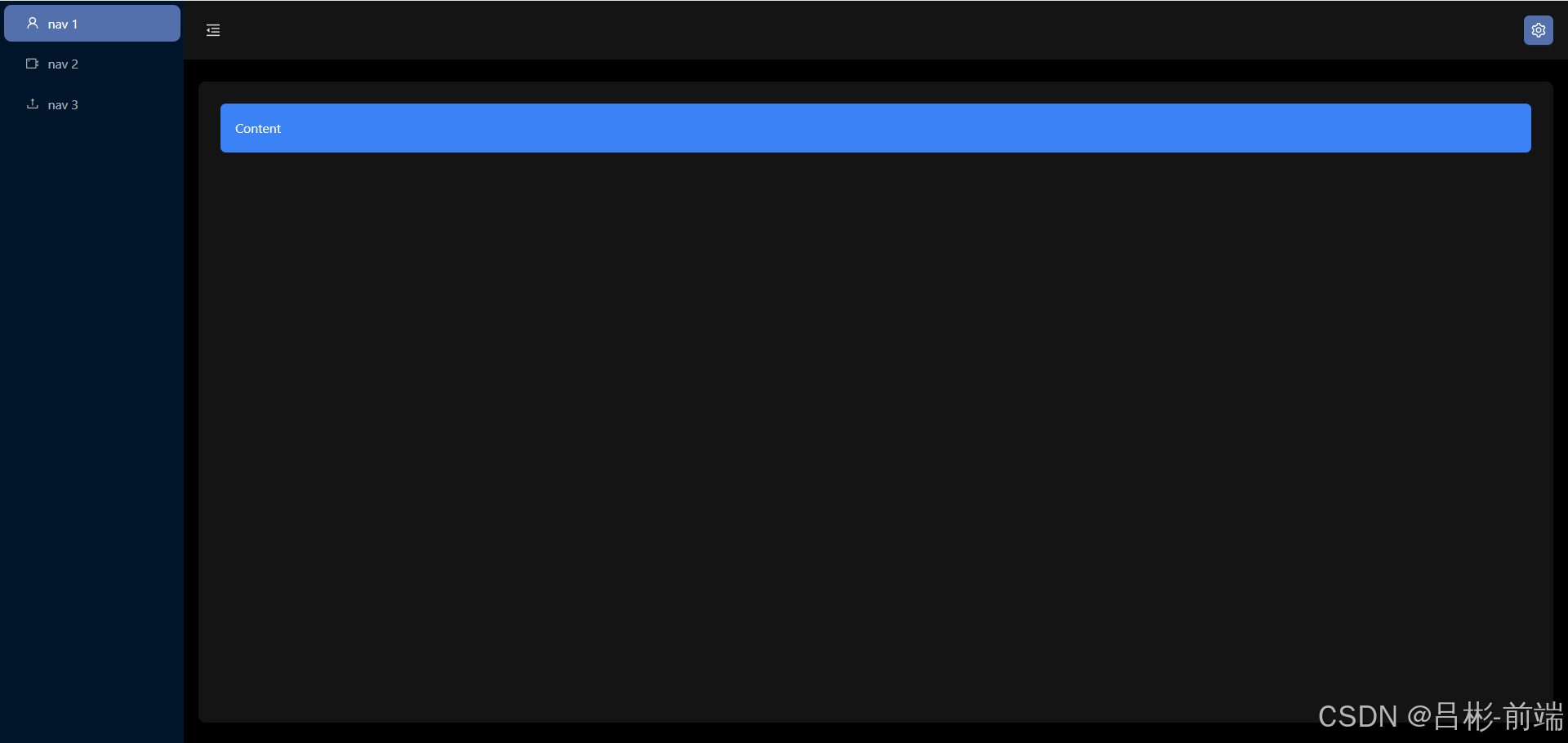
此时我们选择不同的设置
刷新页面后可以看到就是之前设置好的配置
总结
到此我们对全局配置的一个大概的工作完成了,当然实际项目和需求中可能会有不同或更多的配置按照这个思路可以添加不同的配置,当然如果已经很熟练的使用react+redux可以直接省略掉很多中间的步骤 ,比如直接新建setting.tsx子组件写逻辑,和直接在global.ts中添加状态管理及方法在组件中直接应用。
后续
本篇文章为项目使用redux配合本地存储做了全局设置,代码已经同步到了gitee仓库,下一篇会使用axios和mock来设置左侧菜单
相关文章:
使用vite+react+ts+Ant Design开发后台管理项目(三)
前言 本文将引导开发者从零基础开始,运用vite、react、react-router、react-redux、Ant Design、less、tailwindcss、axios等前沿技术栈,构建一个高效、响应式的后台管理系统。通过详细的步骤和实践指导,文章旨在为开发者揭示如何利用这些技术…...
)
AUTOSAR_EXP_ARAComAPI的5章笔记(11)
5.4.5 轮询和事件驱动处理模式 接下来,我们探讨服务提供方同时支持事件驱动和轮询行为的情况。从服务实例(此处指骨架子类实例)的角度来看,服务消费者的请求(包括服务方法或字段的 getter/setter 调用)可能…...

面经3——中和农信
今天参加了中和农信的面试,先进行60分钟的笔试,笔试完参加面试,面试官有两个人,面试了大概四十多分钟,因为没有亮点的项目,简历看起来十分单薄。现在来复盘一下。 笔试 事务ACID、事务隔离级别、乐观锁的…...

线程1(重点知识)
线程 1.线程的概念: 线程是进程中的⼀个执行单元,负责当前进程中程序的执行,⼀个进程中至少有⼀个线程 ⼀个进程中是可以有多个线程 多个线程共享同一个进程的资源,每个线程参与操作系统的统一调度 可以简单理解: 进程 进程资源…...

Python中requests模块(爬虫)基本使用
Python的requests模块是一个非常流行的HTTP库,用于发送HTTP/1.1请求。 一、模块导入 1、requests模块的下载: 使用包管理器下载,在cmd窗口,或者在项目的虚拟环境目录下: pip3 install -i https://pypi.tuna.tsingh…...

快递上门取件API接口代码
官网:快递鸟 API列表 功能功能描述应用场景超区校验接口校验该地区是否支持上门取件,以及3天内可支持的上门取件时间段。场景一:寄件人老七,选择从深圳向北极村寄快递,通过超区检验接口,提前了解到深圳寄…...

sklearn特征选取之RFE
sklearn.feature_selection.RFE 是一种递归特征消除(Recursive Feature Elimination, RFE)方法,用于通过反复训练模型和消除不重要的特征,逐步减少特征数量,最终选择最重要的特征。它是一种用于特征选择的算法…...

vue.js 展示树状结构数据,动态生成 HTML 内容
展示树状结构数据: 从 jsonData 读取树状结构的 JSON 数据,将其解析并生成 HTML 列表来展示。树状结构数据根据 id 和 label 属性组织,节点可以包含子节点 children。 展示评级信息: 从预定义的表单字段 form 中读取 arRateFlag 和…...

科技赋能安全,财谷通助力抖音小店腾飞!
在数字经济的浪潮中,短视频与直播带货已成为新时代的商业风口,抖音小店作为这一领域的佼佼者,正引领着无数小微商家踏上创业与转型的快车道。然而,随着市场的日益繁荣,如何有效管理店铺、提升运营效率、保障交易安全成…...
Redis安装教程
Redis安装详细教程 📖1.单机安装Redis✅安装Redis依赖✅上传安装包并解压✅启动🧊默认启动🧊指定配置启动🧊开机自启 📖2.Redis客户端✅Redis命令行客户端✅图形化桌面客户端🧊安装🧊建立连接 大…...

Idea集成docker实现镜像打包一键部署
1.Docker开启远程访问 #修改该Docker服务文件 vi /lib/systemd/system/docker.service#修改ExecStart这行 ExecStart/usr/bin/dockerd -H tcp://0.0.0.0:2375 -H unix:///var/run/docker.sock将文件内的 ExecStart注释。 新增如上行。 ExecStart/usr/bin/dockerd -H fd:/…...

spring 注解 - @NotNull - 确保字段或参数值不为 null
NotNull 是 Bean Validation API(JSR 303/JSR 349)中的一个注解,用于确保一个字段或参数值不为 null。这个注解可以用于 Java 类的字段、方法的参数或者方法的返回值上,以确保在运行时这些值不为空。 使用场景 字段验证…...

408算法题leetcode--第13天
61. 旋转链表 61. 旋转链表思路:注释时间:O(n);空间:O(1) /*** Definition for singly-linked list.* struct ListNode {* int val;* ListNode *next;* ListNode() : val(0), next(nullptr) {}* ListNode(int x…...

【MySQL】表的基本查询
目录 🌈前言🌈 📁 创建Creator 📂 插入数据 📂 插入否则更新 📂 替换 📁 读取Retrieve 📂 select列 📂 where条件 📂 结果排序 📂 筛选分页结果…...

李宏毅2023机器学习HW15-Few-shot Classification
文章目录 LinkTask: Few-shot ClassificationBaselineSimple—transfer learningMedium — FO-MAMLStrong — MAML Link Kaggle Task: Few-shot Classification The Omniglot dataset background set: 30 alphabetsevaluation set: 20 alphabetsProblem setup: 5-way 1-sho…...
API安全推荐厂商瑞数信息入选IDC《中国数据安全技术发展路线图》
近日,全球领先的IT研究与咨询公司IDC发布报告《IDC TechScape:中国数据安全技术发展路线图,2024》。瑞数信息凭借其卓越的技术实力和广泛的行业应用,被IDC评选为“增量型”技术曲线API安全的推荐厂商。 IDC指出,数据安…...

1.5 计算机网络的性能指标
参考:📕深入浅出计算机网络 目录 速率 带宽 吞吐量 时延 时延带宽积 往返时间 利用率 丢包率 速率 速率是指数据的传送速率(即每秒传送多少个比特),也称为数据率(Data Rate)或比特率&am…...

【已解决】IDEA鼠标光标与黑块切换问题,亲测有效
前言 前两天我妹妹说她室友的idea光标变成黑块状了,解决不了跑来问我,这是刚入门开发者经常遇到的问题,这篇文章介绍一下这两种方式,方便刚入门的小伙伴儿们更清楚地了解idea,使用idea。 希望这篇文章能够帮助到遇到…...
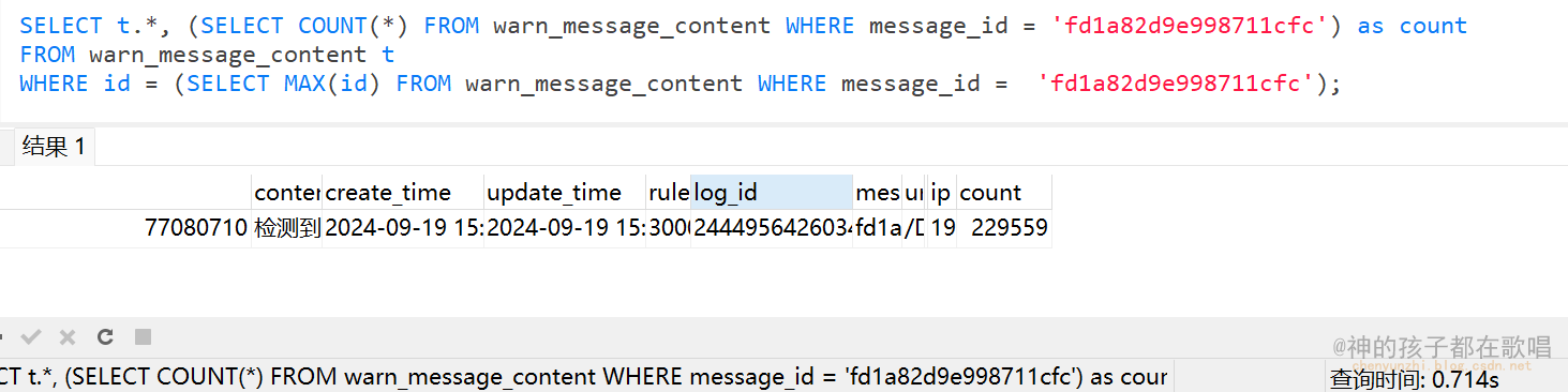
记一次sql查询优化
记一次sql查询优化 前言 这是我在这个网站整理的笔记,有错误的地方请指出,关注我,接下来还会持续更新。 作者:神的孩子都在歌唱 今天测试环境发现一个问题,就是测试同事在测试的时候,发现cpu一直居高不下,然…...
)
str函数的模拟(包括strn函数的模拟)
首先先说这些函数引用的头文件是<string.h> 1.strlen函数 int my_strlen(char* s1) { //这里只用最难的方法 if (*s1) { return my_strlen(s1 1) 1; } else return 0; } 这里使用了递归的方法(不创建新的变量࿰…...

搞定银河麒麟V10+飞腾平台Qt开发环境后,我总结的3个必做配置和1个字体坑
银河麒麟V10飞腾平台Qt开发环境深度调优指南 在国产化技术栈中,银河麒麟V10操作系统搭配飞腾D2000处理器的组合正逐渐成为自主可控解决方案的主流选择。对于需要在此平台上进行Qt开发的工程师而言,成功安装Qt仅仅是万里长征的第一步。本文将深入剖析三个…...

微信好友关系检测工具完整指南:如何快速发现谁删除了你
微信好友关系检测工具完整指南:如何快速发现谁删除了你 【免费下载链接】WechatRealFriends 微信好友关系一键检测,基于微信ipad协议,看看有没有朋友偷偷删掉或者拉黑你 项目地址: https://gitcode.com/gh_mirrors/we/WechatRealFriends …...

英雄联盟录像编辑终极指南:5分钟掌握免费开源工具League Director
英雄联盟录像编辑终极指南:5分钟掌握免费开源工具League Director 【免费下载链接】leaguedirector League Director is a tool for staging and recording videos from League of Legends replays 项目地址: https://gitcode.com/gh_mirrors/le/leaguedirector …...

5分钟解锁虚拟多屏生产力:Rust驱动打造Windows虚拟显示器终极方案
5分钟解锁虚拟多屏生产力:Rust驱动打造Windows虚拟显示器终极方案 【免费下载链接】virtual-display-rs A Windows virtual display driver to add multiple virtual monitors to your PC! For Win10. Works with VR, obs, streaming software, etc 项目地址: htt…...

ARM迷你PC硬核体验:RK3588玩转游戏、影音与家庭服务器
1. 项目概述:当ARM迷你PC遇上硬核游戏最近几年,迷你PC市场可以说是百花齐放,从主打办公的英特尔NUC,到各种基于AMD平台的准系统,选择非常多。但不知道你有没有注意到,一股新的力量正在悄然崛起——那就是基…...

抖音下载器实战指南:告别手动保存,批量获取无水印内容
抖音下载器实战指南:告别手动保存,批量获取无水印内容 【免费下载链接】douyin-downloader A practical Douyin downloader for both single-item and profile batch downloads, with progress display, retries, SQLite deduplication, and browser fal…...

突发!Gemini Ultra最新v1.5更新导致批量推理吞吐下降38%?我们48小时内完成全链路压测并定位CUDA内核缺陷
更多请点击: https://codechina.net 第一章:Gemini Ultra性能测试的背景与挑战 随着多模态大模型能力边界持续拓展,Gemini Ultra作为Google最新发布的旗舰级AI模型,在推理深度、上下文理解与跨模态协同方面提出了前所未有的工程验…...

对比直接使用官方API通过聚合平台管理网站AI调用的体验
🚀 告别海外账号与网络限制!稳定直连全球优质大模型,限时半价接入中。 👉 点击领取海量免费额度 对比直接使用官方API与通过聚合平台管理网站AI调用的体验 作为一名网站开发者,在项目中集成大模型能力已成为常态。早期…...

IL-4/IL-4R信号通路及其靶向治疗研究进展
摘要白介素-4(interleukin-4, IL-4)是一种多效细胞因子,通过特异性结合细胞表面的IL-4受体(IL-4 receptor, IL-4R)发挥生物学效应。IL-4/IL-4R信号通路在特应性皮炎、哮喘及恶性肿瘤等疾病的病理过程中发挥重要作用。近…...

3分钟解决Windows热键冲突:Hotkey Detective完全使用指南
3分钟解决Windows热键冲突:Hotkey Detective完全使用指南 【免费下载链接】hotkey-detective A small program for investigating stolen key combinations under Windows 7 and later. 项目地址: https://gitcode.com/gh_mirrors/ho/hotkey-detective 你是否…...