HarmonyOS NEXT实战:自定义封装多种样式导航栏组件
涉及知识点和装饰器
- @ComponentV2,@Local, @Builder,@BuilderParam,@Extend, @Require ,@Param,@Event等
- 第三方库:ZRouter ,如项目中本来就用了ZRouter路由库,案例中点返回按钮直接使用了 ZRouter.pop(),没有用到的话也支持自定义返回事件。
背景:
在项目开发进程中,导航栏的应用场景颇为繁多。以我的页面为例,其导航栏呈现为图标、文字与箭头相组合的样式;而设置页面的导航栏则是图标、文字、右侧文字以及小红点的搭配形式;至于公用顶部导航栏,又表现为左侧返回图标、中间文字、右侧图标与文字的布局。倘若针对每一处用到导航栏的地方均单独编写代码,那么代码的重复编写现象将极为严重。基于此,我们可采用自定义封装的方式构建公用组件。如此一来,不仅为项目后期的维护与拓展提供了极大的便利,同时也能够显著提升开发效率,让开发者有更多精力投入到更具价值的工作思考中,减少不必要的重复劳作时间消耗。
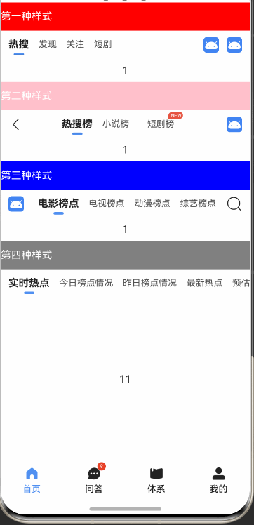
先上效果图
-
图一

-
图二

-
图三
实现 图一 效果图
- 1、首先需要定义好类型,比如 图片+文字+小红点+返回右键等。
@ObservedV2
export class TabHorizontalModel {title: string;index: number; //下标icon: string | Resource;hasIcon: boolean; //是否显示图@Trace rightTitle: string;hasRightTitle: boolean;@Trace hasNew: boolean; //是否显示红点hasRightIcon: boolean; //是否显示图constructor(title: string, index: number = -1, icon: string | Resource = '', hasIcon: boolean = false, rightTitle: string = '', hasRightTitle: boolean = false, hasNew: boolean = false,hasRightIcon: boolean = true) {this.icon = icon;this.hasIcon = hasIcon;this.title = title;this.rightTitle = rightTitle;this.hasRightTitle = hasRightTitle;this.hasNew = hasNew && rightTitle !== '';this.index = index;this.hasRightIcon = hasRightIcon;}
}- 2、封装一个通用的 横向Tab 图片、文字、右边文字、小红点 组件
import { CommonConst } from "utils"
import { TabHorizontalModel } from "../model/TabHorizontalModel"/*** Author:J* Describe: 横向Tab 图片、文字、右边文字、小红点*/
@ComponentV2
export struct HorizontalTabItemComp {@Param @Require tabItem: TabHorizontalModel= new TabHorizontalModel('')@Param onItemClick?: () => void = undefinedbuild() {Row() {Image(this.tabItem.icon).width(24).margin({ right: 12 }).visibility(this.tabItem.hasIcon ? Visibility.Visible : Visibility.None)Text(this.tabItem.title).fontSize(16).fontColor($r('app.color.color_222222')).layoutWeight(1)if (this.tabItem.hasNew) {Badge({value: '',position: BadgePosition.Right,style: { badgeSize: 7, badgeColor: $r('app.color.color_FA2A2D') }}) {Text(this.tabItem.rightTitle).fontSize(16).fontColor($r('app.color.color_222222')).visibility(this.tabItem.hasRightTitle ? Visibility.Visible : Visibility.None).margin({ right: 20 })}} else {Text(this.tabItem.rightTitle).fontSize(16).fontColor($r('app.color.color_222222')).visibility(this.tabItem.hasRightTitle ? Visibility.Visible : Visibility.None)}Image($r('app.media.ic_arrow_right_gray_small')).width(24).margin({ left: 12 }).visibility(this.tabItem.hasRightIcon ? Visibility.Visible : Visibility.None)}.width(CommonConst.FULL_PARENT).height(44).backgroundColor($r('app.color.white')).onClick(() => {this.onItemClick?.()})}
}- 3、使用案例
3.1 针对于一个,可以用下面的代码,但是对于一个页面有多个的话,要是一行行的写,虽然可以,但是不建议,而且也不优雅,所以需要用到ForEach来实现。
HorizontalTabItemComp({tabItem: new TabHorizontalModel("我的积分", 0, $r('app.media.ic_coin'), true),onItemClick: () => {ToastUtil.showToast('我的积分')}}).margin({ left: 12, right: 12 })3.2 定义一组数据,塞到数组里
/** 横向Tab */
export const horizontalTabItemData: Array<TabHorizontalModel> = [new TabHorizontalModel("我的积分", 0, $r('app.media.ic_coin'), true, '666', true),new TabHorizontalModel("我的分享", 1, $r('app.media.ic_share_article'), true),new TabHorizontalModel("我的收藏", 2, $r('app.media.ic_collect'), true),new TabHorizontalModel("我的书签", 3, $r('app.media.ic_read_later'), true),new TabHorizontalModel("阅读历史", 4, $r('app.media.ic_read_record'), true),new TabHorizontalModel("开源项目", 5, $r('app.media.ic_github'), true),new TabHorizontalModel("关于作者", 6, $r('app.media.ic_about'), true, '请他喝杯咖啡~', true),
]
3.3 使用ForEach来实现
ForEach(horizontalTabItemData, (item: TabHorizontalModel, index: number) => {HorizontalTabItemComp({tabItem: item,onItemClick: () => {this.onItemClick(item)}}).margin({ left: 12, right: 12 })})/** 点击事件 */private onItemClick(item: TabHorizontalModel) {ToastUtil.showToast(item.title)if (item.index == 0) {} else if (item.index == 1) {} else if (item.index == 2) {} else if (item.index == 3) {} else if (item.index == 4) {} else if (item.index == 5) {} else if (item.index == 6) {}}
实现 图二 效果图
- 1、首先需要定义好需要的参数
/** 标题 */@Param title: ResourceStr = '';/** 返回按钮的点击事件 */@Param backClick?: (event?: ClickEvent) => void = undefined;/** 是否显示右侧按钮 */@Param isShowRight: boolean = false;/** 右侧标题 */@Param rightTitle: ResourceStr = '';/** 右侧图片 */@Param rightImage: ResourceStr = '';/** 右侧点击事件 */@Param rightClick?: (event?: ClickEvent) => void = undefined;
- 2、封装一个公用的自定义导航栏组件,内置了导航栏的返回按钮、标题、右侧按钮等,完整代码如下:
import { ZRouter } from '@hzw/zrouter';
import { CommonConst } from 'utils';/*** Author:J* Describe:自定义导航栏组件* 内置了导航栏的返回按钮、标题、右侧按钮等*/
@ComponentV2
export struct TitleBarComp {/** 标题 */@Param title: ResourceStr = '';/** 返回按钮的点击事件 */@Param backClick?: (event?: ClickEvent) => void = undefined;/** 是否显示右侧按钮 */@Param isShowRight: boolean = false;/** 右侧标题 */@Param rightTitle: ResourceStr = '';/** 右侧图片 */@Param rightImage: ResourceStr = '';/** 右侧点击事件 */@Param rightClick?: (event?: ClickEvent) => void = undefined;build() {Column() {Row() {Image($r('app.media.ic_arrow_left')).width(44).padding(8).onClick(() => {if (this.backClick) {this.backClick()} else {ZRouter.pop()}})Text(this.title).fontColor($r('app.color.color_222222')).fontSize(16).maxLines(1).fontWeight(FontWeight.Bold)Row() {if (this.rightTitle) {Text(this.rightTitle).fontColor($r('app.color.color_222222')).fontSize(16).margin({ right: 10 })} else {Image(this.rightImage ? this.rightImage : $r('app.media.ic_local_search')).width(44).padding(10)}}.onClick(this.rightClick).visibility(this.isShowRight ? Visibility.Visible : Visibility.Hidden)}.width(CommonConst.FULL_PARENT).height(44).justifyContent(FlexAlign.SpaceBetween).backgroundColor($r('app.color.white'))Divider().width(CommonConst.FULL_PARENT).color($r('app.color.color_F0F0F0'))}.width(CommonConst.FULL_PARENT).height(45)}
}- 3、使用案例,包含了多种样式使用
NavDestination() {Column({space:8}) {Text('第一种样式').fontColor(Color.Red)TitleBarComp({ title: '设置' })Text('第二种样式,自定义返回事件').fontColor(Color.Red)TitleBarComp({title: '设置二', backClick: () => {ToastUtil.showToast('自定义返回事件')}})Text('第三种样式,右边有文字').fontColor(Color.Red)TitleBarComp({title: '设置三',isShowRight: true,rightTitle: '右边',rightClick: () => {ToastUtil.showToast('右边')}})Text('第四种,右边有图片').fontColor(Color.Red)TitleBarComp({title: '设置四',isShowRight: true,rightImage: $r('app.media.ic_share_article'),rightClick: () => {ToastUtil.showToast('右边')}})}.width(CommonConst.FULL_PARENT).height(CommonConst.FULL_PARENT).backgroundColor($r('app.color.white'))}.hideTitleBar(true)实现 图三 效果图
- 背景:这个逻辑比较复杂,一步步优化实现,为啥还需要自定义,直接用官方自带的Tabs+TabContent就可以实现啊;如果只是针对于一行都是简单文字切换那还好,但是对于那种,左边、右边是图片+中间是文字用自带的就不行了,因为下面的内容的宽度是铺满屏幕的宽度的,所以需要自定义。
- 1、定义需要的参数,自定义左边视图,右边视图,内容,下划线,是否滑动等,具体可以看完整代码。
@Param currentTabIndex: number = 0;@Param tabContentArr: boolean[] = []; //存储页面状态private tabsController: TabsController = new TabsController();@Param tabs: Array<TabBarModel> = [];//左边视图@BuilderParam tabBarLeft: () => void = this.barLeft;//右边视图@BuilderParam tabBarRight: () => void = this.barRight;//内容@BuilderParam tabContentBuilder: ($$: TabBarModel) => void = this._TabContentBuilder;//是否显示下划线@Param isShowDivider: boolean = false;//是否滑动@Param scrollable: boolean = false;//顶部中间视图是否居中 true居中 false 默认 居左@Param isTabBarCenter: boolean = false;//选中字体颜色@Param selectFontColor: ResourceColor = $r('app.color.color_222222');//滑动条是否显示@Param isDividerVisible: boolean = true;//更新@Event changeFactory: (currentTabIndex: number, isShowDivider: boolean) => void = (currentTabIndex: number, isShowDivider: boolean) => {}- 2、自定义顶部视图,List替换tabBar 配合Tabs 左视图–tabBar–右视图
Column() {//切换this.customTabBar()//下划线Divider().color($r('app.color.color_F0F0F0')).visibility(this.isShowDivider ? Visibility.Visible : Visibility.None)//TabContent中的tabBar居中显示,所以暂时不用tabBarTabs({ controller: this.tabsController, barPosition: BarPosition.Start }) {ForEach(this.tabs, (item: TabBarModel, index: number) => {TabContent() {//滑到哪个页面再加载,防止一块加载if (this.currentTabIndex === index || this.tabContentArr[index]) {this.tabContentBuilder(item)}}// .tabBar()}, (item: string) => item)}.layoutWeight(1).barHeight(0) //隐藏tabBar.scrollable(this.scrollable).onChange(index => {this.tabContentArr[index] = truethis.changeFactory(index,this.tabs[index].isShowDivider)})}.width(CommonConst.FULL_PARENT).backgroundColor($r('app.color.white'))- 3、 List实现【标题+横线】选中效果
@BuildercustomTabBar() {Row() {//左边自定义this.tabBarLeft()//中间CustomTabBarComp({currentTabIndex: this.currentTabIndex,tabs: this.tabs,selectFontColor: this.selectFontColor,isTabBarCenter: this.isTabBarCenter,onTabClick: (index: number) => {this.tabsController.changeIndex(index)},isDividerVisible: this.isDividerVisible})//右边自定义this.tabBarRight()}.width(CommonConst.FULL_PARENT).height(44)}
- 4、标题+横线 List和TabContent.tabBar都可以用
@ComponentV2
export struct TabBarViewComp {@Param private index: number = 0@Param currentTabIndex: number = 0@Param tabs: Array<TabBarModel> = new Array<TabBarModel>()//选中字体颜色@Param selectFontColor: ResourceColor = $r('app.color.color_222222');@Param onTabClick: (index: number) => void = () => {};@Param isDividerVisible: boolean = true;build() {Column() {//右上角图片Image(this.tabs[this.index].rightSrc).height(11).margin({ left: 46 }).visibility(this.tabs[this.index].isShowRightSrc ? Visibility.Visible : Visibility.None)Text(this.tabs[this.index].name).fontSize(this.currentTabIndex == this.index ? 16 : 14).fontColor(this.currentTabIndex == this.index ? this.selectFontColor : $r('app.color.color_505050')).fontWeight(this.currentTabIndex == this.index ? FontWeight.Bold : FontWeight.Normal).margin({ top: this.tabs[this.index].isShowRightSrc ? 0 : 11 })Divider().width(16).height(4).backgroundColor($r('app.color.colorPrimary')).margin({ top: 4, bottom: 4 }).borderRadius(12).visibility(this.isDividerVisible && this.currentTabIndex == this.index ? Visibility.Visible : Visibility.Hidden)}.margin({ right: 15 }).onClick(() => {this.onTabClick(this.index)})}
}
- 5、完整代码如下
import { CommonConst } from "utils";
import { TabBarModel } from "../model/TabBarModel";/*** Author:J* Describe:自定义tabBar 左视图--tabBar--右视图** ListWithTabBarView({}) List替换tabBar 配合Tabs  左视图--tabBar--右视图* CustomTabBarComp({}) List实现【标题+横线】选中效果* TabBarViewComp({})  标题+横线   List和TabContent.tabBar都可以用*/
@Preview
@ComponentV2
export struct ListWithTabBarView {@Param currentTabIndex: number = 0;@Param tabContentArr: boolean[] = []; //存储页面状态private tabsController: TabsController = new TabsController();@Param tabs: Array<TabBarModel> = [];//左边视图@BuilderParam tabBarLeft: () => void = this.barLeft;//右边视图@BuilderParam tabBarRight: () => void = this.barRight;//内容@BuilderParam tabContentBuilder: ($$: TabBarModel) => void = this._TabContentBuilder;//是否显示下划线@Param isShowDivider: boolean = false;//是否滑动@Param scrollable: boolean = false;//顶部中间视图是否居中 true居中 false 默认 居左@Param isTabBarCenter: boolean = false;//选中字体颜色@Param selectFontColor: ResourceColor = $r('app.color.color_222222');//滑动条是否显示@Param isDividerVisible: boolean = true;//更新@Event changeFactory: (currentTabIndex: number, isShowDivider: boolean) => void = (currentTabIndex: number, isShowDivider: boolean) => {}aboutToAppear() {for (let index = 0; index < this.tabs.length; index++) {this.tabContentArr.push(index == 0 ? true : false)}}build() {Column() {//切换this.customTabBar()//下划线Divider().color($r('app.color.color_F0F0F0')).visibility(this.isShowDivider ? Visibility.Visible : Visibility.None)//TabContent中的tabBar居中显示,所以暂时不用tabBarTabs({ controller: this.tabsController, barPosition: BarPosition.Start }) {ForEach(this.tabs, (item: TabBarModel, index: number) => {TabContent() {//滑到哪个页面再加载,防止一块加载if (this.currentTabIndex === index || this.tabContentArr[index]) {this.tabContentBuilder(item)}}// .tabBar()}, (item: string) => item)}.layoutWeight(1).barHeight(0) //隐藏tabBar.scrollable(this.scrollable).onChange(index => {this.tabContentArr[index] = truethis.changeFactory(index,this.tabs[index].isShowDivider)})}.width(CommonConst.FULL_PARENT).backgroundColor($r('app.color.white'))// .padding({ left: 12, right: 12 })}@Builder_TabContentBuilder($$: TabBarModel) {Text("tabContentBuilder:()=>{your @Builder View}")}@BuildercustomTabBar() {Row() {//左边自定义this.tabBarLeft()//中间CustomTabBarComp({currentTabIndex: this.currentTabIndex,tabs: this.tabs,selectFontColor: this.selectFontColor,isTabBarCenter: this.isTabBarCenter,onTabClick: (index: number) => {this.tabsController.changeIndex(index)},isDividerVisible: this.isDividerVisible})//右边自定义this.tabBarRight()}.width(CommonConst.FULL_PARENT).height(44)}@BuilderbarLeft() {}@BuilderbarRight() {}
}@ComponentV2
export struct CustomTabBarComp {@Param currentTabIndex: number = 0;@Param tabs: Array<TabBarModel> = new Array<TabBarModel>()//选中字体颜色@Param selectFontColor: ResourceColor = $r('app.color.color_222222');@Param onTabClick: (index: number) => void = () => {};@Param isTabBarCenter: boolean = false;@Param isDividerVisible: boolean = true;build() {Row() {List() {ForEach(this.tabs, (item: TabBarModel, index: number) => {ListItem() {TabBarViewComp({index: index,currentTabIndex: this.currentTabIndex,tabs: this.tabs,selectFontColor: this.selectFontColor,onTabClick: (index: number) => {this.onTabClick(index)},isDividerVisible: this.isDividerVisible})}})}// .width(Constants.FULL_PARENT).height(44).listDirection(Axis.Horizontal).alignListItem(ListItemAlign.Center).scrollBar(BarState.Off)// .margin({ right: 8 })}.layoutWeight(1).justifyContent(this.isTabBarCenter ? FlexAlign.Center : FlexAlign.Start)}
}@ComponentV2
export struct TabBarViewComp {@Param private index: number = 0@Param currentTabIndex: number = 0@Param tabs: Array<TabBarModel> = new Array<TabBarModel>()//选中字体颜色@Param selectFontColor: ResourceColor = $r('app.color.color_222222');@Param onTabClick: (index: number) => void = () => {};@Param isDividerVisible: boolean = true;build() {Column() {//右上角图片Image(this.tabs[this.index].rightSrc).height(11).margin({ left: 46 }).visibility(this.tabs[this.index].isShowRightSrc ? Visibility.Visible : Visibility.None)Text(this.tabs[this.index].name).fontSize(this.currentTabIndex == this.index ? 16 : 14).fontColor(this.currentTabIndex == this.index ? this.selectFontColor : $r('app.color.color_505050')).fontWeight(this.currentTabIndex == this.index ? FontWeight.Bold : FontWeight.Normal).margin({ top: this.tabs[this.index].isShowRightSrc ? 0 : 11 })Divider().width(16).height(4).backgroundColor($r('app.color.colorPrimary')).margin({ top: 4, bottom: 4 }).borderRadius(12).visibility(this.isDividerVisible && this.currentTabIndex == this.index ? Visibility.Visible : Visibility.Hidden)}.margin({ right: 15 }).onClick(() => {this.onTabClick(this.index)})}
}
- 6、使用案例如下,多种样式的使用:
import { ToastUtil } from '@pura/harmony-utils'
import { ListWithTabBarView, TabBarModel } from 'uicomponents'
import { CommonConst } from 'utils'
import { GetFourStyleTabData, GetOneStyleTabData, GetThreeStyleTabData, GetTwoStyleTabData } from './TestModel'@Preview
@ComponentV2
export struct TestTabBarView {@Local currentTabIndex: number = 0@Local isShowDivider: boolean = GetOneStyleTabData[0].isShowDivider@Local currentTabIndex2: number = 0@Local currentTabIndex3: number = 0@Local currentTabIndex4: number = 0build() {NavDestination() {Column() {Text('第一种样式').text(Color.Red)ListWithTabBarView({currentTabIndex: this.currentTabIndex,tabs: GetOneStyleTabData,tabBarLeft: this.tabBarLeft,tabBarRight: this.tabBarRight,tabContentBuilder: this.tabContentBuilder,isShowDivider: this.isShowDivider,changeFactory: (currentTabIndex, isShowDivider) => {this.currentTabIndex = currentTabIndexthis.isShowDivider = isShowDivider}}).height(80)Text('第二种样式').text(Color.Pink)ListWithTabBarView({currentTabIndex: this.currentTabIndex2,tabs: GetTwoStyleTabData,tabBarLeft: this.tabBarLeft2,tabBarRight: this.tabBarRight2,tabContentBuilder: this.tabContentBuilder,changeFactory: (currentTabIndex) => {this.currentTabIndex2 = currentTabIndex},isTabBarCenter: true}).height(80)Text('第三种样式').text(Color.Blue)ListWithTabBarView({currentTabIndex: this.currentTabIndex,tabs: GetThreeStyleTabData,tabBarLeft: this.tabBarLeft3,tabBarRight: this.tabBarRight3,tabContentBuilder: this.tabContentBuilder,isTabBarCenter: true,changeFactory: (currentTabIndex) => {this.currentTabIndex = currentTabIndex}}).height(80)Text('第四种样式').text(Color.Grey)ListWithTabBarView({currentTabIndex: this.currentTabIndex4,tabs: GetFourStyleTabData,tabBarLeft: this.tabBarLeft4,tabContentBuilder: (tab): void => this.tabContentBuilder(tab),isShowDivider: true,changeFactory: (currentTabIndex) => {this.currentTabIndex4 = currentTabIndex}}).layoutWeight(1).height(80)}.width(CommonConst.FULL_PARENT).height(CommonConst.FULL_PARENT)}}@BuildertabBarLeft() {Text().width(12)}@BuildertabBarRight() {Row({ space: 12 }) {Image($r('app.media.app_icon')).width(24).visibility(this.currentTabIndex == 0 || this.currentTabIndex == 1 ? Visibility.Visible : Visibility.Hidden).onClick(() => {ToastUtil.showToast('点了1')})Image($r('app.media.app_icon')).width(24).onClick(() => {ToastUtil.showToast('点了')})}.padding({ right: 12 })}@BuildertabContentBuilder($$: TabBarModel) {Text($$.id)}@BuildertabBarLeft2() {Image($r('app.media.ic_arrow_left')).width(24).margin({ left: 12, right: 6 }).onClick(() => {ToastUtil.showToast('返回键')// ZRouter.pop()})}@BuildertabBarRight2() {Image($r('app.media.app_icon')).width(24).margin({ right: 12 }).onClick(() => {ToastUtil.showToast('点了')})}@BuildertabBarLeft3() {Image($r('app.media.app_icon')).width(24).fillColor(Color.Black).margin({ left: 12, right: 20 }).onClick(() => {ToastUtil.showToast('设置')})}@BuildertabBarRight3() {Image(this.currentTabIndex == 1 ? $r('app.media.ic_next') : $r('app.media.ic_local_search')).width(24).margin({ right: 12 }).visibility(this.currentTabIndex != 2 ? Visibility.Visible : Visibility.Hidden).onClick(() => {ToastUtil.showToast(this.currentTabIndex == 1 ? '点了1' : '搜索')})}@BuildertabBarLeft4() {Text().width(12)}
}@Extend(Text)
function text(color: ResourceColor) {.height(44).width(CommonConst.FULL_PARENT).fontColor(Color.White).backgroundColor(color)
}
以往系列文章
- 《探索 HarmonyOS NEXT(5.0):开启构建模块化项目架构奇幻之旅 —— 模块化基础篇》
- 《探索 HarmonyOS NEXT(5.0):开启构建模块化项目架构奇幻之旅 —— 构建基础特性层》
- 《探索 HarmonyOS NEXT(5.0):开启构建模块化项目架构奇幻之旅 —— 构建公共能力层》
- 《探索 HarmonyOS NEXT(5.0):开启构建模块化项目架构奇幻之旅 —— Tabs底部导航栏》
- 《探索 HarmonyOS NEXT (5.0):开启构建模块化项目架构奇幻之旅 —— 动态路由 ZRouter:引领高效模块通信的智慧中枢》
- 《探索 HarmonyOS NEXT(5.0):开启构建模块化项目架构奇幻之旅 ——第三方库的使用:网络请求RCP、二次封装上下拉刷新、弹窗》
- HarmonyOS NEXT:模块化项目 ——修改应用图标+启动页等
- HarmonyOSNext模块化设计实践:打造简洁高效的登录注册页面
若本文对您稍有帮助,诚望您不吝点赞,多谢。
有兴趣的同学可以点击查看源码
- gitee:https://gitee.com/jiaojiaoone/explore-harmony-next/tree/case%2Fwanandroid/
- github:https://github.com/JasonYinH/ExploreHarmonyNext.git
欢迎加我微信一起交流:+V:yinshiyuba
相关文章:
HarmonyOS NEXT实战:自定义封装多种样式导航栏组件
涉及知识点和装饰器 ComponentV2,Local, Builder,BuilderParam,Extend, Require ,Param,Event等第三方库:ZRouter ,如项目中本来就用了ZRouter路由库,案例中…...
大数据面试笔试宝典之Flink面试
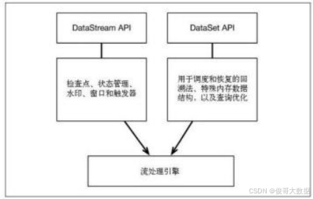
1.Flink 是如何支持批流一体的? F link 通过一个底层引擎同时支持流处理和批处理. 在流处理引擎之上,F link 有以下机制: 1)检查点机制和状态机制:用于实现容错、有状态的处理; 2)水印机制:用于实现事件时钟; 3)窗口和触发器:用于限制计算范围,并定义呈现结果的…...
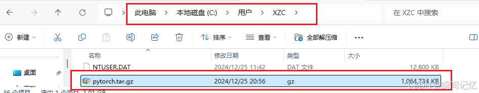
pytorch整体环境打包安装到另一台电脑上
步骤一:安装conda-pack 首先利用 pip list 指令检查conda环境安装在哪里,在系统环境(base)下,于是我是使用的conda指令完成的。 # 使用Conda安装(如果已安装conda) conda install conda-pack …...

PostgreSQL 数据库连接
title: PostgreSQL 数据库连接 date: 2024/12/29 updated: 2024/12/29 author: cmdragon excerpt: PostgreSQL是一款功能强大的开源关系数据库管理系统,在现代应用中广泛应用于数据存储和管理。连接到数据库是与PostgreSQL进行交互的第一步,这一过程涉及到多个方面,包括连…...
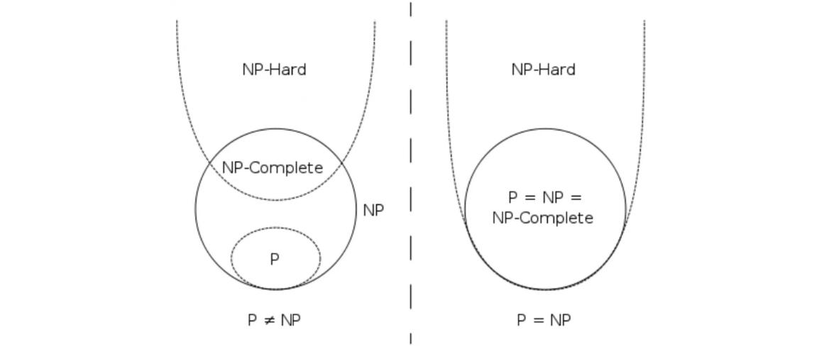
【算法】复杂性理论初步
六、算法复杂性初步 重要的复杂性类 P P P 的定义 多项式时间内可解的问题 若 L ∈ P L∈P L∈P,则存在确定性多项式时间的图灵机 M M M,使得 M ( x ) 1 ⟺ x ∈ L M(x)1⟺x∈L M(x)1⟺x∈L N P NP NP 的定义 多项式时间内可验证验证解的正确性 &…...
HarmonyOS NEXT应用开发实战:免费练手的网络API接口分享
学习一项技能,最好也最快的办法就是直接动手实战。在实战中不断的总结经验和收获成就感。这里分享些好用且免费的网络API练手接口,这对于想要提升自己网络开发能力的开发者来说,无疑是极大的福音。今天,我将详细介绍一个API接口集…...
C++的第一个程序
前言 在学习c之前,你一定还记得c语言的第一个程序 当时刚刚开始进行语言学习 因此告诉到,仅仅需要记住就可以 #include <stdio.h>int main(){printf("Hello World");return 0; }而对于c中的第一个程序,似乎有所变化 C的…...

Java 中 Stream 流的使用详解
Java 中 Stream 流的使用详解 什么是 Stream? Stream 是 Java 8 引入的一种全新的操作集合的方式。它支持通过声明性方式对集合进行复杂的数据操作(如过滤、排序、聚合等),避免使用大量的 for 循环,提高代码的可读性…...
【UE5.3.2】生成vs工程并rider打开
Rider是跨平台的,UE也是,当前现在windows上测试首先安装ue5.3.2 会自动有右键的菜单: windows上,右键,生成vs工程 生成的结果 sln默认是vs打开的,我的是vs2022,可以open with 选择 rider :Rider 会弹出 RiderLink是什么插...

ssh免密码登陆配置
ssh 命令本身不支持直接在命令中带上密码,出于安全考虑,SSH 协议不允许将密码明文写在命令中。直接在命令行中输入密码是一种不推荐的做法,因为它会暴露密码,增加安全风险。 如果你希望实现自动化登录而不手动输入密码࿰…...

Hive之import和export使用详解
在hive-0.8.0后引入了import/export命令。 Export命令可以导出一张表或分区的数据和元数据信息到一个输出位置,并且导出数据可以被移动到另一个hadoop集群或hive实例,并且可以通过import命令导入数据。 当导出一个分区表,原始数据可能在hdf…...

数据库锁的深入探讨
数据库锁(Database Lock)是多用户环境中用于保证数据一致性和隔离性的机制。随着数据库系统的发展,特别是在高并发的场景下,锁的机制变得尤为重要。通过使用锁,数据库能够防止并发操作导致的数据冲突或不一致。本文将深…...

【每日学点鸿蒙知识】沉浸式状态栏、类似ref 属性功能属性实现、自定义对话框背景透明、RichEditor粘贴回调、自动滚动列表
1、HarmonyOS 沉浸式状态栏? 实现沉浸式状态栏功能时,能够实现,但是目前每个自定义组件都需要padding top 状态栏的高度才行,有办法实现统一设置吗?不需要每个自定义组件中都padding top 状态栏的高度? 暂…...
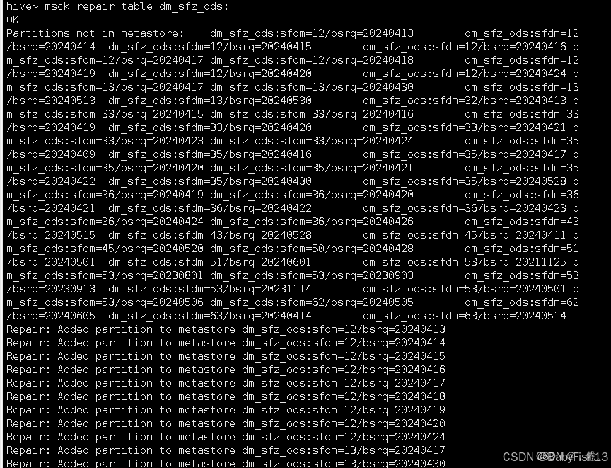
Hive刷分区MSCK
一、MSCK刷分区 我们平时通常是通过alter table add partition方式增加Hive的分区的,但有时候会通过HDFS put/cp命令或flink、flum程序往表目录下拷贝分区目录,如果目录多,需要执行多条alter语句,非常麻烦。Hive提供了一个"…...

在Ubuntu下通过Docker部署Mastodon服务器
嘿,朋友们,今天咱们来聊聊如何在Ubuntu上通过Docker部署Mastodon服务器。想要拥有自己的社交媒体平台?Mastodon就是个不错的选择!🌐🚀 Docker与Mastodon简介 Docker是一个开源的容器化平台,让…...
【EtherCATBasics】- KRTS C++示例精讲(2)
EtherCATBasics示例讲解 目录 EtherCATBasics示例讲解结构说明代码讲解 项目打开请查看【BaseFunction精讲】。 结构说明 EtherCATBasics:应用层程序,主要用于人机交互、数据显示、内核层数据交互等; EtherCATBasics.h : 数据定义…...

MYSQL无法被连接问题
如果您在尝试连接到MySQL服务器时遇到问题,以下描述了您可以采取的一些措施来纠正该问题。 确保服务器正在运行。如果没有,则客户端无法连接到它。例如,如果尝试连接到服务器失败并出现以下消息之一,则可能是服务器未运行…...
?)
【Python】什么是字典(Dictionary)?
什么是字典(Dictionary)? 字典(Dictionary)是 Python 中一种 可变(mutable)的数据结构,用于存储键值对(key-value pairs)。字典通过 键(key&…...

Web安全 - API 成批分配漏洞的四种修复方案
文章目录 概述危害修复建议与实施方案解决方案 1:手动绑定数据解决方案 2:使用 DTO 进行数据过滤解决方案 3:启用字段白名单解决方案 4:验证输入数据模式 验证修复有效性小结 概述 批量分配漏洞(Mass Assignment&#…...
计算机网络实验室建设方案
一、计算机网络实验室拓扑结构 计算机网络综合实验室解决方案,是面向高校网络相关专业开展教学实训的综合实训基地解决方案。教学实训系统采用 B/S架构,通过公有云教学实训平台在线学习模式,轻松实现网络系统建设与运维技术的教学…...

Android系统服务揭秘:从system_server到Watchdog的完整生命周期
Android系统服务深度解析:从system_server诞生到Watchdog守护的完整生命旅程 如果你曾经好奇过,当你按下Android设备的电源键,那块冰冷的硬件是如何一步步苏醒,变成一个能响应触摸、运行应用、连接网络的智能伙伴,那么…...

HY-MT1.5-7B翻译模型应用案例:如何集成到CI/CD实现自动翻译
HY-MT1.5-7B翻译模型应用案例:如何集成到CI/CD实现自动翻译 在软件开发的全球化浪潮中,多语言支持早已不是“锦上添花”,而是产品走向国际市场的“入场券”。然而,传统的人工翻译流程慢、成本高,而调用外部翻译API又面…...

从“发短信”到“打电话”:IM与RTC的技术路径与应用分野
1. 从“发短信”到“打电话”:两种通信模式的直观感受 我们每天都在用手机,但可能没仔细想过,微信里给朋友发条文字消息,和直接点开视频通话,背后其实是两套完全不同的技术体系在支撑。这就像“发短信”和“打电话”的…...
)
实战指南:基于Ansible的Linux等保三级自动化加固方案(CentOS/Kylin)
1. 为什么你需要Ansible来做等保三级加固? 如果你是一名运维或者安全工程师,手头管理着几十甚至上百台CentOS或者Kylin服务器,每次等保检查前,是不是都感觉头皮发麻?一台台服务器登录上去,重复执行那些繁琐…...
)
Labview新手必看:用Windows Media Player控件打造简易音乐播放器(附避坑指南)
LabVIEW音乐播放器实战:从零构建与深度避坑指南 如果你刚接触LabVIEW,看着那些花花绿绿的连线图有点发懵,却又想做出一个能实际运行的小项目,那么从音乐播放器入手是个绝佳选择。这不像那些复杂的工业控制系统,它贴近生…...

STM32智能小车:红外循迹、超声波避障与蓝牙遥控实战
1. 项目概述基于立创梁山派开发板构建的智能小车系统,是一个面向嵌入式硬件实践的多功能移动平台。该系统以STM32F103C8T6作为主控制器,集成红外循迹、超声波避障与蓝牙无线遥控三大核心功能模块,具备完整的运动控制能力与人机交互接口。项目…...

Gemma-3-12b-it极简UI设计解析:侧边栏上传+主界面聚焦交互的工程取舍
Gemma-3-12b-it极简UI设计解析:侧边栏上传主界面聚焦交互的工程取舍 1. 引言:当大模型遇见极简主义 如果你用过一些大模型工具,可能会发现一个有趣的现象:功能越强大,界面往往越复杂。各种参数滑块、模式切换、高级设…...

多模态AI实战:CLIP模型原理与代码深度剖析
1. 引言:多模态AI与CLIP简介1.1. 什么是CLIP?CLIP 是OpenAI于2021年发布的多模态预训练模型,它通过4亿张图像及其文本描述进行对比学习,将图像和文本映射到同一个特征空间。CLIP的出现彻底改变了计算机视觉领域,它使得…...
)
洛谷:P1424 小鱼的航程(改进版)
题目描述有一只小鱼,它平日每天游泳 250 公里,周末休息(实行双休日),假设从周 x 开始算起,过了 n 天以后,小鱼一共累计游泳了多少公里呢?输入格式输入两个正整数 x,n,表示从周 x 算起…...

基于本体论的应用到底能做什么?
🧠 从哲学思想到企业实践 行业技术观察引言"本体论"(Ontology)这个词听起来哲学味十足,但正在成为企业级 AI 应用的核心技术。从 Palantir 的 4000 亿市值神话,到国内 UINO、字节、帆软等厂商的技术探索&am…...