CSS3的常见边框汇总
<!DOCTYPE html>
<html lang="en">
<head><meta charset="UTF-8"><title>CSS3 边框</title><style>body, ul, li, dl, dt, dd, h1, h2, h3, h4, h5 {margin: 0;padding: 0;}body {background-color: #F7F7F7;}.wrapper {width: 1000px;margin: 0 auto;padding: 20px;box-sizing: border-box;}header {padding: 20px 0;margin-bottom: 20px;text-align: center;}header h3 {line-height: 1;font-weight: normal;font-size: 28px;}.main {/*overflow: hidden;*/}.main:after {content: '';clear: both;display: block;}.main .item {width: 210px;height: 210px;margin: 0 30px 30px 0;display: flex;position: relative;background-color: #FFF;float: left;box-shadow: 2px 2px 5px #CCC;}.main .item:after {content: attr(data-brief);display: block;width: 100%;height: 100%;text-align: center;line-height: 210px;position: absolute;top: 0;left: 0;color: #FFF;font-family: '微软雅黑';font-size: 18px;background-color: rgba(170, 170, 170, 0);z-index: -1;transition: all 0.3s ease-in;}.main .item:hover:after {background-color: rgba(170, 170, 170, 0.6);z-index: 100;}.main .item:nth-child(4n) {margin-right: 0;}/*.main .item:nth-last-child(-n+5) {margin-bottom: 0;}*//* 以上是骨架样式 *//* 1、2、3、4 顺时针 */.border-radius {width: 180px;height: 180px;margin: auto;border: 1px solid red;/*border-radius: 50% 30% 20%;*/}.square {border-radius: 0;}/*拱形*/.item:nth-child(1) .border-radius {border-radius: 90px;}/*拱形*/.item:nth-child(2) .border-radius {border-radius: 90px 90px 0 0;}/*半圆*/.item:nth-child(3) .border-radius {height: 90px;border-radius: 90px 90px 0 0;}/*左上角*/.item:nth-child(4) .border-radius {/*height: 90px;*/border-radius: 90px 0 0 0;}/*四分之一圆*/.item:nth-child(5) .border-radius {width: 90px;height: 90px;border-radius: 90px 0 0 0;}/*横着的椭圆*/.item:nth-child(6) .border-radius {height: 90px;/*border-radius: 50%;*/border-radius: 90px 90px 90px 90px / 45px 45px 45px 45px;/*border-radius: 45px / 90px;*/}/*竖着的椭圆*/.item:nth-child(7) .border-radius {width: 90px;border-radius: 45px 45px 45px 45px / 90px 90px 90px 90px;}/*半个横着的椭圆*/.item:nth-child(8) .border-radius {height: 45px;border-radius: 90px 90px 0 0 / 45px 45px 0 0;}/*半个竖着的椭圆*/.item:nth-child(9) .border-radius {width: 45px;border-radius: 45px 0 0 45px / 90px 0 0 90px;}/*四分之一竖着的椭圆*/.item:nth-child(10) .border-radius {width: 45px;height: 90px;border-radius: 45px 0 0 0 / 90px 0 0 0;}/*饼环*/.item:nth-child(11) .border-radius {width: 40px;height: 40px;border: 70px solid red;border-radius: 90px;}/*圆饼*/.item:nth-child(12) .border-radius {width: 40px;height: 40px;border: 70px solid red;border-radius: 60px;}/*左上角圆饼*/.item:nth-child(13) .border-radius {width: 60px;height: 60px;border: 60px solid red;border-radius: 90px 0 0 0;}/*对角圆饼*/.item:nth-child(14) .border-radius {width: 60px;height: 60px;border: 60px solid red;border-radius: 90px 0 90px 0;}/*四边不同色*/.item:nth-child(15) .border-radius {width: 0px;height: 0px;border-width: 90px;border-style: solid;border-color: red green yellow blue;}/*右透明色*/.item:nth-child(16) .border-radius {width: 0px;height: 0px;border-width: 90px;border-style: solid;border-color: red green yellow blue;border-right-color: transparent;}/*圆右透明色*/.item:nth-child(17) .border-radius {width: 0px;height: 0px;border-width: 90px;border-style: solid;border-color: red;border-right-color: transparent;border-radius: 90px;}/*圆右红透明色*/.item:nth-child(18) .border-radius {width: 0px;height: 0px;border-width: 90px;border-style: solid;border-color: transparent;border-right-color: red;border-radius: 90px;}/*阴阳图前世*/.item:nth-child(19) .border-radius {width: 180px;height: 0px;border-top-width: 90px;border-bottom-width: 90px;border-style: solid;border-top-color: red;border-bottom-color: green;/*border-right-color: red;*/border-radius: 90px;}/*阴阳图前世2*/.item:nth-child(20) .border-radius {width: 180px;height: 90px;border-bottom-width: 90px;border-style: solid;border-bottom-color: green;background-color: red;/*border-right-color: red;*/border-radius: 90px;}/*阴阳图今生*/.item:nth-child(21) .border-radius {width: 180px;height: 90px;border-bottom-width: 90px;border-style: solid;border-bottom-color: green;background-color: red;border-radius: 90px;position: relative;}.item:nth-child(21) .border-radius::after,.item:nth-child(21) .border-radius::before {content: '';position: absolute;top: 50%;width: 20px;height: 20px;/*margin: -10px 0 0 0;*/border-width: 35px;border-style: solid;border-radius: 45px;}/*左阴阳*/.item:nth-child(21) .border-radius::after {background-color: red;border-color: green;}/*右阴阳*/.item:nth-child(21) .border-radius::before {background-color: green;border-color: red;right: 0;}/*右阴阳*/.item:nth-child(22) .border-radius {width: 180px;height: 90px;border-bottom-width: 90px;border-bottom-color: green;border-bottom-style: solid;background-color: red;border-radius: 90px;position: relative;}.item:nth-child(22) .border-radius::after,.item:nth-child(22) .border-radius::before {content: '';position: absolute;top: 50%;width: 20px;height: 20px;border-width: 35px;border-style: solid;border-radius: 45px;}.item:nth-child(22) .border-radius::before {border-color: green;background-color: red;}.item:nth-child(22) .border-radius::after {right: 0;border-color: red;background-color: green;}/*消息框*/.item:nth-child(23) .border-radius {width: 160px;height: 80px;background-color: red;border-radius: 6px;position: relative;}.item:nth-child(23) .border-radius::after {content: '';width: 0;height: 0;border-width: 10px;border-style: solid;border-color: transparent;border-right-color: red;position: absolute;top: 16px;left: -20px;}/*奇怪的图形*/.item:nth-child(24) .border-radius {width: 40px;height: 40px;border-width: 45px 0 45px 70px;border-style: solid;border-radius: 0 0 60px 0;border-color: red;}/*奇怪的图形2*/.item:nth-child(25) .border-radius {width: 100px;height: 40px;border-width: 45px 20px 45px 70px;border-style: solid;border-radius: 60px;border-color: red;}/*QQ对话*/.item:nth-child(26) .border-radius {width: 160px;height: 80px;background-color: red;border-radius: 6px;position: relative;}.item:nth-child(26) .border-radius::after {content: '';position: absolute;top: 0;right: -20px;width: 30px;height: 30px;border-width: 0 0 30px 30px;border-style: solid;border-bottom-color: red;border-left-color: transparent;border-radius: 0 0 60px 0;}/*圆角的百分比设置 */.item:nth-child(27) .border-radius {width: 180px;/*height: 180px;*/height: 90px;border-radius: 50%;border-radius: 90px/45px;/*百分比是按横竖两个对应的方向的长度进行计算*/}</style>
</head>
<body>
<div class="wrapper"><header><h3>CSS3 边框圆角</h3></header><div class="main"><div class="item" data-brief="整圆"><div class="border-radius"></div></div><div class="item" data-brief="拱形"><div class="border-radius"></div></div><div class="item" data-brief="半圆"><div class="border-radius"></div></div><div class="item" data-brief="左上角"><div class="border-radius"></div></div><div class="item" data-brief="四分之一圆"><div class="border-radius"></div></div><div class="item" data-brief="横着的椭圆"><div class="border-radius"></div></div><div class="item" data-brief="竖着的椭圆"><div class="border-radius"></div></div><div class="item" data-brief="半个横着的椭圆"><div class="border-radius"></div></div><div class="item" data-brief="半个竖着的椭圆"><div class="border-radius"></div></div><div class="item" data-brief="四分之一竖着的椭圆"><div class="border-radius"></div></div><div class="item" data-brief="饼环"><div class="border-radius"></div></div><div class="item" data-brief="圆饼"><div class="border-radius"></div></div><div class="item" data-brief="左上角圆饼"><div class="border-radius"></div></div><div class="item" data-brief="对角圆饼"><div class="border-radius"></div></div><div class="item" data-brief="四边不同色"><div class="border-radius"></div></div><div class="item" data-brief="右透明色"><div class="border-radius"></div></div><div class="item" data-brief="圆右透明色"><div class="border-radius"></div></div><div class="item" data-brief="圆右红透明色"><div class="border-radius"></div></div><div class="item" data-brief="阴阳图前世"><div class="border-radius"></div></div><div class="item" data-brief="阴阳图前世2"><div class="border-radius"></div></div><div class="item" data-brief="阴阳图今生"><div class="border-radius"></div></div><div class="item" data-brief="阴阳图今生2"><div class="border-radius"></div></div><div class="item" data-brief="消息框"><div class="border-radius"></div></div><div class="item" data-brief="奇怪的图形"><div class="border-radius"></div></div><div class="item" data-brief="奇怪的图形2"><div class="border-radius"></div></div><div class="item" data-brief="QQ对话"><div class="border-radius"></div></div><div class="item" data-brief="圆角百分比"><div class="border-radius"></div></div></div>
</div>
</body>
</html>
<!DOCTYPE html>
<html>
<head lang="en"><meta charset="UTF-8"><title></title><style>.heart {width: 200px;height: 300px;/*border: 1px solid #000;*/margin: 100px auto;position: relative;}.heart::before, .heart::after {content: "左一半";width: 100%;height: 100%;position: absolute;background-color: red;left: 0;top: 0;border-radius: 100px 100px 0 0;transform: rotate(-45deg);text-align: center;line-height: 100px;color: yellow;font-size: 30px;font-family: "MIcrosoft Yahei";}.heart::after {content: "右一半";left: 71px;transform: rotate(45deg);}</style>
</head>
<body>
<div class="heart"></div>
</body>
</html>CSS3引入了许多新的边框样式和属性,增加了前端开发者设计和实现各种边框效果的灵活性。以下是一些常见的CSS3边框样式的汇总:
1. 边框颜色(border-color):通过设置边框的颜色属性可以改变边框的颜色值,例如:border-color: red。
2. 边框宽度(border-width):可以使用边框宽度属性来控制边框的粗细程度,例如:border-width: 2px。
3. 边框样式(border-style):通过设置边框样式属性可以改变边框的外观,常见的样式包括实线(solid)、虚线(dashed)、点线(dotted)等,例如:border-style: dashed。
4. 圆角边框(border-radius):使用border-radius属性可以为元素的边框添加圆角效果,例如:border-radius: 10px。
5. 阴影边框(box-shadow):可以通过box-shadow属性为元素的边框添加阴影效果,例如:box-shadow: 2px 2px 4px rgba(0, 0, 0, 0.2)。
6. 渐变边框(border-image):使用border-image属性可以为边框应用渐变效果,例如:border-image: linear-gradient(to right, red, blue) 1;
7. 双边框(outline):通过outline属性可以为元素添加双边框效果,例如:outline: 2px solid black。
当然,以下是一些常见的CSS3边框样式的代码示例:
1. 边框颜色、宽度和样式的组合:
```css
.example {
border: 2px solid red;
}
```
2. 圆角边框:
```css
.example {
border-radius: 10px;
}
```
3. 阴影边框:
```css
.example {
box-shadow: 2px 2px 4px rgba(0, 0, 0, 0.2);
}
```
4. 渐变边框:
```css
.example {
border-image: linear-gradient(to right, red, blue) 1;
}
```
5. 双边框:
```css
.example {
outline: 2px solid black;
}
```
这些代码示例可以作为您在项目中使用CSS3边框样式的起点,您可以根据自己的需求进行调整和扩展,创造出符合自己设计要求的独特边框效果。
相关文章:

CSS3的常见边框汇总
<!DOCTYPE html> <html lang"en"> <head><meta charset"UTF-8"><title>CSS3 边框</title><style>body, ul, li, dl, dt, dd, h1, h2, h3, h4, h5 {margin: 0;padding: 0;}body {background-color: #F7F7F7;}.wr…...
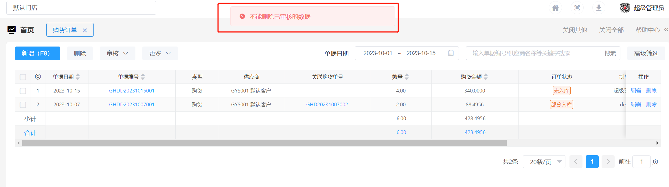
酷柚易汛ERP-购货订单操作指南
1、应用场景 先下购货订单,收货入库后生成购货单。 2、主要操作 2.1 新增购货订单 打开【购货】-【购货订单】新增购货订单。(*为必填项,其他为选填) ① 录入供应商:点击供应商字段框的 ,在弹框中选择供…...
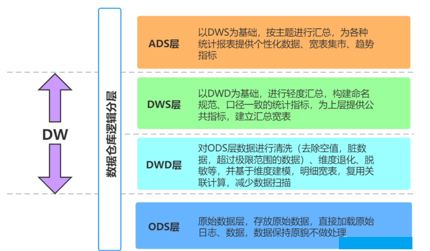
【数据仓库】数仓分层方法详解与层次调用规范
文章目录 一. 数仓分层的意义1. 清晰数据结构。2. 减少重复开发3. 方便数据血缘追踪4. 把复杂问题简单化5. 屏蔽原始数据的异常6. 数据仓库的可维护性 二. 如何进行数仓分层?1. ODS层2. DW层2.1. DW层分类2.2. DWD层2.3. DWS 3. ADS层 4、层次调用规范 一. 数仓分层…...
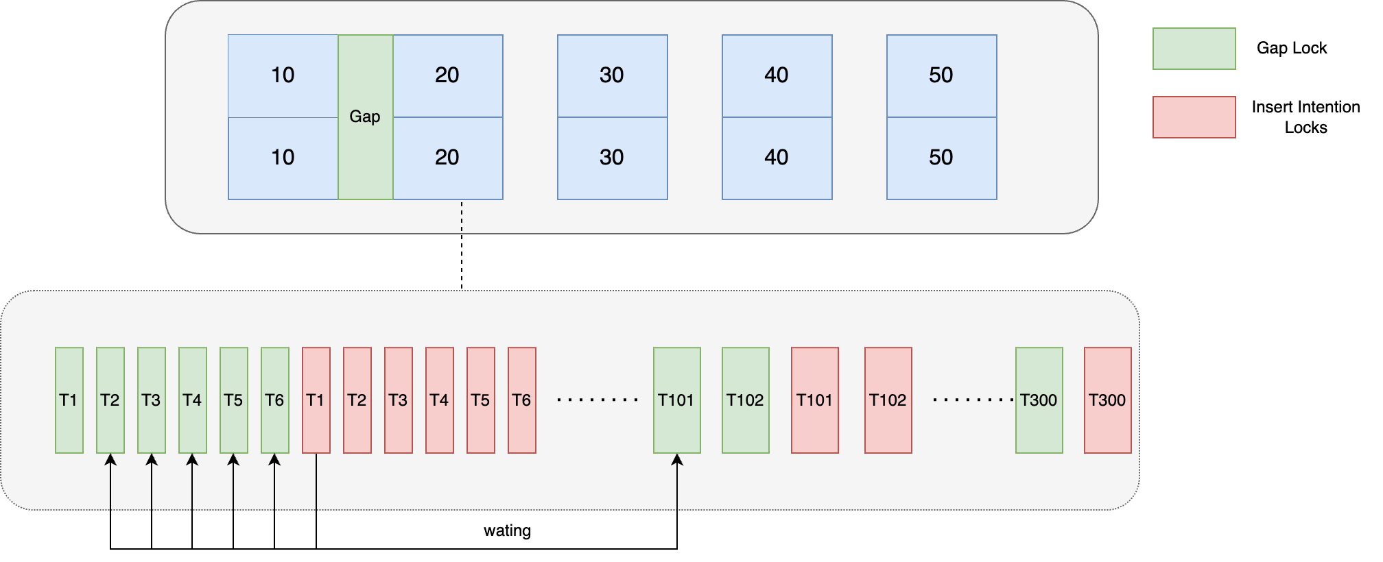
记一次线上问题引发的对 Mysql 锁机制分析
背景 最近双十一开门红期间组内出现了一次因 Mysql 死锁导致的线上问题,当时从监控可以看到数据库活跃连接数飙升,导致应用层数据库连接池被打满,后续所有请求都因获取不到连接而失败 整体业务代码精简逻辑如下: Transaction p…...

Android 工厂模式距离传感器逻辑优化
Android 工厂模式距离传感器逻辑优化 接到客户反馈提到距离传感器校准完毕之后,每次测试完成界面都会弹出“请点击校准按钮进行校准!”Toast弹窗,需要对弹窗的显示逻辑进行优化,即只让其在首次进入距离传感器测试界面时弹出&#…...

Dell笔记本电脑 启动时提示解决
https://www.dell.com/support/kbdoc/en-us/000139731/what-the-headless-operation-mode-active-post-message-means-and-how-to-stop-it-appearing-during-start-up dell官方解释: 提示来自于BIOS/UEFI固件中POST Behaviar,只要打开了忽略警告、错误…...

【人工智能Ⅰ】7-KNN 决策树
【人工智能Ⅰ】7-KNN & 决策树 7-1 KNN(K near neighbour) 思想:一个样本与数据集中的k个样本最相似,若这k个样本大多数属于某类别,则该个样本也属于这类别 距离度量 样本相似性用欧氏距离定义 L p ( x i , x…...

【LeetCode】26. 删除有序数组中的重复项
26. 删除有序数组中的重复项 难度:简单 题目 给你一个 非严格递增排列 的数组 nums ,请你原地 删除重复出现的元素,使每个元素 只出现一次 ,返回删除后数组的新长度。元素的 相对顺序 应该保持 一致 。然后返回 nums 中唯一元素…...
K8S知识点(八)
(1)实战入门-Label 通过标签实现Pod的区分,说白了就是一种标签选择机制 可以使用命令是否加了标签: 打标签: 更新标签: 筛选标签: 修改配置文件,重新创建一个pod 筛选࿱…...

25.4 MySQL 函数
1. 函数的介绍 1.1 函数简介 在编程中, 函数是一种组织代码的方式, 用于执行特定任务. 它是一段可以被重复使用的代码块, 通常接受一些输入(参数)然后返回一个输出. 函数可以帮助开发者将大型程序分解为更小的, 更易于管理的部分, 提高代码的可读性和可维护性.函数在编程语言…...

Unity 下载Zip压缩文件并且解压缩
1、Unity下载Zip压缩文件主要使用UnityWebRequest类。 可以参考以下方法: webRequest UnityWebRequest.Get(Path1); //压缩文件路径webRequest.timeout 60;webRequest.downloadHandler new DownloadHandlerBuffer();long fileSize GetLocalFileSize(Path2); …...

c++11新特性篇-委托构造函数和继承构造函数
C11引入了委托构造函数(Delegating Constructor)和C11及后续标准引入了继承构造函数(Inheriting Constructor)两个特性。 1.委托构造函数 委托构造函数是C11引入的一个特性,它允许一个构造函数调用同一类的另一个构造…...
案例)
Flink SQL处理回撤流(Retract Stream)案例
Flink SQL支持处理回撤流(Retract Stream),下面是一个使用Flink SQL消费回撤流的案例: 假设有一个数据流,包含用户的姓名和年龄,希望计算每个姓名的年龄总和。 以下是示例代码: // 创建流执行…...
)
6.5.事件图层(MapEventsOverlay)
愿你出走半生,归来仍是少年! 简单来说就是一个不参与绘制但是可进行交互的图层,它具备了单击和长按的交互功能。 booleanonSingleTapConfirmed(MotionEvent e, MapView mapView)booleanonLongPress(MotionEvent e, MapView mapView) 通过继承它重写上方…...
供暖系统如何实现数据远程采集?贝锐蒲公英高效实现智慧运维
山西某企业专注于暖通领域,坚持为城市集中供热行业和楼宇中央空调行业提供全面、专业的“智慧冷暖”解决方案。基于我国供热行业的管理现状,企业成功研发并推出了可将能源供应、管理与信息化、自动化相融合的ICS-DH供热节能管理系统。 但是,由…...
Flutter笔记:关于Flutter中的大文件上传(上)
Flutter笔记 关于Flutter中的大文件上传(上) 大文件上传背景与 Flutter 端实现文件分片传输 作者:李俊才 (jcLee95):https://blog.csdn.net/qq_28550263 邮箱 :291148484163.com 本文地址&#…...
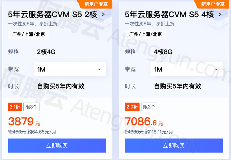
腾讯云CVM服务器5年可选2核4G和4核8G配置
腾讯云服务器网整理五年云服务器优惠活动 txyfwq.com/go/txy 配置可选2核4G和4核8G,公网带宽可选1M、3M或5M,系统盘为50G高性能云硬盘,标准型S5实例CPU采用主频2.5GHz的Intel Xeon Cascade Lake或者Intel Xeon Cooper Lake处理器,…...
数据结构:反射
基本概念 反射中的四个类 Class类 Java文件在被编译之后,生成了.class文件,JVM此时解读.class文件,将其解析为java.lang.Class 对象,在程序运行时每个java文件就最终变成了Class类对象的一个实例。通过反射机制应用这个 实例就…...

45 深度学习(九):transformer
文章目录 transformer原理代码的基础准备位置编码Encoder blockmulti-head attentionFeed Forward自定义encoder block Deconder blockEncoderDecodertransformer自定义loss 和 学习率mask生成函数训练翻译 transformer 这边讲一下这几年如日中天的新的seq2seq模式的transform…...

java中用javax.servlet.ServletInputStream.readLine有什么安全问题吗?怎么解决实例?
使用 javax.servlet.ServletInputStream.readLine 方法在处理 Servlet 请求时可能存在以下安全问题,以及相应的解决方案: 缓冲区溢出:readLine 方法会将数据读取到一个缓冲区中,并根据换行符分隔成行。如果输入流中包含过长的行或…...

App无辜躺枪?手把手教你搞定腾讯手机管家误报导致的应用商店下架
当合规应用遭遇误报下架:开发者系统性应对指南运动健康类应用被标记为金融诈骗软件?社交工具因"病毒风险"被各大商店紧急下架?这类看似荒谬的误报事件,正在成为中小开发团队的"无妄之灾"。某知名运动App开发团…...

2026在线测评系统十大量表对比:信效度与场景全解析
【30s 核心摘要】2026 年在线测评成人才管理刚需,信效度与场景适配成选型核心。本文聚焦十大量表,从信度、效度、适配场景等维度深度对比,重点解析问卷星、北森、金数据等主流平台的量表能力与落地效果,为企业、高校及机构提供科学…...

2026 新视角:化妆品开发的底层逻辑,做好一款产品,从选对原料开始
在化妆品研发链条中,配方架构、生产工艺、包装设计固然重要,但决定一款产品上限的,永远是原料。一款稳定、安全、表现优异的护肤成品,离不开纯净、达标、批次一致的优质原料。对于品牌方、配方师、代工企业而言,原料不…...

PlayAI语音合成质量到底如何?12款竞品横向对比+5项MOS/LSD/STOI硬指标揭榜
更多请点击: https://kaifayun.com 第一章:PlayAI语音合成质量评测报告 PlayAI 是一款面向开发者与内容创作者的实时语音合成(TTS)服务,支持多语种、多音色及情感可控输出。本报告基于客观可复现的评测流程࿰…...

179个核心职位,50个公司分类,中国大模型产业全栈
最后 对于正在迷茫择业、想转行提升,或是刚入门的程序员、编程小白来说,有一个问题几乎人人都在问:未来10年,什么领域的职业发展潜力最大? 答案只有一个:人工智能(尤其是大模型方向)…...

通用物联网开发板设计:基于ESP8266的硬件集成与开发实践
1. 项目概述:为什么我们需要一块“通用”的物联网开发板?在捣鼓了几年物联网项目之后,我发现自己桌面上堆满了各种开发板:ESP8266、ESP32、Arduino Uno、STM32 Nucleo……每个项目都要重新连线、配置电源、焊接传感器接口…...

如何通过Joy-Con Toolkit实现专业级Switch手柄控制与硬件逆向工程
如何通过Joy-Con Toolkit实现专业级Switch手柄控制与硬件逆向工程 【免费下载链接】jc_toolkit Joy-Con Toolkit 项目地址: https://gitcode.com/gh_mirrors/jc/jc_toolkit 在游戏开发、硬件调试和嵌入式系统研究中,与游戏手柄等专业输入设备进行深度交互一直…...

如何快速掌握MPC视频渲染器:面向初学者的完整教程
如何快速掌握MPC视频渲染器:面向初学者的完整教程 【免费下载链接】VideoRenderer Внешний видео-рендерер 项目地址: https://gitcode.com/gh_mirrors/vi/VideoRenderer 想要在Windows系统上获得影院级的视频播放体验吗?MPC…...

Java网络编程基础分享
在学习 Java 的过程中,网络编程是非常重要的一环。无论是后端开发、分布式系统、即时通讯、文件传输,还是游戏服务、物联网设备,都离不开网络通信一、计算机网络基础1.1 什么是计算机网络把不同地理位置、具有独立功能的计算机,通…...

3分钟上手:NBTExplorer终极指南 - 可视化编辑Minecraft游戏数据的免费神器
3分钟上手:NBTExplorer终极指南 - 可视化编辑Minecraft游戏数据的免费神器 【免费下载链接】NBTExplorer A graphical NBT editor for all Minecraft NBT data sources 项目地址: https://gitcode.com/gh_mirrors/nb/NBTExplorer 你是否曾经想要修改Minecraf…...