28 星际旋转
效果演示
实现了一个太阳系动画,其中包括了地球、火星、金星、土星、水星、天王星、海王星以及火卫二号等行星的动画效果。太阳系的行星都被放在一个固定的容器中,并使用CSS动画来实现旋转和移动的效果。当太阳系的行星绕着太阳运行时,它们会围绕太阳旋转,并且在运行过程中会发生碰撞和交叉。
Code
<div class="wrapper"><div class="neptune-container"><img src="img/neptune.png" /></div><div class="uranus-container"><img src="img/uranus.svg" /></div><div class="saturn-container"><img src="img/saturn.png" /></div><div class="jupiter-container"><img src="img/jupiter.png" /></div><div class="mars-container"><img src="img/mars.png" /></div><div class="earth-container"><img src="img/earth.png" /></div><div class="venus-container"><img src="img/venus.png" /></div><div class="mercury-container"><img src="img/mercury.png" /></div><div class="sun-container"><img src="img/sun.png" /></div>
</div>
* {margin: 0;padding: 0;box-sizing: border-box;
}body {display: flex;justify-content: center;align-items: center;height: 100vh;background-image: url(img/space-background.jpg)
}.wrapper {height: 100%;width: 100%;display: flex;justify-content: center;align-items: center;
}.wrapper div {position: absolute;border-radius: 100%;display: flex;justify-content: center;align-items: center;border: 1px solid white;position: absolute;
}.neptune-container {height: 850px;width: 850px;
}.neptune-container>img {height: 50px;width: 50px;animation: neptune-rotation 53954ms linear infinite;
}.uranus-container {height: 750px;width: 750px;
}.uranus-container>img {height: 75px;width: 75px;animation: uranus-rotation 37054ms linear infinite;
}.saturn-container {height: 600px;width: 600px;
}.saturn-container>img {height: 75px;width: 75px;animation: saturn-rotation 33218ms linear infinite;
}.jupiter-container {height: 500px;width: 500px;
}.jupiter-container>img {height: 75px;width: 75px;animation: jupiter-rotation 27339ms linear infinite;
}.mars-container {height: 400px;width: 400px;
}.mars-container>img {height: 35px;width: 35px;animation: mars-rotation 12684ms linear infinite;
}.earth-container {height: 350px;width: 350px;
}.earth-container>img {height: 30px;width: 30px;animation: earth-rotation 11079ms linear infinite;
}.venus-container {height: 300px;width: 300px;
}.venus-container>img {height: 20px;width: 20px;animation: venus-rotation 7259ms linear infinite;
}.mercury-container {height: 250px;width: 250px;
}.mercury-container>img {height: 15px;width: 15px;animation: mercury-rotation 5768ms linear infinite;
}.sun-container {height: 200px;width: 200px;border-radius: 100%;display: flex;justify-content: center;align-items: center;
}.sun-container>img {height: 310px;width: 310px;
}@keyframes neptune-rotation {0% {transform: rotate(0deg) translate(425px) rotate(0deg);}100% {transform: rotate(360deg) translate(425px) rotate(360deg);}
}@keyframes uranus-rotation {0% {transform: rotate(0deg) translate(375px) rotate(0deg);}100% {transform: rotate(360deg) translate(375px) rotate(360deg);}
}@keyframes saturn-rotation {0% {transform: rotate(0deg) translate(300px) rotate(0deg);}100% {transform: rotate(360deg) translate(300px) rotate(360deg);}
}@keyframes jupiter-rotation {0% {transform: rotate(0deg) translate(250px) rotate(0deg);}100% {transform: rotate(360deg) translate(250px) rotate(360deg);}
}@keyframes mars-rotation {0% {transform: rotate(0deg) translate(200px) rotate(0deg);}100% {transform: rotate(360deg) translate(200px) rotate(360deg);}
}@keyframes earth-rotation {0% {transform: rotate(0deg) translate(175px) rotate(0deg);}100% {transform: rotate(360deg) translate(175px) rotate(360deg);}
}@keyframes venus-rotation {0% {transform: rotate(0deg) translate(150px) rotate(0deg);}100% {transform: rotate(360deg) translate(150px) rotate(360deg);}
}@keyframes mercury-rotation {0% {transform: rotate(0deg) translate(125px) rotate(0deg);}100% {transform: rotate(360deg) translate(125px) rotate(360deg);}
}
实现思路拆分
* {margin: 0;padding: 0;box-sizing: border-box;
}
这段代码是设置全局样式,包括设置元素的盒模型为border-box,即盒模型的宽度和高度包括内容、内边距、边框和外边距。
body {display: flex;justify-content: center;align-items: center;height: 100vh;background-image: url(img/space-background.jpg)
}
这段代码是设置整个页面的样式,包括设置页面的高度为100vh,即视口的高度,使页面填充整个屏幕。同时,设置页面的背景图片为space-background.jpg。
.wrapper {height: 100%;width: 100%;display: flex;justify-content: center;align-items: center;
}
这段代码是设置一个容器的样式,包括设置容器的高度和宽度为100%,使容器填充整个屏幕。同时,设置容器的显示方式为flex,使容器中的元素可以自动排列。
.wrapper div {position: absolute;border-radius: 100%;display: flex;justify-content: center;align-items: center;border: 1px solid white;position: absolute;
}
这段代码是设置太阳系中的行星的样式,包括设置行星的位置为绝对定位,使其相对于容器的位置进行定位。同时,设置行星的圆角半径为100%,使其变成一个圆形。设置行星的显示方式为flex,使其中的元素可以自动排列。设置行星的边框为1px solid white,使其看起来像一个白色的圆形。
.neptune-container {height: 850px;width: 850px;
}.neptune-container>img {height: 50px;width: 50px;animation: neptune-rotation 53954ms linear infinite;
}
这段代码是设置尼普斯星的样式,包括设置行星的高度和宽度为850px,使其变成一个圆形。同时,设置行星的动画效果为neptune-rotation,即使用CSS动画实现行星的旋转效果。
.uranus-container {height: 750px;width: 750px;
}.uranus-container>img {height: 75px;width: 75px;animation: uranus-rotation 37054ms linear infinite;
}
这段代码是设置乌拉斯星的样式,包括设置行星的高度和宽度为750px,使其变成一个圆形。同时,设置行星的动画效果为uranus-rotation,即使用CSS动画实现行星的旋转效果。
.saturn-container {height: 600px;width: 600px;
}.saturn-container>img {height: 75px;width: 75px;animation: saturn-rotation 33218ms linear infinite;
}
这段代码是设置土星的样式,包括设置行星的高度和宽度为600px,使其变成一个圆形。同时,设置行星的动画效果为saturn-rotation,即使用CSS动画实现行星的旋转效果。
.jupiter-container {height: 500px;width: 500px;
}.jupiter-container>img {height: 75px;width: 75px;animation: jupiter-rotation 27339ms linear infinite;
}
这段代码是设置木星的样式,包括设置行星的高度和宽度为500px,使其变成一个圆形。同时,设置行星的动画效果为jupiter-rotation,即使用CSS动画实现行星的旋转效果。
.mars-container {height: 400px;width: 400px;
}
这段代码是设置火星的样式,包括设置行星的高度和宽度为400px,使其变成一个圆形。
.mars-container>img {height: 35px;width: 35px;animation: mars-rotation 12684ms linear infinite;
}
这段代码是设置火星的图片样式,包括设置图片的高度和宽度为35px,使其变成一个圆形。同时,设置图片的动画效果为mars-rotation,即使用CSS动画实现行星的旋转效果。
.earth-container {height: 350px;width: 350px;
}
这段代码是设置地球的样式,包括设置行星的高度和宽度为350px,使其变成一个圆形。
.earth-container>img {height: 30px;width: 30px;animation: earth-rotation 11079ms linear infinite;
}
这段代码是设置地球的图片样式,包括设置图片的高度和宽度为30px,使其变成一个圆形。同时,设置图片的动画效果为earth-rotation,即使用CSS动画实现行星的旋转效果。
.venus-container {height: 300px;width: 300px;
}
这段代码是设置金星的样式,包括设置行星的高度和宽度为300px,使其变成一个圆形。
.venus-container>img {height: 20px;width: 20px;animation: venus-rotation 7259ms linear infinite;
}
这段代码是设置金星的图片样式,包括设置图片的高度和宽度为20px,使其变成一个圆形。同时,设置图片的动画效果为venus-rotation,即使用CSS动画实现行星的旋转效果。
.mercury-container {height: 250px;width: 250px;
}
这段代码是设置水星的样式,包括设置行星的高度和宽度为250px,使其变成一个圆形。
.mercury-container>img {height: 15px;width: 15px;animation: mercury-rotation 5768ms linear infinite;
}
这段代码是设置水星的图片样式,包括设置图片的高度和宽度为15px,使其变成一个圆形。同时,设置图片的动画效果为mercury-rotation,即使用CSS动画实现行星的旋转效果。
.sun-container {height: 200px;width: 200px;border-radius: 100%;display: flex;justify-content: center;align-items: center;
}
这段代码是设置太阳的样式,包括设置行星的高度和宽度为200px,使其变成一个圆形。同时,设置行星的圆角半径为100%,使其变成一个圆形。设置行星的显示方式为flex,使其中的元素可以自动排列。设置行星的居中方式为居中对齐,使其在容器中居中显示。
.sun-container>img {height: 310px;width: 310px;
}
这段代码是设置太阳的图片样式,包括设置图片的高度和宽度为310px,使其变成一个圆形。
@keyframes neptune-rotation {0% {transform: rotate(0deg) translate(425px) rotate(0deg);}100% {transform: rotate(360deg) translate(425px) rotate(360deg);}
}
这段代码是定义了一个名为neptune-rotation的CSS动画,用于实现尼普斯星的旋转动画。该动画包含两个关键帧,分别为0%和100%。在0%时,尼普斯星的旋转角度为0度,并向右移动425px。在100%时,尼普斯星的旋转角度为360度,并向右移动425px。
@keyframes uranus-rotation {0% {transform: rotate(0deg) translate(375px) rotate(0deg);}100% {transform: rotate(360deg) translate(375px) rotate(360deg);}
}
这段代码是定义了一个名为uranus-rotation的CSS动画,用于实现乌拉斯星的旋转动画。该动画包含两个关键帧,分别为0%和100%。在0%时,乌拉斯星的旋转角度为0度,并向右移动375px。在100%时,乌拉斯星的旋转角度为360度,并向右移动375px。
@keyframes saturn-rotation {0% {transform: rotate(0deg) translate(300px) rotate(0deg);}100% {transform: rotate(360deg) translate(300px) rotate(360deg);}
}
这段代码是定义了一个名为saturn-rotation的CSS动画,用于实现土星的旋转动画。该动画包含两个关键帧,分别为0%和100%。在0%时,土星的旋转角度为0度,并向右移动300px。在100%时,土星的旋转角度为360度,并向右移动300px。
@keyframes jupiter-rotation {0% {transform: rotate(0deg) translate(250px) rotate(0deg);}100% {transform: rotate(360deg) translate(250px) rotate(360deg);}
}
这段代码是定义了一个名为jupiter-rotation的CSS动画,用于实现木星的旋转动画。该动画包含两个关键帧,分别为0%和100%。在0%时,木星的旋转角度为0度,并向右移动250px。在100%时,木星的旋转角度为360度,并向右移动250px。
@keyframes mars-rotation {0% {transform: rotate(0deg) translate(200px) rotate(0deg);}100% {transform: rotate(360deg) translate(200px) rotate(360deg);}
}
这段代码是定义了一个名为mars-rotation的CSS动画,用于实现火星的旋转动画。该动画包含两个关键帧,分别为0%和100%。在0%时,火星的旋转角度为0度,并向右移动200px。在100%时,火星的旋转角度为360度,并向右移动200px。
@keyframes earth-rotation {0% {transform: rotate(0deg) translate(175px) rotate(0deg);}100% {transform: rotate(360deg) translate(175px) rotate(360deg);}
}
这段代码是设置地球的动画效果,包括设置动画的名称为earth-rotation,即使用CSS动画实现地球的旋转效果。在0%时,将地球的位置设置为0deg,并将其向右移动175px。在100%时,将地球的位置设置为360deg,并将其向右移动175px。
@keyframes venus-rotation {0% {transform: rotate(0deg) translate(150px) rotate(0deg);}100% {transform: rotate(360deg) translate(150px) rotate(360deg);}
}
这段代码是设置金星的动画效果,包括设置动画的名称为venus-rotation,即使用CSS动画实现金星的旋转效果。在0%时,将金星的位置设置为0deg,并将其向右移动150px。在100%时,将金星的位置设置为360deg,并将其向右移动150px。
@keyframes mercury-rotation {0% {transform: rotate(0deg) translate(125px) rotate(0deg);}100% {transform: rotate(360deg) translate(125px) rotate(360deg);}
}
这段代码是设置水星的动画效果,包括设置动画的名称为mercury-rotation,即使用CSS动画实现水星的旋转效果。在0%时,将水星的位置设置为0deg,并将其向右移动125px。在100%时,将水星的位置设置为360deg,并将其向右移动125px。
相关文章:
28 星际旋转
效果演示 实现了一个太阳系动画,其中包括了地球、火星、金星、土星、水星、天王星、海王星以及火卫二号等行星的动画效果。太阳系的行星都被放在一个固定的容器中,并使用CSS动画来实现旋转和移动的效果。当太阳系的行星绕着太阳运行时,它们会…...
)
测试人员必备基本功(3)
容易被忽视的bug 第三章 查询列表容易被忽视的bug 文章目录 容易被忽视的bug第三章 查询列表容易被忽视的bug 前言1.查询角色2.接口设计 三、测试设计1.测试点2.容易发现bug的测试点如下: 总结 前言 一个WEB系统的所有功能模块,其实都是围绕“增、删、…...

记一次数据修复,需要生成十万条sql进行数据回滚
一、背景 数据回滚 二、难点 2.1 需要处理的数据涉及多达数万个用户,每个用户涉及的表达到10个 2.2 时间紧急,需要快速回滚,数据需要完整 2.3 数据存在重复或空缺问题 三、解决方案 3.1 数据多,使用分批处理,把大任务分割成若…...

[paddle]paddlehub部署paddleocr的hubserving服务
步骤如下: 第一步:首先需要安装好paddleocr环境已经paddlehub环境 第二步:下载paddleocr源码: git clone https://github.com/PaddlePaddle/PaddleOCR.git 然后切换到paddocr目录执行 新建个文件夹叫Inference把paddleocr模型…...

2024校招,网易互娱游戏测试工程师一面
前言 大家好,今天回顾一下,我前段时间参加的游戏测试工程师技术面试 两个面试官,一个提问,另一个负责记录 过程 自我介绍比赛经历介绍一下使用的博弈算法穷举算法对性能有什么影响怎么评估局面好坏出现的bug怎么解决的&#x…...
Linux Ubuntu搭建我的世界Minecraft服务器实现好友远程联机MC游戏
文章目录 前言1. 安装JAVA2. MCSManager安装3.局域网访问MCSM4.创建我的世界服务器5.局域网联机测试6.安装cpolar内网穿透7. 配置公网访问地址8.远程联机测试9. 配置固定远程联机端口地址9.1 保留一个固定tcp地址9.2 配置固定公网TCP地址9.3 使用固定公网地址远程联机 前言 Li…...

Springboot对接ceph集群以及java利用s3对象网关接口与ceph集群交互
springboot中引入相关依赖 <dependency><groupId>software.amazon.awssdk</groupId><artifactId>regions</artifactId><version>2.22.13</version></dependency><dependency><groupId>software.amazon.awssdk<…...

nrm使用
为了更方便的切换下包的镜像源,我们可以安装 nrm 这个小工具,利用 nrm 提供的终端命令,可以快速查看和切换下 包的镜像源。 //通过 npm 包管理器,将 nrm 安装为全局可用的工具 npm i nrm -g//查看所有可用的镜像源 nrm ls//将下载…...
06-微服务OpenFeigh和Sentinel持久化
一、OpenFeign基础应用 1.1 概念 OpenFeign是一种声明式、模板化的HTTP客户端。在Spring Cloud中使用OpenFeign,可以做到使用HTTP请求访问远程服务,就像调用本地方法一样的,开发者完全感知不到这是在调用远程方法,更感知不到在访…...
docker 安装redis (亲测有效)
目录 1 安装 1 安装 1 将redis 的 tar 包 上传到服务器 上传之后tar 包,将他变成镜像 输入docker images,发现目前是没有镜像的,现在将tar 包变成镜像 docker load -i redis.tar以上就将tar 包变成镜像了 现在在宿主机找一个地方,存放数据…...
利用GitHub开源项目ChatGPTNextWeb构建属于自己的ChatGPT - Docker
Docker部署ChatGPTNextWeb ChatGPTNextWeb项目github开源地址:https://github.com/ChatGPTNextWeb/ChatGPT-Next-Web 根据文档部署ChatGPTNextWeb 文档地址:https://github.com/ChatGPTNextWeb/ChatGPT-Next-Web/blob/main/README_CN.md 步骤一&#…...

Vue3使用ElementPlus中的el-upload手动上传并调用上传接口
前端代码 <div class"upload-div"><el-uploadv-model:file-list"form.fileImageList"ref"uploadRef"capture"false"action"#"accept"image/*"list-type"picture-card":on-change"handleC…...

【Github3k+⭐️】《CogAgent: A Visual Language Model for GUI Agents》译读笔记
CogAgent: A Visual Language Model for GUI Agents 摘要 人们通过图形用户界面(Graphical User Interfaces, GUIs)在数字设备上花费大量时间,例如,计算机或智能手机屏幕。ChatGPT 等大型语言模型(Large Language Mo…...
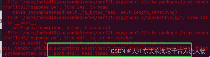
【conda】pip安装报错,网络延时问题解决记录(亲测有效)
【conda】pip安装报错,网络延时问题解决记录 1. pip install 报错如下所示2. 解决方案: 1. pip install 报错如下所示 pip._vendor.urllib3.exceptions.ReadTimeoutError: HTTPSConnectionPool(hostfiles.pythonhosted.org, port443): Read timed out.…...

Spring Boot整理-Spring Boot的优势
Spring Boot 提供了多个显著的优势,特别是对于快速开发和简化 Spring 应用的配置和部署。这些优势包括: 简化配置:Spring Boot 的“约定优于配置”的原则意味着许多 Spring 应用的常见配置项被自动设置,这减少了开发人员需要编写和维护的配置代码量。快速启动和部署:Sprin…...

C++标准学习--decltype
decltype / auto 是具有类型推导功能的 类型 描述/占位 符 decltype: 获取对象或表达式的类型auto: 类型自动推导 decltype 可以获取变量类型, (并不同于python的type,但python能打印出type获取的名称, C通过typeid实现ÿ…...
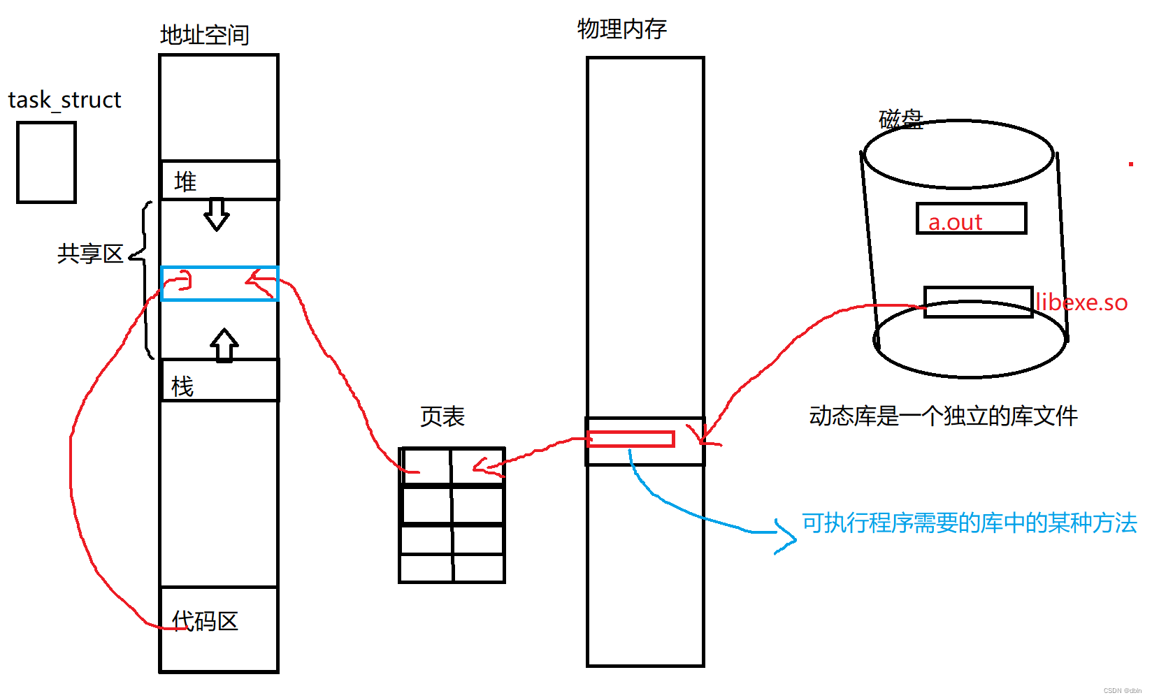
Linux之静态库和动态库
目录 一、前言 二、对于库的理解 三、静态库 四、动态库 五、动静态库的加载 一、前言 在之前,我们讲了静态库和动态库,详情请跳转:静态库和动态库 下面我们将从工程师的角度,去了解静态库和动态库的形成过程,以…...
(三))
erlang/OTP 平台(学习笔记)(三)
分布式 Erlang 借助于语言属性和基于复制的进程通信,Erlang程序天然就可以分布到多台计算机上。要问为什么,且让我们来看两个用Java或C这类语言写成的进程,它们运作良好并以共享内存为通信手段。假设你已经搞定了锁的问题,一切精…...

Spring整理-Spring框架中用了哪些设计模式
Spring框架广泛应用了多种设计模式,这些模式提高了框架的灵活性、可扩展性和可维护性。下面是在Spring框架中常见的一些设计模式: 单例模式(Singleton):用于在应用的整个生命周期内保持一个类的单个实例。在Spring中,Bean默认是单例模式。 工厂模式(Factory Pattern):…...

PasteMD:一键解决AI内容到Office文档的格式转换难题
1. 项目概述与痛点解析如果你经常需要写论文、做报告,或者整理从各种AI助手(比如ChatGPT、DeepSeek、Kimi)那里得到的答案,那你一定遇到过这个让人头疼的问题:辛辛苦苦从网页上复制下来的内容,一粘贴到Word…...

避坑指南:树莓派4B用FFmpeg推USB摄像头流,我踩过的那些编译和权限的坑
树莓派4B USB摄像头推流实战:从编译陷阱到系统服务的深度排雷手册 当你在树莓派4B上尝试用FFmpeg推送USB摄像头流时,是否遇到过这样的场景:按照教程一步步操作,却在编译阶段卡在OMX报错,或是明明设备识别成功却提示权…...

从测试到实战:用hashcat -b命令摸清你的显卡性能,优化破解速度
从测试到实战:用hashcat -b命令摸清你的显卡性能,优化破解速度 当你第一次在命令行中输入hashcat -b并按下回车时,屏幕上跳动的数字不仅仅是枯燥的基准测试结果——它们是你硬件潜力的密码。对于中级安全研究人员和密码学爱好者来说ÿ…...

基于OpenClaw与Binance API的加密货币安全助手:四层架构与实战部署
1. 项目概述:一个为普通人打造的加密资产守护神在加密货币的世界里,技术壁垒和信息不对称就像一道无形的墙,将许多普通人挡在了安全投资的门外。我们见过太多这样的场景:一位想为子女攒点教育金的母亲,因为误点了钓鱼链…...

Vue.Draggable终极指南:掌握拖拽数据同步的5大核心策略
Vue.Draggable终极指南:掌握拖拽数据同步的5大核心策略 【免费下载链接】Vue.Draggable Vue drag-and-drop component based on Sortable.js 项目地址: https://gitcode.com/gh_mirrors/vu/Vue.Draggable Vue.Draggable是一个基于Sortable.js的强大Vue.js拖拽…...
Windows 11任务栏透明化神器:TranslucentTB让你的桌面焕然一新!
Windows 11任务栏透明化神器:TranslucentTB让你的桌面焕然一新! 【免费下载链接】TranslucentTB A lightweight utility that makes the Windows taskbar translucent/transparent. 项目地址: https://gitcode.com/gh_mirrors/tr/TranslucentTB 你…...

Fillinger智能填充插件:如何用3分钟完成1小时的设计工作?
Fillinger智能填充插件:如何用3分钟完成1小时的设计工作? 【免费下载链接】illustrator-scripts Adobe Illustrator scripts 项目地址: https://gitcode.com/gh_mirrors/il/illustrator-scripts 还在为Adobe Illustrator中繁琐的图案填充而头疼吗…...

给视觉开发新手的保姆级教程:在Ubuntu上从下载源码到成功运行Demo,搞定OpenCV 3环境搭建
给视觉开发新手的保姆级教程:在Ubuntu上从下载源码到成功运行Demo,搞定OpenCV 3环境搭建 第一次在Ubuntu上搭建OpenCV开发环境,对很多视觉开发新手来说可能是个令人望而生畏的任务。命令行操作、编译工具链、环境配置……这些术语听起来就让人…...
)
Perplexity学术模式尚未开放的4个隐藏功能(仅限IEEE Fellow级用户测试通道泄露)
更多请点击: https://intelliparadigm.com 第一章:Perplexity学术模式尚未开放的4个隐藏功能(仅限IEEE Fellow级用户测试通道泄露) 离线语义缓存预热接口 Perplexity 内部测试版暴露了 /v2/academic/cache/warmup 端点ÿ…...

【模拟CMOS集成电路】噪声分析实战指南——从模型到计算的完整路径
1. 噪声分析的必要性与基础概念 做模拟电路设计的朋友们应该都深有体会,噪声就像个甩不掉的影子,时时刻刻影响着我们的设计。记得我第一次做低噪声放大器时,仿真结果看起来很美,实测却发现信号完全被噪声淹没,那种挫败…...