CSS动画效果(鼠标滑过按钮动画)
1.整体效果
https://mmbiz.qpic.cn/sz_mmbiz_gif/EGZdlrTDJa5SXiaicFfsrcric7TJmGO6YddqC4wFPdM7PGzPHuFgvtDS7MIvnLHB4WFaKia0Qh8VCyUaoyHMc2Zltg/640?wx_fmt=gif&from=appmsg&tp=webp&wxfrom=5&wx_lazy=1&wx_co=1
网页设计中的按钮不仅是用户交互的桥梁,更是展示创意和技术的平台。酷炫的鼠标经过动画效果能够显著提升按钮的吸引力,激发用户的点击欲望,从而增加用户参与度。本文将介绍几种常用且引人注目的CSS按钮动画效果
2.完整代码
HTML
<!DOCTYPE html>
<html lang="en">
<head>  <meta charset="UTF-8">  <title>Title</title>  <link rel="stylesheet" type="text/css" href="6_1.css">
</head>
<body>
<div class="frame">  <button class="custom-btn btn-2">btn02</button>  <button class="custom-btn btn-3"><span>btn03</span></button>  <button class="custom-btn btn-4"><span>btn04</span></button>  <button class="custom-btn btn-5"><span>btn05</span></button>  <button class="custom-btn btn-6"><span>btn06</span></button>  <button class="custom-btn btn-7"><span>btn07</span></button>  <button class="custom-btn btn-8"><span>btn08</span></button>
</div>
</body>
</html>
CSS
body {  background: #e0e5ec;
}
h1 {  position: relative;  text-align: center;  color: #353535;  font-size: 50px;  font-family: "Cormorant Garamond", serif;
}  p {  font-family: 'Lato', sans-serif;  font-weight: 300;  text-align: center;  font-size: 18px;  color: #676767;
}
.frame {  width: 50%;  margin: 40px auto;  text-align: center;
}
button {  margin: 20px;
}
.custom-btn {  width: 130px;  height: 40px;  color: #fff;  border-radius: 5px;  padding: 10px 25px;  font-family: 'Lato', sans-serif;  font-weight: 500;  background: transparent;  cursor: pointer;  transition: all 0.3s ease;  position: relative;  display: inline-block;  box-shadow:inset 2px 2px 2px 0px rgba(125, 111, 111, 0.5),  7px 7px 20px 0px rgba(0,0,0,.1),  4px 4px 5px 0px rgba(0,0,0,.1);  outline: none;
}
/* 1 */  /* 2 */
.btn-2 {  background: rgb(96,9,240);  background: linear-gradient(0deg, rgba(96,9,240,1) 0%, rgba(129,5,240,1) 100%);  border: none;  }
.btn-2:before {  height: 0%;  width: 2px;
}
.btn-2:hover {  box-shadow: 4px 4px 6px 0 rgba(255,255,255,.5),  -4px -4px 6px 0 rgba(116, 125, 136, .5),  inset -4px -4px 6px 0 rgba(255,255,255,.2),  inset 4px 4px 6px 0 rgba(0, 0, 0, .4);
}  /* 3 */
.btn-3 {  background: rgb(0,172,238);  background: linear-gradient(0deg, rgba(0,172,238,1) 0%, rgba(2,126,251,1) 100%);  width: 130px;  height: 40px;  line-height: 42px;  padding: 0;  border: none;  }
.btn-3 span {  position: relative;  display: block;  width: 100%;  height: 100%;
}
.btn-3:before,
.btn-3:after {  position: absolute;  content: "";  right: 0;  top: 0;  background: rgba(2,126,251,1);  transition: all 0.3s ease;
}
.btn-3:before {  height: 0%;  width: 2px;
}
.btn-3:after {  width: 0%;  height: 2px;
}
.btn-3:hover{  background: transparent;  box-shadow: none;
}
.btn-3:hover:before {  height: 100%;
}
.btn-3:hover:after {  width: 100%;
}
.btn-3 span:hover{  color: rgba(2,126,251,1);
}
.btn-3 span:before,
.btn-3 span:after {  position: absolute;  content: "";  left: 0;  bottom: 0;  background: rgba(2,126,251,1);  transition: all 0.3s ease;
}
.btn-3 span:before {  width: 2px;  height: 0%;
}
.btn-3 span:after {  width: 0%;  height: 2px;
}
.btn-3 span:hover:before {  height: 100%;
}
.btn-3 span:hover:after {  width: 100%;
}  /* 4 */
.btn-4 {  background-color: #4dccc6;  background-image: linear-gradient(315deg, #4dccc6 0%, #96e4df 74%);  line-height: 42px;  padding: 0;  border: none;
}
.btn-4:hover{  background-color: #89d8d3;  background-image: linear-gradient(315deg, #89d8d3 0%, #03c8a8 74%);
}
.btn-4 span {  position: relative;  display: block;  width: 100%;  height: 100%;
}
.btn-4:before,
.btn-4:after {  position: absolute;  content: "";  right: 0;  top: 0;  box-shadow: 4px 4px 6px 0 rgba(255,255,255,.9),  -4px -4px 6px 0 rgba(116, 125, 136, .2),  inset -4px -4px 6px 0 rgba(255,255,255,.9),  inset 4px 4px 6px 0 rgba(116, 125, 136, .3);  transition: all 0.3s ease;
}
.btn-4:before {  height: 0%;  width: .1px;
}
.btn-4:after {  width: 0%;  height: .1px;
}
.btn-4:hover:before {  height: 100%;
}
.btn-4:hover:after {  width: 100%;
}
.btn-4 span:before,
.btn-4 span:after {  position: absolute;  content: "";  left: 0;  bottom: 0;  box-shadow: 4px 4px 6px 0 rgba(255,255,255,.9),  -4px -4px 6px 0 rgba(116, 125, 136, .2),  inset -4px -4px 6px 0 rgba(255,255,255,.9),  inset 4px 4px 6px 0 rgba(116, 125, 136, .3);  transition: all 0.3s ease;
}
.btn-4 span:before {  width: .1px;  height: 0%;
}
.btn-4 span:after {  width: 0%;  height: .1px;
}
.btn-4 span:hover:before {  height: 100%;
}
.btn-4 span:hover:after {  width: 100%;
}  /* 5 */
.btn-5 {  width: 130px;  height: 40px;  line-height: 42px;  padding: 0;  border: none;  background: rgb(255,27,0);  background: linear-gradient(0deg, rgba(255,27,0,1) 0%, rgba(251,75,2,1) 100%);
}
.btn-5:hover {  color: #f0094a;  background: transparent;  box-shadow:none;
}
.btn-5:before,
.btn-5:after{  content:'';  position:absolute;  top:0;  right:0;  height:2px;  width:0;  background: #f0094a;  box-shadow:  -1px -1px 5px 0px #fff,  7px 7px 20px 0px #0003,  4px 4px 5px 0px #0002;  transition:400ms ease all;
}
.btn-5:after{  right:inherit;  top:inherit;  left:0;  bottom:0;
}
.btn-5:hover:before,
.btn-5:hover:after{  width:100%;  transition:800ms ease all;
}  /* 6 */
.btn-6 {  background: rgb(247,150,192);  background: radial-gradient(circle, rgba(247,150,192,1) 0%, rgba(118,174,241,1) 100%);  line-height: 42px;  padding: 0;  border: none;
}
.btn-6 span {  position: relative;  display: block;  width: 100%;  height: 100%;
}
.btn-6:before,
.btn-6:after {  position: absolute;  content: "";  height: 0%;  width: 1px;  box-shadow:  -1px -1px 20px 0px rgba(255,255,255,1),  -4px -4px 5px 0px rgba(255,255,255,1),  7px 7px 20px 0px rgba(0,0,0,.4),  4px 4px 5px 0px rgba(0,0,0,.3);
}
.btn-6:before {  right: 0;  top: 0;  transition: all 500ms ease;
}
.btn-6:after {  left: 0;  bottom: 0;  transition: all 500ms ease;
}
.btn-6:hover{  background: transparent;  color: #76aef1;  box-shadow: none;
}
.btn-6:hover:before {  transition: all 500ms ease;  height: 100%;
}
.btn-6:hover:after {  transition: all 500ms ease;  height: 100%;
}
.btn-6 span:before,
.btn-6 span:after {  position: absolute;  content: "";  box-shadow:  -1px -1px 20px 0px rgba(255,255,255,1),  -4px -4px 5px 0px rgba(255,255,255,1),  7px 7px 20px 0px rgba(0,0,0,.4),  4px 4px 5px 0px rgba(0,0,0,.3);
}
.btn-6 span:before {  left: 0;  top: 0;  width: 0%;  height: .5px;  transition: all 500ms ease;
}
.btn-6 span:after {  right: 0;  bottom: 0;  width: 0%;  height: .5px;  transition: all 500ms ease;
}
.btn-6 span:hover:before {  width: 100%;
}
.btn-6 span:hover:after {  width: 100%;
}
/* 7 */
.btn-7 {  background: linear-gradient(0deg, rgba(255,151,0,1) 0%, rgba(251,75,2,1) 100%);  line-height: 42px;  padding: 0;  border: none;
}
.btn-7 span {  position: relative;  display: block;  width: 100%;  height: 100%;
}
.btn-7:before,
.btn-7:after {  position: absolute;  content: "";  right: 0;  bottom: 0;  background: rgba(251,75,2,1);  box-shadow:  -7px -7px 20px 0px rgba(255,255,255,.9),  -4px -4px 5px 0px rgba(255,255,255,.9),  7px 7px 20px 0px rgba(0,0,0,.2),  4px 4px 5px 0px rgba(0,0,0,.3);  transition: all 0.3s ease;
}
.btn-7:before{  height: 0%;  width: 2px;
}
.btn-7:after {  width: 0%;  height: 2px;
}
.btn-7:hover{  color: rgba(251,75,2,1);  background: transparent;
}
.btn-7:hover:before {  height: 100%;
}
.btn-7:hover:after {  width: 100%;
}
.btn-7 span:before,
.btn-7 span:after {  position: absolute;  content: "";  left: 0;  top: 0;  background: rgba(251,75,2,1);  box-shadow:  -7px -7px 20px 0px rgba(255,255,255,.9),  -4px -4px 5px 0px rgba(255,255,255,.9),  7px 7px 20px 0px rgba(0,0,0,.2),  4px 4px 5px 0px rgba(0,0,0,.3);  transition: all 0.3s ease;
}
.btn-7 span:before {  width: 2px;  height: 0%;
}
.btn-7 span:after {  height: 2px;  width: 0%;
}
.btn-7 span:hover:before {  height: 100%;
}
.btn-7 span:hover:after {  width: 100%;
}  /* 8 */
.btn-8 {  background-color: #f0ecfc;  background-image: linear-gradient(315deg, #f0ecfc 0%, #c797eb 74%);  line-height: 42px;  padding: 0;  border: none;
}
.btn-8 span {  position: relative;  display: block;  width: 100%;  height: 100%;
}
.btn-8:before,
.btn-8:after {  position: absolute;  content: "";  right: 0;  bottom: 0;  background: #c797eb;  /*box-shadow: 4px 4px 6px 0 rgba(255,255,255,.5),  -4px -4px 6px 0 rgba(116, 125, 136, .2),      inset -4px -4px 6px 0 rgba(255,255,255,.5),      inset 4px 4px 6px 0 rgba(116, 125, 136, .3);*/    transition: all 0.3s ease;
}
.btn-8:before{  height: 0%;  width: 2px;
}
.btn-8:after {  width: 0%;  height: 2px;
}
.btn-8:hover:before {  height: 100%;
}
.btn-8:hover:after {  width: 100%;
}
.btn-8:hover{  background: transparent;
}
.btn-8 span:hover{  color: #c797eb;
}
.btn-8 span:before,
.btn-8 span:after {  position: absolute;  content: "";  left: 0;  top: 0;  background: #c797eb;  /*box-shadow: 4px 4px 6px 0 rgba(255,255,255,.5),  -4px -4px 6px 0 rgba(116, 125, 136, .2),      inset -4px -4px 6px 0 rgba(255,255,255,.5),      inset 4px 4px 6px 0 rgba(116, 125, 136, .3);*/    transition: all 0.3s ease;
}
.btn-8 span:before {  width: 2px;  height: 0%;
}
.btn-8 span:after {  height: 2px;  width: 0%;
}
.btn-8 span:hover:before {  height: 100%;
}
.btn-8 span:hover:after {  width: 100%;
}
相关文章:
)
CSS动画效果(鼠标滑过按钮动画)
1.整体效果 https://mmbiz.qpic.cn/sz_mmbiz_gif/EGZdlrTDJa5SXiaicFfsrcric7TJmGO6YddqC4wFPdM7PGzPHuFgvtDS7MIvnLHB4WFaKia0Qh8VCyUaoyHMc2Zltg/640?wx_fmtgif&fromappmsg&tpwebp&wxfrom5&wx_lazy1&wx_co1 网页设计中的按钮不仅是用户交互的桥梁&#…...

数据结构(C):从初识堆到堆排序的实现
目录 🌞0.前言 🚈 1.堆的概念 🚈 2.堆的实现 🚝2.1堆向下调整算法 🚝2.2堆的创建(堆向下调整算法) ✈️2.2.1 向下调整建堆时间复杂度 🚝2.3堆向上调整算法 🚝2.…...
ChatGLM3-6B部署
ZhipuAI/chatglm3-6b 模型文件地址 chatglm3-6B-32k-int4 量化的模型地址 ChatGLM3 代码仓库 ChatGLM3 技术文档 cpolar http xxx 端口 /anaconda3/envs/chatglm2/lib/python3.8/site-packages/gradio$ networking.py 硬件环境 最低要求: 为…...

代码随想录35期Day54-JavaScript
Day54题目 ### LeetCode739每日温度 核心思想:今天主要是学会单调栈的使用.找到比元素更大的下一个元素,如果比栈顶元素小就入栈,否则就出栈顶元素,当前元素就是比栈顶元素大的"下一个更大的元素". /*** param {number[]} temperatures* return {number[]}*/ var …...

把自己的服务器添加到presearch节点
Presearch is a scam. Before, judging by the price of the token you should have been able to get between $150-$200 after 12-13 months of regular searches. "If you use this service for the next 11 years you will have earned $30!" Presearch大约需要…...
Open3D(C++) OTSU点云二值化
目录 一、算法原理二、代码实现三、结果展示1、原始点云2、二值化本文由CSDN点云侠原创,原文链接。如果你不是在点云侠的博客中看到该文章,那么此处便是不要脸的爬虫与GPT。 一、算法原理 最大类间方差法(Between-class scatter method)是一种用于分割的方法,它通过计算图…...

浔川python社获得全网博主原力月度排名泸州地区第二名!
今日,浔川python社在查看全网博主原力月度排名泸州地区时,一看就震惊啦! 全网博主原力月度排名泸州地区排名榜单 全网博主原力月度排名泸州地区第二名为:浔川python社。 感谢粉丝们的支持!浔川python社还会继续努力&a…...
)
第二站:Java——集合框架的深邃海洋(续)
### Java——集合框架的深邃海洋(续) 在我们的Java集合框架探索之旅中,我们已经涉足了基本操作、高级特性,现在让我们深入探讨一些特定场景下的应用和进阶技巧,比如集合的分区操作、分组、并行流的性能考量࿰…...

linux系统下,mysql增加用户
首先,在linux进入mysql mysql -u root -p 然后查看当前用户: select user,host from user; 增加用户语句: CREATE USER 用户名host范围 IDENTIFIED BY 密码;...
)
Java数据结构与算法(最长回文子串中心扩散法)
前言 回文子串是练习数据结构和算法比较好的使用场景,可以同时练习到双指针、动态规划等一些列算法。 实现原理 中心扩散算法实现。这里定义最长回文子串长度的大小为maxLen,起点位置为0. 奇数个数为中心点和偶数个数为中心点分别计算回文长度大小。…...

基于Python网络招聘数据可视化分析系统的设计与实现
基于Python网络招聘数据可视化分析系统的设计与实现 Design and Implementation of Python-based Network Recruitment Data Visualization Analysis System 完整下载链接:基于Python网络招聘数据可视化分析系统的设计与实现 文章目录 基于Python网络招聘数据可视化分析系统的…...

【Linux】Linux工具——gcc/g++
1.使用vim更改信用名单——sudo 我们这里来补充sudo的相关知识——添加信任白名单用户 使用sudo就必须将使用sudo的那个账号添加到信用名单里,而且啊,只有超级管理员才可以添加 信用名单在/etc/sudoers里 我们发现它的权限只是可读啊,所以…...
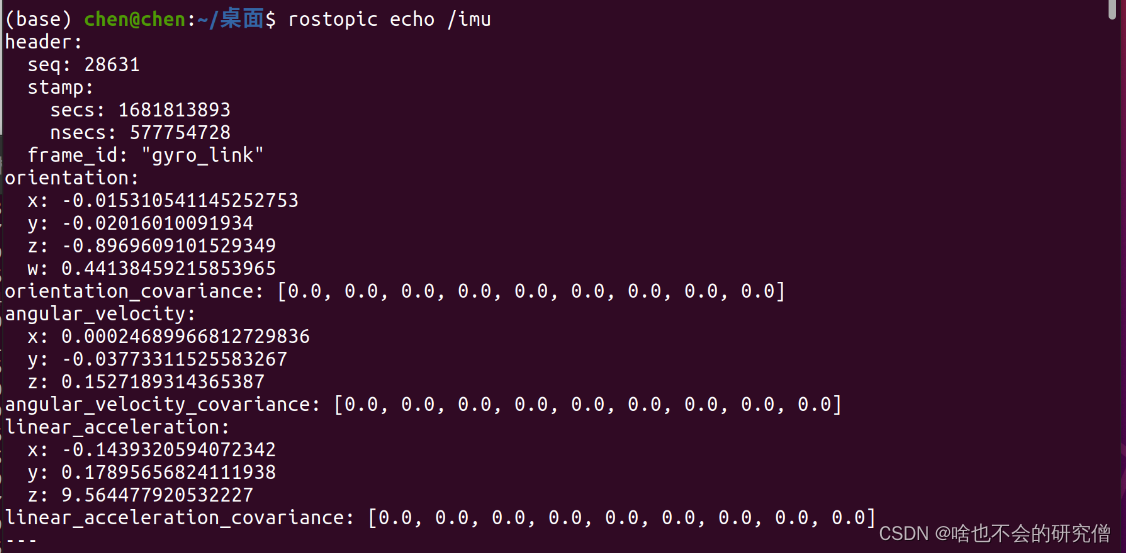
【惯性传感器imu】—— WHEELTEC的惯导模块的imu的驱动安装配置和运行
提示:文章写完后,目录可以自动生成,如何生成可参考右边的帮助文档 文章目录 前言一、IMU驱动安装1. 安装依赖2. 源码的下载3. 编译源码(1) 配置固定串口设备(2) 修改luanch文件(3) 编译 二、启动IMU1. 运行imu2. 查看imu数据 总结 前言 WHEE…...

Linux提权一
#信息收集 当前主机的操作系统 hostnamectl cat /etc/*-release lsb_release -a cat /etc/lsb-release # Debain cat /etc/redhat-release # Redhat cat /etc/centos-release # Centos cat /etc/os-release # Ubuntu cat /etc/issue 当前主机的内核版本 hostnamectl uname -a …...

Vue.js中如何实现以列表首列为表头
前言 一般情况table列表的展示,列头都在第一横行,此方法用于列头在第一列的情况。 效果图 核心代码 <template><div><table class"data-table"><tr v-for"(column, columnIndex) in columns" :key"col…...

如果孙宇晨和贾跃亭能够握手,或许将会上演新的戏码
就在贾跃亭宣布将进行个人IP的商业化不久,便迎来了回应,并且这一次给予贾跃亭回应的,同样是一个颇具争议性的人物——孙宇晨。 根据孙宇晨最新发布的视频显示,他愿意投资贾跃亭「做一个新的个人IP化的公司」,并且将会…...
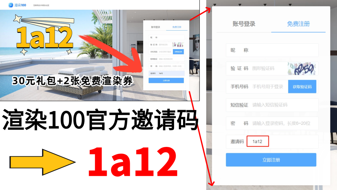
渲染100为什么是高性价比网渲平台?渲染100邀请码1a12
市面上主流的网渲平台有很多,如渲染100、瑞云、炫云、渲云等,这些平台各有特色和优势,也都声称自己性价比高,以渲染100为例,我们来介绍下它的优势有哪些。 1、渲染100对新用户很友好,注册填邀请码1a12有3…...
Jenkins流水线pipeline--基于上一章的工作流程
1流水线部署 1.流水线文本名Jenkinsfile,将流水线放入gitlab远程仓库代码里面 2pipeline脚本 Jenkinsfile文件内容 pipeline {agent anyenvironment {key"value"}stages {stage("拉取git仓库代码") {steps {deleteDir()checkout scmGit(branches: [[nam…...

比较Rust和Haskel
在比较Rust和Haskell时,我们可以从多个维度来分析它们各自的优势。以下是Rust相对于Haskell的优势,以及Haskell相对于Rust的优势: Rust比Haskell强的方面: 内存安全与并发性: Rust通过独特的所有权系统和借用检查器在…...

RedisTemplate的Long类型使用increment自增报错
问题描述 代码如下 Resourceprivate RedisTemplate<String,String > redisTemplate;redisTemplate.opsForValue().set("testKey", 0L); redisTemplate.opsForValue().increment("testKey");工作里用Long类型存储评论数,在使用increment自…...

STM32驱动AS-108M/AD-013指纹模块底层协议与高可靠实现
1. SparkFun串口指纹识别模块AS-108M与AD-013底层驱动技术解析 SparkFun Serial Fingerprint Scanners AS-108M 和 AD-013 是两款基于国产中科芯(CETC)ZFM-20系列指纹识别模组核心的工业级串口指纹传感器。尽管官方文档简略,但通过逆向分析其…...

DRV2665压电触觉驱动芯片原理与嵌入式实现
1. DRV2665 驱动芯片技术解析:面向嵌入式系统的压电触觉反馈全栈实现 DRV2665 是德州仪器(TI)推出的一款高度集成的 IC 接口压电触觉驱动器,专为需要高保真、低功耗、小尺寸触觉反馈的便携式设备而设计。与传统基于电磁线圈&…...

从0到1学会使用PageHelper
本文的思维导图为什么我们需要PageHelper?想象一下,你经营着一家餐厅,有顾客要点菜了,就比如:“鱼香肉丝”,你要把菜端给顾客。这时候,你要怎么把菜给顾客呢(如何把数据展示给前端)?你有三个解…...

正点原子lwIP实战解析——PHY芯片LAN8720A与YT8512C的配置与应用
1. 认识PHY芯片:网络通信的"翻译官" 当你用网线连接开发板时,数据究竟是如何从物理信号变成单片机可处理的数字信号的?这个关键角色就是PHY芯片。简单来说,PHY就像个精通多国语言的翻译官——它把网线里的模拟信号&…...

ROS teb_local_planner实战:从源码编译到多机编队避障调优
1. 为什么选择TEB算法优化多机编队避障? 在狭窄环境中实现多机器人编队移动,就像让一群人在拥挤的走廊里保持队形行走。传统DWA算法就像个固执的领队,只愿意前进不愿后退,遇到死胡同就卡住。而TEB(Timed Elastic Band&…...

ImportExcel与数据库集成:如何实现SQL数据到Excel的无缝转换
ImportExcel与数据库集成:如何实现SQL数据到Excel的无缝转换 【免费下载链接】ImportExcel PowerShell module to import/export Excel spreadsheets, without Excel 项目地址: https://gitcode.com/gh_mirrors/im/ImportExcel ImportExcel是一款强大的Power…...
Pixel Aurora Engine实战教程:Pixel Aurora + Blender实现像素3D建模联动
Pixel Aurora Engine实战教程:Pixel Aurora Blender实现像素3D建模联动 1. 教程概述 Pixel Aurora Engine是一款独特的AI绘图工具,它采用复古像素游戏风格界面,能够将文字描述转化为精美的像素艺术作品。本教程将带你了解如何将Pixel Auro…...

319嵌入式
1.关于lcd的时序图,为什么读操作时,vaild data在E拉高后,而写操作vaild data 在E拉高前写操作:数据必须在 E 上升沿之前稳定(因为 LCD 要”有效采样”) 读操作:数据在 E 拉高之后才有效…...
高效集成供应商库(Vendor Libraries)的实战指南)
ADS(Advanced Design System)高效集成供应商库(Vendor Libraries)的实战指南
1. 为什么需要供应商库? 刚接触ADS的射频工程师常会遇到这样的困境:设计一个简单的滤波器,光是找合适的电容电感模型就要花半天时间。Murata的0402封装电容该用哪个SPICE模型?AVX的叠层电感参数怎么设置?这时候**供应商…...

4个维度解析OpenArm:开源7自由度机械臂的创新价值与实践路径
4个维度解析OpenArm:开源7自由度机械臂的创新价值与实践路径 【免费下载链接】openarm A fully open-source humanoid arm for physical AI research and deployment in contact-rich environments. 项目地址: https://gitcode.com/GitHub_Trending/op/openarm …...