Wpf美化按钮,输入框,下拉框,dataGrid
Wpf美化按钮,输入框,下拉框,dataGrid
引用代码后
引用资源
<ControlTemplate x:Key="CustomProgressBarTemplate" TargetType="ProgressBar"><Grid><Border x:Name="PART_Track" CornerRadius="2" BorderBrush="#AAAAAA" BorderThickness="1"><Border.Background><LinearGradientBrush StartPoint="0,0" EndPoint="1,1"><GradientStop Color="#EEEEEE" Offset="0"/><GradientStop Color="#CCCCCC" Offset="1"/></LinearGradientBrush></Border.Background><Rectangle x:Name="PART_Indicator" HorizontalAlignment="Left" Fill="#248735"/></Border></Grid><ControlTemplate.Triggers><Trigger Property="IsIndeterminate" Value="True"><!-- 处理不确定模式的逻辑 --></Trigger></ControlTemplate.Triggers>
</ControlTemplate><Style x:Key="ToggleButtonStyle" TargetType="{x:Type ToggleButton}"><Setter Property="Width" Value="50"></Setter><Setter Property="Height" Value="20"></Setter><Setter Property="Template"><Setter.Value><ControlTemplate TargetType="ToggleButton"><!--定义视觉树--><Border x:Name="border" BorderThickness="1.5" CornerRadius="9" BorderBrush="#aaa" Background="#2790ff"><Grid x:Name="togglebutton" HorizontalAlignment="Right"><Border Width="17" Height="17" CornerRadius="9" Background="White"/></Grid><!--阴影设置--><Border.Effect><DropShadowEffect Color="Gray" BlurRadius="5" ShadowDepth="0" Opacity="0.5" /></Border.Effect></Border><!--定义触发器--><ControlTemplate.Triggers><Trigger Property="IsChecked" Value="false"><Setter TargetName="border" Property="Background" Value="#ccc"/><Setter TargetName="togglebutton" Property="HorizontalAlignment" Value="Left"/></Trigger></ControlTemplate.Triggers></ControlTemplate></Setter.Value></Setter>
</Style>
<!--<c:CheckConverter x:Key="CheckConverter"/>-->
<Style x:Key="pro1" TargetType="{x:Type ProgressBar}"><Setter Property="Height" Value="15"/><Setter Property="Background" Value="#F9F9F9"/><Setter Property="Padding" Value="5,2"/><Setter Property="Template"><Setter.Value><ControlTemplate TargetType="{x:Type ProgressBar}"><Border Padding="0" CornerRadius="10" Background="{TemplateBinding Background}"><Grid Height="{TemplateBinding Height}"><Border x:Name="PART_Track"/><Grid  x:Name="PART_Indicator" Background="Transparent" HorizontalAlignment="Left" ><Border Background="Green" CornerRadius="10"><Viewbox HorizontalAlignment="Right"Margin="{TemplateBinding Padding}" SnapsToDevicePixels="True"><TextBlock Foreground="White"HorizontalAlignment="Right"Text="{Binding RelativeSource={RelativeSource TemplatedParent},Path=Value,StringFormat={}{0}%}"/></Viewbox></Border></Grid></Grid></Border><ControlTemplate.Triggers><Trigger Property="IsEnabled" Value="False"><Setter Property="Background" Value="gray"/></Trigger></ControlTemplate.Triggers></ControlTemplate></Setter.Value></Setter>
</Style>
<Style x:Key="TextBoxStyle" TargetType="TextBox"><Setter Property="Foreground" Value="Black"/><Setter Property="BorderBrush" Value="#FF3C3C3C"/><Setter Property="BorderThickness" Value="1"/><Setter Property="Padding" Value="5"/><Setter Property="Template"><Setter.Value><ControlTemplate TargetType="TextBox"><Border Background="{TemplateBinding Background}"BorderBrush="{TemplateBinding BorderBrush}"BorderThickness="{TemplateBinding BorderThickness}"CornerRadius="5"><ScrollViewer x:Name="PART_ContentHost"/></Border></ControlTemplate></Setter.Value></Setter><!-- 当 IsReadOnly 为 true 时,改变背景色 --><Style.Triggers><Trigger Property="IsEnabled" Value="False"><Setter Property="Background" Value="LightGray"/><Setter Property="Foreground" Value="DarkGray"/><Setter Property="BorderBrush" Value="Gray"/></Trigger></Style.Triggers>
</Style><Style x:Key="ButtonStyle" TargetType="Button"><Setter Property="FontSize" Value="16"/><Setter Property="BorderBrush" Value="Transparent"/><Setter Property="Margin" Value="10"/><Setter Property="Foreground" Value="White"/><Setter Property="Background" Value="Green"/><Setter Property="Padding" Value="10,5"/><Setter Property="FontWeight" Value="Bold"/><Setter Property="FocusVisualStyle" Value="{x:Null}"/><Setter Property="Template"><Setter.Value><ControlTemplate TargetType="Button"><Border Background="{TemplateBinding Background}" BorderBrush="{TemplateBinding BorderBrush}" BorderThickness="1" CornerRadius="10"><ContentPresenter HorizontalAlignment="Center" VerticalAlignment="Center" /></Border></ControlTemplate></Setter.Value></Setter><Style.Triggers><Trigger Property="IsEnabled" Value="False"><Setter Property="Background" Value="LightGray"/><Setter Property="Foreground" Value="DarkGray"/><Setter Property="BorderBrush" Value="Gray"/></Trigger></Style.Triggers>
</Style><!-- 定义 ComboBox 的样式 -->
<Style x:Key="ComboBoxStyle" TargetType="ComboBox"><!-- 默认样式 --><Setter Property="Background" Value="White"/><Setter Property="Foreground" Value="#FF1E1E1E"/><Setter Property="BorderBrush" Value="#FF3C3C3C"/><Setter Property="BorderThickness" Value="1"/><Setter Property="Padding" Value="5"/><Setter Property="Template"><Setter.Value><ControlTemplate TargetType="ComboBox"><Grid><Border x:Name="Border" Background="{TemplateBinding Background}"BorderBrush="{TemplateBinding BorderBrush}"BorderThickness="{TemplateBinding BorderThickness}"CornerRadius="5"/><ToggleButton x:Name="ToggleButton"Grid.Column="1"Focusable="False"IsChecked="{Binding Path=IsDropDownOpen, Mode=TwoWay, RelativeSource={RelativeSource TemplatedParent}}"ClickMode="Press"><ToggleButton.Template><ControlTemplate TargetType="ToggleButton"><Border Background="Transparent"><Path x:Name="Arrow"Fill="Green"HorizontalAlignment="Right"VerticalAlignment="Center"Data="M 0 0 L 4 4 L 8 0 Z"/></Border></ControlTemplate></ToggleButton.Template></ToggleButton><ContentPresenter x:Name="ContentSite"IsHitTestVisible="False"Content="{TemplateBinding SelectionBoxItem}"ContentTemplate="{TemplateBinding SelectionBoxItemTemplate}"ContentTemplateSelector="{TemplateBinding ItemTemplateSelector}"Margin="5,0,0,0"VerticalAlignment="Center"HorizontalAlignment="Left"/><TextBox x:Name="PART_EditableTextBox"Style="{x:Null}"HorizontalAlignment="Left"VerticalAlignment="Center"Margin="5,0,0,0"Focusable="True"Background="Transparent"Foreground="{TemplateBinding Foreground}"Visibility="Hidden"IsReadOnly="{TemplateBinding IsReadOnly}"/><Popup x:Name="Popup"Placement="Bottom"IsOpen="{TemplateBinding IsDropDownOpen}"AllowsTransparency="True"Focusable="False"PopupAnimation="Slide"><Grid x:Name="DropDown"SnapsToDevicePixels="True"MinWidth="{TemplateBinding ActualWidth}"MaxHeight="{TemplateBinding MaxDropDownHeight}"><Border x:Name="DropDownBorder"Background="{TemplateBinding Background}"BorderBrush="{TemplateBinding BorderBrush}"BorderThickness="1"CornerRadius="5"/><ScrollViewer Margin="4,6,4,6" SnapsToDevicePixels="True"><StackPanel IsItemsHost="True" KeyboardNavigation.DirectionalNavigation="Contained"/></ScrollViewer></Grid></Popup></Grid></ControlTemplate></Setter.Value></Setter><!-- 当 IsEnabled 为 false 时,改变背景色 --><Style.Triggers><Trigger Property="IsEnabled" Value="False"><Setter Property="Background" Value="LightGray"/><Setter Property="Foreground" Value="DarkGray"/><Setter Property="BorderBrush" Value="Gray"/></Trigger></Style.Triggers>
</Style><Style x:Key="DataGridStyles" TargetType="DataGrid"><!--<Setter Property="ColumnHeaderStyle" Value="{DynamicResource ColumnHeaderStyle}"></Setter><Setter Property="CellStyle" Value="{DynamicResource CellStyle}"></Setter><Setter Property="RowStyle" Value="{DynamicResource RowStyle}"></Setter>--><!-- <Setter Property="EnableRowVirtualization" Value="True"></Setter> --><!-- <Setter Property="GridLinesVisibility" Value="None"></Setter> --><!-- <Setter Property="CanUserAddRows" Value="False"></Setter> --><!-- <Setter Property="AutoGenerateColumns" Value="False"></Setter> --><Setter Property="IsEnabled" Value="True"></Setter><Setter Property="HeadersVisibility" Value="Column"></Setter><!--网格线颜色--><Setter Property="Background" Value="White" />
</Style>
<Style x:Key="ColumnHeaderStyles" TargetType="DataGridColumnHeader"><Setter Property="Height" Value="35"></Setter><Setter Property="FontSize" Value="13"></Setter><Setter Property="Background" Value="#F2F2F2"></Setter><Setter Property="BorderThickness" Value="0,0,1,1"></Setter><Setter Property="BorderBrush" Value="Black"></Setter><Setter Property="VerticalContentAlignment" Value="Center"></Setter><Setter Property="HorizontalContentAlignment" Value="Center"></Setter>
</Style>
<Style x:Key="RowStyles" TargetType="DataGridRow"><Setter Property="Cursor" Value="Hand"></Setter><Setter Property="BorderBrush" Value="Black"/><Setter Property="BorderThickness" Value="0,0,0,1"/><Style.Triggers><Trigger Property="IsMouseOver" Value="true"><Setter Property="Background" Value="#F2F2F2"/></Trigger><Trigger Property="IsSelected" Value="True"><Setter Property="Background"  Value="Blue" /></Trigger></Style.Triggers>
</Style>
<Style x:Key="CellStyles" TargetType="DataGridCell"><Setter Property="Height" Value="35"></Setter><Setter Property="FontSize" Value="15"></Setter><Setter Property="Template"><Setter.Value><ControlTemplate TargetType="DataGridCell"><Border x:Name="Bg" Background="Transparent" BorderThickness="0" UseLayoutRounding="True" BorderBrush="#FFCBCBCB"><ContentPresenter HorizontalAlignment="Center"  VerticalAlignment="Center" /></Border></ControlTemplate></Setter.Value></Setter>
</Style>
<!-- 定义数据表格的基础风格 --><Style x:Key="styleDataGridView" TargetType="DataGrid"><Setter Property="Background" Value="#F0F0F0"/><Setter Property="BorderBrush" Value="#D7D7D7"/><Setter Property="BorderThickness" Value="1"/><Setter Property="RowHeaderWidth" Value="25"/><Setter Property="AutoGenerateColumns" Value="False"/><Setter Property="CanUserAddRows" Value="False"/><!-- <Setter Property="AlternatingRowBackground" Value="#EDEDED"/> --><!-- 隔行变色效果 --> <Setter Property="CellStyle"><Setter.Value><Style TargetType="DataGridCell"><Setter Property="Padding" Value="8,4"/><Setter Property="Foreground" Value="Black"/><Setter Property="FontSize" Value="14"/><Setter Property="FontFamily" Value="Arial"/><Setter Property="HorizontalContentAlignment" Value="Center"/><Setter Property="VerticalContentAlignment" Value="Center"/></Style></Setter.Value></Setter></Style><Style x:Key="DataGridStyles" TargetType="DataGrid"><Setter Property="ColumnHeaderStyle" Value="{DynamicResource ColumnHeaderStyle}"></Setter><Setter Property="CellStyle" Value="{DynamicResource CellStyle}"></Setter><Setter Property="RowStyle" Value="{DynamicResource RowStyle}"></Setter><!-- <Setter Property="EnableRowVirtualization" Value="True"></Setter> --><!-- <Setter Property="GridLinesVisibility" Value="None"></Setter> --><!-- <Setter Property="CanUserAddRows" Value="False"></Setter> --><!-- <Setter Property="AutoGenerateColumns" Value="False"></Setter> --><Setter Property="IsEnabled" Value="True"></Setter><Setter Property="HeadersVisibility" Value="Column"></Setter><!--网格线颜色--><Setter Property="Background" Value="White" /></Style><Style x:Key="ColumnHeaderStyles" TargetType="DataGridColumnHeader"><Setter Property="Height" Value="35"></Setter><Setter Property="FontSize" Value="15"></Setter><Setter Property="FontWeight" Value="Bold"></Setter><Setter Property="Background" Value="#F2F2F2"></Setter><Setter Property="BorderThickness" Value="0,0,1,1"></Setter><Setter Property="BorderBrush" Value="Black"></Setter><Setter Property="VerticalContentAlignment" Value="Center"></Setter><Setter Property="HorizontalContentAlignment" Value="Center"></Setter></Style><Style x:Key="RowStyles" TargetType="DataGridRow"><Setter Property="Cursor" Value="Hand"></Setter><Setter Property="BorderBrush" Value="Black"/><Setter Property="BorderThickness" Value="0,0,0,1"/><Style.Triggers><Trigger Property="IsMouseOver" Value="true"><Setter Property="Background" Value="#F2F2F2"/></Trigger><Trigger Property="IsSelected" Value="True"><Setter Property="Background" Value="Blue" /></Trigger></Style.Triggers></Style><Style x:Key="CellStyles" TargetType="DataGridCell"><Setter Property="Height" Value="35"></Setter><Setter Property="FontSize" Value="15"></Setter><Setter Property="Template"><Setter.Value><ControlTemplate TargetType="DataGridCell"><Border x:Name="Bg" Background="Transparent" BorderThickness="0" UseLayoutRounding="True" BorderBrush="#FFCBCBCB"><ContentPresenter HorizontalAlignment="Center" VerticalAlignment="Center" /></Border></ControlTemplate></Setter.Value></Setter></Style>
项目主要代码
MainWindow.xaml
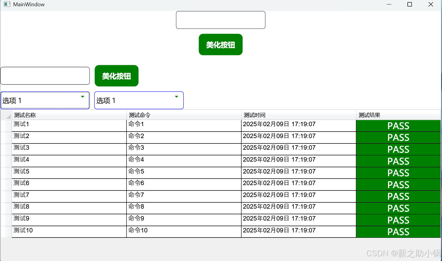
<Window x:Class="TestWpfUI.MainWindow"xmlns="http://schemas.microsoft.com/winfx/2006/xaml/presentation"xmlns:x="http://schemas.microsoft.com/winfx/2006/xaml"xmlns:d="http://schemas.microsoft.com/expression/blend/2008"xmlns:mc="http://schemas.openxmlformats.org/markup-compatibility/2006"mc:Ignorable="d"Title="MainWindow" Height="600" Width="1000"WindowStartupLocation="CenterScreen"><Grid><Grid.RowDefinitions><RowDefinition Height="Auto"/><RowDefinition Height="Auto"/><RowDefinition Height="Auto"/><RowDefinition Height="Auto"/><RowDefinition/></Grid.RowDefinitions><TextBox Grid.Row="0" Style="{StaticResource TextBoxStyle}" Width="200" Height="40"x:Name="textBox1"FontSize="20"></TextBox><Button Grid.Row="1" Style="{StaticResource ButtonStyle}" Width="100" Height="50" Content="美化按钮" Click="Button1_OnClick"/><StackPanel Grid.Row="2" Orientation="Horizontal"><TextBox  Style="{StaticResource TextBoxStyle}" Width="200" Height="40"x:Name="textBox2"IsReadOnly="True"FontSize="20"></TextBox><Button Style="{StaticResource ButtonStyle}" Width="100" Height="50" Content="美化按钮"IsEnabled="False"Click="Button2_OnClick"x:Name="Button2"/></StackPanel><StackPanel Grid.Row="3" Orientation="Horizontal"  VerticalAlignment="Center"><!-- 普通 ComboBox --><ComboBox x:Name="ComboBox1" FontSize="15" Style="{StaticResource ComboBoxStyle}" Width="200" Height="40" SelectedIndex="0"><ComboBoxItem Content="选项 1"/><ComboBoxItem Content="选项 2"/><ComboBoxItem Content="选项 3"/></ComboBox><!-- 不可用 ComboBox --><ComboBox x:Name="ComboBox2" FontSize="15" Style="{StaticResource ComboBoxStyle}" Width="200" Height="40"Margin="10,0,0,0" SelectedIndex="0" IsEnabled="False"><ComboBoxItem Content="选项 1"/><ComboBoxItem Content="选项 2"/><ComboBoxItem Content="选项 3"/></ComboBox></StackPanel><Grid Grid.Row="4"><DataGrid x:Name="DataGrids" Style="{StaticResource styleDataGridView}"><DataGrid.Columns><DataGridTextColumn Header="测试名称" Binding="{Binding Path=TestName ,Mode=TwoWay,UpdateSourceTrigger=PropertyChanged}" Width="0.15*" /><DataGridTextColumn Header="测试命令" Binding="{Binding Path=Command,Mode=TwoWay,UpdateSourceTrigger=PropertyChanged}" Width="0.15*" /><DataGridTextColumn Header="测试时间" Binding="{Binding Path=TestDate,Mode=TwoWay,UpdateSourceTrigger=PropertyChanged}" Width="0.15*" /><DataGridTextColumn Header="测试结果" Binding="{Binding Path=TestValue,Mode=TwoWay,UpdateSourceTrigger=PropertyChanged}" Width="0.11*"><DataGridTextColumn.CellStyle ><Style TargetType="DataGridCell"><Setter Property="FontSize" Value="20"></Setter><Style.Triggers><DataTrigger Binding="{Binding TestValue}" Value="PASS"><Setter Property="Template"><Setter.Value><ControlTemplate TargetType="DataGridCell"><Border Background="Green"><ContentPresenter HorizontalAlignment="Center"  VerticalAlignment="Center" /></Border></ControlTemplate></Setter.Value></Setter><Setter Property="Foreground" Value="White"></Setter></DataTrigger><DataTrigger Binding="{Binding TestValue}" Value="FAIL"><Setter Property="Template"><Setter.Value><ControlTemplate TargetType="DataGridCell"><Border Background="Red" ><ContentPresenter HorizontalAlignment="Center"  VerticalAlignment="Center" /></Border></ControlTemplate></Setter.Value></Setter><Setter Property="Foreground" Value="White"></Setter></DataTrigger></Style.Triggers></Style></DataGridTextColumn.CellStyle></DataGridTextColumn></DataGrid.Columns></DataGrid></Grid></Grid>
</Window>
MainWindow.cs
using System.Collections.ObjectModel;
using System.Windows;
using TestWpfUI.Common.Models;namespace TestWpfUI;/// <summary>
/// Interaction logic for MainWindow.xaml
/// </summary>
public partial class MainWindow
{public MainWindow(){InitializeComponent();var testDatas = new ObservableCollection<TestData>();for (int i = 1; i <= 10; i++){testDatas.Add(new TestData() { TestName = "测试"+i, Command = "命令"+i,TestDate = DateTime.Now.ToString("yyyy年MM月dd日 HH:mm:ss"),TestValue = "PASS"});}DataGrids.ItemsSource = testDatas;}private void Button1_OnClick(object sender, RoutedEventArgs e){MessageBox.Show(textBox1.Text);if (textBox2.IsReadOnly){textBox2.IsReadOnly = false;}if (Button2.IsEnabled == false){Button2.IsEnabled = true;}}private void Button2_OnClick(object sender, RoutedEventArgs e){MessageBox.Show(textBox2.Text);if (ComboBox2.IsEnabled == false){ComboBox2.IsEnabled = true;}}
}
相关文章:
Wpf美化按钮,输入框,下拉框,dataGrid
Wpf美化按钮,输入框,下拉框,dataGrid 引用代码后 引用资源 <ControlTemplate x:Key"CustomProgressBarTemplate" TargetType"ProgressBar"><Grid><Border x:Name"PART_Track" CornerRadius&q…...

搜索插入位置:二分查找的巧妙应用
问题描述 给定一个已排序的整数数组 nums 和一个目标值 target,要求在数组中找到目标值并返回其索引。如果目标值不存在于数组中,则返回它按顺序插入的位置。必须使用时间复杂度为 O(log n) 的算法。 示例: 示例1: 输入: nums …...

Cocos2d-x 游戏开发-打包apk被默认自带了很多不必要的权限导致apk被报毒,如何在Cocos 2d-x中强制去掉不必要的权限-优雅草卓伊凡
Cocos2d-x 游戏开发-打包apk被默认自带了很多不必要的权限导致apk被报毒,如何在Cocos 2d-x中强制去掉不必要的权限-优雅草卓伊凡 实战操作 去除权限 要在 Cocos2d-x 开发的游戏中去掉 APK 自带权限,可以按照以下步骤操作: 编辑 AndroidMa…...
自动化xpath定位元素(附几款浏览器xpath插件)
在 Web 自动化测试、数据采集、前端调试中,XPath 仍然是不可或缺的技能。虽然 CSS 选择器越来越强大,但面对复杂 DOM 结构时,XPath 仍然更具灵活性。因此,掌握 XPath,不仅能提高自动化测试的稳定性,还能在爬…...

String类(6)
大家好,今天我们继续来学习一下String类的查找方法,主要是反向查找的一些方法。 ⭐️从后往前找一样的道理,如果找到了就返回对应字符的下标. 如果后面有对应的字符,则会返回第一个遇到的字符下标. ⭐️注意一下传入字符串的找法…...

动态表格html
题目: 要求: 1.表格由专业班级学号1-10号同学的信息组成,包括:学号、姓 名、性别、二级学院、班级、专业、辅导员; 2.表格的奇数行字体为黑色,底色为白色;偶数行字体为白色,底 色为黑…...
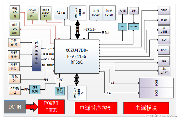
ZU47DR 100G光纤 高性能板卡
简介 2347DR是一款最大可提供8路ADC接收和8路DAC发射通道的高性能板卡。板卡选用高性价比的Xilinx的Zynq UltraScale RFSoC系列中XCZU47DR-FFVE1156作为处理芯片(管脚可以兼容XCZU48DR-FFVE1156,主要差别在有无FEC(信道纠错编解码࿰…...
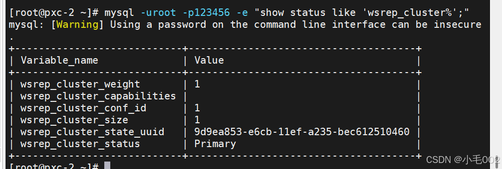
mysql8.0使用pxc实现高可用
环境准备 准备三台虚拟机,其对应的主机名和IP地址为 pxc-1192.168.190.129pxc-2192.168.190.133pxc-3192.168.190.134 解析,都要做解析 测试 下载pxc的安装包, 官网:https://www.percona.com/downloads 选择8.0的版本并下载,…...

Kotlin 使用 Chrome 无头浏览器
1. 概念 无头浏览器在类似于流行网络浏览器的环境中提供对网页的自动控制,但是通过命令行界面或使用网络通信来执行。 它们对于测试网页特别有用,因为它们能够像浏览器一样呈现和理解超文本标记语言,包括页面布局、颜色、字体选择以及JavaSc…...
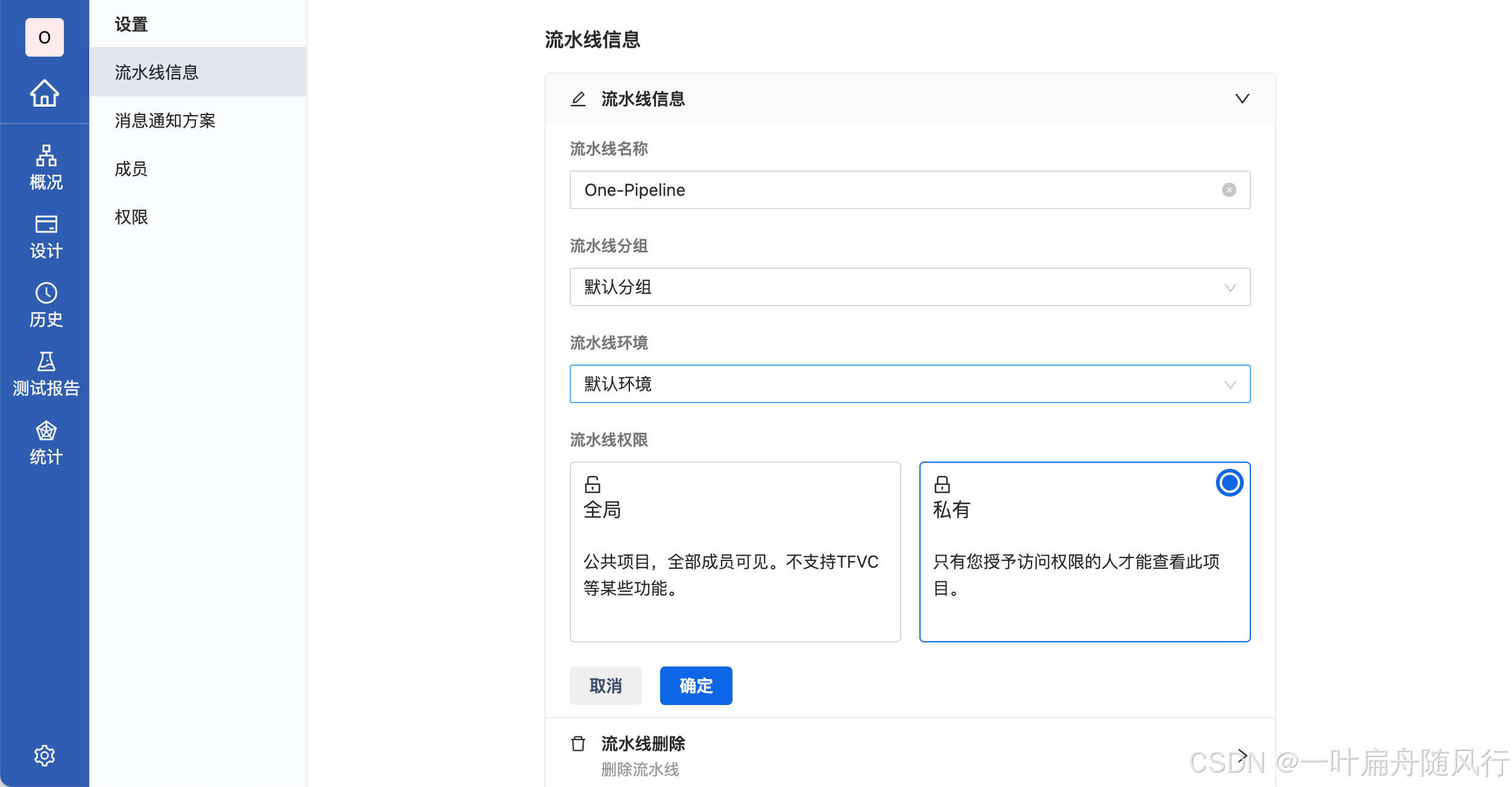
Arbess基础教程-创建流水线
Arbess(谐音阿尔卑斯) 是一款开源免费的 CI/CD 工具,本文将介绍如何使用 Arbess 配置你的第一条流水线,以快速入门上手。 1. 创建流水线 根据不同需求来创建不同的流水线。 1.1 配置基本信息 配置流水线的基本信息,如分组,环境&…...
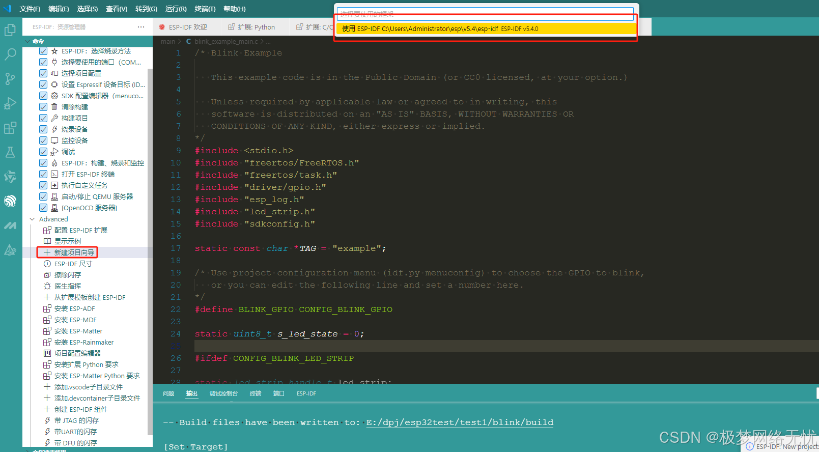
vscode安装ESP-IDF
引言 ESP-IDF(Espressif IoT Development Framework)是乐鑫官方为其 ESP32、ESP32-S 系列等芯片提供的物联网开发框架。结合 Visual Studio Code(VSCode)这一强大的开源代码编辑器,能极大提升开发效率。本教程将详细介…...
第31周:文献阅读
目录 摘要 Abstract 文献阅读 问题引入 研究背景 研究动机 创新点 动态预训练方法(DynPT) 深度循环神经网络(DRNN) 传感器选择 方法论 时间序列的动态预训练 异构传感器数据的DRNN 基于稀疏度的传感器过滤 实验研…...
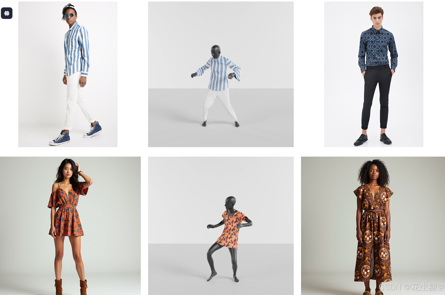
GenAI + 电商:从单张图片生成可动态模拟的3D服装
在当今数字化时代,电子商务和虚拟现实技术的结合正在改变人们的购物体验。特别是在服装行业,消费者越来越期待能够通过虚拟试衣来预览衣服的效果,而无需实际穿戴。Dress-1-to-3 技术框架正是为此而生,它利用生成式AI模型(GenAI)和物理模拟技术,将一张普通的穿衣照片转化…...
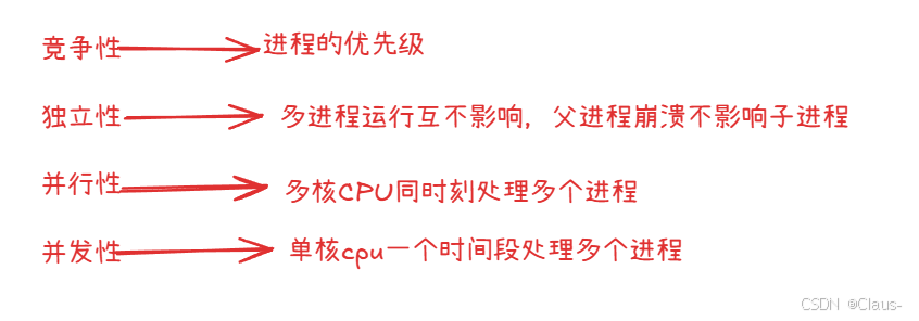
进程(1)
1.什么是进程 要回答这个问题首先我们要解答什么是程序的问题。什么是程序呢?程序本质是就是存放在磁盘上的文件。我们要运行程序,首先必须要将其加载到内存中,这样才能与cpu交互,这是冯诺依曼体系架构所决定的。 程序运行起来后…...
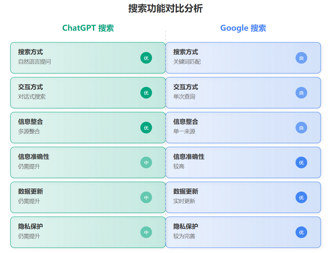
ChatGPT搜索免费开放:AI搜索引擎挑战谷歌霸主地位全面分析
引言 2025年2月6日,OpenAI宣布ChatGPT搜索功能向所有用户免费开放,且无需注册登录。这一重大举措在搜索引擎行业引发巨大反响,有观点认为"谷歌搜索时代即将结束"。本文将深入分析ChatGPT生成式AI搜索对谷歌搜索业务及全球搜索市场…...

hadoop之MapReduce:片和块
假如我现在500M这样的数据,如何存储? 500M 128M 128M 128M 116M 分为四个块进行存储。 计算的时候,是按照片儿计算的,而不是块儿。 块是物理概念,一个块就是128M ,妥妥的,毋庸置疑。 片是逻辑概念&…...
GitPuk快速安装配置教程(入门级)
GitPuk是一款国产开源免费的代码管理工具,工具简洁易用,开源免费,本文将讲解如何快速安装和配置GitPuk,以快速入门上手。 1、安装 支持 Windows、Mac、Linux、docker 等操作系统。 1.1 Linux安装 以下以Centos7安装…...
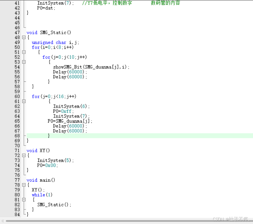
在CT107D单片机综合训练平台上,8个数码管分别单独依次显示0~9的值,然后所有数码管一起同时显示0~F的值,如此往复。
题目:在CT107D单片机综合训练平台上,8个数码管分别单独依次显示0~9的值,然后所有数码管一起同时显示0~F的值,如此往复。 延时函数分析LED首先实现8个数码管单独依次显示0~9的数字所有数码管一起同时显示0~F的值,如此往…...
深入浅出Java数组:从基础到高阶应用
目录 引言 一、数组概述 1.什么是数组? 2.数组的分类? 3.Java数组存储元素的特点? 4.数组优点? 5.数组缺点? 二、一维数组 1. 静态初始化一维数组 2.增强 for 循环(for-each 循环) 3…...

基于 Nginx 的 CDN 基础实现
概览 本文是对基于Nginx的CDN网络的学习笔记,阅读的代码为:https://github.com/leandromoreira/cdn-up-and-running 其中,先确定CDN中的一些基础概念: Balancer:负载均衡,即请求数据的流量最开始打到Bal…...

量子计算中Loschmidt回声相位测量的创新方法
1. 量子计算中的Loschmidt回声相位测量方法概述Loschmidt回声是量子动力学中一个重要的概念,它描述了量子系统在时间反演演化后与初始状态的相似程度。在量子计算领域,精确测量Loschmidt回声的相位信息对于理解量子系统的非平衡态行为、计算能量本征值以…...

作业本耐用度差距巨大?深圳大明印刷厂拆解合规工艺,告别定制作业本掉页开裂通病
在校园日常教学中,很多学校都会遇到同一个难题:同一学期采购的作业本、定制作业本,品质差距悬殊,有的完好无损用到期末,有的短短几周就出现书脊开裂、页面脱落、边角破损、翻页卡顿等问题。不少人误以为是学生使用习惯…...

录音会议纪要整理不同使用场景,实用口碑选择建议
针对不同场景的录音整理需求(短录音、中长录音、长内容深度整理),本文基于实际使用体验,分享不同场景下的工具选择建议与使用心得。一、场景一:短录音(15-60分钟,发音清晰)典型场景&…...

基于雷达与光敏传感器的低功耗智能窗防设备设计与实现
1. 项目概述:一个基于雷达与光敏的智能窗防设备几年前,我因为一次短暂的出差,家里空置了几天,回来后就一直琢磨着怎么给家里的窗户加点“动静”。市面上的智能安防摄像头固然好,但要么需要复杂的布线,要么云…...

航空发动机叶片三维扫描-诺斯顿
航空发动机叶片作为发动机的核心动力部件,其精度与性能直接决定发动机的推力、燃油效率及运行安全性,三维扫描技术作为航空制造领域的核心数字化手段,已广泛应用于叶片全生命周期的多个关键环节。其应用涵盖叶片研发设计阶段的逆向工程&#…...

在Node.js服务中集成Taotoken实现稳定的大模型能力调用
🚀 告别海外账号与网络限制!稳定直连全球优质大模型,限时半价接入中。 👉 点击领取海量免费额度 在Node.js服务中集成Taotoken实现稳定的大模型能力调用 对于需要在后端服务中集成AI功能的Node.js开发者而言,直接对接…...

render_async嵌套渲染:构建复杂异步界面的完整解决方案
render_async嵌套渲染:构建复杂异步界面的完整解决方案 【免费下载链接】render_async render_async lets you include pages asynchronously with AJAX 项目地址: https://gitcode.com/gh_mirrors/re/render_async 在现代Web开发中,页面加载速度…...

别再乱建索引了!用Explain的key_len字段,一眼看穿你的MySQL联合索引到底生效了几个字段
解密MySQL联合索引:用key_len精准判断索引生效范围 在数据库性能优化领域,联合索引的使用一直是个既基础又容易踩坑的话题。很多开发者虽然知道"最左匹配原则"这个名词,但在实际业务场景中,面对复杂的查询条件组合时&a…...

观察Token消耗明细,Taotoken用量看板如何帮助控制预算
🚀 告别海外账号与网络限制!稳定直连全球优质大模型,限时半价接入中。 👉 点击领取海量免费额度 观察Token消耗明细,Taotoken用量看板如何帮助控制预算 对于个人开发者或项目管理者而言,在使用大模型API时…...

解决claude code频繁封号与token不足的taotoken接入方案
🚀 告别海外账号与网络限制!稳定直连全球优质大模型,限时半价接入中。 👉 点击领取海量免费额度 解决Claude Code频繁封号与Token不足的Taotoken接入方案 1. 问题背景:Claude Code用户面临的挑战 对于依赖Claude Cod…...