CSS3+动画
浏览器内核以及其前缀
css标准中各个属性都要经历从草案到推荐的过程,css3中的属性进展都不一样,浏览器厂商在标准尚未明确的情况下提前支持会有风险,浏览器厂商对新属性的支持情况也不同,所有会加厂商前缀加以区分。如果某个属性已经从草案变为了或接近的推荐方案,并且厂商已经完全实现了推荐属性,那就不用加厂商前缀。如border-radius已经很成熟了,不用加前缀。
根据不同的浏览器内核,css前缀会有不同。最基本的浏览器内核有如下四种。
(1)Gecko内核:前缀-moz。火狐浏览器。
(2)Webkit内核:前缀-webkit。chrome、safari。
(3)Trident内核:前缀-ms-。IE。
(4)Presto内核:前缀-o-。opera。
box-shadow
box-shadow:阴影1,阴影2,…
box-shadow:0px 0px 0px 0px #fff inset,0px 0px 0px 0px #fff inset;
box-shadow:水平偏移 垂直偏移 模糊度 阴影大小 颜色 内侧阴影

变换 transform2D
transform 2D函数:translate(x,y)-移动、scale-缩放、rotate-旋转、skew-扭曲
matrix(a,b,c,d,e,f)-矩阵变换
参数a和d:控制元素的缩放。
参数b和c:控制元素的倾斜或斜切。
参数e和f:控制元素的平移。
格式:transform 函数
transform-origin:指定rotate旋转的中心点位置/scale缩放的基点/skew(默认是图形中心点)。
transform-origin:center;
transform-origin:top left;
transform-origin:50px 50px;
transform-origin:bottom right 60px;
变换 transform3D
transform 3D函数:
translate3d(x,y,z)、translateX(x)、translateY(Y)、translateZ(z);
scale3d(x,y,z)、scaleX(x)、scaleY(Y)、scaleZ(z);
rotate3d(x,y,z)、rotateX(x)、rotateY(Y)、rotateZ(z);
格式:transfrom 3d函数
perspective:透视:视角距离:视角离显示屏的距离。
perspectice-origin:视角位置。
过渡 transition
格式:transition:property duration timing-function delay
transition:all 0.3s linear 1s;
缓动函数timing-function:缓动函数有三类:
(1)贝塞尔缓动函数:cubic-bezier(x1,y1,x2,y2)。下面是四个预定义的贝塞尔函数。

(2)线性缓动函数:linear(<point-list>)

(3)阶跃缓动函数:steps(<number-of-steps>,<direction>)

动画 animation
通过关键帧控制动画,关键帧之间的过渡效果。
animation属性
@keyframes 规定动画,用于指定关键帧。。
animation 所有动画属性的简写属性。
animation-name 规定 @keyframes 动画的名称。
animation-duration 规定动画完成一个周期所花费的秒或毫秒。默认是 0。
animation-timing-function 规定动画的速度曲线。默认是 “ease”。
animation-fill-mode 规定当动画不播放时(当动画完成时,或当动画有一个延迟未开始播放时),要应用到元素的样式。
animation-delay 规定动画何时开始。默认是 0。
animation-iteration-count 规定动画被播放的次数。默认是 1。infinite无限循环。
animation-direction 规定动画是否在下一周期逆向地播放。默认是 “normal”。alternate先执行一遍动画,然后再反向执行一遍动画。
animation-play-state 规定动画是否正在运行或暂停。默认是 “running”。
动画案例
小球弹跳动画
.boll{width:500px;height:500px;background:#29d1d1;border-radius:50%; animation:bounce 1s linear infinite;
}
@keyframes bounce{0%{transform:translateY(0%);}50%{transform:translateY(25%);}100%{transform:translateY(0%);}
}
文字渐变动画效果
.text-animation{width:140px;height:70px;font-size:90px;font-weight:bold;line-height:50px;background:linear-gradient(-45deg,#ee7752,#e73c7e,#23a6d5,#23d5ab);color:transparent;background-clip:text; animation: gradient 2.5s ease infinite alternate;background-position:0% 100%;background-size:400% 400%;
}
@keyframes gradient{0%{background-position:0% 100%;} 100%{background-position:100% 100%;}
}
地图图标动画

<!DOCTYPE html>
<html lang="en"><head><meta charset="UTF-8"><meta name="viewport" content="width=device-width, initial-scale=1.0"><title>Document</title>
</head><body><div class="content"><div class="pos"></div><div class="pos-bottom"></div></div></body>
<style>body {background-color: #0b3061;overflow: hidden;}.content {width: 100%;height: 100vh;display: flex;flex-direction: column;align-items: center;justify-content: center;}.pos {width: 100px;height: 100px;background-color: #0c5db9;border-radius: 50% 50% 50% 0;transform: rotate(-45deg);animation-name: bounce;animation-duration: 1s;animation-timing-function: ease;animation-fill-mode: both;}.pos::after {content: '';display: inline-block;width: 50px;height: 50px;border-radius: 50%;background-color: #fff;position: relative;top: 25%;left: 25%;}.pos-bottom { width: 50px;height: 50px;background-color: rgba(0, 0, 0, 0.2);border-radius: 50%; transform: rotateX(55deg);  z-index: -1; }.pos-bottom::after {content: '';display: inline-block;width: 100px;height: 100px;background-color: transparent; border-radius: 50%;transform: rotateX(30deg); position: relative;bottom: 50%;right: 50%;box-shadow: 0px 0px 2px 5px rgba(255, 255, 255, 0.5);animation-name: pulsate;animation-duration: 1s;animation-iteration-count: infinite;animation-timing-function: ease-in-out;animation-delay: 1.1s; opacity: 0;}@keyframes bounce {0% {opacity: 0;filter: alpha(opacity=0);transform: translateY(-1000px) rotate(-45deg);}60% {opacity: 1;filter: none;transform: translateY(30px) rotate(-45deg);}100% { transform: translateY(0px) rotate(-45deg);}}@keyframes pulsate {0% { transform: scale(0.2);opacity: 0;} 50% { opacity: 1;}100% {transform: scale(1); opacity: 0;}}
</style></html>
背景混合动效

<!DOCTYPE html>
<html lang="en"><head><meta charset="UTF-8"><meta name="viewport" content="width=device-width, initial-scale=1.0"><title>Document</title>
</head><body><div class="container"><div class="card"><div class="bg-1"></div><div class="bg-2"></div><div class="icon-box"></div></div><div class="card"><div class="bg-1"></div><div class="bg-2"></div><div class="icon-box"></div></div><div class="card"><div class="bg-1"></div><div class="bg-2"></div><div class="icon-box"></div></div></div></body>
<style>:root {--color: rgb(61, 98, 112);--color-bg-1: #33adff;--color-bg-2: #ff2af4;}body {background: linear-gradient(45deg, rgba(42, 199, 219, 0.973), rgba(255, 122, 151, 0.5));width: 100vw;height: 100vh;display: flex;flex-direction: row;justify-content: center;align-items: center;overflow: hidden;}.container {width: 95vw;max-width: 600px;display: flex;flex-wrap: wrap;text-align: center;position: relative;}.card {flex: auto;min-width: calc(33% - 2vw);margin: 0 1vw calc(1vw + 50px) 1vw;position: relative;cursor: pointer;border: 1px solid #fff;}.card:hover .bg-1,.card:hover .bg-2 {display: block;}.card::after {content: '';float: left;padding-top: 100%;}.icon-box{position: absolute;width: 85%;height: 85%;border-radius: 50%;background-color: #fff;margin: 8%;}.bg-1,.bg-2{position: absolute;width: 85%;height: 85%;border-radius: 50%;   opacity: 1;mix-blend-mode: multiply;display: none;}.bg-1{background-color: var(--color-bg-1); animation: move 1.8s linear infinite  ;}.bg-2{background-color: var(--color-bg-2);    animation: move 1.2s linear infinite  ;}@keyframes move {0%{top:8%;left:0%;}25%{top:0%;left:8%;}50%{top: 8%;left: 16%;}70%{top: 16%;left: 8%;} 100%{top: 8%;left: 0%;}}
</style></html>
渐变动态边框
- 1、通过背景旋转rotate得到

<!DOCTYPE html>
<html lang="en"><head><meta charset="UTF-8"><meta name="viewport" content="width=device-width, initial-scale=1.0"><title>Document</title>
</head><body><div class="container"><div class="box"><h2>CSS</h2></div><div class="box"><h2>Border</h2></div><div class="box"><h2>Animation</h2></div></div>
</body>
<style>body {padding: 0;margin: 0;}.container {width: 100%;height: 100vh;display: flex;justify-content: space-between;align-items: center;background-color: #0e1538;}.box {width: 300px;height: 400px;margin: 30px;border-radius: 20px;background-color: rgba(0, 0, 0, .5);position: relative;display: flex;align-items: center;justify-content: center;color: #fff;box-shadow: 0 0 10px #000;overflow: hidden; h2{z-index: 1;}}.box::before {content: '';position: absolute;width: 150px;height: 140%;background: linear-gradient(#00ccff,#d400d4);box-shadow: 0 0 20px #999;animation: animate 4s linear infinite; }.box::after{content: '';position: absolute;inset: 4px;background-color: #0e1538;border-radius: 16px;}@keyframes animate {0%{transform: rotate(0deg);}100%{transform: rotate(360deg);}}
</style></html>
- 2、动态渐变边框:放大背景,修改背景位置 可以得到图片各位置的图像。
background-size: 200% 100%;
background-position: 0 0;//看到左边部分的渐变
background-position: 100% 0;//看到右边部分的渐变

<!DOCTYPE html>
<html lang="en"><head><meta charset="UTF-8"><meta name="viewport" content="width=device-width, initial-scale=1.0"><title>Document</title>
</head><body><div class="container"><div class="input"><input class="input-inner" type="text" placeholder="Enter your name"></input></div></div>
</body>
<style>body {padding: 0;margin: 0;}.container {width: 100%;height: 100vh;overflow: hidden;display: flex;justify-content: center;align-items: center;background-color: #000;}.input {position: relative;}.input::before {content: '';position: absolute;width: 100%;height: 100%;border-radius: 5px;background: linear-gradient(to right, yellow, green, #00ccff, #d400d4);/* 横向放大2倍,可视区域只能看到两个颜色的渐变 */background-size: 200% 100%;animation: input-border 2s ease-in-out infinite;animation-direction: alternate-reverse;}.input-inner {position: relative;display: inline-block;margin: 10px;width: 400px;height: 50px;z-index: 1;}@keyframes input-border {0% {background-position: 0 0;}100% {background-position: 100% 0;}}
</style></html>
文本变形动画
文本变形 :filter contrast() blur()
animation-delay 负数 提前执行:动画提前执行,重叠在页面上的元素 希望他们一次出现,可以设置提前执行。这样在元素还没有显示在页面上时就开始执行动画。
元素居中:
left: 50%;top: 50%;//相对父元素的偏移transform: translate(-50%, -50%);//相对自身往反方向偏移一半就居住中了

<!DOCTYPE html>
<html lang="en"><head><meta charset="UTF-8"><meta name="viewport" content="width=device-width, initial-scale=1.0"><title>Document</title>
</head><body><div class="morphing"><div class="word">word</div><div class="word">morphing</div><div class="word">with</div><div class="word">pure</div><div class="word">CSS</div><div class="word">is</div><div class="word">greet!!</div></div>
</body>
<style>body {padding: 0;margin: 0;}.morphing {width: 100%;height: 100vh; background:  #000;color: #fff;position: relative;/*  contrast(25) 和 动画中的 blur 配合使用,可以达到 圆角的效果 */filter: contrast(25) blur(1px);}.word {font-size: 120px;position: absolute;/*居中*/left: 50%;top: 50%;transform: translate(-50%, -50%);animation: word 16s ease-in-out infinite; /* 可以设置为0,让延迟为正数 *//*opacity: 0;animation: word 14s ease infinite; */}/* animation-delay 负数 提前执行 */.word:nth-child(1)  {animation-delay: -16s;}.word:nth-child(2) {animation-delay: -14s;} .word:nth-child(3) {animation-delay: -12s;} .word:nth-child(4) {animation-delay: -10s;} .word:nth-child(5) {animation-delay: -8s;} .word:nth-child(6) {animation-delay: -6s;}.word:nth-child(7) {animation-delay: -4s;}  /* .word:nth-child(1)  {animation-delay: 1s;}.word:nth-child(2) {animation-delay: 3s;} .word:nth-child(3) {animation-delay: 5s;} .word:nth-child(4) {animation-delay: 7s;} .word:nth-child(5) {animation-delay: 9s;} .word:nth-child(6) {animation-delay: 11s;}.word:nth-child(7) {animation-delay: 13s;}   */@keyframes word {0%,5%,100% {opacity: 1;filter: blur(0px);}20%,80% {opacity: 0;filter: blur(1em);}}
</style></html>
平面移动动画
transform: translateX:从屏幕左边移到右边

<!DOCTYPE html>
<html lang="en"><head><meta charset="UTF-8"><meta name="viewport" content="width=device-width, initial-scale=1.0"><title>Document</title>
</head><body><div class="container"><div class="plane plane-1"><i></i></div><div class="plane plane-2"><i></i></div></div>
</body>
<style>body {padding: 0;margin: 0;}.container {width: 100%;height: 100vh;overflow: hidden;position: relative;}.container::after {content: '';position: absolute;width: 100%;height: 100%;background-image: linear-gradient(360deg, #b7bca4 26.23%, #3d94b2 87.3%);top: 0;left: 0;opacity: 0.4;}.plane {position: absolute;left: 0;width: 100%;z-index: 1;transform: rotate(-10deg);}.plane i {background-image: url("./plane.png");background-repeat: no-repeat;background-position: right center;background-size: contain;position: absolute;right: 0;transition: all 0.4s ease-out; animation: motion linear infinite;  }.plane-1 {top: 90px;}.plane-1 i {width: 1171px;height: 67px;animation-duration: 50s;animation-delay: -10s;}.plane-2 {top: 200px;}.plane-2 i {width: 500px;height: 47px;animation-duration: 60s;animation-delay: -5s;}@keyframes motion{0%{opacity: 1;transform: translateX(-120vw);}100%{/* opacity: 0; */transform: translateX(0);}/* 97%{ opacity: 1;}98%{ opacity: 0;} *//* 100%{ opacity: 0;transform: translateX(calc(0% + 100px));} */}
</style></html>
鼠标光标动画

<!DOCTYPE html>
<html lang="en"><head><meta charset="UTF-8"><meta name="viewport" content="width=device-width, initial-scale=1.0"><title>Document</title>
</head><body><div class="container"><div class="box box-1">Sphere</div><div class="box box-2">Circle Outline</div><div class="box box-3">Circle Pin</div><div class="box box-4">Circle Color Gradient</div><div id="circle"></div></div>
</body>
<script>let circle = document.getElementById("circle");const circleStyle = circle.style;document.addEventListener("mousemove", (e) => {window.requestAnimationFrame(() => {circleStyle.left = `${e.clientX - circle.offsetWidth / 2}px`;circleStyle.top = `${e.clientY - circle.offsetHeight / 2}px`; })  })</script>
<style>body {padding: 0;margin: 0;cursor: none;}.container {width: 100%;height: 100vh;padding: 100px;box-sizing: border-box;overflow: hidden;position: relative;background-color: #359095;}#circle {width: 30px;height: 30px;border-radius: 50%;background-color: #fff;pointer-events: none;position: absolute;transition: background ease-in 10ms ,box-shadow ease-in 150ms,transform ease-in 150ms;transform: translate3d(0,0,0);}.box {width: 70%;height: 25%;margin: 0 auto;display: flex;align-items: center;justify-content: center;}.box-1 {background-color: #e8edf3; }.box-1:hover ~ #circle{background-color: #e6cf8b;box-shadow: 0 0 0 0 transparent,inset 0em -0.3em 0.4em 0.2em #ca9e03a6;}.box-2 {background-color: #e6cf8b;}.box-2:hover ~ #circle{background-color: transparent;border: 3px solid #b56969; }.box-3 {background-color: #b56969;}.box-3:hover ~ #circle{background-color: pink; transform: scale(0.5);}.box-4 {background-color: #1d1f31;color: #fff;}.box-4:hover ~ #circle{background-image: linear-gradient(to top, #fbc2eb, #a6c1ee); }
</style></html>
相关文章:
CSS3+动画
浏览器内核以及其前缀 css标准中各个属性都要经历从草案到推荐的过程,css3中的属性进展都不一样,浏览器厂商在标准尚未明确的情况下提前支持会有风险,浏览器厂商对新属性的支持情况也不同,所有会加厂商前缀加以区分。如果某个属性…...

使用DeepSeek和Kimi快速自动生成PPT
目录 步骤1:在DeepSeek中生成要制作的PPT主要大纲内容。 (1)在DeepSeek网页端生成 (2)在本地部署DeepSeek后,使用chatBox生成PPT内容 步骤2:将DeepSeek成的PPT内容复制到Kimi中 步骤3&…...

DeepSeek使用最佳实践
一、核心使用原则 任务结构化设计 明确目标:例如用“我需要生成包含5个功能的Python计算器代码”而非简单“帮我写代码”。分步拆解:复杂任务可拆成“需求分析->框架搭建->代码生成->测试验证”等阶段。格式约束:明确输出格式&…...

机器学习 - 进一步理解最大似然估计和高斯分布的关系
一、高斯分布得到的是一个概率吗? 高斯分布(也称为正态分布)描述的是随机变量在某范围内取值的概率分布情况。其概率密度函数(PDF)为: 其中,μ 是均值,σ 是标准差。 需要注意的是…...

Oracle常用导元数据方法
1 说明 前两天领导发邮件要求导出O库一批表和索引的ddl语句做国产化测试,涉及6个系统,6千多张表,还好涉及的用户并不多,要不然很麻烦。 如此大费周折原因,是某国产库无法做元数据迁移。。。额,只能我手动导…...

linux安装jdk 许可证确认 user did not accept the oracle-license-v1-1 license
一定要接受许可证,不然会出现 一、添加 ppa第三方软件源 sudo add-apt-repository ppa:ts.sch.gr/ppa二、更新系统软件包列表 sudo apt-get update三、接受许可证 echo debconf shared/accepted-oracle-license-v1-1 select true | sudo debconf-set-selection…...

Spring基于文心一言API使用的大模型
有时做项目我们可能会遇到要在项目中对接AI大模型 本篇文章是对使用文心一言大模型的使用总结 前置任务 在百度智能云开放平台中注册成为开发者 百度智能云开放平台 进入百度智能云官网进行登录,点击立即体验 点击千帆大模型平台 向下滑动,进入到模型…...

【Elasticsearch】derivative聚合
1.定义与用途 derivative聚合是一种管道聚合(pipeline aggregation),用于计算指定度量(metric)的变化率。它通过计算当前值与前一个值之间的差异来实现这一点。这种聚合特别适用于分析时间序列数据,例如监…...
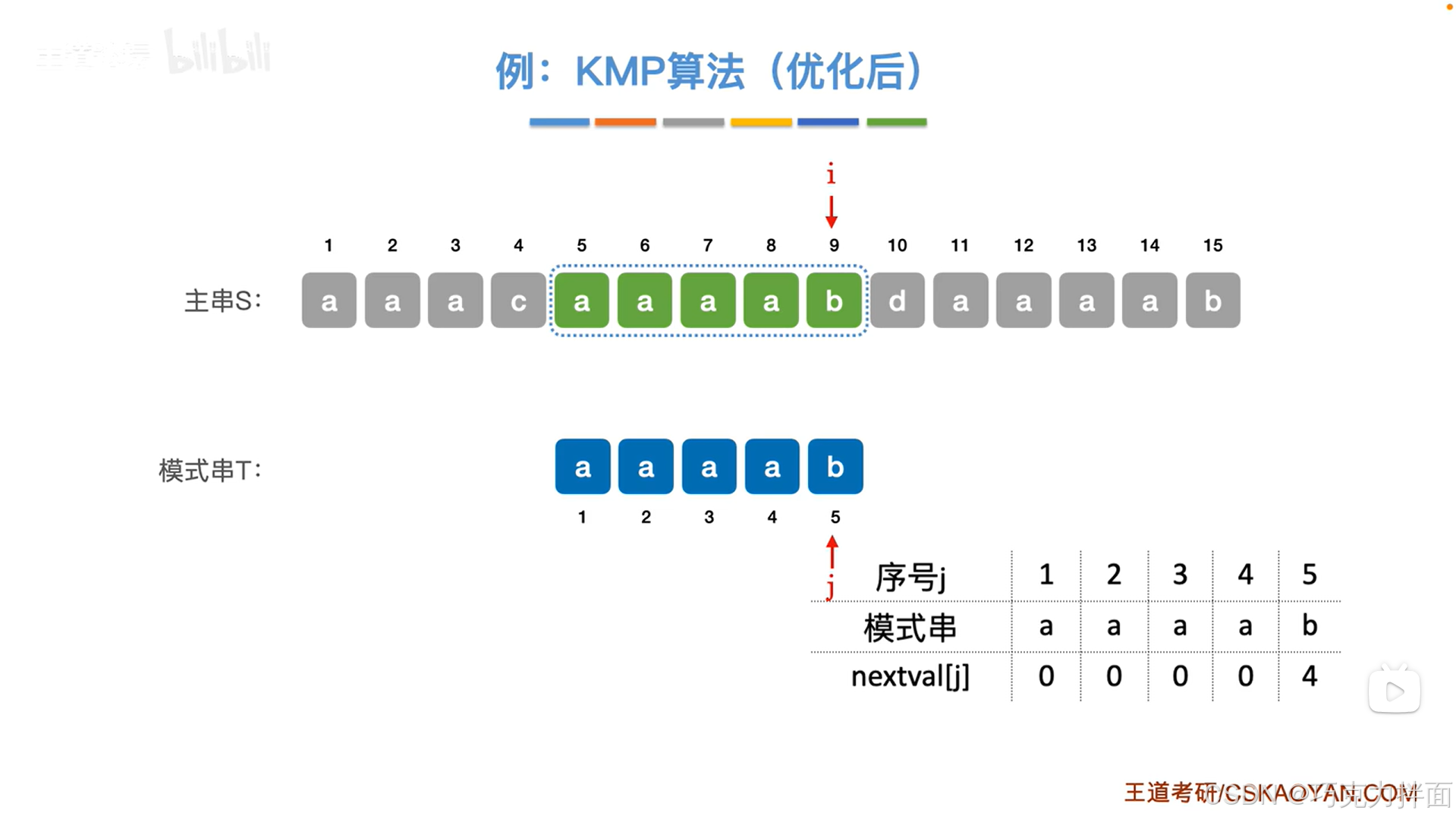
4.7.KMP算法(新版)
一.回顾:KMP算法基于朴素模式匹配算法优化而得来的 朴素模式匹配算法核心思想:把主串中所有长度与模式串长度相等的子串与模式串进行对比,直到找到第一个完全匹配的子串为止,如果当前尝试匹配的子串在某一个位置匹配失败…...

iOS AES/CBC/CTR加解密以及AES-CMAC
感觉iOS自带的CryptoKit不好用,有个第三方库CryptoSwift还不错,好巧不巧,清理过Xcode缓存后死活下载不下来,当然也可以自己编译个Framework,但是偏偏不想用第三方库了,于是研究了一下,自带的Com…...

错误报告:WebSocket 设备连接断开处理问题
错误报告:WebSocket 设备连接断开处理问题 项目背景 设备通过自启动的客户端连接到服务器,服务器将设备的 mac_address 和设备信息存入 Redis。前端通过 Redis 接口查看设备信息并展示。 问题描述 设备连接到服务器后,前端无法立即看到设…...

点云配准网络
【论文笔记】点云配准网络 PCRNet: Point Cloud Registration Network using PointNet Encoding 2019_pcr-net-CSDN博客 【点云配准】【深度学习】Windows11下PCRNet代码Pytorch实现与源码讲解-CSDN博客 【点云配准】【深度学习】Windows11下GCNet代码Pytorch实现与源码讲解_…...

黑马Redis详细笔记(实战篇---短信登录)
目录 一.短信登录 1.1 导入项目 1.2 Session 实现短信登录 1.3 集群的 Session 共享问题 1.4 基于 Redis 实现共享 Session 登录 一.短信登录 1.1 导入项目 数据库准备 -- 创建用户表 CREATE TABLE user (id BIGINT AUTO_INCREMENT PRIMARY KEY COMMENT 用户ID,phone …...

51单片机俄罗斯方块整行消除函数
/************************************************************************************************************** * 名称:flash * 功能:行清除动画 * 参数:NULL * 返回:NULL * 备注: * 采用非阻塞延时࿰…...

Vue 3 30天精进之旅:Day 21 - 项目实践:打造功能完备的Todo应用
前言 经过前20天的学习,我们已经掌握了Vue 3的核心概念、组合式API、路由、状态管理等关键技术。今天将通过一个完整的项目实践——Todo应用,将所学知识融会贯通。我们将为Todo应用添加编辑、删除、过滤等进阶功能,并优化代码结构。 一、项目…...

32单片机学习记录1之GPIO
32单片机学习记录1之GPIO 前置 GPIO口在单片机中扮演着什么角色? 在单片机中,GPIO口(General Purpose Input/Output) 是一种通用输入/输出接口,扮演着连接单片机与外部设备的桥梁角色。具体来说,它在单片…...

AI 编程助手 Cline
Cline 是一款集成于 Visual Studio Code(VS Code)的 AI 编程助手,旨在提升开发者的编程效率和代码质量。 主要功能: 代码生成与补全:Cline 能根据开发者的输入,自动生成代码片段或完整的函数,减…...

YOLOv11-ultralytics-8.3.67部分代码阅读笔记-patches.py
patches.py ultralytics\utils\patches.py 目录 patches.py 1.所需的库和模块 2.def imread(filename: str, flags: int cv2.IMREAD_COLOR): 3.def imwrite(filename: str, img: np.ndarray, paramsNone): 4.def imshow(winname: str, mat: np.ndarray): 5.PyTorch…...

R语言LCMM多维度潜在类别模型流行病学研究:LCA、MM方法分析纵向数据
全文代码数据:https://tecdat.cn/?p39710 在数据分析领域,当我们面对一组数据时,通常会有已知的分组情况,比如不同的治疗组、性别组或种族组等(点击文末“阅读原文”获取完整代码数据)。 然而,…...

2025 年前端开发现状分析:卷疯了还是卷麻了?
一、前端现状:框架狂飙,开发者崩溃 如果你是个前端开发者,那么你大概率经历过这些场景: 早上打开 CSDN(或者掘金,随便),发现又有新框架发布了,名字可能是 VueXNext.js 之…...

Qwen3-TTS多语言语音合成实测:一键部署,生成10种语言的逼真语音
Qwen3-TTS多语言语音合成实测:一键部署,生成10种语言的逼真语音 1. 开篇:语音合成新体验 想象一下,只需输入一段文字,就能让电脑用10种不同语言"开口说话",而且声音自然得几乎分辨不出是机器生…...

在MATLAB中调用与可视化Lingbot-Depth-Pretrain-ViTL-14的深度估计结果
在MATLAB中调用与可视化Lingbot-Depth-Pretrain-ViTL-14的深度估计结果 对于很多从事计算机视觉、机器人或者测绘相关研究的工程师和学者来说,深度估计是一个基础又关键的任务。它能从一张普通的二维图片中,推测出每个像素点距离相机的远近,…...

Ostrakon-VL终端实战:从扫码识别到生成抖音短视频脚本的创意延伸
Ostrakon-VL终端实战:从扫码识别到生成抖音短视频脚本的创意延伸 1. 像素特工终端介绍 想象你是一名零售侦探,手持的不是笨重的扫描枪,而是一个充满复古游戏风格的AI终端。这就是基于Ostrakon-VL-8B模型开发的像素风格交互界面,…...

终极Win11Debloat优化指南:简单4步让你的Windows 11飞起来
终极Win11Debloat优化指南:简单4步让你的Windows 11飞起来 【免费下载链接】Win11Debloat A simple, lightweight PowerShell script that allows you to remove pre-installed apps, disable telemetry, as well as perform various other changes to declutter an…...
)
手把手教你用VSCode快速定位并修改RuoYi框架的页面标题和图标(避坑指南)
高效定制RuoYi前端界面:VSCode全局搜索实战指南 刚接触RuoYi框架的开发者常会遇到这样的困扰:想修改浏览器标签页标题或系统Logo,却不知从何下手。前后端分离的项目结构让配置文件散落在各处,而手动翻找无异于大海捞针。本文将带你…...

文墨共鸣惊艳效果:古风UI下实时语义相似度计算与墨韵动画演示
文墨共鸣惊艳效果:古风UI下实时语义相似度计算与墨韵动画演示 1. 项目概览 文墨共鸣是一个将深度学习技术与传统水墨美学完美结合的系统。它基于先进的StructBERT模型,能够智能分析两段文字之间的语义相似度,并通过优雅的古风界面直观展示结…...

太原烘焙培训排名
在太原选择烘焙培训机构时,许多朋友会关注不同机构的教学质量与特色。以下整理了一些选择时可以考虑的方面,供您参考。教学方式与内容部分机构采用以实操为主的教学模式,例如山西旭梦圆食品有限公司的课程安排中,实践操作占较大比…...

ComputeSharp未来展望:GPU计算在.NET生态中的发展路线图
ComputeSharp未来展望:GPU计算在.NET生态中的发展路线图 【免费下载链接】ComputeSharp A .NET library to run C# code in parallel on the GPU through DX12, D2D1, and dynamically generated HLSL compute and pixel shaders, with the goal of making GPU comp…...

cv_unet_image-colorization音乐史料处理:黑白乐谱AI上色与音符语义关联增强
cv_unet_image-colorization音乐史料处理:黑白乐谱AI上色与音符语义关联增强 1. 引言:当黑白乐谱遇见AI色彩 想象一下,你是一位音乐史研究者,面前摊开一本泛黄的、只有黑白线条的19世纪乐谱手稿。那些音符、标记、作曲家的笔迹&…...

SPIRAN ART SUMMONER异常处理:常见错误解决方案
SPIRAN ART SUMMONER异常处理:常见错误解决方案 1. 前言 遇到SPIRAN ART SUMMONER运行报错时,别急着放弃。作为一款强大的AI艺术生成工具,它在使用过程中确实会遇到一些典型问题,但大多数都有明确的解决方法。本文汇总了用户反馈…...