使用轮廓分数提升时间序列聚类的表现
我们将使用轮廓分数和一些距离指标来执行时间序列聚类实验,并且进行可视化
让我们看看下面的时间序列:

如果沿着y轴移动序列添加随机噪声,并随机化这些序列,那么它们几乎无法分辨,如下图所示-现在很难将时间序列列分组为簇:
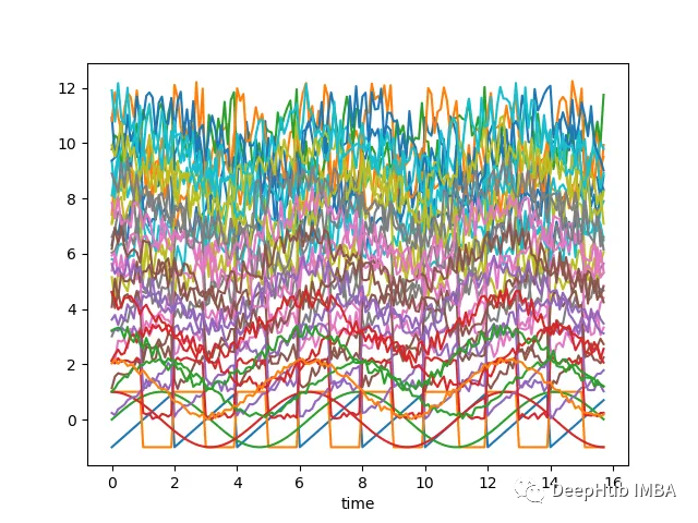
上面的图表是使用以下脚本创建的:
# Import necessary librariesimport osimport pandas as pdimport numpy as np# Import random module with an alias 'rand'import random as randfrom scipy import signal# Import the matplotlib library for plottingimport matplotlib.pyplot as plt# Generate an array 'x' ranging from 0 to 5*pi with a step of 0.1x = np.arange(0, 5*np.pi, 0.1)# Generate square, sawtooth, sin, and cos waves based on 'x'y_square = signal.square(np.pi * x)y_sawtooth = signal.sawtooth(np.pi * x)y_sin = np.sin(x)y_cos = np.cos(x)# Create a DataFrame 'df_waves' to store the waveformsdf_waves = pd.DataFrame([x, y_sawtooth, y_square, y_sin, y_cos]).transpose()# Rename the columns of the DataFrame for claritydf_waves = df_waves.rename(columns={0: 'time',1: 'sawtooth',2: 'square',3: 'sin',4: 'cos'})# Plot the original waveforms against timedf_waves.plot(x='time', legend=False)plt.show()# Add noise to the waveforms and plot them againfor col in df_waves.columns:if col != 'time':for i in range(1, 10):# Add noise to each waveform based on 'i' and a random valuedf_waves['{}_{}'.format(col, i)] = df_waves[col].apply(lambda x: x + i + rand.random() * 0.25 * i)# Plot the waveforms with added noise against timedf_waves.plot(x='time', legend=False)plt.show()
现在我们需要确定聚类的基础。这里有两种方法:
把接近于一组的波形分组——较低欧几里得距离的波形将聚在一起。
把看起来相似的波形分组——它们有相似的形状,但欧几里得距离可能不低
距离度量
一般来说,我们希望根据形状对时间序列进行分组,对于这样的聚类-可能希望使用距离度量,如相关性,这些度量或多或少与波形的线性移位无关。
让我们看看上面定义的带有噪声的波形对之间的欧几里得距离和相关性的热图:
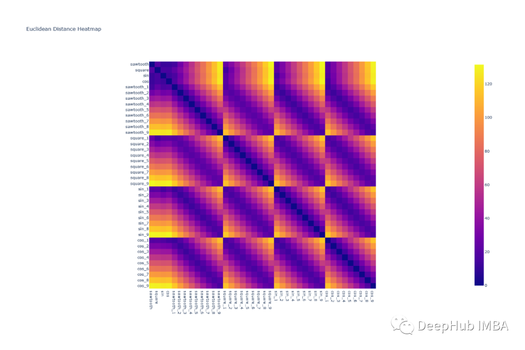
可以看到欧几里得距离对波形进行分组是很困难的,因为任何一组波形对的模式都是相似的。例如,除了对角线元素外,square & cos之间的相关形状与square和square之间的相关形状非常相似

所有的形状都可以很容易地使用相关热图组合在一起——因为类似的波形具有非常高的相关性(sin-sin对),而像sin和cos这样的波形几乎没有相关性。
轮廓分数
通过上面热图和分析,根据高相关性分配组看起来是一个好主意,但是我们如何定义相关阈值呢?看起来像一个迭代过程,容易出现不准确和大量的人工工作。
在这种情况下,我们可以使用轮廓分数(Silhouette score),它为执行的聚类分配一个分数。我们的目标是使轮廓分数最大化。
轮廓分数(Silhouette Score)是一种用于评估聚类质量的指标,它可以帮助你确定数据点是否被正确地分配到它们的簇中。较高的轮廓分数表示簇内数据点相互之间更加相似,而不同簇之间的数据点差异更大,这通常是良好的聚类结果。
轮廓分数的计算方法如下:
- 对于每个数据点 i,计算以下两个值:- a(i):数据点 i 到同一簇中所有其他点的平均距离(簇内平均距离)。- b(i):数据点 i 到与其不同簇中的所有簇的平均距离,取最小值(最近簇的平均距离)。
- 然后,计算每个数据点的轮廓系数 s(i),它定义为:s(i) = \frac{b(i) - a(i)}{\max{a(i), b(i)}}
- 最后,计算整个数据集的轮廓分数,它是所有数据点的轮廓系数的平均值:\text{轮廓分数} = \frac{1}{N} \sum_{i=1}^{N} s(i)
其中,N 是数据点的总数。
轮廓分数的取值范围在 -1 到 1 之间,具体含义如下:
- 轮廓分数接近1:表示簇内数据点相似度高,不同簇之间的差异很大,是一个好的聚类结果。
- 轮廓分数接近0:表示数据点在簇内的相似度与簇间的差异相当,可能是重叠的聚类或者不明显的聚类。
- 轮廓分数接近-1:表示数据点更适合分配到其他簇,不同簇之间的差异相比簇内差异更小,通常是一个糟糕的聚类结果。
一些重要的知识点:
在所有点上的高平均轮廓分数(接近1)表明簇的定义良好且明显。
低或负的平均轮廓分数(接近-1)表明重叠或形成不良的集群。
0左右的分数表示该点位于两个簇的边界上。
聚类
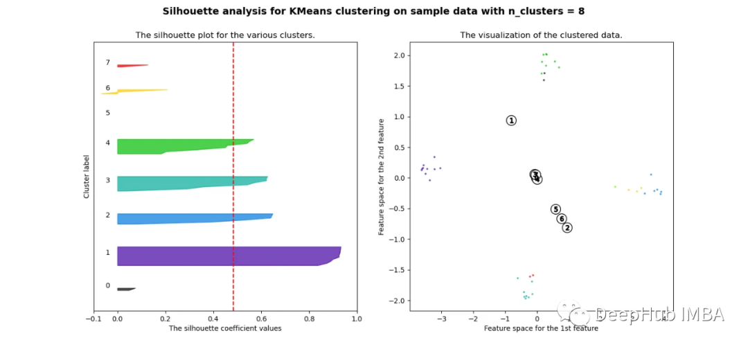
现在让我们尝试对时间序列进行分组。我们已经知道存在四种不同的波形,因此理想情况下应该有四个簇。
欧氏距离
pca = decomposition.PCA(n_components=2)pca.fit(df_man_dist_euc)df_fc_cleaned_reduced_euc = pd.DataFrame(pca.transform(df_man_dist_euc).transpose(), index = ['PC_1','PC_2'],columns = df_man_dist_euc.transpose().columns)index = 0range_n_clusters = [2, 3, 4, 5, 6, 7, 8]# Iterate over different cluster numbersfor n_clusters in range_n_clusters:# Create a subplot with silhouette plot and cluster visualizationfig, (ax1, ax2) = plt.subplots(1, 2)fig.set_size_inches(15, 7)# Set the x and y axis limits for the silhouette plotax1.set_xlim([-0.1, 1])ax1.set_ylim([0, len(df_man_dist_euc) + (n_clusters + 1) * 10])# Initialize the KMeans clusterer with n_clusters and random seedclusterer = KMeans(n_clusters=n_clusters, n_init="auto", random_state=10)cluster_labels = clusterer.fit_predict(df_man_dist_euc)# Calculate silhouette score for the current cluster configurationsilhouette_avg = silhouette_score(df_man_dist_euc, cluster_labels)print("For n_clusters =", n_clusters, "The average silhouette_score is :", silhouette_avg)sil_score_results.loc[index, ['number_of_clusters', 'Euclidean']] = [n_clusters, silhouette_avg]index += 1# Calculate silhouette values for each samplesample_silhouette_values = silhouette_samples(df_man_dist_euc, cluster_labels)y_lower = 10# Plot the silhouette plotfor i in range(n_clusters):# Aggregate silhouette scores for samples in the cluster and sort themith_cluster_silhouette_values = sample_silhouette_values[cluster_labels == i]ith_cluster_silhouette_values.sort()# Set the y_upper value for the silhouette plotsize_cluster_i = ith_cluster_silhouette_values.shape[0]y_upper = y_lower + size_cluster_icolor = cm.nipy_spectral(float(i) / n_clusters)# Fill silhouette plot for the current clusterax1.fill_betweenx(np.arange(y_lower, y_upper), 0, ith_cluster_silhouette_values, facecolor=color, edgecolor=color, alpha=0.7)# Label the silhouette plot with cluster numbersax1.text(-0.05, y_lower + 0.5 * size_cluster_i, str(i))y_lower = y_upper + 10 # Update y_lower for the next plot# Set labels and title for the silhouette plotax1.set_title("The silhouette plot for the various clusters.")ax1.set_xlabel("The silhouette coefficient values")ax1.set_ylabel("Cluster label")# Add vertical line for the average silhouette scoreax1.axvline(x=silhouette_avg, color="red", linestyle="--")ax1.set_yticks([]) # Clear the yaxis labels / ticksax1.set_xticks([-0.1, 0, 0.2, 0.4, 0.6, 0.8, 1])# Plot the actual clusterscolors = cm.nipy_spectral(cluster_labels.astype(float) / n_clusters)ax2.scatter(df_fc_cleaned_reduced_euc.transpose().iloc[:, 0], df_fc_cleaned_reduced_euc.transpose().iloc[:, 1],marker=".", s=30, lw=0, alpha=0.7, c=colors, edgecolor="k")# Label the clusters and cluster centerscenters = clusterer.cluster_centers_ax2.scatter(centers[:, 0], centers[:, 1], marker="o", c="white", alpha=1, s=200, edgecolor="k")for i, c in enumerate(centers):ax2.scatter(c[0], c[1], marker="$%d$" % i, alpha=1, s=50, edgecolor="k")# Set labels and title for the cluster visualizationax2.set_title("The visualization of the clustered data.")ax2.set_xlabel("Feature space for the 1st feature")ax2.set_ylabel("Feature space for the 2nd feature")# Set the super title for the whole plotplt.suptitle("Silhouette analysis for KMeans clustering on sample data with n_clusters = %d" % n_clusters,fontsize=14, fontweight="bold")plt.savefig('sil_score_eucl.png')plt.show()

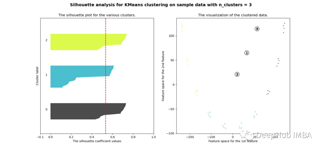


可以看到无论分成多少簇,数据都是混合的,并不能为任何数量的簇提供良好的轮廓分数。这与我们基于欧几里得距离热图的初步评估的预期一致
相关性
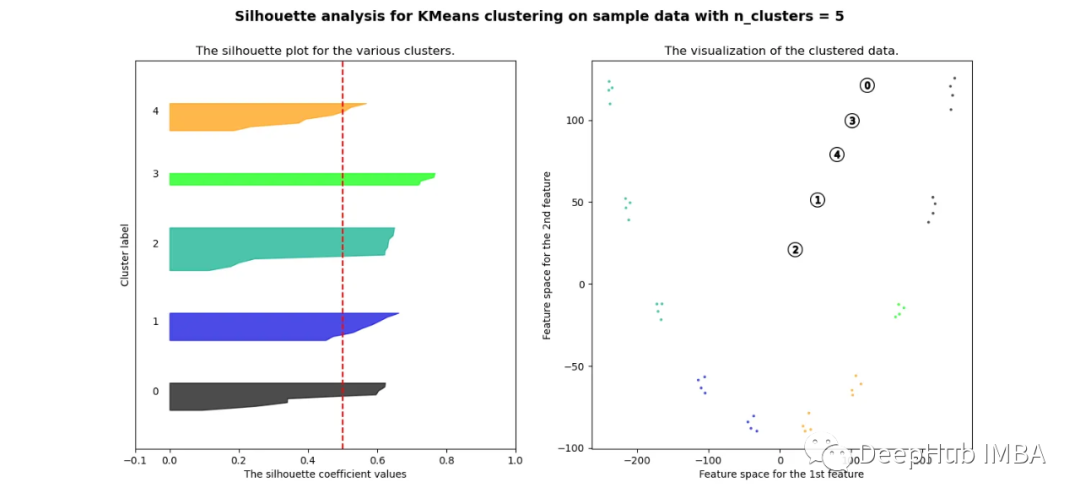
pca = decomposition.PCA(n_components=2)pca.fit(df_man_dist_corr)df_fc_cleaned_reduced_corr = pd.DataFrame(pca.transform(df_man_dist_corr).transpose(), index = ['PC_1','PC_2'],columns = df_man_dist_corr.transpose().columns)index=0range_n_clusters = [2,3,4,5,6,7,8]for n_clusters in range_n_clusters:# Create a subplot with 1 row and 2 columnsfig, (ax1, ax2) = plt.subplots(1, 2)fig.set_size_inches(15, 7)# The 1st subplot is the silhouette plot# The silhouette coefficient can range from -1, 1 but in this example all# lie within [-0.1, 1]ax1.set_xlim([-0.1, 1])# The (n_clusters+1)*10 is for inserting blank space between silhouette# plots of individual clusters, to demarcate them clearly.ax1.set_ylim([0, len(df_man_dist_corr) + (n_clusters + 1) * 10])# Initialize the clusterer with n_clusters value and a random generator# seed of 10 for reproducibility.clusterer = KMeans(n_clusters=n_clusters, n_init="auto", random_state=10)cluster_labels = clusterer.fit_predict(df_man_dist_corr)# The silhouette_score gives the average value for all the samples.# This gives a perspective into the density and separation of the formed# clusterssilhouette_avg = silhouette_score(df_man_dist_corr, cluster_labels)print("For n_clusters =",n_clusters,"The average silhouette_score is :",silhouette_avg,)sil_score_results.loc[index,['number_of_clusters','corrlidean']] = [n_clusters,silhouette_avg]index=index+1sample_silhouette_values = silhouette_samples(df_man_dist_corr, cluster_labels)y_lower = 10for i in range(n_clusters):# Aggregate the silhouette scores for samples belonging to# cluster i, and sort themith_cluster_silhouette_values = sample_silhouette_values[cluster_labels == i]ith_cluster_silhouette_values.sort()size_cluster_i = ith_cluster_silhouette_values.shape[0]y_upper = y_lower + size_cluster_icolor = cm.nipy_spectral(float(i) / n_clusters)ax1.fill_betweenx(np.arange(y_lower, y_upper),0,ith_cluster_silhouette_values,facecolor=color,edgecolor=color,alpha=0.7,)# Label the silhouette plots with their cluster numbers at the middleax1.text(-0.05, y_lower + 0.5 * size_cluster_i, str(i))# Compute the new y_lower for next ploty_lower = y_upper + 10 # 10 for the 0 samplesax1.set_title("The silhouette plot for the various clusters.")ax1.set_xlabel("The silhouette coefficient values")ax1.set_ylabel("Cluster label")# The vertical line for average silhouette score of all the valuesax1.axvline(x=silhouette_avg, color="red", linestyle="--")ax1.set_yticks([]) # Clear the yaxis labels / ticksax1.set_xticks([-0.1, 0, 0.2, 0.4, 0.6, 0.8, 1])# 2nd Plot showing the actual clusters formedcolors = cm.nipy_spectral(cluster_labels.astype(float) / n_clusters)ax2.scatter(df_fc_cleaned_reduced_corr.transpose().iloc[:, 0], df_fc_cleaned_reduced_corr.transpose().iloc[:, 1], marker=".", s=30, lw=0, alpha=0.7, c=colors, edgecolor="k")# for i in range(len(df_fc_cleaned_cleaned_reduced.transpose().iloc[:, 0])):# ax2.annotate(list(df_fc_cleaned_cleaned_reduced.transpose().index)[i], # (df_fc_cleaned_cleaned_reduced.transpose().iloc[:, 0][i], # df_fc_cleaned_cleaned_reduced.transpose().iloc[:, 1][i] + 0.2))# Labeling the clusterscenters = clusterer.cluster_centers_# Draw white circles at cluster centersax2.scatter(centers[:, 0],centers[:, 1],marker="o",c="white",alpha=1,s=200,edgecolor="k",)for i, c in enumerate(centers):ax2.scatter(c[0], c[1], marker="$%d$" % i, alpha=1, s=50, edgecolor="k")ax2.set_title("The visualization of the clustered data.")ax2.set_xlabel("Feature space for the 1st feature")ax2.set_ylabel("Feature space for the 2nd feature")plt.suptitle("Silhouette analysis for KMeans clustering on sample data with n_clusters = %d"% n_clusters,fontsize=14,fontweight="bold",)plt.show()


当选择的簇数为4时,我们可以清楚地看到分离的簇,其他结果通常比欧氏距离要好得多。
欧几里得距离与相关廓形评分的比较
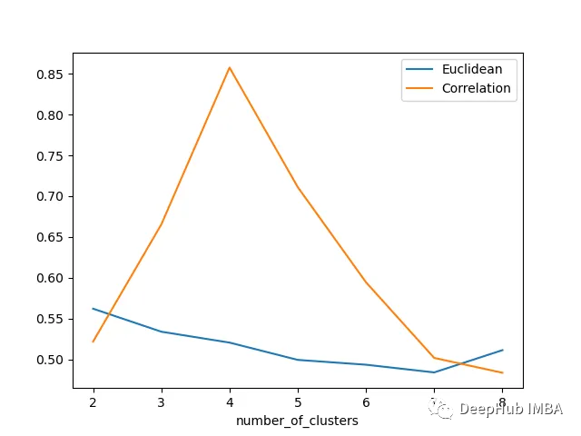
轮廓分数表明基于相关性的距离矩阵在簇数为4时效果最好,而在欧氏距离的情况下效果就不那么明显了结论
总结
在本文中,我们研究了如何使用欧几里得距离和相关度量执行时间序列聚类,并观察了这两种情况下的结果如何变化。如果我们在评估聚类时结合Silhouette,我们可以使聚类步骤更加客观,因为它提供了一种很好的直观方式来查看聚类的分离情况。
https://avoid.overfit.cn/post/939876c1609140ac803b86209d8ee7ab
作者:Girish Dev Kumar Chaurasiya
相关文章:
使用轮廓分数提升时间序列聚类的表现
我们将使用轮廓分数和一些距离指标来执行时间序列聚类实验,并且进行可视化 让我们看看下面的时间序列: 如果沿着y轴移动序列添加随机噪声,并随机化这些序列,那么它们几乎无法分辨,如下图所示-现在很难将时间序列列分组为簇: 上面…...

蔬菜水果生鲜配送团购商城小程序的作用是什么
蔬菜水果是人们生活所需品,从业者众多,无论小摊贩还是超市商场都有不少人每天光临,当然这些只是自然流量,在实际经营中,蔬菜水果商家还是面临着一些难题。 对蔬菜水果商家而言,线下门店是重要的࿰…...

金融用户实践|分布式存储支持数据仓库业务系统性能验证
作者:深耕行业的 SmartX 金融团队 闫海涛 估值是指对资产或负债的价值进行评估的过程,这对于投资决策具有重要意义。每个金融公司资管业务人员都期望能够实现实时的业务估值,快速获取最新的数据和指标,从而做出更明智的投资决策。…...
代码随想录二刷 Day41
509. 斐波那契数 这个题简单入门,注意下N小于等于1的情况就可以 class Solution { public:int fib(int n) {if (n < 1) return n; //这句不写的话test能过但是另外的过不了vector<int> result(n 1); //定义存放dp结果的数组,还要定义大小r…...

C++项目实战——基于多设计模式下的同步异步日志系统-⑪-日志器管理类与全局建造者类设计(单例模式)
文章目录 专栏导读日志器建造者类完善单例日志器管理类设计思想单例日志器管理类设计全局建造者类设计日志器类、建造者类整理日志器管理类测试 专栏导读 🌸作者简介:花想云 ,在读本科生一枚,C/C领域新星创作者,新星计…...
:MapReduce中的排序)
Hadoop3教程(十四):MapReduce中的排序
文章目录 (99)WritableComparable排序什么是排序什么时候需要排序排序有哪些分类如何实现自定义排序 (100)全排序案例案例需求思路分析实际代码 (101)二次排序案例(102) 区内排序案例…...

测试需要写测试用例吗?
如何理解软件的质量 我们都知道,一个软件从无到有要经过需求设计、编码实现、测试验证、部署发布这四个主要环节。 需求来源于用户反馈、市场调研或者商业判断。意指在市场行为中,部分人群存在某些诉求或痛点,只要想办法满足这些人群的诉求…...

Qt 视口和窗口的区别
视口和窗口 绘图设备的物理坐标是基本的坐标系,通过QPainter的平移、旋转等变换可以得到更容易操作的逻辑坐标 为了实现更方便的坐标,QPainter还提供了视口(Viewport)和窗口(Window)坐标系,通过QPainter内部的坐标变换矩阵自动转换为绘图设…...

使用Git将GitHub仓库下载到本地
前记: git svn sourcetree gitee github gitlab gitblit gitbucket gitolite gogs 版本控制 | 仓库管理 ---- 系列工程笔记. Platform:Windows 10 Git version:git version 2.32.0.windows.1 Function:使用Git将GitHub仓库下载…...
前端需要了解的浏览器缓存知识
文章目录 前言为什么需要缓存?DNS缓存缓存读写顺序缓存位置memory cache(浏览器本地缓存)disk cache(硬盘缓存)重点!!! 缓存策略 - 强缓存和协商缓存1)强缓存ExpiresCach…...

自动驾驶:控制算法概述
自动驾驶:控制算法概述 常见控制算法PID算法LQR算法MPC算法 自动驾驶控制算法横向控制纵向控制 参考文献 常见控制算法 PID算法 PID(Proportional-Integral-Derivative)控制是一种经典的反馈控制算法,通常用于稳定性和响应速度要…...
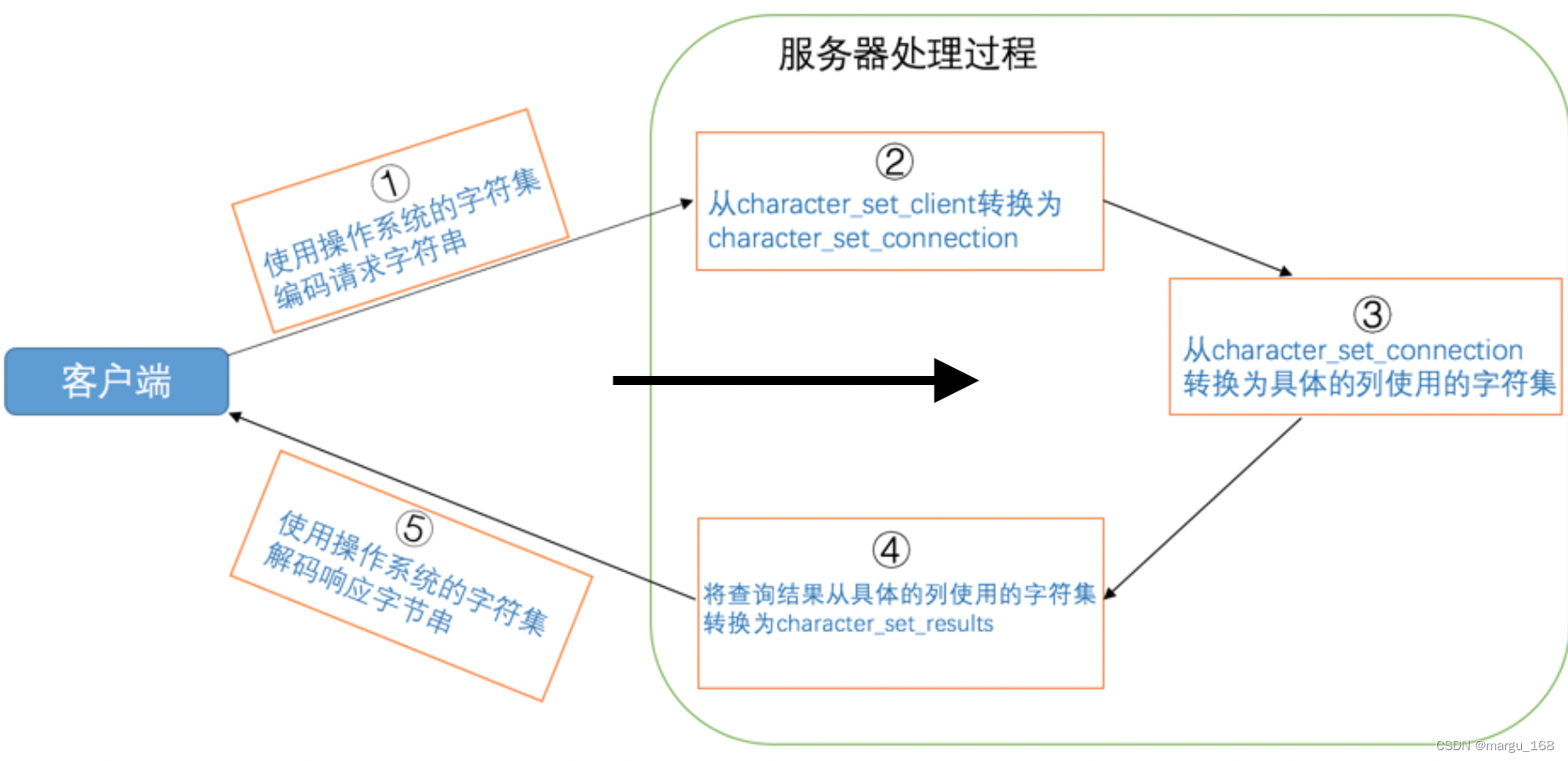
【Mysql】Mysql的字符集和比较规则(三)
字符集和比较规则简介 字符集简介 我们知道在计算机中只能以二进制的方式对数据进行存储,那么他们之间是怎样对应并进行转换的?我们需要了解两个概念: 字符范围:我们可以将哪些字符转换成二进制数据,也就是规定好字…...
【SpringCloud-11】SCA-sentinel
sentinel是一个流量控制、熔断降级的组件,可以替换第一代中的hystrix。 hystrix用起来没有那么方便: 1、要在调用方引入hystrix,没有ui界面进行配置,需要在代码中进行配置,侵入了业务代码。 2、还要自己搭建监控平台…...
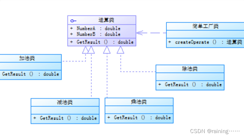
设计模式:简单工厂模式(C#、JAVA、JavaScript、C++、Python、Go、PHP):
简介: 简单工厂模式,它提供了一个用于创建对象的接口,但具体创建的对象类型可以在运行时决定。这种模式通常用于创建具有共同接口的对象,并且可以根据客户端代码中的参数或配置来选择要创建的具体对象类型。 在简单工厂模式中&am…...
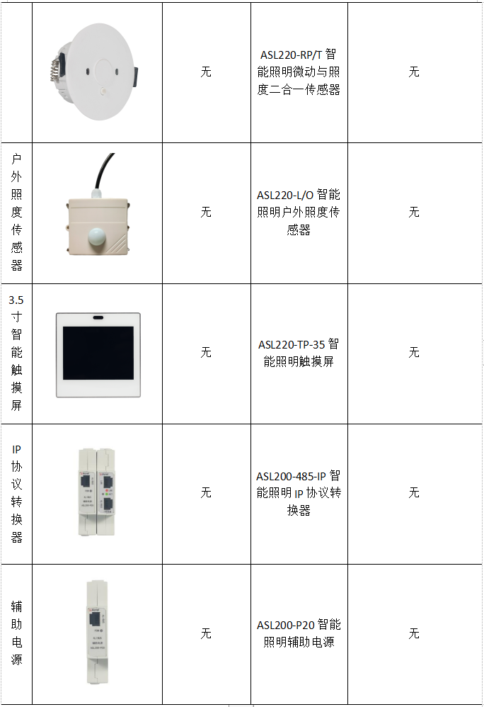
浅谈智能照明控制系统在智慧建筑中的应用
贾丽丽 安科瑞电气股份有限公司 上海嘉定 201801 摘要:新时期,建筑行业发展迅速,在信息化背景下,建筑功能逐渐拓展,呈现了智能化的发展态势。智能建筑更加安全、节能、环保,也符合绿色建筑理念。在建筑智…...
以及upper_bound())
lower_bound()以及upper_bound()
lower_bound(): lower_bound()的返回值是第一个大于等于 target 的值的地址,用这个地址减去first,得到的就是第一个大于等于target的值的下标。 在数组中: int poslower_bound(a,an,target)-a;\\n为数组…...
unity(WebGL) 截图拼接并保存本地,下载PDF
截图参考:Unity3D 局部截图、全屏截图、带UI截图三种方法_unity 截图_野区捕龙为宠的博客-CSDN博客 文档下载: Unity WebGL 生成doc保存到本地电脑_unity webgl 保存文件_野区捕龙为宠的博客-CSDN博客 中文输入:Unity WebGL中文输入 支持输…...

加速企业云计算部署:应对新时代的挑战
随着科技的飞速发展,企业面临着诸多挑战。在这个高度互联的世界中,企业的成功与否常常取决于其能否快速、有效地响应市场的变化。云计算作为一种新兴的技术趋势,为企业提供了实现这一目标的可能。通过加速企业云计算部署,企业可以…...

ubuntu 18.04 LTS交叉编译opencv 3.4.16并编译工程[全记录]
一、下载并解压opencv 3.4.16源码 https://opencv.org/releases/ 放到home路径下的Exe文件夹(专门放用户安装的软件)中,其中build是后期自建的 为了版本控制,保留了3.4.16,并增加了-gcc-arm 二、安装cmake和cmake-g…...
禁用和开启笔记本电脑的键盘功能,最快的方式
笔记本键盘通常较小,按键很不方便,当我们外接了键盘时就不需要再使用自带的键盘了,而且午睡的时候,总是担心碰到笔记本的键盘,可能会删掉我们的代码什么的,所以就想着怎么禁用掉,下面是操作步骤…...

DIY实验室振荡器:基于Crickit与3D打印的机电一体化实践
1. 项目概述与核心价值在实验室里,振荡器是个再常见不过的设备了,无论是生物培养时的恒温摇床,还是化学实验中的涡旋振荡,其核心任务就一个:让液体或样品动起来,实现均匀混合或加速反应。对于玩3D打印的朋友…...

Beyond Compare 5密钥生成终极指南:快速激活与完全使用教程
Beyond Compare 5密钥生成终极指南:快速激活与完全使用教程 【免费下载链接】BCompare_Keygen Keygen for BCompare 5 项目地址: https://gitcode.com/gh_mirrors/bc/BCompare_Keygen Beyond Compare是一款广受欢迎的文件对比工具,但当30天试用期…...

终极指南:如何用Reset-Windows-Update-Tool快速修复Windows更新故障
终极指南:如何用Reset-Windows-Update-Tool快速修复Windows更新故障 【免费下载链接】Reset-Windows-Update-Tool Troubleshooting Tool with Windows Updates (Developed in Dev-C). 项目地址: https://gitcode.com/gh_mirrors/re/Reset-Windows-Update-Tool …...

用STM32F103和AD9833制作一个简易信号源:从电路搭建、驱动编写到波形测试全记录
用STM32F103和AD9833打造高精度信号发生器:硬件设计、固件开发与波形优化全解析 在电子工程和嵌入式开发领域,信号发生器是不可或缺的基础工具。无论是测试滤波器响应、校准传感器,还是验证通信协议,一个稳定可靠的信号源都能显著…...

2026亚洲消费电子展!媒体曝光资源加码
北京讯——2026年6月10日至12日,2026亚洲消费电子展将在北京盛大启幕。作为亚太消费电子领域极具影响力的行业盛会,本届展会全面升级品牌传播矩阵,百家主流媒体集结现场全程报道,全媒体曝光资源重磅加码。目前展会赞助合作席位余量…...

OpenClaw Studio:基于Web技术的可视化自动化工作流构建平台解析
1. 项目概述:从开源仓库到创意工坊的蜕变 看到 grp06/openclaw-studio 这个项目标题,我的第一反应是:这又是一个在 GitHub 上诞生的、充满潜力的开源工具。 grp06 看起来像是一个团队或个人的标识,而 openclaw-studio 则直…...

深入 Spring Boot Logback 集成:手把手教你自定义彩色日志模板,告别千篇一律的默认样式
深入 Spring Boot Logback 集成:手把手教你自定义彩色日志模板,告别千篇一律的默认样式 在开发过程中,日志是我们最亲密的伙伴之一。它记录着应用的每一次心跳,每一个异常,每一次重要的状态变化。然而,面对…...

智能体技能库构建指南:从基础工具到复杂工作流编排
1. 项目概述:智能体技能库的构建与价值最近在探索AI智能体(Agent)的开发与应用时,我一直在思考一个问题:一个真正“智能”的智能体,其核心能力究竟体现在哪里?是背后的大语言模型(LL…...

Botty:暗黑2重制版自动化助手,告别重复刷图的终极方案
Botty:暗黑2重制版自动化助手,告别重复刷图的终极方案 【免费下载链接】botty D2R Pixel Bot 项目地址: https://gitcode.com/gh_mirrors/bo/botty 你是否厌倦了在《暗黑破坏神2:重制版》中反复刷图、手动拾取、机械操作?每…...

AI代码助手Cursor与Django全栈开发:十倍速构建Web应用实战
1. 项目概述:当AI代码助手遇上Django全栈开发如果你是一名独立开发者、初创团队的技术负责人,或者正在学习全栈开发,那么你一定对如何高效构建一个现代化的Web应用感到头疼。从环境配置、数据库设计、API接口开发到前端页面渲染,每…...