Flutter 解决ExpansionTile上下分割线问题,以及title撑满问题
文章目录
- 前言
- 一、解决上下分割线问题
- 二、使ExpansionTile的title撑满
- 总结
前言
最近在做flutter项目,其中的一个功能用到了ExpansionTile的效果,奈何我们的设计师要求很高,展开的时候不能有上下一根线,而且我们是不需要展开的按钮,也就是说,让title横向撑满显示组件的信息。
一、解决上下分割线问题
1、使用Theme,然后把dividerColor的颜色改为透明或者白色,就能解决问题。
Theme(data: Theme.of(context).copyWith(dividerColor: Colors.transparent),child: BSExpansionTile(trailing: null,title: _buildTitle(model),onExpansionChanged: (value) {setState(() {isExpanded = value;});},initiallyExpanded: isExpanded,children: _buildWalletItemList(),),);
二、使ExpansionTile的title撑满
1、查看它的源码发现都会有一个默认展开的箭头问题,只能把它的源码拷贝出来重新写了,把名字改为:BSExpansionTile
// Copyright 2014 The Flutter Authors. All rights reserved.
// Use of this source code is governed by a BSD-style license that can be
// found in the LICENSE file.import 'package:flutter/material.dart';const Duration _kExpand = Duration(milliseconds: 200);/// Enables control over a single [ExpansionTile]'s expanded/collapsed state.
///
/// It can be useful to expand or collapse an [ExpansionTile]
/// programatically, for example to reconfigure an existing expansion
/// tile based on a system event. To do so, create an [ExpansionTile]
/// with an [ExpansionTileController] that's owned by a stateful widget
/// or look up the tile's automatically created [ExpansionTileController]
/// with [ExpansionTileController.of]
///
/// The controller's [expand] and [collapse] methods cause the
/// the [ExpansionTile] to rebuild, so they may not be called from
/// a build method.
class ExpansionTileController {/// Create a controller to be used with [ExpansionTile.controller].ExpansionTileController();_BSExpansionTileState? _state;/// Whether the [ExpansionTile] built with this controller is in expanded state.////// This property doesn't take the animation into account. It reports `true`/// even if the expansion animation is not completed.////// See also:////// * [expand], which expands the [ExpansionTile]./// * [collapse], which collapses the [ExpansionTile]./// * [ExpansionTile.controller] to create an ExpansionTile with a controller.bool get isExpanded {assert(_state != null);return _state!._isExpanded;}/// Expands the [ExpansionTile] that was built with this controller;////// Normally the tile is expanded automatically when the user taps on the header./// It is sometimes useful to trigger the expansion programmatically due/// to external changes.////// If the tile is already in the expanded state (see [isExpanded]), calling/// this method has no effect.////// Calling this method may cause the [ExpansionTile] to rebuild, so it may/// not be called from a build method.////// Calling this method will trigger an [ExpansionTile.onExpansionChanged] callback.////// See also:////// * [collapse], which collapses the tile./// * [isExpanded] to check whether the tile is expanded./// * [ExpansionTile.controller] to create an ExpansionTile with a controller.void expand() {assert(_state != null);if (!isExpanded) {_state!._toggleExpansion();}}/// Collapses the [ExpansionTile] that was built with this controller.////// Normally the tile is collapsed automatically when the user taps on the header./// It can be useful sometimes to trigger the collapse programmatically due/// to some external changes.////// If the tile is already in the collapsed state (see [isExpanded]), calling/// this method has no effect.////// Calling this method may cause the [ExpansionTile] to rebuild, so it may/// not be called from a build method.////// Calling this method will trigger an [ExpansionTile.onExpansionChanged] callback.////// See also:////// * [expand], which expands the tile./// * [isExpanded] to check whether the tile is expanded./// * [ExpansionTile.controller] to create an ExpansionTile with a controller.void collapse() {assert(_state != null);if (isExpanded) {_state!._toggleExpansion();}}/// Finds the [ExpansionTileController] for the closest [ExpansionTile] instance/// that encloses the given context.////// If no [ExpansionTile] encloses the given context, calling this/// method will cause an assert in debug mode, and throw an/// exception in release mode.////// To return null if there is no [ExpansionTile] use [maybeOf] instead.////// {@tool dartpad}/// Typical usage of the [ExpansionTileController.of] function is to call it from within the/// `build` method of a descendant of an [ExpansionTile].////// When the [ExpansionTile] is actually created in the same `build`/// function as the callback that refers to the controller, then the/// `context` argument to the `build` function can't be used to find/// the [ExpansionTileController] (since it's "above" the widget/// being returned in the widget tree). In cases like that you can/// add a [Builder] widget, which provides a new scope with a/// [BuildContext] that is "under" the [ExpansionTile]:////// ** See code in examples/api/lib/material/expansion_tile/expansion_tile.1.dart **/// {@end-tool}////// A more efficient solution is to split your build function into/// several widgets. This introduces a new context from which you/// can obtain the [ExpansionTileController]. With this approach you/// would have an outer widget that creates the [ExpansionTile]/// populated by instances of your new inner widgets, and then in/// these inner widgets you would use [ExpansionTileController.of].static ExpansionTileController of(BuildContext context) {final _BSExpansionTileState? result = context.findAncestorStateOfType<_BSExpansionTileState>();if (result != null) {return result._tileController;}throw FlutterError.fromParts(<DiagnosticsNode>[ErrorSummary('ExpansionTileController.of() called with a context that does not contain a ExpansionTile.',),ErrorDescription('No ExpansionTile ancestor could be found starting from the context that was passed to ExpansionTileController.of(). ''This usually happens when the context provided is from the same StatefulWidget as that ''whose build function actually creates the ExpansionTile widget being sought.',),ErrorHint('There are several ways to avoid this problem. The simplest is to use a Builder to get a ''context that is "under" the ExpansionTile. For an example of this, please see the ''documentation for ExpansionTileController.of():\n'' https://api.flutter.dev/flutter/material/ExpansionTile/of.html',),ErrorHint('A more efficient solution is to split your build function into several widgets. This ''introduces a new context from which you can obtain the ExpansionTile. In this solution, ''you would have an outer widget that creates the ExpansionTile populated by instances of ''your new inner widgets, and then in these inner widgets you would use ExpansionTileController.of().\n''An other solution is assign a GlobalKey to the ExpansionTile, ''then use the key.currentState property to obtain the ExpansionTile rather than ''using the ExpansionTileController.of() function.',),context.describeElement('The context used was'),]);}/// Finds the [ExpansionTile] from the closest instance of this class that/// encloses the given context and returns its [ExpansionTileController].////// If no [ExpansionTile] encloses the given context then return null./// To throw an exception instead, use [of] instead of this function.////// See also:////// * [of], a similar function to this one that throws if no [ExpansionTile]/// encloses the given context. Also includes some sample code in its/// documentation.static ExpansionTileController? maybeOf(BuildContext context) {return context.findAncestorStateOfType<_BSExpansionTileState>()?._tileController;}
}/// A single-line [ListTile] with an expansion arrow icon that expands or collapses
/// the tile to reveal or hide the [children].
///
/// This widget is typically used with [ListView] to create an
/// "expand / collapse" list entry. When used with scrolling widgets like
/// [ListView], a unique [PageStorageKey] must be specified to enable the
/// [ExpansionTile] to save and restore its expanded state when it is scrolled
/// in and out of view.
///
/// This class overrides the [ListTileThemeData.iconColor] and [ListTileThemeData.textColor]
/// theme properties for its [ListTile]. These colors animate between values when
/// the tile is expanded and collapsed: between [iconColor], [collapsedIconColor] and
/// between [textColor] and [collapsedTextColor].
///
/// The expansion arrow icon is shown on the right by default in left-to-right languages
/// (i.e. the trailing edge). This can be changed using [controlAffinity]. This maps
/// to the [leading] and [trailing] properties of [ExpansionTile].
///
/// {@tool dartpad}
/// This example demonstrates how the [ExpansionTile] icon's location and appearance
/// can be customized.
///
/// ** See code in examples/api/lib/material/expansion_tile/expansion_tile.0.dart **
/// {@end-tool}
///
/// {@tool dartpad}
/// This example demonstrates how an [ExpansionTileController] can be used to
/// programatically expand or collapse an [ExpansionTile].
///
/// ** See code in examples/api/lib/material/expansion_tile/expansion_tile.1.dart **
/// {@end-tool}
///
/// See also:
///
/// * [ListTile], useful for creating expansion tile [children] when the
/// expansion tile represents a sublist.
/// * The "Expand and collapse" section of
/// <https://material.io/components/lists#types>
class BSExpansionTile extends StatefulWidget {/// Creates a single-line [ListTile] with an expansion arrow icon that expands or collapses/// the tile to reveal or hide the [children]. The [initiallyExpanded] property must/// be non-null.const BSExpansionTile({super.key,this.leading,required this.title,this.subtitle,this.onExpansionChanged,this.children = const <Widget>[],this.trailing,this.initiallyExpanded = false,this.maintainState = false,this.tilePadding,this.expandedCrossAxisAlignment,this.expandedAlignment,this.childrenPadding,this.backgroundColor,this.collapsedBackgroundColor,this.textColor,this.collapsedTextColor,this.iconColor,this.collapsedIconColor,this.shape,this.collapsedShape,this.clipBehavior,this.controlAffinity,this.controller,}) : assert(expandedCrossAxisAlignment != CrossAxisAlignment.baseline,'CrossAxisAlignment.baseline is not supported since the expanded children ''are aligned in a column, not a row. Try to use another constant.',);/// A widget to display before the title.////// Typically a [CircleAvatar] widget.////// Depending on the value of [controlAffinity], the [leading] widget/// may replace the rotating expansion arrow icon.final Widget? leading;/// The primary content of the list item.////// Typically a [Text] widget.final Widget title;/// Additional content displayed below the title.////// Typically a [Text] widget.final Widget? subtitle;/// Called when the tile expands or collapses.////// When the tile starts expanding, this function is called with the value/// true. When the tile starts collapsing, this function is called with/// the value false.final ValueChanged<bool>? onExpansionChanged;/// The widgets that are displayed when the tile expands.////// Typically [ListTile] widgets.final List<Widget> children;/// The color to display behind the sublist when expanded.////// If this property is null then [ExpansionTileThemeData.backgroundColor] is used. If that/// is also null then Colors.transparent is used.////// See also:////// * [ExpansionTileTheme.of], which returns the nearest [ExpansionTileTheme]'s/// [ExpansionTileThemeData].final Color? backgroundColor;/// When not null, defines the background color of tile when the sublist is collapsed.////// If this property is null then [ExpansionTileThemeData.collapsedBackgroundColor] is used./// If that is also null then Colors.transparent is used.////// See also:////// * [ExpansionTileTheme.of], which returns the nearest [ExpansionTileTheme]'s/// [ExpansionTileThemeData].final Color? collapsedBackgroundColor;/// A widget to display after the title.////// Depending on the value of [controlAffinity], the [trailing] widget/// may replace the rotating expansion arrow icon.final Widget? trailing;/// Specifies if the list tile is initially expanded (true) or collapsed (false, the default).final bool initiallyExpanded;/// Specifies whether the state of the children is maintained when the tile expands and collapses.////// When true, the children are kept in the tree while the tile is collapsed./// When false (default), the children are removed from the tree when the tile is/// collapsed and recreated upon expansion.final bool maintainState;/// Specifies padding for the [ListTile].////// Analogous to [ListTile.contentPadding], this property defines the insets for/// the [leading], [title], [subtitle] and [trailing] widgets. It does not inset/// the expanded [children] widgets.////// If this property is null then [ExpansionTileThemeData.tilePadding] is used. If that/// is also null then the tile's padding is `EdgeInsets.symmetric(horizontal: 16.0)`.////// See also:////// * [ExpansionTileTheme.of], which returns the nearest [ExpansionTileTheme]'s/// [ExpansionTileThemeData].final EdgeInsetsGeometry? tilePadding;/// Specifies the alignment of [children], which are arranged in a column when/// the tile is expanded.////// The internals of the expanded tile make use of a [Column] widget for/// [children], and [Align] widget to align the column. The [expandedAlignment]/// parameter is passed directly into the [Align].////// Modifying this property controls the alignment of the column within the/// expanded tile, not the alignment of [children] widgets within the column./// To align each child within [children], see [expandedCrossAxisAlignment].////// The width of the column is the width of the widest child widget in [children].////// If this property is null then [ExpansionTileThemeData.expandedAlignment]is used. If that/// is also null then the value of [expandedAlignment] is [Alignment.center].////// See also:////// * [ExpansionTileTheme.of], which returns the nearest [ExpansionTileTheme]'s/// [ExpansionTileThemeData].final Alignment? expandedAlignment;/// Specifies the alignment of each child within [children] when the tile is expanded.////// The internals of the expanded tile make use of a [Column] widget for/// [children], and the `crossAxisAlignment` parameter is passed directly into/// the [Column].////// Modifying this property controls the cross axis alignment of each child/// within its [Column]. The width of the [Column] that houses [children] will/// be the same as the widest child widget in [children]. The width of the/// [Column] might not be equal to the width of the expanded tile.////// To align the [Column] along the expanded tile, use the [expandedAlignment]/// property instead.////// When the value is null, the value of [expandedCrossAxisAlignment] is/// [CrossAxisAlignment.center].final CrossAxisAlignment? expandedCrossAxisAlignment;/// Specifies padding for [children].////// If this property is null then [ExpansionTileThemeData.childrenPadding] is used. If that/// is also null then the value of [childrenPadding] is [EdgeInsets.zero].////// See also:////// * [ExpansionTileTheme.of], which returns the nearest [ExpansionTileTheme]'s/// [ExpansionTileThemeData].final EdgeInsetsGeometry? childrenPadding;/// The icon color of tile's expansion arrow icon when the sublist is expanded.////// Used to override to the [ListTileThemeData.iconColor].////// If this property is null then [ExpansionTileThemeData.iconColor] is used. If that/// is also null then the value of [ColorScheme.primary] is used.////// See also:////// * [ExpansionTileTheme.of], which returns the nearest [ExpansionTileTheme]'s/// [ExpansionTileThemeData].final Color? iconColor;/// The icon color of tile's expansion arrow icon when the sublist is collapsed.////// Used to override to the [ListTileThemeData.iconColor].////// If this property is null then [ExpansionTileThemeData.collapsedIconColor] is used. If that/// is also null and [ThemeData.useMaterial3] is true, [ColorScheme.onSurface] is used. Otherwise,/// defaults to [ThemeData.unselectedWidgetColor] color.////// See also:////// * [ExpansionTileTheme.of], which returns the nearest [ExpansionTileTheme]'s/// [ExpansionTileThemeData].final Color? collapsedIconColor;/// The color of the tile's titles when the sublist is expanded.////// Used to override to the [ListTileThemeData.textColor].////// If this property is null then [ExpansionTileThemeData.textColor] is used. If that/// is also null then and [ThemeData.useMaterial3] is true, color of the [TextTheme.bodyLarge]/// will be used for the [title] and [subtitle]. Otherwise, defaults to [ColorScheme.primary] color.////// See also:////// * [ExpansionTileTheme.of], which returns the nearest [ExpansionTileTheme]'s/// [ExpansionTileThemeData].final Color? textColor;/// The color of the tile's titles when the sublist is collapsed.////// Used to override to the [ListTileThemeData.textColor].////// If this property is null then [ExpansionTileThemeData.collapsedTextColor] is used./// If that is also null and [ThemeData.useMaterial3] is true, color of the/// [TextTheme.bodyLarge] will be used for the [title] and [subtitle]. Otherwise,/// defaults to color of the [TextTheme.titleMedium].////// See also:////// * [ExpansionTileTheme.of], which returns the nearest [ExpansionTileTheme]'s/// [ExpansionTileThemeData].final Color? collapsedTextColor;/// The tile's border shape when the sublist is expanded.////// If this property is null, the [ExpansionTileThemeData.shape] is used. If that/// is also null, a [Border] with vertical sides default to [ThemeData.dividerColor] is used////// See also:////// * [ExpansionTileTheme.of], which returns the nearest [ExpansionTileTheme]'s/// [ExpansionTileThemeData].final ShapeBorder? shape;/// The tile's border shape when the sublist is collapsed.////// If this property is null, the [ExpansionTileThemeData.collapsedShape] is used. If that/// is also null, a [Border] with vertical sides default to Color [Colors.transparent] is used////// See also:////// * [ExpansionTileTheme.of], which returns the nearest [ExpansionTileTheme]'s/// [ExpansionTileThemeData].final ShapeBorder? collapsedShape;/// {@macro flutter.material.Material.clipBehavior}////// If this property is null, the [ExpansionTileThemeData.clipBehavior] is used. If that/// is also null, a [Clip.none] is used////// See also:////// * [ExpansionTileTheme.of], which returns the nearest [ExpansionTileTheme]'s/// [ExpansionTileThemeData].final Clip? clipBehavior;/// Typically used to force the expansion arrow icon to the tile's leading or trailing edge.////// By default, the value of [controlAffinity] is [ListTileControlAffinity.platform],/// which means that the expansion arrow icon will appear on the tile's trailing edge.final ListTileControlAffinity? controlAffinity;/// If provided, the controller can be used to expand and collapse tiles.////// In cases were control over the tile's state is needed from a callback triggered/// by a widget within the tile, [ExpansionTileController.of] may be more convenient/// than supplying a controller.final ExpansionTileController? controller;State<BSExpansionTile> createState() => _BSExpansionTileState();
}class _BSExpansionTileState extends State<BSExpansionTile> with SingleTickerProviderStateMixin {static final Animatable<double> _easeOutTween = CurveTween(curve: Curves.easeOut);static final Animatable<double> _easeInTween = CurveTween(curve: Curves.easeIn);static final Animatable<double> _halfTween = Tween<double>(begin: 0.0, end: 0.5);final ShapeBorderTween _borderTween = ShapeBorderTween();final ColorTween _headerColorTween = ColorTween();final ColorTween _iconColorTween = ColorTween();final ColorTween _backgroundColorTween = ColorTween();late AnimationController _animationController;late Animation<double> _iconTurns;late Animation<double> _heightFactor;late Animation<ShapeBorder?> _border;late Animation<Color?> _headerColor;late Animation<Color?> _iconColor;late Animation<Color?> _backgroundColor;bool _isExpanded = false;late ExpansionTileController _tileController;void initState() {super.initState();_animationController = AnimationController(duration: _kExpand, vsync: this);_heightFactor = _animationController.drive(_easeInTween);_iconTurns = _animationController.drive(_halfTween.chain(_easeInTween));_border = _animationController.drive(_borderTween.chain(_easeOutTween));_headerColor = _animationController.drive(_headerColorTween.chain(_easeInTween));_iconColor = _animationController.drive(_iconColorTween.chain(_easeInTween));_backgroundColor = _animationController.drive(_backgroundColorTween.chain(_easeOutTween));_isExpanded = PageStorage.maybeOf(context)?.readState(context) as bool? ?? widget.initiallyExpanded;if (_isExpanded) {_animationController.value = 1.0;}assert(widget.controller?._state == null);_tileController = widget.controller ?? ExpansionTileController();_tileController._state = this;}void dispose() {_tileController._state = null;_animationController.dispose();super.dispose();}void _toggleExpansion() {setState(() {_isExpanded = !_isExpanded;if (_isExpanded) {_animationController.forward();} else {_animationController.reverse().then<void>((void value) {if (!mounted) {return;}setState(() {// Rebuild without widget.children.});});}PageStorage.maybeOf(context)?.writeState(context, _isExpanded);});widget.onExpansionChanged?.call(_isExpanded);}void _handleTap() {_toggleExpansion();}// Platform or null affinity defaults to trailing.ListTileControlAffinity _effectiveAffinity(ListTileControlAffinity? affinity) {switch (affinity ?? ListTileControlAffinity.trailing) {case ListTileControlAffinity.leading:return ListTileControlAffinity.leading;case ListTileControlAffinity.trailing:case ListTileControlAffinity.platform:return ListTileControlAffinity.trailing;}}Widget? _buildIcon(BuildContext context) {return RotationTransition(turns: _iconTurns,child: const Icon(Icons.expand_more),);}Widget? _buildLeadingIcon(BuildContext context) {if (_effectiveAffinity(widget.controlAffinity) != ListTileControlAffinity.leading) {return null;}return _buildIcon(context);}Widget? _buildTrailingIcon(BuildContext context) {if (_effectiveAffinity(widget.controlAffinity) != ListTileControlAffinity.trailing) {return null;}return _buildIcon(context);}Widget _buildChildren(BuildContext context, Widget? child) {final ExpansionTileThemeData expansionTileTheme = ExpansionTileTheme.of(context);final ShapeBorder expansionTileBorder = _border.value ??const Border(top: BorderSide(color: Colors.transparent),bottom: BorderSide(color: Colors.transparent),);final Clip clipBehavior = widget.clipBehavior ?? expansionTileTheme.clipBehavior ?? Clip.none;return Container(clipBehavior: clipBehavior,decoration: ShapeDecoration(color: _backgroundColor.value ?? expansionTileTheme.backgroundColor ?? Colors.transparent,shape: expansionTileBorder,),child: Column(mainAxisSize: MainAxisSize.min,children: <Widget>[ListTileTheme.merge(iconColor: _iconColor.value ?? expansionTileTheme.iconColor,textColor: _headerColor.value,child: ListTile(onTap: _handleTap,contentPadding: widget.tilePadding ?? expansionTileTheme.tilePadding,leading: widget.leading ?? _buildLeadingIcon(context),title: widget.title,subtitle: widget.subtitle,trailing: widget.trailing,),),ClipRect(child: Align(alignment: widget.expandedAlignment ?? expansionTileTheme.expandedAlignment ?? Alignment.center,heightFactor: _heightFactor.value,child: child,),),],),);}void didChangeDependencies() {final ThemeData theme = Theme.of(context);final ExpansionTileThemeData expansionTileTheme = ExpansionTileTheme.of(context);final ExpansionTileThemeData defaults =theme.useMaterial3 ? _ExpansionTileDefaultsM3(context) : _ExpansionTileDefaultsM2(context);_borderTween..begin = widget.collapsedShape ??expansionTileTheme.collapsedShape ??const Border(top: BorderSide(color: Colors.transparent),bottom: BorderSide(color: Colors.transparent),)..end = widget.shape ??expansionTileTheme.collapsedShape ??Border(top: BorderSide(color: theme.dividerColor),bottom: BorderSide(color: theme.dividerColor),);_headerColorTween..begin = widget.collapsedTextColor ?? expansionTileTheme.collapsedTextColor ?? defaults.collapsedTextColor..end = widget.textColor ?? expansionTileTheme.textColor ?? defaults.textColor;_iconColorTween..begin = widget.collapsedIconColor ?? expansionTileTheme.collapsedIconColor ?? defaults.collapsedIconColor..end = widget.iconColor ?? expansionTileTheme.iconColor ?? defaults.iconColor;_backgroundColorTween..begin = widget.collapsedBackgroundColor ?? expansionTileTheme.collapsedBackgroundColor..end = widget.backgroundColor ?? expansionTileTheme.backgroundColor;super.didChangeDependencies();}Widget build(BuildContext context) {final ExpansionTileThemeData expansionTileTheme = ExpansionTileTheme.of(context);final bool closed = !_isExpanded && _animationController.isDismissed;final bool shouldRemoveChildren = closed && !widget.maintainState;final Widget result = Offstage(offstage: closed,child: TickerMode(enabled: !closed,child: Padding(padding: widget.childrenPadding ?? expansionTileTheme.childrenPadding ?? EdgeInsets.zero,child: Column(crossAxisAlignment: widget.expandedCrossAxisAlignment ?? CrossAxisAlignment.center,children: widget.children,),),),);return AnimatedBuilder(animation: _animationController.view,builder: _buildChildren,child: shouldRemoveChildren ? null : result,);}
}class _ExpansionTileDefaultsM2 extends ExpansionTileThemeData {_ExpansionTileDefaultsM2(this.context);final BuildContext context;late final ThemeData _theme = Theme.of(context);late final ColorScheme _colorScheme = _theme.colorScheme;Color? get textColor => _colorScheme.primary;Color? get iconColor => _colorScheme.primary;Color? get collapsedTextColor => _theme.textTheme.titleMedium!.color;Color? get collapsedIconColor => _theme.unselectedWidgetColor;
}// BEGIN GENERATED TOKEN PROPERTIES - ExpansionTile// Do not edit by hand. The code between the "BEGIN GENERATED" and
// "END GENERATED" comments are generated from data in the Material
// Design token database by the script:
// dev/tools/gen_defaults/bin/gen_defaults.dart.// Token database version: v0_162class _ExpansionTileDefaultsM3 extends ExpansionTileThemeData {_ExpansionTileDefaultsM3(this.context);final BuildContext context;late final ThemeData _theme = Theme.of(context);late final ColorScheme _colors = _theme.colorScheme;Color? get textColor => _colors.onSurface;Color? get iconColor => _colors.primary;Color? get collapsedTextColor => _colors.onSurface;Color? get collapsedIconColor => _colors.onSurfaceVariant;
}// END GENERATED TOKEN PROPERTIES - ExpansionTile总结
这就是解决ExpansionTile上下分割线问题,以及title撑满问题,希望能够帮到你,谢谢。
相关文章:

Flutter 解决ExpansionTile上下分割线问题,以及title撑满问题
文章目录 前言一、解决上下分割线问题二、使ExpansionTile的title撑满总结 前言 最近在做flutter项目,其中的一个功能用到了ExpansionTile的效果,奈何我们的设计师要求很高,展开的时候不能有上下一根线,而且我们是不需要展开的按…...
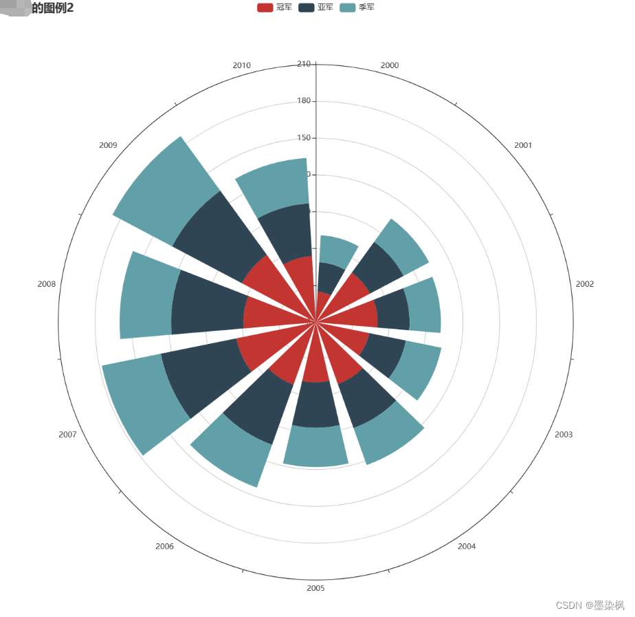
数据可视化 pycharts实现时间数据可视化
自用版 数据格式为: 运行效果为: from pyecharts import options as opts from pyecharts.charts import Polar, Page import csv filename "./hot-dog-places.csv" data_x [] data_y [] with open(filename) as f:reader csv.reade…...
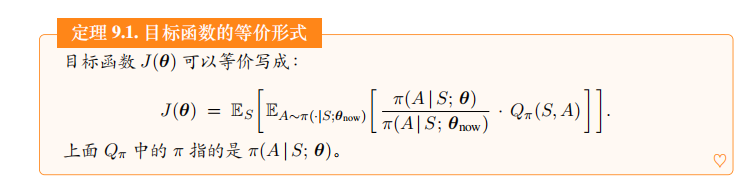
深度强化学习(王树森)笔记11
深度强化学习(DRL) 本文是学习笔记,如有侵权,请联系删除。本文在ChatGPT辅助下完成。 参考链接 Deep Reinforcement Learning官方链接:https://github.com/wangshusen/DRL 源代码链接:https://github.c…...

python 实现 macOS状态栏 网速实时显示
安装依赖包: pip install pillow psutil rumpsnetSpeedApp.py from PIL import Image, ImageDraw, ImageFont import psutil import rumpsclass NetSpeedApp(rumps.App):def __init__(self):super(NetSpeedApp, self).__init__("NetSpeed")self.titlese…...

【C++】开源:Windows图形库EasyX配置与使用
😏★,:.☆( ̄▽ ̄)/$:.★ 😏 这篇文章主要介绍Windows图形库EasyX配置与使用。 无专精则不能成,无涉猎则不能通。——梁启超 欢迎来到我的博客,一起学习,共同进步。 喜欢的朋友可以关注一下&#…...

微信小程序 全局变量键值对map对象
在微信小程序中,键值对的map对象通常用于存储和操作键值对的集合。以下是一些常见的操作: 创建map对象 在JavaScript中,可以通过对象字面量语法或者使用new Map()来创建map对象 // 使用对象字面量 var map {key1: value1,key2: value2 };…...
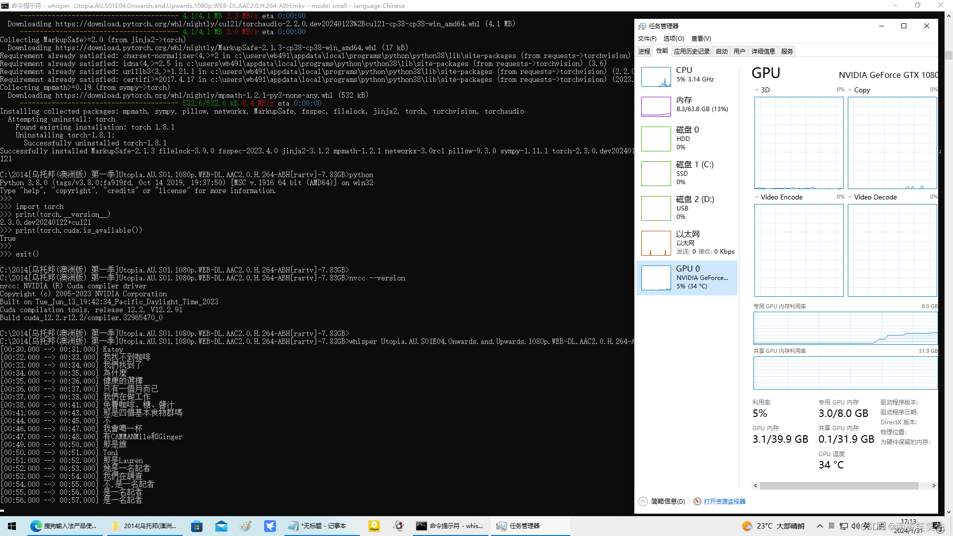
20240131在WIN10下配置whisper
20240131在WIN10下配置whisper 2024/1/31 18:25 首先你要有一张NVIDIA的显卡,比如我用的PDD拼多多的二手GTX1080显卡。【并且极其可能是矿卡!】800¥ 2、请正确安装好NVIDIA最新的545版本的驱动程序和CUDA。 2、安装Torch 3、配置whisper http…...
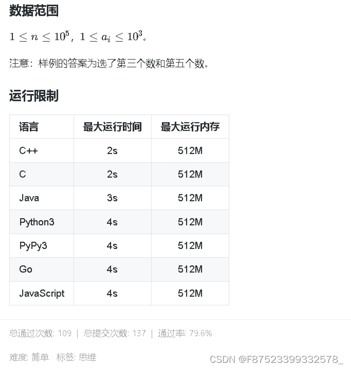
3338 蓝桥杯 wyz的数组IV 简单
3338 蓝桥杯 wyz的数组IV 简单 //C风格解法1,通过率50% #include<bits/stdc.h>int main(){std::ios::sync_with_stdio(false);std::cin.tie(nullptr);std::cout.tie(nullptr);int n; std::cin >> n;int ans 0;std::vector<int>a(n);for(auto &am…...

git Filename too long
git Filename too long 原因: 文件名限制260长度 解决:全局配置git git config --system core.longpaths true查看: git config --get core.longpaths...
MySQL数据库-理论基础
1.1 什么是数据库 数据: 描述事物的符号记录, 可以是数字、 文字、图形、图像、声音、语言等,数据有多种形式,它们都可以经过数字化后存入计算机。 数据库: 存储数据的仓库,是长期存放在计算机内、有组织…...
立体边界,让arcgis出图更酷炫一些
就是这样子的那个图—— 本期我们还是用长沙市为例, 来手把手的演示制作立体边界, 就是这个样子的边界—— 第一步—准备底图 其实你准备什么底图都可以哈,例如调用天地图、下载个影像图,或者用其他什么的底图,都是…...
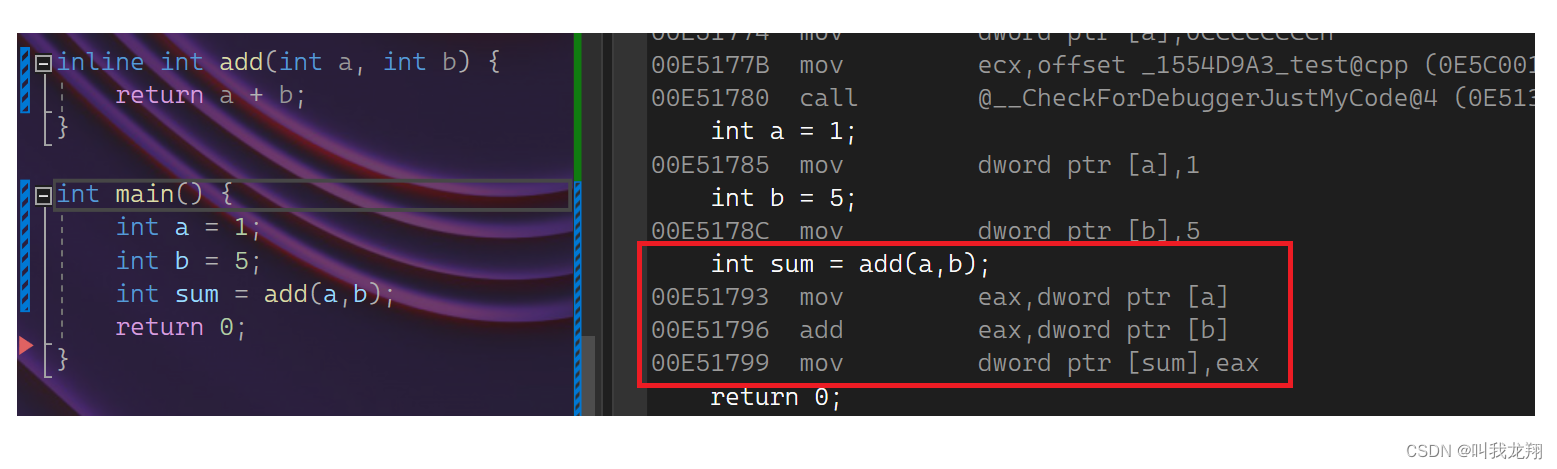
【C++】 C++入门—内联函数
C入门 1 内联函数1.1 定义1.2 查看方式1.3 注意 Thanks♪(・ω・)ノ谢谢阅读下一篇文章见!!! 1 内联函数 1.1 定义 程序在执行一个函数前需要做准备工作:要将实参、局部变量、返回地址以及若干寄存…...

软件工程知识梳理2-需求分析
需求分析时软件定义的最后一个阶段,它的基本任务时准确回答系统必须做什么的问题。 输出:本阶段必须的输出时软件需求规格说明书。 角色:需求分析员 参与者:用户、需求分析员 需求分析遵循的准则: 必须理解并描述问…...
mac裁剪图片
今天第一次用mac裁剪图片,记录一下过程,差点我还以为我要下载photoshop了, 首先准备好图片 裁剪的目的是把图片的标题给去掉,但是不能降低分辨率,否则直接截图就可以了 解决办法 打开原始图片(不要使用预览…...
 | Box,Surface - 帧布局)
Compose | UI组件(十) | Box,Surface - 帧布局
文章目录 前言Box 组件的参数说明Box 组件的使用Surface 的参数说明Surface 的使用 总结 前言 Box组件是 按子组件依次叠加 的布局组件,相当传统View中的 FrameLayout Box 组件的参数说明 Composable inline fun Box(modifier: Modifier Modifier, …...

种草日记|林曦老师的冬日好物分享
冬天将尽春天就要来了,换季的时候最容易引起皮肤干燥、头发毛躁不舒服的问题,今天就来说说林曦老师推荐的冬日护理爱用好物。大家都要“如婴儿乎”,照顾好自己哦~ 1、Aco甘油保湿霜 Aco甘油保湿霜好大一罐&#x…...
【算法与数据结构】139、LeetCode单词拆分
文章目录 一、题目二、解法三、完整代码 所有的LeetCode题解索引,可以看这篇文章——【算法和数据结构】LeetCode题解。 一、题目 二、解法 思路分析:本题可以看做一个动态规划问题。其中,字符串s是背包,而字典中的单词就是物品。…...

NLP任务之Named Entity Recognition
深度学习的实现方法: 双向长短期记忆网络(BiLSTM): BiLSTM是一种循环神经网络(RNN)的变体,能够捕捉序列数据中的长期依赖关系。在NER任务中,BiLSTM能有效地处理文本序列,捕捉前后文本…...

NUXT3项目实践总结
目录 一、NUXT3实现黑夜白天模式切换 需求 实现 效果 二、scrollreveal插件实现动画效果 需求 实现 封装 使用 文档 效果 三、useSeoMeta的使用 作用 使用 效果 四、NUXT3开启代理 使用 注意 五、$fetch、useFetch 、useAsyncData的区别 六、错误页面处理 …...
中科星图——2020年全球30米地表覆盖精细分类产品V1.0(29个地表覆盖类型)
数据名称: 2020年全球30米地表覆盖精细分类产品V1.0 GLC_FCS30 长时序 地表覆盖 动态监测 全球 数据来源: 中国科学院空天信息创新研究院 时空范围: 2015-2020年 空间范围: 全球 数据简介: 地表覆盖分布…...

基于GIS三维地球的全球指挥官推演沙盘软件军迷免费版 谷歌地球 数字孪生 自媒体创作 战术想定编辑
一套完全自主的、基于真实地理坐标系的沉浸式战术推演引擎,其技术栈的构建是对传统可视化与交互范式的系统性革新。 全球指挥官沙盘软件军迷免费版下载 一、 项目概述:一个核心命题与两项技术挑战 本项目源于一个明确的工程命题:构建一个允…...

SHE 密钥注入的“通配符魔法”:从 UID 通配到 AUTOSAR 分层落地
想象一下,你是一家汽车电子工厂的技术员,需要为成千上万个 ECU 刷写密钥。每个 ECU 都有一个独一无二的 ID(UID)。如果每次刷写都要读取这个 UID,再根据 UID 计算出专属的密钥数据,那产线的效率会大打折扣。…...
 综合模拟运输测试标准(CSDN 完整版)前言)
ISTA 3B-2013 全解析|零担货物 (LTL) 综合模拟运输测试标准(CSDN 完整版)前言
前言 ISTA 3B-2013 是 ISTA 3 系列高级综合模拟测试,专门针对零担货物运输(LTL) 的包装件。 零担运输的特点是多货混装、多次中转、人工 / 叉车交叉搬运、环境复杂,因此 3B 是工业、设备、家电、汽配、大型包装最贴近真实物流的测…...

3个步骤掌握Betaflight飞控固件:从零开始打造专业级无人机飞行体验
3个步骤掌握Betaflight飞控固件:从零开始打造专业级无人机飞行体验 【免费下载链接】betaflight Open Source Flight Controller Firmware 项目地址: https://gitcode.com/gh_mirrors/be/betaflight Betaflight作为全球最受欢迎的开源飞控固件,为…...

独立开发者如何利用Taotoken同时管理多个AI项目的模型调用
🚀 告别海外账号与网络限制!稳定直连全球优质大模型,限时半价接入中。 👉 点击领取海量免费额度 独立开发者如何利用Taotoken同时管理多个AI项目的模型调用 对于独立开发者而言,同时维护多个小型产品是常态。每个产品…...

利用 AI 导出鸭将 DeepSeek 内容一键转为 PDF
在日常使用 AI 助手进行技术调研或文档整理时,我们常常会遇到一个痛点:生成的优质内容往往停留在网页对话框中,难以直接转化为便于归档、打印或离线阅读的格式。尤其是像 DeepSeek 这样输出结构清晰、代码片段丰富的长文,如果只能…...

通信对抗新利器:HWG1在铁路高速领域的卓越应用
在现代化交通体系中,铁路、高速等关键领域的通信安全至关重要。为了应对复杂多变的电磁环境,确保通信系统的稳定运行,成都鼎讯信通科技有限公司推出了通信信号干扰模拟器HWG1,为交通领域的通信对抗训练提供了强有力的支持。HWG1通…...

ARM Cortex-M4中断优先级与嵌套机制详解:从原理到实战配置
1. 项目概述:深入理解中断的“秩序”在嵌入式开发,尤其是基于ARM Cortex-M4这类高性能微控制器的项目中,中断系统是驱动实时响应的核心引擎。它就像一家繁忙餐厅的后厨,各种订单(外部事件)会随时涌入。如果…...

Ender-3固件配置终极指南:从新手到高手的完整教程
Ender-3固件配置终极指南:从新手到高手的完整教程 【免费下载链接】Ender-3 The Creality3D Ender-3, a fully Open Source 3D printer perfect for new users on a budget. 项目地址: https://gitcode.com/gh_mirrors/en/Ender-3 Ender-3 3D打印机是一款广受…...

RAG+Agent+记忆图谱三重架构解析,2026年仅剩这4个工具通过企业级安全审计认证
更多请点击: https://codechina.net 第一章:RAGAgent记忆图谱三重架构解析,2026年仅剩这4个工具通过企业级安全审计认证 架构协同的本质逻辑 RAG 提供实时、可溯源的外部知识注入能力;Agent 负责任务分解、工具调用与多步推理闭…...