前端 CSS 经典:grid 栅格布局
前言:Grid 布局是将容器划分成"行"和"列",产生单元格,然后将"项目"分配给划分好的单元格,因为有行和列,可以看作是二维布局。
一 术语
1. 容器
采用网格布局的区域,也就是外层盒子。
2. 项目
容器包裹的一级子元素,不包含二级及其以下的子元素。当容器使用了 grid 布局,项目的 float,display 等设置都将失效。
3. 单元格
通过容器设置行列属性,切割出来的单元格。单元格不等于项目,打个比方,容器相当于一个房子,单元格相当于在房子里划分出的一个个房间,项目相当于房间里的家具等东西。
二 容器属性
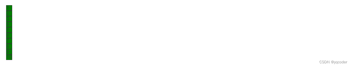
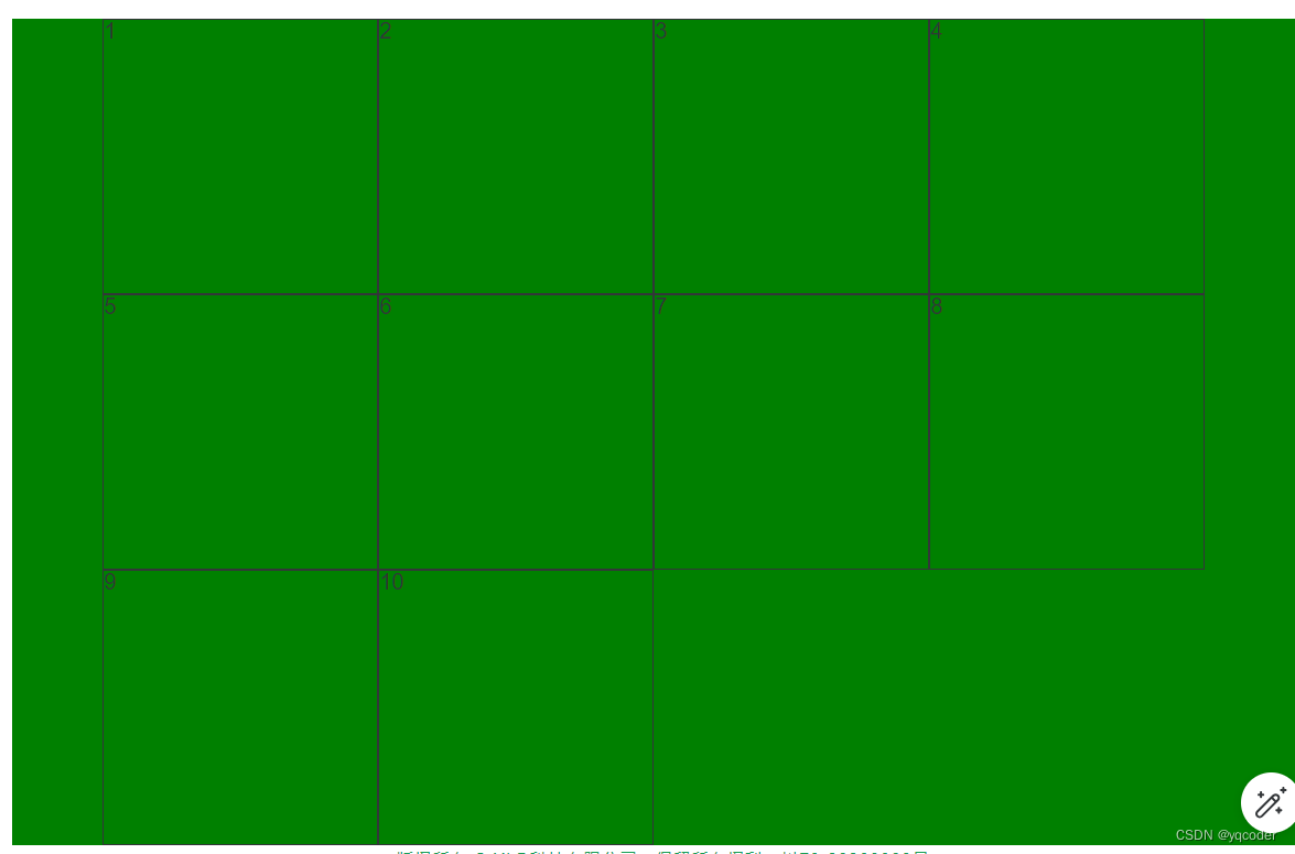
demo 默认样式,未设置 grid 属性。
<template><div class="container"><span v-for="i in 10" :class="`item${i}`">{{ i }}</span></div>
</template><style lang="scss" scoped>.container {background: green;span {border: 1px solid;}}
</style>
1. display
设置网格布局
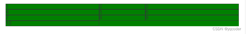
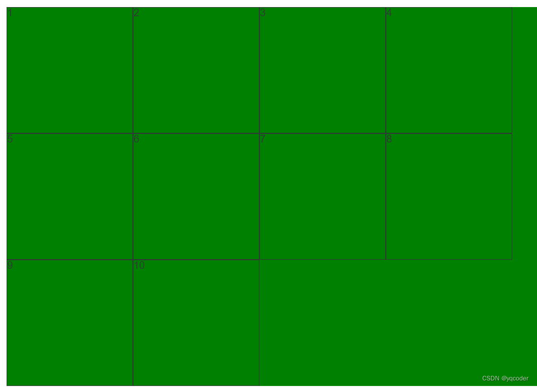
1.1 display: grid
项目宽度填充整行
.container {background: green;display: grid;span {border: 1px solid;}
}
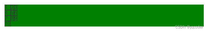
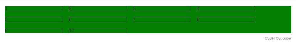
1.2 display: inline-grid
项目宽度根据内容撑宽。
.container {background: green;display: inline-grid;span {border: 1px solid;}
}
2. grid-template-columns
划分容器列和列宽,可以单独或混合使用:绝对值 px,百分比 %,比例 fr,关键字 auto,函数 minmax,函数 repeat,函数 fit-content
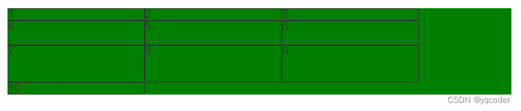
2.1 绝对值 px
例:设置 3 列,每列宽 300px
.container {background: green;display: grid;grid-template-columns: 300px 300px 300px;span {border: 1px solid;}
}
2.2 百分比 %
例:设置 3 列,每列宽 33.33 %
.container {background: green;display: grid;grid-template-columns: 33.33% 33.33% 33.33%;span {border: 1px solid;}
}
2.3 比例 fr
总宽度除以总的 fr,得到每份 fr 所占宽度,然后分给设置的列宽,例:设置 3 列,第 2 列是第 1 列的 1 倍,第 3 列是第 1 列的 3 倍
.container {background: green;display: grid;grid-template-columns: 1fr 2fr 3fr;span {border: 1px solid;}
}
2.4 关键字 auto
宽度自适应,例:设置 3 列,第 1 列 100px,第 3 列 100px,第 2 列宽度自适应
.container {background: green;display: grid;grid-template-columns: 100px auto 100px;span {border: 1px solid;}
}
2.5 函数 minmax
minmax(min, max),用于产生一个长度范围,例:设置 3 列,第 2 列 自适应宽度在 100px 到 300px 之间,第 1 列和第 3 列宽度为 300px。
.container {background: green;display: grid;grid-template-columns: 300px minmax(100px, 300px) 300px;span {border: 1px solid;}
}
2.6 函数 repeat
repeat(n, content),n 代表重复次数,可以是数字代表几次,可以 auto-fill 自动填充满,content 代表重复内容。例:设置 3 列,每列 1fr。
.container {background: green;display: grid;grid-template-columns: repeat(3, 100px);span {border: 1px solid;}
}
例:设置每列 100px,每行自动填充最多的 100px 列
.container {background: green;display: grid;grid-template-columns: repeat(auto-fill, 100px);span {border: 1px solid;}
}
2.7 函数 fit-content
fit-content(length),当内容小于 length,以内容为准,如果大于 length 以 leng 为长度,例:设置 3 列,每列最大宽度 200px,当小于 200px,以内容撑开宽度。
.container {background: green;display: grid;grid-template-columns: repeat(3, fit-content(200px));span {border: 1px solid;}
}
3. grid-template-rows
划分容器行和行高,属性同 grid-template-columns 一致,比例 fr 略有不同。如果不设置项目高度,1fr 代表的高度就是项目高度,如果设置有项目设置了高度,那就以该项目的高度除以该项目所分的 fr 算出 1fr 的大小。例:设置列宽 200px,自动铺满列,不设置项目高度,第 1 行 1fr,第 2 行 2fr,第 3 行 3fr。
.container {background: green;display: grid;grid-template-columns: repeat(auto-fill, 200px);grid-template-rows: 1fr 2fr 3fr;span {border: 1px solid;}
}
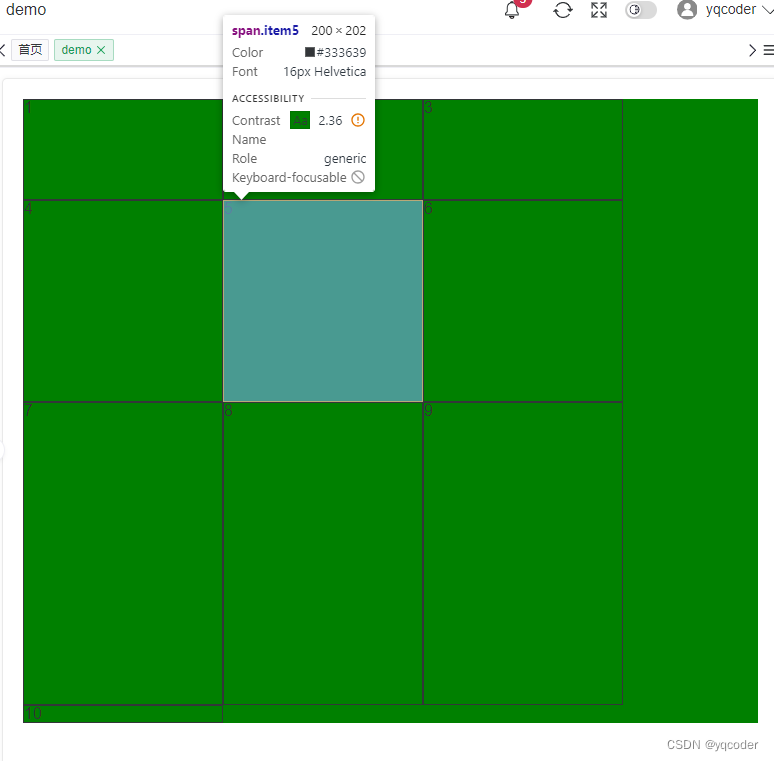
例:设置列宽 200px,自动铺满列,设置项目 item5 高度 200 px,第 1 行 2fr,第 2 行 2fr,第 3 行 3fr。
.container {background: green;display: grid;grid-template-columns: repeat(auto-fill, 200px);grid-template-rows: 1fr 2fr 3fr;span {border: 1px solid;}.item5 {height: 200px;}
}

4. grid-template-areas
区域命名,区域命名形成区域一定要是矩形区域,无论是 L,凹,凸都是无效属性值。可以配合 grid-template-rows、grid-template-columns 使用。例:设置 3 列每列 100px,3 行每行 100px,通过区域命名实现如图布局。
.container {background: green;display: grid;grid-template-columns: repeat(3, 100px);grid-template-rows: repeat(3, 100px);grid-template-areas:"left top top""left middle right""bottom bottom right";span {border: 1px solid;}.item1 {grid-area: left;}.item2 {grid-area: top;}.item3 {grid-area: middle;}.item4 {grid-area: right;}.item5 {grid-area: bottom;}
}
5. grid-template
是 grid-template-columns、grid-template-rows 这 2 个属性的合并简写形式。
grid-template-columns: repeat(3, 100px);
grid-template-rows: repeat(3, 100px);// 简写
grid-template: repeat(3, 100px) / repeat(3, 100px);
6. column-gap
列间距,支持数值和百分比。例:设置列间距为 20px。
.container {background: green;display: grid;grid-template-columns: repeat(auto-fill, 200px);column-gap: 20px;span {border: 1px solid;}
}
7. row-gap
行间距,支持数值和百分比。例:设置行间距 10px。
.container {background: green;display: grid;grid-template-columns: repeat(auto-fill, 200px);row-gap: 10px;span {border: 1px solid;}
}
8. grid-gap
行间距和列间距简写,grid-gap: 行间距,列间距,如果第二个值省略,默认两个值相等。例:设置行间距,列间距都为 20px。
.container {background: green;display: grid;grid-template-columns: repeat(auto-fill, 200px);grid-gap: 20px;span {border: 1px solid;}
}
9. grid-auto-flow
定义栅格元素的排列规则:row、column、row dense、column dense。
9.1 row
默认水平顺序排列
.container {background: green;display: grid;grid-template-columns: repeat(auto-fill, 200px);grid-template-rows: repeat(3, 200px);grid-auto-flow: column;span {border: 1px solid;}
}
9.2 column
垂直顺序排序
.container {background: green;display: grid;grid-template-columns: repeat(auto-fill, 200px);grid-template-rows: repeat(3, 200px);grid-auto-flow: column;span {border: 1px solid;}
}
10. justify-items
单元格内容水平位置设置:stretch、start、end、center
10.1 stretch
默认单元格内容水平填充单元格
.container {background: green;display: grid;grid-template-columns: repeat(auto-fill, 200px);grid-template-rows: repeat(3, 200px);justify-items: stretch;span {border: 1px solid;}
}
10.2 start
单元格内容水平靠右
.container {background: green;display: grid;grid-template-columns: repeat(auto-fill, 200px);grid-template-rows: repeat(3, 200px);justify-items: start;span {border: 1px solid;}
}
10.3 end
单元格内容水平靠左
.container {background: green;display: grid;grid-template-columns: repeat(auto-fill, 200px);grid-template-rows: repeat(3, 200px);justify-items: end;span {border: 1px solid;}
}
10.4 center
单元格内容水平居中
.container {background: green;display: grid;grid-template-columns: repeat(auto-fill, 200px);grid-template-rows: repeat(3, 200px);justify-items: center;span {border: 1px solid;}
}
11. align-items
单元格内容垂直位置:stretch、start、end、center
11.1 stretch
单元格内容垂直填充
.container {background: green;display: grid;grid-template-columns: repeat(auto-fill, 200px);grid-template-rows: repeat(3, 200px);align-items: stretch;span {border: 1px solid;}
}
11.2 start
单元格内容垂直靠上
.container {background: green;display: grid;grid-template-columns: repeat(auto-fill, 200px);grid-template-rows: repeat(3, 200px);align-items: start;span {border: 1px solid;}
}
11.3 end
单元格内容垂直靠下
.container {background: green;display: grid;grid-template-columns: repeat(auto-fill, 200px);grid-template-rows: repeat(3, 200px);align-items: end;span {border: 1px solid;}
}
11.4 center
单元格内容垂直居中
.container {background: green;display: grid;grid-template-columns: repeat(auto-fill, 200px);grid-template-rows: repeat(3, 200px);align-items: center;span {border: 1px solid;}
}
12. place-items
是 align-items 属性和 justify-items 属性的合并简写形式。如果省略第二个值,则浏览器认为与第一个值相等。例:设置单元格内容垂直和水平居中
.container {background: green;display: grid;grid-template-columns: repeat(auto-fill, 200px);grid-template-rows: repeat(3, 200px);place-items: center;span {border: 1px solid;}
}
13. justify-content
容器内容水平位置:start、end、center、stretch、space-around、space-between、space-evenly
13.1 start
默认容器内容水平靠左
.container {background: green;display: grid;grid-template-columns: repeat(auto-fill, 200px);grid-template-rows: repeat(3, 200px);justify-content: start;span {border: 1px solid;}
}
13.2 end
例:设置容器内容水平靠右
.container {background: green;display: grid;grid-template-columns: repeat(auto-fill, 200px);grid-template-rows: repeat(3, 200px);justify-content: end;span {border: 1px solid;}
}
13.3 center
例:设置容器内容水平居中
.container {background: green;display: grid;grid-template-columns: repeat(auto-fill, 200px);grid-template-rows: repeat(3, 200px);justify-content: center;span {border: 1px solid;}
}
13.4 space-around
例:设置容器内容水平平均分布,项目间距是项目距离容器边框的两倍
.container {background: green;display: grid;grid-template-columns: repeat(auto-fill, 200px);grid-template-rows: repeat(3, 200px);justify-content: space-around;span {border: 1px solid;}
}
13.5 space-between
例:设置容器内容水平平均分布,靠近容器边框项目紧贴容器,其余水平项目平均间距
.container {background: green;display: grid;grid-template-columns: repeat(auto-fill, 200px);grid-template-rows: repeat(3, 200px);justify-content: space-between;span {border: 1px solid;}
}
13.6 space-evenly
例:设置容器内容水平平均分布,项目间距和项目距离容器边框间距相等
.container {background: green;display: grid;grid-template-columns: repeat(auto-fill, 200px);grid-template-rows: repeat(3, 200px);justify-content: space-evenly;span {border: 1px solid;}
}
14. align-content
容器内容垂直位置:start、end、center、stretch、space-around、space-between、space-evenly,同 justify-content 属性一致。一般需要给容器设置固定高度。align-content 属性才有效。例:设置容器内容垂直居中
.container {height: 500px;background: green;display: grid;grid-template-columns: repeat(auto-fill, 200px);grid-template-rows: repeat(3, 100px);align-content: center;span {border: 1px solid;}
}
15. place-content
是 align-content 属性和 justify-content 属性的合并简写形式。如果省略第二个值,浏览器就会假定第二个值等于第一个值。例:设置容器内容水平居中,垂直居中。
.container {height: 500px;background: green;display: grid;grid-template-columns: repeat(auto-fill, 200px);grid-template-rows: repeat(3, 100px);place-content: center;span {border: 1px solid;}
}
三 项目属性
1. grid-column-start、grid-column-end、grid-column、grid-row-start、grid-row-end、grid-row、grid-area
grid-column-start: number; 左边框垂直网格线
grid-column-end: number; 右边框垂直网格线
grid-column: grid-column-start / grid-column-end; 左、右边框垂直网格线简写
grid-row-start: number; 上边框垂直网格线
grid-row-end: number; 下边框垂直网格线
grid-row: grid-column-start / grid-column-end; 左、右边框垂直网格线简写
grid-area: grid-row-start / grid-column-start / grid-row-end / grid-column-end; 上、左、下、右边框垂直网格线简写
number 值默认从 1 开始依次递增。
例:设置一个 3 列每列宽 200px,3 行每行高 200px,让内容为 1 的项目居中。
.container {background: green;display: grid;grid-template-columns: repeat(3, 200px);grid-template-rows: repeat(3, 200px);span {border: 1px solid;}.item1 {grid-column-start: 2;grid-column-end: 3;grid-row-start: 2;grid-row-end: 3;background: red;}
}// grid-column、grid-row 简写
.container {background: green;display: grid;grid-template-columns: repeat(3, 200px);grid-template-rows: repeat(3, 200px);span {border: 1px solid;}.item1 {grid-column: 2 / 3;grid-row: 2 / 3;background: red;}
}// grid-area 简写
.container {background: green;display: grid;grid-template-columns: repeat(3, 200px);grid-template-rows: repeat(3, 200px);span {border: 1px solid;}.item1 {grid-area: 2 / 2 / 3 / 3;background: red;}
}
2. justify-self
单元格内容的水平位置,同 justify-items 但只作用于单个项目。赋值:start、end、center、stretch。
3. align-self
单元格内容的垂直位置,同 align-items 但只作用于单个项目。赋值:start、end、center、stretch。
4. place-self
justify-self 和 align-self 简写,同 place-items 但只作用于单个项目。只有一个值时,第二个值默认与第一个值相同。
相关文章:
前端 CSS 经典:grid 栅格布局
前言:Grid 布局是将容器划分成"行"和"列",产生单元格,然后将"项目"分配给划分好的单元格,因为有行和列,可以看作是二维布局。 一 术语 1. 容器 采用网格布局的区域,也就是…...
多输入多输出通道
文章目录 图像卷积填充和步幅填充步幅 多输入多输出通道1x1卷积层 图像卷积 卷积原理: 就是将之前的大的图片,定义一个核函数,然后经过移动并运算将图片变小了.也就是将图像压缩提取整合特征值. 这里利用的时乘法. 填充和步幅 填充 在应用多层卷积时,我们常常…...
http响应练习—在服务器端渲染html(SSR)
一、什么是服务器端渲染(SSR) 简单说,就是在服务器上把网页生成好,整个的HTML页面生成出来,生成出的页面已经包含了所有必要的数据和结构信息,然后直接发给浏览器进行展现。 二、例题 要求搭建http服务&a…...
: std::deque的使用)
C++(8): std::deque的使用
1. std::deque std::deque 是 C 标准库中的一个双端队列容器。这个容器支持在序列的两端进行快速的插入和删除操作,其时间复杂度为常数时间 O(1)。同时,std::deque 也提供了对序列中任意元素的随机访问。 2. 特点 (1)双端操作&…...
openwrt开发包含路由器基本功能的web问题记录
1.这里的扫描怎么实现的先找一些luci代码,在openwrt21版本后,luci用js替换了lua写后台,先找一些代码路径 在openrwt15这部分代码是在这个目录下 feeds/luci/modules/luci-mod-admin-full/luasrc/view/admin_network/wifi_join.htm 里面包含…...
HarmonyOS ArkTS 骨架屏加载显示(二十五)
目录 前言1、骨架屏代码显示2、代码中引用3、效果图展示 前言 所谓骨架屏,就是在页面进行耗时加载时,先展示的等待 UI, 以告知用户程序目前正在运行,稍等即可。 等待的UI大部分是 loading 转圈的弹窗,有的是自己风格的小动画。其实…...
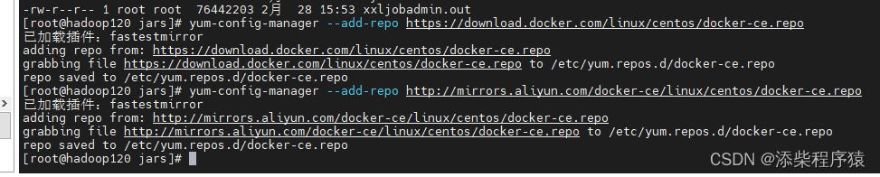
Ruoyi-Cloud-Plus_使用Docker部署分布式微服务系统_环境准备_001---SpringCloud工作笔记200
1.首先安装docker: 如果以前安装过首先执行: yum remove docker docker-client docker-client-latest docker-common docker-latest docker-latest-logrotate docker-logrotate docker-selinux docker-engine-selinux docker-engine 去卸载docker 2.安装dokcer需要的工具包…...
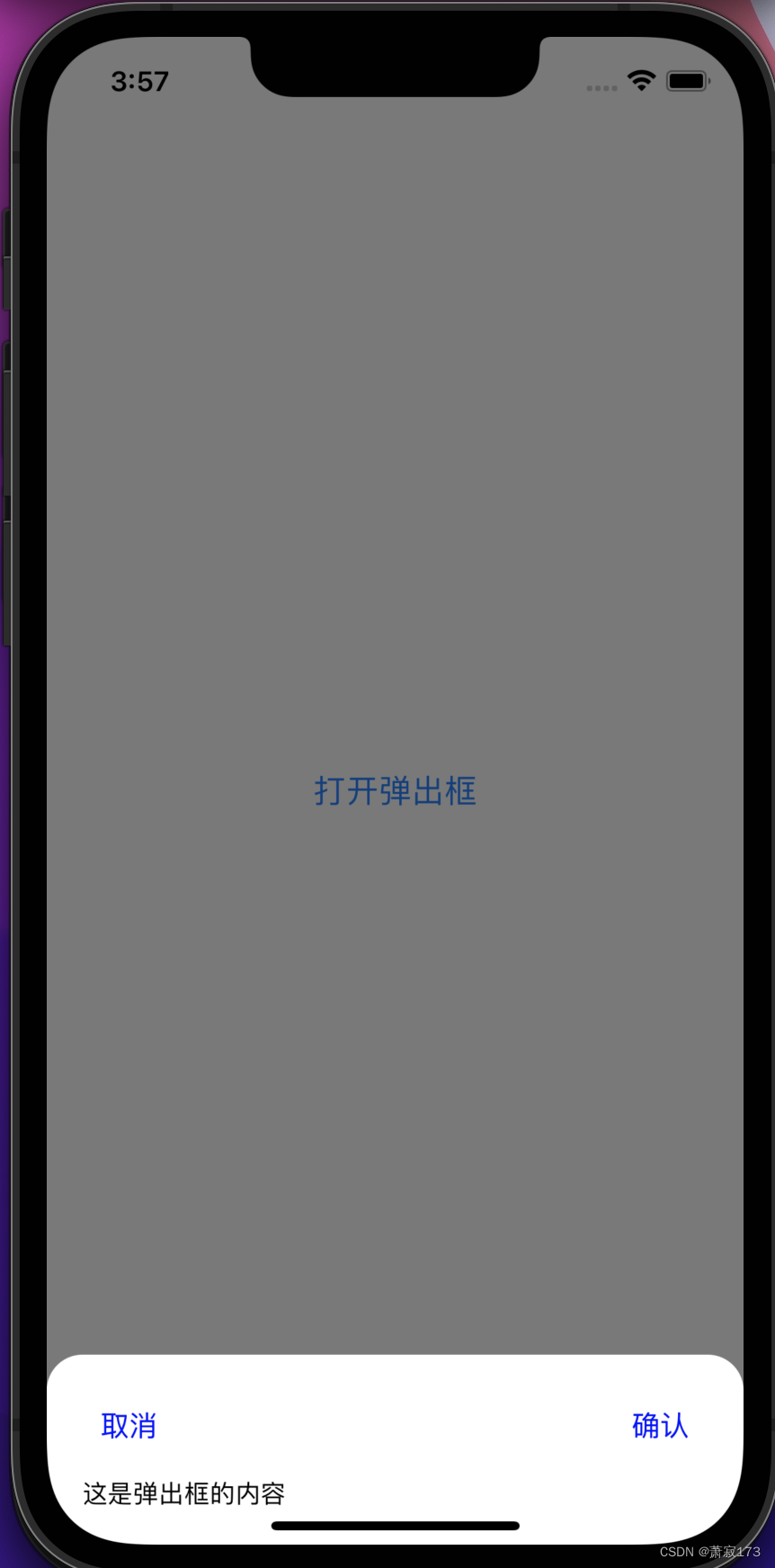
RN封装的底部向上弹出的弹出层组件
组件代码 import React from react; import { View, StyleSheet, Modal, TouchableOpacity, Text, TouchableWithoutFeedback } from react-native;const BottomPopup ({ visible, onClose, children, leftButtonTitle, rightButtonTitle, onLeftButtonPress, onRightButtonP…...

基于深度学习YOLOv8+PyQt5的水底海底垃圾生物探测器检测识别系统(源码+数据集+配置说明)
wx供重浩:创享日记 对话框发送:323海底 获取完整源码7000张数据集配置说明文件说明远程操作配置环境跑通程序 效果展示 基于深度学习YOLOv8PyQt5的水底海底垃圾生物探测器检测识别系统设计(源码数据集配置文件) 各文件说明 程序运…...
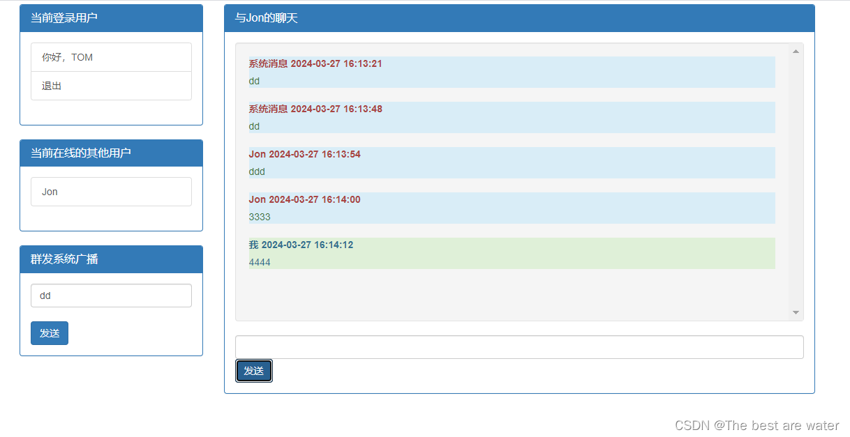
SpringBoot集成WebSocket实现简单的多人聊天室
上代码—gitee下载地址: https://gitee.com/bestwater/Spring-websocket.git下载代码,连上数据库执行SQL,就可以运行,最终效果...
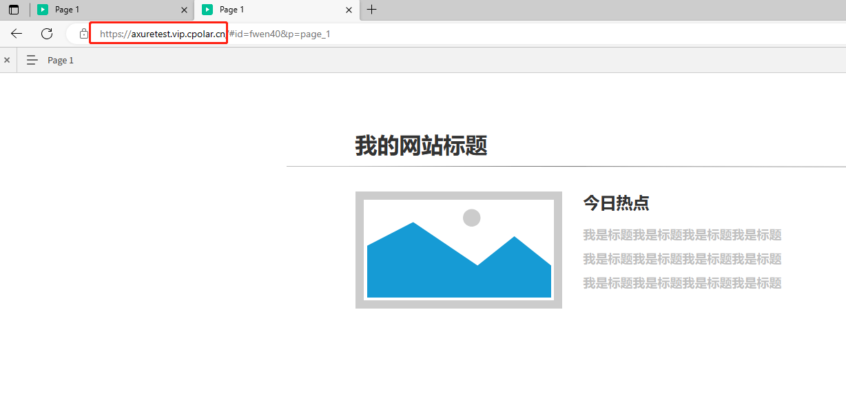
如何使用固定公网地址远程访问内网Axure RP生成的网站原型web页面
文章目录 前言1.在AxureRP中生成HTML文件2.配置IIS服务3.添加防火墙安全策略4.使用cpolar内网穿透实现公网访问4.1 登录cpolar web ui管理界面4.2 启动website隧道4.3 获取公网URL地址4.4. 公网远程访问内网web站点4.5 配置固定二级子域名公网访问内网web站点4.5.1创建一条固定…...
蓝桥杯习题
https://www.lanqiao.cn/problems/1265/learning/ 第一题---排序 给定一个长度为N的数组A,请你先从小到大输出它的每个元素,再从大到小输出他的每个元素。 输入描述: 第一行包含一个整数N 第二行包含N个整数a1,a2,a3,...an,表…...

AMS概念以及面试相关整理
1、ActivityManagerService是什么?什么时候初始化的?有什么作用? ActivityManagerService(AMS)是什么? ActivityManagerService(简称AMS)是Android操作系统中的一个核心服务&#…...
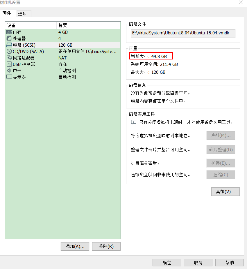
Vmware下减小Ubuntu系统占用系统盘大小
1、虚拟机设置下占用空间 如图,给虚拟机分配了120GB,已经占用116.9GB,开机会提示空间不足。 2、实际使用空间 ubuntu系统下使用“df -h”命令查看实际使用空间大小50GB左右 造成这个原因是,虚拟机的bug:在虚拟机的ub…...

面试题-Elasticsearch集群架构和调优手段(超全面)
对于Elasticsearch(ES),我了解并有经验。在我之前的公司,我们有一个相对大型的ES集群,以下是该集群的架构和一些调优手段的概述: 1. 集群架构 集群规模:我们的ES集群由15个节点组成,…...

python基础练习题6
1、找出10000以内能被5或6整除,但不能被两者同时整除的数(函数) def find_numbers(m,n):result []for num in range(m,n):if (num % 5 0 or num % 6 0) and not (num % 5 0 and num % 6 0):result.append(num)return resultprint(find_…...
Chrome 插件各模块使用 Fetch 进行接口请求
Chrome 插件各模块使用 Fetch 进行接口请求 常规网页可以使用 fetch() 或 XMLHttpRequest API 从远程服务器发送和接收数据,但受到同源政策的限制。 内容脚本会代表已注入内容脚本的网页源发起请求,因此内容脚本也受同源政策的约束,插件的来…...

内存可见性
内存可见性 一:内存可见性1.2: 二:解决内存可见性问题2.1 volatile关键字2.2:synchronized关键字解决内存可见性问题 一:内存可见性 public class Demo1 {public static int count 0;public static void main(String[] args) throws InterruptedException {Thread t1new Thre…...
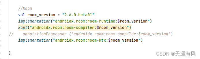
Android room 在dao中不能使用挂起suspend 否则会报错
错误: Type of the parameter must be a class annotated with Entity or a collection/array of it. kotlin.coroutines.Continuation<? super kotlin.Unit> $completion); 首先大家检查一下几个点 一、kotlin-kapt 二、 是否引入了 room-ktx 我是2024年…...
【stable diffusion扩散模型】一篇文章讲透
目录 一、引言 二、Stable Diffusion的基本原理 1 扩散模型 2 Stable Diffusion模型架构 3 训练过程与算法细节 三、Stable Diffusion的应用领域 1 图像生成与艺术创作 2 图像补全与修复 3 其他领域 四、Stable Diffusion的优势与挑战 👉优势 …...

Flink:Keyed State vs Operator State 原理与实践
一、引言在 Flink 实时计算的世界里,流处理的本质可以概括为公式:实时流处理 业务逻辑 状态(State)。无论是窗口聚合、双流 Join 还是复杂的 CEP 模式匹配,都离不开状态管理。Flink 提供了两种基本的状态类型&#x…...

从零到一:PyQt-Fluent-Widgets导航组件实战指南
从零到一:PyQt-Fluent-Widgets导航组件实战指南 【免费下载链接】PyQt-Fluent-Widgets A fluent design widgets library based on C Qt/PyQt/PySide. Make Qt Great Again. 项目地址: https://gitcode.com/gh_mirrors/py/PyQt-Fluent-Widgets 你是否曾经为P…...

从‘坍缩’到‘对齐’:用SimCSE解决BERT句子向量老难题,我的中文业务实验复盘
从语义坍缩到精准对齐:SimCSE在中文业务场景的实战指南 BERT模型在自然语言处理领域取得了巨大成功,但其原生句子向量存在一个令人头疼的问题——语义坍缩。简单来说,就是不同句子的向量在高维空间中倾向于聚集在一起,导致相似度计…...

三星48层3D V-NAND深度拆解:从电荷陷阱架构到存储密度革命
1. 初探三星48层3D V-NAND:一次深度拆解与工艺解析作为一名长期关注半导体存储技术的从业者,每次拿到业界巨头的新品进行物理层面的拆解分析,都像是一次充满惊喜的“寻宝”之旅。2016年初,当三星将其早在2015年8月就已预告的256Gb…...

InputTip:提升表单体验的动态输入引导组件设计与实战
1. 项目概述:一个被低估的输入增强工具 在桌面应用开发中,我们常常会花费大量精力去构建复杂的业务逻辑和炫酷的界面,却容易忽略一个直接影响用户体验的细节: 输入引导 。回想一下,你是否遇到过这样的场景࿱…...
)
服务器卡死别慌!手把手教你读懂NMI watchdog的soft lockup报错信息(附CentOS 7排查流程)
服务器卡死应急指南:NMI watchdog与soft lockup实战排查手册 凌晨三点,机房告警铃声大作,监控大屏上某台核心服务器的CPU使用率突然飙升至100%并持续不降。登录系统后,dmesg中赫然出现NMI watchdog: BUG: soft lockup - CPU#2 stu…...

在Node.js后端服务中集成Taotoken调用大模型指南
🚀 告别海外账号与网络限制!稳定直连全球优质大模型,限时半价接入中。 👉 点击领取海量免费额度 在Node.js后端服务中集成Taotoken调用大模型指南 将大模型能力集成到后端服务是现代应用开发的常见需求。Taotoken平台提供了OpenA…...

Arm编译器在嵌入式开发中的优化实践
1. Arm编译器嵌入式开发环境概述在嵌入式系统开发领域,工具链的选择往往决定了最终产品的性能上限。作为Arm架构的"原生"编译器,Arm Compiler for Embedded凭借其深度优化的代码生成能力,在物联网设备、工业控制器等资源受限场景中…...

3分钟掌握完全离线的实时语音转文字:TMSpeech让你彻底告别云端依赖
3分钟掌握完全离线的实时语音转文字:TMSpeech让你彻底告别云端依赖 【免费下载链接】TMSpeech 腾讯会议摸鱼工具 项目地址: https://gitcode.com/gh_mirrors/tm/TMSpeech 在数字时代,语音转文字已成为现代办公和学习的高效助手,但你是…...

TEdit地图编辑器:10倍效率打造你的泰拉瑞亚梦想世界
TEdit地图编辑器:10倍效率打造你的泰拉瑞亚梦想世界 【免费下载链接】Terraria-Map-Editor TEdit - Terraria Map Editor - TEdit is a stand alone, open source map editor for Terraria. It lets you edit maps just like (almost) paint! It also lets you chan…...